Lesson Info
32. Blend Modes
Lessons
Day 1
1Introduction
18:02 2Key Terms
27:06 3System Configuration and RAID Storage
19:22 4Q&A with Creating an Efficient Workflow
19:36 5Interface and Media Management
31:02 6Importing Media Part 1
30:40 7Importing Media Part 2
11:58Ratings and Keywords
32:21 9Reviewing Clips for Edit
25:13 10Importing Clips
19:26 11Editing an Interview Demo
33:20 12Replace Edit and Timeline Index
32:50 13Compound Clips and Auditions
18:27Day 2
14Editing Review
13:34 15Trimming Part 1
28:43 16Trimming Part 2
39:03 17How We Hear
21:51 18Audio Key Terms with Q&A
12:14 19Audio Basics, Meters, and Inspector
31:01 20Audio Q&A
08:55 21Dual System Sound and Audio Analysis
28:58 22Multicam Editing Part 1
27:08 23Multicam Editing Part 2
15:02 24Transitions Part 1
23:27 25Transitions Part 2
24:06 26Formatting and Animating Titles
30:18Day 3
27Additional Effects
12:36 28Editing and Trimming Review
11:58 29Changing Speed of a Clip
31:31 30Inspector Effects
36:35 31The Effects Browsers and Generators
19:37 32Blend Modes
17:10 33Effects Q&A
13:58 34Simple Effects
16:52 35Intro to Color Correction
18:20 36Video Scopes
19:25 37Color Correcting for Video
20:28 38Color Correcting Skintone
23:11 39Color Correction Q&A
08:54 40Audio Effects Part 1
26:20 41Audio Effects Part 2
23:08 42Exporting and Sharing
21:28Lesson Info
Blend Modes
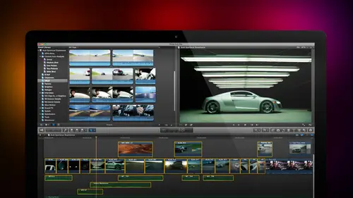
Lend modes are something that most editors don't understand because it's a photo shop technique, a photo shop artist can't lose. Well, actually, jim, let me just ask you on art director question when you're creating objects and in photo shop, I mean, we're now still working photoshopped. How often do you use? Blend? Not often, but you know, I probably used blend modes on ten percent of my work that's ten percent more than most video. Yes, because people think video editors don't know what they do on day, especially think that they're just used for stills and photo shop work, and they don't realize that we can do a lot of stuff with blend votes inside a video. So what I want to do now is I want to spend some time showing you what blend moats are in what capacity is so let's, open up this and let's, go find something to start with and it's interesting that you mentioned that because we did have someone asking about the opacity of picture and pictures. Well, ok, the, um, opacity settings ...
are available on every clip. It's not a filter that you have to apply. You can change your past the settings on any clip, any titled any, any effect except transitions, but generators, titles, video clips all of those khun have capacity changed and we give an example of this. If I have I have the word opacity here in white and I have the word opacity in green. If I select the clip, go up to the video tab in the inspector and go down to the very bottom, we see there's a compositing mode and were able to adjust the opacity. Now, when I have the opacity adjusted here, for instance, notice that I'm seeing through the text to the texture below this texture is really important because most the time when we just take a pure color clip, look at that light. The white is sitting there, but it looks like it's pasted on top of the rock. By the way, the rock is a stone generator from inside final cut. How can you not love that texture of the rock? I want to make it look like the word opacity is spray painted onto the rock. Look at how the rock texture is showing through the green here. Well, if I grabbed this clip and drag the opacity down, yes, I start to see the rock texture, but notice how much more difficult it's become to read the text. This is the difference between opacity on top and blend mode on the bottom. What opacity does is it makes the top clipped the top layer translucent and I see through it but in making it translucent it makes it fainter and fainter and fainter until it's harder and harder to read if I want to have perfect texture I can't read the text at all if I want to have perfect text I don't have any texture and somewhere in the middle I get okay texture I get okay text but it's really not a good combination of either one the second clip allows me to combine based upon blend modes let me illustrate just hide settings by clicking on the high button pull this all up here for instance I have a green clip there's the color green and it's fully opaque I can't see any of the stone behind it blend modes which are part of a pass ity and stored right above a ministry set the opacity on this to one hundred percent because we'll play with both blend mode allows me to combine images based upon their gray scale values. Now you'll hear about this a lot more when we talk about color correction gray scale is the amount of light or dark in the image for instance opacity top is a very light gray scale it happens to have the color of white but in terms of grey it's almost one hundred percent pure white as in gray scale this opacity the second opacity has the color green but in gray scale it's a medium gray this dot right there has the grayscale value of close to black near zero whereas this gray is medium gray probably about oh sixty percent toward white we need to differentiate in our mind the color of an object from the grayscale value of an object and blend modes combined elements based upon their gray scale they're black and white values were going to come back and hear this theme again this afternoon when we talk about color correction, watch the green opacity as I change the blend mode there's four different categories of blend modes subtract multiply combines based upon darker pixels watch the green opacity in two one wolf look at that I'm taking the darker elements off the background and combining it with the darker elements of the foreground and while opacity on top looks like it's sitting above the stone, the opacity on the bottom looks like it's painted onto the stone. You can see the texture, the ripples actually seeming to deform the character because of the blend mode well, the next category is called screen screen combines elements based upon their lighter values see how now we've got a lighter, washed out kind of look same word I'm seeing texture doesn't have the same feeling could be a better feeling could be a worse feeling, but it's not the same feeling third category is overlay this happens to be one of my favorites multiply combines upon darker grace scales screen combines based upon lighter grey scales overlake combines based upon mid tone grey grey scales and in many cases although not this one overlay is probably the best choice to go to first followed by multiply all these different iterations give us different looks all based on combining the medium grey pixels oven image will seymour this in just seconds so in this particular case we get the best result at least to my eye for this particular color against this particular background by choosing multiply if I select the top clip were pride get the best results not with multiply but with screen notice how screen will screen so I combined the lighter pixels I don't see anything come through here how about opacity? The overlay over late yeah, we start to see that and if we go to multiply disappears totally because there's no dark pixels in that pure white shape so the color and grey scale of the foreground has an impact on what the results of the blend mode is that's well, seymour this because I want to spend a few minutes explain this this just gives us all kinds of interesting things to play with. For example here if I have notice I've got the word texture t e is in a way the second timeout tio there we go the letter t e t a is ninety percent white next to you is fifty percent gray and you can't see it but the r is ten percent so ninety percent fifty percent and ten percent almost but not quite white mid tone grey and almost but not quite black with that said if I look at this against a medium background we can barely see the t e let's just hide the projects we can barely see the tea we can clearly see the medium gray in the dark right as we change blend modes watch what happens I'm going to go down too look at screen which combines based upon lighter pixels I c t e some of x to you and none of the ar e if I look at overlay overlay I see a little bit of everything because it works in the middle multiply works with a darker pixels notice that as I changed the blend mode depending upon what the grayscale value of the foreground and background clip is I get different results take look att darken take a look it's trucked take a look a color burn the need thing about blend mode is there's nothing to adjust you look at and say that has got to be the ugliest thing I have ever seen in my life well don't use it change it try something different let's try soft light or let's try hard light or let's try color, dodge your screen or whatever one that I recommend you not uses don't use ad ad is a really bad choice for video because it causes your white levels to exceed one hundred percent which for the web does not make any difference and for broadcast and cable will get you fired screen clamps white levels that one hundred percent to prevent them from going over into two white a territory adiz thie on ly blend mode that I actively recommend that you not use so what we're seeing is that these three categories of blend modes combined images based upon the grayscale value of the background and the grayscale value of the foreground and they combine based upon the brighter pixels the mid tone grey pixels or the darker pixels well this is all well and good and we use this for text all the time but let's see if we can't take this something a little bit further here this is that generator I talked about before look at that stone look at the color look at the texture look att the shading this is really cool background well notice I've applied a texture to it the texture is a blend mode called difference let's just take a look at some different choices here is what the textbooks by itself one of the ugliest colors I could possibly have chosen and it looks like it's floating above it and yes, I could go to text and yes, if I wanted to, I could add a drop shadow and give it a drop shadow look, which is what we do with many of our titles where we want the title to float over the background but in this case I want tohave the color and the text look like it's spray painted on the rock let's take a look at what multiplied does all right, definitely we get texture definitely we get colored definitely looks different let's try screen still some but not a lot color dodge we start to seymour of the rock background or linear dodge again they're subtle differences that may or may not work for you. We get overlay, which is one that I like we're seeing mohr of the shadow in here soft light is sort of a gentler hand and hard light is stronger but one of the neat settings here is farther down difference and exclusion unlike all the other blend modes which work on grayscale value difference and exclusion work on color values. This is one of those things where let's just see what we can make this look like let's see if it looks good let's see if it looks bad and you say, hey that's kind of neat? Well, we've been doing this with a still image of the background we've been doing it with a still image of the foreground but let's go back in time and let's talk ansel adams ansel adams is probably one of the most famous photographers that ever lived, and he made a career out of taking spectacularly lovely images all across the west and one of things that he discovered is a filter a camera filter called a grad filter short for graduated filter the top portion of the filter was dark, translucent but dark and it would shade to completely transparent at the bottom. It looked like this except where white is you could see through it what the grad filter allows us to do is to take a really nice looking exterior wide shot slipped the grad filter in front of the lens and what we can do also in post we get the effect of an overlay blend mode. This is the shot this is the shot without the grad filter applied look at the grass clearly it's good and it's blowing grass this is a still this is a moving image, grasses blowing wheat got a nice sweet color the clouds are definitely there there's lowering clouds and we can see that there's clouds and the mountain but we don't have a lot of detail in the sky and we don't have a lot of life in the foreground because the sun is actually way in the background not foreground watched the grad filter in too one wolf oh, my goodness, look at the detail that suddenly showed up in the sky that wasn't there before. This is before this is after look at how we've made that we'd just pop it looks as though the sunlight came out in the foreground. Why we've applied the grady int using the overlay filter and watch what happens is I play this clip in real time. There is a dramatic, different, more powerful look toe having that grad filter in than having a grad filter out. Well, they could see even more exciting than this here's a village barn, totally nondescript sky. Nothing happening in the foreground limited stuff happening to background. The sun is in the in the wrong place. We want the sun to be in the foreground I've got a grad filter, but I also have a grad filter that's got a much narrower horizon let's see what we can do here if I select both of those go, too. The blend mode changed the blend mode toe overlay cause that works of mid tone grey and let's. Watch what happens this is before, and this is the grad filter this is before, and this is the grad filter we've got detail in the sky, and we've shifted that whole balance so that now the foreground isn't a secondary thought being dominated by the background. Your eye goes right to the road the barn the grapevines and the lighting looks like it's consistent all the way across and this too is a piece of video well we can do more than this. What happens if I take this exact same scene and it's ah horror film well we can take a grady int which is dark blue shading cool the entire time select this go to video go to the overlay menu bomp bomp bom lightning and thunder just before the door slammed shut on a screaming starts or what happens if I take a grady int which is shading between different colors? Okay let's go to here and let's go to overlay look at that now we've got the world of oz all the colors air accentuated maybe this is too saturated maybe we want to just work with a warm grady in this's a grady it created inside final cut I can adjust the grady in't inside final cut in a way that I can't with the photo shop graphic but I can play with it or I could just take a photo shop graphic this's a straight radiant created inside photoshopped this is before and this is after look at how the wheat has got life energy and the sky has got detail and what we worked with this just a gold grade and there's another thing we can do with this grady in watch what happens instead of doing overly if I decide to go with hard mix now, I've got a poster ization image, which is a moving image that I could use is the opening graphic to my show drop text. On top of this, the sky is moving, the grasses moving. I've got a peter max style color palette that allows me to do all kinds of interesting things. This text knock this back in terms of brightness or we can do something. One more thing to show you. Just I want expand your thinking in terms of what we could do with these blood modes that's far beyond what you may have thought about here's our image here we're shading from cool toe, warm, selected. Go to overlay. Look at this this is before and this is after I mean, this is a fabulous shot, this's, more fabulous. This is what my I would see. This is what's in my imagination, it's a major, major difference in easy, easy to create with blend moz, is that not cool? I love this stuff.
Class Materials
bonus material with purchase
Ratings and Reviews
a Creativelive Student
Absolutely one of the best & easy to follow teaching / learning sessions for this product. Larry has a great approach & insight into delivering a wealth of information from his years of experience that budding video engineers will certainly benefit from with a product that is powerful & great to use. I'm enjoying the journey to better understand & use this great product, expanding my experience in producing awesome video presentations. Great work Larry, & also huge fan of creativelive Keep up the great work you all do to assist budding producers in mastering their skills. Noel Blake Melbourne Australia
plb42
Final Cut Pro with Larry Jordan has been of enormous help to me just stating in FCPX. Larry has a unique way of getting the message on the basics across in an easy to understand manner. I have not yet looked at the entire course as I am practicing the steps as I go through the course. Many programs of FCP are not presented in the easy to follow manner thatL array does so well. I am 100% delighted with my purchase. I am in Sydney, Australia, and, due to the time difference it is impractical to view courses live. So I had to purchase on trust which in this case was a good choice. It would be good if Creative Live could perhaps rerun programs so overseas folks could view them at a convenient time. The courses still need to be purchased as I find it best to run it on another monitor and put what is taught into practice. Well done and thanks for the special offer in July.
a Creativelive Student
Attending this class was really a life-changing experience. Larry is a wonderful teacher and clearly on top of the program and methodology, and the way he structured the course, did frequent reviews and constant technique reminders (naming keyboard shortcuts as he did them, for example) really added a lot to the presentation. The depth of the class was very much appreciated, and his command of a complex subject showed that it was possible. I have wanted to understand FCP for several years and have only gotten the beginnings of a handle on it in the last 6 months or so. This class was an exponential knowledge upload and I hope will allow me to do lots of things I've only wondered about. I thought Jim was a good foil for Larry and did a nice job keeping things together, even when there was a technical problem. The value for me of being able to sit through the class before deciding to purchase was huge, and I am very much looking forward to reviewing the videos as questions come up. The class was very thorough and I didn't feel anything was being left out. Thank you so much for making it available.
Student Work
Related Classes
Final Cut Pro X