Critique of Student Series
Lesson 137 from: Fine Art Photography: The Complete GuideBrooke Shaden
Critique of Student Series
Lesson 137 from: Fine Art Photography: The Complete GuideBrooke Shaden
Lessons
Class Introduction
19:06 2Storytelling & Ideas
27:34 3Universal Symbols in Stories
03:19 4Create Interactive Characters
02:16 5The Story is in The Details
04:13 6Giving Your Audience Feelings
05:49 7Guided Daydream Exercise
04:20 8Elements of Imagery
02:19The Death Scenario
01:47 10Associations with Objects
03:01 11Three Writing Exercises
06:39 12Connection Through Art
30:35 13Break Through Imposter Syndrome
07:40 14Layering Inspiration
23:13 15Creating an Original Narrative
07:42 16Analyze an Image
04:12 17Translate Emotion into Images
04:31 18Finding Parts in Images
06:02 19Finding Your Target Audience
04:05 20Where Do You Want Your Images to Live?
12:01 21Create a Series That Targets Your Audience
32:43 22Formatting Your Work
06:08 23Additional Materials to Attract Clients
07:24 24Which Social Media Platforms Will be Useful?
04:17 25How to Make Money from Your Target Audience
11:27 26Circle of Focus
07:55 27The Pillars of Branding
06:18 28Planning Your Photoshoot
09:05 29Choose Every Element for The Series
07:38 30Write a Descriptive Paragraph
09:37 31Sketch Your Ideas
17:27 32Choose Your Gear
02:50 33How to Utilize Costumes, Props & Locations
26:18 34What Tells a Story in a Series?
13:06 35Set Design Overview
01:43 36Color Theory
19:50 37Lighting for the Scene
12:05 38Props, Wardrobe & Time Period for Set Design
06:00 39Locations
04:31 40Subject Within the Scene
07:26 41Set Design Arrangement
05:46 42Fine Art Compositing
03:46 43Plan The Composite Before Shooting
10:29 44Checklist for Composite Shooting
18:52 45Analyze Composite Mistakes
12:11 46Shoot: Black Backdrop for White Clothing
10:42 47Shoot: Black Backdrop for Color Clothing
08:36 48Shoot: Black Backdrop for Accessories
08:17 49Shoot: Miniature Scene
09:59 50Editing Workflow Overview
01:57 51Add Fabric to Make a Big Dress
08:35 52Edit Details of Images
08:09 53Add Smoke & Texture
10:47 54Blend Multiple Images Into One Composite
24:58 55Put Subject Into a Miniature Scenario
17:55 56Location Scouting & Test Photoshoot
22:10 57Self Portrait Test Shoots
22:30 58Shoot for Edit
04:21 59Shoot Extra Stock Images
10:01 60Practice the Shoot
25:07 61Introduction to Shooting Photo Series
03:33 62Shoot: Vine Image
10:40 63Shoot: Sand Image
09:50 64Shoot: End Table Image
04:59 65Shoot: Bed Image
06:18 66Shoot: Wall Paper Image
05:54 67Shoot: Chair Image
08:02 68Shoot: Mirror Image
06:57 69Shoot: Moss Image
05:48 70Shoot: Tree Image
07:33 71Shoot: Fish Tank Image
04:09 72Shoot: Feather Image
09:00 73View Photo Series for Cohesion & Advanced Compositing
07:35 74Edit Multiple Images to Show Cohesion
36:55 75Edit Images with Advanced Compositing
29:33 76Decide How to Start the Composite
09:35 77Organize Final Images
21:37 78Choosing Images for Your Portfolio
08:19 79Order the Images in Your Portfolio
16:28 80Why do Some Images Sell More Than Others?
16:03 81Analyze Student Portfolio Image Order
11:42 82Framing, Sizing, Editioning & Pricing
02:19 83Determine Sizes for Prints
16:44 84How to Choose Paper
13:56 85How to Choose Editions
07:18 86Pricing Strategies
18:59 87How to Present Your Images
13:26 88Example Pricing Exercise
09:39 89Print Examples
08:23 90Licensing, Commissions & Contracts
04:44 91How to Keep Licensing Organized
06:07 92How to Prepare Files for Licensing
07:28 93Pricing Your Licensed Images
12:33 94Contract Terms for Licensing
12:07 95Where to Sell Images
04:55 96Commission Pricing Structure
08:23 97Contract for Commissions
12:17 98Questions for a Commission Shoot
08:45 99Working with Galleries
08:58 100Benefits of Galleries
07:39 101Contracts for Galleries
10:32 102How to Find Galleries
05:22 103Choose Images to Show
08:53 104Hanging the Images
03:38 105Importance of Proofing Prints
08:04 106Interview with Soren Christensen Gallery
21:59 107Press Package Overview
04:35 108Artist Statement for Your Series
18:20 109Write Your 'About Me' Page
09:04 110Importance of Your Headshot
03:55 111Create a Leave Behind & Elevator Pitch
20:19 112Writing For Fine Art
04:44 113Define Your Writing Style
14:49 114Find Your Genre
06:41 115What Sets You Apart?
02:25 116Write to Different Audiences
05:10 117Write for Blogging
39:57 118Speak About Your Work
14:21 119Branding for Video
07:37 120Clearly Define Video Talking Points
14:27 121Types of Video Content
31:45 122Interview Practice
13:22 123Diversifying Social Media Content
22:32 124Create an Intentional Social Media Persona
24:48 125Monetize Your Social Media Presence
18:46 126Social Media Posting Plan
04:01 127Choose Networks to Use & Invest
02:57 128Presentation of Final Images
19:13 129Printing Your Series
09:16 130How to Work With a Print Lab
13:39 131Proofing Your Prints
10:11 132Bad Vs. Good Prints
03:32 133Find Confidence to Print
10:50 134Why Critique?
06:55 135Critiquing Your Own Portfolio
10:39 136Critique of Brooke's Series
16:18 137Critique of Student Series
40:07 138Yours is a Story Worth Telling
02:09Lesson Info
Critique of Student Series
Okay, (mumbles) so do you want to just say a quick elevator pitch about your work as a whole. What is it, what do you do, what does it look like, what can we expect? I guess from me you can expect all kinds of genres 'cause I'm experimenting with things. Good. I like nature, landscapes, the decisive moment in them, and I like people and I like to travel. Beautiful, good. Holding a camera. Perfect, as one should. I always forget my camera every time I go anywhere, it's terrible. Okay, so let's take a look at your portfolio. Now we're gonna just sort of zoom through these fairly quickly, but we're gonna get a sense of the images, and your look and your style and your story. I have the distinct privilege of already knowing each of your portfolios just a little bit, so we're going to just flip through. Can I just say that I have multiple portfolios in there. Yes. I appreciate you saying that. I mean, it's important to note that you have a few different types of images here. I like how you ...
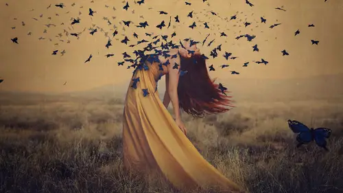
have little mini series going on as well. Where was this? That's in New Delhi, that's actually Old Delhi this part, yeah. Yeah, very interesting. Okay, so as we look through the images this is the first time that I felt a shift, the first time, which is interesting because I noticed a shift, but I didn't feel it before. This is the first time that I feel it, and I'm bringing that up because this is my first emotional response to what I'm seeing as we go through, and not in a good way or a bad way, so if we go through these images I'm gonna go backwards now I'm gonna tell you my emotional response, and then I'll tell you as a whole where I think you could go with this, and what's strong and what's not as strong, okay. So what I think as we go through is that I stopped on these images because, one, there's a dark background. It was very jarring at first because you didn't have anything else with a completely dark background, so that's very interesting as a first thing to note. Okay, so we've got the dark background, and we have the lighting, which is completely different from anything that I've seen before, obviously, well, maybe not, but this is at night? This is in broad daylight. No way. Yeah. Okay, well, see I learned something, but it does appear to have a nighttime look, which makes it look a little bit different than the others even though you have images of people, and city and all of these types of things that could be one portfolio over another. I actually think that that portfolio relates really well to your travel images like this because they have the same color toning that sort of warm feeling to them, and it makes me feel like I want to be there. Both of them have the same immersive warm experience that some of your other images don't have. You seem to have a way of experiencing a place that I don't have, that other people don't have that perspective of, and I think that's your greatest strength is that you see something like this, a scene that could otherwise be unnoticed, and you have this way of finding just the right perspective, so that we wonder both how did you take this picture, and how can I get to this place, which for a travel photographer I feel is one of the ultimate goals is to make somebody say how can I experience this too because I assume that you're going to these places, and you're thinking this is amazing. I want to share this with people. I want people to feel what I felt when I was here, and I can't say if I feel what you feel because you were there and I wasn't, but I feel that I'm having an immersive experience when I look at your work, and that's really special to me. Now it's hard to critique you in a lot of ways because this image is quite different from the one before. It's very golden, it's definitely a different series within your work, but I wouldn't say it's a different genre, it's not a different portfolio it's just a shift in one series to the next. I think that's really interesting to have in a portfolio. Now I would argue that maybe there are too many of these particular images in here because I sort of get it at a certain point. I think that this image is very strong. I like that you can't see the light source in this picture. There's great motion, there's good depth of field, so I like that one over this one, for example. I think they're very similar, but I would also argue that that one is stronger than this one, and that's just because this feels more like something I could see, whereas, this one I have never seen anything like this in my life. Did you really see that? Yes. Amazing. It's very close to what was in my eyes, and it was just a week ago, actually. Really? Yeah, and five minutes from my house, so. Oh, my gosh, I'm moving to Washington. Yeah, I mean, I think that we see these images, and I don't want to speak for you guys, but I have a sense that I wish that I was there to witness this. That to me is very intriguing because I'm not creating anything based in reality, so I see things and I don't want to photograph them. I make things because that's what I want to see. You do just the opposite. You have a great way even with people of finding these little moments, and framing it in such a way that makes it very immersive. She's reaching into the frame. She's not totally there. The point is that her toddler is getting away, and she's grabbing at him to say, no, no, come back, at least that's the story I'm making up in my head about this, which is valuable. I think this is good. You have a way of finding really great perspectives within your work. I think that's your strong point is your perspective the way that you find angles, perhaps the way that you use your lenses to create this experience, which is not too wide, like you're not using a giant fisheye lens, but you also seem to be very close to these people sort of not looking from afar, which I think is really nice and refreshing to see like you're really in this space in their space even, so I would say that images such as this one while beautiful don't have that factor of I wish I could be there right now because they seem more rooted in everyday, whereas, some of your others seem a little bit less, and that's something that for me is it a critique? Maybe, somebody else might think this is your best image because of that same thing and same with this. Now this feels accessible to me because I feel like I could go out to a butterfly garden, and try to capture this, whereas, your other images are so out there, and intensely beautiful in a way that I've never actually seen before that it makes me wish I could experience that, but this feels more real to me, and that's why I'm not as attracted to it. It's important to think about galleries, and what their perspective is, and have they seen images of butterflies with flowers? Probably, yes, a thousand times. Have they seen images overlooking Old Delhi from than angle? Maybe not as much as the butterflies. Same with that bird in that way with that mist have they ever seen it like that? Probably not, so that might give you an edge, so that's my initial reaction. This is actually a slightly different portfolio as well with the blur which is okay. Again, you're still based in lifestyle, travel, things like that so it's okay, but I would say that, oh, my favorite. You know it's my favorite, right? This is my favorite image of yours because of that perspective, and this is a great way to end looking at your main portfolio because this image is to me the epitome of why I love your work because we have that foreground and background separation that interesting lens choice that you're using. May I ask? 16. 16 millimeter, okay, very, very good. I love the choice of it. I love the distortion on it. I love that you go to places that other people don't often go to it's fascinating to me, and I think this is a beautiful piece of work that people would love to hang in their house. Thank you. Yeah, and I hope that somebody buys it. Now I challenged you to create a series over the course of the 20 days and here it is. I just have to say I'm so proud of you for doing this because you took every challenge that I gave you, and you just did it. You took the critique, you made the changes, and here we are with this series. I want to show you guys this series. This is, if I may, Sit and Wander, no? Yeah, it is, Sit and Wander, and the wander is actually with an "a," so it has a duality to it. Your concept here was what? What do you want people to take away from these images? Well, I want people to look at these images, and evoke emotions the feelings. Then when we sat at breakfast me and the fellow photographers here, and talking about the keywords for these pictures everyone had something else. This one is fast or maybe run over like fast. The one with the plant is flourish, but than tangled as well. What else did we have there? The lake is alone but together, so choose your place. It's not only gloomy you have also light, so you can just pick where you are, where are you emotionally in it. That's great and when you started talking about the concept for this series I remember having this discussion with you about how do you portray this feeling that you want somebody to take the time to be somewhere to really sit and be somewhere, and it's about wandering, it's about exploring, and then being in that place that you're exploring, and I love the way that you've constructed this series. Some of the things I almost wish that you hadn't worked so hard on it, so that I could critique you better because some of the things that we talked about were the fact that you were compositing this chair into these spaces a lot of the times. Not all of them, I know that some you actually went out and created, and others you had the images, and you dropped the chair in such as this one, right? Where there was not a crater in the ground, and you actually napped the texture on to create the angle, and did so much work here, so my critique initially was that these images felt a little bit like the chair just didn't fit because of the color, the lighting, things were just slightly off, sometimes, the shadows. I know specifically in this image we talked a lot about the shadows and then you fixed it, so my initial critique of this series, which was make people really the chair. I'm saying people like the chair is a people. Make the chair really fit into the scenario perfectly, and then it will be believable, and then people can look past the technique to think about the concept. I know that you even re-shot this image from this angle so that you could get nighttime instead of daytime, which made it a lot more dynamic. There were choices that went into this series that were fascinating to me like your decision to put the chair in the city really, really interesting and shows your point of view, and a way of creating that I would never have thought of, so that was really great. So if I had to say any critique from now on I would simply say that some of them look very realistic as this one does, and others look a little bit more fantastical like these, and I think that that's okay to have a mixture of things that look very like that chair was really there as it was, right? Others look like maybe there's some fantasy element, so I wouldn't say take one away and only do fantasy, or only do reality, I just would say keep working on it and expanding it, so that there's a flow of images from realistic to more fantasy based, and that could be a really good arc of your story here, but you've done an amazing job. I'm thrilled, thrilled with you. Thank you. You're welcome. Can I ask you a question. Yeah, of course. Is it salable to you? Is it salable that's a great question. Okay, there are some images that are more salable than others. For example, this image looks to me a little bit like it wasn't meant for this series because this looks like a landscape photo to me, and the chair looks like an afterthought in a way even though technically it looks really beautiful, so I would argue that this one has less salable impact to me than the others, whereas, if I go through this one looks very salable to me. It has a very pensive look. The chair looks like it's really there. The lighting makes me just feel like it's early morning, and I want to go sit and ponder something, so that has a really cohesive feeling to me with the location and the concept working together. I would say that this one also has a very salable vibe to it technically because of the lines leading into it, because of the colors, because of how it's a very visually stimulating image, but because at the same time the concept fits perfectly as well, so I would simply argue that an image such as this maybe is less salable to me because it's so real and because I get it, but it just feels a little bit too like I could capture this as well, do you know what I mean? It's so straight on and it's so direct, whereas, something like this that takes a lot of technical skill, and a lot of conceptualization at the same time, and that makes me want to buy it, so that's what I would say. Okay, thank you very much. Thank you so much you are fantastic. (applause) Okay, so April is up. Hi. Thank you. Okay, so if you had to give me your elevator pitch about what we're about to see what would you say? I would say that photography for me is an outlet for creating or breathing some simplicity, and some peace into my hectic life of being a mom of three boys. Yes, good. I love them to pieces, but, yes, crazy. I understand, so we're going to see something peaceful, something soft. What's one more word that you would use to describe it? Peaceful, soft. And a connection. Connection, okay, good, so let's take a look. I love this first image already, you know that I'm a very big fan. I love these rolling hills I think it's fascinating. So we're just gonna take a quick zoom through, so that we can get a sense of the overall portfolio. I think it's really important when we're looking at images to just get a sense of the overall arc in what we're seeing trying to just piece one image to another, and I know that you probably have a strong urge to say that some of these aren't meant to go together, and I understand because they're different places, and that's okay. We have some people versus landscapes. There's a lot going on here. Those are your boys? Yep. How sweet, okay, so let's go backwards through and take a look. and if you feel like you need to say anything feel free we're gonna go through. If we look at the images of people first I have to say that, yes, it might be a different portfolio specifically because of this idea of salability. What is salable to whom? Now these images are not necessarily salable to somebody in a gallery let's say, but I don't think that they're necessarily meant to be because each one is capturing a very clear emotion. I mean, this is obviously capturing an emotion, but is that an emotion that people would want to put on their walls? Yes and no, people want to put joy on their walls, but they want to put their own family members on their walls, so I would say that this is an excellent piece to market as a service that you provide, whereas, and I know that these aren't necessarily sessions because we talked about this before these particular ones, but they have that same sort of feeling of maybe somebody an art collector wouldn't buy this, but it's a service that you can market beautifully to people. Then we've got the images of landscapes, and beautiful, peaceful moments, and what you have going for you is that every single image from one to the next to the next has a few obvious keywords attached to it. One, is solitude in such a big way. I know that you said you like to get away sometimes, and that's sort of you channeling what you're missing. They all have a sense of peace, a sense of clarity of vision as well, which is very, very important in a series of images. Every single one that I look at I feel was done intentionally, and I don't always feel that way in a portfolio. Sometimes it's like, okay, well, it's obvious that you saw this really thing, so you took a whole bunch of pictures of it, and you put them all in your portfolio, but with this one I mean, did I already pass it? That piece of ice versus this piece of ice, but they're very different feelings. This one makes me think of something that's steadfast and wants to be alone, and everything is just rushing past it, whereas, the other one is more integrated into their scene, so every single image that you have here has a similar perspective, maybe a similar angle in your lens, or something like that that you're using. It has this play of light and shadow intermixed in a way that I don't see that often. I think it's really interesting whether it's cloud versus dark sky versus field, whether it's light alternating on your hills things like that there's always this sense of light and dark, and there's also a softness to it, so I would say looking at your portfolio really my only critique is that I think that you might have too many images of the hills. I think that this first one is the most striking one to me. It's what I would want to put on my wall more than any of the others, and that's probably because of the color variation in it, super interesting wouldn't normally see this anywhere. I still don't know how you found this, but I'm telling you I'm moving here. I'm moving in with all you guys, so you have what is it four, five, six images that are all very similar, and I can't necessarily tell you which one is better. Some people might react to this one versus this one versus this versus this one, but the fact is that there are a lot of them, so unless you're going to package it as a series, I wouldn't keep all of them in your portfolio. I would just make that choice, maybe two I would choose to see what's best. Now when you compare an image like this to an image like this it feels very flat in a sense compared to the other because the other one has so much contrast, so much richness to it that this one feels a little bit less, so it's just something to think about with how you're pairing your images, how the flow goes. Now I know that we didn't choose a flow for this I just popped them in, but if you were choosing a flow it should be something that you think about that this image feels more robust than this one does, so this one might feel a little bit lacking in comparison, but it's not lacking as an image itself, so that's what I would say, overall, when I go through. Do you have any questions though? Is there any way that you could see doing a series out of the hills? For sure. Even for a re-shoot? Yeah, I don't know if you need to re-shoot because I'm loving your hills in general, but I think that if you focused on one central idea and went back to focus on that, for example, where was that picture? There where there's just that little house, and this is just an example, not something you should do necessarily, but what if your series had a house this big, and then little, and little, until it's just this tiny little dot just something to connect them that makes you think about something as you're looking at it, so maybe it's the fact that this house is becoming more swallowed by the hills. Maybe it's the way that the light changes. Maybe you go out there and you shoot the same hills at 9am, 10am, 11am, all the way into darkness, so just finding a way to put your own stamp on this place. This is a gorgeous place. Obviously, it's a photographer's dream. We would all love to be there, but what is it about this place that you feel connected to, and how can you accentuate that in a way that tells a story or has a strong emotional concept to it, so I would say go for that, and I would love to see a whole series of this because it's highly marketable, highly. I think that there would be a lot of people who would purchase these images. Great, thank you. You're welcome, thank you so much. (applause) We must. We must. All right, if you had to give me your elevator pitch about what we're gonna see. I am a conceptual fine art photographer working in the fantastical space, and moving into the horror space. Okay, good, so fantasy, horror, and self-portraiture? Both. Okay, so we're gonna see both. So we're gonna take a look at the whole portfolio first. Obviously, we can see what you're talking about right away. Is this that image you were speaking about that's your favorite? Yes. That's great, good to know, especially, in a review, so that I know where you're coming from visually. Oh, neat. I think I own that dress. Just mentioning, we shop at the same Goodwill. Okay. This is very interesting to watch progress. Okay, and then I think that's the last one. It is. So let's go backwards now and take a look, and see what's working and what can be improved on. All right, now I'm actually gonna speak about this one last because this is the hardest one to talk about in relation to the portfolio. Now I stopped on this one mentally because I immediately was like this is the most horror one that you have, and I say that because they're making eye contact. There's a really huge shift that happens when somebody makes eye contact with the camera versus when they don't, so even though you have other images, I can't tell she's looking, like this one that are bloody and clearly gory, and meant to be it's a lot more graphic. I don't mean graphic like what's the other? Bold, that's what I mean by graphic, so this one has just a bit of a bolder feel to it, and a more abstract feeling, so even though it's bloody I don't immediately associate horror with this in the same way that I did the other one. This one is my most recent of all of this, so you can see where I'm moving into my work definitely. So here's the thing that first stood out when I looked through your images is that these two in particular actually end where was it? The legs, the legs. These three images I would say are the most the images that I would like to have on my wall more than the others because there's no face because I feel the abstract quality to them, and that's the thing about horror and darkness is that people don't always want to associate a face. They don't want to see the acting behind it. They want to just see the expression of the emotion, and these to me are abstract, they're interesting. They're from a perspective that I've never seen before, and they make me really stop and look at them because I don't get it right away, and I love not getting something right away. Same with this one. That's why I was also drawn to this image, and I was glad to know that this is one of your favorites. This is the image that propelled me to want to move into the horror space. Beautiful, so if I had to say this isn't quite a critique, but if I had to say what I think is strongest about your work it's the fact that you have this ability to create abstract works that are still highly emotional, which not a lot of people can do. You find that there's either abstract, and you have to really like wonder what the intent was, but these are abstract and emotional which is very, very interesting to me. Then we've got other images that feel a little bit more cinematic like this one. Same with that last one that we stopped on here, which I would say if I were you I would probably start contacting movie producers, people like that to try to see if you can get on set create some artwork for different movies, and see if you can have any luck with that because that is where I would place this genre right now in terms of like a salable place to go with your work, and that's not to say there aren't people out there that wouldn't buy it, but the more you make eye contact, and the more that you sort of see people acting in an image you sort of step away from the realm of what people would want to buy, generally, not all the time, so that's my first thought with that is just if I were going to sort of separate your portfolio out you've got abstract, you've got cinematic, and then you have some images that like this one that are cinematic, but not in a horror genre necessarily. So I think for you it's just gonna be a matter of making that clear choice as you move forward. Are you gonna stick with horror? Are you gonna stick with more like beautiful cinematic, which is still dark and haunting, don't get me wrong, just not quite as much as the others. I would say same with this one and the first one. So I think you've done an amazing job, and I'm excited to see where you go with it too. See how far you push it. I have a question for you actually. So as an artist who wants to move into a different space than where they are right now, and where their current portfolio is do you have any recommendations for doing that without feeling like you need to scrap everything you've ever done before? Yeah, it's a horrible feeling, isn't it? Yeah, I don't want to forget about this work that I created. I don't want to get rid of the things that don't necessarily feel like the artist I am now, but I feel like I kind of have to. Does that make sense? Can you give a little glimpse of what you're trying to move into? Less people, more objects, more abstractions probably, but I also still really love my past work, and I don't want to lose that part of myself. Right, well the first thing to consider is that what you feel is going to be a totally new thing probably won't actually look that different, so if we just take a quick look at some of those images like this one this is already abstract. It's a person I recognize that, but that's not the important thing right away when you look at this. Let's just say that your next project you go around and you gather skulls, and you photograph skulls in some way. There's no human it's just dead things, okay? Yeah. Okay, let's just be real. That would pair really well with this conceptually and maybe visually depending on what you try to do, so if I were you, if you create a body of work of this nonhuman work I would pair it with some of these images like we talked about, I went the wrong way. Something like this one and this one. Just in terms of it being the same abstract feeling, the same nonhuman element I would pair it with that, and then if for whatever reason you end up with a body of work that's totally different depends on who you're gonna go see. Market it differently to different people, but recognize that there is a strong connection. You are death. Thank you, that's the most beautiful compliment I've ever received in my life. It's really intriguing, so just remember that you should probably get second opinions when you create this new work. It will probably be less different than you think it's going to be. Okay, that makes me feel better. Yeah, all right. Thank you. (applause) Okay, Tory. All right, now we're gonna see two things from you, right? Still images and cinemagraph? Cinemagraphs, yes. Okay, so give us your pitch on this. Well, the cinemagraphs were more of me teaching myself how to do them. My intent was to do the style that I do in the stills and cinemagraphs as well, so they're not quite merging yet, but I'm getting there. Okay, good, well, I'm excited. So what keywords would you pull out for yourself? Inner power, whimsical, mystical. Okay, good, and that actually makes sense with the series that you were thinking about doing. It really fits in, so let's take a quick zoom through, and we're gonna look at your cinemagraphs separately, so first we'll talk about the stills, okay. Can't get over it, can't get over that. Okay, so these were the stills, and we're gonna take a backwards look through now, which is hard, right? You're like, no, they go the other way. So let's take a backwards look. Now I want to say right off the bat I think this image is for me the most striking, and interesting of all of them. I feel that way because it's very she looks like she's not meant to be there, but not in a technical way like you did something wrong just like how did she get into this space, and is she going up or is she going down? Is she ascending to somewhere? It asks a lot of questions that I'm very curious about the answers. This image is actually called Purgatory. Look at that, isn't that great when that happens? So it made me wonder and it gave me that sense of she's stuck in between somewhere, so I already love that, but what I also love is that it's very clean, it's very simple to look at, but there are a lot of little details like the boats that angle at the clouds, the way that the light is moving through the frame. It's so clean, so simple, and makes me want to look at it for such a long time. That's really hard to do as I'm sure that you know. So then I look at other images that you have, and I would actually say that an image such as this one is straddling the line between looking like a salable gallery image, and looking like a commissioned service that you would give to somebody. I say that because she looks very beautiful, and she looks almost slightly aware of how beautiful she looks in a way. Not as a critique of this person not like she's looking full of herself, but she looks like she's posing in a way that will make her look beautiful, so it makes me question was this created as a fine art piece, or was this created for somebody to make them into art, which is the difference that I'm finding here? Now you also have some storytelling images that seem much more rooted in fantasy, and I can see how these would be related quite a bit because they're both whimsical, they're both fairytale, but this one is more overtly fairytale. It makes me think of Brave, or something like that in a very good way. It's one of my favorite movies, but that's what I think of because it's very cinematic. We'll get back to you, but as I look through your images I would say that you have a few different styles happening with a lot of visual consistency, but when I say different styles I don't necessarily mean what you're doing visually, but who your work is intended for, and that's the main critique that I have is that as I move through from one to the next I'm not sure who you're trying to market to, and that's a good problem to have because it means that you clearly know how to market to many different people, or if you don't know how it's working. Okay, good. Because I see this image and immediately I think, well, I would like for you to take my picture looking like that. I don't know if I would hang this in my house, but I would love to have a picture of me hanging in my house like that, which makes me sound very selfish, but that's how people think sometimes, so that's my reaction to it. I love this image as an image on its own. I think it's dynamic, I think it's interesting, great composition. Same with this one. Did you change this since we last looked at it? It's a little darker on the screen. I like this one it's very cinematic, but, again, ignoring chicken three different types of images here. We've got commission images, which make me think that somebody could have their portrait taken. Images like this which are very much rooted in storytelling, and then images like this which feel like very salable, gallery worthy, fine art images, so I would say those are the three categories that I see all done very beautifully. Now please let's discuss what is that animal? Goat. Goat and chicken. Goat and chicken. I was like is this a ram, what is this thing? Okay, so this is the only one that stands out as being quite different. I think a lot of people will look at this, and say technically beautiful image. As you know I've already gushed about it. I love this picture a lot. I love this image too. In its own way it's a very salable image in the gallery, but it would really depend on the gallery, obviously, not the same gallery that's going to put your Purgatory girl in there, but something very different, so just being conscious of this doesn't really fit with the other images, but it's still a beautiful image. I think that's why it's still in there because I love it so much, and lots of people do. Exactly, forever you will be goat and chicken. Good, I'm glad we got that settled. Okay, so let's take a look at your cinemagraphs. Okay. Okay. Ooh. Wow. So that was a very, very interesting look at a portfolio that is in odd ways connected, and in other ways very not. Clearly you're very skillful at creating cinemagraphs because you see some that are very like staccato and don't really flow very nicely, but yours flow beautifully. Thank you. In the little that I know about cinemagraphs I can tell that they're really well done. Thank you. I don't know the market for that, so I can't give advice about salability, but what I would say is you have two very different skillsets. One, the ability to create images such as this, very fine art, very salable beautiful images, and then you also have the ability to animate those images. Whether the cinemagraph itself is salable or not I would die to see you create this image as a cinemagraph like I'm like staring at it like is that cloud moving? I hope it is and it wasn't, but what if it was? What if you could have a gallery show with this image hanging right next to the cinemagraph of it moving? I would love that would be fantastic. I would love it, too, and I guarantee you that art buyers would also love it. They'd be thrilled to be able to see just like the next version of this image, and I don't know maybe somebody would even say, how can I buy this digital thing? There are digital frames available I'm sure it's possible. I'm sure people do it, in fact, so if I were you knowing you a little bit better now, and knowing the direction you're going in I would say be the person to break those boundaries. Be the person to approach galleries with multimedia events and say you know what? I have still images and they're salable, and I have moving images, and they might also be salable, too, and let's have an interactive experience because honestly gallery shows are really boring sometimes. We walk in and it's like, okay, there are the prints we get it. Its been done over and over. Do something crazy and surprise everybody, and I think that you're gonna be on the forefront of how to create a multimedia experience that makes the gallery process a lot more interesting for everybody involved. That's interesting for you to say because I've been moving away from the stills because they're kind of boring to me, but I love the storytelling in them, too, so, but to have the prints that are salable that makes a lot of sense. Yeah, totally, so I think you're in a good place. I would say just really dissect this image in particular. Figure out if multiple people have the same feeling of it being more hangable on their wall than others. Figure out what makes it so, and then maybe pursue that if you're going to try to get into galleries and sell your work that way, and expand what you can do with these images because it's crazy, I love it. Great.
Class Materials
Bonus Materials with Purchase
Ratings and Reviews
April S.
I tuned in for most of Brooke's lessons in this course and watched some of them more than once as they were rebroadcast. First I want to say that Brooke is a very good instructor. Her easy-going, friendly, down-to-earth, somewhat quirky manner cannot be mistaken for unprofessional. She is very prepared, she speaks well (not a bunch of hemming and hawing), she is thoughtful, she is thorough, she is very relatable and at ease, and she is definitely professional in her presentation. I really thought when I first tuned in that it would mostly be background noise while I was at work, sound to keep me company. Not because I didn't like Brooke but I really didn't think I was into fine art photography nor did I think I cared about the business side of things much. Not now anyhow. I was really wrong. Brooke sparked a deep interest in me to delve into fine art photography, to consider creating images for myself, from my imagination. In fact, I realized that this was something I'd been thinking about for a couple of years though I hadn't put a name to it (the idea of creating pre-conceived images based on my own creative goals). I gleaned many little treasures from her about image sizes, working with printers, different types of paper, selling, interacting with galleries, and so much more. I may not need all of what she taught right now because I'm definitely headed in another direction at the moment, but she planted ideas and information in my head that I know will be useful at some point. Things I may not have thought of on my own, but that seed is in my head now so when the time comes, I'll know. I'd really like to buy her course but at the moment, with the holidays right around the corner, it's not in my personal budget. I'm grateful to have caught the live and rebroadcast lessons though, and her course is on my list to own. I think it's a great reference to be consulted over and over again, not watched once and forgotten. Kudos Brooke for really putting together an excellent course.
Angel Ricci
When the title says comprehensive, it means comprehensive! I loved every part of this course. It's inspirational, motivating, and insightful towards creating art work. Even if you are not necessarily considering a fine art specialty, the concepts discussed in this course are applicable to many areas! I find this super useful as a videographer and photographer and look to apply all of these exercises and concepts for my personal and business work moving forward. It is lengthy, but you will not regret a single minute. Brooke Shaden is an amazing artist and educator. I recommend keeping up with her work, presentations, and any future courses that may come in the future.
Ron Landis
I'm retired now, but spent decades in the people and training business. Brooke is extraordinary! Even though this course is extremely well organized and she's left nothing unattended, she moves through it with friendly conversational manners and without a sense of it being stilted. It's as though we are all her friends, not students, as she shares her heart and passion with us. What a joy it is to listen to her. And what a clear, unambiguous command of her subject. Wow! She explains it with such ease using explanations and techniques that won't overwhelm artists just starting their portfolio or the Photoshop-squeamish among us; but despite its simplicity her resulting art is breathtaking and beyond original. I wish more of my professors at school were as engaging. This was by far my best buy at Creative Live yet.