Edit Images with Advanced Compositing
Lesson 75 from: Fine Art Photography: The Complete GuideBrooke Shaden
Edit Images with Advanced Compositing
Lesson 75 from: Fine Art Photography: The Complete GuideBrooke Shaden
Lesson Info
75. Edit Images with Advanced Compositing
Lessons
Class Introduction
19:06 2Storytelling & Ideas
27:34 3Universal Symbols in Stories
03:19 4Create Interactive Characters
02:16 5The Story is in The Details
04:13 6Giving Your Audience Feelings
05:49 7Guided Daydream Exercise
04:20 8Elements of Imagery
02:19The Death Scenario
01:47 10Associations with Objects
03:01 11Three Writing Exercises
06:39 12Connection Through Art
30:35 13Break Through Imposter Syndrome
07:40 14Layering Inspiration
23:13 15Creating an Original Narrative
07:42 16Analyze an Image
04:12 17Translate Emotion into Images
04:31 18Finding Parts in Images
06:02 19Finding Your Target Audience
04:05 20Where Do You Want Your Images to Live?
12:01 21Create a Series That Targets Your Audience
32:43 22Formatting Your Work
06:08 23Additional Materials to Attract Clients
07:24 24Which Social Media Platforms Will be Useful?
04:17 25How to Make Money from Your Target Audience
11:27 26Circle of Focus
07:55 27The Pillars of Branding
06:18 28Planning Your Photoshoot
09:05 29Choose Every Element for The Series
07:38 30Write a Descriptive Paragraph
09:37 31Sketch Your Ideas
17:27 32Choose Your Gear
02:50 33How to Utilize Costumes, Props & Locations
26:18 34What Tells a Story in a Series?
13:06 35Set Design Overview
01:43 36Color Theory
19:50 37Lighting for the Scene
12:05 38Props, Wardrobe & Time Period for Set Design
06:00 39Locations
04:31 40Subject Within the Scene
07:26 41Set Design Arrangement
05:46 42Fine Art Compositing
03:46 43Plan The Composite Before Shooting
10:29 44Checklist for Composite Shooting
18:52 45Analyze Composite Mistakes
12:11 46Shoot: Black Backdrop for White Clothing
10:42 47Shoot: Black Backdrop for Color Clothing
08:36 48Shoot: Black Backdrop for Accessories
08:17 49Shoot: Miniature Scene
09:59 50Editing Workflow Overview
01:57 51Add Fabric to Make a Big Dress
08:35 52Edit Details of Images
08:09 53Add Smoke & Texture
10:47 54Blend Multiple Images Into One Composite
24:58 55Put Subject Into a Miniature Scenario
17:55 56Location Scouting & Test Photoshoot
22:10 57Self Portrait Test Shoots
22:30 58Shoot for Edit
04:21 59Shoot Extra Stock Images
10:01 60Practice the Shoot
25:07 61Introduction to Shooting Photo Series
03:33 62Shoot: Vine Image
10:40 63Shoot: Sand Image
09:50 64Shoot: End Table Image
04:59 65Shoot: Bed Image
06:18 66Shoot: Wall Paper Image
05:54 67Shoot: Chair Image
08:02 68Shoot: Mirror Image
06:57 69Shoot: Moss Image
05:48 70Shoot: Tree Image
07:33 71Shoot: Fish Tank Image
04:09 72Shoot: Feather Image
09:00 73View Photo Series for Cohesion & Advanced Compositing
07:35 74Edit Multiple Images to Show Cohesion
36:55 75Edit Images with Advanced Compositing
29:33 76Decide How to Start the Composite
09:35 77Organize Final Images
21:37 78Choosing Images for Your Portfolio
08:19 79Order the Images in Your Portfolio
16:28 80Why do Some Images Sell More Than Others?
16:03 81Analyze Student Portfolio Image Order
11:42 82Framing, Sizing, Editioning & Pricing
02:19 83Determine Sizes for Prints
16:44 84How to Choose Paper
13:56 85How to Choose Editions
07:18 86Pricing Strategies
18:59 87How to Present Your Images
13:26 88Example Pricing Exercise
09:39 89Print Examples
08:23 90Licensing, Commissions & Contracts
04:44 91How to Keep Licensing Organized
06:07 92How to Prepare Files for Licensing
07:28 93Pricing Your Licensed Images
12:33 94Contract Terms for Licensing
12:07 95Where to Sell Images
04:55 96Commission Pricing Structure
08:23 97Contract for Commissions
12:17 98Questions for a Commission Shoot
08:45 99Working with Galleries
08:58 100Benefits of Galleries
07:39 101Contracts for Galleries
10:32 102How to Find Galleries
05:22 103Choose Images to Show
08:53 104Hanging the Images
03:38 105Importance of Proofing Prints
08:04 106Interview with Soren Christensen Gallery
21:59 107Press Package Overview
04:35 108Artist Statement for Your Series
18:20 109Write Your 'About Me' Page
09:04 110Importance of Your Headshot
03:55 111Create a Leave Behind & Elevator Pitch
20:19 112Writing For Fine Art
04:44 113Define Your Writing Style
14:49 114Find Your Genre
06:41 115What Sets You Apart?
02:25 116Write to Different Audiences
05:10 117Write for Blogging
39:57 118Speak About Your Work
14:21 119Branding for Video
07:37 120Clearly Define Video Talking Points
14:27 121Types of Video Content
31:45 122Interview Practice
13:22 123Diversifying Social Media Content
22:32 124Create an Intentional Social Media Persona
24:48 125Monetize Your Social Media Presence
18:46 126Social Media Posting Plan
04:01 127Choose Networks to Use & Invest
02:57 128Presentation of Final Images
19:13 129Printing Your Series
09:16 130How to Work With a Print Lab
13:39 131Proofing Your Prints
10:11 132Bad Vs. Good Prints
03:32 133Find Confidence to Print
10:50 134Why Critique?
06:55 135Critiquing Your Own Portfolio
10:39 136Critique of Brooke's Series
16:18 137Critique of Student Series
40:07 138Yours is a Story Worth Telling
02:09Lesson Info
Edit Images with Advanced Compositing
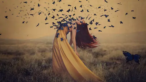
So we've got some sand here. And this image is a very interesting one to me, because we've got a couple of things that are a little weird. First of all, the light is very directional. I'm not used to that, it makes me really uncomfortable to edit, and that's why I wanted to do this on camera, because why not? Why not do something that you hate doing and that you're afraid of on camera? And I'm going to try to edit this window so that it looks a lot better. It's totally stealing the attention of the frame right now. I want our subject to steal that attention, so I'm gonna open her up into Camera Raw. And this is one of the very few times when I would actually want to adjust the Shadows. I think that it's just too dark. And I shot, if I Cancel this I'll show you, I shot a lot of images that were much brighter. You can see, this is much brighter. And I might choose to take this image instead into Camera Raw and dull the highlights down, but I find that I don't have as much luck with bring...
ing highlights back as I do bringing Shadows up. The other sort of tipping point for me is that I love shadows. I would much rather my image be darker. So I'm going to open this one into Camera Raw and deal with the shadows by taking the Shadows slider and just pulling it up a little bit, so that we see way more detail all around the edges. I said a little bit, but I actually brought it up 83 points, which is quite a ton, but that's OK. And then the Blacks as well if you want just to add more atmosphere. But what I notice actually with the Blacks is that if I go too high with it then you see even more glow around the window, which is going to be more difficult to composite into, because you have this weird light spilling out over the edges. So I'm actually gonna take the Blacks down a bit more and open that up. So I've got this pretty cool image here and I'm going to consider just by looking at my other files if I want to add onto the bottom of this picture and I'll add onto the top, because we have kind of a tight frame here, just a little bit. I could add a little bit more, so you see the whole window, you could add more, so you see more floor. So that's something that I need to consider. And I'm just gonna open up these two images, which are my top and bottom of the frame, and we'll open those up. Now if I had been thinking ahead I would've opened all of these into Camera Raw to make my adjustments, but for now we already know that I took my Shadows up to 83 points, so I'll do that again on both of them. And I think the Blacks went up just slightly. And we'll open those images. Now that I have all of those images I need to start considering what am I going to do with this window? This window is a massive issue for me. If I kept it in the series I think that it would be a little bit of a departure from other shots if I left it as it is, just a big white block in the center of my picture, which is actually horrifying to me and it gives me anxiety just thinking about it. So I don't want this big white block. So here's the question, do I, for example, take this wall, like this, copy and paste it, and flip it, and use this wall right there to cover up this scene. That is something that I could do. The light could realistically be coming from just above the frame. So that is an option that I have to just start to blend this piece of wall into our scene. OK, so that is one option. And it might work, it might not work, I mean, I'm not totally certain, but I definitely am thinking about this as an option, because it stresses me out having this wall. So that's one thing that we could do. Now I'm like totally committed apparently to this route and I just can't stop editing it. So just getting it in there. OK, so that's one option. But I think that I would rather go a lot more fairytale with this and just bring in a little softness to this room, which is really sad, which I love, but a little too sad. So instead let's first expand our frame just slightly upward, so that we do have room for that window to be complete instead of cutting it off in a very haphazard way. So I'm just gonna drag with my Move Tool and drop this image in. And I'm going to line this up. And I'm gonna do this really fast, because we've already talked about this. But I'm just lining this up, trying to make sure that everything looks good. There, OK. And taking the Opacity back up and layer masking. So we're just getting this little window in as best we can. OK, erasing. I'm actually just gonna leave that whole entire window, because it's fine as it is, I don't need to erase anything else out of there. Getting rid of all my harsh lines. Anything else. Now I'll bring back what I accidentally erased too much of. OK, so we've got a new window. Not bad. And I'll go ahead and crop this for the sake of time, just getting in there, getting to the edge of our sand. I left a little strip, nobody judge, it's down there. It's gonna bother me. All right, so now I need to try to find something to put in that window. And this is going to be a slight challenge, because I shoot clouds looking straight at them, not at some weird perspective with them shifting in the distance or anything. And that's going to be a little bit challenging. So I've got my cloud folder here and we know two things. One, that the perspective might not match. So if I go back into Photoshop it's very unlikely that I would see just like perfect clouds in the distance just facing me exactly, so I might have to shift the perspective of the clouds. But here's the other thing that scares me, is that we have a lot of light leaking around this window. The light is coming in and wrapping around the edges of our room and that probably wouldn't happen if there were dark clouds outside. It's very unlikely that you would have that much light wrapping around. I would have to either expose for the clouds outside or expose for the room. And this is HDR, this is why people create HDR images where you have a high dynamic range, because your photographing for one exposure, then another exposure, and blending them together. Could I have done that here? Absolutely, but there were no clouds outside, so there would be no point. It was just gray sky. And I don't want just gray in the background, I want it to be visually interesting. So let's go ahead and choose some clouds. Now light is spilling in, so there has to be some light outside. So I'm keeping in mind that it doesn't have to be, the clouds don't have to be backlit, but they can't be so dark that it's not realistic that light is even coming in that window. So just keeping that in mind. I don't actually know which cloud to use. I wanna use something with enough texture in it that it'll look good out there, so maybe this one. That one's a pretty interesting cloud to me, so I'll bring that in. And let's go ahead and see what this looks like in our shot. That one? Yeah. OK, first of all, are the clouds big enough? Or too small? Or not small enough? I am so bad at this, so I just wanna point that out. I'm really, really bad at this. And other people would be better to be certain and it's just not my forte. So I think that the clouds either need to be shrunk down a little bit if we wanna use this portion or we can use this little bottom part where the clouds were much further in the distance. As you can see, they're closer to the horizon line. So those are two options. Maybe let's go with the ones at the bottom for now. And another thing that we can do is start to change our perspective on this. So if I go into Edit, Transform, Perspective, we're just keeping in mind that maybe the clouds would be bigger on one side and sort of going away just to match the line of the window slightly better. And now we need to rotate this, 'cause we have very crooked clouds. OK, that's much better, isn't it? So we'll put them in there. Now what options do we have? One is to change our blending mode. So I could go from blending mode Normal, let's see what Darken does. Darken is allowing the clouds to stick to whatever is lightest, but this is the problem here is that the light is wrapping inside, so the clouds think that they're supposed to stick to this glow all around the window, when in fact they are not supposed to stick to that part of the window. So another option here is that we actually go in and just mask out the clouds wherever they're not supposed to be. So if I go back to my blending mode Normal I could go ahead and create a layer mask. And the fastest way of doing this right now is to click on that layer mask and invert the color of the mask by Command + I or Control + I and that's gonna turn the whole mask black, just to get rid of those clouds, so that now I can go ahead and bring back the clouds wherever I want them, instead of painting it all out and then painting it all back in and so on. So we've got the ability to go ahead and just paint the clouds into the space and that's a really good option, but it's going to be really challenging to paint in a straight line just exactly along this area. I know, 'cause I've done it a million times. And I would love if there was like a square brush where you could just go in a square straight line and it would be great. I know that you can hold, what is it? Shift or one of those controls that will take you in a straight line, but it's not gonna be good for anything on a slant. So we're gonna go ahead and use our Lasso Tool, but instead of the regular Lasso Tool, the Polygonal or Polygonal Lasso Tool is going to allow us to click and define points right along our window here. And I don't mind if I cut into the window just slightly, just making sure that I don't get anything outside. You can see, maybe you can't see, but I'm gonna make sure you can. Here there's actually just the slightest bit of white in this area, so I might just select that again and see about there. And this is like really nitpicky and you might be like, that doesn't matter. It does to me, so we're doing it. So I've got this selection and we might wanna Feather this just a small amount, I'll just do two pixels here just for a little bit of softness. And now we can click on that mask and bring back our clouds right up against the edges without having to worry too much about anything else. So once we do this you're gonna be like, uh, it just looks like you pasted a weird block in your picture. Yes, I completely agree with you. So let's see what we can do to change that, to try to make sure that it works out. So with my Lasso Tool I'm just gonna select the region where we have this sort of glow effect from the window and I'm going to Feather it, so that we have a nice falloff with whatever changes that we do make. Maybe about 40 pixels to start. And I know that this is on this layer, right? We put a new window in, but that's not right here, but that layer is pretty much this whole region. So on that layer, Layer 2, the first thing that I might try is by going into Replace Color, as we've already talked about, and choosing that halo glow, maybe taking our Fuzziness up, and seeing if we can't take the Lightness down in that whole region. OK, so that looks pretty good, say OK. All right, so now maybe we'll do that same thing again with this whole region, but maybe even bigger. So maybe we'll take this whole entire area through here, right-click, and Feather. This time I'm going to do 150 pixels and instead of Replace Color, maybe I'll pin a Curve to that layer. And using my highlights to just take that down slightly. Now we have this whole entire rim that is basically going to kill me if I leave it like that. It's looking slightly better. If we zoom out you can be like, OK, I kind of see where this is going. This is me projecting, hoping that that's what you're thinking, instead of whoa, this looks really stupid. But I'll choose to think that you're not thinking that. So I wanna take this light down up here and on the side and I'm gonna go with Replace Color just one more time in this whole area here to try to get the wood that we have lit up to be taken down a little bit more. So maybe we'll do 40 pixels again. Clicking on our layer, because Replace Color doesn't work on a layer mask, so you always wanna click on your layer when you're using Replace Color, and I'm just gonna click in this wooded area here and see if that helps our situation at all. So we're getting a little bit darker, that's good. We can always go in again and make more adjustments to a different area, such as right there, making that darker. So I like where this is going. It's getting a little bit better. And some of this might be something that isn't so easily adjusted with just Replace Color. So perhaps we go in and we'll use our Clone Stamp Tool, as we've done before. Just getting in there with a little bit of a darker area and Clone Stamping that region, so that it's a little bit less bright. Just through there. And you can do that again and again. I'm only at Opacity 20, so if I take that up it's going to do more as we go. I like how that's looking, because that's really taking that area down a little bit. And we can do the same thing here. And I don't even know if I really want to through this region, 'cause I actually am kind of liking how this is going up top, but so far, so good. And the one thing that we haven't done yet is adjusting the sky itself. Let's go up to that sky layer and go ahead with our Curve and see if we can't just make that sky a little bit more believable out there. You take that brightness up and it's going to make the light that's coming in a lot more justified. And I think justified is really the right word to be talking about here, because everything has to motivate something else. The lighting has to motivate the light on our subject, the light on our subject has to reflect a mood, and that mood has to serve our concept, and everything has to work together. So I think that we're getting really close here with this sky. The one thing that I would say is this rim is still a little bit bright, so maybe I'll just go ahead and take it darker, just by selecting it, Feathering it, as I do everything. I'm super boring in Photoshop. And I'll darken it just by creating another Curve right there on that layer. Just taking that down just a little bit. Oh, that made me feel better. Gosh, that was really, that was not good. Now I'm going to add even more light just in this area outside of the window on the clouds and we'll Feather that, maybe 70 pixels. And I'm just going to pin that down to the cloud layer, so that we're just affecting the cloud there. Contrast. You know it's good to play with these things to see. See, there's that light coming in. That's a little bit more motivated. And I really like that. We haven't even touched color yet. So, so far what we've done here, oh yeah, we don't need that wall. Who needs another wall when you have clouds to put out the window? That's what I always say. So here we have the original where it was just that big block and what we're doing now is trying to cover that up and make it look like something is beautiful out there, that yes, it's stealing some attention, but it's meant to, isn't it? You're meant to look out that window and just see that. Another thing you might wanna do is blur the clouds a little bit if they're not already blurry, to make it really believable when you're adding clouds into a background. So you might consider going into Gaussian Blur and just adding a slight blur. Not too much blur for me, just slightly to the clouds. Just to make it more believable. All right, so let's just change the lighting dynamics slightly more here. I'm going to go ahead and add a little bit more light to the wall area here. And this is just like painting, so we're just painting in wherever we think light should go. I'm really super artistic, can you tell? And this is where my light is going and that's just how it's gonna be. So I'm going to go ahead and Feather, as I do everything. And it gets really boring to keep saying Feather this, Feather that, but the fact is that if you don't then it's not gonna look right. So we have to Feather to make everything believable. And we're just creating a little bit more light in that region. I love to add light in the shadows, instead of the midtones or highlights, just to sort of add a little airiness to it. And this is so slight, like hardly anything is happening in this change. Maybe you can't even see it, because I have on many occasions asked my friends, can you see this difference? Which one's better, this one or this one? And they're like, I don't see anything of what you're doing. I'm sure that you guys have had that experience at some point. And maybe, but I notice the difference and I think those small changes are very important. So just to start bringing this image together, let's focus on the sand. And I don't know if you can see that little apple box in the background, we're ignoring it for now, pretend it's not there, that's not sand, that's gonna be not there later. And I'm just going to select all around the sand, and I'm gonna do this in pieces, 'cause I'm not great at selecting things. So I'm just selecting in pieces, hold Shift to keep clicking and adding to your selection. And what I'm doing here is I'm selecting the sand to turn it a prettier color. Turns out that sandbox sand is not very beautiful and it's very gray and not very atmospheric, so I'm just selecting really generally where the sand is, where I might wanna change that color. I can't tell if that's sand or not, but we're getting it anyways. And I'm gonna make it more yellow to match her dress a little bit better. So first I'm going to Feather. I'm gonna Feather maybe 30 pixels and that's a pretty large Feather here, since we are going around edges, but I want this to be a really soft transition, so just making sure that we are working within that realm of soft transitions. And then I'll create Curves. And this is something that we referenced earlier, with changing colors of things that don't have color to begin with. Replace Color is so easy, 'cause if you have a red dress you can change that red to be any color you want. But with something like this gray sand it's not so easy. But doing it through Curves, through the RGB drop-down menu is going to allow you a little bit more freedom to add color. So here we have the Blue Curve. I almost always will start on a Blue Curve. And I wanna add yellow to the sand, so I'm going to add yellow, just a little bit. That's a lot, I recognize that. I'll take it back in just a second. But you can see that the more yellow you add the more you're like, oh, that looks green. Do you guys have that feeling? I do too. And I'm told a lot that I'm colorblind, I don't know if I am, but I see green and I don't like green. So I'm adding just a little bit of yellow and then countering that with red. So if you add a little bit of red suddenly it doesn't look so green anymore, right? 'Cause the opposite of red is cyan. So if you have the issue where you have too much yellow you can often counter that with red. And you might say, well then why don't you just go to the Green Curve and fix it that way? And you can. So if I go to the Green Curve and if I were to add magenta I would definitely be countering it. But my issue with the red, or I'm sorry, the Green magenta Curve is that I don't like either one of these colors at all. I don't like adding purples to my images generally speaking and I don't like adding green generally speaking. So I tend to stay away from that and instead go with the Red cyan color combination, 'cause it fits my aesthetic. And it might not fit yours, and that's OK. Maybe your thing is the Green magenta Curve and I would like to know if it is, because I find it very challenging. But this is just, you can see this little change has just really brightened up that sand immediately and it gives a totally different feel to this image. So if we were to go in and edit this image just slightly more. First of all, can you guys just forgive me for taking a moment to get rid of this pink thing up here? It is driving me so crazy that I, there's just not a chance that I'm leaving that there right now. Oh, OK. So I'm getting rid of the distracting little thing that was just driving me insane. All right, fit that later. So I've got this really interesting image and I wanna just pull it together really fast and just share a couple of small things that we could do to really pull this image together. One is to make that lighting even more dramatic, so just go ahead with the light and you know what, you know what? This might look crazy, but it looks so much more realistic than if you were to just do a big circle in the middle of the image. And that's really the point here, is making this as cohesive as possible. So if you think about it, if you were to create lighting like this in every single image throughout your series where it's very soft and really naturally falls on the image rather than every image having a tradition vignette, those are two different styles that you have to choose. And it's going to either create cohesion in your series or not create cohesion in your series if you go back and forth between your lighting and your colors and things like that. So I've created this weird blobby thing and I'm going into Curves just to add a little bit of brightness, maybe right through the center. Again, I can do that from the shadows to create more dustiness. But I actually think that the midtones looks really nice here for that one. And outside of that let's start to look at where the light falls. So I think that there's a little bit too much light up in this corner, maybe through here, and down in this region. And I'm going to get rid of that, so that our subject and the window and the sand is really the thing that we're looking at here, 'cause this is really extraneous information. So I'm gonna right-click and Feather and do 200 pixels, maybe 300 even just to make this really soft. Again, we're just focusing in. So this is cohesion from the last one as well. Where do we want to look? Maybe I'll go from the highlights there. And how can we get our viewer to look in that spot? So I'm gonna go ahead and actually create a little bit more light just on the sand right through here, because I think this is a really interesting spot in our image that maybe isn't bright enough. And I'll do 150 pixels there, just so that it's soft and even and just maybe brightening that up slightly. If you create an S curve in your Curves here, just like that, that's gonna create contrast. So keeping that in mind is a great way if it's just too flat when you're making it brighter or darker, I will often make something brighter and then add a little bit of contrast to that area, which is motivated by this directional window light, so that's good. The light is also coming from above and then sweeping across here, so I think that having a little bit of light just in this region would also be really nice. And that's what I'm going to add in. It's so important that we think a lot about believability in the image and where would the light naturally be hitting? And it's kind of funny, because the light really was hitting there. We did not fake this light, there was a window there. And yet, I can't even tell you how many times I have released an image and somebody says, oh, that's obviously photoshopped, even though it wasn't. That was one of the few things that really was there when I created the picture. And I'm not saying that because I think those people are wrong, I think that they're absolutely right in saying that, my point is that you have to really analyze an image where things have been altered and say, what is believable here? Now that we have this light, now that we've really paid attention to this window, doesn't it look nicer with that little piece of light in the corner? Just really sort of brings a through line right across diagonally in the image that I think is really gorgeous. So we might try a Curve layer that goes back to overall colors, which we haven't done yet. So if I go back to that Blue Curve we did talk a little bit about color signatures if you remember. And I talked about how I like to add blue in the shadows and yellow to the highlights. And that's a really common coloring of my images that I create. So I'm on that Blue Curve maybe I'll try that first. Add some blue into the shadows, some yellow into the highlights. And that instantly brings us into my realm of an image. This is now my color palette that I am comfortable working in. Maybe I'll do the same thing with the Red, maybe adding a little bit of red into the highlights here. And you can see how this one simple Curve just really starts to change how you see the image. Before it looked a little bit realistic, a little bit what you would normally find in this space, aside from the blue clouds and the yellow sand, and then you're just adding a little bit more atmosphere by putting your color signature onto it. And that makes me really excited for this picture. So let's just go back through and see what we started with one more time here. So you can see we've got this image that we started with, and then all of these layers that went into creating this particular look. And you can even see the evolution of this sky and how it fits and how the light works with it and all of that. So let me just get right back up to the end. And I think that this is an interesting one to talk about because there are a lot of small changes here that make a really big impact. Such as the color of the sand and the fact that there's now a sky and the fact that her dress doesn't look so out of place, because the color tones match. The last thing that I wanna do to this image is talk about how we read color and light. And we did talk about this earlier in theory, but if I go into Curves again and we go back to that Blue Curve you can see how adding yellow to the highlights is going to give the feeling of this being evening or sunset, 'cause you have this yellow evening light coming in. And the same with Red. If you add red into the highlights you're gonna get that same golden sense. This could be sunrise, it could be sunset, but you know that this image is not at noon, you know that, because either the clouds outside would be completely gray and you would have a gray tone over your image, or you would have a blue sky with blue tones in your image. And this one is neither one of those things. So this is allowing your image to have a certain time of day to it, where you would look at it and know what time of day it was and that's really important for figuring out the type of emotion, the type of reaction that you want your viewer to have when they view this. So I'm gonna, I didn't save this, and that would be tremendously sad if I completely lost this image, because I really like where this is going. And I'm not gonna finish it right now, but it is important to talk about how there are certain things that need to happen here. One is this pipe is bothering me a little bit. Of course, I just messed up my crop there at the bottom, but you're gonna ignore that. I need to get rid of this apple box, but aside from that I want to change the color of the dress slightly. I think that if we really made this pop and gave it a little bit more contrast she would stand out even more. And this chair, it was like the most beautiful chair and it's just hidden back there. And I actually think I'd like to make that more cyan, just give it a little tiny pop of color that would hopefully match the outside. So that's going to be what I focus on with this image.
Class Materials
Bonus Materials with Purchase
Ratings and Reviews
April S.
I tuned in for most of Brooke's lessons in this course and watched some of them more than once as they were rebroadcast. First I want to say that Brooke is a very good instructor. Her easy-going, friendly, down-to-earth, somewhat quirky manner cannot be mistaken for unprofessional. She is very prepared, she speaks well (not a bunch of hemming and hawing), she is thoughtful, she is thorough, she is very relatable and at ease, and she is definitely professional in her presentation. I really thought when I first tuned in that it would mostly be background noise while I was at work, sound to keep me company. Not because I didn't like Brooke but I really didn't think I was into fine art photography nor did I think I cared about the business side of things much. Not now anyhow. I was really wrong. Brooke sparked a deep interest in me to delve into fine art photography, to consider creating images for myself, from my imagination. In fact, I realized that this was something I'd been thinking about for a couple of years though I hadn't put a name to it (the idea of creating pre-conceived images based on my own creative goals). I gleaned many little treasures from her about image sizes, working with printers, different types of paper, selling, interacting with galleries, and so much more. I may not need all of what she taught right now because I'm definitely headed in another direction at the moment, but she planted ideas and information in my head that I know will be useful at some point. Things I may not have thought of on my own, but that seed is in my head now so when the time comes, I'll know. I'd really like to buy her course but at the moment, with the holidays right around the corner, it's not in my personal budget. I'm grateful to have caught the live and rebroadcast lessons though, and her course is on my list to own. I think it's a great reference to be consulted over and over again, not watched once and forgotten. Kudos Brooke for really putting together an excellent course.
Angel Ricci
When the title says comprehensive, it means comprehensive! I loved every part of this course. It's inspirational, motivating, and insightful towards creating art work. Even if you are not necessarily considering a fine art specialty, the concepts discussed in this course are applicable to many areas! I find this super useful as a videographer and photographer and look to apply all of these exercises and concepts for my personal and business work moving forward. It is lengthy, but you will not regret a single minute. Brooke Shaden is an amazing artist and educator. I recommend keeping up with her work, presentations, and any future courses that may come in the future.
Ron Landis
I'm retired now, but spent decades in the people and training business. Brooke is extraordinary! Even though this course is extremely well organized and she's left nothing unattended, she moves through it with friendly conversational manners and without a sense of it being stilted. It's as though we are all her friends, not students, as she shares her heart and passion with us. What a joy it is to listen to her. And what a clear, unambiguous command of her subject. Wow! She explains it with such ease using explanations and techniques that won't overwhelm artists just starting their portfolio or the Photoshop-squeamish among us; but despite its simplicity her resulting art is breathtaking and beyond original. I wish more of my professors at school were as engaging. This was by far my best buy at Creative Live yet.