Photoshop: Curves for Colors
Lesson 17 from: Photoshop for Photographers: The EssentialsBen Willmore
Photoshop: Curves for Colors
Lesson 17 from: Photoshop for Photographers: The EssentialsBen Willmore
Lessons
Day 1
1Adobe Bridge: Basic Navigation
33:58 2Adobe Bridge: Organizing Images
47:54 3Camera Raw: Basic Sliders
18:24 4Camera Raw: Adjusting for Exposure
32:10 5Camera Raw: Adjusting for Contrast and Color
21:45 6Camera Raw: Localized Adjustments
40:44 7Camera Raw: Optimizing an Image
43:52Photoshop: Work Flow Options
33:15 9Photoshop: Resolution
25:55 10Photoshop: Quick Overview
18:41Day 2
11Photoshop: Black and White
17:46 12Photoshop: Focus Bracketing
36:09 13Photoshop: Panorama Stitching
27:17 14Photoshop: Curves
41:40 15Photoshop: Curves Continued
27:58 16Photoshop: Shadows and Highlights
14:52 17Photoshop: Curves for Colors
34:13 18Photoshop: Hue and Saturation
39:43 19Photoshop: Adjustment Layers
37:44 20Photoshop: Adjustment Layers Before and After
38:13Day 3
21Photoshop: Layers
39:27 22Photoshop: Layers - FX and Masks
38:42 23Photoshop: Compositing
31:59 24Camera Raw and Photoshop: Retouching
35:35 25Photoshop: Retouching Continued
31:47 26Photoshop: Content Aware, Selective Focus
23:06 27Photoshop: Textures With Layer Masks
31:08 28Photoshop: Creative Treatments
16:24 29Finishing Techniques and Workflows
31:06 30Finishing Techniques and Workflows Continued
22:40Lesson Info
Photoshop: Curves for Colors
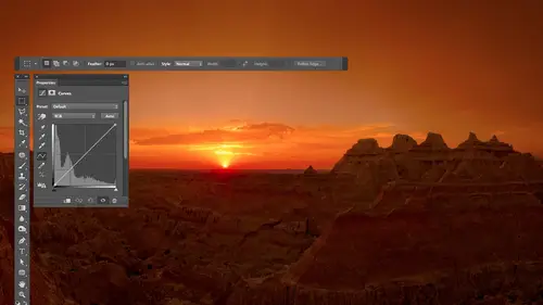
before we get into curves for color it would be useful for you to know some general concepts that relate to color these air not absolutely essential but if you have these in the back your head it's almost like having the dimmer analogy in the back your head you have something some basis for how does all this stuff work and it's good to refer back to I find that most people will have seen the concept of setting light through a prism and coming out the other side it turns into a spectrum of light you know different colors that's what this is supposed to represent but I'm not an illustrator so well in your image in photo shop every image you ever open and photo shop could be represented by being made out of only three colors in those three colors are red green in blue huh in everything you've ever seen in photo shop or everything you've ever seen on television can be and not just can be is being represented out of red green and blue if you've never seen it grab a really powerful magnifyin...
g glass and just stick it on your tv set you will see that you see red green and blue dots in no other colors unless you have a some other brand at a added yellow dot I don't know why but but all of your tv sets they create every picture you've ever seen out of various brightness levels of red green and blue it's just the dots are so small you're I can't focus on him and instead it looks like a full color image but any image I could just go over here and pull out the red green and the blue like that again usually behind the scenes it's doing that and it's just doing it in an area that most people don't look at which is the channels panel channels is where you would see red green blue listed and all the changes you're actually making to your image are happening there because that's what your image is made out of behind the scenes now there's another concept that is useful here we have red green and blue and let's see what it looks like if we have a balanced um out of red green and blue where we don't have mortgage rinne than red or blue we have the same amount and we just get him to overlap see all these weird colors and stuff but let's get all three to overlap in equal amounts look what happens when all three overlap in equal amounts do you see down the middle of this their shades of gray if you ever have a balanced amount of red green and blue or red is the exactly the same as green it's exactly the same with blue you have a shade of gray and that is a key concept in performing color correction because we look in our picture for things that should be a shade of gray and if they don't have a balanced amount of red green and blue whatever one of those colors you have more of is contaminating your pictures to read it's too green whatever once too high or if it's too low compared to the others you don't have enough of that color but once you get them in balance the area that you're looking at is going to be a shade of gray and you'll see how that works when it comes to color correction then one other concept that is overly useful to know about is that every single color has an opposite and if you could know the opposite of the three colors that make up your picture behind the scenes your pictures are made out of red green and blue if you could know the opposite of red green and blue it will be useful when you learn adjusting so let's figure out how do you figure out the opposite of any color and what's the opposite of red green and blue well if you have a color wheel well which I have here choose any color you want whatever your favorite color is that appears on this wheel let's just say you picked that one then drawn imaginary line directly from the color you're thinking about to the center of the color wheel so there'd be a manchurian line from here to here and then extend that line in equal distance beyond the center so it's just one straight line going to the other side that's the opposite color so if I were to choose let's say the three colors that make up our image regrettable and I take red and I make that line the opposite of red of science so when I say the opposite it's a ziff I have a seesaw are teeter totter or whatever you call it when you have something like my two arms where if I move this arm up the are other arm goes down like this just imagine in my hands on this hand I have read in this hand I have science and if I increase the amount of red it's automatically decreasing its opposite that's just how it works and that's also why you have science ink in your inkjet printer all signing does is it absorbs red light that's it let's look at green the opposite of green is magenta the reason you have magenta pink in your inkjet printer rana putting press is all it does is absorb green light and then we got blew its opposite of yellow and that's why you have yellow ink so what happens is anytime use light to make your image would you be like your computer screens shining lights in your eyes it's using red green and blue any time you zinc instead you're not directly creating the light instead you have to absorb it so use the opposite colors the opposite colors absorb so um anyway you don't have to truly remember all that but if you could remember the opposite of red green and blue it would be useful I don't expect you to remember it though so let me show you how photoshopped can remind you anytime you want to just open the info panel where you will find red green and blue on one side cyan magenta yellow and black on the other side and the opposites are directly across from each other so the more you look at that and the more you get used to that after you know three months of staring at that you'll go you know the opposite of blues yellow you know that kind of stuff uh but sometimes it takes a while and if you never remember it don't worry just open the info panel take a look so what the heck does all that stuff have to do with curves and adjusting color well first off in my head the things I need to remember at all that is every color has an opposite my pictures made out of three colors red green and blue and it be nice to know the opposite of red green blue but I don't have it in my head yet uh in finally balanced red green and blue makes gray those with concepts if you happen to ever get those concepts to stay in your head then doing color adjustments in photo shop actually start making sense so let's start adjusting some pictures and let's see where can that start applying how can it start to help us all right I'm going to start doing curves adjustment layers in other things but even before I go to curves know that this doesn't just apply to curves it applies to almost any adjustment that affect color so with one exception uh there's another style of color adjustment will talk about later on that talks about hugh saturation of brightness and we'll get into those so I'm just gonna go in here and just try a simple color adjustment that's not curves just to show you that it applies color balance you know why it's offering me choices of red green and blue on one side because that's what my pictures made out of and you know how red green and blue have opposites that's what's listed across from red green and blue and you see how moving a slaughter towards sayin is automatically at the same time moving it away from red because they're opposites sion in hk absorbs red light so moving in towards science automatically gets rid of red so you see how it's in here it's in any kind of color adjustment most color adjustments will offer you the choices of red green and blue simply because that's what your pictures made out off that's what it has to adjust so I just wanted to show you that here but here color balance were overly limited we have the choice of adjusting that dark partier imaged the medium brightness or the highlights in curves we gonna just any brightness level on our picture were not limited to these so I don't use this thing it's nice good it's simple but if you want control you want curves we just go to another one levels see this little pop up menu if you adjust equal amounts of red green and blue you're adjusting the brightness of your picture remember balanced red green and blue means grey so it's just making it brighter or darker if I click here though red green blue you're also a tte the same time adjusting the opposites sai in magenta yellow itjust doesn't tell you that but we're going to use curves before I do have a question timei colors now that we have eight sixteen and three three two big killer big difference when you're doing this or no exactly the same just more colors it's you don't even have to think about all it means is is will there be enough information to have a smooth transition between these colors and if it ever matters the way it would show up is your image would look like it had banding where it should look smooth or if some people call it post or ization so where you had it should have a smooth transition from one color to another you'll see abrupt steps if that thing you just talked about wasn't high enough that's it if you never see banding than that never was an issue and if you ever do see banding then if you went to a higher number like eight to sixteen you might prevent the banning yeah but other not all concepts would apply all right so here we're in curves and let's see what we can do first there's a pop up menu in curves just like there wasn't levels right here and if I leave it on rgb that's the setting we've been using so far we just ignored the menu but when it's left rgb it's primarily going affect the brightness of your picture and that's what we saw in the last hole serious of images we worked with with curves but if I change it to read now I'm specifically going to control how much red light is being used to make my picture and so if I dragged the curve from anywhere down it's going to start looking less red because we're taking away red light some excess less red light is gonna look less red or if I push it up we'll use more red light so I'm gonna first push it up just so you can see that the image becomes more red looking but when I push it down we're going to start absorbing read once we get all the red pulled out of the picture though I still have room to move it so what the heck is that going to do now well there's an opposite to read the opposite of right is sayin so if dr reddin this hand sigh in this hand and what I'm doing the same reduce the amount of red in my picture it's automatically going to increase the opposite if we have an over abundance of red to begin within the picture we started out with too much we're goingto trying to get like this and if I keep going then it's going to bring the other color in so now if I continue to move this down the opposite of red was sayin I know you might not have that in your head but if you look in the info how you'd see him across from each other so if I continue to bring this down you see how it goes sayin now let's do the same thing with green now if I push it up we're going to add green to the image green light it's gonna look more green look more green if I bring it down we're going to take away green from the image and at some point I'll take away the excess of green and when that's the case if I had my two hands like this green in one hand something else over here magenta on the other hand then why reduce my green we're gonna automatically increase its opposite so the opposite of greenness magenta I'll bring this down do you see it becoming more magenta then the last color we have his blue push it up make the image look more blue bring it down reduce blue once we've gotten rid of the excess of blue we're going to start seeing the opposite appear which is yellow so you see how it would be useful if in your head you could remember the opposite of red green and blue or it could be useful if you just leave the info palate open sitting there because then you don't have to remember him you just glance straight across and you can remember now the info palate though has this extra space the bottom which makes it kind of a space hog so what I'm going to do is go to the upper right corner of the info panel and if you don't have the info panel on your screen go to the window menu that's where all the panels are listed in so there's ever one that I used you can't find find it there but I'm going to go to the upper right corner of the info panel and I'm gonna choose panel options and I'm going to turn off these check boxes at the bottom and all that's going to do when I click okay is watched the info pam no look at the bottom section of it group seal that extra junk disappeared and that just makes it so have more space for my layers and for other things and all I did is went to the upper right corner and said panel options to get to that just turn off any check boxes that are on so now that's sitting there and at any time I can glance at that and I can see what the opposite of red green and blue is so it's kind of nice so now the problem though is how do I know what the heck we have too much of or not enough of in this picture to make it look right well the way I can figure it out is to try to find areas that would be a shade of gray because there's an easy if easy formula for how to make gray and photoshopped balanced red green and blue if they're balanced nothing dominates all you have is a shade of gray so I need to find within my picture is something that should be a shade of gray I don't care how bright any shade of grey so I look in this picture clouds they're usually shades of gray aren't they sometimes they'll be a little different of its near sunrise or sunset but in general a cloud might be or and here looking on the on the pavement down here there's a handicap symbol is not usually white paint well that would be a shade of grey let's go over here there's a sign right here that might be a white sign metal up here the problem with that is it reflects its surroundings if it's a mat metal not polished then it's usually grayish but if there's a blue sky sitting right there is gonna be reflecting some of the blue so it's not the best but if it's the only thing I got it might work if it's a map uh instead of polished that's not crumb um that kind of stuff so let's see if any of those areas might help us and just so you know you're not gonna have to do what I'm about to do photo shops going to help you I'm trying to teach you the concept so it makes sense to your brain how it works and therefore you don't go I'm blindly clicking with these things and I don't know why but it made my picture look better instead you're like whoa this is cool you know this makes sense to me and I'll use these tools to make it faster that makes sense so let's see if I can improve on this I'm going to assume that the sign that's right here is white I don't remember I didn't take this photo but I don't remember but I'm going to make that assumption let's put my mouth on top of it look in the info panel now I'll move the info panel over here so it's easier to see because I consume up on lee where my mouse's and I can't have the info panel read out something and have my mouse away from that so I'm going to just do that so it's easy for you to see so look at the info panel look at the numbers and know that if they were balanced we'd have gray if they're out of balance we don't have gray will color the further out of balance they are the more colorful it isthe huh so let's just get all these to be equal in if I wanted not change the brightness what I would do is just average them but I hate math that's my um traffic person photographer like person so all I'm going to do is pick the middle of the range that's there so the low number seventy four high numbers one thirty six the middle number is one o five I need to get him all the equal one oh five I just wrote down one of five because I don't remember numbers s o that's all I'm going to do I'm going to get him all the equal one of five what happens in the info panel is when you move your mouse on top of your image it simply tells you how much red green and blue light is in the area where your mouse is and if you have an adjustment active like curves you'll see two numbers two sets a number on the laughter the number on the right the number on the left is what you had before you adjusted your picture the one on the right is what you have as a result of your adjustment I haven't changed my adjustment yet so the two numbers are identical now let's see if we can figure out how to get this to happen I'm gonna just remember that I want one o five then I'll put my info panel back up here in the corner I like it and in curves of clicking the little hand symbol and there's something special I can do I'm gonna move my mouse on top of this area the hand symbols turned on remember and there's a weird keyboard truck on a mac it shift in command on windows is shifting control I have those two keys held down right now I'm gonna click on the sign and when I do it won't look like anything happened in curves in general especially if I was on the main curve but what it will do if you hold on those two keys when you click is following watch you're like what the heck well watch over here if I go to read to see a dot that's the amount of red that was in the sign if I get a green do you see that that's the money green that was in the sign I've got a blue sea you dot that's the amount that was in the sign all it did is it looked at the numbers that were in the info palette which told it how much red green and blue was in the sign and added a dot for each what I need to do is simply tell it how much red green and blue to end up with do you remember I wrote down a number one of five do you see numbers in here input and output they really mean before and after so I'm going to select this number and typed in one o five then I'm going to go and switch it from red to green and I'm going to say I want one five and then I'll go to blue and I'll say I want one o five and now zoom out of my picture and see if it looks any different does that look a little better now there's a lot of weird stuff going on there what the heck was that well if you remember back to general concepts balanced red green and blue makes gray over that concept we just made the area where the sign is so it has a balanced amount of red green and blue but when you add a dot to a curve and you move it it's not just the dot the moves it's the rest of the curve that goes along with it and if that sign had too much of one particular colorant most likely the whole picture has too much of that color if it didn't have enough in this case blue and we pushed mohr blew into it it's most likely that the entire picture didn't have enough blue and so we were just getting the right amount of all those by measuring it where we know it easy formula for how to make that area look right and we only know that easy formula for things that should be gray so the key concept in doing color correction is to try to be ableto find gray areas so let's see again before and after I'll turn off my eyeball before after and let's just do the adjustment again because you might have your brain might have exploded in the middle of it somewhere so let's do it again cause I know mine would if these for new concepts and stuff so I'm just gonna do a curves adjustment layer okay uh hand icons already pushed in I'll move my mouth's onto something that should be gray I hold on to keys in general the shift key often means work on mohr of something in this case it means more than one curve I mean instead of putting a dot on the main curve put it on the individual ones of red green and blue and then I actually have to hold on the command key as well but shifting command that shipping control windows I click and all that did was look at the numbers and the info palate in a plug them into curves so that if I go here to the red curve the numbers of the bottom are exactly the number of this that was in the info pound and in this case and get him although one o five because that was somewhere near the middle of the range so I highlight output one oh five good green one ofthe five blue ideally I'd just average the numbers and because then if you added them up you'd end up with the exact same amount of light and you wouldn't have changed the brightness at all but we're close enough and so before after that now I don't I need you to actually do that where you type in the numbers were gonna get photoshopped to do that so now let's get photoshopped to do it and that's what is going to be doing behind the scenes so I'll start over I'll go back to curves and this time in curves on the left side of curves we have some id droppers if you look closely at those I droppers one of them is full of black one of miss full of white in the middle one is full of grey I'm going to grab the middle one I'm just going to move the middle one on top of the sign in a minute click once it just did the work for me the difference between the three eyed droppers is the black one not only makes it a balanced amount of red green blue but it makes it really dark the white one not only makes it a balanced amount but it makes it really bright whereas the middle one doesn't change the brightness so that's what we were trying to dio does it make some sense how this is working and that it's you know I know you didn't need all the detail I gave you before in order to do this but it's going to make it so you could do a lot more than this you're not going to be limited to using these little eye droppers because the same id driver's air found in levels you could be in levels clicking around with them okay but now the problem is if you look at our curves and right now it actually shows the three curves for actually right on top of each other and that's what the setting wass you only saw the options for curves see if I can get in here that was called channel overlays that means show me all for the curves on top of each other red green blue and the main one and if I turned that off I'd only see one curve at a time but anyway if you look at the shape of those curves and I don't really care about the exact shape just notice that there are two parts that did not change whatsoever one is down here don't they aren't they all still where they started and the other is up there and this is the brightest part of our photo and this is the darkest so the problem is we've adjusted most of the picture but the brightest and darkest the ends of the picture haven't changed at all and that's the only thing we have left to do and that's why we have the other two I droppers because they affect really dark and really bright stuff so what we can do with those I droppers well um in your head think about the color red what would read look like you made it darker whatyou're thinking off an even darker and even darker and you got it so is the same brightness is black would there be any color left I think so what if you took the same route and made it brighter and brighter brighter it made it just his bright is white when there anything left it just be white what what happens is when you get to the extremes of brightness I don't care what color you're talking about the color goes away when you get to the extremes close toe white and close to black you simply can't have color if you had any color you wouldn't be that bright where that dark it's kind of weird but that's how it works so if the brightest part of your picture does not have a balanced amount of red green and blue most of time there's color cast in there something that shouldn't be there same thing with the darkest part of the picture and that's kind of weird mentally but it's the case so what you can do is you khun grab the black eye drop her and if you can find the darkest part of the picture and click on it I'm guessing in this case it will usually improve the picture would see if it happens click if you can grab the white eyedropper and find the brightest part of your picture and click on it you will usually improve the picture and I would usually do the middle one afterwards because that moving the ends of the curve makes the middle flop around and so you grab the middle one and just find anything will be great and your picture and click on it so now I've clicked on three parts of my image if you look at my curve even though I don't understand what the heck that shape means I can tell you that the entire range changed the whole length of the curve that's the important part and let's see if I turned the eyeball often on before after is that looked better in the key concept to making it work is balanced regulation blue makes gray let's find stuff that should be great in our picture and as a color gets brighter and brighter closer to white it starts losing its color as it gets to the extreme of white and as it gets darker and darker as you get towards the extreme of black it loses all its color and if there hasn't lost all its color usually it's because there's a massive color casting your picture your whole pictures way to read it's causing the highlights the shadows everything to be way too red and so we could do that after we do that we can just create a curves adjustment layer on top of it in then adjust your brightness just as we did in the previous session I'll lock in the brightness there maybe brighten this brightness up maybe try to bring my sky down a little bit and so now I have optimized the brightness maybe I don't like the bottom portion uh bring it down a little bit looks like part of my curves getting flat because this part here isn't having much detail but now if I hide those two layers before after so we'll do this one more images you get dessert making more sense yes you're going to make my dad's family slides a lot better yeah because they look like this yeah yeah now just so you know I would prefer to do color correction in camera and with the white bowne side wrapper but the white balance eyedropper doesn't always give me exactly what I want it's a good starting point but for some images you need mawr in them or that you need is this so let's just open another picture and let's go to curves and let's just use all three I draw first see what happens I'm going to be guessing where the brightest and darcis darkest parts are by now but there are ways to do it without guessing I would do the black and white ones first doesn't matter which order on those two and then do the middle one last eso let's grab the white one I'm just making the assumption that right there might be brightest because to my eye it looks that way I don't care if the object I'm clicking on is a red apple green grass or anything else if it's truly the brightest area usually there's no color there grab the black one darkest area where might it be an texan it's down here actually and uh middle one what should be gray if I'm not sure I guess and just click around and different things you think might be gray see if one of them makes your image look better um hmm her shirt maybe if it doesn't look better try something else um this's kind of bluish gray here no white shirt right there what's a shade of gray so and then you can always find tune it go to any of the curves moving up or down if it's too blue go to the blue curve down you know but let's see what it did I'll turn off the eyeball before after now if for some reason when you do this you get way too much contrast sometimes happens if I turn off the eyeball wash the dark part of the picture before you see you could see detail there after kind of goes black remember when we adjusted images you could always change the blinding mode here to color and then these don't affect the brightness so then I could get that detail back it's not essential but you can now you see just the color change all right on ly used the eye droppers that help if clicking with any eyedropper does not improve the quality of her picture skip that eyedropper because if it's degrading it what I do that so in this image I'm going to try the dark eyedropper can't tell that helped or not in fact I think it hurt because the red in the distance I think looks more green or something doesn't require right I'll skip that go to the white one looks like that right here's the brightest doesn't seem to do anything there because if it's blown out toe white white there's nothing there to measure so in this one it might be the middle eye dropper in what would be gray I'm not certain but I'm looking at the image just looking for what looks like it could be a shade of gray click on it see if it helps if it doesn't I'll choose undo with command z and I'll try another spot in whichever spot makes the colors look the best by clicking between things I think look crash if I was standing there in real life I can probably get a little better color in there that looked better but only use the eyedropper said help and remember I would usually first do this in camera with a white balance eyedropper you can look all the way back to what your camera originally captured and get all the data out of it here it can't look all the way that far back to get the pure data your camera got so these might be images people e mailed me and I don't have the raw file form by shot j pegs or whatever you can still try it on camera but if that didn't give you enough then you can go in here to further refine it and if you can figure out where the brightest and darkest parts are used those I droppers if you can't you could find something that's great just use the middle one blacktop usually doesn't have much colors we can try that were here there's a white line painted on the ground so you see how that can steer us towards not having too much this I know you don't know what this is supposed to look like it's a weird house in new orleans so um but I can tell you that that's way too yellow green and that doesn't look bad
Class Materials
bonus material with purchase
Ratings and Reviews
a Creativelive Student
This is one of the best courses I've taken on any topic, not just PS or photography. Ben is a fantastic instructor. He introduces a new concept and then reinforces it with great examples and with well done repetition of key points along the way. Really really impressive. He does a super job of finding analogies to explain the concepts that underpin key parts of PS (e.g. comparing curves to a series of dimmer switches) and also teaching tons of super useful keyboard shortcuts in the midst of showing larger processes. Excellent.
a Creativelive Student
Very authoritative and informative class. He commands PS and shares what he knows in concise and precise methods. It was too much for me to keep up with. I am not a techno guy and I decided early on that buying this course, and his next one, was what I needed to do. I watched the whole course and tagged a few areas to review. OK, a LOT of areas to review. Great job and I am looking forward to part 2 in April. Thanks for presenting these courses as you do. I a guy who sure wouldn't gamble on an unknown course, so previewing it is the way to go!! Good luck in your venture. I am looking forward to more great classes from other great photographers. Keep up the great work!!
Walter Hawn
Hurray for Karen and the detailed notes! I understand now why it took awhile to get them together and up on the lesson page. A superb job. Ben teaches well and Karen's notes finish the job superbly. -- And the collection of keyboards shortcuts? I'm almost tempted to say it's worth the price of admission, by itself. This is, by far, the best organized, best assembled, best presented Photoshop course I've seen. I just wish I'd encountered Ben, back when he was actually writing Ps books. Would have saved me much aggravation.