Photoshop: Hue and Saturation
Lesson 18 from: Photoshop for Photographers: The EssentialsBen Willmore
Photoshop: Hue and Saturation
Lesson 18 from: Photoshop for Photographers: The EssentialsBen Willmore
Lessons
Day 1
1Adobe Bridge: Basic Navigation
33:58 2Adobe Bridge: Organizing Images
47:54 3Camera Raw: Basic Sliders
18:24 4Camera Raw: Adjusting for Exposure
32:10 5Camera Raw: Adjusting for Contrast and Color
21:45 6Camera Raw: Localized Adjustments
40:44 7Camera Raw: Optimizing an Image
43:52Photoshop: Work Flow Options
33:15 9Photoshop: Resolution
25:55 10Photoshop: Quick Overview
18:41Day 2
11Photoshop: Black and White
17:46 12Photoshop: Focus Bracketing
36:09 13Photoshop: Panorama Stitching
27:17 14Photoshop: Curves
41:40 15Photoshop: Curves Continued
27:58 16Photoshop: Shadows and Highlights
14:52 17Photoshop: Curves for Colors
34:13 18Photoshop: Hue and Saturation
39:43 19Photoshop: Adjustment Layers
37:44 20Photoshop: Adjustment Layers Before and After
38:13Day 3
21Photoshop: Layers
39:27 22Photoshop: Layers - FX and Masks
38:42 23Photoshop: Compositing
31:59 24Camera Raw and Photoshop: Retouching
35:35 25Photoshop: Retouching Continued
31:47 26Photoshop: Content Aware, Selective Focus
23:06 27Photoshop: Textures With Layer Masks
31:08 28Photoshop: Creative Treatments
16:24 29Finishing Techniques and Workflows
31:06 30Finishing Techniques and Workflows Continued
22:40Lesson Info
Photoshop: Hue and Saturation
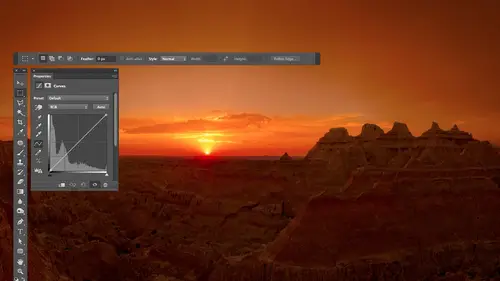
all right so how can we then not just use those I droppers we can instead use this curves thing to influence what color things are not just color correct well let's take a look I'll show you a couple different things let's go into curves and first let's find out how can you tell where the brightest and darkest areas are the same technique would work in levels by the way it has the same eye droppers so if you ever done it in levels have been doing the exact same thing um remember these two sliders at the bottom of curves one slider forces areas toe white the other forces things too black well there's a hidden feature built into those that if I hold on the option key ultima windows you could get a different view of your image where it'll actually show you which part of the image is becoming white you can see did anything become white or how big is it so if I hold on the option key which I have held down right now alton windows and I click on this slider it changes my view and it's trying...
to show me if anything's become white in the image and I looked you see any white I don't so nothing's become white yet but if I pull this in it's going to start forcing areas toe white is going to show me where it happens well if I pull this in until I see the very first hint of white not color but white wouldn't that be the brightest part of the picture so right there that's the brightest part of the picture that's where I would click with white eyedropper then if I grab the other slider the black one I'd do the same thing if I hold down the option key ultima windows and I click on it it'll show me what's currently black in the picture do you see any black I don't but if I start to pull this in the darkest part of the picture will be the first thing the turns black I'm not looking at colors though I'm looking at black katie see the pant leg or something like that well that's the darkest part of the picture and that's where I could click with the black eye drop and therefore I'm not guessing it were to click with those two that makes sense now the only problem with this if I bring these in to find out where those areas are I got to be careful not to leave it sitting where I ended up I didn't want to force areas to black I just want to see where is the darkest area so when I'm done I'm gonna make sure these are all the way back into the corners but that's how you can find out where that is but let's do other things I want this building thing on the left to beam or yellow I wanted to feel more like it's sunset you know kind of feeling well you remember when we had the hand tool active we could move our mouse on top of something and there's two special keys we could hold down and when we did and clicked it would add dots to the three curves the keys were shift in command that shifting controlling windows I'm going to do that right now to this part of the building click that should have added dots to the red curve to the green curve and the blue curve so now what I want to do is make this feel more like it's at sunset and this was near sunset so it's got some warmth in there already I think make it look more yellow it's going to help so I look at this menu but unfortunately I don't see yellow listed wouldn't it be useful to know the opposite of those colors and up here in the info panel do you see yellow listed what sit across from blue so that's what I'm going to choose over here is blue so if I move this up I'd make it more blue move it down and I make it the opposite of blue which is yellow so I'm gonna grab that little dot I can use the arrow keys of my keyboard if I want to move it straight down and that way it won't stray to the left or right just move it down and as I d'oh look at the building to see if becoming more yellow maybe that's just too pure of yellow it needs to be more reddish warm or magenta ish warm while I go over here to read and if you want more red when I push this up let's get a different kind of color in it or the other choice I would have is magenta is another warm color and it's the opposite of green cross me here so but got a green I would need to say opposite of green or less green they start to look a little warmer more like sunset e let's see before and after get a little bit more that way but the highlights out here they don't look that way dang it wasn't that the bright part of the picture why don't we go over here to the thing that made stuff yellow remember which one it was if you don't look up here blow all right let's go to the blue and where would the bright part of the picture be in this curve where's bright stuff look down here isn't it way over here and it's saying else uses much blue as we possibly can there so let's pull that down see if we get that bright part of our picture to start going yellow but I'm not just yellow let's get some warmth in there some reddish stuff let's go to red or to green one of the two because the opposite of green is magenta so that so red it's already maxed out as high as it can go on the bright part of the image so that's not the one I'm going to go for I'm going to go for green because last green means more magenta and so I can independently control the color of the bright part of the picture and the color of the building that kind of weird kind of powerful and it's not the same it's just having the choices of highlights mid tones and shadows which is what we have in color balance instead I can click on this object and say you figure out how bright that is and let me adjust it individually so it's not for everybody for some people this is too far out to venture but the main thing is if you ever look at a picture and it just looks too yellow find out what they were yellow is click on that object had a dot in get it away from yellow so here come on do you see the tile in the background I'm assuming that ty was white looks like white tile on that but over here you see looks kind of greenish maybe yellow wish I can't tell over here it might even be reddish well if I wanted to fix that I could come over here to curves and unless I'm working on the absolute brightest or absolute darkest area I used the middle eyedropper the others are only for absolute right absolute dark because they shave change the brightness of things but I can come over here and click right here to say neutralize this it's going to shift the entire picture though but that area now your brain will think it looks like the opposite color because you've been staring at it and your brain has been trying to color correct it so you have to look away somewhat something else and then look back in order evaluated because your brain screws you up but then once I learn about adjustment layers I'd be able to paint that in to just that area and then I could adjust the area here on the left which might have different light source falling on it and painted in just to that area and I could even out that entire area of tile by doing that if I didn't have white tile instead I had something else I have I don't know anything I look at over here if it just looks too yellow or two blue or something else I could just use that technique where it automatically adds the dots for me shift in command book click on it and fine tune them color mix that's in there so when it comes to curves of color just remember you have red green and blue to adjust if you had more of it it will become obvious that you're making it more red more green or more blue we move in the opposite direction moving down you're going to start shifting towards the opposite colors and that's why it's nice to open the info palette to see what those opposites are and um fine tune things as you need need to sometimes the colors air off just a little bit and you look at something just say that's too yellow so you target that spot with your shift in command clicking on it and you find the curve that'll affect yellow when you move it away from yellow and in fine tune it other times you have to do more complex color correction it all depends how comfortable they are the more time you spend with it you know the better and it takes a while to get used to but I find it to be immensely powerful but know that I always try to get the most out of my picture in camera first I would rather use the white cropper white balance eyedropper click on something in camera and fix it there and hopefully it fixed the whole thing in that on occasion make it in here to curves in just tweak little areas a wall where there's a little bit of blue light falling on it where's the rest of the wall's getting some other code so I tweak it a little and once you get into using adjustment layers it's not gonna affect your entire image anymore you can paint it in just where you need it and that's when it's truly powerful so any questions or comments relating to that ben um would you be interested in the internet challenge yeah and this might be the perfect image to talk about our internet we're having a lot of people asking about whether you'd be willing to discuss and demonstrate using the curse panel for color correcting human skin to the normal skin tones well most of time when it comes to that kind of stuff alone on a second here groups actually and this is the brightest have already marked it here we go I would start off working with praise because if I could get the grace to be right they're going to steer the skin tone to the right spot as well everything will be right if you get all the grace to be right and if I'm not sure what's gray I'll have to experiment by clicking around in scene what makes it look the most true I can usually tell when it's the most true because you get the most separation between colors the greens looked more distinctly different than the reds they look more distinctly different than the yellow's where is when you have a color cast all those things start looking the same because you have too much read something else so that somewhat steer me then I can come in and find tune the skin if I come in and grab my hand tool move it on top of skin remember the two keys you hold down shift in command I can click there and now I confined tune the skin and with skin the amount of yellow we have in the skin here those two dots real close to each other so graham both um if I find we need a little more a little less I could do that but the main thing there's if I've already color corrected the rest of the photo probably going to want to be using an adjustment layer and painting on a mask and so let's get into that when we get into adjustment layers and masks no curves is not the only color adjustment I use there are two primary color adjustments that I use where if you look at all my images if you opened a thousand the images I work with that have gone into photo child you would find that ninety eight percent of them use only two adjustments curves and the other one is human saturation so let's take a look at human saturation and see how much it can refine our images there is something similar with in camera and so if I need a very simple change that's similar to this I'll use camera ought to do it but when I need to go beyond what cameras possible capable of then I'll end up popping into human saturation it's a different way of thinking about your image instead of making your image mohr shifting it more towards red green and blue or science magenta yellow it's a bit different what is going to do instead this is still going to think about a color wheel but before we're pushing things towards yellow towards blue cross this thing with human saturation if we have something that's blue and we adjust it it's going to instead spin it around this color wheel and you'll see that when I get into it and it's a little different way of thinking I use it when I want to do color manipulation I have a red car I want it to be blue uh I'm not doing color correction of noon color manipulation so let's uh see how it works and what we can do with it here's one of my light painted images like paints one of my favorite kinds of photography if you haven't done light painting you've got to try it at night um but this is a light painted image and I'm gonna come over here to my layers and I'm going to create a human saturation adjustment layer and I'm going to make sure that the little hand icon that's their automatically gets turned on so I'm just gonna go to the side menu in the upper right and just make sure that that auto select targeted adjustment tool is turned on so that that thing stays in now if you look here we have three choices hugh saturation in lightness lightness is just another word for brightness if I use that I could brighten my picture or dark in my picture but it's not an adjustment I would ever apply to the entire picture because look what it does looks pretty bad but it becomes useful once you've isolated something if I was only working on the red part of the car then it's useful saturation means how colorful is bringing up becomes more colorful bring it down it becomes less colorful all the way down means no color then he was the weird one he was going to change the color of thanks but instead of acting like curves where it's going to make it warmer or cooler as I move it this is going to make it look funky because it's rotating those colors around the color wheel and it's kind of weird it's also not that useful unless I want some disco music thing going on unless I've isolated a particular area of my picture if you want to isolate a particular area you can isolate things inhuman saturation based on color I can isolate the greens from everything else for the reds from everything else in one way of doing that is to simply have that hand icon pushed in when it's pushed in I could move my mouth's on top of my image in says click right here watch what happens when I click the place you want to look is over here this little menu I'm gonna click over here do you see what I just did it just changed to the greens that means isolate the greens within my picture so all I can effect are things that are green and now I can change the lightness of the greens you see him getting darker that kind of stuff now I can change how colorful the greens are less colorful more colorful or the fun part is I can change what color the greens are I want a blue no I want to read I wanted something else okay so those are the three kinds of changes we can make and we isolate things either by grabbing this hand icon and clicking on our picture which is going to change this menu to what we want and moving these sliders or we just manually choose from this menu so we need the hand the hand makes it so when I click on my picture it automatically chooses from this menu and it's actually more precise than choosing from this menu because instead of generically getting reds it's going to concentrate on the specific read you click on so in here I think the wall that's here should be more colorful so I click on the wall and it figures out that hey the walls yellow I wanted more colorful sir bring up saturation look what happens to my wall do you see the red shoes and things of shoes and a christmas tree it's kind of weird this is in spain um I'm gonna come in here and click on the red so it isolates the reds now and I'm gonna make the reds darker because I think they look richer if there were darker cool and then I'm going click on these little blue um butterflies somebody the client's favorite color is purple so now I'm going to change the basic color human's basic color let's find purple for um uh you can adjust up to six colors at once using this and they don't have to be these name two colors you can just click on up to six areas within your picture and it will say what color is that let's change everything within the picture that is currently that color and let's either change how bright it is how colorful it is or what color it is and that's what we have the choice of you know question yeah so when you select a specific hue but when you split selected color and then start monkeying with hugh slider are you limited in the colors that you khun choose with that hugh by what color you select and if so can you bump it up a notch or switch to a different ring of options by adjusting the saturation of the combination of hugh saturation and brightness should you allow you to get teo any color as long as you can figure out what direction those sliders need to be moved to to show you that let me see if I can take this picture in make every single one of these colored areas be red hey I want him also look like this one if we try let's go to human saturation the hand's already pushed in let's start with the orange one click now I need to figure out the difference between these two right now it's not really a huge difference in brightness it might need to be a little darker to be like that red that's up there it's not necessarily huge difference in how colorful which is what saturation is it's a difference of hugh now I could just hunt and peck and try to move this thing around and see if I confined where red would be ok once I get there it looks too colorful and it looks a bit too bright so I'm gonna make a little darker by bringing down lightness and then I can adjust how colorful with saturation and am I getting close I'm not going to be like absolutely precise because we don't have that much time but then I grabbed the hand to on this time let's click on the blues for now the greens click on the greens we've isolated him now and now the difference the main difference between this thing and the thing I'm trying to match is hugh isn't the basic color now I need to figure out what direction to move this sucker well I can find out by looking up here this thing always starts in the middle but look at what color we're going to be working on are we working on the greens which are here and look at where the reds are compared to that I see red on this edge and I also see red they're so where's what direction would I have to to go to from the greens that are here to make the shortest journey to read would it not be going to the left that far that's exactly how far I need to move this slider boot to about there and let's see what happens do you see things hoping might need to move a little further there we go starting to get the reds now it looks a little bit too bright maybe and just a little bit too colorful maybe I needed actually brighter anyway you seem fine tuning that then what's teo greens click um or actually purples then we'll come back to the greens purples I look up and here purple is kind of a magenta e color and I need to move it probably towards the right a little bit maybe you can just hunt and pack around move it if you could ever get to the end and you're not having found the color you need start on the opposite end this is actually a color wheel it's been straightened out so the colors on the ends are identical s o if you ever need to try to prove it beyond here what that really means it's moving all the way over here so let's see what my adjusting here I don't remember what part of the picture is working on a little dark and a little more colorful okay then I'm going to try to get into the greens it looks like that's already been adjusted because when I click on it at the top it was saying science and the sliders already moved okay when I click here it seems to uh who can get their c I can't get it going all the way over so what do I do go to the opposite side I still can't get it come on just go all the way across even get right ok we're getting what it might be is that needed to be darker before I can determine what color I need who that's the one I can't seem to be able to get our way it might be that I've hit shadow but it's isolated based on color so it's usually not going to matter as much but I'm getting pretty darn close aren't you so you can isolate things like that so window I end up using this anytime you need to find tune color so I already showed you on this image where you find tune the individual colors that made up the picture um and so I could do that with anything let's say I want to take this image this is ah iceberg in iceland and I did hugh in saturation the hand's already pushed in just remember if it wasn't you'd have to click on and what happens is you don't have to just click on your picture and then move over and get to the sliders watch what happens if I click on the picture and I start dragging right on the picture I'm actually gonna drag left and right look at which slider it moves saturation right so I'm gonna make this more colorful come out here if I want that more colorful too but I'm adjusting them independently of each other then it's kind of weird you can hold out in different keys to have it grab different sliders unfortunately there's not one that would grab the lightness slider unfortunate wish their wass but if you hold on the command key control on windows it will change the hue when you drive so I guess I wanted that more orange in the iceberg I wanted more blue that kind of thing but if you want to adjust lightness you gotta manually go over and grab it I wish there was a different key I could hold down because then I could just click on my image to the whole thing yeah I want that blue sky to be darker so let's go up here hugh saturation click on the blue sky I want a darker and more saturated unfortunate when I click it isolates it but lightness I can't control unless I actually manually do it so come over here and see if I can manually get the blues to be darker when I get him darker than not colorful enough so let's bring up the saturation just don't go too far though the card artificial okay let's see what that's doing um I see a little lens flare here can you see a little hint of green they're weird little that dude let's click on it I'm gonna drag with left remember when you click and drag it saturation you're changing was paul the color out of that and let's bring the lightness down it's not gone but it's helped um the building I think needs to be more colorful so I click on the building and I'll isolate whatever that color is dragged to the right make it more colorful but you see how fine tune in all these areas relatively quickly but know that any time I isolated particular color it's isolating that color everywhere on the picture if there's a blue sky a blue car they're both changing and that's where when you get into using adjustment layers you'll be able to paint on a mass to say just don't affect this entire part of the picture it'll become more power yeah okay let's get to the red veins that aaron here may be in tune them let's make the green that's in here less colorful are more colorful whenever we like there's a lighter green in here that might be considered a different color it's hard to tell see if I get the oranges stuff in their oranges yellows maybe I find tune the actual color let's see that did anything I'll turn off the eyeball thing when we're fine tune and little stuff sometimes they're tiny tweaks but sometimes it's you need to be a little more um precise and let me get rid of adjustment that's been applied here the's guy's skin tones I don't like the way they look they've been out in the sun a little too long so let's go to human saturation and let's look at what it does when we click so when you move your mouse on top the image and you click the mouse in the past I had the bottom of this dialogue box kind of cut off because the layers panel was too big or I think I had the info panel open and it just pushed this down so you couldn't see this area but it was always there you just needed to expand this to see it but watch these two colored bars that you see right here if I choose a color from that men you look at what happens where those color bars are the heck is that well this is what exactly got isolated within your picture er it khun on ly change the areas that are above thes bars now it can't affect stuff it's this color can effect stuff that's at the only place it can start to affect things is right there and it's going to affect it until it gets too right there okay that makes sense that it's isolating things now it's ignoring brightness and it's ignoring how colorful things are so doesn't care if it was a dark red bright red or barely colorful red anything that has the base of red in it so the maroons and the image would be affected that kind of stuff it ignores brightness but then why does it have thes different sections here well the lighter gray bar that's where it gets the full force of the adjustment then when it hits the edge of that it's charged to fade out to transition to nothingness so once it hits this bar it no longer applies at full strength it goes less and less and less and less because it gets out here where it gets nothing same thing on the other side less and less and less and that way it blends into the surroundings without having an abrupt end well when you click on your picture with the little hand instead of generically choosing red it takes this sucker and it points it exactly centre's it on the exact color you clicked on so it's not a generic credits that way but you can grab this thing and move it around you khun make it fade out more you could make it fade out less you could make it work on a wider range of colors let's try that thing I'm going to start with a fresh adjustment reset this and let's see we can dio there's also some id droppers here that can help us that work differently than the ones that were in camera so let's see I'm gonna just choose a color red's I want to work on their faces but I'm worried that these things are so far apart that it's gonna work on too much of the image it's going to work on their faces and anything else that's anywhere close to those colors I wantto really target the color in her face so what I'm going to do is smash thes together so it means work on the narrowest range we possibly can the problem is now it's no longer pointing at the color I was thinking of me maybe I'd smash announce pointing a blue so do you see the eyedropper that doesn't have the plus or minus all that eyedropper does is center these on whatever you click on so if I click on the green over here tell but moved over it over to whatever the exact color wass if I click on the color of his skin it's over there if I click on the color of the grass up here it moved it over to that color so if I click on the color of the skin it just moved it to the exact base color that's built into that skin so it's actually this color it just not might not be that vivid of aversion but I bet you that that's not a wide enough range now because if I look at the skin the skin varies and color so I just want to do something to figure out what the heck of we isolated I'm just going to make a radical change teo any one of these sliders just to see where does the picture change I usually make things black and white by just moving saturation all the way down just to see what part of the picture are we affecting you see we're not affecting all the red parts of the skin well that's when you go to the eyedropper has got the plus sign on it now wherever you click is going to expand that bar toe also include the color you've just click on so if I move over here to an area of skin that's not black and white yet watching inhuman saturation with this little bitty bars are when I click on this part of the skin those little bitty bars separate a little bit yeah to say also include this in your adjustment this part up here isn't changing yet so click on it and you see it's affected now and so I'll come in here and try to isolate just the really read parts of the skin I might not get into the paylor parts of the skin I might not want to because they're just wanna get in the most sunburnt uh areas but then if you look at where that adjustment ends it's an abrupt one you khun take a pen and trace around the edge of where it stopped so I might want to come in here and just pull out these ends the little lisp it to get her to fade out into the surrounding colors systemic sense so I'm gonna grab the edge and his pull it a little bit and did you see it fade out on his cheek I can try the other side it almost looks like his eyes open I can pull the other side a little bit of a fade out so it's not an abrupt edge now I didn't want black and white faces I just wanted to isolate the reddest part of their skin so now I am made the saturation slaughter go all the way down just to see what I was changing let's put it back to normal and now we have these three sliders we can adjust the skin with so sunburnt skin is usually darker than pale skin isn't it so let's lighten the skin a little bit with lightness sunburnt skin is usually more colorful than pale skin isn't so why don't we make this a little less colorful by bringing down saturation sunburnt skin is usually more red than the rest of skin is not so if I look up here ignore where the slider is right now and just look for the color that would be red and amore appropriate skin tone would most likely be mohr towards the yellowish orange is so to get from red to yellow isthe orange I need to move to the right about this far maybe so I take the slider wherever it iss and move it right that far this doesn't usually point at the color you're thinking about so I'm going to move this to about here which is going to move every single color that's in here it's going to rotate them but it's kind of weird but gonna move it about that far so not like that that takes every single color that was here and shifts it over and let's see now might need even more color though let's see what we're doing I'll turn off the little eyeball you see redskin after you see him paler skin probably just want to be more careful with how much I brighten how much I make it more saturated and all of that because I'm not doing a great job of that right now but I can fine tune the basic color fine tune how colorful fine tune how bright and if it's hard to talent just make it really colorful when you're picking the basic color look for where would good skin look maybe more over there then bring your saturation back down okay let's see he tell her gain less sunburn uh so you can get really precise with this in order to do so you need to know a little bit in the little bit you need to know I don't know if I have another one where khun precisely isolate things going try is human saturation is where you start the first thing you do is pick any color and I don't care the name I can close my eyes to pick a color I don't care because it's where I move these to that determined the color so it might start off on blue but if I just did that it's no longer blue slam lease together to say work on a narrow range to begin with and then this is going to centered on the color you want this is going to expand it to include more so start by saying I want to get just the red veins and nothing else click just to see what you've isolated make a radical change to any slider just see what happens do you see all the veins didn't turn black and white so grab the eyedropper the plus sign to say I need to work on a wider range get into the other shades of ratting click e can try over here quick and then there's some transition area to see over here what kind of reddish but not full red that's where I might pull out these ends thes little edges say fade out into similar colors on the other side fade out and in case you can't tell what I'm doing so now it could be small in the broadcast I'm pulling out these little ends and this means fade out slowly do less and less and less as you get into these surrounding colors so now I've isolated the reds relatively well I can't really see red left so now I take saturation I didn't want things to be black and white set it back two zero and now I say well what color did I want those veins to be maybe they should be more purple did I want them to be darker did I want them to be more colorful less colorful but I confined to knit so you see how human saturation convicts immensely powerful and it's more powerful than what's built into camera camera you have sliders that control hughes saturation of brightness for different colors but when you don't have is this thing where you can isolate stuff precisely so you use this when you find that what's in cameras to limited you come in here and use this just so you know this eyedropper would narrow the width of this to say do not include the particular color I'm clicking on make this skinnier and you can adjust up six colors and one adjustment just switch to a different color continue the process switch to another color were kind another area or you could do him a separate adjustments it's up to you okay so if you want saturation is new to you your head's probably jello because we just finished curves and that's you know boom yes but that's why we have a course that they're recording and video video has this amazing ability to be real wound and we have a handbook where if you get the class you can refer back to it and you get all of these practice images to experiment with so I don't expect you to be able to sit in one sitting in understand imagine going to a language course and expecting to walk out the door and speak french when you leave you know it doesn't work that way you gotta practice but if you've seen it once and it made some sense the first time you've seen it that's what's most important it's when you come back and re investigate it in practice it over and over that it starts sinking in
Class Materials
bonus material with purchase
Ratings and Reviews
a Creativelive Student
This is one of the best courses I've taken on any topic, not just PS or photography. Ben is a fantastic instructor. He introduces a new concept and then reinforces it with great examples and with well done repetition of key points along the way. Really really impressive. He does a super job of finding analogies to explain the concepts that underpin key parts of PS (e.g. comparing curves to a series of dimmer switches) and also teaching tons of super useful keyboard shortcuts in the midst of showing larger processes. Excellent.
a Creativelive Student
Very authoritative and informative class. He commands PS and shares what he knows in concise and precise methods. It was too much for me to keep up with. I am not a techno guy and I decided early on that buying this course, and his next one, was what I needed to do. I watched the whole course and tagged a few areas to review. OK, a LOT of areas to review. Great job and I am looking forward to part 2 in April. Thanks for presenting these courses as you do. I a guy who sure wouldn't gamble on an unknown course, so previewing it is the way to go!! Good luck in your venture. I am looking forward to more great classes from other great photographers. Keep up the great work!!
Walter Hawn
Hurray for Karen and the detailed notes! I understand now why it took awhile to get them together and up on the lesson page. A superb job. Ben teaches well and Karen's notes finish the job superbly. -- And the collection of keyboards shortcuts? I'm almost tempted to say it's worth the price of admission, by itself. This is, by far, the best organized, best assembled, best presented Photoshop course I've seen. I just wish I'd encountered Ben, back when he was actually writing Ps books. Would have saved me much aggravation.