Photoshop: Curves Continued
Lesson 15 from: Photoshop for Photographers: The EssentialsBen Willmore
Photoshop: Curves Continued
Lesson 15 from: Photoshop for Photographers: The EssentialsBen Willmore
Lessons
Day 1
1Adobe Bridge: Basic Navigation
33:58 2Adobe Bridge: Organizing Images
47:54 3Camera Raw: Basic Sliders
18:24 4Camera Raw: Adjusting for Exposure
32:10 5Camera Raw: Adjusting for Contrast and Color
21:45 6Camera Raw: Localized Adjustments
40:44 7Camera Raw: Optimizing an Image
43:52Photoshop: Work Flow Options
33:15 9Photoshop: Resolution
25:55 10Photoshop: Quick Overview
18:41Day 2
11Photoshop: Black and White
17:46 12Photoshop: Focus Bracketing
36:09 13Photoshop: Panorama Stitching
27:17 14Photoshop: Curves
41:40 15Photoshop: Curves Continued
27:58 16Photoshop: Shadows and Highlights
14:52 17Photoshop: Curves for Colors
34:13 18Photoshop: Hue and Saturation
39:43 19Photoshop: Adjustment Layers
37:44 20Photoshop: Adjustment Layers Before and After
38:13Day 3
21Photoshop: Layers
39:27 22Photoshop: Layers - FX and Masks
38:42 23Photoshop: Compositing
31:59 24Camera Raw and Photoshop: Retouching
35:35 25Photoshop: Retouching Continued
31:47 26Photoshop: Content Aware, Selective Focus
23:06 27Photoshop: Textures With Layer Masks
31:08 28Photoshop: Creative Treatments
16:24 29Finishing Techniques and Workflows
31:06 30Finishing Techniques and Workflows Continued
22:40Lesson Info
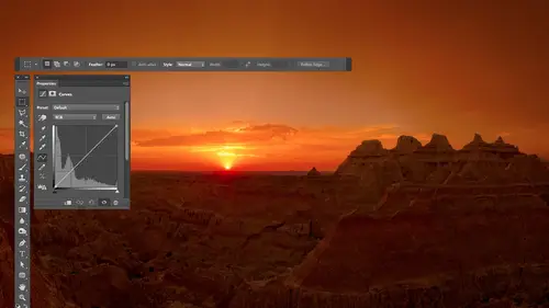
Photoshop: Curves Continued
now there's one thing you want to minimize err avoid at all costs with curves and if you've ever played with curves before and you ended up with a picture look look really weird you did this ok in that is if you look at the original line and you follow it from left to right aren't you going uphill the whole time followed the original line in there the diagonal one from left to right uphill whole time look at this curve follow from left to right and notice you're not going uphill the whole time instead there's one spot where you go downhill don't do that unless you want a special effect you will get a special effect every time you ever do that all right let's figure out what the heck would that do well let's go back to this and sea view and figure it out now look at this if you fall from left to right their like stairs aren't you going upstairs if you go from left to right well let's make it so you go downhill if you went from left to right think about what that would do to a picture lo...
ok at black black would become would have as much light as you possibly can they become white would not look white instead of having a cz much light as you could have it had none would have turned black when you'd have the opposite of what you had before your image would turn into a negative of itself well that makes sense or not but if you see it on a picture looks really weird because what used to be darkness suddenly really bright in what used to be really bright is suddenly has nothing for light in it so let's do it let's go to curves and let's make the entire curve go downhill to see what happens I'll grab the dot up here in the corner which effects the brightest part of the image and also the lights off now all the dimmer switches are completely off right all the way across the bank now lets take the dimmer switch for black turned all the way on the negative of itself is not now usually that's not gonna happen to the entire picture unless you just did what I did what's gonna happen instead is you're going to click somewhere in your picture and try to brighten it you're going to go really far brightening it and then you're going to say oh somewhere else in the picture I want to darken and you're going really far and when you do somewhere in your curve it's goingto go downhill and you're going to get weirdness now if you're into weirdness some people are make it go up and down a lot were there now we got weirdness okay so if you ever messed with curves and you ended up with a picture that just was weird is how you made it go downhill now we can use that sometimes I just want part of this picture to look weird let's say I want the stone areas in case you don't know you're looking straight up in a stone arch I want the stone area so look weird I want the sky to look semi normal and I can only do that if the sky is different in brightness than the stone because that's all photoshopped khun do it say let's take things that used to be this bright in brighton or darken them if there's an area that's equally as bright somewhere else that's going to change too so they have to be different in brightness so what I'm going to do is clique within dark area of this don't arch in clique within a bright area I mean ignore that where the sun is hitting because that's not two huge urban area so first I need that hand tool though dark area bright area and somehow I need to make it so in between the two it goes downhill well if I move this one down it's only going to start going downhill once I get all the way down here and that's where black hiss I don't think I want to do that or I could move this one up it's on ly going to start going downhill when I get it above that one we got a lot of space to do that so I'm going to try that out see it's starting to go downhill see the start to look really weird on a color picture not only does the brightness invert so the colors you get the opposite colors that usedto have but now the sky is looking pretty weird too well all I need to do is figure out where is the sky in represented in this curve so move my mouse out here to see where it isthe and I drag over it do you see part of that is going downhill so I just need to take this part of the curve which is what I get when I drag over my sky and make it not go downhill so what if I had a dot in here somewhere just do this to it we're getting the sky club we still got one area here that's a little odd you see where it is on the curve that's where it might be either downhiller flat or something I could add another dot on this kind of inch that up but I've largely not completely but largely gotten the weird looking stuff to be where the rock is in the sky looks somewhat normal but don't do that by accident meaning if your picture ever starts looking really really weird just look at the curve part of it is doing one of two things it's either going perfectly flat which means where you used to have detail you now have nothing and listen sometimes like weird suddenly the middle of somebodys forehead looks flat uh or party your curve is going downhill as you go from left to right and you need to somehow prevent that and so mellow out on your adjustment a little bit so that it doesn't end up going downhill so I know I'm covering a lot of information right now with curves and if you have you're not used to curves you're kind of your brain's probably you know starting fry a little bit up there kind of thing but hopefully if you come back each time you thinking about it too something already know just dimmer switches it's exactly like a bank of dimmer switches it's just you're not used to having so many dimmer switches next to each other and you're used to dimmer switches where this dimmer controls light above your sink in this controls the hallway whereas these are thinking about brightness levels within your picture so why don't we get into a few questions and just start adjusting some pictures without describing new concepts more and more new concepts so first is earning basic questions coming up that would like me to dress before I do that yeah nordic goddess would like to know do curves and camera work like curves in photo shop and same with light room any time you see curves it's curves meaning that it could be in your scanner it could be in your camera it could be anywhere all it iss is ah bar at the bottom that says what you're changing on a bar at the left saying what you're changing it too if you move it to a particular height the only thing you might run into is on occasion you'll find a curve that doesn't talk about light instead it talks about inc and if that's what you have when you move your mouse on top of your image it's telling you how much ink would be used to print these areas and if you move the curve up you're adding inc which means you're darkening the picture so it's like the curves been flipped vertically so up and down have been reversed and you can actually do that and curves if I open a picture and I go to curves remember that thing for the settings down here at the bottom do you see here it says light and if I said it to pigment slash inc now look at the bar on the left if I push this up I'm adding more and more ink and things will be getting darker if I bring it down I'm adding letter taking away in class unless ink when I get all the way to the bottom all I have left is the white paper so that's one thing you might run into is in some areas you might run into a curve that talks about inc and if so just think moving it up is adding inc it's kind of weird I like using it with light I found photographers are usually more comfortable thinking about light but it regardless of where you ever find a curve the concepts are the same so camera frank scanner camera anything thank you yeah on curves you get the uh what is a eye drops yep one of those for we're going to use those in the next session they have to do with dressing color and we haven't talked about color yet it's okay you're just saying you want me to get to the next section pretty quick that's fine nose have do a color and though they'll help us out with color correction uh all right well let's start adjusting a few images if anybody happens to get questions either on the interwebs or here pop him up is you think of them and just know this is going to become much more powerful when we can apply them with adjustment layers where we can paint on a mask when we're not limited to isolated areas based on brightness instead I could just say hey don't change that I'll just paint right over it or make a selection before we adjust something so on this image on the right side do you see some markings but those markings air pretty faint aren't they so let's either make it so it's next to impossible to see the markings or make it easy to see the markings so I'm going to from now on use adjustment layers because I no longer have that complex document that had a boatload of layers and because adjustment layers is how I always apply curves so that's what we'll use so I'm going to go to the bottom of my layers panel click on the half black and half white circle I mean choose curves and now instead of appearing as a white big dialogue box it takes up a lot of space in my screen it appears in this little panel then the only problem is there is no symbol near the bottom that I can use to expand the panel and get to the options that were there remember how he could turn a history graham on and off and other things so in order to access those things I need to go to the upper right of this panel where this little icon that indicates there's a menu and there's a choice in here called curves display options in that where I find the choices that are usually under that little triangle that we had when we were in the other version of curves so I can choose do I want a history ram I want that intersection line I don't usually like that channel overlays has to do with working color so we could talk about that when we get into adjusting color you wantto mess up somebody that's used to using curves thinking about light do that you know screw up somebody does it to you switch back to this this thing here just changes thie size of the grid if you look at the grid right now it's what's known as twenty five per cent increments so this line here points to seventy five percent gray fifty percent gray twenty five percent gray some people are used to thinking about a concept used to use in the photographic darkroom and when you had big view cameras and things notice the zone system in the zone system if you wanted to use that you would click on this other grid icon it would give you a finer grid we're now it's in ten per cent increments in this zone system would make it so you just a sign of certain one of those brightness levels you'd move part of your image to one of these lines to sell it what zone you put it in I think it's funny people teach the digital zone system why don't you get away from the word zone and just call it curves it's just like when you talk about texts and they have to call line spacing letting you know it's like use an old term for something that we don't need but any way you could just get a finer grid if you happen to prefer it or of course a grid um so I got that the other thing I would do here with our adjustment layer is I go to the upper right corner click on that menu and choose auto select targeted adjustment tool what that means is automatically turn on the hand symbol because remember we we'd have to turn that on before we click on our picture turn that sucker around so it stays on that way every time you go to curves you can instantly start moving your mouth to the picture and clicking all right so this is on adjustment layer these air the options it works exactly the same as the normal curve that we've been working with you remember we had little sliders in that curve a swell and just like with that curve I can click on this dad dots moving around and drag him off the grid to get rid of them so it's no different other than it's more compact so now let's work on this wall we got some markings were really hard to see let's make them more pronounced so I got the hand to already turned on I'm going to come out here and click on the darkest part of the markings and I don't don't have to be laser precise about it just in general get to a dark part of the markings so right here that's relatively dark click then I get to a bright part so right here it's bright click so I have two dots on my curve and I simply need to make it steeper between the two I can manually move my mouse over to the curve and dragged up and down on them the problem with that is it's so easy to accidentally drift to the left or right that I don't like doing it so instead I'll just move my mouse over here back to the dark area I'll click so grabs that dot and I'm gonna pull it down and as I pull it down it should be darkening everything that's that brightness level but the bright part is staying the same brightness because we locked it in biology and dot so that part's not moving where has had I not locked in the brightest part it be moving along with this everything and just be getting darker so there is it becoming a bit easier to see I'm now let's make it harder to see to make it harder to see we get the two dots to be similar in height so now just look at the curve you see the dot that's active it's one that's white I'm going to move it up getting really close the same height as the other and let's see if we can get it next to impossible to see that detail try doing that with levels your entire picture will just radically change and you won't be concentrated in any particular spot if you've ever heard of anybody telling you to make an s curve that's a generic tip that people will tell you what that means is simply make the curve steeper in the middle let me make an s curve this is just a common tip you'll hear people say to people that aren't overly comfortable of curves yet they say this is cool making s curve and the put that down and move it up like this and they put another dot about over here and move it down like that and you see that looks a little bit like the letter s well if anybody ever tells you that usually they don't know what they're talking about because they're giving you a generic tip because that's exactly what the contrast slider does and brightness and contrast they should just say go to brightness and contrast move the contrast slider it's much easier than two dots and tryingto deal with it because that's exactly what brightness and contrast us what we're doing is we're targeting where it gets steeper whereas here it's generic it's right in the middle all we're doing is we're looking within the picture insane what is it that needs the additional contrast let's not just put it in the middle because if we just put it in the middle in this particular case it might not bring out the detail you want so all we're doing is we're making it steeper the same concept is an s curve but we're figuring out where to make it steeper so it's not just in the middle so we're moving over here to a wall and we're saying this part over here and if I move up and down on this do you see in curves a little circle moving around that's the part that needs to be steeper or if I'd rather pull out the detail here I drag across that let's make the difference between the dark part of the steppe and the light part of the steppe more pronounced I'm gonna leave the bright part alone by clicking out letting go locked it in grab the dark part pulled down isn't it becoming more pronounced at the same time I'm gonna come over here and I'm going to say make this more pronounced you see where it is in the curve just above that stuff go to the bright part maybe pull that now the problem is if there's two dots or if there's a dot really close to where you're trying to adjust it might think you just want to grab the one that's already there and so there is a limit what you could do is manually at a dot and watch what happens to my mouse if I get really close to a dot that's already there you see that mouse changes if I get far enough away it looks different if you see with the little arrows on the end it means let's move one that's already there if you get far enough away where the arrow's go away it means let's add a freshman so all I need to do it so I really want to dot right there move far enough away where you dad one click and then drag it over there yeah you can still get it there you just got to start a little further away I could make that a little steeper so if it ever has arrows on the end it means you're so close to it not that's already there it thinks you just want to grab that that's actually a convenient feature it makes it easier to grab a dot you don't have to get exactly on it um with that if you find it difficult to um to grab the dots because they're so darn close together you can make this larger if I pull the edge out like that and maybe collapsed my layers panel then those are going to have more space in between them and it's going to be easier to add extra dots without thinking you're so close so I'm gonna go toe layers uh curves adjustment layers the hands automatically turned on why because we went to the side menu previously and said auto select target adjustment tools so from now on it's always going to be active and I'll just get layers out of the way by double clicking and uh all right look at the bottom of this picture you see texture within that bottom area of some detail where there's lighter and darker things I wanted more pronounced so I click on the bright area maybe I brighten it a little bit bring it up and then I click on the dark area I bring it down see the more pronounced now there's a problem and that is anytime you darken watch what happens to the color isn't it becoming more and more colorful yeah sometimes has great you're like I love the color coming out but other times it's too much to do that to skin people look sunburnt pretty darn quick so if you ever bring the curve down and dark and know the image is going to become more colorful sometimes that's a good thing sometimes it's not but if you want to prevent it here's how you d'oh in layers it'll be adjusted unjust mint layer and there's a menu right here that controls how this later interacts with what's under it if I change this menu there bottom most choices called luminosity luminosity is a fancy word for brightness so what this means is make this adjustment on ly affect the brightness don't allow it to affect the color so when I do that I'll choose inducing see what it looked like without here's what it looked like without it after I said it to luminosity it can no longer make it more colorful so therefore we keep the original saturation of the image we're still dark and things and not have it mess up so that's luminosity if you want to see it in a more radical way let's do a different curve no put one on top of this one I'm going to make the curve go downhill somewhere just push part of it really high and push part of it really low we get those weird colors and then I'll just say luminosity and now watch wherever it changed color it can't change color the brightness can change you look all weird brightness wise but it can't affect the color so luminosity any time the color shifts with any adjustment layer you ever make doesn't have to be curves could be anything else if the color changes and you on ly meant to change the brightness sedita luminosity uh ben quick question for you over here please when you're doing your tonal adjustments because we're working just tones yet not colors do you ever make your tonal adjustments within a targeted channel uh yes but if I do it within a targeted channel which means that I change this menu up here this is what channel you're working on I'm going to affect the color and that's what we cover in the next session great thank you now with this after I just the bottom portion of the picture I look at the top and the sky's pretty darn bright I think it's too bright I'm going to see can I adjust the sky separately from the bottom I can on ly adjusted separately if they're different in brightness so I moved my mouse onto the sky and you see where it is in the curve it's nowhere near the part I was really trying to adjust already so I can easily just it separately but if when I get to the deepest blue part of the sky that's still in an open part of the curve meaning apart I haven't messed with yet with actual dots I could adjust that separately but if the circle showed up right near one of the dots had already messed with it means it's the same brightness is something else I was already trying to adjust and I wouldn't be able to adjust it separately I would need to instead paint on a mask make a selection beforehand or do something to isolate it outside of curves but the sky is in this general area the photo if I drag across it you see where it is and curves the general brightness range so I'm just going to adjust that I could do it right here in the curve you can see where we used to be right I'm just gonna grab here I'm doing it down here because it can steer the entire area uh and just kind of get it back near where it used to be like that is that close to where we used to be now if the reason I steered here is I often will steer near the dot that caused the problem this dot created a kind of a pivot point where the curse started pushing up after it and if I add a dot right there aiken steer that whole section if I don't add it near instead I just grab up here and pull it you see how it's not controlling quite the entire section because it's down here is creating the pivot point that's causing it to go up and so oftentimes whoops my mouse had the little arrows on the ends when I clicked anyway I'll try toe steer it from where it started deviate but I can't have another dot in here hey I want a darker sky find click it's long it's it's an open part of the curve drag it down be careful though look at what's happening to my curve if I continue to pull this part right here straight down won't part of the curve go flat if I let that happen somewhere in my picture it might start looking weird and I'm amazed that in this picture is not obvious most of time would be obvious you would see like whoa this part completely lost detail uh let's see if I can find any oh it's right here in the reflection do you see it right there there's a reflection of the sky there was a little darker and it looks odd so any time you're in curves in something looks weird you did one of two things the curve either went flat or downhill so if I continue moving this that same area will suddenly start looking weird do you see the reflection of the so all that means is this is beyond the limit of where I should move that so back off on your adjustment and say to prevent it from looking weird I'm going to stay up here and not go quite as far down usually what you end up doing though is just creating a second curves adjustment layer and you'll use masks to say don't affect the entire bottom of the photo that kind of stuff we just need to get into adjustment layers one last tip when it comes to curves try to keep the shape of your curve as smooth as is practical you don't want a kinky curve if you have abrupt kinks in your curve instead of a very smooth shape imagine it's something like a bowl or a sculpture and you're running your hand across its shape it should feel like a smooth transition between everything instead of really sharp ridges and things if you have really abrupt transitions you're going tohave abrupt transitions and brightness in your picture where it used to look smooth and it can look odd so try to keep it as smooth as is practical so if you look at this curve it's relatively smooth if I added another dot and did this and then did gonna move far enough away you see a kink in that curve that is goingto often produce a result that doesn't look smooth so just when you look at your curves he is there any way I can simple fighter move the dots a little bit finesse them to maintain a relatively smooth shape one that doesn't kink all right so questions comments commentary ready and we'll start with randy and we'll go to uh chat rooms the question I have is when you're just in the sky if you just too much of your unnatural as a total picture so you gotta keep an eye on boats aspect of oh sure it's very easy to make things look on natural by over adjusting them so it's up to you to use your own judgment in thinking about what's the most I could do to this sky we'll still you know making it look realistic of course behind the holder too but yeah a lot of people weigh over doing some people think my images when you see before and after our overdone I like contrast I like you know bold color that kind of stuff and to some that's too much it's each person has their own personal you know style thank you yeah and then a couple questions from show me toto and judy wisconsin both asking about multiple curve adjustment layers and yeah the when the winds and wife force the winds and wife wars usually you have multiple curves adjustment layers once you start using masks and we're going to get into mass at the end of the day and what it will be is iike unmask this such that whatever I do in my curve will only affect the area where I paint and so I could paint across the sky and then adjust the curve and I wouldn't care what happens to the bottom of the photo because the curve would be uncomfortable of changing the bottom then I could make a second adjustment layer that on ly affects the little area where the reflection of the sky is and I wouldn't have to care about the rest of the curve I've dialled in tow on ly effect that little puddle of water that's they're using a mask and therefore I would have a bunch of curves adjustment layer stacked on top of each other each one containing a mask attached to it that physically isolates it toe on ly affect certain areas of the picture and I'll do that at the end of the day you'll see me you have a bunch of currents adjustment layers building up a particular effect and it's great
Class Materials
bonus material with purchase
Ratings and Reviews
a Creativelive Student
This is one of the best courses I've taken on any topic, not just PS or photography. Ben is a fantastic instructor. He introduces a new concept and then reinforces it with great examples and with well done repetition of key points along the way. Really really impressive. He does a super job of finding analogies to explain the concepts that underpin key parts of PS (e.g. comparing curves to a series of dimmer switches) and also teaching tons of super useful keyboard shortcuts in the midst of showing larger processes. Excellent.
a Creativelive Student
Very authoritative and informative class. He commands PS and shares what he knows in concise and precise methods. It was too much for me to keep up with. I am not a techno guy and I decided early on that buying this course, and his next one, was what I needed to do. I watched the whole course and tagged a few areas to review. OK, a LOT of areas to review. Great job and I am looking forward to part 2 in April. Thanks for presenting these courses as you do. I a guy who sure wouldn't gamble on an unknown course, so previewing it is the way to go!! Good luck in your venture. I am looking forward to more great classes from other great photographers. Keep up the great work!!
Walter Hawn
Hurray for Karen and the detailed notes! I understand now why it took awhile to get them together and up on the lesson page. A superb job. Ben teaches well and Karen's notes finish the job superbly. -- And the collection of keyboards shortcuts? I'm almost tempted to say it's worth the price of admission, by itself. This is, by far, the best organized, best assembled, best presented Photoshop course I've seen. I just wish I'd encountered Ben, back when he was actually writing Ps books. Would have saved me much aggravation.