Camera Raw: Adjusting for Contrast and Color
Lesson 5 from: Photoshop for Photographers: The EssentialsBen Willmore
Camera Raw: Adjusting for Contrast and Color
Lesson 5 from: Photoshop for Photographers: The EssentialsBen Willmore
Lesson Info
5. Camera Raw: Adjusting for Contrast and Color
Lessons
Day 1
1Adobe Bridge: Basic Navigation
33:58 2Adobe Bridge: Organizing Images
47:54 3Camera Raw: Basic Sliders
18:24 4Camera Raw: Adjusting for Exposure
32:10 5Camera Raw: Adjusting for Contrast and Color
21:45 6Camera Raw: Localized Adjustments
40:44 7Camera Raw: Optimizing an Image
43:52Photoshop: Work Flow Options
33:15 9Photoshop: Resolution
25:55 10Photoshop: Quick Overview
18:41Day 2
11Photoshop: Black and White
17:46 12Photoshop: Focus Bracketing
36:09 13Photoshop: Panorama Stitching
27:17 14Photoshop: Curves
41:40 15Photoshop: Curves Continued
27:58 16Photoshop: Shadows and Highlights
14:52 17Photoshop: Curves for Colors
34:13 18Photoshop: Hue and Saturation
39:43 19Photoshop: Adjustment Layers
37:44 20Photoshop: Adjustment Layers Before and After
38:13Day 3
21Photoshop: Layers
39:27 22Photoshop: Layers - FX and Masks
38:42 23Photoshop: Compositing
31:59 24Camera Raw and Photoshop: Retouching
35:35 25Photoshop: Retouching Continued
31:47 26Photoshop: Content Aware, Selective Focus
23:06 27Photoshop: Textures With Layer Masks
31:08 28Photoshop: Creative Treatments
16:24 29Finishing Techniques and Workflows
31:06 30Finishing Techniques and Workflows Continued
22:40Lesson Info
Camera Raw: Adjusting for Contrast and Color
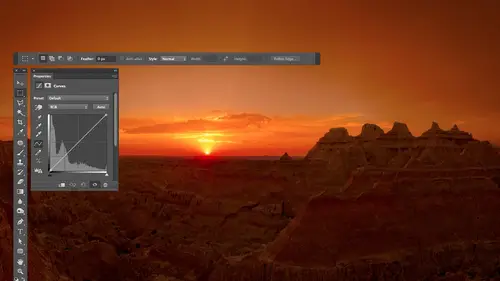
oftentimes I will run into images that have too much contrast I need to just clear some settings here before I do and I want to show you how to deal with those all right here is an image where the darks are way too dark the brights are a bit bright and that means there's just too great of a difference between bright and dark now the first thing I might think of mentally is contrast because it controls how big of a difference there is between bright and dark but there's only so much it khun do so if you try it mmm okay but it doesn't do that much so contrast is the slider that if it got removed from camera I would miss it kind of the least I still use it especially when I bump it up tio increase contrast but the other sliders are going often be much more effective if I bring this down the temple is going to end up looking a little dull in my opinion so I might start with a little bit of that but what I'm really usually gonna have to do is adjust the bright areas and the dark areas separ...
ately and that means working with the highlights and the shadow sliders because that's what and ends up I have lighting it so I could go over here to the highlights and say I want to darken the highlights to try to get some more detail in that temple then I can come down to the shadow slider and I could bring it up to say and I want some shadow detail now my shadows I've maxed out it's all the way as high as I could go if I want to go further was their trick that issue go to exposure and move it the same direction you were trying to move the slider that maxed out so I go I want some more out of there and then it's gonna overdo the opposite of what you were trying to work on so we were trying to get shadow detail out of it and by doing the trick it's going overdo the opposite so if you were working on shadows it's going overdo the highlights so you'll have to compensate them right bring that down at this point I might decide to adjust contrast and I might even end up increasing it let's see bring it up actually but that's little pop to it I think it is I might come down here and also just clarity just to make the details pop out of there and I'll just bring it up really how you never know if you're gonna overdo it unless you push it too far and then back off you might be just one little bit off of perfect and you just were afraid to move it higher now max it out and then back off on it until you find the good setting I always try to overdo and then back off until it's just right all right then I might make the image just a little bit more colorful vibrance gets some of the color back in the sky and in the temple that's there and let's see before and after I'll turn preview auf before after so you get the idea that often times when we have way too much contrast the contrast slider itself it could do okay but it's usually going to be me isolating the highlights from the shadows by using the highlights and shadows sliders so here I could use this if I wanted him just a za shaped like a silhouette if that was the case I might take the shadow slider and turn it down darhk in the shadows to say I don't want you to see the detail of him I want him just to be a shape sometimes that's what I'm looking for but let's say I know who that is and if so I probably want you to be able to tell who it is it might be somebody you know then instead I might end up bringing the shadows up to say let's see if we can see him I've maxed out the shadow slaughter I wish I could go a little bit further so there was a trick you go back up to exposure and push it but when you push it the highlights will end up getting too bright so you bring it down ok then clarity if I want to emphasize the details in the end just make it pop a little bit and this is where I might end up noticing halos with clarity if you watch around the top of the temple you might actually end up seeing a dark halo where the sky touches the temple I'm not sure but let's see this is when I might expect it if you can see it or not but just a little hint of right along here if I bring clarity down I'll double click on it see the sky look more even whereas when it's up it just it's also see it right around the edge of the telescope like thing but that's where you got to be a bit careful and clarity's easy to move too far you can actually move negative clarity to smooth out some of those if they were caused by the highlights and shadows slaughter but let's see what we did I'll turn preview auf before after if I knew that person that would be a more usable image now we haven't really talked about color issues so let's get into it what might be involved they're just going to clear my settings we start from the originals I think this one has color issue here I was at a winery and uh took a shot of my white balance on the camera didn't quite figure out the lighting and compensate for it so I'll have to do it myself so we haven't really talked about much of the color settings other than we've upped vibrance to make the much more colorful so now let's start looking at what's the difference between vibrance and clarity and these top two settings which control color the top two that are up here the temperature and the tent collectively are known as white balance so if you ever mention white balance it means what are these two slider set too above that it says white balance in this menu is just presets if I click there there's a preset for correcting for tungsten lighting because we know what color tungsten lighting is in these sliders could make it look like white light instead or fluorescent or the flash you might have on your camera custom simply means you're not at a preset you've moved the sliders and they don't match a preset that's what custom means daylight with the color of daylight they'll try to compensate for auto is where photo shop we'll look at the image analyze it and try to figure it out sometimes is good at that sometimes it's sucks and as shot is whatever your camera had for its white balance setting so we could try auto here because I don't know what kind of lighting was there I don't know if there was a candle in there or what it was uh didn't work all that weld it so auto could be nice for some images but my camera was set to auto and it did this so I don't expect photo shops otto to be much better then instead of working with a pre set I would have used that if I knew what kind of light ain't wass if it was in an office building and I knew there fluorescent lights above just use florescent you're done uh it would be nice but I can't do it there then another way of setting white balance is to go to the upper left in up there is an eyedropper there's actually two I droppers but it's the one on the left that's the white balance eyedropper the one on the right has nothing to do with white balance I'm gonna click on it in another way of figuring out white balance is to find something that should not contain color where if you walked up to it in the real world and grabbed held in your hand it wouldn't be blew it wouldn't be yellow wouldn't be pink wouldn't be orange it would be a neutral gray grey is something that can show up in a grayscale picture a black and white photo it has no color and so when I talk about grey I'm not talking about any brightness level of gray I mean anything from white to black in brightness range uh that would not contain color so white sheet of paper in this scene it's a picture of this stable my sheet of paper right here click and it would be able to figure it out if I have a shirt my shirt the buttons on my shirt unless these air sometimes putting their little brown ish kind of thing uh but there are all sorts of things usually in the real world that are shades of gray and the idea is when you click with white balance eyedropper on an area that should be gray photoshopped looks at what color it really is it knows that if it's supposed to be grey then that's the color that's contaminating your entire picture there's too much of this because this area is not supposed to have any color and let's say that when I click on it what it finds is that it looks orange is yellow then it takes these two sliders and moves them away from orange in a way from yellow because what happens is blue is the opposite of yellow if you make something mohr blue you're automatically making it less yellow because these are the opposite of each other if you make something mortgage reen you're automatically making it less magenta because they're the opposite of each other and so it's simply figuring out where to move these two slaughtered based on where you click it says a that area that you clicked on looked overly green so we're going to move this slider away from green until no more green appears in it so what I need to do is look at this image and see if there's any areas that should be shades of gray so let's zoom up on the image uh how about a label over here I don't know for sure because I don't remember you know standing in the room but lots of wine labels are are white if that's the case I can try that let's see what else might be in here candles are usually yellowish you know brownish kind of color so I doubt that over here there's a picture in the matting around it oftentimes you have white matte not always though if it's not a white matt when I click on it it won't look quite right but I'll know the second I click I'm your scene is there anything else in here I recognize that it's something that if I walked up to it in that room um there's a chance that it would be a shade of gray and white is a shade of gray so I'm going to try the wine label if we click on it in the image looks better than it was probably a white label if it looks bad it probably wasn't I just clicked on the wine label that's not bad this was looks more similar to what the actual scene looked like I know you guys weren't there when the photo was taken so I don't know what what would be right I'm going to click on the picture frame right on the the edge of it looks like aboutthe same value meaning I'm not getting a radically different results and so that's probably closer to it's from what I remember closer to what was there then I confined to in the end result by moving these two sliders because all it did when I clicked with that eye dropper if you watch those two sliders I'll click somewhere else do you see it just moved the bottom slider a little bit click somewhere else it moved it more and so all it's doing is it's figuring out where to move those two sliders for me I either start with a pre set from this pop up menu if I know the light source or I use the white balance eyedropper and look for things that should be white or gray and click on him and just see if it improves the picture and in the end though you confined tune it by moving the two sliders so if I think it's a little too magenta more not enough or see if I need more yellow that kind of thing then yes I just want to let you know that I gave away five y bowels for christmas you did did you got you got me totally hug so it's a little key chain will bend just really it's really and just see if I have one in here because I don't know if I do right here I know I do somewhere ah I don't have it in this particular folder but somewhere enough the three days of this course I will have a wide ball card um in what it is it's a little great card and it's a card where they've measured each and every one of them before they sell them to make sure that there's no color in this card it's that there's no hint of blue there's no hint of yellow no hint of pink no hint of anything it's neutral meaning that it's truly gray and you can put it in the senior about to photograph included in the picture just take a picture and then pull it out of the scene and continue shooting there and then put it back in the scene anytime the lighting changes so if I shot in this room I take one shot with it in there and that I would shoot without it for the rest of the time in here than when I went out in the hallway where might be a different kind of light I put in the scene again and then pull it out and the idea is to get the light that's lighting your scene to fall on that card because then if the light is greenish that card is going to become greenish because it's going to take on the color of the light source you put a red light bulb out there red light would fall on it it would look reddish right and therefore you have something to click on with the white balance eyedropper and in camera you can adjust more than one image at a time so I could adjust all of the images I took in this room and I click on the little why bell card it would color correct them all with one click and I simply would throw away that picture when I'm done if because I only used it for the white balance study but it's called a y belle card y belle is short for white balance so w h I b a l and I think you just goto why belle dot com to get him there are other manufacturers that makes similar products you can get one that's a little sticker you put on your lens cap because you always have your lens cap and therefore you could use it there are other ones also that have multiple colors that you can use for other things but what I like about the y belle is they make it the same size as a business card so you can always have one in your wallet they make it the same size as those things I hate those little plastic cards and all the grocery stores want you to have you know what I mean those things they make the exact same size as those kidnapped one of your key chain and then they make one I think it's an eight by ten and er you know all those sizes and so they're very convenient and they're durable so if I drop it in mud I pull it out wash it off and as long as the mud didn't stain it's on inca drop often or something I can continue to use it where as many of the other solutions fragile where if it gets rained on throw it away kind of thing that it's not plastic instead it's more about paper I used to use a normal wallet but now my wallet is actually a iphone case which is also a wallet so I flip it open like this to talk on it or I open it all the way and it's my wallet and I have it takes up a lot less I have a lot less storage space so I no longer have a y bell with me at all times but when I had a normal wallet I always had a y bell on and on my camera gear like mike liquid into a backpack that I use I always have a wide ball hanging from it my wife loves it because whenever we're out shooting she's takes pictures of me and she's got the white balance reference there and a cz long as I'm in the same lighting and so she's constantly taking pictures of me and I'm like oh that's nice and she's really trying to get my wife so good on the and the discount code is wilmore lower case okay remember wilmore has two l's in it that's the one thing people might mess up on yep perfect all right so we've talked about some color issues which was we can use the eyedropper if we had a wide bel card click on it that would be awesome and do that but sometimes the color issue I run into is not that there is a color cast look here's another one with color cast this when I lit with a flashlight a big flashlight and this is cadillac ranch which is a bunch of cadillacs buried nose first on the ground there all nineteen fifties cadillacs but the light coming on my flashlight is very yellowish so if I grab my eye dropper in find something white on the car there's some white spray paint right here it will compensate for the color of the flashlight making it so I have the true color of the cars in there and then that I think looks better even makes the sky what you can actually control the color of the sky using a flashlight or your normal flash would have on the hot shoot your camera you just have to figure out what color do you want to change the sky to let's say you have an overcast sky and you wanted to look all yellow all you need to do is figure out what's the opposite of yellow in light your subject with that because when you compensate for it with white balance it will be saying hey the opposite of yellow by the way is blue and so if you like your subject using blue light not overly strong but a hint of blue light and then you do color correction with that little white balance eyedropper it's going to say make the image less blue will look at what less blue looks like less blue means mohr yellow so if I light my subject with blue light but the light that I'm using on my subject it can't reach the clouds in the overcast sky right so it's not affecting their color so my subject looks all blue because I let him with that eye color correct for with a little white balance eyedropper click on something white on their outfit it takes this slider and goes whoa you got blue light I'm going to make it less blue what did it just due to the sky it pushed the entire color the sky towards yellow if that makes sense or not but it works and so I can control the color of the sky by lighting my subject with the opposite of what I want to shift the sky too uh so that's what happened here if I end up resetting this before and after you see the sky changing in color and that's because of the color I let the cars with but the other thing I can do is sometimes I showed up I wanted sunrise or sunset but I got there to earlier late and just didn't quite get it so I want to fake sunrise or sunset so why not just grab the temperature and push it over here towards yellow see how much I could get away with maybe make it a little bit more warned dish and bring up one of these things it makes it more colorful in that in this case though I think the skies too bright skies the bright part of the pictures of probably highlights you think so it bring their highlights down maybe bring our exposure down even because if it was sunrise or sunset it might not get quite that much and now let's see what happens so he pushed that over it's looking a little bit more like sunrise or sunset it's not exactly but compared to what I had it's getting closer to it so here's so sometimes I try toe put it in and you'll see this image later on where you see a processed version in the sky will look yellow yellowish orange but this is what the original looked like so when you see that tomorrow where whatever it is that comes up keep this one in mind all right so we've talked about the general adjustments that aaron camera in the area that affects the entire picture the on ly thing we haven't gotten into in there is vibrance vs saturation and I'll cover that after we end up taking a break because we want to also be able to apply that to limited areas and that's our next subject so I'll get into that but before we do get into that do we have any questions in the audience or out on the interwebs joe let's start with you so I've made some adjustments in camera before but now I'm using light room so could I now open those same photographs in light roman see the just say it made previously yeah there's a depends let me describe what happens there so first off there's a setting that says where should these settings be stored there's two different places they could be stored they could be stored as those little ex mp files or they could be stored in the quill into the preferences file for either bridge or light room and it might take me a moment to find where the setting this is settings are it's under kamerad preferences the very top here it's a save image settings in sidecar ex mp files they calm sidecar files it just means an extra file or I can say camera database in this means save it in one central hidden file that keeps track everything in problem is if that one file gets corrupt he just lost all of your adjustments compared to having him a separate files where if one file gets corrupt or something else you still have all the others I personally like the ex mp that's where I get the extra file it's not that I like the extra file it's just that I like the security of knowing that if I moved that picture the settings air going along with it even regardless of what I move it with s o if you have it in the ex mp files and have adjusted here in camera when I import these images in the light room it will find the ex mp file and read it and then when I got a light ramo see those settings so it will translate in light room there's a similar setting we can either save it in the ex mp files or in a central database and if I haven't sat to save it is the ex mp file then if I ever point bridge at whatever folder light room has those files stored in I would see the adjustments the light room did so if I used the ex mp files and that's what my preferences are set to then it could go back and forth between light room and camera find that's what I'm doing here all of these files if you ever see need that are pre adjusted I just um in light room
Class Materials
bonus material with purchase
Ratings and Reviews
a Creativelive Student
This is one of the best courses I've taken on any topic, not just PS or photography. Ben is a fantastic instructor. He introduces a new concept and then reinforces it with great examples and with well done repetition of key points along the way. Really really impressive. He does a super job of finding analogies to explain the concepts that underpin key parts of PS (e.g. comparing curves to a series of dimmer switches) and also teaching tons of super useful keyboard shortcuts in the midst of showing larger processes. Excellent.
a Creativelive Student
Very authoritative and informative class. He commands PS and shares what he knows in concise and precise methods. It was too much for me to keep up with. I am not a techno guy and I decided early on that buying this course, and his next one, was what I needed to do. I watched the whole course and tagged a few areas to review. OK, a LOT of areas to review. Great job and I am looking forward to part 2 in April. Thanks for presenting these courses as you do. I a guy who sure wouldn't gamble on an unknown course, so previewing it is the way to go!! Good luck in your venture. I am looking forward to more great classes from other great photographers. Keep up the great work!!
Walter Hawn
Hurray for Karen and the detailed notes! I understand now why it took awhile to get them together and up on the lesson page. A superb job. Ben teaches well and Karen's notes finish the job superbly. -- And the collection of keyboards shortcuts? I'm almost tempted to say it's worth the price of admission, by itself. This is, by far, the best organized, best assembled, best presented Photoshop course I've seen. I just wish I'd encountered Ben, back when he was actually writing Ps books. Would have saved me much aggravation.