Photoshop: Creative Treatments
Lesson 28 from: Photoshop for Photographers: The EssentialsBen Willmore
Photoshop: Creative Treatments
Lesson 28 from: Photoshop for Photographers: The EssentialsBen Willmore
Lessons
Day 1
1Adobe Bridge: Basic Navigation
33:58 2Adobe Bridge: Organizing Images
47:54 3Camera Raw: Basic Sliders
18:24 4Camera Raw: Adjusting for Exposure
32:10 5Camera Raw: Adjusting for Contrast and Color
21:45 6Camera Raw: Localized Adjustments
40:44 7Camera Raw: Optimizing an Image
43:52Photoshop: Work Flow Options
33:15 9Photoshop: Resolution
25:55 10Photoshop: Quick Overview
18:41Day 2
11Photoshop: Black and White
17:46 12Photoshop: Focus Bracketing
36:09 13Photoshop: Panorama Stitching
27:17 14Photoshop: Curves
41:40 15Photoshop: Curves Continued
27:58 16Photoshop: Shadows and Highlights
14:52 17Photoshop: Curves for Colors
34:13 18Photoshop: Hue and Saturation
39:43 19Photoshop: Adjustment Layers
37:44 20Photoshop: Adjustment Layers Before and After
38:13Day 3
21Photoshop: Layers
39:27 22Photoshop: Layers - FX and Masks
38:42 23Photoshop: Compositing
31:59 24Camera Raw and Photoshop: Retouching
35:35 25Photoshop: Retouching Continued
31:47 26Photoshop: Content Aware, Selective Focus
23:06 27Photoshop: Textures With Layer Masks
31:08 28Photoshop: Creative Treatments
16:24 29Finishing Techniques and Workflows
31:06 30Finishing Techniques and Workflows Continued
22:40Lesson Info
Photoshop: Creative Treatments
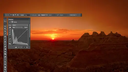
let's talk about some other creative treatments and then let's get into just um start to finish examples that use more of a variety that techniques that we've talked about throughout these three days yeah let's see here somewhere I had a note all right I want to show you two different techniques these air techniques that I apply on a large number of my images and if you saw any of my images that are from route sixty six or were vintage gas stations oftentimes they have these effects applied at a subtle level means I'll lower the opacity of effect so it's barely showing up but it does influence the look of the picture one of them is something I call soft contrast the other is one that I call auntie color and so let's take a look uh the first thing I'm going to do he is I'm going to duplicate the original layer twice I don't know if you remember or not but there was a keyboard charcot that can jump something to a new layer command j control jam windows if I type that you watching my laye...
rs panel in the lower right I'll type it twice you see that now we have a total of three identical uh layers now what I'm going to do in here is I'm going to take and just for now hide the top layer will use it in a moment I'll get to the layer that's underneath I'm going to change its blending mode here to a choice called over life now when I end up choosing overlay ah we have this you know sitting here it's see what it's doing to the image itself adding a lot of contrast to the image but the problem is it also makes the colors shipper shift around so what I'm going to do then is take that top layer and just to prevent the colors from shifting around I'll turn it back on that's the original and offset its menu to the choice called color in that way whatever is going on underneath you can't mess with the colors just can't mess him up so now we have this middle layer and it is sitting here giving us more contrast but I also just wanted to make the interest the image look a little bit more interesting so what I'm going to dio is with that middle layer active I'm going to run a filter that's called median media and usually simplifies your image gets rid of fine details in that type of thing and this will end up giving me this kind of soft contrast e look let's look at the difference between the original picture in this remember I don't always apply it at full strength so I'm just going to make it so all we can see is the bottom layer by option clicking out its eyeball before look at my clouds after you see how they got all soft look at other details in the image and how they got more contrast to them and they ended up um just having this different feeling now if I want to I could come in here and look at just one layer which you'll find the top layer looks identical to the bottom it's in color mode it won't be noticing much it's the middle layer that's doing all the work that's where it is and the one problem with it is it seems to make the shattered ito get way too dark you tell that when I turned on and off so I'm gonna have that middle layer active and let's see if there's a way we might be able to get our shadow detail back what I'm going to do is with the middle air active I'll go down to the letters f x at the bottom of my screen I'm gonna choose a choice called blending options and while this is open I'm going to pull over this what that's going to do is take the layer that's adding all the contrast to my picture and make it to the dark part of it disappears I'm going to pull this over until I start seeing the dark part of the image change can you see the dark part of the image starting to change their then I'm going to split the slider in half my whole india down the option key and dragging it over so that it's a subtle change for eyes try to get back some of my shadow detail so if you look at where I ended up you see the position of these that's about where I go to bring back shattered detail so what do we have here we have the original picture at the bottom we have a copy of the original picture on top it's set to color mode just to make sure that whatever you do underneath that doesn't mess with the colors the colors air coming from this exact copy of the original that's sitting up top then the actual changes happening with the middle layer the middle layer is a copy of our original it's had a filter applied called median and it's in a mode called overlay since it ended up getting rid of too much shattered detail I used something called the blending sliders to make the shadows slowly disappear from that layer so it couldn't affect him quite a ce much now if I want to control how strong this effect is all they do is they work on that middle layer and I lower the opacity of it so I click on the word opacity I usually drag until it goes down to zero so I can see what the original look like and slowly drag it up to see exactly how strong so I want that to be because sometimes full strength is a bit much a little too obvious that I've done it so I'll just find a nice level maybe around there you can also add a mask to the middle layer if you don't want it to affect one particular area of your picture if you find you don't like the way it looks on somebody's eyes or their lips or something like that just add a mast of middle layer in paint with black on it you'll remove the effect from wherever you paint so if I hide all my layers except for the bottom one here's without that effect here's with you see a slightly different field to the image it's got a softer feeling and it has a bit more contrast that's why he called soft contrast now remember if you purchase class then you get an action that would do that for you so you wouldn't have to remember those steps because I truly don't enjoy that process and so that's why I recorded the action and there's one other step that the action would do and that is in the layers panel instead of just having this where if you open this image six months later you bee why the heck do I have all these it would first name these layers so this one would be say color comes from here or something like that in this one would say blurry dupe or contrast something like that and it would also take those two layers and put them into a folder you can put something in a folder by selecting the layers he'd like to put in a folder in typing command g command g means group it group in into a folder you khun then double click on the name of the folder and just call it auntie color or soft contrast in this case but the action would have done all that stuff for you so that when you're done applying the action you just have one layer it's really easy to figure out why those layers air there because he got the name of the effect right there you click on it you could lower the opacity to lessen the effect as the hole you could add a mask to paint on it so I just find the action be convenient and that's why I ended up creating then quick question about the action if you don't mind could you talk a little bit about whether those actions that were providing with purchase are those for c c maybe photo shop I couldn't actually think about what versions they will apply to tested them yeah but I can say that they were created before photo shop cc existed great so I would imagine that that they would work with previous versions I don't at the top of my head and see why they wouldn't yeah five or six probably no prom most likely great but I want to guarantee that because without testing them it's hard to say exactly what you say is the majority of them were created before photo shop sees he existed perfect awesome thank you yeah all right so that's one effect let's try something else let's try one that might change the feeling of the color in our image in fact only find an image that might be a little more colorful than this taking just a moment to do x I didn't have one pre planned yeah let's see here we'll go for the bird cages I like that image just like how colorful it is and how not something I see every day so so now what I'm going to end up doing is trying to make the colors look a bit different just to get a stylistic look to the photograph so in order to accomplish that the first thing I'm going to do is I'm going to apply a black and white adjustment layer to paul the color out and I could finesse this to control the brightness by clicking and dragon if I want to but instead I'm just going to hit the auto button there's an auto button within this innit will move the sliders around to get me some variation and then the next thing I'm going to do is take the original image in that original image I'm going to duplicate in one way I can duplicate the layers just type command j to jump it to a new layer so with that original layer active all type command j jump it and I'm gonna put that on top of the layers stack by clicking on its name and dragging up like that and now we're going to take the colors from this original picture in apply um to what's underneath which doesn't have color it has a black and white adjustment layer but when we do it we're going to do it not by setting this menu to color because that would make it looked literally like the original dead but we're going to instead come down here and change it to a choice called overlay it's gonna look a little different right now the images you feel a bit too dark this image in generals a bit too dark but we can brighten it up afterwards with us so we ended up having this in overlay mode and then to give it a soft feeling I'm gonna blur it because I wanted to look a little bit more like an antique e color as if maybe it was a black and white photo and somebody colorized it with a q tip for something with um guys and such and if they ever do that they never get really really crisp transitions between one color and the next so I'll come down here and I'll just blurred enough where you don't see the really crisp details instead they're just a bit soft like that and then I can either come in into adjust the brightness of the pictures I think the end results a little in the dark side in this particular case I could go into the black and white adjustment layer double click on its little symbol on the far left to get the settings to show up once again and come in here in brighton or darken various colors that are in the image to say hey I want the reds to be a bit brighter here or I want the blues a little brighter because it just wasn't the best mix that I ended up with remember hit the auto button uh and that's why when we described using this particular adjustment early on I didn't even use the auto but never really used it when somebody asked about it I could also come in and use curves to end up adjusting the images a hole but I'm not going to do that right now because that's just image dependent we know how to do that let's see what this particular effect is doing though so I'm going to come in here and take both of these layers and I'm going to put them in a folder and the only reason I'm put them in a folder is so we have one eyeball to turn them on and off and if you put them in a folder you'll have in opacity setting and that opacity setting will control all of the layers that are inside the folder so therefore we don't have to deal with two individual layers and adjusting them separately we can have them changed as a group so to do that I select both of the layers I type command g to group them and now I have an opacity right up here I could grab the opacity turn it down and slowly bring it up and decide exactly how much of this effect I want but it's going to give you a little bit more of an antique e field to the color within your image and it's what I end up applying to my vintage gas stations and things to make the colors look a bit different I don't know that this is the best example of mentions a little in the dark side but if you brighten up the image shows the hole you could do fine and that's also one where there's an action to apply it so that you don't have to remember how to do it if you end up with the course you just click in the name of the action hit the play button and it also puts it in the folder for you at the end so you can just write away adjust your um capacity question about brightness since we're talking about it but do you have a way of calibrating brightness between different screens that you might be working on or well just in general it's not this sort of brightness but a combination of brightness and color is you can get a hardware device that usually most umberg roundish that it looks like a suction cup you stick on your screen its color color emitter and it's what is the best thing to use to get your screen to be accurate the most ah common ones as faras the high quality one is calling I won and it's going to end up flashing colors in front of your screen that the device measures so it can figure out exactly what the brightness is of your screen and also how does it render color and therefore you khun calibrate and profile your screen so that it's the most accurate and that's would be the most ideal way to do it in anything other than a hardware device that does it is going to be dependent more on your eyes and your eyes aren't usually very accurate when it comes to you judging things you do use thie mac the retina the new retina screen or you want an older version a ce faras my external screen goes is a twenty seven in chapel display it's not right now they haven't come up with a retina big screen yet that's the one thing I'm surprised that from apple is that they haven't come up with what's known as a fork a display yet because they're numac approaches their little tower supports a whole bunch of four k displays these huge displays that would be retina but apple hasn't released one themselves so but this described here is right now all right let's see what else just so you know if you end up applying a lot of textures to your images there is something you should get that would make the process faster and easier and if something is free uh what you'd want to do is go to russell brown dot com that's r u s s e l l brown dot com and he has a texture panel it's like a little icon that would appear on your screen that would make it very easy to um to load and apply textures and if you load it I have it open right here you would get this extra icon and when your sidebars and you can have some textures shown here these textures I'm not sure if these exact ones come with it or not but there are few textures that come with it but you can also use your own including that folder you get with the class once you want to apply a texture you khun choose the bloody mode you wanted to apply with this is the same menu you find in photo shop and they just click on the texture you want and you can apply I think it might be up to three of these just by clicking on him and if you decide you don't like him just click again it'll turn it back off and so it's just a quick and easy very fast way of applying textures and I believe you get this at russell brown dot com it's the texas that come with it are from a company called flypaper textures and if you don't feel like shooting your own textures and the ones that I give you what the class or not enough you get obsessed with textures look up flypaper textures they make a bunch of great sets of textures for use in photo shop or anything else that's another thing to consider
Class Materials
bonus material with purchase
Ratings and Reviews
a Creativelive Student
This is one of the best courses I've taken on any topic, not just PS or photography. Ben is a fantastic instructor. He introduces a new concept and then reinforces it with great examples and with well done repetition of key points along the way. Really really impressive. He does a super job of finding analogies to explain the concepts that underpin key parts of PS (e.g. comparing curves to a series of dimmer switches) and also teaching tons of super useful keyboard shortcuts in the midst of showing larger processes. Excellent.
a Creativelive Student
Very authoritative and informative class. He commands PS and shares what he knows in concise and precise methods. It was too much for me to keep up with. I am not a techno guy and I decided early on that buying this course, and his next one, was what I needed to do. I watched the whole course and tagged a few areas to review. OK, a LOT of areas to review. Great job and I am looking forward to part 2 in April. Thanks for presenting these courses as you do. I a guy who sure wouldn't gamble on an unknown course, so previewing it is the way to go!! Good luck in your venture. I am looking forward to more great classes from other great photographers. Keep up the great work!!
Walter Hawn
Hurray for Karen and the detailed notes! I understand now why it took awhile to get them together and up on the lesson page. A superb job. Ben teaches well and Karen's notes finish the job superbly. -- And the collection of keyboards shortcuts? I'm almost tempted to say it's worth the price of admission, by itself. This is, by far, the best organized, best assembled, best presented Photoshop course I've seen. I just wish I'd encountered Ben, back when he was actually writing Ps books. Would have saved me much aggravation.