Finishing Techniques and Workflows
Lesson 29 from: Photoshop for Photographers: The EssentialsBen Willmore
Finishing Techniques and Workflows
Lesson 29 from: Photoshop for Photographers: The EssentialsBen Willmore
Lesson Info
29. Finishing Techniques and Workflows
Lessons
Day 1
1Adobe Bridge: Basic Navigation
33:58 2Adobe Bridge: Organizing Images
47:54 3Camera Raw: Basic Sliders
18:24 4Camera Raw: Adjusting for Exposure
32:10 5Camera Raw: Adjusting for Contrast and Color
21:45 6Camera Raw: Localized Adjustments
40:44 7Camera Raw: Optimizing an Image
43:52Photoshop: Work Flow Options
33:15 9Photoshop: Resolution
25:55 10Photoshop: Quick Overview
18:41Day 2
11Photoshop: Black and White
17:46 12Photoshop: Focus Bracketing
36:09 13Photoshop: Panorama Stitching
27:17 14Photoshop: Curves
41:40 15Photoshop: Curves Continued
27:58 16Photoshop: Shadows and Highlights
14:52 17Photoshop: Curves for Colors
34:13 18Photoshop: Hue and Saturation
39:43 19Photoshop: Adjustment Layers
37:44 20Photoshop: Adjustment Layers Before and After
38:13Day 3
21Photoshop: Layers
39:27 22Photoshop: Layers - FX and Masks
38:42 23Photoshop: Compositing
31:59 24Camera Raw and Photoshop: Retouching
35:35 25Photoshop: Retouching Continued
31:47 26Photoshop: Content Aware, Selective Focus
23:06 27Photoshop: Textures With Layer Masks
31:08 28Photoshop: Creative Treatments
16:24 29Finishing Techniques and Workflows
31:06 30Finishing Techniques and Workflows Continued
22:40Lesson Info
Finishing Techniques and Workflows
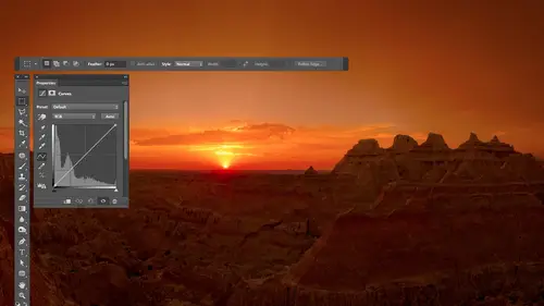
let's talk about some start to finish examples and some workflow ideas and just whatever we didn't have a chance to talk about all the other sessions first there's one thing I haven't had a chance to talk about over the last three days that if I don't talk about it right now I'll forget and will never cover it so and that is when I view my picture here in photo shop compared to when I view the same picture on the internet thinking about what size is it going to be once it gets into an email program or on the internet because in here it doesn't usually tell you that this is the view you're going to get on the internet so if you want to see how large something's going to be when it appears in a web browser or usually in an email program what you want to do is go to the view menu and there's a choice in here called one hundred percent one hundred percent his internet view that's exactly how big it's going to appear when you get online so if I have a high resolution image like this one whe...
n I choose one hundred percent is gonna look quite large this is high res picture I think this would be a little excessive in a web browser actually on this screen and be like okay what's the picture of let me move around to find out so let me show you how I think about scaling an image to be used for the internet so I'm all done with all my techniques and got my file saved in photoshopped file form out of it as layers or tiff and now I'm going to create a separate file just be used on the internet or the email the friends here's how I think about it first of you the image one hundred percent viewed to say this is how big it currently is if you'd on the internet then I zoom out of my picture until it is visually the size I want someone else to see it at on their screen so I'll do command minus command minus until I look at it and say well exactly how big do I want to show this maybe about like that that's so big I want to just show up as when I talked to somebody that's how big I want it to be if somebody sees it on the web browser so how can I make sure that it ends up being that size well it tells you right at the top of your document that's what I would need to scale it to in order to get it to appear at this size on the internet so all we need to do is glance up here at the top of my screen and see the percentage that's listed eight point three three and remember it then go to the image menu and choose image size when you're in image size changed the width or height doesn't matter which one two percent and before you type anything in make sure this little check box down here called re samples turned on re sample means allow me to change the amount of information we have then where you have the entry for percent type in the percentage you see at the top of your picture I see a point three three sol type in eight point three three uh then I'm just gonna click okay when I do the picture is going to look tiny that's because I'm not viewing it internet internet view right now internet views a hundred percent view so I go up here to the view menu and choose one hundred percent to see how big would it look on the internet and it will be exactly the size I was looking at a minute ago so what did I do first I just went one hundred percent to see hey how big is it maybe it's fine you know somebody emailed me the picture or something maybe it'll be fine for the internet but if it's not if it's way too large or way too small a zoom in or out on the image until I see it here the size I want to see it in my browser I glanced at the percentage that is shown at the top of the screen right at the top of the document and I go teo image size and that's what I type in for the percentage to double check that it works and it and screw anything up I then go back to the view menu say one hundred percent view and then I see it and just so you know when I go to image size this number right here called resolution is totally completely ignored unless you're printing your picture the internet doesn't care about this number I could type in ten billion if it would allow me to what it cares about is within hiding pixels it's you got your screen is made out of pixels little squares and this is just saying how many of them were going to use for this picture when we show it in this setting means how big are they when you print so that number I don't care what it is for the internet I do care what it is if I'm going to print my image or if I'm going to load it into a program designed to work with printing like in design dobie in design eyes something designed for lane out brochures magazines that kind of stuff it would matter for that but not for the internet question about the internet um copyrights do you want a color what do you do choose to protect your image is uh I'm first off I'm not a legal guy so I'm the technical guys don't take anything about what I say is is any legal device or anything else assume whatever I say is wrong if it has to do with legal stuff okay ah what I do when I end up pretty my images for put him up on the internet unless I forget is let me see if I can find it here projects photography somewhere in here right there is I have this theory that my photography website is called the best of ben and I have this little thing which I paste on top of my pictures I have it all prepped here were within this layer it has a yellow glow around the outside of it so that if I put it on a dark background it would still show up and then the middle part of it and here is white so if I put it on a bright pack around something it's surrounded with but black and white it'll show up so I just select on copy that and if I wanted to have this image prepped for the internet I would just there's a tip and that is whatever you choose pace to pay something in usually it will center it when you paste unless you have a selection active if you have a selection active it will center it on the selection although it won't let it go beyond the edge of the document so right now if I choose paste do you see out popped it in the corner then with the move to elective I can't lower the opacity just press the number keys on your keyboard and lower the opacity and I try to put it down where it's not too obtrusive in the image and so I want a market the main reason I do that is I find a lot of my images especially the ones of vintage america end up on pinterest I didn't put him there necessarily and they rarely are linked back to my original site so my images are just out there and nobody knows who made it and I would rather have people know where they came from so they if they want my like my work they know to get back to my site and so I end up water marking my images like that and if you ever see one that's not watermarked it means I was in too much of a hurry and forgot uh so that's what I personally d'oh and I can set up in action that automatically grabs that file if it's always stored in the same location on your hard drive then I could make an action that goes and grabs that exact file and so I could have an action that simply specifies what corner of the picture it's in that depends on the content of the picture and then I just play in action and boom it's put on the image so I don't know that that's helping me when it comes to exact copyright thing but the main thing is that somebody takes my picture and they retouched that out before they put it on their site usually aiken show evidence that they've done the retouching part and that means they knew where it came from and that they tried to cover it up and it don't know if it'll help me legally but it will uh um make it hard for them to have an excuse to not of link backer credited me so I don't if that helps us faras what I what I was thinking but okay sir I have lost where I was here to take me a moment to get there there we go so we were talking about prepping things for the internet and I just mentioned that one hundred percent view is internet view and so we want to scale our images so that they look the size we want at one hundred percent and that's how I go about doing it um and either that or I'll have a preset size because I just know my blawg is always this many pixels wide and I'll scale to that size but if I'm not sure and I just want to do it in a visual fashion uh that's how I'd go about uh accomplishing it so then let's look at some images and let's look at a few other tips and problems we can encounter one problem we could encounter that I haven't discussed is we had talked about working with bridge to organize our images on the first day and we had also talked about adjusting the images using camera raw and the problem is that if you work with images that are j peg or tiffs and you adjust him in camera you don't get that little extra ex mp file to give you a clue that if I copy this somewhere else that the adjustment is on ly attached to the picture as text it's not known is what's baked in it's not permanently applied and so you can run into some issues here is an image that has been adjusted only in camera I can see that it's been cropped that's what this icon means and has been adjusted well the problem with that image is if I come in here and open let's say a web browser and the web browser will simply indicate a non adobe program that's all this represents I'm gonna load it into a non adobe program I'll go to bridge I'm going to take that picture and I'm just going to drag it on to a non adobe program with that means it's a program that doesn't know what the heck camera rise a program that doesn't know how to read the metadata that contains the adjustments and actually apply them instead all it can do is look at the picture in that metadata is just like your aperture settings or your shutter speed it's usually ignored by just about any software so if I dragged this to my web browser well it looks like that looks completely different from what I saw ah that's my wife karen by the way who for quite a few years ago in her family but if I go back to bridge all the changes that were made to this picture were done in camera they're attached to the image on leah's text so don't give that picture to somebody else until you've baked in the changes meaning you've created a version of the picture with the changes of permanent so what I would do is double click on this file which will open it since it has some camera adjustments on it and opens it and camera wrong even though it's a jpeg file and if I were to go to things like the crop tool I'd be able to see that it's not the whole image you know and if I were to go to things like the adjustment brush I would see that there's these adjustments that are making the background black you know paying them in but in the lower laughed there's a button that's a save image and that means bake the changes in and create a new file that doesn't have it where the adjusted adjustments are just done is meta data where just text attached for your picture it's permanent and if we view it in bridge it doesn't have those little bitty circles on it because those little circles just indicate that whatever changes were made are not permanent they're just settings attached to this picture so I hit the save image button and up here at the top it says select the folder right now it's set to the desktop that should be fine if I want to but I don't have to I can rename the file and it has a lot of fields here just in case you had thirty or forty images that you're doing to this two at once and right here I tell what file format what I like to have and my quality settings and so on and I can also have it resized it just in case it's a full size raw file and I want it on lee give somebody else a small image or same with j peg maybe I don't want to give him the full size I could scale it down but I'll not scale it so I'm just going to hit the save button and it's going to save out a picture I still have my original that's a separate picture so I would still keep my original which is right here I see the little icons up here the main thing is whatever you see those icons it means the changes made to this picture are just attached to it is text they're not permanent yet whereas if you see it like this one without those icons all the changes have been baked in that file you can give to somebody else so now if I point my um my bridge at my desktop and look at a few things that are here what's that uh here's the file and you noticed there are no icons on top of it so that the changes have been baked in so that's another thing to think about that could mess you up that we didn't have a chance to talk about previously especially a problem with j pegs are tiffs keep an eye out for those little icons somebody opens it outside of the adobe world where it can uh use camera they're not going to see it all right then let's look at some images and see how they might have gone from start to finish some simple images and some more complex ones so first here's one and I'm going to show you what this image originally looked like by going to the upper right in general where that side menu appears and I'm into choose camera defaults you see what happens that's the original capture and to me that doesn't look very good for the original capture but the end result I kind of like so if you look at the sliders that air here and you look at him when I show you before and after just watch how they change before everything zeroed out set for the top too after everything set for the top to have been adjusted you see that so when it comes to camera raw I don't usually just adjust one or two sliders sometimes that's all I need but the majority of the time I find that I'm going to get much better looking image if I end up uh moving quite a few of these to really refine the image the primary thing that was done to this image to make it feel the way it does is most of the time people end up bringing out shadow detail by moving the shadow slaughter towards the right to make it easier and easier to see what's in the shadows and in this particular case I did the opposite if you look at the shadows slaughtered you see it sent negative one hundred because I wanted to simplify the image by darkening everything and just having these little flower petals be center stage and so if I double click on the shadow slider to get it to its default setting in this particular case you might notice a slight change to the image but that's one of the things that is doing it also bringing the exposure down is doing it those two in combination it what it probably was is I moved my shadows slider all the way down and I wish it could go farther remember the trip the trick you use well then you go to the exposure slider and you move in the same direction and that's how I ended up getting the dark part of the image to recede into kind of blackness after that the rest of the sliders were just fine tuning the end result and had I not adjusted my highlights this was just a little bit on the hot side I thought a little bit too bright so I ended up bringing down both my highlights and the other thing that will make things more similar eyes the contrast and I just kind of brought that down a bit now one thing we didn't have all that much time to talk about is when I'm done adjusting things in camera there are some finishing techniques that I use the main one is I find that I make sure that I have a small area of solid black within my picture this image might end up with a large area of solid back black just because of its content but let's go look at a different picture where's not obvious that we have huge areas of darkness when I'm done adjusting the image in camera I think I'm going to hit the done button button to be done I go to the black slider and I hold on the option key ultima windows and I click and it's going to show me if there's anything black in my picture and if there's nothing that shows up that's black ignore colors I look just for black I move this to the left until I see the little list bit of black it does not have to be a big area at all right now I see it just below the middle of the picture if I don't do that I find a lot of my images look dull and it's just because they're not using the full brightness range available and they can feel a bit about the other thing that I'll do when I'm done that's already been done to this picture is ah glance up at the history graham when I'm done in I'll look on the right side of the history ram let me undo the change it's already been done to this one if I see any gap at the end right here and I'm going to call that a gap even those were speck on the end but if I see any gap on the right side it's an indication that the whites slider might help the image but I say might unlike the black slider which helps ninety eight percent of the images the white slider is an optional one that helps some and doesn't help others I can tell if it could be a possibility by just glancing at the end and say does the history graham go all the way across if it doesn't I move the white slider towards the right while I ignore the picture and I looked at the history I move it until I see a spike on the end so the little spike just starting and back off until I get the highest setting that doesn't give me a spike now I look at the picture because I know if I go any further than this the spike indicates that we're starting to get a large area of white the area that's why it's getting bigger the height of the spike is how big the white areas and so I'll move it up and then what I'll do is I'll just double click on the slider to reset it toe its default and say doesn't help and then I can click again if I haven't moved my mouse to bring it right back to where I wass I say did that help or not some images it will help others it won't but if there's a gap on the right end of my history ram I'm always going to try and oftentimes I'll find that my image suddenly just pops because it has the full brightness range then and could be useful so when I open this image it was already the whites was already a plus twenty which means I'd done this test and I found it to be a little useful with other images it might not help and let's see one of these two images I think it had a big gap on the end let's see and we'll see what it will do you see the huge gap s o first off I'll check my blacks I look so I can go a little bit darker on this one hoop not pig not big area black little video c in the upper left hand if you can tell or not but there's tiny specks of black then I see the huge gap on the right side so I ignore the picture and right now though I'll remember because this images are had the the white suggested you see it set plus seventeen so I got to remember so I could get back to that but I'm going to bring this apple ignoring the picture until I see a spike and then back off because that's the highest I never want to bring it and I look at the picture and say does that help in this case if I double click on this slider to get it back to normal that guy's going pretty extreme but I know that's the highest so now I'm just gonna lower it and say what is the highest that makes the image look good maybe it's about there but what that's going to do is say how bright can I make my highlights will still looks good because the closer I get to using the full brightness range of my picture usually the more it's gonna pop off the page whereas otherwise if it's seen next to another print and somebody else has the full brightness strange in mind doesn't minds gonna look dull and so I always make sure on ninety eight percent of the images that I have a tiny area of solid black and if there's a gap on the right side of the history graham I'm just going to see what would happen what's the highest I'd want to bring it and then let's back off and find the highest setting that makes the image look good therefore I'm gonna end up with a good amount of contrast to my image is going to pop is much as I can get it and if it's shown next to somebody else's mindell pop just like theirs or mind will pop better than their so they look at my all right now let's look at a few start to finish images and see how they worked all right I thought this was kind of fun with just the antlers they're just laying down in the really tall grass and so you mainly just see their antlers but look at my layers on this thing this is a rather complex one and I didn't pre prep these I wanted to show you really what my layers sometimes look like but let's see how this document was constructed and see what about it is special if there's anything so first let's view the bottom most layer in just the outermost layer option click on its eyeball wait a minute look at the antlers it's a composite cheater it's a composite because I didn't like the angle of some of the antlers at one point so I stood there a little longer waited for one of the other guys to turn its head the way I liked it got another shop waited a little while and let the other one come in so let's take a look at how the composite goes together so in here there's a layer directly above this shot that layer is retouching out one of these pieces so that I could use one from another and it wouldn't see a double image if they you know we're in the same position then the next one up is one of my other shots that has a mask on it to say I only want to use one of these guys is that puts him back in if I didn't have the layer that was underneath you see a double whammy of him it's like whoa so there was a mask there then there's an adjustment layer here its curves and if you look at the adjustment layer you see the down pointy narrow which means it's only affecting this thing so that means I adjusted the uh guy let's see what happens when I turn it on and you see that became more yellow less purplish because I think I liked the one to the left of the picture and when I turn this on and just try to make the color look a little bit more like that so that would be a curves adjustment layer and I think it would be making the image most likely less bluish in maybe a little bit more magenta or yellow too get that come in unless blue means more yellow so all right then the one on the right I had a different shot were the one on the right look more interesting so I brought it in and I applied a mask to it and that's the end result I didn't need to cover up the one that was underneath because the two matched up enough that I just used enough of er the one on top to completely cover up what was under it so if that I also have a curves adjustment layer there and I'm guessing it's doing something similar because look at how purplish kind of magenta ish the thing on the right is compared to the other two which feel a little bit more yellowish so I have a curves adjustment layer that has that down pointing arrow on it and it's just changing the color of that one now it has a mask on it because if it doesn't have a mask on it it would have affect the green grass that surrounds it if I turned the mask off can you tell the green grass turned more yellow so it needed a mask to limit it to just the um animal it's there then I don't know what I'm doing up here at the top but let's find out I'm gonna go up here and turn this on and my guess is that I did not like the fact that there was detail near the edge of my frame at the top you see the dark stuff near the upper right in so you see how that's coming in here to put in some other pieces that's just stealing from another photograph might have been one of these like before it was cropped possibly and moving it up to that area to fill that in then above that I have a curves adjustment layer I can tell the curves adjustment layer only affects the upper right because do you see the mask if I turn on the curves adjustment layer just by glancing my guess is it makes this little area right here less yellow mohr green just a guest because to me I noticed the difference in color right there let's turn on yep so in curves what would that be well we'd be working on the individual colors of red green and blue and I would go to the one that's called green and push it up I would go to the one called blue which also affects yellow because blue and yellow are opposites and I would move it away from the yellow by saying a little bit more blue then the next one I can see by the name of it it's called vignette that's where I darken the images a hole and then I came back with a huge soft brush on I painted across where you wanted your eyes to look that's how I usually deal with that so let's turn this on and now you see how the rest all the way around it is darker except for in that one middle spot in if I overlay my mask by hitting the back slash key seats right there then let it have the original brightness then I have one more adjustment this adjustment is affecting the bottom portion of the picture because if I look at the masque I see the whites of the bottom just by glancing at the picture might guess although I could easily be wrong is that it could make the bottom part of the picture possibly more green more like the top part of the picture that could be one uh or it may be it adjust the contrast will find out when we turn it on yep or green I just wanted to look more like it's what happened is my I was being drawn over into here because there's these bright things that are different color and I thought when I did that now the areas that are bright and different color are here right where I want your eye to go doesn't make sense how I kind of built this thing up eh so if I show you just one layer oh option clicking the bottom one hears before that's just a single capture here's after you see the difference now that bottom layer is a smart object so I'm assuming it contains a raw file so if I double click on the thumbnail for the bottom layer it hopefully will help me into camera yeah and we can see the difference between the original capture in what I did in camera so in the upper right near the upper ranks it's not all the way in the corner we got that menu and I'm gonna choose camera defaults whoa now we're going to talk about on the next three day class why sometimes what I capture doesn't always look ideal it has to do with the fact that your camera captures the most information in the bright area and captures less and less information as it gets into a dark area and so if we end up actually capturing our images have been on the bright side just not too bright weaken sometimes get more fidelity in the end result if we darken it up digitally I don't know if that was actually the reason I did it here or if it was like oh jeez look at these animals point camera click click click oh bummer there bright it might have been that I don't remember but oftentimes you will find that my originals are often a bit on the bright side and again with this one if you look at all the sliders that aaron here look at how many sliders removed every single slider except for vibrance on this one and so that's why it's great to get used to how to truly think about those sliders and that's why we spent a darn good amount of time on it just need practice before after yeah timeframe how long to take you I have no idea but I don't remember not a tremendous amount of time the actual adjustment of the image here probably took me about a minute because I'm pretty good at moving these things around the time thing that took a little bit longer was to stack it all up like this I don't remember how much time this took but just by glancing at it I would guess to mate I might have spent fifteen minutes on this picture huh so that's my guess the only thing that I see that's odd and here is there is a weird layer here that has a cosy and blur attached and my assumption is I copied from an area that I was a little bit more in focus and I put it up here where it was a little more out of focus in the surrounding image and needed to blur it so there is a blur there but when I turn off and on I don't really see a big difference I probably have to zoom up to hundred percent view to see it but anyway does that make sense somewhat how this was constructed and so you can see how we went from the original capture which was quite light to this and result
Class Materials
bonus material with purchase
Ratings and Reviews
a Creativelive Student
This is one of the best courses I've taken on any topic, not just PS or photography. Ben is a fantastic instructor. He introduces a new concept and then reinforces it with great examples and with well done repetition of key points along the way. Really really impressive. He does a super job of finding analogies to explain the concepts that underpin key parts of PS (e.g. comparing curves to a series of dimmer switches) and also teaching tons of super useful keyboard shortcuts in the midst of showing larger processes. Excellent.
a Creativelive Student
Very authoritative and informative class. He commands PS and shares what he knows in concise and precise methods. It was too much for me to keep up with. I am not a techno guy and I decided early on that buying this course, and his next one, was what I needed to do. I watched the whole course and tagged a few areas to review. OK, a LOT of areas to review. Great job and I am looking forward to part 2 in April. Thanks for presenting these courses as you do. I a guy who sure wouldn't gamble on an unknown course, so previewing it is the way to go!! Good luck in your venture. I am looking forward to more great classes from other great photographers. Keep up the great work!!
Walter Hawn
Hurray for Karen and the detailed notes! I understand now why it took awhile to get them together and up on the lesson page. A superb job. Ben teaches well and Karen's notes finish the job superbly. -- And the collection of keyboards shortcuts? I'm almost tempted to say it's worth the price of admission, by itself. This is, by far, the best organized, best assembled, best presented Photoshop course I've seen. I just wish I'd encountered Ben, back when he was actually writing Ps books. Would have saved me much aggravation.