Finishing Techniques and Workflows Continued
Lesson 30 from: Photoshop for Photographers: The EssentialsBen Willmore
Finishing Techniques and Workflows Continued
Lesson 30 from: Photoshop for Photographers: The EssentialsBen Willmore
Lesson Info
30. Finishing Techniques and Workflows Continued
Lessons
Day 1
1Adobe Bridge: Basic Navigation
33:58 2Adobe Bridge: Organizing Images
47:54 3Camera Raw: Basic Sliders
18:24 4Camera Raw: Adjusting for Exposure
32:10 5Camera Raw: Adjusting for Contrast and Color
21:45 6Camera Raw: Localized Adjustments
40:44 7Camera Raw: Optimizing an Image
43:52Photoshop: Work Flow Options
33:15 9Photoshop: Resolution
25:55 10Photoshop: Quick Overview
18:41Day 2
11Photoshop: Black and White
17:46 12Photoshop: Focus Bracketing
36:09 13Photoshop: Panorama Stitching
27:17 14Photoshop: Curves
41:40 15Photoshop: Curves Continued
27:58 16Photoshop: Shadows and Highlights
14:52 17Photoshop: Curves for Colors
34:13 18Photoshop: Hue and Saturation
39:43 19Photoshop: Adjustment Layers
37:44 20Photoshop: Adjustment Layers Before and After
38:13Day 3
21Photoshop: Layers
39:27 22Photoshop: Layers - FX and Masks
38:42 23Photoshop: Compositing
31:59 24Camera Raw and Photoshop: Retouching
35:35 25Photoshop: Retouching Continued
31:47 26Photoshop: Content Aware, Selective Focus
23:06 27Photoshop: Textures With Layer Masks
31:08 28Photoshop: Creative Treatments
16:24 29Finishing Techniques and Workflows
31:06 30Finishing Techniques and Workflows Continued
22:40Lesson Info
Finishing Techniques and Workflows Continued
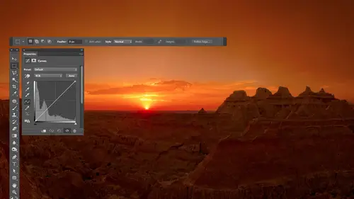
this one was captured in the galapagos islands and if you look at my layers you'll see him stack up there let's take a look at it unfortunately the bottom layer is not a smart object so I can't double click on it and show you the original raw settings because I don't have the original rough file with me at the moment I find that I end up having the bottom layer a raw file very frequently part of the reason though is for teaching it's always nice to be able to double click and show all the way back to the original it's less critical to do that in actual work so I got an option click on the bottom layer within this particular file so you can see what it looked like when I was done with camera and then I'll turn on the other layers and will see the difference between the raf version you know the process draw in my end result you see quite a difference I found that some people when they looked at this picture didn't notice there was anything alive in it really were you just showing two the...
y're like oh that's nice you know and so I wanted to do something to make it more blatantly obvious that it was something in there and I probably find to this again but when you look at it here you might I think it's a bit much kind of thing but the main time you think that is when you see before and after if you never saw that before then usually don't think about it it's much so anyway let's build this one up so first off when I look at this image my I went all over the place because there's so many things to look at and also if you look at how many areas are colorful uh look at all the blue that's in the water it's kind of pulling you away from what was really the subject for me which is the person of the thing that's on stage here you go on and so I wanted to do something to make it so my I was pulled like a magnet to here and not distracted by other things and so the first thing I did is I didn't like this thing I would flick up there just to see what it wass wasn't that interesting and then it would come back down but then it would flick back up their just cause there's something there so what I did in this particular case is I selected the left side of the photograph with the lasso tool just like this I copied it to its own layer you know a command j and after I'd done that I went to the edit menu and there was a choice under edit transform called flip horizontal we just flip vertical earlier to do a little reflection of something well I flipped it horizontally and then I moved it over so it covered up this area on the right and that's what's in this layer but when I covered it up on the right if I turn the eyeball often on like that the shore started to look the same on both sides so I added a mask and I painted on the mast to limit what how much of the short it could cover up and so when I turned the mask back on then we get more of the original surf that was on that right side so if I turn this off and on now you see it's only up where the clouds were and in fact it looks like I should possibly paint right here where there's a little white clouds still sitting there then I started wanting to get your attention down to where the iguana is and if I want detailed a pop out you guys know how to make detail papa two dots on a curve make it steeper between them right and when you do two shots on a curve you add one dot for the bright area of whatever surface you're thinking of one for the dark area make it steeper you had to decide how to make it steeper should you move things up down or both and when you just glance at the subject that usually will tell you in this case when I look at the iguana I wouldn't want to darken that thing look how dark he is already so I ended up adding two dots and moving the upper one higher and this is what I got now I had to limit that so it only affected the iguana and that was the most difficult part of this entire picture is getting a selection or a mask that was accurate enough to be around that edge because if I just use a soft edge brush and paint there it's going to go beyond the edge too much it'll look kind of glowy around the edge so in this particular case I needed a pretty accurate one so anyway I ended up doing that if I double click on this curve I bet you it's two dots one of them has been moved higher yep so that's the dark part of the iguana locked in that's the bright part and brightened then the next one if I look at it it looks to me like it affects everything except for the iguana who's black means don't affect it and so my assumption and I'm not absolutely sure though I might actually be making thie rest of the image have less contrast either that or I might be darkening one of the two because your eyes drawn to things that are bright your eye likes things that have detail and all that and I'm going to take where I don't want your eye to look and make it have less contrast or be darker so let's see what I did I don't remember darker is what it looks like to me that's most likely one dot there's a small chance is too because after pulling one area down it might have noticed another area get too dark so what double click on the curve it's one dot then we got another one this is a vibrance adjustment layer in vibrant sends up making your image more colorful where less and in this particular case if you look at where it's targeted by looking at the mask it's getting the iguana and so that tells me I'm probably going to make it more colorful because your eyes drawn to color so it's not a big change let's double click on and see what it is that's plus thirteen just a little bump uh it probably started looking unnatural when I brought it up higher but it's just this little iss hint of more yellowish gold in it but not much then here is a vibrance adjustment layer if you look at where it affects the image by looking at the mask it's the bottom portion of the image everything except for the iguana my guests make it less colorful the sky's not effected cause this guy's black and that's because this blue water here is distracting me from my subject I probably lowered the vibrance all the way down and then slowly brought it up and said what's the lowest setting that still makes this look at all natural you see that look at the water above into the left of the iguana see you getting less colorful and therefore you're going to be more attracted to the guanacos it's more colorful then I have a curves adjustment layer that's affecting the same general area and I'm assuming it's going to most likely reduce contrast but I'm not certain yeah it took the highlights the bright parts the background and darkened him up it's probably two dots the upper dot moving down its wonder it's more this is what I do sometimes devyn yet to darken the edges um but so that's dark ended up trying to make me want to just pop right off that background then finally there is another layer this is a retouching layer my final retouching and I just noticed tiny little areas near the top that don't quite look like they blend in so that ends up I can only see it in the upper left little dark speck being retouched out it's just right in those spots uh doing that so if you look at this starting from the beginning image before the iguana was something that you looked at but I looked a lot of the color that was around it and everything else where is in the after my eye goes boom iguana and then it clancy is a little bit around but it goes right back to booth the iguana not sure if it does it for you or not and I don't know that I'm done with his image I haven't printed it and started messing with it I might mellow out a little bit on my iguana after I'm looking at it right now but hopefully that gives you a sense a little bit for how I think about directing your eye to something your eyes attracted to bright colorful so whatever you don't want it to look at make it the opposite of that dark less colorful in your eye will usually linger where there's a lot of detail so you know you might want to sharpen your image selectively so that you only get the subject sharpest that kind of stuff here's another image this one is from the neon bone yard in las vegas here we're in photoshopped there's only two layers the bottom layer it has that icon on telling me it's a smart object so that means that I most likely did most of the work in camera let's double click on that this might have been done with an older version no it looks like it's this version and but what's odd about it is when I double clicked it didn't show me what it looked like I'm actually slightly confused when I double click usually it would show me exactly the way it looked in photo shop and it's not showing me right now all of these airs zeroed out which doesn't make any sense I've never had that happen before so I'm not certain what's going on in this particular image where it suddenly is that default settings but you can see what the original raw file looked like because these air zeroed out so this is what it looked like out of the camera and to me it looks a little bluish in here it's lacking contrast overall and it was all boosted up to get to this from within camera and then after doing that camera the main thing I did is just simplify a little bit more here and so when I look at this I like the shape of this s just the curvature I'm just going for shape but my eye went to hear that little detail on the edge it popped over here for a minute and it popped over here and when I went to those areas there was no payoff visually when I got there everywhere else there's payoff I'm like yeah cool curve cool thing you know and so all I did was come in and paint with black simple fine get rid off that's pulling weeds and get rid of that stuff but I needed to make sure that what was surrounding it was black already by doing it in camera if it wasn't black already I would've need teo to use something like the spot healing brush so it blends in with its surroundings it's not quite black but simplified it you know how we talked about hdr how we can emerge multiple images sometimes I decide not to use hdr I just feel like blending the the exposure's manually in this is an instance of that ah let me show you what a few of these things look like these were shot in iceland s so here's one capture and then I got this one which is darker I just liked how the certain portions of this looked when it was darker and then I have this one which is much brighter so it's like an hd our exposure but I decided to manually put them together instead have photoshopped do it so let's see what I did I took the darker one put it on top and I just turn this on and off and said where do I like it better in the darker one and added a mask and painted there so let's see where I ended up using the darker I ended up using it right there which is where we see into the distance if I turn it off you see that before the sky was a bit bright where it was tryingto almost like blown out in afterwards it feels like it have more detail make sense now if I turn off the mask let's see what the iceberg would have looked like in the far distance that's in the water see it's a little dark so I didn't end up applying it to the iceberg that's why there's a little hole in the my mask so that you see little hole where I didn't use it on the iceberg then I have another one of these layers alternate on and this one I used for the rocks so you see the rocks at the bottom if I mask it let's see what it's adding to the image before after just bring a little highlights in so sometimes I feel like doing that where I'd wanna manually put it together now let's see how it was built up using adjustment layers so here's a curves adjustment layer it's affecting the upper left corner I can tell that by looking at the masque turn it on and you see how it's just darkening that just trying to keep your attention more towards the middle of the image get another curves adjustment layer working in the left side and that's also darkening a little bit just a different amount got a few little specks it looks like down near the bottom we curved and that's pulling out those little jewels that air sitting there loose that I didn't even notice until I brought out their contrast another one here that works in a tiny area can't quite tell what it's doing let's see where applying clicking that layer and hit the back slash key to get to the mask oh it's that iceberg in the distance that's where I gotta look so if I trade off and on its very subtle it looks like it's darkening the dark part got another one that's going to affect the right side of the image this one is a human saturation adjustment and its mellowing out the blueness on the right side you want to see where it's doing it it's right in that area I just felt that that part look too different than the rest of the image so it smelling it sometimes the changes are subtle here's a curve affecting somewhere near the lower right I can't tell where to look I hit the back slash he hits the bottom edge of that iceberg let's see what it's doing ok it was just a little bit bright I'm darknet that's a tiny change probably wouldn't notice then finally there's one other adjustment it's an adjustment I don't think we've talked about it's photo filter photo filter just means let me choose a color that you're going to push into my picture as if I had a colored filter in front of the lens of my camera and so I could choose the color and push it in there and let's see where it's doing it ok to see where it is okay so now let's turn off not okay that was kind of more it almost looked gray scale in that area before and this is just shoving a color in there what I did is I did a photo filter adjustment layer and I could just click my picture to choose the color used I just choose to color from where it didn't look greyish to do that so let's look at before and after from the original raw adjustment to this end result I don't know that it's going to be a dramatic is some of the others but you see how it is fine tune so sometimes you either don't feel like doing the normal hdr or for some reason you do the normally charge just doesn't look the way you want it teo and so you might just stack those layers and manually mask them it'll take you a lot more time but sometimes you like the end result better but case you don't know what it is is two melted down icebergs you're looking through underneath to some water in the distance and if you ever go to iceland be sure to go to the lagoon that's if you're looking at the map that's a little bit east of center on the bottom edge of the country it's gorgeous lagoon full of icebergs they all float out towards the ocean and then they'll their log end up on the shore and it's gorgeous and finally here's a relatively new image in this image I created for walk come the people that make graphics tablets because I tried out there sinti companion tablet it wasn't actually the one I use now it was one that was a stand alone you can't hook it to your to your mac teo connected instead it's on ly a windows tablet it's just it's a windows machine that's built into a tablet and I made this image here is the original unadjusted picture in here is my end result see all the retouching in the background and so that's why we talk about all the retention things we did and anything that we didn't cover today when it comes to that retouching we got three more days coming up in april and so you'll learn how to do the more complex stuff if you look at it even got this rv out from behind a tree and kept the tree yeah so then if I look at how it's built up here I just got a adjusted version but I retouched to get rid of pulling weeds I wasn't sure if I was going to retouch everything out yet and I put it on a different layer to get rid of that I just wasn't sure if I was going to if I wanted it in there black and white adjustment I was trying out in fact I want to try something here quick because there's a chance that some of these layers were turned off when I was done but what's interesting about this particular image is that I applied one particular filter in photo shop on multiple copies of the image s so that I could have it applied in different strengths and then I'm asked them to say in one area the picture I wanted a certain strength in a different area the picture I wanted at a alternative strength and so when this turns back on I'll show you that describe the process so if you look at this what I was really looking to do was to make it so this image looked like a photograph in general from a distance but then the closer you got the more you realized that it's not really a photo at all does that look like a photo and so it looked like it had a lot of texture in it but if I had just applied this filter this is a filter that's in the newer versions of fighter shop I think it's called oil paint and if I were to apply it all the same strength across the whole image it looks overly generic what I did is I had a three or four copies of this and I applied a different strengths in different areas and then I'm asked it in when I'm asked it I let the original rivets show through said that you have some fine fine detail that that filter wouldn't usually deliver for you and you can see here you can read that where is usually that would be overly painterly because of the filter you can see the detail in the keyhole because I'm asked it to say don't allow the filter to effect right here and I used a different setting of the filter on this really detailed piece that I did out here where it's all general asked different setting over here on this s so that I can mix them all together so that I thought it looked a little bit more interesting as they came around this but you can see that I get the little bitty details to be the original photographic ones and then have the painterly just where I need it and then to have this stand out from the rest of the image you put a texture on it the texture is not being applied to the trailer it's only being applied to the background you see this kind of feel of a texture and that texture had a yellowish feeling to it as well because I didn't d saturate it and it ended up dark and I'm asked it though so it didn't affect the trailer at all and you get a sense for kind of the end result but this is a more complex image this is more of the creative kind of techniques were going to do and the next three day class that is in april so on this particular class if you think about what we've done we started out with some really relatively basic things how do you look at your images and bridge and then we progressed into adjusting it with camera we progressed into working on isolated areas in camera raw then we progressed into things we couldn't do in camera or not convenient I concentrated on what I considered to be the most important adjustments the ones that I use truly day to day after using funder shop for twenty years which ones are worth ignoring so that you can concentrate your learning on the ones that are most important and you've learned that for me at least curves and human saturation khun do most everything you saw me open a lot of pictures where you might see fifteen curves layers in there you didn't see much else alluring curves in human saturation then we talk about pulling weeds with retouching doing a little bit of creative stuff and putting all of that together is what gets you from what can be a pretty boring looking picture on the back of your camera or when you first open it to something that might really shine but it takes some time to be able to progress through it so you guys have questions comments we got questions let's go for it so then do you think in photo shop when you are taking photographs when you're out there taking photographs yeah do I think about what do you think in photo shop what I'm in when I'm out taking photographs I'm not necessarily I don't think in photo shop no I just think visually okay what do I want my end result look like ok I don't care if it's gonna be photoshopped or any other tool to get there yeah but I do try to think about the end result when I'm out shooting and I do change the way I capture my image is because I know of what I'm going to be doing later and that's what we're going to talk about also on the next three day class in april is how do I think differently in the field because I know I'm going to be doing things digitally
Class Materials
bonus material with purchase
Ratings and Reviews
a Creativelive Student
This is one of the best courses I've taken on any topic, not just PS or photography. Ben is a fantastic instructor. He introduces a new concept and then reinforces it with great examples and with well done repetition of key points along the way. Really really impressive. He does a super job of finding analogies to explain the concepts that underpin key parts of PS (e.g. comparing curves to a series of dimmer switches) and also teaching tons of super useful keyboard shortcuts in the midst of showing larger processes. Excellent.
a Creativelive Student
Very authoritative and informative class. He commands PS and shares what he knows in concise and precise methods. It was too much for me to keep up with. I am not a techno guy and I decided early on that buying this course, and his next one, was what I needed to do. I watched the whole course and tagged a few areas to review. OK, a LOT of areas to review. Great job and I am looking forward to part 2 in April. Thanks for presenting these courses as you do. I a guy who sure wouldn't gamble on an unknown course, so previewing it is the way to go!! Good luck in your venture. I am looking forward to more great classes from other great photographers. Keep up the great work!!
Walter Hawn
Hurray for Karen and the detailed notes! I understand now why it took awhile to get them together and up on the lesson page. A superb job. Ben teaches well and Karen's notes finish the job superbly. -- And the collection of keyboards shortcuts? I'm almost tempted to say it's worth the price of admission, by itself. This is, by far, the best organized, best assembled, best presented Photoshop course I've seen. I just wish I'd encountered Ben, back when he was actually writing Ps books. Would have saved me much aggravation.