Photoshop: Shadows and Highlights
Lesson 16 from: Photoshop for Photographers: The EssentialsBen Willmore
Photoshop: Shadows and Highlights
Lesson 16 from: Photoshop for Photographers: The EssentialsBen Willmore
Lessons
Day 1
1Adobe Bridge: Basic Navigation
33:58 2Adobe Bridge: Organizing Images
47:54 3Camera Raw: Basic Sliders
18:24 4Camera Raw: Adjusting for Exposure
32:10 5Camera Raw: Adjusting for Contrast and Color
21:45 6Camera Raw: Localized Adjustments
40:44 7Camera Raw: Optimizing an Image
43:52Photoshop: Work Flow Options
33:15 9Photoshop: Resolution
25:55 10Photoshop: Quick Overview
18:41Day 2
11Photoshop: Black and White
17:46 12Photoshop: Focus Bracketing
36:09 13Photoshop: Panorama Stitching
27:17 14Photoshop: Curves
41:40 15Photoshop: Curves Continued
27:58 16Photoshop: Shadows and Highlights
14:52 17Photoshop: Curves for Colors
34:13 18Photoshop: Hue and Saturation
39:43 19Photoshop: Adjustment Layers
37:44 20Photoshop: Adjustment Layers Before and After
38:13Day 3
21Photoshop: Layers
39:27 22Photoshop: Layers - FX and Masks
38:42 23Photoshop: Compositing
31:59 24Camera Raw and Photoshop: Retouching
35:35 25Photoshop: Retouching Continued
31:47 26Photoshop: Content Aware, Selective Focus
23:06 27Photoshop: Textures With Layer Masks
31:08 28Photoshop: Creative Treatments
16:24 29Finishing Techniques and Workflows
31:06 30Finishing Techniques and Workflows Continued
22:40Lesson Info
Photoshop: Shadows and Highlights
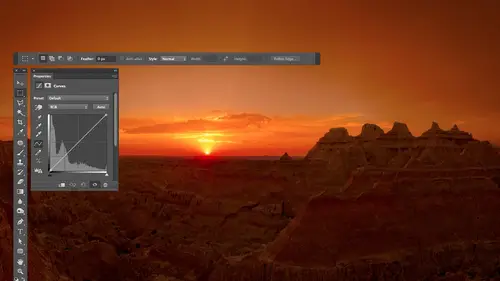
on occasion you will find that curves will be difficult to create a smooth transition between a really really dark area in something bright the surrounding it in order to do it you need to adjust the dark area and then get a smooth shape on your curve going into the rest of the image in sometimes that just is difficult for certain images it's you know five or ten percent of the images I run into it and when that's the case I will often switch to something else and so I wanted to show you that something else so I'm just gonna open an image and know that with all of these images I would usually have already adjusted them in camera and I would try to get the most I can ever get out of the image within camera before I open it with every single you image you ever seen me work with some of the images I won't be doing that with simply because then we have an image that has problems that need to be solved and I'm going to show you how they could be solved with curves but just so you know some ...
of these the same images could have been fixed within camera and that's where I would prefer to do it I tryto do as much as I possibly can to the image in camera first because that's the only place where I could look all the way back to the raw data that might camera captured and get us much out of it as you can once it's open in photo shop a lot of processing has happened and there's no way to get all the way back to the pure data that the camera grant grabbed so let's take a look though at an alternative to curves when you need to work on a very dark or bright area I'm gonna come up here choose thie image menu and choose adjustments because this particular adjustment is not available as an adjustment layer so I have to go to this menu to get it there are some limitations of adjustment layers and there's a technical limitation of it where it needs to be able to figure out what to do with any individual pixel within your image without having you know with what surrounds that pixel it's kind of a weird thing with the justin players in this particular adjustment has to know what surrounds the dark areas to figure out how to blend them with it so all you have to know is there's a technical reason they can't make it an adjustment layer on what it is is shadow highlight so let's take a brief look when I choose shadow highlights it looks pretty darn simple to be n with we have a slider for shadows and a slider for highlights and with this if I move the shadow slaughter up it's gonna brighten up my shadows if I move the highlights letter up it will darken up the highlights uh with this and it looks like it's pretty darn simple the default setting has the shadows turned up I think to around twenty five and all that the problem with the default settings and using it when it looks simple is you don't have any much control it feels more like you're using something like brightness and contrast where if it doesn't quite do what you want you're just stuck with it but that's not the case there's actually more to this dialog box than what you're seeing right now but before I turn on the checkbox called show more options where it's going to start looking complicated just remember the essence which is this a slider that controls how bright the shadows are then a slider that controls how right the highlights are now going to turn on show more options and let's see how we can get control over this thing there's a lot more stuff in there but we still have the amount slider for shadows in amount slider for highlights so we just gained two additional sliders for each one of those things let's take a look at what they are in fact it might be helpful let me see if I go find the image that we had the other day when I talked about I think it was camera I had this simple image remember that thing it might be useful to have that up I'm gonna choose image adjustments shadow highlight and let's for now just play with shadows I'm gonna bring up the amount slider and you can see that it's attempting to isolate the dark portion of the picture from the rest and so it does not really affect the bright stuff makes sense from what you're saying notice that doesn't matter how far up I bring this if we have black in the picture at the moment at least with current settings it stays black which is actually rather important because some adjustments and photo shop of you brighten things up anything that would black would be black would brighten up with it and it doesn't look so good you lose the contrast that you had in your picture so it's nice that black a stained black now let's find out what total with does so watch this image and what I had just tunnel with uh it's going to limit where the image is being affected let's just see if we can figure out what it means when it's turned all the way up now watch what happens when I changed my amount just look at how much of the image changes do you see how far it's extending when I bring this to the extremes I can see changes up to here can you sell it that it's going that far with the changes whereas if I bring total with way down let's bring it down to ten percent see if we can even get a change at ten percent now look at what is changing and look at how far it extends into the rest of the image tonal with means what with of tones should we effect from black toe what from black to eighty percent gray is that what you want to just it from black to fifty percent gray from black to what how far should we extend into the mid tones or bright parts of the image is what tonal with is talking about so as I lower it you're limiting the adjustment to the deep dark shadows in the image and as I bring it up you're extending the change into the brighter and brighter and brighter areas so it's a matter of how can I isolate that dark the thing I'm trying to change what range from black upto what should we change so that's what total with means and we also have a total waits for the highlights so for adjusting the highlights from white down toe what shade should we affect the image that's what talking with means then I'm going to make an extreme change to this and let's see if we can figure out what radius does it's not quite as easy but hard to tell what what's happening is it's doing an interesting thing with the transition between one shade and the next if you look at just one of these little bars of gray you'll notice that if the radius is low compared to the radius being high the transition is spread further across this distance um and it just creates a different transition so let's try this on a picture I'm gonna come up here to shadow highlight and in this case I want to work with the shadows because they think the kid was too dark so I have my highlights zero nothing's happened the highlights at all right now we're going to concentrate on our shadows the first thing I'll do is all just the shadow slider until the kid looks approximately the brightness I want and I always try to move it too far and then back off because you just never know if it's going to still improve the image to go even brighter okay then once I figure it out the overall brightness I want now I'm going to see how much could I limit it into the shadows trying to get just the kid and not a lot of other stuff so I'll bring the total with all the way down and I'll notice that hey that's not enough I'm not affecting the kid so I need to bring it up and tell the kid gets affected and I try not to bring it up too much higher because then you see how ah lot maura the images affected so I can try to find the lowest point that kid it's what I need I might bring it to about there just to try to limit it so it doesn't affect too much of the rest of the picture then to find tune the end result we have radius which just control some of the transition and we'll make it look different so I just swing it low and I swing it high and I see what so I think gives me the best looking transition I'm looking at the kids that's why I'm making the most changed to the image in saying the transition from the kid to the surroundings and the kid overall what makes it look better a low radius ah hi radius if you go quite higher it looked quite different so uh maybe I like it about there huh the personal choice everybody has a different idea of what they want their image to look like then on some images I might also want to adjust the highlights but most of the time I go to shadow highlight it's one thing I'm thinking about either it's shattered detail I want or a highlight detail but on occasion I get both in this case we have a lot of really bright areas and if you look at this bright area it's kind of hard to see the detail there so I could take the highlights slaughter and pull it up to get it to darken the highlights looks kind of artificial once I bring it up quite a distance some to bring up only a small amount and then all just the tonal with to say how much of the image should be affected I'll bring it all the way down and then I'll see what's the lowest setting that still allows it to get into the area that I was thinking about and I have radius again to control the transition and just the overall feel for that to see then at the bottom we have some extra stuff it's optional but if we're justine the highlights in the shadows what's left is the mid tones that stuff in between the shadows and highlights and we have a control called mid tone contrast which simply means what should the stuff that we didn't to just look like so I could swing this one direction swing in the other direction and now we're controlling I mean it's going to control the whole image but it's thinking about everything in between the shadows and highlights and I can just kind of fine tune that whole feeling to my liking color correction I think is an odd name because of what this does but if you bring this up you're going to get more variation in color larger difference between different colors and as you bring it down things will become more similar to each other and so I could bring this up and say exactly how much of that dough I need if any ghetto looked away like then finally at the bottom there are choices of black clip in white clip and what you'll find is that with a lot of images if you have let me click okay here to get a different image open if you have any images that are lacking contrast you will find that the moment you go into shadow highlight they're going to radically change when I'll show you why whom do you see a change I didn't move a single slider although the default of shadows was there when we bring it down so now this is set to zero you gotta have it not at zero it has to be anything but zero and then suddenly just get this toe one it's like a dramatic change in the images like what's going on turn preview ofthe before after one shouldn't do that much that's on ly because when you get these to be something other than zero this setting right here kicks in black clip in white clip what do they do well black clip makes sure that the darkest part of your picture has black in it so if we didn't have anything close to black in the dark part our picture suddenly it's snapped the darkest part to become black and if we didn't have any white in our picture the brightest part of the image was instead of medium gray this is going to snap it to end up with some white in the image so it's gonna automatically had some contrast to the image for those ones that are looking rather um what's the word just kind of dull the number that's their means what percentage of the total number of pixels that make up your image should go to black or white should it be a speck or should we go big enough to get a blob and oftentimes I want to bump those up especially for the black bring it up maybe do point three it will be more aggressive and get ah a larger area in this case I actually got to three instead of point three but you could come in here and if I put higher numbers in here you'll just find a larger and larger areas going toe to black so just that I haven't really messed with shadows and highlights is kind of putting that in there but I don't go to shadow highlight just to get this because there are other commands that would do that for me if I go to the image menu and choose it here there's auto contrast auto tone those kinds of things would do similar stuff for me so I only go to shadow highlight when I want the shadow or highlight detail but just so you're aware it automatically uh messes with your highlights in your shadows and if he didn't want to you could set zeros in those fields see there's auto contrast would have just done it I don't need shadow highlight for that so if I end up having any difficulty with curves you know I got an image and for some reason that image when I try to get out of the shadow detail here or highlight detail here the transition looks on or something like that and it just can't look natural that's when I come over here and I go to shadow highlight and I use thes sliders as an alternative but it's on ly on five to ten percent of the images where I really find a need teo yeah and then here I'll go to midtown contrast to affect everything else let's see I'll turn preview ofthe before after seo got more shadow detail more highlight detail on this stuff but that's an alternative to curves it's not really by any means a replacement for curves it's just when it's difficult to accurately get into your shadows or your highlights isolated and make it look good I had there
Class Materials
bonus material with purchase
Ratings and Reviews
a Creativelive Student
This is one of the best courses I've taken on any topic, not just PS or photography. Ben is a fantastic instructor. He introduces a new concept and then reinforces it with great examples and with well done repetition of key points along the way. Really really impressive. He does a super job of finding analogies to explain the concepts that underpin key parts of PS (e.g. comparing curves to a series of dimmer switches) and also teaching tons of super useful keyboard shortcuts in the midst of showing larger processes. Excellent.
a Creativelive Student
Very authoritative and informative class. He commands PS and shares what he knows in concise and precise methods. It was too much for me to keep up with. I am not a techno guy and I decided early on that buying this course, and his next one, was what I needed to do. I watched the whole course and tagged a few areas to review. OK, a LOT of areas to review. Great job and I am looking forward to part 2 in April. Thanks for presenting these courses as you do. I a guy who sure wouldn't gamble on an unknown course, so previewing it is the way to go!! Good luck in your venture. I am looking forward to more great classes from other great photographers. Keep up the great work!!
Walter Hawn
Hurray for Karen and the detailed notes! I understand now why it took awhile to get them together and up on the lesson page. A superb job. Ben teaches well and Karen's notes finish the job superbly. -- And the collection of keyboards shortcuts? I'm almost tempted to say it's worth the price of admission, by itself. This is, by far, the best organized, best assembled, best presented Photoshop course I've seen. I just wish I'd encountered Ben, back when he was actually writing Ps books. Would have saved me much aggravation.