Lesson Info
21. Pairing Textile Elements for Success
Lessons
Day 1
1Class Introduction
10:02 2Color Models 101
26:46 3Color Schemes 101
45:39 4Debunking Color Fears
44:02 5Debunking Color Fears Pt. 2
25:23 6Evolution of Tobi's Color Style
42:37 7Evolution of Tobi's Color Style Pt. 2
44:12To Trend or Not to Trend
12:47 9Color & Design Trends
31:36 10Color & Design Trends Pt. 2
25:37 11Tobi's Color Inspirations
22:09 12Tobi's Color Inspirations pt. 2
23:29 13Using Inspiration Boards & Q&A
19:43 14Psychology of Color
36:34 15Color Meanings
17:04 16Psychology of Color Q&A
12:55 17What to Consider Before Choosing a Color
26:20 18The Right Color: The Entry & Living Room
19:27 19The Right Color: Family/Dining Room & Kitchen
21:19 20The Right Color: From Bathrooms to Outdoor Spaces
20:05 21Pairing Textile Elements for Success
28:49 22Pairing Wall Color, Pattern & Texture
24:42 23Floorings, Furnishings, Art & Lighting
19:04 24Intro & Top Color Palettes: NYC Showhouse
24:41 25Top Color Palettes: Hampton's & Richmond Showhouses
21:31 26More Top Color Palettes
33:46 27Layering Color Palettes in Your Home
38:16 28Transitioning Color Palettes in Your Home
28:08 29Historical Overview of Color in Design
16:47 30History of Color in Design Examples
43:59 31History of Color in Design Examples Pt. 2
16:32 32Color Mistakes to Avoid: 1-6
31:20 33Color Mistakes to Avoid: 7-10 & Final Q&A
40:06Day 2
Day 3
Lesson Info
Pairing Textile Elements for Success
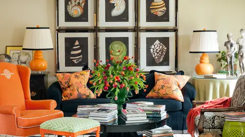
I'm just laughing a little bit internally because my goal here is to make all of this not complicated, but have we had a section yet that I didn't tell us how complex this relationship was, but it's true, because we were just talking about in the kitchen because these ladies were saying, oh, we wish you could spend more time on every single image because there's so much to see in a space, and there is so much to see and there, sir, so many layers and so many details and so many ideas, which is the fun part about sort of uncovering and discovering what's happening when you study rooms, but ah lot of that interest is achieved by a perfect mix of color and pattern and texture, and we've talked about that ah lot just with regard to why something has depth there had to make a monochromatic spice interesting, but have we really broken down rooms and talked about the specific color and pattern? Not quite yet. So that's, what we're going to do do now, so really achieve those design goals you h...
ave. You need to know about how to use that pattern and texture. Along with your color are maybe in spite of color sometimes in a neutral space even teo achieve the results that you're looking for so that's what we're going to talk about right now so because of the white color works visually it can't be truly understood separate from the texture and the pattern of something and you know that quote I gave earlier about yellow and and the author of the quote was saying a yellow set and I think he said but we could start envisioning the difference in a yellow flat wall paint versus a yellow set and it's completely different it's not even close to the same thing so what? What are we talking about? Texture is the feel the appearance and the consistency so it's multi sensory it's not just what our eyes perceive but our eyes can't even perceive that appearance piece that sheen of say, a silk or satin and you know when you touch it you can envision already and imagine already what it's gonna feel like to the touch right so it's all of that together which is why I say it is again a complex relationship and then pattern is a repeated decorative design anything from a floral to a stripe to a polka dot to a damn isc or any other thing in between there's also sorts of options of patterns so let's see how both texture and pattern start coming into play and interiors I'm so specifically for me a lot of times we're going to talk about as we said, well paper and a little bit, but a lot of this is a cheap for me personally in my spaces and the spaces that designed for clients through the use of fabrics and textiles, which is what you love right is so much fun, so your total fabric scheme will have a major impact on how your color palette is applied to the room. So some things to remember varying the scale of different patterns in your space is going to be really, really important. So just envision, say, even in your wardrobe, if you had a blouse that was a huge floral and a pant that was a really wide strike, you're going to look a little clownish, right? A little comical, not interesting pattern overload visually, visually over of versed stimulating to everyone that passes you on the street so just too much and the way the trick for really making pattern work in a space is really deciding which piece you want to be the most prevalent and maybe for you that is the most bold piece I don't know for me it often is on dh, then varying this scale of the pattern all the way down to some solids if that makes sense to you, we're going to look at some examples of what that looks like so for me, I think in my work and many of you are going to find this to be true for yours scale is possibly the very most important element to successful pairings of fabrics, not their content, not their color, but really they're scale a lot of time. So if you become really skilled, impairing fabrics, yes, you could break these rules remember, we've learned the rules so we know how to break them. But for those of you who are having trouble bringing a lot of pattern into your space, try not to have more than one fabric with the same scale to begin sort of as you're jumping off point, so imagine like a large scale day miss with sort of a medium scale honey comb geometric sort of like what you're your pants that you're wearing, you know that could be a medium scale, maybe down to a little pin strife and then some solid, and you can see how the variation from a small repeat to something really large could be interesting, and they could help support one another without detracting from are competing with each other, and I usually have the most successful, starting with the largest scale piece first. And deciding where it's going to go so it'll often I love to use this is a paisley but I love to use as you've seen large scale florals and large scale geometric prints and I often like to use them in a big way like on the entire drive free treatment in a space and maybe also bring them over to the sofa pillows just like I've done in this space so those were some of my first decisions when it came to layering pattern in this room and then because we knew in this space we wanted one of those serene retreats and we wanted it to be relaxing then I was very cautious with how much other how many other patterns I included in the room because if I had a pattern on pattern on pattern on pattern it's not very relaxing is it it's a lot more busy and sort of visually noisy so you can see here I have a little pointer yet maybe don't have a little at this point um so we've got the large scale paisley and then sort of a medium scale polka dot and then more much more intricately scaled stripe that's layering in the space and you can see how that's interesting and then the well and even this so if it's hard to say but this has a really tiny little pin stripe as well so you can start seeing that ultimately a lot of the peace is in the room, and the large spans of wall and ceiling are all solid colors. They're not covered in pattern, as opposed to, say, my entry hall that we saw earlier that had pattern everywhere on the wall. So this is one approach to layering down from the largest scale to the smallest and even solids, and really starting to find balance with the pattern and the color, but at the moment, we're just isolating that pattern out to see what that means for this space. So you're total fabric scheme will have a major impact on how your color palette is applied to your room if those scales are different and the types of patterns are different. So you didn't see a whole bunch of paisley's, but all in different scales, right? Wedding giant paisley, baby paisley, tiny paisley that get a little boring as well. So it was paisley and stripes and polka dot and another little strike that's. What starts to make a space interesting? Does the size of a room ever inhibit your use of patton? Uh for mei? Usually not, um, it's more about, eh, an emotional goal or ah or a look, a style goal to me that would keep me from using pattern like I'm not use all solids to achieve a certain style. But not necessarily because of the size of the room. Now, maybe what she's thinking is, is there a room too small for that gigantic day miss cake that was in my entry, right? Maybe on dh it's more about thinking of possibly the ceiling height for a repeat so that if you can't really get much of a repeat, are a really clear picture of what's happening on the fabric it's kind of why bother using it into space? You know what I mean? If it's going tojust look awkward and not really show off the dramatic pattern that is meant to be achieved with but most the time, no again, the jewell box effect says, bring a bunch of bold things into a tiny little space, and that could mean wallpaper as well. So for me now, so again, this is where we start get started, get to start combining thie idea of color with pattern with that emotional goal or that kind of style goal. So if you want a bold result, a cz farrah scales concerned again, we just said, start with a large scale, maybe a floral are geometric, um, and layer it down through the space to create that kind of a dramatic look male there's, two different kinds of dramatic here, there's dramatic scale and there's dramatic color so this room is a perfect example of some really dramatic scale it's a really large repeat in this damn mess here and even in this pillow and on the bed but it almost goes away because we used it in a neutral way sort of like that bedroom we were just looking at that you said didn't really look like a quintessential toby space but because it was all gold and why, even though the scale was so dramatic it was a lot softer and more subtle, right? Had we done it in that room or even this one in red or something really bold, it would have a completely different feel so bold scale is not the same as a bold feeling of a space it just depends on again what choices you make and then if serenity use your goal maybe this is serene because it's got a lack of color or maybe you achieve serenity because you use very little pattern and it's more about solids and maybe those nubby textures like that great mohair we saw on the dining bank hit that starts really adding that cool interest in depth that's really chic and not dramatic so it's much more subtle on your inspiration fabric might really set that tone through the color palette for you, which could make that ah lot easier and what I mean by that is you don't have to do all the work yourself you might get the bold the bold result because you pick a pattern that is full of really high contrast colors or say a floral print that's got every color in the rainbow in that one fabric that alone could set a dramatic tone for a spy nice right if you're learning how to create these schemes I would try to stick to maybe just one floral per space now I often needs more than that and the more skilled you get on the same thing can happen with maybe only stick toe one type of geometric like if you're using a trellis pattern or cut like this you're not gonna want a whole lot of those even if they're all in varied scales pick a couple of superstars maybe a big floral maybe something like this and those were really going to give you enough interest that you don't want a whole lot of different things kind of competing to be the star of the show right and then if the scales are different you can start to get comfortable adding more and more of them as you go there was a reason I was thinking about this this picture earlier with a question someone asking I can't remember what it is that maybe it'll come to me but really this speaks to that pastel palette we were looking at yesterday in trends and again a released large scale this is even a larger scale on the drape it's a day miss been this trellis, but which one do you notice? The one with contrast, right? Because the other just really blends away so again, depending on the percentages, or say, if we had reversed the colors and the day miss had been the coral and wise and the bench, the kind of minty green and white, then it would have been a completely different look. The directs would have contrast, id the wall itself. It would have been really bold. So it is it's all about that placement that starts making a difference in how they're layered in the room. And, of course, all the textured solids helped make it really, really interesting. From a solid silk to a solid wool to a solid mohair. Two solid leather, you know, and you can have a really good time playing with all those finishes in a space. Consider when you have a piece of furniture with quite ornate based, like that sort of feature ottoman table thing would would you consider that a knight vice a patent when you're considering the patent in a room? Definitely can I think that's a great ah, great observation and yes, and a lot of times in this instance I think it is not only a pattern but it's a pattern that is really kind of reflected in the fabric pattern because aren't they similar they both sort of have that little bit of a moroccan flavor to them on they have that kind of movement but yes and a lot of times that's the great point that you're making is maybe your fabrics aren't what's bringing the pattern into the space but maybe it's something entirely different like I can envisioned right now in several rooms where I've used a kind of a fretwork pattern on the front of cabinetry on so it becomes that piece of furniture becomes almost like the fabric of the space and so then we intentionally tone everything else down but yeah that's a great observation fabrics games so the next piece so we've looked at varying the scales marrying the types and then what about varying the material so textures if everything in the room was a linen it's gonna be really boring if everything in the room is silva still didn't get to be the star anymore ah and if everything is cotton itjust khun b really too casual sometimes and just boring and not interesting so you want to mix of all of those and let's talk about what kind of even the psychology piece of what fabric content can do first base so think about what a silk with a really shiny finish adds to worry like what are the things that come to mind like ideas or our moves or con you know concepts that come to mind when you think of silk elegant sexy if it's a really shiny silk or like a silk satin and like we saw earlier on this chair's it could be glamorous or sexy looks your luxurious yeah so what about a wool? Uh people could have all kinds of connotations about that I love well, I love like a wolf uh flannel as if as a fabric in a space that could be very, very cozy or like men's where other people might think boulis you know, a little dull and a little schoolmarm ish and a little library in maybe you know, for a space that they want to be sexy or could it be fabulously sexy because it is cozy like ah wool flannel charcoal so sofa in a space on then lynn and I think is more light and airy and then cotton I would say is more relaxed and fun, right? And then does everybody know the difference? And uh what what a weldon fabric is vs like a printed fabric. So a lot of the things we've been looking at these air just printed fabrics like it's a flat cotton or linen and the design is printed on the top of it as opposed to something that is woven together to create on a loom to create a pattern which a lot of the things you're working with, it sounded like a near textiles are woven textiles that on dh, that is a totally different feel as well, and they could be very traditional, depending on the pattern of the woven, but they're also often hardy and durable as well, so they're great for upholstery like a chair or a sofa. So a mix of fabrics we said, gives a room that kind of death. So even in this you see a silk bed skirt, a linen that cover a solid velvet pink ottoman, and then a silk velvet patterned ottoman within acrylic shiny leg that's a lot happening, and we're looking at a tiny little space, and then we go to a wool and silk carpet and a painted bid. Can you imagine that? That many different things they're playing in that one little bitty segment of a room it's a lot going on there so and then when you add pattern, too, that you have the large scale geometric and then the sort of tone on tone on tone, pattern of the bench at the foot of the bit on then all the way down to this huge scale on the floor, that's really curvy and organic in a lot of movement so a lot of decisions to make in one room and we don't even have any contrast in color there it's almost all simple and plain and monochromatic which I think is really the fun the interesting part of this space is what makes it most beautiful is that it's intricately um put together in detailed so and then next thing we want to think about it considering the proportions as we were just saying of each of those in a space for a balanced so you're going to get a lot different look, if you put a huge scale wallpaper on an entire wall or an entire room or you just put that huge scale damos pattern maybe on the brunt's of two pillows on one sofa completely different result, right? So it's about mixing, making some specific decisions to have a feeling or a look or drama are, you know, elegance or whatever it is you're going for and using both the pattern while all three the pattern, the color and the texture to make that happen in different parts in places of the room and really what I love to do a lot of times with pattern and color is to use it to sort of move your eye around a space and help you notice things by balancing color opposite of a room like maybe on the drapes and then maybe across the room on the other side on the sofa in some way or a pillow so it's all about the proportion and balance in the space so in a lot of my designs and this is you know an option I mean a good example you just look at this space and you see a tenant floral on so you think wow that's a really huge overly busy floral room in a sense at first glance but when you really start studying it look how many spaces in this room have zero pattern to them the entire floor the entire ceiling all the walls and even though the bet the mat was a betting has a pattern tenant tone on tone visually it looks like a solid and then even these little benches air just in like a muslin at the foot of the bed so it reads just like we were talking about yesterday with my color you say you said you were surprised at how many of the walls had no color on them because you looked at the room and he thought oh orange or coral or whatever in your mind it seemed like it was on all the walls well the same thing here in your mind it's everywhere in the entire ring but you really start studying in the balance and proportion and it's really not there's a more proportion of the space that is neutral and solid than anything else another and this is ah a style choice to decide to take something like this, like a floral or a tall and intentionally use it as the only pattern in the space which I also love to do a lot so it's on the drapes it's on the bed is the exact same fabric in the exact same color there's no difference in it, and I intentionally decided to not use anything else, and they're so, in a sense, the way cano was loving that a color becomes a neutral when it's used everywhere a pattern can be neutralized as well are downplayed because it's the only pattern in the room and it doesn't have any other pattern contrast ing it would act, which actually makes it less busy than if we had a stripe and a a little check and a lot of other things being paired with these elements in this space. Toby, do you think first about the different texture, all the patterns, or is it more simultaneous? And I'm a guest part of that will be you have been doing this, you're probably a little more like that than the average person it becomes a little bit more habit. But for me, I goto what I love and what inspires me, and as I've said a lot during this course, I'm really inspired by textiles and fabrics, particularly the patterns of them and the color so pattern and color for me kind of works together a lot of times say on a fat particular fabric. It's got a lot of pattern and a lot of color in it and the texture is sort of the second layer for me. Once I decide that huge, bold floral print or geometric print or whatever is going to really be the wow factor, then I start saying, okay, we got to mix it up a little bit, cause that's all linen say on all the draperies. So now what? Well, let's, bring in maybe a velvet on the sofa, our let's bring in a set, a sisal or natural material on the floor is a rug or, you know, let's bring in even a marble on the top of a table for a different kind of material and say also thinking about mixing up the materials, meaning not just the fabrics in the space, but like I just said, like painted woods and marbles and other things in the spaces, they all play a part in that mix of pattern. I mean, I mean, mix of texture. Another question from jeannie be, what kinds of trends are you seeing in fabrics and textiles? S o a lot of the trends that we were talking about yesterday, but as faras pattern, remember that one little slide where I said I'm seeing a lot of butterflies, which is interesting also things like these, like stags heads like this pillow like a lot of things that are more rested and then of course a lot of them are part of the color trends we were talking about yesterday, like the cobalt blue and the lavenders, and you can imagine some of the well and the hair on hyde, which was very much a tree, a texture trend we talked about and it was just that was also just thinking about in fashion it's also very much coming into trend in furniture. We're both wait wearing leather today, but seeing leather everywhere on all sorts of ways and not just the hair on high but also colored leather and the more simple and sleek and soft sorts of leather as a texture as well. We've also had a couple of questions and I know um, tomorrow you do have a whole segment on the segway from room to room, and since we're looking at patton and texture and a lot of not so much this one but a lot of the images, we're looking at a quite intense in the liar ing how would you justus a general? How would you approach a transition? Would you would you have the sub the room after the adjacent room being more simple than the intensely patent room a lot of times you would so maybe kind of alternating between spaces if one is really really bold maybe you don't want the next one to be equally bold I also think a lot about cannot stand in one place and see both of them at the same time so if literally have to look this direction to see one room and if you have to turn completely around to see this one then that it's a little easier to get away with using two things that are bold because they can't really you know, take away from one another they're not competing as the focal point so also it's it's about kind of the layout of a space to and where you can see them and if it's the same thing when you get to something that sort of related which is patterns and materials and flooring and you know you think about you don't want to see two or three different flooring changes in one space you want something that's a seamless transition so that's a good rule of thumb also for fabrics maybe where they're not competing are overwhelming one another cool thank you and jackie I think he had a question too um yeah, but you answered it e I love when that happens okay? So when we're thinking about those proportions of how much to use, consider all possible applications like we were just talking about there's a lot of there, it's not just the pillows like I love to talk about it's, not just the sofa if there's dre free there's betting there's table linens, there's the walls, the ceiling and the floor and that can mean a lot of different things that could be the the permanently installed flooring, it could be a rug over, um, a flooring treatment or it can sometimes you even see layer drugs where someone would have, like, a sisal or natural fiber rug, and then maybe later, another rug over that so depending on the style you're working in theirs, all kinds of options for layering different materials all through the space, and then we even said things like cabinetry can become pattern even like the panel molding on the front of these cabinets, you know, could read as a pattern that supports part of the scheme. There's a pattern you can't really see it in the front of the woodwork on this chest back here, so lots of subtle nuances of pattern and texture happening all the way through the space from the furniture that it's case good, what we call case against the hardened furniture of the tables, to the upholstery to the fabrics and the drapes and everything else so again that's, where we start getting that complex idea of all the different places that you can see detail, which is why you say let's, slow down, you know, you keep wanting to take it all in there's a lot to take in and sometimes that's, even when I say I like to get all of my old design books out and read him again, you see things all the time that you've never seen before because there's so much to see in a room, yes, so going to suspect the fabrics a little bit and because I noticed when you showed us a lot of the design rooms, issues designed, they also were functional and sad. Briggs aren't necessary, functional for certain people's lifestyle. So is that part of the intake process when you're talking like I know you definitely is and that's a great question, so this is going to be important when you're thinking about fabric content sheens and finishes. So earlier, when I had the chairs that were silk satin for a dining room, most people can't have that in their dining room because you spill on it and it's not very durable, but we weren't putting that even though that client had children. That was not the space where the kids were eating every day there's actually a built in bench in their kitchen that was covered in vinyl. Where the kids eat breakfast, lunch and dinner pretty much all the time and the more grown up space had the more delicate things another thing I love to do and I mentioned it on the nursery we talked about earlier but if I'm a lot of times you can't achieve a lot of pattern and color without using things like linens and cottons that are printed materials and so then what happens when you want to bring that to a space like maybe a kitchen like we're talking about and there's really no place for it to go other than maybe a little small window treatment or roman shade or something that's not going to give a lot of of impact what I do then as I will use a technique that I mentioned of having them vinyl coated and there's companies that vinyl eyes things for you and it's not like the old vinyl like I used on a lot of the chairs like the fifties diner, you know, red bitch kind of vinyl it's like a soft, almost waxy coating that is applied teo a material to make it much more durable make you able able to clean it with a damp cloth and so I do that a lot so on kitchen bank it's when you'll see kind of my signature look of a big floral up the wall a lot of times those air vinyl coated so sticky hands or you know crafts and the arts and crafts and homework and all of that stuff that maybe busy family has is not going to soil those materials and allow you to use them in different sorts of ways on dh then thinking of things like some things are easier to clean than others there's all kinds of synthetic fabrics that have been created these days like micro fibers and things that can really wear well but almost looked more like a velvet or something with a better texture. So yeah so that goes into knowing your goals like is this a hard working space for a lot of people? Is this like just one single adult on we could make everything white and more delicate you know it depends on exactly what's happening there yes, we've had a couple of questions throughout the day on drapes one in particular chase may chase may you nice one talks about the impact of color and patent on drapes in a room especially in balancing the size of the room and I guess stripes have that you're framing a window on the one hand but you're also getting the proportion of the room and changing a portion of a window and so there's several things that I do for drapery sometimes I that's my first place to go to with a big pattern because I want to be able to see a lot of it and dr free often takes yards and yards of fabric and study where I was saying earlier and a little bitty room, you might not get the full impact of sale wallpaper on a little bitty pillow are a small chair. Sometimes you can't get the impact, either that a large scale pattern can really bring to a space. So that's when I a lot of times, we'll say let's, do the window treatment in this to make a statement on the flip side, sometimes I'll decide to put a pattern like you were saying at your own house, like a pattern on this sofa, and maybe we decide to go with a bold pattern and that's when I would do just the opposite and go to the dry paree and maybe pick a solid for the drapery are solid with a little grow grain detail or a little banding her something that makes it interesting, but but really, then they're not competing. So how make a decision right off the bat of where that big piece is going to go? That big pattern or that big impact is going to go? And then I worked from there, and often for me, it isn't in the window treatment.
Class Materials
bonus material with enrollment
Ratings and Reviews
1st Carpet Cleaning Ltd.
Very convenient and creative! Continue In that way!
a Creativelive Student
Fantastic Course!!
Student Work
Related Classes
Interior Design