Lessons
Day 1
1Class Introduction
10:02 2Color Models 101
26:46 3Color Schemes 101
45:39 4Debunking Color Fears
44:02 5Debunking Color Fears Pt. 2
25:23 6Evolution of Tobi's Color Style
42:37 7Evolution of Tobi's Color Style Pt. 2
44:12To Trend or Not to Trend
12:47 9Color & Design Trends
31:36 10Color & Design Trends Pt. 2
25:37 11Tobi's Color Inspirations
22:09 12Tobi's Color Inspirations pt. 2
23:29 13Using Inspiration Boards & Q&A
19:43 14Psychology of Color
36:34 15Color Meanings
17:04 16Psychology of Color Q&A
12:55 17What to Consider Before Choosing a Color
26:20 18The Right Color: The Entry & Living Room
19:27 19The Right Color: Family/Dining Room & Kitchen
21:19 20The Right Color: From Bathrooms to Outdoor Spaces
20:05 21Pairing Textile Elements for Success
28:49 22Pairing Wall Color, Pattern & Texture
24:42 23Floorings, Furnishings, Art & Lighting
19:04 24Intro & Top Color Palettes: NYC Showhouse
24:41 25Top Color Palettes: Hampton's & Richmond Showhouses
21:31 26More Top Color Palettes
33:46 27Layering Color Palettes in Your Home
38:16 28Transitioning Color Palettes in Your Home
28:08 29Historical Overview of Color in Design
16:47 30History of Color in Design Examples
43:59 31History of Color in Design Examples Pt. 2
16:32 32Color Mistakes to Avoid: 1-6
31:20 33Color Mistakes to Avoid: 7-10 & Final Q&A
40:06Day 2
Day 3
Lesson Info
Color & Design Trends
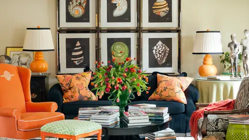
So let's look at some fun trends right now neons and I love this example this is my friend um scott made him what he was actually a san francisco and a designer I had dinner with him last night on what I love about the space is he is the idea of neon colors, but it couldn't be more traditional and you don't really think about that punchy highlighter kind of pink and green and yellow being presented in such a classic sort of way so I love that he turned the idea of neon on its ear because that we kind of think of neon is like totally eighties like vinyl are pleather something you know really cutting edge forward and I love that he said, you know what? It could just be a fresh approach to a classic design detail s o that's what's so fun about this to me and we're gonna let let's look at some other examples of neon just for fun um not just in so we're gonna go out to our pinterest board thiss first image which I love is jonathan adler and he's brilliant at pushing the envelope and really ...
embracing a lot of those retro colors but really those chairs there such a bright, almost highlight or yellow which is so much fun and even that even the blue really leans toward that kind of neilan look but in many ways this this project has a timeless appeal. It could have been, um designed in the twenties, it could have been designed in the seventies. It could be designed today and that's, where we kind of see those trends cycles coming back around. So I love this idea because if you love something that you own, you don't have to get rid of it. Because it's not the latest hottest color of the year, even pan town, the color institute, which I love to follow, comes out now with the color of the year every year and it's been fun and the design and to treat to watch, and this year it was emerald green, which I actually think they were a year behind in world was really strong last year. Ah, it'll be interesting to see what they say next year, most the time they were pretty close toe, I think toe on trend, but the thing is, this is showing you that idea of if you love it, embrace it and leap with it, and it can last for a long time, it could be timeless, but I love that now. Also, we're not seeing in this instance, and we we may see that in a moment when it's mixed with pattern, but you're not seeing the on yellow on all the walls right here, right? You're seeing it on those great accent pete chinese chippendale chairs that have that great pattern on the back and they're so interesting but their area and open so it's a beautiful accent but it's not overwhelming in the space um of course you know here's just some other examples of seeing and nail polish and that's where it's easy to gentle on trin because you could be in tune with your nail polish in the summer and not be over it by the fall which is fun but I think seeing it and interiors is what especially exciting so this is a twelve again not unlike what scott did very traditional but I think this fabric is made by quadri yl and it's a designer named david kleinberg out of new york but so refreshing because it just takes that analogous color scheme and it like turns up the volume can that's how I like to think about sort of some of these transit like it's like it's like green analogous on steroids in a sense but it's exciting and it has energy and it's fresh and it's just a little bit different then this would have been if it was a more classic sort of calmer traditional green on blue so love how it really has energy and even though look what it does for a cool color palette because these air on the cool side but when you have any when it's neon look how much energy they have they're almost electric so it's away tohave energy even in the cool, cool color palette, which is fun um and here's another one while I love this let's look at this so this a lot of times you see designers and people talk about a transition from like fashion to a room, and I think this is a perfect example of proportion of the neon here in the orange and the yellow with a sort of a neutral base isn't that the same method we would use for a room which I think is really clever and there's a room in here that kind of has to the same idea like these two things look like they could have inspired each other to me from the flowers with that pop of coral to the neutral base with this sort of a stripe of ah neon drapery. So isn't that fun to see how the same exact concepts and rules were applied, whether they knew it or not to building this room and building that the dress on the page or on the image before and supporting things like neon, which is really forward thinking with lucite but grounding it and making it more timeless because look how traditional thes chairs are that's another thing I really, really love to do is take something uber traditional like this little french armchair and then again turned up the volume on it because you put a short truce neon leather really fun it bridges the gap to like if you have a really traditional home and you architecturally but you're more forward and our young or fresh that's a great way to speak teo and have point of reference to a traditional architectural space but make it fresher and newer and more unique questions about using neon anybody deal have you have the guts scene yeah maybe the neon question comes into a couple we've had a fancy people talk about people that are renting on what they can do with stuff that is not to their taste in a rental and perhaps how they can radically change that without in fact radically changing anything that would then have to be changed back maybe his name on the answer because it's such an eye catching sort of an application it's such has such impact and while factor and you think about let's look at this room again I mean a rental could be totally bland and blah but this entire room is just that neutral envelope again look it's a boring beige wall and a totally boring beige carpet and now it's not boring at all it's phenomenal with the depth and the interest in the punch and the just that one color is so daring don't you look at that and go oh that sheik that's forward that's progressive that's cool it and we're going to talk about psychology of color tomorrow but a lot of descriptions and ideas come two to the table just looking at how someone used this one color in their space I think that would be a gorgeous way and an amazing way to introduce something exciting to a rental property or a space that you had little control over that what I call the envelope the background that's a great question. Anybody else have it and neon quick question yes what specifically what neon colors have you been using and for your clients? So definitely the yellow has been something in that kind of short truce which is highlighter is you, as you imagine me on it's almost green it's almost yelling also a lot of orange tones and a lot of people are getting really comfortable with orange and have been for a few years so that's away to go howto I really upped the ante on the orange story is to take it to any on and then even I think about the little highlight or colors my daughter likes to buy markers and we love tio by neon, you know markers and so I think about all the colors in the neon set the blue, the yellow, even that line punchy lime green which is like this one right here that we just looked at this one so so almost anything goes but ask probably see more of these tones on the particularly the yellow and then maybe moving towards thie orange a cz the next most popular version aqua blue and the blue tents have been really popular now for several years that I think as I said I mentioned in passing earlier and we'll see tomorrow when we talk about the psychology of color over and above any other color blue is the most popular favorite of all human beings now various shades of blue but that would still apply if if you're afraid to add something like a neil and I think he would probably find this kind of turquoise bright turquoise version would be a lot safer way to dip your toe in that water than jumping off with the yellow kind of short truce version like this right here uh maybe reserve that for most people for your nails or not at all for your for your highlighter for your homework um nicky is saying can use white in a room that receives very little sunlight if so what color would you recommend and I'm again wondering is is neon the answer to a room with not much light well would it be absorbed by the darkness now it could actually be it could be a great punch let's look at it again was it could be a great punch of color and so definitely bring if you really need to see yes, you can you can embrace the jewell box effect in a dark room, but a lot of times we actually need to see for function and at the end of the day we can talk about color all we want but if we can't function in our space, what good is enforcing the older our eyes get the harder it is to see um so certainly wrapping a room just like this one has been done if you didn't have a lot of sunlight in a white envelope and then bring in the neon could be great and if you don't have a lot of of light just from natural light exterior light I think you could sort of mimic that warm kind of sunny tone um this is an example and we can look back at the other room with bringing in those warm yellow highlighter colors because they sort of emanate that sort of radiant sunshine color anyway, they glow a bit right? So I think that could be a fun solution for that but definitely that case that he's talking about maybe an example where you know and again all these ideas you go well, toby said to make small rooms be a jewel box? Well, yes, except if there's an idea that the reason that trumps that so if you truly need to see see and it's the only room in your house you're probably not going to say well, this room is really dark so let's just go ahead and paint the whole thing black because it just may not function for you you could do that depending on what the purpose of the room was if it was a media room and are a bedroom and he wanted to be really dark and great for sleeping yeah maybe you paint it all black but if it's the only space that you need to work and see and and have more kind of tasks happening there you're going to need to be ableto see what's going on so a light wall is a great idea so anybody rages jump off with the neon hopes to eighties for me eyes you know it's definitely and we'll talk in a minute about a lot of my favorite trends that are happening right now are definitely rooted in the eighties including a lot of the pastel color so look at what's happening with you know and a lot of eighties were really strong trends I think they were so memorable and maybe it's just the age that a lot of us are that butt pastels were really part of that time period as well this's ah design of one of my friends were out castle who's a brilliant designer in new york city and I love how he brought this coral to the wall in the past still sort of way the greens maybe a little darker than pastel it's really that wall kind of tone that start sending the the pastel idea in motion here but it's a really fun way to just mix things that to bring in pattering blues and powdery corals and maybe even pinks and I think it's why we're seeing a lot of the lavenders and so, you know, thinking of how you might start to embrace those colors paint peach, aqua, mint green we're going to see specifically some of those pulled out plucked out as a trend on their own and a few more in a few minutes but let's, look at let's, go back to our pinterest board, we're gonna hop around again and look at, um what pastels look like in the world of interiors and beyond other product so for me let's, look at that image I just had pulled up of the pencils there's something that's so fresh too me about pastels. Look these almost even fall into the neon and past still palate a few of those because they're real punchy but it's there's something so sweet and almost like candy that I love it's sort of like the tiffany box that set blue that isn't that that's just a color that people are drawn to there's something about it maybe that's a little bit daring because most of us down embraced these kind of color palette of colors in our home so let's, take a look at what? What that might ah look like in an interior this is even almost to that mob of the eighties which was my most hated color at that time period and I even find myself seeing mobs done in a beautiful sort of way mixed this is mixed with a gorge just great granite so it's just a little bit um more updated than we maybe envision mawf past als to a degree island tonight men um, not necessarily. I mean, they do sometimes have a little bit of a feminine appeal, but it depends on how you use them. Do you all feel like that this room is too feminine for him to be comfortable in it? You know, there's some smart decisions here that I think helped make this not too feminine. The walls aren't pink. They're more of like a beige shirt gray color with these great flannel chairs right here in the gray really helps support and compliment the pink on the sofa. You know, I just did a bedroom recently in all sorts of lavender and purple shades and that was one of the questions and I was like, wondering when we did the presentation eyes the married couple if he would have a problem with it and I was so happy when they came into my office for their presentation and he walked in on a pale purple shirt and I was like, well, this is really a good sign because I knew it could be it could go either way because I hadn't really given them a clue of what I was going teo bring to them so yeah, maybe I mean it's definite depends on you're, as I was saying earlier, sort of your set of life experiences because there are certain people that associate pink or other soft colors is being really feminine and there's other people that are really comfortable, um with it let's, look at this one who and all over jamie drinks clause that he did for a show house that's tones of pink and lavender and e I mean there's definitely I mean a feminine sense about this it's a woman's closet, but I could also see those colors on a wall mixed with rich shark holes or other tones that could have a really, really rich, layered look that was not really a feminine space at all. Can you envision in that particularly this color, even more so than the one that's, a little more pink and rosy and yes, he's sorry, just kind of add to that I definitely feel like in my my bedroom is very purple lavender girl very girly but I think but there's grey and and I think pulling gray charcoal lt's like you mentioned on that I think that really does add sort of ah or richness that that makes it look less feminine and that definitely kind of that gray flannel is associated with like a menswear so it's kind of the perfect mix of family feminine and masculine and I just I think a lot of a lot because of what has happened in men's fashion even with gorgeous colors of shirts and ties and things I think there are a lot of men who are much more comfortable with some of these tones because they've entered introduced it into their life in other ways um let's this's the pink space very, very traditional very traditional space collected kind of quirky and interesting on dh then a peak wall and the thing that's great about a pink wall like this it's it's not really reflected in all the rest of the room but people look healthy and pretty in rooms that air this color the reflection in the space makes everybody glow it looks really attractive so it's actually a really smart neutral color tio go on the wall and people really respond to it well in my experience and you can even go even a shade lighter so ah wife it's really just slightly tinted pink can look really great in the space this one is more monochromatic but really leans tour that looks like a really neutral room. I think this is a very dixon room his a great designer friend and really see how that's just barely blush under in the other tent undertones, but it make csis it's about this whole layering of all sorts of tones of cream that makes this really interesting and almost even has a little bit of ah um moroccan field to me or a little bit of a traveled in global kind of feeling because of some of the textiles and materials and other things that are happening there but ultimately still really considered a kind of a past dale look if there's any other exciting here's just a pop of past dale so the idea of introducing just a piece which I think is really gorgeous and this would be a great way it's looks a little washed out on that screen out and if you can see it but this pillow is ah a pale shade of pink and then these powdery blue chairs but everything else in the space is totally cream and neutral, so again, something that would be easy to embrace and freshen up your space but it's not too scary because two chairs and two pillows it's not that much of a daring leap it's not like painting all the walls pink like the previous picture I love this this sort of is a great representation of what we were just talking about but in fashion I can t you bring in this like either navy or charcoal with that peachy pink and then even that great pop of aqua on her shoe on dh there's a lot of things about this that aren't feminine and you could see how that could translate to a room I think and be a really fun room and depending on how much you used in those colors I mean you could have a pop of those colors or you could literally wrap the wall on that blush and have a charcoal sofa and a pair of awkward chairs and it might be amazing and interesting particularly I love I can envision these even in like an ultra suede in that kind of great texture with the pastel aqua again I don't I don't know if it's just the age thing here that image brought me right back to the eighties with my guests pink overall yeah anyone think it over well sorry if you were of that strange the exact color of them yeah you know and while we're watching this antsy and his wife are at home watching this in bid but one system I fully dressed and I put out there are there any guys that are watching that want to come in on past all whether you love it or hide it and antsy a little antsy in bed with his wife says I love him because everything is so fresh yeah it is so fresh and that's what I think about this space like this is a fun little guesses I don't even know what the purpose of this room is it by a designer named sharon taylor looks like a kind of kid's space to me but I love this because of that same reason like there's something that just draws me in because it is so fresh almost that vintage meant color and the chandelier and that's the pale shade of blush on the table it looks so refreshing to me like I want to stay in that room I feel like a cool breeze is on me when I'm looking at those color so it brings such a mood and emotion do you all get that when you look at this do you all have that almost feeling like the um that the air has been turned on and there and like it's a just like wintergreen if you can imagine that taste so those colors say you pulled that into a bedroom we'll call it a kind of colors I mean that's a white table right? But what color a furniture would you pull? Would you only pull white furniture and with that or what would you think you have to be pretty careful and keeping it pretty soft because that's a great question now here we see a little black and white in this space in black and white could work but the many start introducing a ton of contrast you're going to tell a different story now let's look back at that what? We were just talking about this so that this is a lot of contrast uh and you strategically could look great but if you start introducing like black legs on every piece of furniture and black on a headboard it's gonna add a lot of noise and and sort of break a this continuity of this soft color palette so just be really mindful that's how you introduce it like a black and white rug on the floor that grounds the space and maybe the the part of the bed or if you're in an entry hall like the stair bannister being painted black might be interesting, but I think it's goingto you wanted to be a small percentage if you're trying to achieve this really cool fresh look otherwise it gets really strong now black and blush could be gorgeous together as a very specific contraceptive really high contrast but that's a different kind of decision than a room like this which is all very, very soft here's this is a good example this has some dark a little bit richer version so that's kind of taking tone's intense of these so this is you know pale awkward plus probably black to get into those shades that are darker on it works but it hasn't doesn't have a different emotion it's totally different it's almost a little bit mysterious in a way when you start adding a lot of the rich towns it's fun that's fun to play with the and really to start realizing you can have this one too even has some dark contrasts and it's a little more mysterious or quirky or unexpected so depending on what your emotional goals or you can it's not just baby pink toe have passed still in the space okay so let's look at another we'll go back tire presentation and see what our next trend is there ever being a color combination which was so roar and revolting that she thought note to self will never ever do that thing you asked because almost nothing is off limits for me and it would make me so happy to take something that I thought was so hideously revolting back and say like theeighties and find a way like remember how at the time we thought some things got really bad like kind of a wedge with blue and peach and some things that we were kind of like whoa and then we almost just looked at that exact color by those pattern blue chairs and a pink um pillow on the sofa so it's all in how you use them um and so probably there's, not any color palette that I couldn't make work and make myself really like, depending on how it was layered in straight primaries like if you're given legos blocks, I mean, it would be maybe wishing, well, something you know, that's kind of like very montreal on and we saw that room just this morning that was a red wall on a blue share in a gold ceiling, and it really works so it's all about how you executed okay? So purple by itself, not just as the past still, but really purple, um alone is very, very popular in everything from lavender to ama thiss toe albert jean it's, not just for kids it's beautiful on a bedroom wall it's beautiful in a living room, like we said with some great neutrals or some smoky gray or even a blue it's really fun to change the look of purple with the texture and the content and think about velvet and there's, a big difference in, like royal purple velvet that is not my favorite color but could still work uh, in a lot of instances, depending on how you used it and we're going to look at something just a second to something that's, just a soft, soft shade of lavender eso but I particularly like purple in a bedroom, not just like my daughter's room but even like a master bedroom because it's just a new way as opposed to doing pale blue with something just a little bit different and more fun and unique s so let's look at what the what are pinterest examples tell us about purple we'll have to say purple is purple and green are my two favorite colors personally and what I wear but what I'm curious is this discussion around what we wear and what we're doing to versus how we decorate and it's soft is very different and as a child I never loved purple I wasn't I was one of those you know you kind of either loved it or you did and that was more of a pink sort of girl but I'm really enjoying a lot of purple and interior so here's a room by amanda nisbet who I'd love and that really leans towards almost like a pinky orchid version I love this this would be an easy transition for me it's purple with navy s o rooted in classic details with the navy accents ah but just a little bit different than this is her daughter's room than pink could be it's just a little bit edgier then you go to something like this was just really like that idea of royal purple velvet and it's mixed with green I mean that's really strong but look out every other thing in the room is really toned down that it's almost like that meant pastel color. This is just a little exciting moment, but if you tired of it, it could totally go away because it's not the whole color palette to something like this where it's totally the whole color palette. But again, that's like that's almost purple is a neutral, which I was saying could be really pretty now this is a little more modern of a space, so it may not be your style, but I love the use of it. And then it looks really pretty with this little pop of peach eso part. So this is a complimentary, almost a complimentary color scheme. You know how we think of like the purple and yellow, but if you shift a little bit in the purple and a little bit towards the orange, these air really close to compliments, but they're toned and our tented down with white they're powdery. This falls under the pastel category too, but purple and orange look really, really lovely together. Just that room there and this room is probably quite contained, but see how that wallace hitting off out of the shot. We did get a question earlier, which was about walls that merge and other spices, and it was from pure design interiors who has been fantastic today with really, really succinct and cold questions this one is I reside in the southwest style of architecture typically has the rounded corners in rooms which makes stopping and starting wall colors throughout behind the challenge so she's asking how you treat that top of conditions so you really have to make unfortunately sometimes things don't work for you even though you want to because there isn't a stopping and starting place or maybe there's an opportunity to just put an accent color on one wall behind a bit or behind a sofa or something that can be very contained but happening drawing in an imaginary line down the middle of a curved corner is not an option we haven't done it albright that would be kind of interesting and fun yeah, you know it's kind of like I have people say I want a round dining table and I say well great but your room's not square so it won't fit yours this rectangle and you won't even be able to walk around the side so sometimes we want stuff okay? And for whatever reason it just doesn't work in our home so maybe we have to use it in our next home or some other inn in some other creative way and it might not work for the walls s o sometimes you're constrained by things and that's when you have to get really creative and come up with unique ways to to do something different let's look at him really moody smoky version of purple so totally different look right um richer and really interesting layered tones of purple okay and let's see if there's anything left this with a pop of red so I think that was on the way say boobs that was on a cover of house beautiful probably about a year ago uh and what a statement it says to pop that bright red in the middle of that purple color story so again purple becomes the neutral here looked the entire space is really wrapped in uh yeah, because they didn't want them to stand out in contrast and that's a great example of when people say in whether to paint the molding ah contrast they would really lose something it becomes much more contemporary less um traditional because they painted the show shutters purple if those had been white, big chunky white shutters think it would have looked much more traditional s o they had a very specific color goal in mind there um and here painting the molding on dh you can transition just ride inside of a doorway which looks like they did do that here so that there is an opportunity for a stopping point there if it didn't have the cased opening that wouldn't have been a possibility there so toby within here what are some of the most popular colors right now to pair with purple? It looks great with green um, it depends on what your goals are. High contrast. Think about yellow analogous. Think about everything from cobalt three, rich purples and down to a softer purple. So you're going to get that really layered, gorgeous looking cobalt is really trending right now, very, very popular. Where, over the last few years, it's been a lot of aqua blue on some of those soft returns. Now it is a really royal, punchy cobalt, and we're seeing it in fashion, seeing it in interiors, even on the wall.
Class Materials
bonus material with enrollment
Ratings and Reviews
1st Carpet Cleaning Ltd.
Very convenient and creative! Continue In that way!
a Creativelive Student
Fantastic Course!!
Student Work
Related Classes
Interior Design