Lessons
Day 1
1Class Introduction
10:02 2Color Models 101
26:46 3Color Schemes 101
45:39 4Debunking Color Fears
44:02 5Debunking Color Fears Pt. 2
25:23 6Evolution of Tobi's Color Style
42:37 7Evolution of Tobi's Color Style Pt. 2
44:12To Trend or Not to Trend
12:47 9Color & Design Trends
31:36 10Color & Design Trends Pt. 2
25:37 11Tobi's Color Inspirations
22:09 12Tobi's Color Inspirations pt. 2
23:29 13Using Inspiration Boards & Q&A
19:43 14Psychology of Color
36:34 15Color Meanings
17:04 16Psychology of Color Q&A
12:55 17What to Consider Before Choosing a Color
26:20 18The Right Color: The Entry & Living Room
19:27 19The Right Color: Family/Dining Room & Kitchen
21:19 20The Right Color: From Bathrooms to Outdoor Spaces
20:05 21Pairing Textile Elements for Success
28:49 22Pairing Wall Color, Pattern & Texture
24:42 23Floorings, Furnishings, Art & Lighting
19:04 24Intro & Top Color Palettes: NYC Showhouse
24:41 25Top Color Palettes: Hampton's & Richmond Showhouses
21:31 26More Top Color Palettes
33:46 27Layering Color Palettes in Your Home
38:16 28Transitioning Color Palettes in Your Home
28:08 29Historical Overview of Color in Design
16:47 30History of Color in Design Examples
43:59 31History of Color in Design Examples Pt. 2
16:32 32Color Mistakes to Avoid: 1-6
31:20 33Color Mistakes to Avoid: 7-10 & Final Q&A
40:06Day 2
Day 3
Lesson Info
Debunking Color Fears Pt. 2
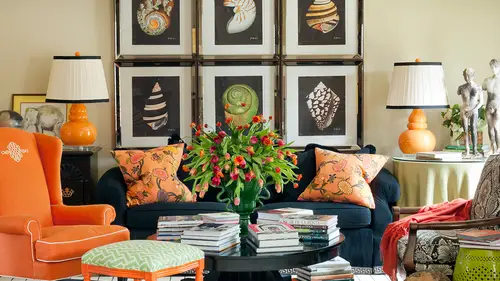
I'm afraid that using color will make my room feel less sophisticated that may be what some of you are afraid of like again and it does sometimes if you don't use it correctly eso color is this color does tackiest tacky whether it's, beige or fuchsia and of course tacky is everybody's personal opinion so you may walk in my house and see that what I do and think oh that's so tacky or vice versa and somebody else might love it so again it's about what you love tasteful comes and all kinds of colors, but a lot of times it has to do with things like we just learned earlier the saturation of a color or if it's contrast id with other colors like sometimes in that entry we were just talking about with that softer version of kind of a coral read it had a lot of white molding and contrast it wasn't like the entire room was red, which might be overwhelming it was beautifully contrast it with the white moldings and so it felt classic and traditional in a way really because of some of the other el...
ements and then another thing that's important is when you're going to go really strong with color, particularly on the wall, you might need to edit a lot of the other what I call visual noise out of the space, so if you're a person who loves lots of things lots of stuff, lots of accessories on the table tops and you know, lots of books in the bookshelves and things over displayed on the coffee table there's a lot of it of stuff happening already you're gonna want to be careful with bringing even more noise that's what people are talking about when they're afraid it's going to make my room fill cluttered and that's why I say it's the clutter that makes the roomful cluttered and you might not think it's closer you may think it's things you love and and if you love things yes, surround yourself with them but they are going to impact your color choices for things even like the wall so if you know there's a lot of stuff going on in your space yeah, you're going to probably back off a little bit on the wall color but if you know you want to go bold with the wall color that's when you're gonna look at everything else in the room ingo what can what can go away what can be edited out what can be simplified? The next thing we're going to look at I love because this is a project of mine that's a show house and as we say beauty's in the eye of the beholder and so this is one that people could say oh my gosh like that's hideous or that's fabulous I'm not offended either way it was a fun show, hasn't it not about whether or not you like the scream but it's really about using this as an example of thinking through some of these ideas now again remember when I say designers do show houses it's sort of like the runway version of the fashion show so you know you see your favorite fashion shows they have crazy hair and weird shoes and all kinds of funky makeup and it's for like a performance it's supposed to look really exciting and different and that's certainly thie idea of a show house and it's also the idea of giving people a lot of different things that they could use individually in their own home so by no means am I suggesting that everybody go home and recreate this uh in your house but it is a great example of dramatic color dramatic jade green hot coral bright short truce, it's it's definitely an example of high contrast so there's a lot of white versus a lot of really bold color on dh then there's a whole lot of layering in the space and that is really what starts adding its sophistication like the walls aren't just painted peach or, you know, a tone of the soft coral there actually actually a grass cloth so you get this great texture um and you know you have like different kinds of finishes in the room from lucite too a painted bright coral leg on the chair to kind of ah ah washed finish on the bed so it's sort of this mix of everything that starts making it more sophisticated so it's not about just saying okay, I want to go bold with killer I'm gonna pick a really bright wall in my work is done here it's about what else is gonna happen to support it and how else are you going to make it more sophisticated with textures? And yes, it's just like you said supported these air these colors are not necessarily what I would choose, but together they look like they've come together like they're cohesive low and they work well and that's what we mean like design and style and all of someone's personal stock in a design style, I guess is what I'm trying to say it's certainly teo each his own but when you can look at a room and start understanding and sort of peeling it and taking it apart, peeling the onion and taking it apart and understanding why this works and the the fabric on the window is balanced by the fabric on the headboard and you know the stripe on the ceiling is kind of grounded in the stripe of a blanket over the foot of the bed and really start understanding how the color moves your eye around the space and how it's balanced and supported that's what starts making it work and so you all may not go create this at all, but you might go home and sam came in to introduce teal on the window and so maybe I should also bring it to another part of the space and maybe I should use this as the dramatic pop of color that moves the eye around the room and makes the whole room really feel like it's teal when everything else is going to be sort of a neutral, you know, so it's it's more about just having a aye that road map and knowing where you're headed with it and understanding it. So this is what I love to do is peel apart things and even little bitty details like the inside of this little cabinet over here, this little chippendale cabinet is painted a pop of green it's so subtle, but if it when you're in the space you go oh, look at that little detail it's green on the inside that's so interesting that's even creating the jewell box effect within that one little piece of furniture. So most of us aren't taking our interiors and our process to that detail and that's why when you look at a magazine and you go, why does that look like that? And mine's not working we're not really we're not taking it to that degree we're not really finishing the job innocence um yeah, so and ultimately when you look at this there's still almost as bold as the ceiling is sort of that neutral envelope of color here because the walls are all kind of a warm neutral the floor is all a warm, neutral and most of the betting is wide as well. So you think by glancing at that that every surface in your mind you think every single service and there is a color or a pattern, but really the largest percentage of the room is actually a solid at a neutral um and that's the only way it works if everything in there was a color or a pattern, you couldn't even look at it, it would be so overwhelming. And so, you know, it's it's about knowing that balance and understanding that here's another great room that's more on that analogous kind of color scheme, so a lot less contrast and it does ultimately I think look a little more sophisticated, don't you? All when there is less contrast but you might not want sophistication, your goal might be fun and cool and young and hip and this might be, you know, the exact opposite of what you want also the texture in the materials tones things down because if you I can see this and I think even ah love you should be able to tell with the tuft ing of the bank it that there's like some texture it's a mohair fabric on all the chairs and on the the bank it so it has that nobody kind of feeling that makes it more cozy and more interesting on it really turns down the almost short truce color that that neutral is um and then in this space the wood towns are perceived this color because look how there um a warm version because there's like a bronze stripe in the drive and it's really reflected in in the table too I'm afraid that using color will limit my other options for the room while it will. So what do we do? What we've been talking about this you have to plan plan plan plan like the pros put it all on paper for ah, and that way you can know what you're going to do even if it's going to be a while before you can phase and other pieces peace milling is going to be trouble every single time. If you're just gonna leave it to chance and hope that it works out, you're probably going to be disappointed most the time when it comes to color, so really thinking about the plan and then another fear is I'm afraid that the look will the room will get really outdated quickly if I use this a color that I love right now. A lot of people think that, okay, well, purple is really popular right now, but what am I going to think about purple in three years from now? Or or I'm afraid just the opposite, like, I really still love hunter green and isn't that so eighties? Well, you know who? It depends on what you want for your house and going back to that who cares and it's it's, you're you're the person that's going to be enjoying the space and to you and all the people that are living there really loved that color and there's almost nothing that is out anymore, just like in fashion, you know, we used to say you will this year, it's the kitten heel, and last year was the stacked heel, so we can't wear the stat teal or the flat, you know, because we have to have a stiletto or a kitten, we'll now in fashion, you can walk in any story any given time, and you can see all of it, right? Because it just doesn't go out of style anymore and things it's cool to bring things back in that we're retro, or that we're you know, some classic look from the past so there's really nothing out of style anymore and there's really nothing that's off limits it's more about how you transition it into the space? Is it balanced? Is it are you using an analogous scheme? Are you going to use high contrast and just really using those rules in that structure to bring it to fruition just like you said you might not choose jade and coral but you might choose I don't know blue and orange and you could have the same balanced look whether or not you thought blue and orange were on trend or not on trend if you loved them you could still make them really successful in your space and really it's about having fun cause I just told you min ago what a trend cycle is now down to about two years you could hardly even get your room finish if you're worried about it going out of style and technically the high fashion people would say oh that's so two thousand you know twelve so it's really more about what makes sense for you and having fun with it so don't choose it because it's out or not out I mean here's a space red white and blue and it's red, white and blue could it couldn't be any more classic or americana this was a show house I did but at the same time red, white and blue were becoming really popular again in the last few years, and you can still see it. We just saw that great philip gaurav and room this morning that with the red and blue s so it's more about how it's used and I used tents and tones of the blue to make it look fresher, more up to date put color in unique places, like on a chair that in a blue lacquer that might have traditionally been stained wood. So it's, just about how you bring your color personality into the room and how it's not as much about what's inner what's out, um also afraid all make a costly mistake. This was a fun little rendering of mine that was in house beautiful back in the spring in march, and they do this little instant room idea of like, hypothetically, if he picked all these things, what would a room look like? You can even hire people to do renderings for you if you just aren't sure, wouldn't we be willing to spend two hundred dollars or three hundred dollars or one hundred dollars or fifty dollars, depending on what source you confined? And there are people you confined in every city and on the web that can help you visualize things before you buy it, and I don't know about you, but even for pro designers, sometimes we need to see how things are all going to come together. So using tools, there's all kinds of things out on the web olia board pinterest can sort of help with this if you can pull things together that kind of looked like what you're trying to execute and get a feel for how it's gonna look, but really giving yourself the opportunity to be set up for success because you've been able to visualize what you want to do somewhere. You know something? Most things have been done by someone, even if it's not the color palette you're gonna use the idea that wallpaper in the back of a cabinet, or the way a driver he is hung are mixing a floral with a geometric so you can find evidence for almost anything you want to do. You can also do it around little sketches if you if your artistic or even if you're not. This was a really little thumbnail sketch we did for a design project and then later on had someone on our team put it in cat and make it. Really working just the idea of putting a little bit of marker in the back of the shelves and showing a client how green's gonna look and just instead of just saying what's going to be green which might scare them to death they look at that and go that's lovely that's interesting that makes sense to me um I'm afraid to use the color because there's too many choices out there I think that is a big fear of a lot of a sauce that pick your paint color last but then you have not only hundreds of colors from any given paint company there's how many paint companies out there there's tons and tons and tons of them so what can you do to make this work for you well you can paint one wall and see what happens so invest in a court of paint and actually put the real pain on the wall it's not that expensive before you go and buy several gallons of paint to really just test it and see if it's gonna work or maybe you don't use paint it all maybe you bring something in as a fabric and maybe use it in a really see small way it's just the sofa pillows at first and if you love them then later on you might look for some lamps to match or something else in the space so you can lay your stuff in a piece at a time and house beautiful has that amazing column in the front of their magazine every single month. It's just the pros and their favorite paint colors and give you a little swatches of these air, my tried and true colors, and they've worked for me, and I use it in this kind of space and will show samples of it so following people that have actually done it and that have said this worked for me like the lady who said I used purple, and it was so liberating following and that's not the same idea as copying a room that someone's done, but rather being inspired by something that worked for them and then building your own space around it. I think also what happens when, as a maybe non professional designer, you look a space somebody created and you really love it, so you almost feel like you have to mimic every single part of it for it to work. You don't you can just take the wall color at his inspiration or just be inspired by the pillows or just be inspired by the drapes on, and it can still work for you in a hole space. So maybe while paper instead of paint, you know, this was my bedroom in my last house, there's my little dog, hardly on the bed. Uh but you know, thinking about other ways to soften things and bring them in to the room. You could just wallpaper one wall behind the bed paint justin accent wall. So there's many, many ways that you can ease into a look without having to commit to a very scary entire room being painted. Yes, just along those lines, I just, um, for people that live in smaller, small, maybe spaces they can't paint like in san francisco. Do you? What do you what do you suggest for people to put teo, give more dimension there's the coolest product ever, and several people make them there's one company that makes it called temp paper. I think even sherwin williams and some of the paint companies do this, but people are making temporary wallpapers now, and they are so cool and their son that even have things that are similar to this great. This is like a kelly wearstler paper that was in my house, but they make graphic prints and geometrics, and they apply like contact paper, and some of the companies will even let you custom color the paper. So if you had built out this amazing scheme with fabrics and stephanie needed the exact color wallpaper you could pick and have it pay a little bit more, but have it made just for you but it's four spaces just like that that aren't your forever home or that maybe is a college dorm room or maybe it's your first house or an apartment and so you don't I love this question that's a great question cause you don't have to wait until you have your forever house to be able to do something exciting because they're made to go up and also be pilled back off when you leave says so in my apartment in my I live in the city in a small apartment I've one wall that's vinyl stripes on dso they come off very counts I will have to use the decals those are amazing and then the other thing is just not being boxed in by some preconceived notions like how many of us go well the tv has to go over there because that's where the cable outlet is no it doesn't like it might cost you fifty bucks for the cable guy to come back but are you going to design your whole life for the next five years living in the house facing the tv this way just because someone else decided to put the outlet on that wall same thing with paint like it's not you might not love the idea that when you move out you have to paint the wall back cream but you know what's the big deal like create a quality of life in an exciting mood and you know, achieve your design goals in a space by being willing to do a little extra work by painting the wall and then you know, when you move out painted back cream and, you know, everybody's still happy and fine, but so I'm one that that doesn't squish down that kind of gut feeling even about things that might cost me a little bit more money. I don't think it's a waste of money because I think while you're in that space, you're gonna be a lot happier in a lot more inspired, right instead of sitting there every day going, I can't wait until I can have a real house, why not make the most of where you are now? So I think there's a lot of cool solutions like that, too. I've chosen a wall color, but I'm not sure how to choose the correct shade. Well, that's easy let the pros do it for you let the people that have already figured out the paints pick the right shade for you, but pick at last do not go like we've said and pick just a paint color. Make sure you know what else is happening in the room, and even at that point, if you can't decide, exactly decide exactly which paint because your fabric has ten different colors in the floral pick your two or three favorites lay him out live with them for a little while and come back and usually you're going to know your intuition is going to tell you what which ones you like the best but even even professionals do this we might narrow down to one or two and go you know what I want? I want to think about it I want to know what's happening in the rest of the house let's give it a little time and see which one is going to be right for the whole project and then also making sure you look at potential paint colors in the rial space because they could look completely different from my design work room to your house that has a full bank of windows on the backside of it or you know, on office with fluorescent lighting versus a room full of natural light from, you know, reflecting off the pull out side and even what time what? It looks like a different times of day as we've talked about um we don't have to belabor this I think we covered this later but just making sure that we're choosing for who's really going to use the space having the confidence and not be swayed by our friends and family now the family that lives there yet we're not going to probably paint every room a color they don't like I remember one time in one of my homes a painted all the walls orange and then I decided to paint the kitchen cabinets black and my husband was like, hey, we're gonna live in halloween every day of our life uh but then when he saw what I did with the rest of the space and you'll see that space later today it was a little different than he thought and it worked because of the other things that we brought into the room but really, you know, knowing what you love, what the other people in your home live and making and compromise possibly in some spaces when necessary and sometimes you need to hire a pro or somebody to mediate this whole process because we have people that just hit an impasse that they can't decide the husband wants this the wife wants this so so sometimes you need a third party to help kind of movie beyond but beyond that impasse into the right color choice and then number ten what about the trim color? Well that's about knowing whether something is warm or cool and really understanding the the undertones of paint so this is a great room and we intentionally painted the walls contrast ing blue but they're in the same kind of color family so the white has a bluish tint to it it's not really yellow are really green and you can tell that by placing them next to each other and really understanding that color tone and the color wheel like we talked about earlier certainly contrast ing trim is much more traditional ah, if you go to something like this that's a lot more bold that's my little girl when she was younger but we intentionally painted the trim hot pink that's crazy and wild but that was a play room we want it going in there all the time and we wanted to have fun and have energy in that space we could have changed everything but having white trim s o it was it was about our our goal, our color goals um and then wow, these keep going on for every damn thing wei have so many fears were so many fears uh I'm afraid to combine a wall color and also have color and my drapes or upholstery well that's about the balance in the mix that we've already been learning today so prioritizing and probably you're right if you have a strong color on the wall, you're probably not going to go crazy with some of the other elements in the space to deciding which ones that you want, which are most important to you and I equate it to the old fashion kind of concept of you don't have to match your belt and your shoes and your purse but maybe to have a match and the others like an exciting pop of color or co ordinates kind of the same thing with in your house. Like several things. They're gonna really coordinate and work together. And then don't be afraid to bring in something exciting and punchy as an accessory, whether it's your drapes or pillows or something else. Um, so here's an idea that the pop of color is happening in the back of the book case the walls or neutral and then there's a lot of black and white pattern on the room. Ultimately, most of this space is really, really neutral, but it reads colorful on and it's. Really? What on that analogous kind of color palette to the citrusy tones? Um, so, uh, it works great to have some pattern on the drapes. The drapes could have also been green, lime, green or orange, or one of the colors that already lives in there because your eye would have moved around the room. It was just a decision. This was my last house, and I just decided to keep the directory really classic in the black and white about color more listening to you. Would you say that when you use color on the wall, do you tend to keep it in a smaller, less use room, like the powder room? The entryway? Do you very wrong, heller saturated old killer, yes. Or maybe a library that you paint all the walls like navy lacquer or chocolate or something, because it really helps you create a mood there because we want it to be cozy and like a study dark and and, you know, has a purpose, but yes, so what you're probably not going to see, and this is what people start recognizing, and you're going to see it more this afternoon when we do a tour kind of through how my work is progress is and I said that this this morning as well, a lot of you look at my work and you, your mind sort of thinks that I use a lot of color on the wall, but when you start looking at all my space is very few of them have very much color on the wall, they're usually neutral and the color's coming in and other spaces, but don't you just just like you kind of forget you go she's is all this color, but it's usually not necessarily on the wall here's another example, that whole room is almost white the entire thing um here's another example a really traditional now that his color on the wall but it's a really pale shade and there's a lot happening in this space, but it's really traditional it's a lot of antiques it was the inherited home that was a grandmother, so it was intentionally created toe look very traditional in the layering of fabrics and things. S so we knew we knew why we were doing that, but it had a very specific reason and a look that we were trying to achieve tone on tone pattern on pattern, but it is a little busier, so you have to be really careful with the walls. Now. Think about this, though if we had painted the walls all white, it would have almost been even busier because there would have been so much contrast between the white wall so there's, so much going on in this room, you almost need wall color just to support it all, because otherwise, all of that pattern would have really been sticking out like a sore thumb in that interesting. So the more contrast a lot of times, the more vibrant, bold, strong that's. Why in the red entry hall, we had white moldings, butt and black on some of the chairs, but we didn't have fifty different colors going on in there because the red was so strong on the wall already. It was a decision to keep everything else kind of quieter and let it be the shining star um, yeah, so hopefully, we've debunked yur color fears. And you're not afraid to go with color on the wall. Or you're not afraid, afraid to embrace color and other spaces, or you're not going to just design like your mom wants you to.
Class Materials
bonus material with enrollment
Ratings and Reviews
1st Carpet Cleaning Ltd.
Very convenient and creative! Continue In that way!
a Creativelive Student
Fantastic Course!!
Student Work
Related Classes
Interior Design