Lessons
Day 1
1Class Introduction
10:02 2Color Models 101
26:46 3Color Schemes 101
45:39 4Debunking Color Fears
44:02 5Debunking Color Fears Pt. 2
25:23 6Evolution of Tobi's Color Style
42:37 7Evolution of Tobi's Color Style Pt. 2
44:12To Trend or Not to Trend
12:47 9Color & Design Trends
31:36 10Color & Design Trends Pt. 2
25:37 11Tobi's Color Inspirations
22:09 12Tobi's Color Inspirations pt. 2
23:29 13Using Inspiration Boards & Q&A
19:43 14Psychology of Color
36:34 15Color Meanings
17:04 16Psychology of Color Q&A
12:55 17What to Consider Before Choosing a Color
26:20 18The Right Color: The Entry & Living Room
19:27 19The Right Color: Family/Dining Room & Kitchen
21:19 20The Right Color: From Bathrooms to Outdoor Spaces
20:05 21Pairing Textile Elements for Success
28:49 22Pairing Wall Color, Pattern & Texture
24:42 23Floorings, Furnishings, Art & Lighting
19:04 24Intro & Top Color Palettes: NYC Showhouse
24:41 25Top Color Palettes: Hampton's & Richmond Showhouses
21:31 26More Top Color Palettes
33:46 27Layering Color Palettes in Your Home
38:16 28Transitioning Color Palettes in Your Home
28:08 29Historical Overview of Color in Design
16:47 30History of Color in Design Examples
43:59 31History of Color in Design Examples Pt. 2
16:32 32Color Mistakes to Avoid: 1-6
31:20 33Color Mistakes to Avoid: 7-10 & Final Q&A
40:06Day 2
Day 3
Lesson Info
More Top Color Palettes
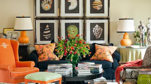
So look, when I first moved into my last house where I went versace after living there for five or six years, how I needed it to change and evolve and so this is the after picture after we've added the blue and yellow, but I was thinking about this color palette earlier and how it really is analogous on the color wheel because the color will goes from blue to green and then crosses over to yellow in that warm tone so you can take a little corner of the color will and really hit all of these colors as well, but the depth that comes in that again that emerald r j green that I love that's my favorite color on it only showed up in this when we brought that pillow in, which was really interesting and look, what else do you see that's a signature toby a bust in that fun um so here's more of what it looked like before without the blue, which is a big difference, isn't it huge difference on dh then here's a little tight close up shot I love photo styling and this is what you all can isolate li...
ttle pieces and I even have a pinterest board, but just about studying how other people photos style, which the photographers will love this to zoom in and zone ian on how to create an interesting table scape uh and the dimension and the balance even in a little bitty piece I think one of you were saying that yesterday that you were noticing that you could take out any little sliver of a table top or other pieces at my work and it's almost its own little microcosm of the color palette because it's intricately detailed there um and then here's moving into and we're going to see these later the transition from space to space but here's what the next room of my house looked like and look how complex this color palette starts to get there's a lot happening in that space very citrusy you're still grounded in almost black and white and a lot of these paint colors people going to ask for in that downloads like the believable blood buff that's on the wall but it's warmer and it's less s contrast ing than if we had a stark white there which I think everybody looks at this roman says it's friendly and inviting I think that warmer town on the wall helps people phil kind of invalid enveloped in, you know like coziness and warmth and it makes a big big difference it's also great for that resale piece that in case you're not going to stay in here forever and you can even see a sneak peek of what we're goingto look at his transitioning but that black and white wallpaper I was right in that space so you can come out of the black and white entry to that great black sofa that's really bold and strong and then here there are certain rooms people are like oh do you always cover your books? No, not at all because sometimes I want a library that you can see every single cover and jacket of a book but I think that works better when it's on a stained shell for in a dark room because the contrast becomes really busy when you just are looking at all the different book jackets and so in this space all of these books are books that I had read, so I decided I wanted it to be more serene and relaxed and less busy when I looked over there on so I wrapped them and paper and just used a pencil to write what they were if I needed to find him again enough reference so I can pull him out and find out it's not unfunny chinna lll but it's also more about a style statement there for me um and just a little closer on the flip side I didn't do anything to wrap all of my design books because they were part of what was happening over here I want to sit and read all of those and studying, but isn't it interesting that a lot of them really still support the color palette so I pulled a lot of the blue ones out and I live in the other room and I pulled a lot of these and they live in here that's not an accident either, so we looked at this one yesterday on we won't really don't wanna belabor all of these because you're now starting to be able to see on your own what's happening but look how little contrast other than the black thes air also close together so that's where you're saying you can tell that in the space there's very little difference between the two different shades that air happening in there yeah, it is even he had the black rod iron there's a black piano this is really almost chocolate deep chocolate brown but it has the edge off just a tiny little bit there's a picture of that side and the black becomes what moves your eye around the room that's I think what's interesting to note here because yellow we learned yesterday is the easiest color to see. Usually your eye goes to the yellow taxi camp, but when the entire room is layered in different shades of yellow it's not the one that jumps out is that it's the black that pops and moves you around the space so it's all about percentages and that's almost the idea of wrapping that room in it becoming a neutral cause it's all shades of yellow I think one of you had a question or coming get to ask you yesterday I did ask you if this was a home they built. This was a new construction. But did you actually design the staircases? Well, uh, start island. Yeah, we designed this pattern. Yes. And even seeing some of the movements see that really thin line that's happening and you see it happening in the rac so again, good eye it's not accidental. Um and if you don't get to design the railing, maybe that could be your point of inspiration if you walk into a space that has some kind of neat detail like and I have a new office in dallas a really tiny little office space because we're working out of dallas a lot now and in the elevator there's little greek key metal railing and I loved it, and so we're putting together the designs came for our little bitty office and yes, I already loved great key, but I loved that that was a point of reference for me in that space talk and feel free to use it all over again. Um, let's, look at this one that we looked at yesterday that that we love so, um here's that complimentary is color scheme and again the black and white and the black is the tiniest piece here there's a whole lot of whites so it's like seventy percent white maybe fifteen percent orange ten percent blue and maybe five percent r less of the black um when we could see it better in this image so we knew that inspiration was mid century we're going to see later in our history talk today about that turquoise and orange coming in the fifties and sixties I can think of the turquoise cars convertibles they had back in that time period andi even that pop of hound's tooth in a bold way is really speaking to that error era of history of design um and this one I think it's fun to see that the purple is only on the ceiling and a tiny bit of it is in another painting that you can't see but really it stands alone on the ceiling so that was a decision to almost make a departure of everything else that's happening in here and have that little surprise element eso kind of fun and different and I think if everybody walks in their closet they're gonna have some cues of what they buy over and over again because I find that to be the same for me a cz well ellison also says you look great oh that's sweet so yes so this one again we talked about sort of inspired by the great hotels like maybe the carlisle and some of those other hotels a lot of black and white base happening here, but really turned it up with the gold in the turquoise here, and they make a statement more than anything, I think, because they're in velvet because you would not get this rich gold if it didn't have that texture to it, but it becomes even just on those two sofas. A huge part of the color story doesn't like its and again, this is that perfect example of yellow is the first part, the first color that that I can detect in a space, because when you look at that, your eyes just instantly go to those sofas, don't they? Andrea lee there it's close to a compliment, blue and orange or compliments so they're kind of close teo, teal and yellow. We're going to be close to each other on the color, will it? I mean closely opposite sit close to opposites on the color wheel. What I'm trying to say another shot of that a little bit of the brown even pull out the brown here because it's in the furniture it's not in any fabric, but it does become a color in the space like you were noticing jamail and some of the other. Design says this is the most beautiful callus game that won the strong and bold colors a combined really well, to create a harmonious space. I think that's really interesting because you were talking on the emotional day on our emotions segment yesterday about the different effects that strong colors can have and you do have to strong colors. And yet it's such a risk spike. And so think about that for him and I think it's worth taking just a second to think about that yellow can be irritating. It could make people argue it could be like the taxi cab. But what happens when you want to use yellow or gold and you want to tone it down with something else? Where, first of all blue and even teal blue is a very universally liked color. Everybody loves it. And because their compliments are almost compliments on the color wheel, too. You know, when we said when we were in that section that very first day, that when your eye looks at a color, it craves it's contrast, its complement, and so I think, that's. Why, when you have these two in a room, they worked together, and it starts to make it mauritz reitz, very regal, it's very sophisticated again, but it but it's still inviting it's but it's formal it's formal that almost like a tuxedo again, or a ball game in which we talked about from that color psychology. So there's ah, lot of things that people can relate to that they like, and I think this is a great example. If if you want to use strong color like gold or yellow, how do you balance that in a space and make it softer? Make make people like it more make it appeal to more people on dh, then here's, that other hotel suite that we said was much more like collegiate and varsity and masculine and could be the kind of color palette you say in a study with that strong red and still, most of this room is wrapped captain tan, but look how strong the red is. In contrast, it is so so strong, even used in a tiny little percentage of the space here's discussion. Also on your use of stripes and mad, lizzie asks, do you stripes to make spaces feel longer or taller than they are? Sometimes we do so in that one that we talked about that have the seven and a half foot ceiling, and I use that strong vertical line, sometimes it's, directional and, like you said, almost not just to elongate, but even pull people through a space. On dh, this was really usedto add interest so it does help because this is a long room, as you can see, almost like a bowling alley. But so we didn't run the stripes the length of the room, which would have even stretched it out further. We ran them counter to the length of the room and a horse. What? I would consider a horizontal application. It's also a great place. I wanted the whole room to feel pretty calm. Uh, and so I really made the decision here. Just the opposite of the new york show house made the floor black because the walls were pattern. This time I made a specific decision to put almost all the pattern in the whole room on the floor. S o that starts showing. And then I loved that really derived, even though we were going to use red because of the societal meaning here, because it's in a collegiate town, really the color palette was derived from that carpet like it was a fabric, it would became the jumping off point to then layer in the little glen plaid on the chairs and the pillows and some other details there, um, and then finally, maybe you're close to finally getting closer to the end? Uh, this is that color palette that everybody has loved and look at how subtle that color palette is it's almost like shades of white didn't I mean there's like beige and a tiny bit darker beijing aqua and a tiny bit darker aqua and again just this layering on dh what I notice and I don't know if it's what you notice is the sheen of the backsplash and the shine of these lamps and they are just a extension on of that color palette that we decided to use that chrome medal as a color there here's the look at the bank it in the same space and we balance here we've got some dark brown happening here which actually should probably be on this color palette and we balance it here and in the curtain rod so those were specific decisions of had to bring that in and then it's balanced again over and the other it is on our color palette there comes in pops in brown there because it's on the refrigerator another version of my orange and blue which I love but look how much white is in that space it's a slightly different blue it's more green blue it's that spirit mint kind of jadeite killer that we said was becoming so popular another look at that very retro chairs there as is the color palette so when we see this afternoon again the sixties and seventies, you're going to see these kinds of forms of chairs and and furniture along with the color palette and here again is where I put a pop of lacquer on a leg of a chair mixed with a solid color fabric which is really fun this is so funny because this color palette I grew up with my mom upholstered urge and I hated it I was like this is the worst combination of every same huh? But to see here so it's just that like twist of had really apply it correctly well and it's fun because as we age our personality is changing and regina is monitoring the chat rooms was telling me yesterday that hurt mom always had all of this crazy color in her house as a reaction of that she was gonna have none of it she wasn't gonna wear color like total rebellion and then the older she gets she's like I'm really kind of missing color I might need to bring that back and so I don't anybody tell my mom I'm wearing red today and have a pink purse but you know it's really kind of fun what and I have a lot of clients who come in and say I hate harvest gold because it was in my mom's kitchen or avocado but we give them an a version of that and they're surprised that they really love it's sort of the way you said I'm surprised I like the coral and jade combination in that other show house the other day I love this. These were this was another show house for me, and it was about green design, sustainability and a lot of these fabrics are these fabrics are green, not just green in color, but they're environmentally friendly. And it was the idea of you, don'thave tio, throw everything out to start introducing cem sustainable elements and phase that in. So I had the idea I was in my warehouse and we had all these broken picture frames that were just piled in a heap, and I said, what if they become the art? S o I pulled out that strong color and lacquered all the frames, and suddenly they were the artwork in the space, which I thought was a really fun used, as opposed to putting that color on the wall as the paint color. We used it, and it becomes really like an architectural detail of the space doesn't because they're an extension of the wall, which is really fun. We've seen the grain house that you were doing that do you do tend to use the no non fume paints as opposed to realize you find that don't do they still have the same saturation of color they do? Because paint companies have gotten so smart and there's such great technology that you, khun tohave an array of color? In the lo v o c paints and it's it's a great thing for especially for families because the off gas and can be so strong and harmful so yes, we do use those all the time um so quickly let's look we've seen this when many times but just another little let another little kind of pointing out of the fact that when a color is this strong on the wall not a lot else is happening in the space in regard to color black and white tiny little bit of brown I guess this is really dark dark brown in both of these but really reads black to me on there's the dining room next door where the brown comes into play um and the coffered ceilings again painted all cream and then the last one is my daughter's room ah and it's all these shades of the purple and green like ken loves um again grounded in black and white who knew I had black and white and almost every single space that I've ever designed but I guess it's kind of like it's such a classic how can you not use black and white? It looks great with everything um so what? What kind of questions do we have ladies? Because we've covered a lot of toby signature color palettes I hope I'm getting you thinking about what your signature color palettes there going to be your like things that become your go to paint colors question was is the stripe on the floor fabric it's it's a carpet that I made with the company I love to work with called new river artisans and they make beautifully hand nodded rugs in piney creek, north carolina so it's sort of in my neck of the woods and so I designed the pattern on dh they made it for me and it's a huge huge room and we intentionally made this drug this is something else to think about. We intentionally placed the stripes in the room where after the show house because there's one back there and then there's one right here in front of the stairs where the rug gets wider so that we could cut the rug into two rugs afterwards and actually use them and other spaces because we knew it wasn't going to stay in the show house long term so that's again thinking creatively so if you're going to be in a house and make something custom that is very specific to a house but you know it's, not your forever house how can you think about how you might use it again later and that's the beauty of it using some of the bound carpets that I love to use? Because if you made one like in my last house, that was I think it was nineteen by fifteen and then I move it to a new house and I only needed to be twelve by thirteen that it's really easy to just cut it down and add binding and it works all over again you don't have to get rid of it our cut it into two rugs even so concept of move ability of the design fades quite nicely into a question earlier from mad lizzie, which was how do you do with storage? And I guess in all of these interiors they're so beautifully composed I know often when you take a photo, you don't take a photo of the story to necessarily but how do you buy thin your show homes? Whether you showed or not and in the actual hymes you build it in do you bring it isthe so it's not not in this picture, but I bet we haven't later in my transitioning of color, but you all remember the room that I showed you yesterday, where I made the giant striped drink free so wayward using that to make that room cozy or because it's a grand room but we wanted to be the family we're aiming for that client and they had two young children, so what? You don't know it is and it's in a video actually that they can see on my website and on my youtube channel about designing for families but behind that sectional sofa I created a custom made table that had a perfect place to fit some big baskets that we had found, and they fit right underneath. So when they were gonna have, like, the kid's toys were constantly everywhere, and it was even big enough to hold, like their little playschool scooter, they were riding around and literally they pop in those baskets and tuck under the table, so they're right there. So the mom wasn't constantly going up and down the stairs, or what she would say is her kids were so young, she didn't want them upstairs playing by themselves all the time they wanted it's practical, they need to be here with us. So we designed storage solutions that work for people. And then we saw the kitchen that's in the here, that I designed the big baskets that fit in the island, so I intentionally designed the island in that one, so around the baskets, this one is all about multi purpose, kind of houston, which is sort of like storage, and this current closes around the sleeping quarter of some two, people were using this, the tv's over here, so that's, a way to divide the space that we're always thinking, function driven, which is why we're gonna have a whole course just on that in february, because I'm so inspired by and drift. And create spaces that are beautiful and functional. Sure, interesting cause remember when you were talking about the emotions on the functions in a room and there was a question that said, if you have a studio and you have sleeping and living in the same one which you have here, yeah, so it would be perfect for you. So have you yeah. So have you done your prioritizing in that room? So you think about how often are they going to sleep in this space versus how often, you know, do other activities in this space, you know? And so depending on that you could decide is more of the room important t be entertaining and television and study and a tiny little note to be sleeping or vice versa. Ah, and it all depends on the person who lives there on that's. What we really just did is zone in this space, and then another thing. I did hear that important to mention you can't see the before and after, but I probably will bring a lot of those before and afters into my course on function because it's so important, but this was a tiny little post, like you can imagine, that holds the ceiling up like a little small posts, and it was not in scale. But I couldn't really make it go away because it needed to hold the ceiling up right? We're in the basement, so I built it out and turned it into something that was functional enoughto hold these light fixtures that really added to that sixties vibe with these jonathan adler fixtures, but what it really did was make the perfect place for me to stop and start my dry pary for my zone, so it becomes this cool multipurpose peace, not this thing that we hate in the middle of the room. S o and it can also sometimes give you it could have possibly in a in a certain studio given us an option to change colors potentially with a divider or something have more than one wall color, or you could come all the way to the opposite side of the room. If you could envision that, and maybe paint the wall behind the television, a pop of blue or a pop of orange, if you wanted not an all white space, that would be the opportunity to bring in another color where you don't want to bring in color or a pop of color it's when it almost like we talked about those rounded corners, sally, you don't want to just stop and start one in the middle of the wall, so I would not have drawn a line down the middle of thistle and painted this section a pop of orange, because that really continues behind that whole wall. So you need to look for spices if you want a pop of color that have a very specific stopping and starting point and also look for spices that aren't interrupted by a lot of openings like doors and windows, especially if there's only one door on one side that makes it interrupted, even think about painting out that whole door, the same color as the wall. So when your eye looks over there, it sees an entire accent while all intact. Does that make sense? I think that's an important thing to know about popping color and on the wall. Thank you. We do have a question from jamie w okay, are their classic palates associated with specific architectural styles. Jamie w is building a very traditional a cady in style home in the texas countryside and wonders if there are disconnects for that particular style with certain colors or certain ones you'd want to include. So I know that's very citic. But do you consider exactly what the term a cage ian means in this instance? So I would have to know a little bit more about what the root of that is. But certainly, yes, and even we're going to get into the history of design this afternoon, which was really my favorite class, as I said in college and design really, the history of design in the history of furniture, and so I'm going to show some things this afternoon that might give them some ideas for researching that. But yes, if you want to be historically correct and there are designers who their whole job is historic restoration of historic preservation that really know a lot about this area in this category, but you can research what traditional colors are that would fit that homestyle and then also think about the landscape. So, you know, as I was saying yesterday, it's a little difficult when I have clients who want to build a mediterranean mansion in the middle of the arkansas pine trees, you know? So how do you it's? Not necessarily that you can't do it, but thinking about colors and materials that are indigenous to the area she lives in and finding ways to blend those with the architecture and blending two styles which happened teaching a whole course on style, which is going to be fun is the same idea is blending color palettes, and so you can have certain elements in this space. That combined both, for example, she could have a chair style, maybe that speaks to the architectural style, but maybe cover it in a fabric and a color or a material that's indigenous to her area, and it becomes sort of this perfect blending of elements for that space and makes it makes sense. And it goes back to what I always loved to call that point of reference for me, and more than anything, no one else is going to come into the space and go, oh, I see that you have a chair that is exactly reflective of your architecture and the fabric is in colors that are indigenous to the area that you live in, but you're gonna have more confidence to make some of those choices when you have that point of reference, because sometimes we just need a little reassurance or that kind of proof that we know what we're doing makes sense, right? So the only person that really needs the confidence is us. We're not gonna have, like, a little plaque beside the chair that tells the origins of it, and everybody is going to read it when they come in, you know, museum might, but but again, I just liketo have those tricks for me, so I know why I did it. If that makes sense, bethany would like to know whether the paint on the wall is full spectrum paint, and I she don't know what forster didn't really hang out, so in that the interesting thing about design, and we have to be careful, as designers did not use design speak, that makes sense to us. But even sally, like you and I were talking about the differences in almost a language barrier between you were orgies in australia and words that we use in america, so I'm not really sure what full spectrum paint means either, but if she'll tell us what she means, whether I'll be happy to see if I can answer that, do we have any questions? And the student studio audience? Yes, I wanted to make a comment about the area and the indigenous materials and stuff like that. I didn't get a chance to talk my grandmother out, yeah, and she mentioned that red and yellow were a dye that was available from the plants around that, so her fix it, and they didn't want to keep stuff white, because it would get dirty, really dirty, and the days they want it black, because it would be too hot, but then the tents were black because to keep them warm, and I was like, it's, a desert, just like it's always cold there so it's like it's soon, even in the summer, as soon as it gets dark, it gets very cold so they needed the morning like heat up bad is keeping amazing, and I love that you love knowing that. And again, why sometimes just educating yourself on the history of something makes you love it even more than you did before, and we're going to see this afternoon in the history of the color of interiors, that exact thing, like how they use for million in pompeii because it was something they had access to, that they could grind and make a diet and that's probably exactly what she's talking about and saffron was a material that was used to create that yellow color so again what was available to them, and they were able to use it in a creative way. And then the warm and cold piece speaks back to kind of like your idea of making textiles to scare lines lions away because it was like fire. So again, it's really sort of survival survival mechanism that was important there. I love it left that answer. I'm glad I know now. Thank you. Anything else that you don't want to add her share. Vera wonders how many whites you could mix in a room or is it ai qaeda mix? I mean you sort of shine a lot of detail wins every wise and we even showed and I can go back to that pinterest board from the very first day about analogous colors and contrasts and all that kind of because I should one ring from africa end phoebe howard is a very accomplished designer and it was all white and you would be amazed when you looked at all of those colors it was really kind of all cream but it looks white at first glance how many different colors of cream are really in there? And even if something is the same color it can look different colors because of the light reflection so a velvet versus a silk even in exactly the same die it's gonna look a little different because the silk reflects light it bounces off of it we're like a velvet absorbs light so it's gonna look shady and shadowed and and a little bit different. So the content well it's not just the colors but it's the content that she wants to feel comfortable mixing in a space so we did get a little bit more information about from bethany about full spectrum and paint so was going to read that defined as paint containing all colors in it a lot full spectrum benjamin moore's new color line color stories inprince sees is a full spectrum style and then bethany says a blue paint would have drops of its complementary innit to rest the eyes need for art that's hello so see that's a paint company who's really studying for a lot of reasons that psychology of color and so my guess is that it wouldn't have the same tiring effect on and fatigue on your eye because if the eye craves the compliment they've added it subtly in there it's almost like a subliminal message that cool thanks for elizabeth anne for the for the education I always learned things in my own courses to so because there's no way like you can look to me is the expert and of course I have a lot of knowledge but there's just no way to know everything and companies air constantly innovating and engineering new things so that's really cool this segment was creating your own unique call accomodation al you nick but now it's coming our unique yes color combination so you shine us how you've done these amazing ones and we have the tool from day one the color wheel and the different shapes you can use to create now I'm texture and patton and you're about to do segway yes oh how would you suggest to those of us who haven't done the massive amount of weight that you have done today? What sort of a step by step of us creating our own combination so it's going you're going to just go back to sort of your checklist we've been building so far so colors that help help you create a mood or an emotion or feeling in her space or maybe that's a pe port a certain task because you start asking yourself how am I going to use this space my watching tv or am I working on the computer or am I sleeping on and then you can start adding in the colors you just like because you think they're beautiful and starts seeing if they're going to help accomplish all of that and then the next step which I hope is what you really learned from this it's starting to make some decisions on how much of each of those colors you want in a space so the primary use maybe to relax. So maybe you wrapped the room and blue but you bring in a little pop of its complement or some other color you like or if you're really drawn to those analogous colors maybe taking two or three like from a cobalt to a royal blue to even a teal and see how you can start layering those in a space and don't forget that often times you're gonna have most success keeping the walls in one of the lighter tunes not necessarily in a beige or a white but a lighter shade of some of those colors unless you're making that bold decision to say cobalt walls, but maybe white furniture. So you have a lot of decisions to make. The power is in your hands to create this, but I've kind of shown you the game it of what your choices could be strong with little contrast in the furniture sort of building this may be analogous color palette or even a complimentary color palette, and you getting decided which pieces come into play in how much percentage in the space loving, having the color power in my hand colored power way, have had such an engaged audience and an awesome engage studio audience. Thanks, guys I'd like to share with you a couple of the convoy from online and we have people watching from sweden, texas, minnesota, savannah we have basically our entire chat room from yesterday. Plus news of the word right spreading rapidly, amy w says many thanks to toby's, so useful for my new forever home built and bob from london says toby turned few into yea that's how to tame this design home if she maybe open my eyes and said a squeezing them shut and I should sight in the accident thank you, toby, thank you for creative life and making it happen. All right, so we're going to take a fifteen minute break, but then, toby, you're going to help us understand layering and transitions, and this has been a huge topic also, so so we're going to see some of these same spices I showed you, but I'm going to show you which ones like I was giving it a little sneak peek or next to each other and the very specific decisions I made of how do you get from this in this room to this in this room without giving everyone is raging headache, you know? So how does it transition seamlessly and make sense for you? Once again, I just love how you're giving us these building blocks, and and it does take a while, I mean, it does take a while, tio, have all those things sink in and really understand where you're going from a to z here, because one room could have eighty decisions in it, right? And then you got to go to the next dream in the next room in the next room, so it kind of makes you start indian people who just have a studio, because maybe they look at it as one space and it's daunting to have a huge house for some people out there to absolutely
Class Materials
bonus material with enrollment
Ratings and Reviews
1st Carpet Cleaning Ltd.
Very convenient and creative! Continue In that way!
a Creativelive Student
Fantastic Course!!
Student Work
Related Classes
Interior Design