Lesson Info
28. Transitioning Color Palettes in Your Home
Lessons
Day 1
1Class Introduction
10:02 2Color Models 101
26:46 3Color Schemes 101
45:39 4Debunking Color Fears
44:02 5Debunking Color Fears Pt. 2
25:23 6Evolution of Tobi's Color Style
42:37 7Evolution of Tobi's Color Style Pt. 2
44:12To Trend or Not to Trend
12:47 9Color & Design Trends
31:36 10Color & Design Trends Pt. 2
25:37 11Tobi's Color Inspirations
22:09 12Tobi's Color Inspirations pt. 2
23:29 13Using Inspiration Boards & Q&A
19:43 14Psychology of Color
36:34 15Color Meanings
17:04 16Psychology of Color Q&A
12:55 17What to Consider Before Choosing a Color
26:20 18The Right Color: The Entry & Living Room
19:27 19The Right Color: Family/Dining Room & Kitchen
21:19 20The Right Color: From Bathrooms to Outdoor Spaces
20:05 21Pairing Textile Elements for Success
28:49 22Pairing Wall Color, Pattern & Texture
24:42 23Floorings, Furnishings, Art & Lighting
19:04 24Intro & Top Color Palettes: NYC Showhouse
24:41 25Top Color Palettes: Hampton's & Richmond Showhouses
21:31 26More Top Color Palettes
33:46 27Layering Color Palettes in Your Home
38:16 28Transitioning Color Palettes in Your Home
28:08 29Historical Overview of Color in Design
16:47 30History of Color in Design Examples
43:59 31History of Color in Design Examples Pt. 2
16:32 32Color Mistakes to Avoid: 1-6
31:20 33Color Mistakes to Avoid: 7-10 & Final Q&A
40:06Day 2
Day 3
Lesson Info
Transitioning Color Palettes in Your Home
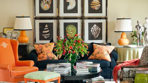
So then color flow from one space to another, which is a lot of what many of us want to talk about on it's the idea of introducing and these is to obviously flow really well cause they're exactly the same color palette uh but then we know because I'm telling you so that from this space you transition to this space so this room is not all sharp truce and blue we just pulled out the blue from this entry and transition that we decided okay, which one of these colors would we like to bring into the next space to make it more interesting on dh? So I selected the blue and then from this space we flow in the next direction to that room that has the painted floors ahh and in the other direction we go to this bedroom s so this one is all very subtle, very subtle nuances of color in this space where in some there are a lot stronger. I thought about this one a lot last night and I could not remember for the life of me what it was that you framed in a plexiglass box on the wall a dale chihuly pain...
ting that was his painting on, so we put it it's on paper and so to make it more fresh and really speak to even say this room that has the lucite hardware that's it another idea it doesn't have to be a color that transitions from space the space it might be a material so in the way that I have circles upstairs in the nursery and then brought him down to the master, I have lose sight in this space, and I introduce it also into this room and even onto the table with their julie sculpture that's in a plexiglass box. So everything becomes a material, not just the fabrics on everything has some color to it, even something clear likely side, it becomes almost like a prism that has every color in it. But this room transitions andi, even the floor, the carpet on the floor has a gold pattern on it that speaks back to this in the entry on dh. Then if you've noticed, and then if you have, I had really mentioned that we can't see it in this picture. We could see it in the last when we saw this earlier, but the bet the side tables are wrapped in raffia so it's a it's like a texture, but it still looks like the whole room is blue it's just let me see. Well, I'll go back to it a little bit if I can, but it's interesting, because it's another texture. But the whole room still looks like a color rep on oh and so then we get to see this is fun I love this it's like a home tour so this is off the from this room you go one direction to the master and you go the other direction into this space which then the kitchen is part of it I don't think you've gotten to see this room yet this week while we've been studying but look how from that from that living or my transitioned into here and we brought in like the cool tones of blue but then we started introducing lime and we started introducing cinnamon so you see how I'm transitioning to another color and it's not that you can't introduced this warm cinnamon read into this house that is all these blues you just take different little elements from room to room that allow you then to morph into another color being added and then you'll see that again stairs in a spaceship already seen where it's all cinnamon and even how you bring the stripes and fromthe one room I'm looking at the bottom of those chairs and just seeing those little you know groups so I added a little banding so it's again that's settle idea you are started see I'll pick up on all of my tricks you're you're giving away all my secrets but you know just like we reintroduced the circle in a in with no color on the front of that little dresser here we've brought a stripe in and we've added it to the bottom of the chair as a little detailer bandic and on the top and around the drapery dc that so settled toby I'm wondering what's in the fireplace that looks like a circle is it like a clay ball? They're all there like concrete balls it's a really it's a really cool products that I wanted something different uh in the other room we have crystals in the fireplace there the blue blast crystals that air really modern on dso in this room we didn't want to go to playing gas logs because this this house is too contemporary and unique so we were looking for something fun and we found these pieces plus I also love that whole collection those air just like plastic resin vases and all I'm sitting on the over the mantle but there it was because this window treatments so challenging there's no way to cover all of those but I wanted it to not be completely open cause we lost some warmth and coziness. Another thing for you to note is I didn't contrast the drapery to the wall because it would have really brought a lot of attention I could have decided okay let's bring the cinnamon colors of the wall but think of what that would've done for the mood in the atmosphere of this space, so I really just made the drive, and I do this a lot just an exact match to the paint color so it's more about dimension and movement and warmth and not about a statement with the pattern. And, you know, we talked about that yesterday when we're introducing in transitioning pattern, you can either decide maybe to put it on the drapes and a sofa pillow, or you could put the whole sofa in the pattern, but you're not probably going to do both. And in this room over here are really wanted that cut velvet on the ottoman to be the shining star in that space, so everything else sort of just goes away. It really is time we all coming together. I love it. Continue to see things that this's the kitchen that's connected to that hearth room that we were just looking at. And then it transitions into the sunroom and look where we introduce that pop of of short truce again into that space and there's actually some orange in that space, too, and the pillow it's a little hard to see. And then you go upstairs and these air what the bedrooms look like, so all cinnamon because it we've had a point of reference downstairs so that as you walk into this space, you don't go o holy cow now it's purple your eye goes, oh that familiar with that color like you may not even notice it, but it makes sense that was so it's a way to subtly transition into the next room and then the other bedroom I really kept in shades and layers of the aqua and green in that space we have some questions we have so many questions from online last time tours because you can then see how we don't have it all worked together in the space, so bethany had a really great question on and she was here on friday as well about transitioning she said that you mentioned on friday that the light that you use the lightest hue of wall color to paint the trim does this mean when you do an entire home? Each room's trim is a different color I always thought painted trim and doors out to be the same color for continuity at least on the same floor. Most of them are the same and that's another reason that I picked paint the at last because if I were to just go to picking, say an awkward in this room and then a darker teal in this room and then maybe the cinnamon in this room individually of one another then they're undertones might not be the same, so I plan all of these fabrics literally there before we buy the first thing I have the entire house laid out, if I get the pleasure of doing an entire home for someone at once and I can see the whole transition, as I call it on paper, from room to room, and I complain and orchestrate like the maestro, those little subtle details and transitions, and then I can pick paint colors that worked for every place, and I can make sure when I go to pick the trim color doesn't match this room and that room. And sometimes we change if it's so important to me, say in the master bedroom to get a certain pain killer on the wall to support that. Then in that one room we might decide it's worth it to transition at the doorway to a different paint trim, and we go ahead and decide to do it, but we're certainly not having a different trim color in every single room. I would say eighty to ninety percent of the house is having the same trim color now. Sometimes another thing I also decided to do is like in one room, make a statement and paint. The walls and the trim all the same color um like I can think of a dining room I did in a farmhouse where it's all aqua and I wanted I didn't want contrast, I wanted all the trim and everything to be that color, but it's fine, you still just transition at the doorway with the trim color and start the rest the house with like a a neutral trim, but that can only happen if you haven't already started. So you know, the other day when I was saying, don't get impatient and go, okay, well, forget it. I'm just gonna paint this room and I'll figure the other out later, then you're going to be kicking yourself because you won't be able to make some decisions that you like because the undertone of the paint you selected won't work with some other fabric, so allow yourself set yourself up for success by planning ahead when you still have it, as I say on paper and you can get just the right paint color to support both schemes in both rooms, it speaks to a question from pure design interiors who has been another fantastic online chatter how strategic a u with placement and color placement and balance at the beginning of a project, so say a house or a floor on dh how does it evolve as you move through the project I'm pretty strategic, as you can kind of tell like my approach and again, that's my accounting plus creativity, I like that literal structured process because I know it'll I don't like to pin myself in a corner, I don't want teo have any sort of regrets later that I can't do something that I want to do, so I'm very, very thoughtful all the way through the process and already thinking ahead and here's, even something I do, I don't spend a lot of time doing this is a professional because in a sense you're working for free, you can't get paid for it, but if I know the client is having for budget reasons to phase in different rooms and I don't have the luxury of planning the whole house, I will at least take an hour or so of my time and make sure that I concur find other elements that might potentially becomes, say, the living room if I'm only working on the kitchen and I keep those in a little box almost like I keep my inspiration things so that when I get to that space and so they say, okay, now, let's, go into the next room, I'm not frantically trying to make something work, I've proven to myself that there's already hordes of options out there that are going to work in transition and I may not use those exact things or they may be discontinued but most the time if you go ahead and start planning ahead you're going to be able to find something really similar that's going to help so I do a little extra work on the friend and it's kind of the measure twice cut once approach so that I'm not backed into a corner I am so ready for you not to leave today and just move along teo the business of interior design starting tomorrow I get excited I came to my mba desires you is awesome. So let's look at a much more bold home to her because we've been seeing a lot of these images but let me show you guys this might really blow your mind which is interesting of what raines have alluded to some of them but let's see what's in the same house. So entry hall you walk in the door and you get this wow factor this client this says what this kind is bold and dramatic but then you still see that her husband was very traditional. You see the thick moldings and all painted out why? So you can kind of start getting a feel for their individual personalities and then the dining room is right off the entry hall there but when you leave this entry hall you go into something that you may think has less transition to this but it's really the chocolate tones that start making this, uh, this room work and that bedroom is also off the hallway, and so you see a little bit of red peeking in there, but it's chocolate that becomes the thing that's transitioning these spaces and this room will make a lot more sense to you when you see that the room between the dining room and this room um, is the kitchen and breakfast room where I've brought the turquoise and the red together. Now this kitchen I didn't get to design everything. This was one of those that they said, okay, toby, you have to keep just like you see on tv or real life designers or dealing with, you have to keep the granite and the state all the stain would if I was designing this from scratch, I probably would have made some different decisions here, and I think this is a great example cause you know how yesterday on the web so people were saying we'd love to see some rooms that toby says I would have done this differently, so hear my my hands were tied a little bit, but I did use color to start transitioning this space into the other rooms, but it's this this breakfast room where I painted those pop of coral the pop of coral on the chairs and brought it into the artwork that transitions ugh from this and even both of those back to the to the entry but this client is more bold, so I know she can take thes stronger transition and again, when you're moving through spices it doesn't look weird it doesn't look busy because there is again that point of reference in the in the mind's eye you know you've seen that coral before you've seen that awkward before, um and then even moving to the upstairs the first room you encounter is this one on and it comes off of that comes off of this room so you can see how this would easily transition up to that right and then moving down the hallways I started taking a key color and really it becomes more of that kind of mocha brown tone that so all the kids rooms and all the upstairs spaces have like a brown undertone even though it's really settle in this space in a pillow in the rug that makes them transition and move into other colors and then thes rooms air also upstairs so the blue is introduced again that's the hallway so the hallway is all neutral with brown and white and off of the hallway you get to this, you get to that so you see how I didn't put a a ton of color in the hallway it's just brown and white but I could go into brown and blue in one room I can go into the purple with a little mocha and one room and then even in there a nursery I go into the this um and then from that room you can see how it easily transitions I'm sorry to this the nursery picks up on things so this is a not so subtle transition but there is a color piece in every single one of those spaces that speaks to the next room that speaks to the next during that speaks to the next room that's a lot bolder a lot more strong but I know this client can take it. Um what what do y'all think about that? It's a little it gets a little a little edgy, right? It gets a little more scary to make some of these kind of color transitions. I feel a lot of the colors seem different but it's very cohesive like the trims and there's very there's a theme right through and then I figure like which room's air closer to which one's kind of have that because when you first enter you got that really dark quarrel and then it lightens up but you add blue in the kitch rights and then the minute trans issues of the blue and the other eminent off of the coral entry the other direction you get to that bedroom that had all those warm, sunny tens so as long as it's making a sense moving from space to space, the room on this side of the house in the room on this side of the house could be completely different color palettes, but there's things in between them that make them flow from piece to piece and from space to space, and that way you don't get a house that goes other's purple and yellow over here and green and red over here it's like green and red two green and purple to purple and yellow and not that we would really even do that but that's an extreme example of how we would transition think through a house it's kind of like thinking of function way with the energy like you go I don't want anything obstructing it's the same thing with the colors do that they carry you through? Yeah and then common spices like hallways. Maybe we go like this so that they're not introducing something else and the hallway doesn't have to have personality because when you arrive in each kid space, it has its own unique personality and that's another thing each little resident that lives in their hat that house they have their own unique personalities and so the mom knows kind of what appeals to them or if they're really um fun and loud or if they're sort of like a studious laidback child and what we do for their goals to support each of those kids in their spaces too that's what I was gonna like each from told a story but the story's made sense together and I really don't know these people but I got a sense of who they are yeah great thank you so quickly I think let's look through my house so my entry we know it's black and white which actually will say let's look at it it's the next life so this is where you started in my former house and you moved into that space and so it's really all the whites that transition well from my entry into that space uh but then you move into my den and it kind of brings both of those rooms together and you can really see all three of those at the same time because it has the green and the black and white that moves through and then this is my dining room so it's all shades of green and then the black and white is introduced again in the kitchen so my whole palette was really a base of black and white and then I strategically introduced color so even in this space which seems like it has a lot going on the reason it works is because the background of that entire house was was basically black and white. Does that make sense of the black and white ties each room together and makes it work so there's not a lot of black in here, but you see black on the chair leg but you see a little bit of black and contrast in the in the artwork, but honestly, you can see in that mirror there's a huge wide double doorway that opens into my entry. So these rooms air almost one in this thing like if you turn around and sit on that sofa, you're looking right at the black and white entry so they connect together and then there's others harley again she made an appearance again on the chair on dh so I think you can start seeing even through that room that it's the green that transitions from the formal living room with the blue into this space and it's the black and white wallpaper that transitions into this space there's no blue in here at all, even though it's right next to the blue and green room but there's not very much blue in that room either remembers isolated, almost just on the table top, so the whole room is really green and white but easily transitions into this space there's what the kitchen looks like on dh this is a need in breakfast area with the kitchen and then upstairs there was the dining and we saw again but then upstairs that's where I chose to bring the blue back in because I wanted that respite but there's still look at the black and white and that that fabric on the headboard is essentially blue and tan and black and white so black and white becomes my tie that binds every single room in the house and even goes to ellison spices which are really all that screaming pink but what's underneath it black and white on the same over here purple with black and white so my tie through my whole whole house including this room is the black and white so isn't that fun so again with me it's bold because I'm really comfortable with a lot of color but every piece speaks back to some bass that tie so in my upstairs it was pretty much just like the last one we talked about the hallway upstairs was really neutral and each room was purple black and white pink and black and white blue black and white and yellow and black and white but you couldn't see any of those rooms from each front you couldn't see any of them at the same time so it wasn't overwhelming it was that it was a transition to each so what do y'all think about the home tours from really settle to really bold but the rules of transitioning are still the same right you have a question. Actually, it all makes sense to me, but thinking of it in my studio there's one, I couldn't figure it out even yesterday was thinking about my bed area is here, and then my living areas here, you sit on the couch, you see the bed if you sit on the bed, he said, the cow, right. I wanted a comfortable calming area and then an active area, and I didn't know if when I'm on the bed, I should I look at the comfortable calm area and then feel comfortable and calm, or should I have the area in, well, that's a great point, because maybe so, because think about that, so generally would gook the bedroom needs to be calming blue, and the living room needs to be energizing, say, orange or something, but it's really more about what you're going to be seeing when you're in there. So maybe when you're laying in the bed of the headboards, bright orange, but you can't really see it because it's behind you. Then what may be for you what you want to look at is the calming blue and then on the flip side maybe you know the living area is the blue and you could pop a little orange and they're possibly if you say if that was our color palette but yeah, you might want to look at that energizing piece so that's a really fun thing and only you can decide this about your own house but I think that's a great point that it's not as obvious as you think it's not just oh this is the bedroom so well let's make it blue uh in the area and actually experiencing the space I think it gives you a different what are people saying on on the web about her home tours? Both you know, the cool calming when and the crazy bright transitions lots I think that's a very specific common tree and yeah cheese me was had an interesting question back when we actually was before you had the kitchen that had the all the wood on dh then you went over that one but chase me says that she doesn't seem to see a lot of natural wood grain in your brooms whether it's furniture or hardwood floors and she's wondering when you might use it since what itself came have those natural patterns or textures but maybe what kind of feelings? What colors would you pair would with so I think we did see more of it than you think because you look at, say, those two different bedrooms that had staying the beds on dh then even in my own house there like in the dining room it's all stained wood let's look at that so I mean the table basis white but the floors would the tables would the sideboard is wood but that's really two man making a statement almost because it's brown as much as its wood now do love wood and patina and inlay and all of that stuff but this worked so well for me and was supported so well in this space because this cruel had those dark, warm tones and so it became the thing that transitioned on I love to do something like I did on my dining table so that it will transition to the rest of the house which doesn't have a lot of stained wood. I painted the base of the table white but the top of the table a sustained so you combine both of them in one piece and then we even see the chocolate lampshades the bronze metal fixture all of those were selected because they were speaking back to the wood tones had I just ignored all of the wood, it could be really too much contrast and stick out like a sore thumb, so I use these little elements to transition it into the space and a lot of people have hardwood floors and a lot of stained furniture and so as opposed to like we've talked about in a lot of instances ignoring it and if you maybe don't like it trying to sort of you know, just decorate around it it really makes more spent since to what I call lean into it and take some cues from yet whether it be colors or other elements like maybe a medal that supported in the space the pure design interiors comments even though there is continuity from room to room there's still an element of surprise is you move through each space which obviously is your right that's truly low telling my signature style that people love yeah so you're not really noticing and you know one of the things even for my own home because the designers have a hard time with their own home they're always the hardest a project to do and one of the things that I even questioned myself and then I just said we're going for it was does black and white wallpaper in the entry transition to brown and white in the very next room and I decided that the reason it worked for me is because there was so much white in the background of the wallpaper and I kept the entire wall everything the molding which you noted yesterday the wall and the wanes coating all quite exactly the same color as the wallpaper in the entry so if you can imagine those two things abutting one another that background color just flowed seamlessly into the walls in this space and that's what made those two things be able to be next to each other plus the hardwood floor transitioned in both space is a cz well so those two things made it work because I think a lot of people would have a hard time going from black and white to brown and white because a lot of people don't see how black and brown seemed to be to the things that maybe don't work together right even like black and navy's sometimes you think those air hard transitions so I used a specific piece to make that happen and for me it was keeping all that wall in the dining room rat in this creamy neutral that spoke to the wallpaper in the other room love it well vera says it's nice to see the whole house and see how the different spaces work together so that everybody will look beautiful segment I love our home tours fantastic I wanted to read off a few comments from people are saying online again pure design interiors um is seeing that again carrying the elements and principles of design through a space brings cohesiveness this is what people are talking about color wiz had commented a home is like a big quilt pattern texture, color can relate match contrast the stitches that hold it all together and I know I know and I'm I'm sitting here just thinking about hearing you talk and get so excited you know hey, how much I love you how much you love it but also I'm learning personally how much more of an art this is and I knew it wass but just when you talk about planning out the entire house and how it's all going to flow together it's just I'm sitting there thinking wow, you are such a maestro such an artist so it's really, really, really exciting to see um wanted teo ask you what it is that we're going to learn now we're going to start studying the the history because I like that you noted are both of you at different times have noted that I didn't put all like the studious part in the taking part together because that could have bored us have tried to sprinkle pieces in so now that we've made reference all through the course of o see how that has like a step seventies flare or a fifties flair with red vinyl let's go back and look at both the history of interiors but really that history of color and see everything from psychology of color to color one o one and triads tio teo like different eras and what they mean socially to everybody and how we bring that as a basis into again jumping off into selecting our own colors. It's gonna be fun. I think you're gonna like knowing where something's came from.
Class Materials
bonus material with enrollment
Ratings and Reviews
1st Carpet Cleaning Ltd.
Very convenient and creative! Continue In that way!
a Creativelive Student
Fantastic Course!!
Student Work
Related Classes
Interior Design