Lesson Info
18. The Right Color: The Entry & Living Room
Lessons
Day 1
1Class Introduction
10:02 2Color Models 101
26:46 3Color Schemes 101
45:39 4Debunking Color Fears
44:02 5Debunking Color Fears Pt. 2
25:23 6Evolution of Tobi's Color Style
42:37 7Evolution of Tobi's Color Style Pt. 2
44:12To Trend or Not to Trend
12:47 9Color & Design Trends
31:36 10Color & Design Trends Pt. 2
25:37 11Tobi's Color Inspirations
22:09 12Tobi's Color Inspirations pt. 2
23:29 13Using Inspiration Boards & Q&A
19:43 14Psychology of Color
36:34 15Color Meanings
17:04 16Psychology of Color Q&A
12:55 17What to Consider Before Choosing a Color
26:20 18The Right Color: The Entry & Living Room
19:27 19The Right Color: Family/Dining Room & Kitchen
21:19 20The Right Color: From Bathrooms to Outdoor Spaces
20:05 21Pairing Textile Elements for Success
28:49 22Pairing Wall Color, Pattern & Texture
24:42 23Floorings, Furnishings, Art & Lighting
19:04 24Intro & Top Color Palettes: NYC Showhouse
24:41 25Top Color Palettes: Hampton's & Richmond Showhouses
21:31 26More Top Color Palettes
33:46 27Layering Color Palettes in Your Home
38:16 28Transitioning Color Palettes in Your Home
28:08 29Historical Overview of Color in Design
16:47 30History of Color in Design Examples
43:59 31History of Color in Design Examples Pt. 2
16:32 32Color Mistakes to Avoid: 1-6
31:20 33Color Mistakes to Avoid: 7-10 & Final Q&A
40:06Day 2
Day 3
Lesson Info
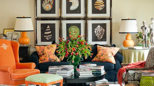
The Right Color: The Entry & Living Room
So let's, start taking some specific room, so this was the entry in my last time, and I've spoken about this while we've been together this dynamic black and white wallpaper there's hardly again she's making another appearance at the front door. My little fifteen year old sweetie. Eso what were my goals here for this entry? Well, so the first thing I think that you see is color is not just about color because we've got color and pattern right off the bat, and then a lot of people think about black and white being a lack of color, but they really are, as we just learned, even in the psychology of color, they have a meaning. And what if some of you I'll see right off the bat in this space that supports what we learned about what black and white mane and do, um can l see some pick out some things like, uh, elegance is what I see elegance? Yeah, so almost even like a tuxedo like the black and white, isn't it sort of like that formality on? And I didn't do that intentionally meaning I think...
this looks like a tuxedo, but I did select it because I knew it had that sort of ah, um, not too serious, but but pretty formal pretty yeah, thank you. I think the, um floral pattern yes makes it not so serious because it's not so geometric right? A little more of a loose and fun and maybe don't take yourself so seriously a little bit said I agree with that and then I love so when we when you saw how added blew into the next room because we're gonna talk this afternoon about transitioning color from one space to another, isn't it kind of fun to see the pale pink lamp, the pale pink flowers this little bit of turquoise milk glass, how that starts affecting even the black and white because it's sweet and it's kind of innocent and it's a little bit southern and feminine, which is who I am so black and white by stuff could be really strong and bold and maybe even masculine and we just soften it a little bit with a little pink it's almost so pale you can't even tell that the lineup is think so, yeah, so one of the reasons the things that I also was working to achieve in the spaces really that go bold sort of idea go boulder go home as I'd like to say, but it's a perfect opportunity to have a wow factor right off the bat and I love people to think that I mean, I'm trying to make a statement even for you know how I alluded to but maybe didn't explain in the psychology of color that color and use of color can show people a lot about who you are so mi is an interior designer and my identity as a designer is someone who wants to show people from the minute they open my door that I'm daring and then I'm bold and that I do unique things with color and pattern so here's the perfect opportunity for that to happen right off the bat of course then we're dealing with a very traditional home nineteen, seventy six brick traditional so damn isc is really traditional the floral pattern it's a traditional pattern so is black and white but it's used in a fresh way and we're young well, we used to be young we're still sort of young uh not as young as we were when we bought the house but you know, a young family my daughter was two when we moved in here and so we didn't want it to be too stuffy into serious so there were a lot of things happen happening and don't you see sort of like a big personality when you see that wallpaper and you probably think I have a pretty big personality after spending a few days with me on dh so do the other people in my family s so it was just sort of accomplished a whole lot of things drama, drama but elegant classic and timeless but not too serious on dh then really that lack of accent colors all the time and there because I couldn't take the flowers away or I can play with the accent colors is really fun for me so it could be sometimes I could make it orange as a contrast cause the lamp is so pale you can almost not even tell it's pink s so you could play with the other colors and the moods that you want to achieve for different kind of events and you know parties and entertaining in that sort of thing do you decorate the banister christmas? I didn't yeah um so well I guess I don't anymore because that's not my house anymore but I did when I lived there here's a completely different look at what does this say compared to the other one? What do you think this injury says? Serious formal, formal yeah more conservative, more conservative um it's all of those things so and then we've sort of got almost the red and green compliment happening here gotta warm neutral in the background very traditional, very grand architecture not at all trendy although this malachite boxes malachite is a little bit trend forward, but in general everything about this is pretty traditional and not trained forward right? But not in a bad way when it doesn't look dated is just much more of a representation of this client it's there forever house my other house wasn't my fair forever house it was will live here for five years this is this is are the rest of our lives sort of house so that maybe allowed them to make our cause them to make some more conservative decisions but some of that's just based on their personalities and then also some of the formality comes from their heritage because they were from jerusalem and first generation when one of the spouses first generation american and his family's from jerusalem and that his wife is from there so there was a lot of cultural on religious pieces that were coming into play with the formality as well so um and then they also wanted a large open space so they could entertain a ton of families that right next to this is a dining room that seats eighteen that is very grand and this four year if this is the entry but it becomes like a living space it's an overflow space for entertaining and receiving friends so ah lot of things needed to happen there but very different from my home still energetic right it's warm and there's a lot of energy in this space then what about this one when I think about this entry pretty I got pretty so it's like what is it the color palette that if you'll see that bet that fight the gold with the pile pile but I think pile pablo's I pretty when it's with that fight in gold and then it's got the break aids that looks very feminine or a very old very hollywood fabulous depending on hollywood going yeah, what else? What other kind of reaction cool here in the lamps to me seem real whimsical whimsical I think for me the first thing I look at it shape so I just was like noticing the mirror shape in the and the wallpaper and the floor has that geometric shape so so a lot of movement, a lot of shake a lot of things air accomplished so many of you noticed things this is is a lot of it's achieved with color but the way the color is presented it was really the form and shape of those that you noticed thing more than anything and interesting how two people can think that you think the lamps look really whimsical maybe she you think they look soft and glamorous and those could be two totally different things because you could look at those and go those look trendy because this pale blue glass has been you know anything art glass has been trendy lately, but actually those are vintage murano nineteen forties so that is, you know, not really trendy even that was on tran to get this couple wass they're baby boomers, their children are grown, they travel all over the world, they have fabulous art collection and they wanted a home that really reflected a lot of the places that they stay and when they traveled glamorous places she wanted to feel like really beautiful and and sort of um oh not cutting edge but you know current they don't want to feel like they're getting old and you know, boring at home they want to really feel that patience and vibrant like they feel when they travel with some of their favorite destinations so on dh there still very active they're not in a baby boomers that air not old by any means but they wanted a space that supported them as they grow old to be you know, keep them active and keep them inspired on dh so it was really fun to say we went from like hunter greens and things that they had done like in the nineties to this and it was a huge departure but very calming and it's a great place to support intimate gatherings with family that you maybe ten people or so not not a lot of people here so different from did you come up with that concept because they had those lamps? Did they own those lips that I did you bring the lapsed brought the lamps and with one of the reasons we came up with this concept here is the pattern so not the color and the pattern but it's a two story entry hall and so a lot of times people feel the need to decorate the second story are, you know, the kind of wall in a big tall space and so I love to use a huge scale pattern like this because it becomes the decoration because it's awkward toe hang aren't working things sometimes up high even though I've done it and you've seen it in some of my work is like, who could see that up there on dit doesn't make a lot of sense, so the pattern becomes the decoration and then the color became something that supported the mood because exactly what you saw was what they wanted glamorous a lot of the places they travel and stay in our in places like lola and palm beach and maybe new york city to and, you know, really fabulous hotels. So so what about what is this se teoh it's it's more of a gathering living space? This is one side of the room that's the other side of the room sophisticated, sophisticated, still pretty formal, right? So this is a space that's attached to that entry that we just looked at that we said was much more formal, but they didn't want it to get too boring, so we use this as an opportunity to bring in the turquoise and, um, a little bit of this sort of even like moroccan flavor um, traveled, collected, they travel all the time as well. And so it was fun to reflect not only their own personal heritage, uh, but mixing that with things they found through their travel so it becomes a little more global, I think teo, um, which is fun, but they just we wanted to spice up the color palette. So if we're taking those kind of reddish orange tones in the in the entry that we had and terra cotta is and going a little bit, um in a complimentary directionally look at a blue as opposed to an orange, so that was only brought in this pop of turquoise on and it works great it's a little more fun and lively. We have some comments coming in from the internet. Toby color was says that it feels like the fire is lit even when it's not on the pier design interiors is saying it it's it does feel less serious. I love that idea because it is like a warm glow when you're in the space and there's a lot of natural light and their needs were everything from the large family we talked about that they wanted to entertain all the way to business dinners because they own their own business that's a global business, and they're constantly entertaining people in having people from all over the world in their city and in their home, so also accommodating people from all walks of life and making them feel comfortable in their space um yeah that's what I was thinking uh it feels like thinking of it connected to the other that it's slowly starting to show their personality it does it it feels like I want to look elsewhere in their house and see in the places that they don't share with everybody else how much more personality they rise s think about like my entry where I said the minute you open the door, I want you to go well, she's fun and wild and daring and these people maybe you're more like we need to present a certain kind of, you know, professional or formal kind of presents to begin with, but as you get into some of our more casual spaces were gonna lighten up a little bit, we're going to loosen up the tie, we're going to bring in a color teo and start letting you really see what's important to us. I think that's a great a great comment on how it's moving through the space and we'll learn a lot more about this in the next section about transitioning from room to room, so this will be fun to think of and then here's the one that I was thinking of when I said I do sometimes put artwork but what is this living room? How is it different from the one that we were just in for each of you emotionally or uh feels idea I think this feels a little bit crisper and a little bit trendier than the last one. Yeah, so that's exactly what we were going for. So if you remember from yesterday I was saying this client uh was in early thirties and she was really inspired by her grandparent's home as a child and so she loved everything about their house that was the brady bunch colors and the shag rugs and lime green and a little bit mid century and so we were trying to create without being so forced of yet let's just do a mid century project how do we bring edgier and young and glam which she was and she worked in the fashion industry on dh mix that with all of the things she I loved about her grandparent's home and so we were able to really capture that and she was really excited about it. So it's it is sophisticated and edgy but it's also a little bit tongue in cheek it's a little bit playful it's a little bit sort of, you know yeah, whimsical the house they built yes so this was a new construction, huh? And so and it was the idea of mixing those warm tones with the sunny yellows and really kind of this room feels like it glows a little bit tio even with the lime green it's sort of like a sunny sunny day all the time in this space which is was great it looks out onto the pool greeny baby says it feels like pop pop it feels like what pop art yeah and so that's fun I love that you will get that and you see how just looking at these things into dimension can bring an emotion or association but all of those really do support that kind of time period that we were kind of paying homage to our having as a point of reference for us on dh so it's not too feminine but it's not too masculine either on it also supports young children and it's fun not too serious where this is totally the opposite this is actually their paint the parent this's her parent's home s o this was their daughter and this is was the parent which is fun um so so what do we see different in this space from the last one first of all what color? What color palette is that? What what color? What type of from our color will in our studies yesterday what is this cool and and close it's close to the analogue analogous it's yeah you got it it's uh thought you were saying I was going to say maybe try ad but I was saying there than they are worth is really monochromatic, isn't it? It's the layers of what happened with the same color and that's what throws you office then we popped in that's actually a painting by dale two huli which you know, we know him for making these glass pieces here, but who knew that he actually did artwork on paper too? Seven way friend in a plexiglass box, which was really fun that the artwork as well as this but they're avid art collectors and so we just were looking at their entry a moment ago with the lamps and the aqua lamps this is the room off of that and so it transitions on and they wanted to showcase their collection, but they really wanted it to be again, I am sort of a nod, teo all of their travels and the beautiful places that they stay around the world, so also their personalities air a little formal they're a little bit I mean, they're they're very polite and very professional and very kind but not as laid back as someone like me he's gonna like, put your feet up on the table like they're they're a little more structured than me, so you could even see that in a space like this it looks very detailed like all the teaser crossed and all the I's are dotted like everything has a place holly bases she loves this room. I just asked a wine. She said she loved the cold blue, and I was wondering, I wonder if the call she says, called blue also because you have that silver table there, like it's, like you've got those silvery moon that metal supports that doesn't, but actually, toby, we do have a question on this from bethany. How would you warm up the blue space if it is perhaps in colder climate? And she also loves so even that pop of peak, which I think also takes the edge off a little bit and makes it not so serious over the fireplace, and when you walk in the front door of the house, what you see is the painting with the pink in it, so it sets the tone all ready for it to not be so cold and so serious. But even the wall is done in of the nation plaster, and I don't know if you all know what that feels like, but it's even cool to the touch it's a it's, a technique that's buffed, and it almost feels like marble. So even when you touch the wallet is truly cool, almost cold to the touch and it's part of that we were trying to create that in the space. On dh then we see this which is my second iteration of my family are living room that we saw yesterday after the blue was added so when you go from this which is all blue to this which we were kind of envisioning a za blew in a sense because we added those possibly but completely different um temperature, isn't it so this is like really cool like you almost fill I see and to me that looks really warm d I'll get that it's like glowing is maybe it's because there's a big sunburst on the wall it feels like the sun but even the color supports that kind of glowing gold on the table in this instance is gold medal not silver and it also adds so much warmth to the space so yeah and then um looking at like a triad of color to o r it's really analogous it's the blue, green and blue and green on one side but if you look at gold as another color or yellow it brings in sort of a tryout of color in the space. Any comments on that? I have a question um how how much is too much color to bring in if you have like a monochromatic blue maybe with a punch of anak sent color and then medals and woods is that too much so in something like this space you see that if you start, this has a little wooden, a wood stain base. But if you brought in a lot of wood, you would completely change the feel of that space, right? If you wanted to keep it pretty close to this, you could you'd have to go with a really dark or sleek are modern looking would tone not something that's like a warm and weathered like an antique, you know, not in english or french antique that would completely change. It could still work, but it just changes everything about it. So you stick with the same. Yeah, would kind of dollars on your goal again. And so if you think about adding color and the person he was saying, how do you warm up a space like this? Will. You could totally makes this into one of those blue and orange color palettes like we talked about. That would be complimentary. But the more orange you added, the different the entire mood feel temperature. Everything of the space would start to change with the contrast. There's the this is the room where we said lack of contrast makes it become a neutral. But think about you start popping orange into that on the sofa and other places, then you suddenly have a completely different kind of space.
Class Materials
bonus material with enrollment
Ratings and Reviews
1st Carpet Cleaning Ltd.
Very convenient and creative! Continue In that way!
a Creativelive Student
Fantastic Course!!
Student Work
Related Classes
Interior Design