Lessons
Day 1
1Class Introduction
10:02 2Color Models 101
26:46 3Color Schemes 101
45:39 4Debunking Color Fears
44:02 5Debunking Color Fears Pt. 2
25:23 6Evolution of Tobi's Color Style
42:37 7Evolution of Tobi's Color Style Pt. 2
44:12To Trend or Not to Trend
12:47 9Color & Design Trends
31:36 10Color & Design Trends Pt. 2
25:37 11Tobi's Color Inspirations
22:09 12Tobi's Color Inspirations pt. 2
23:29 13Using Inspiration Boards & Q&A
19:43 14Psychology of Color
36:34 15Color Meanings
17:04 16Psychology of Color Q&A
12:55 17What to Consider Before Choosing a Color
26:20 18The Right Color: The Entry & Living Room
19:27 19The Right Color: Family/Dining Room & Kitchen
21:19 20The Right Color: From Bathrooms to Outdoor Spaces
20:05 21Pairing Textile Elements for Success
28:49 22Pairing Wall Color, Pattern & Texture
24:42 23Floorings, Furnishings, Art & Lighting
19:04 24Intro & Top Color Palettes: NYC Showhouse
24:41 25Top Color Palettes: Hampton's & Richmond Showhouses
21:31 26More Top Color Palettes
33:46 27Layering Color Palettes in Your Home
38:16 28Transitioning Color Palettes in Your Home
28:08 29Historical Overview of Color in Design
16:47 30History of Color in Design Examples
43:59 31History of Color in Design Examples Pt. 2
16:32 32Color Mistakes to Avoid: 1-6
31:20 33Color Mistakes to Avoid: 7-10 & Final Q&A
40:06Day 2
Day 3
Lesson Info
Evolution of Tobi's Color Style
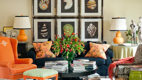
Just like we have our own unique personalities, we have our own unique color or design style on dh of course there's a lot more that goes into design style and it's actually gonna be covered in one of my future courses next year, but today we're particularly talking about how you use color in your home to create your personal style and so I thought that the most fun way tio look at this would be to take my own case study not just my own homes but all of my work over about the last ten or fifteen years because I can actually show you and explain to you the evolution of my personality and a lot of things a lot of things affected my age trends what's happening in the world all sorts of things geographic locations really my color style has evolved as much as my personality and think of how much we change in a ten year period or a twenty year period. Now we're really some so many things stay the same, but a lot of things actually you're different as you get older, you get more confident in ...
general I think you don't care as much what other people think and I find that really effects um your color style in your home so definitely individual and personal but this would be it will be a fun look for us to kind of do the toby through the years tour and I think also this would be a great time if some of the other questions that you've had and that that our viewers have had today that that relate to some of these images pop up, then we can certainly take those kind of questions, so twenty two thousand three, that seems like yesterday and the sense, and it was a long time ago, right? So we're thinking ten years ago, and this is that bedroom I was talking to you all about earlier, when I lived in the mid century house with a pink tile and so here's my pink and bit rid bedroom, and I told you, it was fun and not as as hideous as it sounded when I was describing it, but certainly a different period in my life. So this is an arkansas magazine that it was featured on, and then here's the halloween all year long as my husband called it, or the orange and black version of what was going on in our house, and if you can see in this there's orange, actually in the head board, so there are ways, and we're gonna talk about that as we, um, go through the next few days have had a transition color through your house, because I know we've even had some questions about that, but there are a lot of things that you probably noticed already those of you who are familiar with my work that are different for one thing there's a lot of strong wall color, and we've just been talking about how a lot of my rooms now are a lot of neutral, um, rooms with pops of color and other places, so we're definitely going to see that evolution bold, monochromatic look here and then really almost monochromatic, but but but blended with black and white over there and that's a cute or something I said I recognized about myself as I started studying my own work, which was kind of interesting how often I used black and white as a base for a lot of the work that I do and depending on so note here, how much color is in the room and then really the black and white is kind of an accent and we'll see as we move forward how that changes I'm also just styling and trends you khun see more stuff, more visual noise, less edited in some senses with this space, even though the color is really simple and a lot of that changes through life just depending on what's going on in your own personal life for me, I travel a lot more now I have a young child, we have two dogs, there's things there's plenty of noise happening in our house without me adding to it with that sort of visual clutter. So, again, it's, not the wall color that necessarily makes this so noisy, but just everything else that's happening in this space, and it was much more energetic. Dynamic. I think that also is sort of a sign of of my age at the time. It was probably late twenties, early thirties, when I was doing this, a very daring, having so much fun with color, but really maybe not knowing who I wass not just a za designers muchas even from my own personal space is because this was my actual house. So, um, it'll be interesting for you to see the difference as we move forward. But one thing that I did try to stay true to then and I do now, um, is really paying attention to the architecture of the space and letting it even helped with the color accused. So definitely fifty's ranch style modern horizontal on. And you see, some of that retro vibe reflected in these spaces for sure. Uh, moving from there, this was a show house. I did, and I remember intentionally thinking, you know, earlier I was talking about a high rise, which there aren't a lot of those in our area, and so really using the sky and nature and surroundings and the metal buildings and a lot of those things as my color key for this space but it was a definite departure from most of my rooms at the time that looked a lot more like the spaces we just came from so this was sort of my first dipping my toe in the water of a lot softer tones and as a designer it's interesting because this looks like a very classic space but at the time it was really trained forward to go with really light walls and gray tones which were just not being used at all we were seeing lots of dark gold neutrals like camel and brown and so this was really forward which is funny now because this is what's really trickled down to most people being comfortable with these kinds of values lighter tones even gray tones on the wall so the first little blip on this kind of really vibrant strong color path that I was moving towards this was ah ah a moment that I could see some significant change coming into my color personality um and a lot of layering with the texture of fabric silk and velvet in achieving some interest with really that mix and the attention to detail this was more definitely where I was living most of the time in my um color style this is for a client that had three at the time hot junior high children daughters they're all out of in college or out of college now but look how strong the wall color wass I mean look how much different a space looks with that really vibrant turquoise on the wall and bright red on the wall and it's so much more bold and strong and it also is maybe a little less sophisticated in many ways these are kids spaces we weren't trying to be sophisticated necessarily but I think a lot going on in the way of color and and in saturation not much space to wrist it's really interesting to me and some of that is just happening because that's what's on trend at the time darker paint colors were definitely on trend more vibrant paint colors on the wall um and I was using as I do now still the fabrics as a starting point in a jumping off point for these designs which is interesting but much more dramatic bold and saturated this is the same house and these were the more public spaces but definitely a little closer to what I'm doing now still some strong color on the wall even for a neutral it's darker than what you're seeing in fact you're going to be surprised when you we look back at some of the pictures we've been looking at this morning like the one that saw on the screen and the brakes with my black sofa in the orange phyllis I think you're not even probably realizing how light that wall color is but it's fun to see it in relation to this you know we already have a question we have a guest online he's wondering I guess looking at these rooms how many colors are too many colors in a small home under a thousand square feet? You know it depends on how how experienced you are with using color because of course for me or for some of my designer friends or people that are really comfortable I guess there's not a limit but for most people you're gonna want to stick to maybe three or four colors in a space and then really transition at least one or two of those colors from room to room and we'll talk about that more even later in the week specifically had a transition colors so I can get a lot of colors in the house if you have, you know, depending what did she say? How many square feet a thousand thousand so that's pretty small it's not as much about saying I can't have more than three colors or I can't have more than five colors it's more about how you use them and if you have some key pieces like a piece of fabric that has five or six of them in it it becomes that sort of tie that binds or that transition piece that holds the whole design together I call it a point of reference eso if you're letting some product do the work for you you can get a lot of colors in the space but I would say most rooms I just it also depends on what you're looking for because something like this which falls sort of close to a complimentary color scheme the blue and yellow it's kind of not far from the blue and orange kind of complementary scheme those air we're keeping that really tight on color there's almost just really two tones happening here yellow but I mean two colors but a lot of different towns intense so like a yellow and a blue and every version of yellow and every version of blues sort of brought together in the space which looks gorgeous then you take for example a room like that kelly worsley room we looked at this morning that might have six or seven colors in it but that's a little bit harder for the average person to pull off a cz well too so the more the more experience you get the more colors I think you could bring into a space um and certainly using those elements to tie it all together like a fabric really helps so but yeah so this is very traditional very classic and really close to something that's pretty timeless because this to me doesn't look dated now but I do note that the wall colors were warmer golds not as much as the gray kind of scheme we're seeing, not as much gray is what we're seeing now and a little bit stronger, but still really pretty light and neutral very, very traditional this is an extremely traditional home, the architecture, and so I tried to be mindful of what kind of structure and space that we're working in on make it consistent again, this was another kind of quintessential typical look for me at the time. So again, I think bolder, stronger, busier, a little noisier from a fun I still think it's fun, but I'm sure that as we move forward, you're going to see that the percentage of color in a space and kind of the noise gets quiet or inquire for me and that's, even just my own personal preference of what and and I think things we've even seen just with what happens in our society and and our culture from everything to nine eleven on other events make people want the last noise or less clutter, I think at times in our lives than what we used to have so but definitely this was a client with young children and very strong color palettes, and this is also another complimentary color scheme, blue and orange. S so that's what that's based on high contrast, lots of energy on dh, then a lot of point of reference to nature in the pool and you can certainly see kind of where the color palettes came from, but much more going on then you probably see in a lot of space is now this was sort of my first foray into a monochromatic or neutral space even, yes, the pop of yellow and their semi l a layered into the space, but it's pretty neutral, which I don't do really often you, khun stephan lee, see a sign of the times that this is is not as updated in the form of the size of furniture and some of those sorts of things that we're not seeing. So maybe it looks a little dated in scale, but the color palette that that pop of yellow we see everywhere now, so what's interesting is designers like me, especially people who love to push the color envelope, will venture out and pop in a color that just on the cusp of a trend. So this was two thousand seven that was several years ago, what, six years ago? Um, and now a lot of people are comfortable seeing a pop of bright yellow in a space, but at the time it was pretty forward teo bring that color palette in there, so again that whole kind of like runway fashion idea of throwing something in that is unexpected it's what I like to do here's just a couple more pieces of that. So this is on that kind of analogous color scheme and the inspiration came from the the drapery from peeing toe orange to yellow all in those warm tones but on a neutral base so starting to kind of lane into that whole concept of a little more simple background and more color in accessories a cashmere throw, a linen pillow um, you know, different texture happening there, which is fun, so you can you'll be able to see this as you now start becoming mindful of what your color choices are, you'll be ableto look back at choices you've made before and go that's when I was doing x that's when I was really into this, which is kind of fun to see this was another children space, but look at the difference already over here this is just the cover of the magazine this is not my work, but this piece over here look at the difference already were from that those teenagers rooms with the bright turquoise wall two transitioning to a neutral wall with a little pop of accent color at the top, these friend racer stripe so starting to get some more sophistication kind of that idea of longevity we were wanting to create spaces for for this little boy and his sister, they were in kind of like between ages, so when you spend a lot of money on a space for a teenager or like it's a more like a ten year old, they're not quite a teenager, but they're not a little child anymore, so you really need something that's going to grow with them if you're going to invest in these kinds of pieces, you kind of wanted to maybe get him through high school or pretty close to it, you're not going to start all over in a couple of years, so the idea was how do we create something that's goingto work for them long term and the the entire house which will see pictures of next had a very mid century kind of retro inspiration. The mom of this family was really inspired by her parents are grandparent's home, which had been built in the thick of the seventies brady bunch era shag carpet, sculptured carpets, wall hangings, avocado and gold and you'll see it in just a second because she really loved that and she felt connected to that. So she had a very specific inspiration for her color palette, but my job was to make that look sophisticated and make it look current, and so this was our version of almost even the rate that retro diner replicated in that headboard with the red vinyl but I can already see in myself and I'm sure you probably can to the transition of my color style and where I'm using color um and what that's starting to look like? So this is the downstairs that we were talking about so retro color palette, even retro kind of pieces but more sophisticated, more updated and you see the wall color trends even lighter as we're moving for. So what? This was two thousand seven um it's a, um, almost monochromatic scheme it's tones of yellows and short truce and then this is where you start recognizing and you're going to see it a lot that I have sort of a black and white base to this project, but they're really more the accents here they're not the room wrapped in white with a pop of color it's the room were after this warm kind of short true cielo over here at least on dh then the black moves your higher around the space yes, from the painting and put it on the floor yes, well actually took the motif from the fabric and put it on the floor and then put it in the paint and commission somebody do the painting that it's actually a relief it's a woodwork that's three dimensional which is really fun and so I love to do that as well, so sometimes in the way that you would use a color in a space and move it around the room and maybe stick toe one color two colors so it doesn't get busy I'll take a motif and enlarge it or shrink it and use it in different ways instead of layering a lot of different fabrics and motifs which could get busy it gives us interests but it just keeps it the same color ah and the same idea around the space so that's a good observation uh but definitely that sort of monochromatic or analogous color scheme that nods to the vintage avocado but in a chic sort of way so I think this is starting to get a little closer to ah our even very close to what my work looks like now and already a big departure I think so I was settling into sort of what my color style is and how many of us you can envisioned that from our own say wardrobe style like when we were in our twenties we were trying to figure out sort of who we were and then maybe in your thirties you're kind of going okay I look best in a this kind of skirt or this kind of jacket or a shirt with a call or whatever you start knowing what what compliments your body or your personality it's the same thing with your interiors in the way use color you start getting real comfortable with certain uses and applications and ideas of color some of the other things I like about this space look at the lucite and almost acts as that prism that we talk about for reflecting the light in this space and I think that's kind of fun it's a reflective surface and it's also has that funds sort of seventies and even eighties connotation to it the rug was custom made in a very retro pattern but it brought all of our color scheme together which is really great so also started becoming really skilled at getting around the question of what happens when you can't find something I would just learned and that happens when as a designer because you have a lot of resource is at your fingertips but I love to encourage people that are doing their own projects toe think beyond like I said this morning by something in painting at a different color their sites and sources on the web now like spoon flower dot com where you can go create your own fabric you can use their patterns and pick your own color you can literally make your own pattern um which is really fun because it allows youto have at your fingertips the same kind of tools that professional designers used to start transitioning unique color palettes because what are the chances that I'm going to go out and find either of these rugs that are exactly in these unique color palette styles flavor size all of that stuff it's not gonna happen, and so I think that's, where a lot of people get stuck to introducing color, you think, well, I'd love to introduce it in the rug or somewhere else, and this is how I'd like to do it, but that doesn't exist. Um, and so you have to get creative and learn how to find resource is or make things one of my other favorite things someone was asking over lunch, about rugs on where to find this one of the things that especially loved to do besides having custom made rugs is tio have carpeting like walter welcome pattern carpet bound into a rug that exactly fills the space that I want on dh. There are even companies who will allow you to pick the carpet colors or here's another thing I've been I've gone to a yarn killers, that's what I mean, I've gone tio other like wall to wall carpeting stores and said, will you sell me this much blue carpet and this much tan carpet? And we're going to cut it in horizontal stripes and bind it all together, and suddenly we've created a pattern on the floor that supports a designs game or a color palette or an idea that we could have never found. For sale out in the end, on the web or in the marketplace. So this is where you're starting to see kind of that creativity really settle in with my style, actually do that, like, I mean, if you go to a carpet store, are the majority of carpet stores actually willing to do something like that? A lot of them either have someone on staff or they know someone that you actually hired to do the work. So I have a guy that in my area that does the binding in the work for me. And so I ordered the goods from the store, the carpet supplier, even, you know, home depot. If you wanted to go there wherever you source the carpet and then usually another person, a craftsman type person will put it together for you, and you can create patterns. You can do all sorts of things, and people always say because I know there's been tons of questions already today. Where do you find this? Where do you find a photographer? Where do you find this? You know, I find it all out by asking questions, and people say, well, nobody wants to tell you. And designers never want to tell you their sources and whatever, I just keep asking until someone tells me, and then I try it, and so most of the time particularly if you're a really good customer of a certain store and you used them on a regular basis you'll build a report with them and they'll start being willing to share with you they're resource is air connect you with people that they want to support news that uh so it is definitely all about asking this spaces there's several things that are interesting about these spaces but this is where you can really start seeing that I the idea of using a medal as a color so the ceiling is gold the lighting fixtures air, gold even the tones of a lot of the beiges look really gold so the whole concept was have this really glam retreat very hollywood mirrored surfaces lucite on dso all of it including the gold leaf stealing was really a color for me more as a as much or so more so than a medal and then the accent color is the turquoise here would towns even become a color in this space because they're really warm honey kind of town so it gives this really great glow very chic and very sophisticated these are some more of the kid's spaces in the house and even see with the wall color here being purple it's still more sophisticated there's a lot of color in the drape over here but the wall is neutral so it's that idea of starting to figure out for me where I can get the most interest in impact and success with color and what material is in, like the lamp was one of the jumping off place is for this little retro playroom on dh. The green in that ceramic color has so much punch and death an interest as opposed to the linen or the swaying on the sofa that are much more washed internal intended. So if that lamp wasn't there, we would lose a little bit of the punch. It's. Not that I wanted to put bright green on the wall, it's it had more impact in the lacquered finish on the ceramic, so I was starting to really understand more complex palates. Diverse pallets. I love the company that makes this headboard fabric designers guild, it's, a european company, and there's a lot of companies, textile companies in europe, that's, particularly even in germany, that are really comfortable with crazy, unique color schemes. And so I let them do the work for me. A lot of times there are a lot more bold than people, even in america, with combining unique palate. So but but if you take this all the way down to sort of that lowest common denominator, the purple in the short truce really are very close to being compliments because purple and yellow or complementary. So you think about how much I mean because this I mean, many of you might even call this yellow it's kind of a greenish are true sort of yellow but that's still pretty much a complimentary color scheme. It's a tryout of color because we introduce aqua has a little accident there too. But you could see how you could go to just the color will and pick these three colors and have the same success. Or you can go to the fabric and reverse engineer a successful pal it by taking cues for men and layering it in um but definitely starting to really use a lot of tents and tones of color. And even when color comes to the wallets in a match or a lighter version like in this purple do you remember when you did that room? If one of those fabrics was your jumping off, I think it was the headboard fabric in particular. I loved that with the circles. Um and this is a fun space and I really rat. And this is another idea that I have used particular, like even in this blue room that was on house beautiful lt's, uh, cover the idea of making another color become your neutral so in this space, instead of wrapping the whole room in a neutral and having a pop of color I wrapped the entire room in purple and you know, some people have been asking from the web questions what about molding and when to do things with molding and we'll talk about contrast building in a minute, but in this room I didn't want the molding to be a line that broke up the space like white molding and it has it has one of those ceilings that's sort of the addict comes into play and there's a lot of different angles, so I literally painted the entire room walls and everything and put purple shag carpet because we wanted retro so purple becomes the neutral here it doesn't contrast with anything it wrapped the entire space, and instead of becoming bold, it actually becomes more subtle because there's no white contrast there's no quite molding there's no white ceiling um and it's the same less sort of cool retreat and then the yellow becomes the little pop and accent tell me this comment sash question came in when you was when you were showing us the last version of the kid's rooms but similarly here cow says it appears that toby uses colored to pop a tooty photo into a three d image and do you see it that way is kind of the question do you help me understand that just a little bit so just it appears that you use color to papa tootie photo into a three d image so just adding that depth what we're looking at here um that even just looking at the two dimensional picture of it you see so you can really start to understand the store, which is what he's saying he can see beyond just this to t to see what else we've done with color and it's even not just color but texture and other services I mean, we reflective silver leather on this pillow or the ceramic on glass blown glass laying all of those things play into the dimensional part and I think that's probably what some of you were losing and lacking in your space is because you're using a lot of flats there says you're trying to accomplish all of this with just paint or maybe you're not even noticing that almost every fabric is of the same fabric content if every single thing in your house is linen unless you're going for a real beachy linen they look it's goingto lack interest as opposed to bring in like a cotton ville that that's real warm and cozy and like something shiny that's sort of like the glamour and glitz of the room so all of those pieces do you think I answered that question or it was norman officer is kind of a comment slash question but just do not think about it that I do I have a question that account a point today comment slash question from susie kay, who says you talk about being bold all the time? Can your home not be bold and still be beautiful? Do you have to have parts of your home with gold accents, which I think you were almost touching on their well, and and you definitely don't have to, and of course, this is a class on color, so what we're trying to do here is show people how tio be more bold and more daring. But even just this morning in our court and the pinterest sports we were looking at, we looked at some in particular from, like phoebe howard, where it's really a mix of everything white, and it can still be very dramatic because it was intentionally lacking color and what's so interesting about it is that layering of elements and pieces and medals and things that make it interesting and collected and not like he went out and bought the whole thing from the local, spurning her stories that give me every piece and put it in my living room and not like you took somebody else's room out of a magazine and said, oh, I have to buy a yellow chevron pillow and a purple coffee table in a grey cap it's not about that that's not really inspiring, either. Even though you love it because it's more about you creating and building a space that you're proud of think about when you build something or you accomplish something your studies something or pass the test, it makes you feel great because you did it on and so I think it's about taking all these ideas and if you don't love color are you intentionally are more relaxed in a neutral spice thing go for, but you could still take a lot of ideas away from what we're talking about today of layering and all of that and have the same kind of effect what we gonna do? I think, for buying into susie kay I think the fact that you said you used this purple, but the fact that he wrapped it round the entire room, the floor, the walls ceiling and created a neutral from a color that didn't start off as a neutral would probably probably work for her exactly so keeping something really, really light? Sometimes I'll paint talk about having an accident say, on a ceiling but so subtle that you have to look twice to go is that purple or is that white s so some people would have so much fun playing with such a detailed, intricate approach, but it's almost the same as liar ing white with cream it's not necessarily about going cobalt blue, an emerald green that's just a great example for us teas here when we're talking about color because it's so much more explicit and it's almost like splitting hairs when you get all the way down to kind of the layering tones. But I think a lot of times those rooms air so sophisticated and so gorgeous because they are that detailed um and and contrast the more contrast you have sometimes obviously the more bold certain parts look, but sometimes also the less interesting they look. I love a little surprise of noticing how somebody did something so intricate and detailed, like yeah, a tiny little difference in the shade of and that's crazy, but designers do stuff like that for a reason. It's not because we want to make things more difficult. There is a real reason sometimes where we go when we want the walls this shade of cream and we want the ceiling just this slightly, you know more belushi ate of cream it's not to create something that no one can ever replicate, but really we had a reason or a result or a mood we were trying to achieve. So here's another space. I think this one's interesting because it looks a little more dated in some respects with the styling, but what's interesting to me about this space was this was the first time that I really remember a specific color combination trend happening in my work, which was blue and chocolate. Do you all remember when that blue and chocolate thing went crazy? And so since then, we've seen a lot of other color trends happen, but that one, for some reason was so strong for the first time in several years that we had seen something that was just crazy. Now he would say it went viral at the time there we didn't have all of the web based sources that we have now, but it was everywhere on this client loved it, and I loved it, and it was fun and s o that was kind of the first time I remember me really going what happens when you really start mixing up the colors that you combine and not just using what you see in the marketplace and starting to create your own color palettes and like we were talking about earlier taking the jade and the coral and making them work together? This was kind of the precursor to that for me, for my own color style it's, a mix of warm and cool it's, traditional and transitional there's a whole bunch of things happening here that a reject position of one another getting more complex, kind of casual and sort of formal at the same time, interesting in collected, um but I love to to take away and this is just the cover of the magazine. It was on not the same house, but I love the the idea of noticing that color. Trance, this is another it's a version of that room. Um here was a show house crazy precursor. We're gonna look at a trend in a little while this afternoon of neon this was in two thousand eight, but that is neon and again designers guild from europe jumping out and being really forward crazy, bold again the runway version of a room. This was a kid space. It was published nationally, the walls were chalkboard paint in a pink the first time you could really start tenting, chalkboard paint any color you wanted, which was sort of fun but crazy, bold, complex neon brights and the beginning of that neon trend. Not that we've never seen a neon before in history we have is everything keeps coming back around, but just starting to see it again and wow, is that crazy for kids spaces? And when I first was really starting to get recognition locally and nationally getting published, I was really getting known for kids spaces, daring kids spaces and people were starting to spend a lot of money and kids rooms, so we were having a lot of fun um with that idea so this is the idea of pattern plus color ah and starting to bring in some ideas of like the david hicks we'll talk about that in a few days who the heck is david hicks but he was famous in the seventies and had some great honey comb patterns and classic shin watari done in a new way said chinese influence and but look at the great towns that are starting to come in so great makes an appearance in two thousand eight we now think great you know, saying oh grey everything's great but for designers it was starting to come on strong early on but much more of my current kind of look grey suede upholstered walls not just paint a little bit more traditional but this client was starting to say how can we make traditional a little less busy how can we have less contrast? So this is really a monochromatic sort of color scheme with a very traditional furniture style and then look at this bold custom rug so that's sort of a quintessential toby fairly giant damos pattern but in a really traditional way so again starting to notice um things about my color style that you're going to start noticing similar things about yours making a color statement with the rubber with the art letting the room and that full of you know light filled space set the tone for what the walls look like sunny yellow um and really fresh I think this was my living room in my last house many of you have seen and will see later where it has transitioned to even have a a blue introduced to it but very a monochromatic kind of color scheme look how much lighter the walls have turned it almost everything in that room is white white sofa white rug white in almost white wall white chest white lamp shades and yet we read that as a green room, don't we? So this is where the pop of color comes in and I'm really starting to understand how I love a space more specifically my own home that is softer and more subtle in the background with just some interesting moments also these lamps look really kelly green here but actually there's called hunter green there christopher spits miller great friend of mine who makes a beautiful product and I thought that was so fun to bring back the idea of hunter green in two thousand eight when people many people were still scarred by navy and burgundy and hunter green as the color trend they remembered from the the nineties and never wanted to see it again so for me it was fun to get a look you can have hunter green and it could be current and it could be fresh and it depends on what you do with it well, I think it's really interesting um because I think that the geometric print like on the lamp shade right there is more now than then but you've already started introduced that five years ago I think that's really interesting because it seems like it's just now just in the last year trending and like normal people homes that is really interesting to see that and that's the difference and why people look to designers as those tastemakers and trendsetters cause it's really our job to be studying what's fresh and to be noticing things that we haven't ever seen before and having the confidence like we have the confidence because we get to do it every day and it's not our only house and you know or even in our own houses we know that we're not afraid to use it so we can bleep way before other people leak whether it's a color trend or a pattern trend or any of those things um and give you sort of permission to use that later on and it does take several years for it to trickle down and when you start seeing it everywhere like this is a pattern I just designed with lamps plus when you start seeing it everywhere, then you know it's more towards the end of that trans life cycle when every story you go into and that's not necessarily a bad thing it just means that it was such a great tran that everyone has embraced it all the way down sort of the food chain from the least expensive item to the most expensive item, but when you first start seeing things introduced, probably with the doesn't designers that air trend forward a lot of times they're the luxury items that costs more money there because only the daring companies like designers guild or someone would really leap out and do something really bold. I think this fabric was from jura lee actually and the's great barclay butera chairs I think he's brilliant because he took a wing chair and made it fresh again and so it's that idea of taking something that you've seen a million times and making it really forward. But I will thank you for the observation because I agree, I think that's why many of you gravitate and study designers work for years before you leap because you have to kind of watch them and see what worked for them um and before you can try it yourself any other okay, so here's the rest of the space. And so you saw this room earlier of mine. We've been looking at it actually on the screen during every break and the way it looks now and it has a lot of orange in it, but when I thirst moved to this house, remember what I was moving out of orange and black and white the halloween houses my husband called it, and so I didn't want that any more. Personally, I was tired of all of that bold orange color, even though it's one of my favorites, so this became monochromatic on this with that black and white base, but really a green room in a green color story. But you can't hide from the things that you love the most, so eventually and it didn't take that long, the orange came back into the space because I love it and we'll see that in a minute the evolution, but really simple and clean here, and I was even trending away from all of the stuff. So all the things that were on all the coffee tables, look how many things are on this table like it really simple and pared down when in the last house I had things everywhere, so I think we're going, we see that in ourselves depending on what's happening in our lives. This is my daughter's room for at our last house, so lots of black and white again is a base for purple um, and we're going to see today that I'm going to tell you that purple is really trending right now, but this was in two thousand eight say, like you're saying. Um and part of what inspires me is the fabric companies that are daring enough to bring a really forward kind of color. So that's where I'm taking a lot of my cues and finding some really unique fabric and going oh my god, I have to use this like how can this become part of what I do? And I think it's also what allows magazines and like house beautiful that have great editorial content because there's people like me who are willing to leap and do things that are very daring early on in that trend lifecycle um let them there's parts of this that so the purple's really fresh and forward but then a lot of this is really classic designed to and it was a nineteen seventy six brick traditional I mean it's not a modern house it's not a all white minimalists interior so it has to really support where we live and the architecture of the home too little more of that good question because I have a question we dio bethany has a question she likes airy cool colors blues, greens graze but she lives in a cold winter climate minnesota would those colors maker rooms for cold in winter? They could but you know what? You could do some things that were really amazing with that layering effect to make them extremely cozy, so think about layering and a whole room that's grays and you go from everything to maybe a pale gray on a wall to like a charcoal flannel that you can imagine like a men's men's wear or, you know, some real chunky heavy wool fabric that feels so cozy like you have on your favorite winter blanket sitting by the fire so it's more about not the color itself but how you use it, how you layer it, what you know if if it's all shiny and reflective it's going to feel more cold and if it's never me and warm and texture is going to feel like it wraps you sort of in cashmere, right? You can kind of vision that I'm ready for it to love it. Yes, I almost think again to its like that idea of leaning into a small space with the jewell box effect almost like the idea of leaning into her her great climate because wouldn't maybe feel a little out of place if you had citrus tones and everything outside is grey and gloomy, it might feel a little strange, like a departure, so it makes more sense, I think, to be mindful of your surroundings, for sure.
Class Materials
bonus material with enrollment
Ratings and Reviews
1st Carpet Cleaning Ltd.
Very convenient and creative! Continue In that way!
a Creativelive Student
Fantastic Course!!
Student Work
Related Classes
Interior Design