Lesson Info
14. Re-Color Artwork Interface
Lessons
Class Introduction
02:37 2Color Overview
11:38 3Color Panel
13:51 4Swatches Panel
12:22 5Creating a Tint
09:47 6Creating a Gradient
04:13 7Creating A Color Group
05:55 8Applying Swatches
17:15Lesson Info
Re-Color Artwork Interface
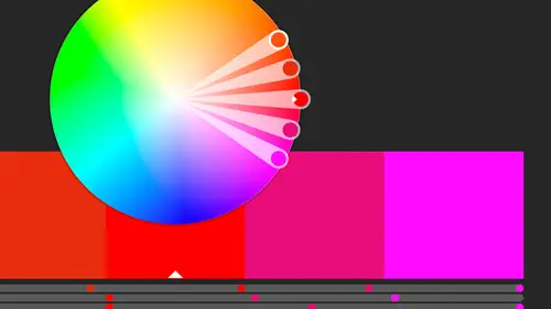
I wanted to start from scratch, so I'm gonna go back and hit Assign. So the first thing I want to show you that you can do, and actually let's select a little bit more, all those. I can come in here, and I'm just gonna come down to this little pull down menu here and say, Global Adjust, so right now I've got all the colors mapping exactly as they should. Each color is mapping to itself, and that's basically what it's showing is that this bright orange is mapping to this bright orange. This pink is mapping to that pink. So right now we're not doing anything with remapping colors. I just want to globally adjust it, so maybe I just want to drop the saturation across the board on this entire selection that's here. And again it's not the whole across the board on the whole document. It's just this one particular instance of the bicycle. So let's just make it a little less saturated, so I can just drop that back all the way back to grayscale. So the nice thing is I just now made all my color...
s across the top gray, so that might be a quick way if you wanted one showing in gray, and everything else in a color, we can do that as well. So let's change this here. Let's maybe change it a little less bright and a little bit more to the green, and maybe a little bit more light here. So again, I'm globally adjusting that across the board, without changing the colors, without mapping the color, I'm changing the luminosity and the brightness of that across the board, and again at any point I can come in here and change that so I have that as a color set available to me in my Swatches panel. I'm gonna go ahead and reset that, all right, and just go back to the way it was. I've got all these colors selected, that's probably way too many. Let's actually cancel out of that, and I want to select fewer colors, because that like I said is a lot of colors to map. So I'm actually gonna select just two colors. Let's go with the orange and the red. I'm sorry the orange and the teal, and I selected both tires this time, and sometimes if I'm not sure, what do I have selected, I might come in here and just find something really bright and obnoxious, and make sure that's exactly what I wanted to select. So I just selected a different color, and do Undo, and we're gonna go back and choose the Recolor Artwork option, and I'm gonna open that up, and then I can take these two colors, and I can simply swap them. It doesn't have to be only two to start with. I just did two to make it nice and simple. So instead of playing with color rules that are here, I've just got these two colors that are selected, that's what shows up in my panel here, and I just want to swap them. So all I need to do, need to look over here. This is the color as it, the color that it's coming from, and this is the color that it's going to. So I know it's a little annoying to try and figure that out, but it does have an arrow so that kind of helps. So this maps to that. So in this case I'm just gonna grab this teal color, and drag it up, and now I've swapped the colors. So now my frame, and actually I can deselect this, just so you can see, that's before, that's after. So it's a quick way to just swap colors that are in there, or just remap which one is which. So swapping them, just drag them around. If I had more than one color selected, let's also grab the seat, so now I've got a red as well, I've got three colors here. Again, swapping is just when I drag one on top of the other. The original one pops into place where the other one was, so I can select these, and then I can also maybe select those, and turn on the Recolor Art, so we can see what's happening with that. So I can just keep playing with these until I get sort of the combination that I like. Especially if I only have three colors to choose from, it's a nice way to say, oh which combination looks best with those colors that are there? And again at any point I can save those colors. Maybe I just want a group that just involves those three colors. I can save that over there as well. So that's how I swap the different colors that are there. All right let's say OK to that, let's Cancel that, and then I'm gonna go ahead and select all of these, and I'm gonna go back up to that Recolor Artwork. And if you notice, there are a lot of colors that are here, and so for me sometimes I'll just select a ton of colors or a ton of objects in my document, and I will use those as my color rules, just as a starting point. So I might click on this item and I can either create a new color rule from here, and everything else will change by the harmony rules that are here. Let's do something that's not so obnoxious here. Let's try this monochromatic, and you can see the kind of nice color that I've come up with. Now, how is that happening? Well right now it's using sort of, it's only using these four, five colors that are in the color harmony rule, right? So I've got these five colors here. What is it doing? That's a lot of colors to look at. Well I had 32 colors to start with, right? And I've told it that I want to keep all the colors to this particular color harmony rule, right? So I picked which one was my base, and then I said, base the color harmony rule off of those, and now what it's doing is it's mapping all these different colors. Now, things that it's not mapping. It's not mapping the black or the white, so I could tell it to map it and basically you click on this little line, it becomes an arrow, and there's nothing to map it to, but I can tell it that I want anything that's black to actually be mapped to this brown color that's here. So I can just slide this item up and now that black color is there as well, so I can kind of see where the black is, and that's mapped to that color. Any color that's in this range here that it came up with is mapping to this orange color, and again, it's gonna be in order of the color that's here, so keep that in mind. That's the color order it came up with, and then it kind of tries to decide what would look good in that color scheme. So anything that has this yellow or orange, or red tint to it, is being mapped to this orange color. Now, if you notice this is two solid lines, and these have a lot of tints in here, and what that is, when I click on this little item off to the side, little arrow off to the side, it says Scale Tints. If I don't Scale Tints and I say Exact, now it's going to, instead of giving tints of everything, it's going to make it that one color, just that orange color that's there. But if I tell it Scale Tints, it's going to actually, should be catching up, come on. It's going to actually bring tints up. Let's see, let's give it a second. You have to click off of it, I always forget. So, Exact, soon as I click, you have to click off of it for it to show up. So now it's using that solid orange color for all of these colors. But that's maybe not what I want. Now some of them look a little different again because there's transparency applied, but for the most part it's saying, if there's this solid color, make it a solid orange. If it's this solid pink, make it this solid orange. But what I like are the scale tints when I click off of that, because now it's taking all the different variations of that color and assigning a tint of that orange color to kind of show up. So again if I've told it, these are the colors I want from this color rule, I can do that. I can map this. If I decide I don't want this gray being mapped to there, I'd rather have it mapped to the lighter brown, I can just move it down. If I want the yellow to also be mapped to this lighter color, I can do that as well. So I can just drag these colors around until everything is sitting in the exact layout that I want. This gray one probably should be down here. This gray one could probably be down here as well. So again I'm able to make changes to the color, and where that color came from again was that harmony rule. I'm gonna hit Cancel, and I'm gonna go ahead and select just a couple colors. I've got the teal, and I've got the red, and we'll go ahead and grab the orange as well, both tires. I'll grab that, and I can instead of the color harmony rule, I can choose a color harmony rule, in this case I'll check one that has let's do three different colors. It doesn't really matter what it looks like. Those are pretty ugly, but what I really want is I want to constrain it to a specific swatch library. So if I say I've got three colors, these three colors that I want, I want to constrain it to three Pantone colors, but based on these colors that are here, I can do that as well. So I'm gonna come into the Color Books, Pantone, let's do Coated. So when I do that, it shows the three Pantone colors that match the three colors from that color harmony rule, and they match pretty well. So now I'm working with three Pantone colors, those three Pantone colors that are there, and I'm also going to map those three colors. Now those three colors, I only had three colors to start with, so I don't have multiple colors across the board. If I had selected all the items, and then chose the Pantone, or the harmony rule of three, and mapped it to Pantones, I'd still have three Pantones but I'd have to make it work with all the colors that I selected. In this case I only had three to start with, and this one, obviously the red changed completely to this blue that's here. I could swap them at any point, and decide, oh I like that like that, and then click OK and it's gonna go ahead and recolor the artwork as it is. So that's one of the ways we can do it. We can constrain it to a color book. It doesn't have to be the color book, the Pantone color book, it could be any of the swatch libraries that are there. Pantone just seems to be one that we're gonna have to work on a lot, and that's one of the other things that we can do is we can take a color, like we've always been able to take Pantone color and then say, oh let's break it down into its CMYK parts to print process. Maybe we were doing it spot color, we were doing black and a Pantone, and then at some point we realized we had black and four Pantone colors, and at that point, that's five colors on a press. You might as well just print it four color and then get all the colors that you need. Or if you're printing photographs anyway, you've already got to put four colors on the press so you might as well just go four color. So we might take a Pantone color that was originally done spot, and say now we're gonna print it in CMYK. It's probably gonna look a little different, but close, but we've been able to break it down into the components. What this does is let us kind of work in the opposite direction. I can take something that's built like this, and I realize, first I was gonna print this four color, right? Or maybe I am gonna print it four color but then at some point I want to print a two color job as well, or I've been working digital, and I can use any color I want, and now I need to print it. But I only need to print it, I'm only gonna be able to print it in two colors, right? That's all the client wants to pay for is two colors. Maybe black and two colors. So I can change that color to a Pantone color if I want. So the same thing, Recolor Artwork. I have one color selected. I can just come in here and tell it that I want to constrain it to that Solid Coated book, and now that becomes that Pantone color that's there, and I can add that as well. So just Artwork colors, I just want to be sure that I get that Pantone color in there. So I didn't have a Pantone color in there before, but now when I come in here, here's my Pantone color, and it's automatically assigned it based on the CMYK values. It grabbed the closest Pantone value. In fact, you can see, I'm gonna actually undo that so that this is the aqua color. All right so that's what color we have is this aqua. So what I'm gonna do is I'm gonna actually just create a little square here filled with that aqua. And then we're gonna grab that, and we're gonna do the same thing we just did. We're gonna constrain that to our Pantone books, and I believe we did the Coated. We're gonna choose that and we're gonna go ahead and save that, because it doesn't look very different, but when we come in here, I'm gonna go ahead and just duplicate that and assign a different color, that color to it. So you can see they're slightly different, they're not super different, but the fact that it was able to take this four color job, or four color piece of artwork, and find the nearest Pantone to it. Now it was coated. If I did the uncoated, we might have a closer match to it. But the nice thing is I have those Pantones so now I can print this thing in digital or in four color, or whatever, but then also I have a version of it that is just in Pantone that I can do when I'm just doing a two color spot job as well. So being able to map different colors and keep them restricted to the individual swatch libraries is I think a pretty cool thing. To be able to be like, this is the only option I have. I know I have all these colors, and I know that there's all these other variations that are on here, but these are the only ones that I really want you to be able to work with. Let's see, I want to do, I thought there was one more thing I wanted to do. Remap with limited colors. Do we have a question at all over there? We're good? Okay, cool. So yeah, so for me I'm often just grabbing the colors that are here, and then mapping them around. So let's just grab, let's grab all of these again. And map them, and again I can come in here and just decide that that is a really big color group that's there. I can create that color group. If I've been working with those and I want to use those in other documents, I can create the color here, and then I can save that out as an ASE file, or I can save it out as an AI library as well, so I can have that for other people to use, just because it's something, just by pulling it off of the items that are here. I thought there was one more I was gonna show you. Basically this is like, if you want to, oh if you want to limit it, so here the thing is, like if I have all these colors, and I want to limit it to a certain number of colors and I didn't want to use one of my harmony rules, I just want to create a certain number of colors, but I'm not sure which ones I want I can come in here and I can say, let's limit it to three colors, so it's going to grab the first three colors that's based on that. Now I can go ahead and choose my color harmony rule, and then I've told it actually three so it's only grabbing the first three. Now I might want to add in that fourth one. To do that though I have to actually have it as a color group and drill down, and to get that last one in there, maybe I want this color to be that one. Maybe I wanted these first two colors and the dark brown that's there, and so instead of that I want to be able to remap that to that brown. I'm going to double-click on that which brings up that Color Picker, and I have to manually put in the values that are here. So I'm actually, can I go into the swatches? No, I don't have a swatch there, so I'm gonna go back to the color models, so I can come in here and just look at that last one, and type in those values. One, one, three, 70, and 60, so I type in those values there, I get that brown, and say OK, so now I've got the first brown, the pink, and the middle brown sets there. So those are the three colors and because I told it I'm limited to three colors, now I'm back to mapping to those three individual colors. So for me, it just manually takes almost everything, I'm not really sure how it picks which colors go where, because to me this color is almost the same, so why would you not map that to that color? So again, it's just a matter of dragging in the colors that you want, and maybe we're gonna put all the pinks and reds here, but I think this green should go up top here. And move that down, so I can just keep mapping those colors until I get a color combination that I like, but I know that I'm limited to three colors. And whether or not that's gonna be three colors that we're actually going to control with Pantones where it's actually gonna be a spot color, or it's just that I don't want that many colors in my pallette. I just want three to be there, and the nice thing is I can say, okay those three are nice, good, great, and then I'm going to go ahead and save that swatch panel that's there, and then I can grab these colors on this next one and do the same thing, and so I have a nice variation. I have limited it to three colors. I could choose which three colors I want. I can remap the colors as needed, and again I'm watching it happen over here and I'm not really worried about what colors I'm picking but I'm kind of just deciding what gets mapped where. And then whether or not it's set to tints which they are by default. So now just by using that Recolor Artwork I've kind of come up with a different look for each. So if I were making, let's say just different icons and I wanted for each section of my newsletter, I wanted a different color set, I now have this as a color set, and I also, if I've saved it to my swatches, I also have that available as well. I didn't save that last one, but I have this first one here. The nice thing is, that's a color set. I can save that out as an ASE file. I can open each color set individually and bring those into InDesign and then when I do chapter one I've got kind of this pink and brown theme going. Then I've got the teal and brown theme going, and just by creating and playing with the colors here, I can move those out and make those available elsewhere. The other thing I can do is I can also bring colors into my Creative Cloud library, so I can either bring in individual colors, or full groups as well. So I can come in here and I can select this color group, and right-click. I can actually select that color group, and come in here and save that out to my library. Let me add that. I'm just gonna grab this and drag it across. Yes, no, not letting me do the whole library. Come on, let me add it. Why is it not letting me add it? So it's adding the individual color. I should be able to add that entire thing to the library. Why it's not letting me, there we go, I'm sorry. Add selected watches and color groups to the current library. So it's down here in this little button. I'm sure you can drag it but I can't get it to work for me, so I'm gonna say add that, and so now I've got that color group here as a color theme. Or I can individually, if I wanted to I can add individual colors to my library here. So I can either save it out as an ASE file, and distribute it, or I can put it into my library. If it's for me I'd probably put it in the library so I have it available to me. But if it's something where I want other people to have it, I would save it out as that ASE library. But hopefully you can see that the Recolor Artwork is a lot of fun, I think, because it really gives you the different color combinations and how colors work together, even if you're kind of color wheel stupid like I am. You don't really understand a lot of this stuff. You understand the concept, but the actual being able to think in those colors, but when I see the color combinations together, I know what I like and what I don't like, and I love the Recolor Artwork that you can just keep remapping and playing with it until you look at it and go, I like that, but then you also have the tools to save that and share it, and use it across your documents.
Class Materials
Bonus Materials with Purchase
Ratings and Reviews
Anka
A lot of useful information about work with colors. Solid colors, Gradients, Global Swatches, Color Groups, Object Mosaic for grabbing colors from images, Color Books, Libraries...and so much more! This is a class for those who want to know everything about color management and use of colors in Adobe Illustrator (some information is helpful even for Photoshop and InDesign users). Erica is a great teacher! She has a good articulation. It's important for those like me whose native language is not english. She speaks evenly (neither slowly nor quickly) and to the point. I definitely recommend this class!
Gemma Kelly
Erica is a really clear instructor. I found the class really useful and the pace was great. This will make my workflow much quicker and I cannot wait to put what I have learnt into practice.