Lessons
Class Introduction
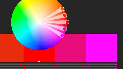
02:37 2Color Overview
11:38 3Color Panel
13:51 4Swatches Panel
12:22 5Creating a Tint
09:47 6Creating a Gradient
04:13 7Creating A Color Group
05:55 8Applying Swatches
17:15Lesson Info
Color Overview
I've got a couple different color modes we can work in for output and also for creation. We're gonna be working with two of those today. So there's three main ones that I'm gonna talk about. And I'm actually gonna open up my color panel just so we can kind of see those colors that are here. And if it isn't showing, under the Window menu, all your panels, most of your panels, are listed here. We've got one called Color. And I do have it open. But I also have work spaces up here, and this tells us which panels are showing at any one time. And if you're in 2018, like I am, they made a new change and they have Essentials and Essentials Classic. I'm using Essentials Classic because it's what Essentials used to be. And it basically just gives you a smattering of panels for you to work with, and the three that I need most for this class today are all here. So I'm using the Essentials Classic workspace from the top of the Control Panel. And I'm gonna open up this little one here, the color. An...
d if I can't see that, or if I can't tell what that icon is, or I can't remember what that is, I can roll over it, but if I don't want to do that, I can even click this little double-headed arrow here and expand that so I actually see all the different panels. In this case I'm not going to, I want as much screen real estate over here, and I'm just gonna click and I'm actually gonna pull out each one. So I'm gonna pull it out, and then actually kind of tear it off. I'm gonna grab it by the top and pull it off. I'm gonna close that up. So basically I opened up my color panel. And for whatever reason, Illustrator's panels are mostly collapsed down. So the first thing I usually do is make sure that my options are showing, because there's nothing more frustrating to think, I know that lives in this panel and it's not there. And it's probably because you need to go up to the little Panel menu and choose Show Options. And I don't know why it frustrates me more in Illustrator than anywhere else, maybe because there's some really important things that aren't showing up until you hit Show Options, like the color panel, like the actual values for the color. I'm gonna open that up, and I'm gonna go back to that Panel menu that's over here. And I'm gonna look at these different color modes that are here, and we're not gonna deal with grayscale, but obviously if you're working just in something that is grayscale, I haven't done anything like that in a really long time, but if you are, you could choose grayscale and work with that. We're gonna work with RGB, and I'm gonna talk about CMYK. And we're gonna work with HSB, as well. So and also if you want to use the Web Safe, safe colors, the old set of I think it was 216 web colors, you can choose those, as well. If that's where it's going, you know it's going to live on web that needs to be working on all browsers of all ages, and you know, varieties and vintages, then you might need to use the Web Safe. But I want to talk about CMYK versus RGB. So you probably have heard these terms, you may know what they are, and you might not. If you're working in print, you're gonna actually print on paper, or even a T-shirt or packaging, anything like that, you're gonna print on a substrate, using either toner or ink, you're gonna want to work in CMYK. And the choices for that, well, I'm sorry, let me back that up. We want to make that choice, again, from the beginning. Is this going to print? Let's work in CMYK to start with. We can always change it later when we export it, if it's going to digital, in addition. Because CMYK is sort of a more restrictive color space, meaning we don't have as many options, we don't have things like really bright colors, because the fact that it's being printed in ink or toner or some kind of solid, paint, even, something like that, we're gonna be working in duller colors. So if we know it's going to print, we don't want to suddenly fill our design with these great, beautiful colors. Like, I have some really nice bright colors over here, and I'm pretty sure they're not gonna look that bright and gorgeous if I go to CMYK. But again, if I am working in CMYK, I have that option to choose that. For instance, we might know what our corporate colors are in CMYK, we might put them here in CMYK, but later when we export to a PDF, we can do that, that becomes RGB, but we're okay because we started with the more restrictive space, there wasn't any wild color out here that can't be reproduced in RGB. So again, printing, CMYK. If you're not going to printing, if everything that we're doing is going to be digital, in some way, we're gonna show it as a presentation, we're gonna put it into a PowerPoint or a Keynote presentation, or we're going to make PDFs, or we going to in any way put this together so that it's viewed digitally on any type of digital device, we're gonna work in RGB. So I'm gonna come in here to RGB. We may know what the RGB values are of our corporate colors, or whatever it is we're creating here. So we have those values to work with, as well. We also have HSB, which actually I work a lot in when I'm trading colors from scratch and when I'm not so worried about maintaining a color that matches something else. So in this case, if I had this file that we're working on with all these fruits, I just know I'm going to have a bunch of different options. And I'm gonna make, say, a PDF of my product catalog and each one's gonna have a little icon next to it that has a fruit that's contained in that product, or something, then I'm not worried if this orange is a specific orange. It just needs to be a consistent orange throughout this document. It's gonna be the same color. I might work in HSB. And that is when we're dealing with hue, so the different colors, the saturation, how bright that is, and I'm sorry, how intense the color is. And then also brightness, how bright the overall color of that is. So it's hue, saturation and brightness. So if I know that it's going to, let's say, a PDF that I'm gonna put, I may work in RGB, and work with those values, simply because I know what those values are, and those values kind of translate across the different devices. If I know what the RGB values are here, and I've created something else on a different computer or a different device that works in that, or I want to convert, let's say I have a Pantone color, or a CMYK color, and I want to convert it to RGB. Generally speaking, I'm able to find those conversion numbers, whether it's online or something like that. So I tend to work in RGB, most often. But some of the tools we'll see in the later sections of this class, we're gonna actually work with HSB even more. So that being said, we kind of figure out what color we want to use, and also when we create a document, we probably want to tell it what color space we're working in. And then we can always change that later, if we want. So I'm gonna go and actually create a new document, choose File, New. And depending on your version of Illustrator, this may or may not be the welcome screen that you see. This is new, I believe, in 2017 they introduced this layout. You might have an older version of that. And also 2018 they introduced a few more items over here in the Advanced. When I'm creating something new, if I know that it's going to print, I'm gonna choose from the Print, up here, and then I can choose any of these document pre-sets that are already here. I can also create one completely from scratch, and then save it, and then that will also appear in this menu here. And what's nice about this is it has a little bit of a visual, although it's not super helpful. It tells you what the size is, and of course these are all in points instead of inches, so I need to set my preferences to change it to inches, if I want to view those in the inches. If I'm going to Web or Mobile, I'm gonna be presented with some standard sizes for that. So Web, I'm gonna get some standard web sizes, and also Mobile, I'm gonna look at specific devices. So Web is kind of a good option, because web, even though it's set to a size, it's more common sizes, I guess, but it's mostly going to be wide, obviously. So if you want something tall, if you're working on a tall design, that you know is going to be viewed simply maybe on a phone, or you're making icons or something for an app, and you know that that app is going to viewed, maybe it's the splash screen, and the app is always gonna be viewed in portrait mode, you would probably want to start with something along those lines, so one of the phones or something like that. Keep in mind, it's gonna be different for each device that you work on later. But the main thing I want to look at here is when I'm choosing one of these items, and I come over into the Advanced options, I can see that my Color Mode changes. So I went into Print, and it automatically assumes you want CMYK. So it knows if you're going to print, it needs to work in CMYK, which is that more restrictive color space. If I switch this to Web, it's gonna automatically switch to RGB color for me. Let's say I started in Print, and I create that file. And I decide, oops, later on I decide I want to work in RGB, I can totally change that, under the Document Color Mode, this is where we chose CMYK, but at any time we can switch it to whatever color mode we need it to be. So it's under your File menu, Document, Color Mode. So I can switch that to RGB. And we can see what it is up in the tab, as well. So it tells me that's RGB, everything I have pretty much is RGB. So we can switch to that mode. So if you didn't do it upfront, we can do it later on. And again, even though I might be working in CMYK, I can create RGB colors, as well. Or if I'm working in RGB, but I know that maybe certain things in here, I might create a bunch of stuff together, but a couple of things I know need to be used in print and in digital, I might start out with the RGB document here, but make sure when I'm creating a color to put in an item, that I'm working strictly in CMYK for that particular item. Again, it all goes back to what your workflow is, where it's coming from and where it's going to when it leaves your hands. So I'm gonna come over here and just look, I just have some really random stuff that's on here. Just with some different strokes and fills. So I basically just want to talk about this, if people are just jumping into Illustrator, and maybe they're coming from Photoshop and they basically just do re-touching and haven't done much with shapes or anything, or if you're new to the whole creative cloud, all together, and this whole idea of strokes and fills is foreign to you. So I'm gonna actually look at some of that. I just have some items here. This is for instance just a rectangle that I created using the Rectangle Tool. I have some other tools down here for different shapes, as well. So I just created that. And what happens when you create a shape, I'll just drag out that shape, and it always uses the last fill-in stroke that you used on whatever you touched last. So the nice thing is, if I want something like this, I can just select that item, and then when I create a new item, it automatically has that information in it. So anyway, I create that item, and I'm gonna come down here. And the stroke and fill lives in a couple different places throughout Illustrator. It's here in the Tool Bar, it's also here in the Color panel, as well, and in Swatches. And so I can tell it what I want to fill the item with or what I want the strokes to look like. So I just need to make sure that whatever it is I'm effecting is at the foreground. So in this case, the filler's at the front, or I can click the stroke and bring it to the front. And right now, the little line through it is telling me that there's a stroke, of none, and I can just, like I say, choose the last fill color that was used, and the last stroke that was used, as well. So I can do that, and now I have the same fill color and stroke color, which doesn't help a lot, except that it is there and it's good to know, because we can actually play with transparency, and the stroke and the fill work independently. So even though it doesn't seem to look any different because it's the same color, it may or may not make a difference down the line.
Class Materials
Bonus Materials with Purchase
Ratings and Reviews
Anka
A lot of useful information about work with colors. Solid colors, Gradients, Global Swatches, Color Groups, Object Mosaic for grabbing colors from images, Color Books, Libraries...and so much more! This is a class for those who want to know everything about color management and use of colors in Adobe Illustrator (some information is helpful even for Photoshop and InDesign users). Erica is a great teacher! She has a good articulation. It's important for those like me whose native language is not english. She speaks evenly (neither slowly nor quickly) and to the point. I definitely recommend this class!
Gemma Kelly
Erica is a really clear instructor. I found the class really useful and the pace was great. This will make my workflow much quicker and I cannot wait to put what I have learnt into practice.