Lessons
Class Introduction
02:37 2Color Overview
11:38 3Color Panel
13:51 4Swatches Panel
12:22 5Creating a Tint
09:47 6Creating a Gradient
04:13 7Creating A Color Group
05:55 8Applying Swatches
17:15Lesson Info
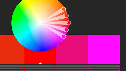
Creating a Tint
Let's work a little bit with some tints and gradients. So, right now I'm working with the solid color. I've got the solid color of this lemon yellow that's here, and I wanna work with tints. So I basically want to create like, say, 50%. Now this is not the same as transparency. And I know it gets confusing, especially because if it's onscreen, and you don't have anything behind it that it's interacting with, a transparent item, and a tinted item can look exactly the same. And if you're going digital and there isn't anything behind it, you might be okay using either one, but we really don't want to mess with that. If we're not using transparency where we actually need items showing from below, don't use it because it actually adds more information to your file, which can create bigger files, or more complex files. And we might not want to actually do that. So, tints might be something we want to do. Now, let's say I have this colored with this green. So this is one of the greens that wa...
s here. It is not a global color. Well, if I go into my color panel... And I'm actually gonna pull this guy back off so he's floating separately. Come over here, close this guy up. I just wanna be able to see both my panels at one time. So if I have this item here, and I have him selected for this color, and I make sure that my options are showing. Notice every time I close that panel, I lose my options. I gotta show a panel. How am I supposed to create a tint? I want 50% of this. I suppose I could go in and create 50% of each of these numbers, which sadly, is the way we used to have to do it. If we had an RGB, or a CYMK color, and we wanted a 50% of that, we had to mathematically do that. We had to do math in the old days, people. This was, you know, that's how we used to have to do it. But now we don't have to worry about it. But I can't do it with this color. Why do I not have an option for that? Well you can only add a tint to a global color. So again, here's another reason to use global colors. So, I'm gonna go ahead and just, in this case, let's just change it to this green that's here because it is a global color. As soon as I do that, I have this ramp, which we saw once we assigned it a color and saved it to swatches. It suddenly turned to this tint ramp where we had all the tints available to us. Now I can just manually drag it across until I find something that looks good, or I might know the exact value I wanna put in here. I want it to be 50%. I'm gonna say okay to that. All right, so I've got that. I've got that 50% tint as well. And so now I actually want to go ahead and add that swatch. So I'm just gonna click add, and now I have 50% of that. So it's lime green, and gave it the same name, and it created that tint for me as well. So now I have an actual swatch that is 50% of that. So that means if I copy that, and I want this one to be 50%, I've already got that set there. And it's linked, so that if I go back and change the lime green color; if I change that to something that is definitely not lime green. It's very dark, very dark green. Say okay, my tint for that changed as well. So because I selected the color, assigned the color, then I selected the tint, then I hit new color, it automatically created a new color from that tint that was already assigned, and it grabbed all that information, and it locked those two together. I can delete them individually, but they are linked together. So that if one changes, the other one changes. But again, it has to be global for you to even get to the point where you choose the tint that's there. All right, let's grab this guy. And I'm going to just create a new document. So we don't need all those colors that we created. But if I go back to the one that we just had... Let's go back to here. And if I grab this guy, and come to here, then I at least have those colors. So, by copying and pasting those, I brought in those colors, and went ahead and threw that in to my swatches. And everything that's in here is automatically filled in. It's processed color, it's global, it's not added to any library, and of course, I had this selected. Let's undo that. I had it selected when I double clicked, and of course, it assigned that to the object I had. I wanna create a gradient. So I've got this item here. And I want to give it, I want it to graduate from one color to another, right? So I want it to go from, let's say the yellow to the green, inside the same document. So I can create a gradient. I've got a couple different ways I can do that. I can just choose a new gradient from here. I can say, just choose a New Swatch, and create it as a gradient. Or I can choose an existing one. Or I can just create it with the Gradient tool. So, that's basically what I'm gonna do. I'm gonna go ahead and select this item, and I'm gonna also open up the gradient, I'm gonna click the Gradient tool, but I also wanna open up the Gradient panel, which I have over here. I'm gonna choose this, and I'm gonna pull this off to the side. So it's sitting over here. And right now, it goes from the color that I have selected to nothing. So I need to actually tell it that I want my first color to be that yellow. So I clicked on the gradient ramp that's here, and it automatically has these two color stops. All right, so it has white to black. So by default, that's what it wants us to have. And then it's got the half way mark, and that's where the transition happens; is at half way. Doesn't have to; we can change that. I can decide if I wanted more of the white, more of the dark. Right now, I'm gonna leave this set at 50%. Or, really close to it; that was weird. All right, doesn't wanna do that. And, but now I need to change the color. I wanted it to go from that yellow to the green. So what I'm gonna do is I'm going to just click in the color here, and I can either double click, or I can drag a color in. In this case, I'm gonna double click on it. Sure I am. And I wanna click on the swatches here. Instead of the color; I could create a color from scratch if I want to, but instead, I wanna grab my swatches, and I want to choose the yellow. So I want it to go from yellow; but I don't want it to go to black, I want it to go to that green, so I'm gonna double click on that, and hit that green. It's a nice dark green. So now, I have yellow to green transition, and it's in a linear format. So it goes just across. I'm gonna do a gradient in just a little while. But right now, let's stick with this. And I can even reverse the gradient if I want to; have it go backwards. But right now, I'm just trying to create this gradient color. So what I have, is I have this gradient, and I wanna go ahead, and I want to bring it into my swatches. So I'm gonna grab this. I thought I could pull this. Nope. I'm gonna grab that and drag it in, which is how I added it. I thought I could add it with a menu. So I'm gonna click on that color that I've created, and drag it in. So now, I can assign that to any item that's here. So, that's how to actually get it in there, but I might wanna change it for each individual item that that's assigned to. So in this case, I'm gonna just zoom in a little bit. And I like the way it looks, but I wanna change it for this particular instance. So I'm gonna go ahead and use the Gradient tool. And by using the Gradient tool on the object, I'm changing the gradient on the object only; not the actual gradient itself. So I'm just going to click and drag to show it what direction I want that gradient to occur in. So I can click and drag. And notice if I'm outside the circle, I'm seeing less of the gradient 'cause much of it is living outside that circle. I could also do a really short line, and have the gradient happen in a smaller area that's here. So, I can change the direction of it. So I'm just dragging across it to get the gradient that I want. I can also play with it here, specifically, and I can change the mid point within this gradient here. So it's basically this same thing, but it's actually just on the object itself. Whatever seems to work best for you. But let's go back and change what this gradient looks like. So I'm gonna double click on the gradient here. No I'm not. I'm going to make a change to it. Oh, come on. I'm gonna go ahead and make the change here. I'm sorry about that. I'm gonna go ahead and make the change here without the item selected; so I'm not changing that item, but the gradient itself. And I can even change things like change it to a radial instead. So I can go ahead and change that, and I'm gonna just sort of add more color to each of that. And then when I'm done, I'm gonna make sure that this gradient is also here available for me. So when I select this item, and select that gradient, I've now put a radial gradient inside that image that's here. I can add more gradient stops if I want to, just by clicking down below. So I can have multiple colors, and by dragging where they live and how much space they take up, and where the actual transition happens between each, we can see what's happening over here as well. So to do that, I'm gonna change these colors, obviously. I'm need some different colors. So let's just randomly select some of the other colors that are here. Oh, that's gonna put everybody to sleep right there. (laughs) Let's actually change that there. So again, because it's a radial it looks a little odd, but again, I can take that, and when I'm done that I can drop that inside there as well.
Class Materials
Bonus Materials with Purchase
Ratings and Reviews
Anka
A lot of useful information about work with colors. Solid colors, Gradients, Global Swatches, Color Groups, Object Mosaic for grabbing colors from images, Color Books, Libraries...and so much more! This is a class for those who want to know everything about color management and use of colors in Adobe Illustrator (some information is helpful even for Photoshop and InDesign users). Erica is a great teacher! She has a good articulation. It's important for those like me whose native language is not english. She speaks evenly (neither slowly nor quickly) and to the point. I definitely recommend this class!
Gemma Kelly
Erica is a really clear instructor. I found the class really useful and the pace was great. This will make my workflow much quicker and I cannot wait to put what I have learnt into practice.