Lesson Info
17. Adobe Illustrator Grid
Lessons
Day 1
1What Is an Infographic?
21:55 2Creating Adobe Illustrator Shapes
40:48 3How to Edit Shapes in Adobe Illustrator Part 1
17:41 4How to Edit Shapes in Adobe Illustrator Part 2
24:33 5Simple Adobe Illustrator Icons
46:07 6The Pathfinder Tool and Adobe Illustrator
28:06 7How to Create an Icon Part 1
25:40Icon Design Tutorial
29:19 9Rotate Tool and Adobe Illustrator
30:44 10The Shear Tool
44:27 11Adobe Illustrator Swatches
33:54 12Adobe Illustrator Effects
29:17 13Adobe Illustrator 3D
20:41 14Typography and Adobe Illustrator
34:37 15Illustrator and Text
32:18 16How to Make a Grid in Adobe Illustrator
18:12 17Adobe Illustrator Grid
26:52 183D Icons
17:42 19Pie Chart and Adobe Illustrator
18:01 20Bringing It All Together and Becoming an Infographic Maker Part 1
40:36 21Bringing It All Together and Becoming an Infographic Maker Part 2
44:48Day 2
Lesson Info
Adobe Illustrator Grid
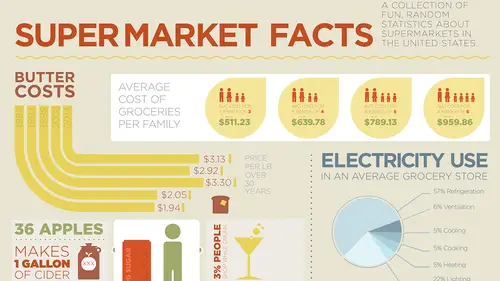
So a couple of other pieces of information, that I have here, this one's fun, going in and doing the electricity use and the cost of butter and I already know what kind of font I'm gonna use, how I'm gonna put this together, so I'm gonna copy this over, I'm gonna drop this right into here, I'm gonna park that and turn on my story here to see where I kind of did it, wow, I really have not paid attention to where I put my items on the page there, so I'm doing a story, but at least I've got my grid structure. So now I've got these items to work with here, I could work with them separately, but I'm gonna do here and I think with this, I'm gonna have a little bit of fun, because I think this infographic here is gonna come down and I'm gonna put a little divider in here, I don't go and normally put in solid dividers here, I like use little dotted lines or things like that, I'm gonna show you how to do connectors very soon, when we start calling out information, where it's going to fit. So I'...
ve got the cost of butter right here and I'm gonna change all this font to Gotham, which I had been using before and if I was really smart, what I would do is I would go in and just add, okay, so there it is and I need to figure out the butter cost per pound, that's gonna be its own title, so I'm just gonna take that and I'm gonna put that right over here and fit that in there, Butter Costs. Alrighty, I think I'm gonna do my headlines in All Caps and that way it makes it a little bit, yeah, per pound over 30 years, do that, return on there, if we go and make that a bit bigger, I may actually go in and make this whole thing bigger to kind of fit the entire column, just to make it look a little bit better, I did Paragraph type, so you can see when I try to scale the whole thing, it doesn't work, so I'm just gonna double-click, convert this to Point Type and then when I hold down my Shift key and I pull, that's gonna scale everything right there and I'm just gonna turn to help clean up a little bit of that space, yep, make that a good color and I think that's going to become our yellow, I just feel it, Eyedropper tool, go up, yellow, maybe a darker yellow, yep, there, that's good, do kind of like a 70% gray there just to see how that's gonna work out, hm, okay. Now I wanna do a fun little infographic here, what I wanna do is, I don't wanna just do little bars of butter, I'm actually gonna do the years and then I'm gonna do kind of like a little swoopy angle thing, that comes around like with my concentric circles and then they're gonna kind of stop at varying lengths here to kind of indicate the dollar amounts, kind of like I've done over here, but I need to have some fun with this, I'm not gonna draw a picture of butter, sorry, I may go ahead and divide the ends of butter to make it look like a little pat of butter, but I'm doing everything two-dimensionally here, so I'm just gonna kind of leave it in the two-dimensional form, I am gonna show you how to do some three-dimensional, cool stuff, using 3D here, because there's some certain things, that I just wanna show you, but this is what I'm gonna do, so how I'm gonna work this is I'm going to go and I'm gonna draw a circle and this is going to be my circle, it's going to come down here and then the bottom of that circle is then going to come right down here, so it's gonna come around just like that and that's gonna have a border on it and that's going to be by Stroke right there, again, I'm gonna put my Stroke on the inside of my line, because you see, as I added my Stroke, it went outside the edge of my grid there, so if the Stroke is on the inside of the line, the side doesn't change, but the Stroke then grows on the inside, really good point. Okay, so with this now what I wanna do is I want to go in and I'm going to do concentric circles, 'cause I've got a lot of pricing here and I think this needs to be less of a stroke, simply because of its thickness, alright, so now I wanna do concentric circles, that are inside each other, 'cause I'm gonna have 2013, eight, three, '98, '93, '83, over this so I'm gonna need one, two, three, four, five, six circles, that are gonna create these lines, so I'm going to take my Scale tool, which I have used before, I'm going to option click in the center and with my Preview turned on, I'm gonna try scaling this down, say 85% and I'm gonna see what that does, okay, so it kind of does that. Alright, so I think 85, I'm gonna do 80% here and I'm going to copy it, okay, ooh, that's gonna work, okay, now I'm going to go in there and option click again and do this and if I do 85% again, or 80% again, you'll see that the spacing isn't quite right, because it's that whole mathematical parabolic equation here, so I'm gonna do 75%, choose Copy and that's gonna work and I'm gonna guess this is 67.5%, choose Copy, boy, I am good and this is probably going to be 50, let's say 57.5%, (laughs) and click Copy, nope, a little bit too big, so I'm gonna do 52.5%, that's it, Copy, sweet, so we've got one, two, three, four, one, two, three, four, five, yep, okay, well guess what, we have 2003, 13, eight, 13, eight, we're just gonna take that one off, there we go, (laughs) didn't have enough room for it, took it off, that's how I manage data, very well, folks. So now I've got all of my strokes and I'm actually gonna go in here and I'm going to get rid of all those points, okay, whoops, did I take away too much? I sure did, get rid of those, get rid of those and now I've got my little strokes right there and these strokes are now going to align to the inside, nope, that's not it, let me align to the inside here, so I'm gonna bump this all up, so that it fits like so, okay. So here's my little butter chart right here and I'm gonna have these run, so that they're going to come down here, so my years are gonna be up here and my costs are gonna come out over here and I'm gonna make that so that it actually fits right there and I can increase the stroke on these as well, so I get the good spacing and I have to reduce that, so it fits right inside the chart, this is gonna look cool. Spacing here, I'm gonna have to reduce the size a bit, because I'm concerned about the spacing, when it comes to the spacing between these items and kind of the weight of these, I don't wanna have things too close together, 'cause the spacing starts to get a little bit too weird, I wanna have consistent spacing of things, so I'm looking at overall thickness of the letters and then the space between the objects as well. Now, I'm going to come in here and I'm going to click on the end of my line right there and I'm gonna grab my Pencil tool, 'cause of course, I can just draw my Pencil tool right up and it's gonna connect that line right to there, this is one of these cases, that I would definitely draw a guide on here or pay very close attention, when you take your Pencil tool and draw, that you go and you snap and for some reason, it doesn't want to snap right to that point and I had a sneaking suspicion about that, so I'm gonna select this object and I'm going to snap a guide right to that, so that when I draw these portions right here and I take my Pencil tool, then I can draw here and I can touch the guide right there, perfect, so I'm gonna use my Command key to select, use my Pencil tool as I go and I forgot to hold my Shift key down, when I did my Pencil tool right there, Command key to select, Pencil tool with the Shift, click on all the way up, didn't go all the way up there, I'll have to go back and fuss with that one, Pencil tool all the way up to the line right there, beautiful, back to my Direct Selection tool, grab that line, Snap to, so I have to go beyond it and then I can snap right to that as well, okay, that one extends a little bit beyond, what is it with the non-Snap-to with the guides? Anchor, hold down the Shift key, Snap, okay and of course, I got pretty close here, but not close enough, so in this case, I have to pull it further away and then snap it, because the Snap to likes to snap right back into its original position. So here's Butter Costs over the years and you can see the kind of chart, that I'm starting to work with here, now again, I don't know how long each and every one of these is going to be, so my scientific method, I'm just going to draw a container, that is going to be 3.13 millimeters long, I don't care how high, you know, quarter of an inch and there's that one and then, actually I'm gonna draw that, not 3.13, I'm going to do it 313 millimeters, that draws it really long and I'm gonna keep drawing these and so the next one's going to be 292 millimeters, got that, okay, I line these all up and this is going to determine my lengths of my lines and therefore my prices, wow, 330 millimeters, that was a long butter back in 2003, hm-mm, and then my other two sections right here, my 205 and my 198, so 205 millimeters, not inches and then my 198 millimeters right there, okay, great, let's select all these items, align them all to their left edges right there, I can distribute everything right through there and then I can go and I can truncate all of these like so and they're all gonna be in proportion, 'cause I don't care really how long they are, I just wanna make sure everything's proportionate right there, so now I can control where those are going to fall and maybe my little lines and call outs are going to come right here, so that's great, now I've kind of got the sense of where these things around going to fall, when they come out of my lines here and I can now go in and park my numbers in here really well and so with this, I'm just going to drag this down, I know where my stopping points are with every single one, so I'm gonna use my Connector tool right there, I can use my Pencil tool, drag right out and I'm gonna bring it out right to that one, go to my Direct Selection tool again and then the Pencil tool, that one's gonna be dragged out to that one, you can see ultra precision, I'll line these up and then the third one is going to come out and that's gonna go a little bit further there, beautiful, fourth one gonna go in, Pencil tool and that one's gonna be much shorter, that one's gonna fall right about there and then Direct Selection tool and that one's gonna fall right about there, probably a little bit longer nonetheless, okay, yep, wrong arrow, cool. So there's my little chart, that I've just created with concentric circles and all of my lengths right here, of which I can then just go line up and I can see just how far off I am with each one and if I bring those to the back, there it is, grab that, I can bring in that intersect with that one, that one intersects with that one, right, that one with that one and then I know that my values are just where they need to be, Snap to it, come on, gotta pull passed it and then go back to it, okay, beautiful, that one's a little bit long, I'm gonna select those and of course, I can deselect these, which then get rid of it, cool, there's my lines, there's my chart. I'm gonna select all of these, 'cause I need to make it a buttery color absolutely, I can turn these into a path, if I want to, don't really need to at this point, so I'm just gonna leave them like this and it's 24 point, 'cause I when I go and I take my Eyedropper tool and I sample the color here, it's going to want to fill them in, convert them back to that and that needs to be made 24 point again, there we have it. So there's my Butter Costs over the years, now this is gonna look quite delicious, isn't it? Hm-mm, I thought so, I really need a headline for this one too and I think that's where we're going to need to do something, 'cause it kind of needs a little header, just like this one has and this, I think, the Per pound over 30 years is gonna go away and I am going to put it into a separate container right here and that's gonna tuck in very nicely right there to look nice and tidy and fill that space quite well, price per pound over 30 years, okay, that looks good, the Butter Costs may go like that, increase the size of that, cut down the letting, tighten it up kind of nicely, do that as well and maybe this gets bigger, kind of fill in that and then increase the point size as well, reduce the size of that, okay and now I may have to move that down, so all that information is gonna fit, I'm gonna put that right there for now, so it stays within that and I can move those all down in a bit, if I so choose like so, hold down the Shift key, sweet, there we go, I like that and this can go down too and it can't be this dark either, so it needs to be a much lighter gray or a much lighter yellow on there, beautiful, I like, I like it a lot. Now the prices here are gonna go at this end, because I want to go ahead and call them out here and then my years are gonna go right through here, so I've got my call outs here for my years, I'm actually going to copy this, because I'm gonna get rid of all my years and just do my prices and one of the things I wanna do with my prices here is I actually want to do a series of call outs, 'cause I wanna show you how to do call outs here and it makes sense to just run the prices right off the ends here of each and every one of the lines like so, but if we go in and we actually put the price at the very end of our line here and put equal spacing there, then all of the prices are going to be staggered with the ends of the lines here, so I could either go in here and I could put the prices all right in the middle of my objects here, so we could see, you know, what's going on over time, which is kind of boring, because it doesn't really show the distance there or I can go in and I can actually put the prices and do like little connector lines, sometimes the connector lines are fun, because they actually connect right to the butter and I think because the way this is done and I wanna have a little bit of fun with the butter here, I'm actually gonna take each one of these out of the text container and put it in their own little object right here and I can put this right here at the very end like that and I think we're just going to go in and I'm just gonna put a little pat of butter at the end, so I'm gonna draw my little container here, same height as that, keep that, use my Eyedropper tool just like that, boom, there's the color and I'm just gonna put a little pat of butter at the end there, okay, who knows, gonna try it. So this next one's gonna be $2.92, so I'm just gonna type that in, 2. and then I can copy this and put that little pat of butter at the end there as well to kind of call it out, kind of puts it in there nicely, I don't wanna draw lines, you know, if I go through here and I draw a line from here, it's so awful to go ahead and connect stuff like this, I'm just gonna make it a black line to make a visual reference there, you start putting lines in here and it just totally detracts from what it is that you're trying to do and it's like you've got all those connector lines, you put this in here and it kind of calls everything together, we can do connector lines, but I'm gonna do connector lines that are fun, because we're gonna need to point out certain things, I think when we do our electrical use right here, we could do a pie chart, but we could also go in and we're gonna do a pie chart on this, but we're gonna have the numbers coming off the pie chart and we're not gonna go ahead and just do, you know, little pointers coming off the pie chart here, we're gonna do awesome pointers following that grid structure, okay. So as I'm going through and doing this, do we have any comments or anything in the chatroom? Well, let's take a look, shall we? Yes indeed. Alright, so let's see, APathy "often uses photos in infographics, "and looking for tips and tricks "on how to keep it clean." For that clean look, that you're going with now, Hm-mm. Is that something you would ever use or like maybe photography on white backgrounds, just real simple things, Jason, or do you try to keep it? I generally don't use it in here, because I don't know if I would consider myself a purist, it's just a particular look that I go for and when you start introducing photography in there, you can, but you have to make sure the photography is extremely consistent through everything and it also is going to compliment the look and the feel, you can use it, by all means, it's just that that adds yet another level, that you really have to pay attention to and it could be complicated. Okay. But sure, you can use it. And then it says, "Do you have a good source for datasets? "I'm particularly interested in the cost "of college education over the past 30 years." There's nothing like the internet. Okay. (laughs) Usually the data is provided to me by my clients, so I don't really go through and hunt down the data by any means, but there are companies out there that will go ahead and do the statistics for you and get all that information, that's not something that I do, because stats are something that I think have numbers in them and I am not a numbers person, Okay, at all. and then Cayenne would like to know, one of our regulars, "When drawing those lines out of the curve, "why did you use the Pencil tool, rather than the Pen tool? "Is it a personal preference "or does the Pencil do something better than the Pen?" No, I was doing two things, I was approving the point, that I wasn't gonna use the Pen tool, Yes, yep. when I don't need to, but I was also using the new feature in the Pencil tool. Cool. So would I have used the Pen tool? Absolutely, but I didn't wanna become too much of a hypocrite, because when I said I wasn't gonna use the Pen tool, would I have used the Pen tool? Absolutely, thanks for asking. (laughs) So HowdyTooty would like to know, "When creating graphics, do you Align to Pixel Grid "to account for Pixel Perfect design?" Can you align the, is there Align to Pixel Grid in Illustrator? There is and aligning to the pixel grid is when you go into your View menu and you have your Guides here, you can Show the Grid on the page and the grid is going to be, you can see the grid right there and you can see the actual grid on the page, that's fine, the biggest problem that I have with that is when you're trying to line up copy or when you're trying to line up stroke objects, they're gonna snap to that grid and in some cases, you know, I may not want it to snap to that grid, it's a personal preference, I use the overall grid to lay my stuff out and I basically snap everything within that box inside the grid or set of columns or rows here, I don't get down to the actual Snap to Grid feature, you can, if you want to, it's not how I do it. Okay. But that doesn't mean that I know what I'm doing. "Is there such a thing as," and this is from CupcakeStylers, "Is there such a thing as an infographic being too big, "too small, too many steps, too little steps?" It's all a matter of how you're telling the story, different people have different ways to tell the stories, every graphic designer has a different look and feel to what they're doing, over the years, I have always had a particular look and feel and no matter what I do, (laughs) I always end up with very much the same looking graphic over all those years, so it's kind of interesting, so I don't know how to answer that one really. Okay and KatrinaIs Hungry would like to know, "How do you go about charging for an infographic, "especially if you're not 100% "how complicated it's gonna be, "before you start the process?" I think with any design, that when you start off, it's always hard to gauge what you're going to do. If the client gives you an accurate representation of what it is that they want, can show you examples of what's been done before, what the outcome is and you know, you have the good data, make sure you look through the data and you can understand it, understand what they want, I think you can price accordingly, you can understand of how long it's gonna take to build this module times 10, times and you can get a pretty good idea. Of course, if you go in there and don't get all the questions answered, or the client's gonna change things, it's kind of difficult if the client comes back in and says, "Hey, could you change this?" You know, it's like, well yeah, I have to rebuild it, you know, there is no real quick and easy way to change this little butter cost thing, you know, I mean, I had to build it this way and it was purpose-built. So definitely try some of this stuff, figure out what it is that you're comfortable with and ask all the questions you possibly can about expectations, so that you don't get burned in the end. Great, thank you, I think we're good to roll. Okay. So there's my little Butter Costs section right there and I've got my dates right here and the prices over all the years and how things have, you know, done and gone and you know, you could throw a little slice of bread in there, if you really wanted to to make it fun to fill that little space and yeah, who knows, it's always something fun. Okay, and if you wanna create a slice of bread, which I know you wanna create a slice of bread, I'm just gonna go ahead, I'm gonna create my little bread, oops, I'm gonna do a rounded-corner bread, so I'm gonna increase the rounded corner there, there's my little slice of bread, keep it square, top really doesn't matter, because I'm gonna go ahead and put my bread on there and how I'm gonna do the top bread is I'm gonna go in and I'm gonna roundy the top like so, go like that and then I can go in and I can merge those two together, there's my piece of bread, hm-mm, herby, that's how you create bread and if you really wanna make it bread, then of course, you can just simply swap it and you get all crust and no bread, so it's all crusty, get a nice piece of toast right there and then you can slap a little pat of butter in there, but I actually like the fill like that and then, if you really wanna make it crazy, then you go in and you make a little square right there, you make it white or you make it buttery, actually I'm just gonna use my lighter color butter to make it nice and subtle and then I'm gonna just do it like crazy, I'm gonna throw it at a 45 degree angle, I'm gonna throw it on the bread there, there we go. So there's the cost of butter right there, actually I'll lighten that up just a touch right there, there we go. Maybe my bread needs to be brown, like I've chosen up here, so Eyedropper tool and do that, yeah, you know, that could work, right there, there's my little butter and you know, I think I'm gonna have to cheat this, folks, I'm actually gonna have to turn this another 22.5 degree angle, just for fun and put it asymmetrically on there, there it is, there's my toast, there's my bread, why not have fun with it and actually, you know this brown here, I'm actually liking that color for the Butter Costs right there and I'm gonna pick that up right there, ooh yeah, that calls it out nicely and you know, I think all this black right here doesn't need to be black, I think that can be brown too, yep, much better, sweet, sweet butter, hm-mm, there's the cost of butter over time, nice little infographic, sure would be boring if we just did sticks of butter going all the way up.
Class Materials
Free Bonus Materials
Ratings and Reviews
Kathleen
I'm not even through the second day yet and I'm thrilled with this class! Only thing, I wish he would go slower BUT then again, if he did, we wouldn't get SO MUCH information. I'm glad I purchased the class so I can go back and replay to my heart's content. Even though this class is based on creating infographics, the wealth of information is perfect for any project using Illustrator. I do wish he would have shown how to work with corners (for example) for those of us who do not have CC (I'm in CS6) so we could learn the "hard way without widgets" and the easier way with widgets. Jason is very funny and I love his direct approach to getting the job done while knocking a clients socks off. I look forward to many more classes taught by Jason.
a Creativelive Student
Another amazing class from a man with a seemingly unbelievably clear mind. So great at conveying the concepts of the program so that you can effectively learn actual methods but also walk away with enough information on the way the software is organized so that figuring out a solution to a design challenge, on your own, is light years easier and faster. i am thrilled with the broader grasp of the possibilities i learned. i could go on and on. It is absolutely a class worth taking whatever your level of expertise.
Rozlen
Loved the class, learnt so much from Jason even if he talks a little fast sometimes he is still very funny and makes it look so easy, would love to buy his indesign class too love watching him, excellent teacher.
Student Work
Related Classes
Design Projects