How to Make a Grid in Adobe Illustrator
Lesson 16 from: Building Infographics in IllustratorJason Hoppe
How to Make a Grid in Adobe Illustrator
Lesson 16 from: Building Infographics in IllustratorJason Hoppe
Lesson Info
16. How to Make a Grid in Adobe Illustrator
Lessons
Day 1
1What Is an Infographic?
21:55 2Creating Adobe Illustrator Shapes
40:48 3How to Edit Shapes in Adobe Illustrator Part 1
17:41 4How to Edit Shapes in Adobe Illustrator Part 2
24:33 5Simple Adobe Illustrator Icons
46:07 6The Pathfinder Tool and Adobe Illustrator
28:06 7How to Create an Icon Part 1
25:40Icon Design Tutorial
29:19 9Rotate Tool and Adobe Illustrator
30:44 10The Shear Tool
44:27 11Adobe Illustrator Swatches
33:54 12Adobe Illustrator Effects
29:17 13Adobe Illustrator 3D
20:41 14Typography and Adobe Illustrator
34:37 15Illustrator and Text
32:18 16How to Make a Grid in Adobe Illustrator
18:12 17Adobe Illustrator Grid
26:52 183D Icons
17:42 19Pie Chart and Adobe Illustrator
18:01 20Bringing It All Together and Becoming an Infographic Maker Part 1
40:36 21Bringing It All Together and Becoming an Infographic Maker Part 2
44:48Day 2
Lesson Info
How to Make a Grid in Adobe Illustrator
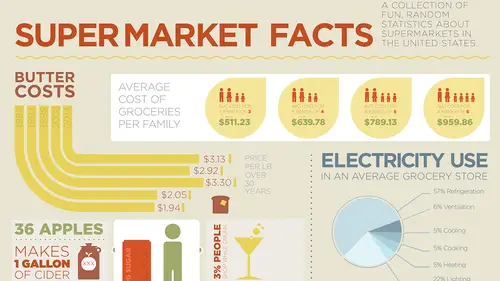
What I want to show you now is I need to kind of put everything together into some type of grid structure. We're starting to build this all out. So I've got a lot of information on here that I want to include. And you can see, I've already filled my art board substantially here. But I've got a whole bunch of information here. You know. It's all about grocery stores so, I've already worked on these. With the cost of grocery bills there. We got electricity use in the grocery store. The cost of butter over the years. The top reasons why people shop. You know, when barcodes were actually started. Top ten items purchased there in the grocery store. We can actually figure that out. All this other great stuff. So I gotta put this together, in a way that's gonna be visually interesting and fun. You know, there's some little tidbits there that may take a little more presence on the page. Other things, Like this big long list Do I really need to have it take up a lot? Who knows. We're going to s...
ee. So what I want to do, is I want to build a grid structure that I can then bring into Illustrator so that I can have this and I can begin to start to block this out and tell my story of how it's going to look and how it's going to feel. I'm not quite sure what kind of spacial relationships I'm going to be working with here, so I'm just going to build a grid structure and I'm gonna do a quick outline of the story, which is probably gonna evolve over time. Now I do have my little grid tool here that I can go into Illustrator and I can draw a grid. But what I don't like about this is that there's no space between the grid. Because I like that little buffer zone. So actually, I switch over to InDesign. I know, It's not an InDesign class, it's an Illustrator class. But I can make a grid here. I'm gonna create a new document in Illustrator or in InDesign here. And it's gonna be a big poster, it's gonna be a 24 by 36 poster. I'm gonna do 18 by 24 inches. 24 inches because I don't wanna translate into Picas right now. And here is my page size. And this is the size I'm gonna do my infographic poster. I wanna create a grid. I'm gonna use my rectangle tool. I'm gonna click and drag on my, and touch my guides, or my margins. And while I have my mouse key held down, I'm gonna use my up arrow. Up arrow is going to allow me to create rows. Right arrow is going to allow me to create columns. And I like to do odd numbers of rows and columns because it makes it a little bit more dynamic. I don't have anything, when I put something in there, I can have it be two or three columns wide, or four columns wide. And I just like to do odd things. Odd number of things, odd number of rows, columns. A little bit more dynamic. You know you can have symmetry but you can have, you get it. Okay. What I'm gonna do is, Cut the tint down on my thing right here. So this is what my whole thing is gonna look like right there. And it's kinda hard to see. If I make that black again, you may be able to see that. But there is my grid structure, right here. And I'm gonna take this grid structure, and I can actually just take it right from InDesign and I can copy it right into Illustrator. I can also, save it as a PDF, Just export this as a PDF. File export. Export is this grid. Print PDF here. Really doesn't matter the quality of it here, High quality print is fine. View after exporting. It's gonna launch the Acrobat file. There's my grid structure. Great. Now I'm gonna jump over. It's that simple folks. I know. I'm gonna jump over to Illustrator, create a new Illustrator file. I can do it in 18 by 24. Open. Go to my desktop there. File open. Desktop. There's my grid. And I can copy the entire grid. Copy it. Put it right into my document here. And I'm gonna go into my layers. And I'm gonna create a new set of layers here. This is gonna be my grid. I'm gonna put my object on the grid. Drop it behind there. And I'm gonna lock the grid. And so, I see my grid here. It's very faint in there which is just fine. I don't wanna see it the whole time. One of the advantages of putting the grid structure in here is that I now have the ability to snap to these areas. Okay. So if I'm drawing on my actual artwork layer here, and I wanna draw something, you can see that I can snap to that grid structure even though it's locked on my layer, I've got the grid structure. So, how I would go through and loosely lay out my story line is this: I would actually create a layer and this is gonna be my story. I can spell it correctly. I got my story. And I'm just gonna kinda lay this out on how I'm going to actually visualize this whole thing coming together. And again, this is gonna be a work in progress here. So, get my panels snapped together here. It's like walking into a spider web, and everything sticks to your face. There we go. Okay. Much better. That was painful. So I created a new layer called My Story here. I could just barely see my grid. And I'm going to go in and I'm going to just build a basic structure here of containers. Of where my story is going to go. Now I realize when I'm dealing with my family here, you know the cost of groceries for an average family, it takes up a lot of information. So I'm going to make this to be my headline here. And I have all this grid structure that I can then use and I can put together and just kind of spell out there I am just doing an outline right here. So maybe I have a container and the cost of groceries for the family is going to take up this much space. Right there. And then I may do my little chart or graphic right here. For that next to it. Or maybe it takes up three columns right there, and my chart or graphic with some explanation takes up two columns, something like that. Okay. And now I've got other information here. So I've got, you know, the amount of electricity butter, where it costs. You know other items here. The barcode. Things like that. And, I would probably spend a little bit more time on this, I'm just giving you a brief overview of how I'd do that. And it's like, you know, okay the history of butter right here. Maybe a little bit of fun. Maybe it just goes across two rows or two columns here. One row and I just kinda just snap it right to my grid structure. So I get an idea of kind of building stuff in there. Alright. That can be a little bit of fun. I do have stuff that's all about bacon. And I know bacon is really important. So that's gonna take up this amount of information right there on the page. You know we do have kids falling out of shopping carts and we're gonna include that. We don't want to make that a headline story there. You know the cost of butter, over the years right there, well that's kind of important. So that may be the cost of butter over the years. You know, how about apples ripening. Well, you know how apples actually ripen here. Who knows that may take up this amount of space right there. And like I said I'm just kind of winging it. Okay I'm putting it on the page, just to get some visual sense of how this stuff can go. I may change this, but I have to start with an outline at some point. What else do we have here? Oh we got the electricity use, which is good. How bacon's used. Oh and the amount of sugar people drink from soda and things like that. Okay. Well here we go. You know this could be a perfect thing for soda right here. And that could be all this information for the amount of soda that people drink, what they do. Actually, this could work too for, you know, the top 10 things in a grocery store. And also too, I may take out a little section of the bacon area to here, I don't have to keep them in solid blocks. I can just you know, pick and choose. Maybe I'll do that. Maybe I'll just go in and create a box right there so that this comes together here. Don't know. But I just wanted to kind of spell this out. And you see kind of how this story is going to go. And I look at it and it's like, oh you know all these four things line up here. It's like, I don't really like that. So this may happen where, you know this becomes a smaller story right here. This becomes a larger story right there. Something like that. And visually, this may just come down here to kind of break it up a little bit different. And you know, maybe that story stops here. And maybe I piece in a little story over here. Stuff like that. Okay. I'm just building a grid structure here, so I get some kind of sense of how the information's going to fit. And since I put very little thought into this whole thing. I just wanted to give you a quick idea. But again, I'm using my grid structure and my smart guides to kind of snap all this area to those edges of my grids here. So I get a pretty good sense at a bounding box around those objects but I know exactly where it's going to be. And by creating this grid structure too, this also has done a great job here to be able to let me keep spacing in between my objects as well. Consistent spacing is always good and that helps me with my grid structure. So it could very easily turn out to be something like this. I know I'm gonna mess with it but there's kind of my story. And I'm sticking to it. Until I feel like changing it. So that's what I have. I can turn on and turn off that story and I can just turn it on to see if I'm using the correct spacing here. And there I have it. So there's my story. I'm gonna have to unlock my grid here because I have a little bit of a hard time seeing this. And so I need to make this about 30% so I can see a little bit better. So I can snap to that. Does that look? Yep. Okay. I like that a bit better. So story's gonna be underneath everything so I can see what's going on with the story. And this is gonna be my artwork layer as we go and we build. Cool. There's my grid. There's kind of my story layout there. Kind of a little haphazard and that's what we have. So now I got my grid structure laid out and I'd done a little bit of work here before and I don't know if I like this, which I'm gonna grab right here I'm gonna group this all together and I'm gonna copy this over and switch over to here. I'm gonna put this in. Of course I'm gonna scale the whole thing down. And rotate it 'cause this looks like something that would go nicely horizontal right there. And you know maybe this comes in and it takes up this amount of space here or maybe that's too big and I can always scale it down to this amount of space. And maybe it fits beautifully into one little row of copy. Okay. That could be it, kind of a nice little visual there. Jump back here and I've kind of spelled these out into kind of a basic shape with all these. These I'm gonna copy as well. And this may fit into the space right here. I don't know. Oh, big. And I'm gonna hold down my option key so I can scale from the middle. Put this right across. Snap that right in. Now I can see how that's gonna fit into my rows and columns. Again, you notice how I love to be symmetrical about things, well the grid structure allows me to snap these items here and put everything, it's like, oh my gosh. Talk about awesome planning. I mean when you do this enough, seriously it like fits in there perfectly. Okay. Not to say that I'm great but okay. It is what it is. I'm going to line this up with my grid structure. I group that all together. I'm gonna group this all together. I group this all together. And I group this all together. Now with my alignment features, I'm gonna select all four of these groups. Go to my alignment and I'm gonna distribute everything horizontally. So now I have equal spacing between everything. And now, already I've got one shindiggidy of an awesome infographic starting right here. Yeah. I may not use this, I mean this may be kind of bold. I may do this as kind of redundant here. But it kind of gives a nice little infographic here. Now I did introduce a gray, just to kind of give a little bit of contextual color here. That may end up being white and I may end up using gray for background, a technique that I learned from Apple. Because they always do a gray background with white instead. Really cool. But again, I'm just starting to plug this stuff in. Now obviously, I don't talk to myself like I talk to you and I try a lot of different things here. But I'm trying to make it look like I know what I'm doing. So I'm gonna make sure I save this. So that if something goes wrong here, I at least have something to fall back on. Great. So I got my information in there. I wanna put some, I wanna put a headline in here. And, I'm gonna take my type tool. And I'm gonna do Super Market Facts and Tidbits. As my infographic. Is it supermarket or should we use grocery store? Supermarket, not so supermarket I like supermarket. Well it sounds so super. Yeah. Supermarket Facts and Tidbits. We'll just do facts. Okay. So of course supeemarket, like I said, I can do a lot of things, typing is not one of them. So, I'm gonna select my font right there. I can't remember the font that I used before. Gotham, that's right. See. 'Cause I got them there. Okay. So Gotham, right there. Gotham Book. That's looking pretty good. And I'm gonna put that right across the top there. And I'm gonna kern that so that it actually fits right in. So, there we go. So it tops out at the top of that. And sorry folks, I just have to do a quick little bit of kerning here. Just because of the anal retentiveness. Quick and easy way to kern, don't bother to use your mouse key to go in and move your cursor from letter to letter here. Just put your cursor in there and use your not your eyedropper, your arrow keys. I'm gonna move it over and then option left and right arrow. Left tightens, right loosens. Let go of the option key. Move your cursor to the next one using your arrow keys. And tighten that up. Tighten that up too. Like so. And just go through and make everything good. I don't normally kern but when I do. I do it with a vengeance. I wanna go through and I want to make sure that everything looks good and I only do this on my headlines. Right here. And I don't wanna use black. I wanna make sure that I use all the color samples that I had before. So I'm gonna grab all those colors that I had chosen before. Make sure I put this in here and I'm gonna park those. Right there, front and center. So now I can get my color palette and I can understand my color palette. It doesn't help that my gray happens to be the exact color of the background but nonetheless. So Super Market Facts. I may go in and I may do as a dark red here. Don't know why but that could work as well. So there's my little Super Market Facts. Okay. Awesome. Got that, don't quite know where I'm gonna place it. But I think that we're on our way to putting together an infographic right here. You know what, for some reason I just feel that this needs to be over here and this kind of needs to be reduced, 'cause I want that space there. We'll see. As this may go away completely or go into something else. Don't know. You know, we can move this around. Not a problem. I wanna put a little divider here along here 'cause I don't wanna do a box or a bar or something like that. I wanna do something fun and something interesting. So I could just do a little dotted line or I could do something that's kind of fun. If you do a box or you just do a divider bar, it isn't as fun. And it also kind of just messes up everything. So you know, I think I'm just going to draw a line here. Across the whole thing. And I'm going to just do my little transform effect right here and my little zigzag. And I think I'm just going to do a bit of a zigzag here. So I'm gonna go in and I'm gonna do a couple of ripples. And of course, nothing shows up because I have no stroke. There we go. And there it is. And I need to edit that. So go into my appearance, edit my zigzag so I can actually see. Size needs to be relatively low. Gonna do lots of little ripples. One thing that Adobe did not do is they didn't keep what's called little sticky. In Photoshop and InDesign when you click on a preview button in any dialog box, it will always stay on when you click on it. InDesign, or Illustrator obviously did not get that message. They did not. Okay. So I'm gonna do this kind of a red, actually I'm gonna do this as a brown. Flop that over there. Bump up the point size a little bit. Okay. Right there. Cool. There it is. I think that needs to be a little bit more bold. It just needs a little bit more beef up there. Okay. Yeah. It looks good. That, lets see here, Bump that point size down, it doesn't need to be as bright. And I think it needs to be yellow instead. Soft stroke for the fill. Get that stroke back right there. Better. Definitely better. Oh got some nice color going on there.
Class Materials
Free Bonus Materials
Ratings and Reviews
Kathleen
I'm not even through the second day yet and I'm thrilled with this class! Only thing, I wish he would go slower BUT then again, if he did, we wouldn't get SO MUCH information. I'm glad I purchased the class so I can go back and replay to my heart's content. Even though this class is based on creating infographics, the wealth of information is perfect for any project using Illustrator. I do wish he would have shown how to work with corners (for example) for those of us who do not have CC (I'm in CS6) so we could learn the "hard way without widgets" and the easier way with widgets. Jason is very funny and I love his direct approach to getting the job done while knocking a clients socks off. I look forward to many more classes taught by Jason.
a Creativelive Student
Another amazing class from a man with a seemingly unbelievably clear mind. So great at conveying the concepts of the program so that you can effectively learn actual methods but also walk away with enough information on the way the software is organized so that figuring out a solution to a design challenge, on your own, is light years easier and faster. i am thrilled with the broader grasp of the possibilities i learned. i could go on and on. It is absolutely a class worth taking whatever your level of expertise.
Rozlen
Loved the class, learnt so much from Jason even if he talks a little fast sometimes he is still very funny and makes it look so easy, would love to buy his indesign class too love watching him, excellent teacher.
Student Work
Related Classes
Design Projects