Lesson Info
11. Adobe Illustrator Swatches
Lessons
Day 1
1What Is an Infographic?
21:55 2Creating Adobe Illustrator Shapes
40:48 3How to Edit Shapes in Adobe Illustrator Part 1
17:41 4How to Edit Shapes in Adobe Illustrator Part 2
24:33 5Simple Adobe Illustrator Icons
46:07 6The Pathfinder Tool and Adobe Illustrator
28:06 7How to Create an Icon Part 1
25:40Icon Design Tutorial
29:19 9Rotate Tool and Adobe Illustrator
30:44 10The Shear Tool
44:27 11Adobe Illustrator Swatches
33:54 12Adobe Illustrator Effects
29:17 13Adobe Illustrator 3D
20:41 14Typography and Adobe Illustrator
34:37 15Illustrator and Text
32:18 16How to Make a Grid in Adobe Illustrator
18:12 17Adobe Illustrator Grid
26:52 183D Icons
17:42 19Pie Chart and Adobe Illustrator
18:01 20Bringing It All Together and Becoming an Infographic Maker Part 1
40:36 21Bringing It All Together and Becoming an Infographic Maker Part 2
44:48Day 2
Lesson Info
Adobe Illustrator Swatches
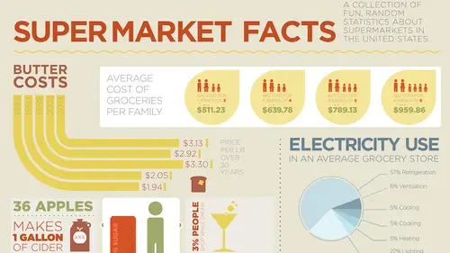
So we had yesterday's class and we got through a lot yesterday, and so today what I've done is I put some information together about what we're going to have created by the end of today's class. And of course, a lot of thought and a lot of time goes into these classes here, and of course, years of experience, but I just wanna share with you that when I came in here yesterday I really didn't know what infographic we were gonna be building. And you can create any story out of just absolutely anything and whenever I have a project like this I put a lot of thought into it. Generally the client supplied me with all the statistics, so I can do that. But when you have to come up with it on your own you know that it's very difficult. So what I did as I was brushing my teeth this morning I looked at the bottle of mouthwash and I thought, oh, barcodes, there's gotta be something interesting. When did barcodes start? So I decided to do a whole infographic on interesting facts in the grocery store...
. Because, of course, where do you buy bacon? In a grocery store, because we have to have bacon. So what I did is I just put all my content on the page here and what I've been doing is just kind of prepping some graphics, looking for a few things, putting things together, and starting to understand how this whole infographic is going to come together. So today what we have for you in the first session we're going to be working with colors. We're gonna understand color, use color building methods, I'm gonna show you how I go through and I pick and choose color, and how I actually use the color. And then we're also going to show you how to do some textures, more shading, and also create effects with line, so we can get certain effects that we don't normally have with our basic drawing tools. Then we're gonna get into type. Understanding how we can tell the story. We're going to work with all different styles of type. You can see I've already started to call out some dollar signs here to see what the look and feel is going to be here. Like I mentioned yesterday, the type is the actors, so we need to do a casting call to find out that we get the right type for the right part in order to make this infographic work. We're gonna do callouts and pointers and connectors and create some type of flow with this whole infographic as well, as well as building a grid structure. And then we're actually gonna use the chart making features in Illustrator for some pie charts and some line charts, and then we're going to use that as a basis to get our distance and our size of our values, and then we're gonna break it all apart and create something really cool and visually interesting. And then by the end of class today we're gonna have a full on infographic. I have no idea what it's gonna look like. Tony and I were just throwing a few ideas around, but I know it's gonna be cool and it's gonna be done by four o'clock. That's what we have. So yesterday we had been working on so many fantastic things and this is what we basically had covered yesterday, creating all these cool, amazing infographics with all different types of styles, and again, all we used was basic building ideas. We didn't really get into the Pen Tool at all, which we will not and I know some people are gonna be disappointed. Get over it now. This is not illustration and this is all building infographics with just basic shapes. And that's what we're gonna do, build it with basic shapes. So what I wanted to start off with today is all about color. Now the way I've been choosing color here is when I draw a specific object I simply go up into my fill or my stroke and I get my swatch panel drop-down and there is the basic default colors that we have here in my Color Picker. I don't mind these. What it does is it gives me all the different hues that I can just go in if I want some lighter or darker colors I can just click on those, but clearly this isn't going to work for my infographics, because I think these colors are a little bit too bold and I like to use a little bit more neutral colors. And another thing that I've been doing as well is just going into my fill or stroke and double-clicking and just calling up my Color Picker to then choose lighter tints or darker shades of a color just for quick purposes of putting things together. But when I'm doing a real infographic here I have to establish the color palette. I need to know the color palette and I need to know what I'm gonna be using, because I have to really set the stage. I gotta know how big it is and the whole color palette. So there's lots of ways you can choose color in Illustrator. If you cannot choose color here let me just show you the ways that are already done for you, precooked. So under the Window menu we have all of our Swatch Libraries that exist here. And Illustrator has kind of a funky way that it organizes and puts its colors together. That being said, if you're looking for something and you want to go ahead and pick and choose, I could go through here and I could look at my Earthtone colors. Every time I call up colors here it always calls up as its own separate color palette and I can click on my specific colors right here and I can go ahead and add those to my swatch panel if I want to. So if I choose these colors and I add them to my Swatches now when I go over to my swatch panel you'll see that I've just added all those colors to my swatch panel. So I don't have to have all my little floaty panels up over here. This could take some time. When I go through here, going down to the bottom here, Swatch Libraries, saying OK, I wanna do something for food or Earthtones or Color Properties. This is where all my Color Books, Art History, Celebration, Scientific, Patterns. What's Neutral? OK, so here's Neutral. Do I like those colors? Are those colors going to work? It's like, oh you know, those colors can look kind of neutral. And then I could click on those and I could add those to the Swatches. And I could really go through and spend a lot of time trying to figure out, OK, are these colors gonna work for me? Just seeing them in the swatch panel here doesn't do much for me. So what I need to do is I need to be able to choose colors I need to vividly see them on screen. So I'm gonna pick one more set of colors here as I go and Swatch Library, I'm gonna do something like hm, Textiles. OK, here should be some interesting colors right here. And you know, this one looks interesting, for no other purpose. Embroidered Italian Silk, right, mm hmm, which I know nothing about whatsoever. I'm gonna add those to the Swatches. So I'm not sure that these colors are gonna work for me, but this is how I'm gonna start with my actual layout of my colors. What I'm gonna do is I'm going to create a new document and with these colors, I need to bring those over into my document here, because of course, every time I start up a new document I don't have the colors that I just added. So I'm just gonna add them over here, so I can see on my pasteboard. And this is how I do it. What I do is I draw a container and each existing container here I just simply duplicate and I'm gonna put all my colors right on the page. So with my first container I'm going to take my first color and I'm gonna drop it in there. My second container, I'm gonna take my second color, I'm gonna drop it in there. Third color, drop it in there. Nope, that would be my second color, because I didn't select this. There we go, third color. Takes a few seconds to do, but it also allows me to see and visualize the colors right on my page, so that I can pick and choose. Surprisingly enough once I go and do I this I don't actually go back to my swatch panel much more. So I've got my swatches right here on the page and now with these colors right here I can get a really good visual sense of how things are going to turn out with my story. Seeing them in the swatch panel here next to everything else on a gray background really teeny I don't get the sense. Now I'm a little anal retentive about certain things. I need my colors kind of in like descending order, so I certainly have to have my yellow one on the top here and so I'm just gonna take my yellow one and I'm gonna put it on the top right there. And then I think my brown one, yeah that could work. I think the red one's gonna go here. Kind of in the order in which I think these things are gonna go. And then I've got my darker brown one too. I think the lighter brown one needs to go on top. You can arrange them however you want to. And then I've got my green and my blue. And yeah, maybe my yellow, green, and blue go together, because I think those are gonna have to go over here. So I'm gonna do my yellow, green, and blue, and then I'm gonna go with kind of my neutral browns as well. I have to visualize the story in some way and now I see the colors kind of in from bright and the colorful ones to more of the neutrals right here and now I've got them. So when I see them very large on the page here I can get a sense of the tonal quality of what it is that I'm doing. So if I need to go in and I need to draw something, who knows what it is. I need to draw, I don't know, let's draw an apple. So I'm gonna draw a tomato. So I'm gonna draw a tomato right here, there's my tomato. I need to put a little stem on there. So I'm going to use just my little stem right there. And I'm going to go ahead and put a stroke on there and to do that what I'm gonna do is I'm just gonna take my Eyedropper Tool and I'm gonna eyedropper from one of my colors, right there. I'm gonna switch those colors. Now I've got the color of my stem here and then I can apply my stroke. I'm not gonna go back to my swatch panel, because I can see it right there, so I know exactly what it is that I'm going to be using. This I think needs to be a little bit more tomatoey color, so I'm gonna take my Eyedropper Tool, sample that. Not quite the right tomato color, but you get the idea. So I'm gonna put a nice little stroke on there, make sure that my stroke is gonna match everything else. And then I need a little leaf or something, so I'm gonna create a little leaf. Two circles, Shift + X is gonna swap the stroke for the fill, I'm gonna go in and I'm gonna create a little leaf by overlapping the two objects, grabbing my Pathfinder, using my bisect mode there. Rotate it, hold down the Shift key, scale it, I've got myself a little leaf right there. And I could make this really any type of vegetable that I wanted to. Send this to the back and that could be a tomato, sure. I could go ahead and tweak it a little bit, so it looks more like a tomato, but you get the gist of what it is that I'm doing. That's a little bit too small, not quite in proportion. There we go, OK. So now I have my object. I just selected from the colors right here. Works really well. That way I don't have to keep going back to my swatch panel and I can kind of determine what these items are going to look like from a color standpoint. So if you're not good with choosing colors and the colors that you choose are a bit too strong or you don't like them, not a problem. Now I'm gonna go through and these are just the defaults here in Illustrator. You can make all of your own colors that you want to. And I can always go over to my Color panel right here and I can create a new color swatch here by using my cyan, magenta, yellow, and black and creating new colors swatches. Once I do that then I could create a new color swatch from there, but again, that's just creating a color. If you're not good at choosing the right color, sure you can make any color that you want to, but if you're color challenged and you know what you like and you wanna go through and sample something then you've gotta go ahead and get that color some way. Now there is a really cool trick for sampling colors, there's lots of cool tricks for sampling colors, and you may not know this. But if I were to open something up in Photoshop here and this is probably something that most people don't know. You don't need to know Photoshop. So I'm gonna show you how to sample colors from a Photoshop file. All you have to do is open up Photoshop and then just open any files that you'd like. I'm gonna open one of my icon sets here. So somebody gives you a picture and you wanna sample colors from here. Somebody gives you a great picture of a house with great colors and you're like, oh my gosh, that's the color scheme that I really want, but it's a photograph. Not a problem, open it up in Photoshop. Take your Eyedropper Tool and you can click on any one of those colors. And when you click on those colors, of course, you're gonna get that color in your Color Picker right here, and you can go through with your Eyedropper Tool every time you get a color you simply add to your Swatches panel. And then you can go back through and say, oh, I really like that color. And then you can add that color to your Swatches. All of which ends up in your Swatches panel. So go under Swatches and it ends up in your Swatches panel. Now you may say, oh my gosh, there's a lot of swatches in the Swatches panel here. Yep, but the reality of it is is that these are the colors right here that we had selected from our color right here, and what we can do is in Photoshop we can actually go and we can save our swatches that we sample in Photoshop here. And you can do this with any Adobe application by the way. What I'm going to do is I'm gonna go under the Swatches panel and I'm gonna save the swatches for Exchange, which allows me to use them in any other Adobe application. If I just save the swatches I can open them back up in Photoshop, which doesn't do me any good, I'm just using Illustrator. I'm gonna save my swatches for Exchange. And here's going to be my info graphic from Photoshop and there's gonna be my swatches right there. So that's one way of doing it as well. Works really well. And we have a question from Melissa here. Yes, did that save everything that was in your Swatches panel, like all of those colors? That's a great question. Or can you just save like two? That's a great question. I don't know how it actually worked in here. I know in InDesign you have to physically select the swatches. So we're gonna see when we open them up. Yep, but a good question. So another trick with Photoshop here that most people probably don't know is this, if you have something in Photoshop, let me get rid of my Application Frame. And I have Illustrator open behind here or anything open, even a picture sitting on a desk or a browser open. If I had a browser window open and I'm in Photoshop and I put my browser window, let's pretend this is a browser window. If I go into Photoshop and I take my Eyedropper Tool and I click and hold inside Photoshop, and then while I have my Eyedropper Tool active I drag outside of Photoshop onto anything that I'm previewing on my desktop here, it will sample whatever I preview or click on on the desktop outside of Photoshop. The key is you take your Eyedropper Tool, you click and hold inside Photoshop, hover your cursor or your Eyedropper Tool onto anything else outside of Photoshop, like the yellow of this gear here, and guess what, I just sampled the yellow of the gear, even though that image was not in Photoshop. So put it on your desktop there, put it off to the side of Photoshop there, click and hold your Eyedropper Tool, and hold your mouse key down until you hover over that. And that's the cool feature in Photoshop. That's a really awesome feature. And that's great, because if you find the colors that you like you can sample them from another image here really quickly and easily. And you don't even have to do any downloading of things online. Keep your browser off to the side, open up a Photoshop document, make it small, and then read it from there. If I want to get any other colors I can also go and use the awesome feature that we have in here, which is called Adobe Kuler. And if you've ever used Kuler it's pretty awesome. And I'm just gonna go to my browser here, because I can go to kuler.adobe.com and this allows you to pick all these colors. Now when you first open up Adobe Kuler this does require you to have an Apple ID. It's free and if you subscribe to the Creative Cloud you already have the Apple ID already. And all you have to do is log in, and I've already logged in. Email address, password, and I'm in. This is what comes up on the home page. And so we've got all these color bars that we can go and pull and slide all around and yes, it's visually awesome and cool, but then it's like, OK, how do I do my hue, saturation, brightness? Slide this stuff. What's my base color? How do I get a complementary neutral? And things that are well beyond this. All I want is I want a really cool color theme that is going to work for my infographic. So I'm gonna go up to the Explore tab at the top of my ruler. And up here I've got all the themes that were made. Now these are all user generated and uploaded to the Kuler site. If you have a theme that you'd like to create you can sign in and you can upload it. You can also see what other people have done, you can search priority to the Most Popular, you can search by the Most Used, for the Week, the Month, of All time, or just Random colors all over the place. So if I search the Most Popular of this Week these are the colors that are the most popular here. And OK, The Cuckoo Clock of Doom number two. Great names on this stuff. But if I'm looking for this this is a great visual way to kind of see. You're doing some type of weather in Seattle, awesome. Colorful Icecream Truck, awesome. These are some really great, dynamic colors. You want something more subtle right here. And you notice, big color swatches here. This is why I work with big color swatches on my page here, I need to see the visual impact. Well, since my infographic here is going to be things that are going on in the grocery store I may not want really bright, vivid colors like this. I do like this. But something more subtle may work, something like this could work as well. I may be doing food and things like that. So this may be a little bit too intense. This may be a little bit better. I kind of like those colors. I think that blue is a little bit dark. And I can just go search. But you know what, I'm actually going to not just search visually, I'm gonna type in super market, because a lot of times people will name these, obviously The Cuckoo Clock of Doom has no bearing on it, OK, what it is. So I'm just gonna do a search for super market and it's like, OK, that's pretty bright, so I'm gonna do grocery and see what they have there. And hopefully when people name these things the metadata in there kind of gives it, it's like OK, Organic Groceries, Grocery Store. This could work really well for an organic grocery store. This isn't bad, I'm not digging the kind of poopy brown right there. Through other things. This could kind of be good as well. I think that's a little bit too bright for what it is that I wanna do. This is kind of cool. Peoples Grocery, OK, that could kind of work. I think I kind of like Peoples Grocery right there. I'd probably change that dark right there, but I like this. So I'm gonna go ahead and grab these colors. You hover over them, I can click on the Info, and here's everything that's been done. It's like OK, there's no comments for it. All right, if I wanna comment on it I certainly can. I can also go through and edit the colors if I want to, I can click on this, and here's how it was all chosen, and it's like maybe I don't want this color brown, not a big deal. But what I wanna do is I would like to download this, so I can use these colors in any of my Adobe applications. So when I download this it's going to download and I'm gonna open it up in my Finder here, and it's going to download as a .ase file. When we exported the swatches from Photoshop we exported them as a Swatch Exchange or an Exchange file. ASE stands for Adobe Swatch Exchange, which means any swatch that I have in any Adobe application when I export that as a .ase I can load that into any other Adobe application and it's gonna bring it right in. So I'm just gonna drag that onto my desktop here, so it's quick and easy to find, and I now have I think what I could use as a really good color theme. And I can download it and I can also tweak it a bit. I think the brown's a bit dark, not a problem. I think this a great way to go here. I like the tonal ranges, they're not as intense, they're a little bit less saturated, but they give some really nice softness and I just have a really good feeling that this is gonna make a killer infographic. I just know it. Especially because we kind of have the bacon color in there and it's just, there's certain things. So have some fun with Kuler right here, it's absolutely awesome. Now if you have an iPhone you can download the Kuler app for the iPhone and it's awesome. And I use this quite often. When I go to the iPhone app you're going to be able to launch your Kuler app and you can hold it up to anything your room. And what it's going to do is you're going to get the five little circles or squares that are gonna start bouncing around and what you can do is you can go ahead and rotate and see where these little squares or circles are getting the picture and you can snap a shot of it, which will then download all of the colors and you can do this numerous times, and right from the app you can then save all of your swatches. So you're going some place, you're at a department store, you're in somebody's home, and you're just like, oh my gosh, the chair, the carpeting, the shag rugs, the oil lamp, everything is just, this is perfect. And you can just do that. So try it out, it's awesome. There's a lot of other apps out there that I haven't found work as well in the Kuler app, because it is truly cooler than all the other ones. Works wonders. I don't know if it's available on Android, I know it's available on the iPhone. And I love to use it simply because you walk into a room and you grab it and you're like wow, all these colors. It's fantastic. So try that app. If not, go online right here and you can certainly download from here. So I use this all the time. I like doing color, but you have millions of colors to choose from. Now this is a great start. I know I'm gonna tweak the colors a bit and I'm gonna show you how we're gonna do that, but now I've got my color here. Now I need to load this into my document. I still like these colors, I think these work really well, and I'm gonna keep these off to the side, but I'm gonna use the Kuler one just to see what we're going to have. So I'm gonna go under my Window menu, under my Swatch Libraries, and I'm going to choose Other Library. Yes, it's kind of convoluted. Other Library, and it's gonna ask me where is your library, I'm gonna navigate to my Desktop, and there is my Peoples Grocery dot Adobe Swatch Exchange. Oh, and by the way here is my Adobe Swatch Exchange that I had from Photoshop as well. So I'm going to click on the swatch file, I'm gonna choose Open, and it's going to open in its own little floating window. There's my little floating window, there are the colors. And I'm gonna do the same thing with that Swatch Exchange. So I'm gonna grab the first color, apply that, the second color, apply it to this, the third color, apply it to that, the fourth color right there, and the fifth color right there. So those are my colors right there. Wow, you know what? I can actually take my tomato and make it more a tomato color. Yeah, that looks better, OK. So these are my swatches right here and I think I've got a really good blend of swatches right there. Now when I open up a new document here these aren't gonna be here, because I have to load them into that document. Once I put them in here though there they are in my document. So that's the nice part, I can copy and paste them in as I go. So I'm gonna try and I'm going to load my swatches in from my Photoshop file to see how those came in as well. Other Library, go to my Desktop, colors I picked from Photoshop, and there's all my colors that came in from Photoshop. Luckily I can go in and I can get rid of certain ones or I could just select colors and add those to my Swatch panel, and then I've got just those swatches right there. And as simple as I got them, I can just close out of the panel right there. So now I think I've got some really good colors to work with. I really like this blue. I think that blue is gonna work well there. That might be a bit dark. And I think I may swap out this one over there. That's a little bit soft, I may put that in there right there. And you know what, that could go right there really well. And that may be a little bit green, I may go a little bit more yellow green right there. I still think I've got too many colors in here, but I think I'm getting a nice color panel of swatches here. Too many colors. I still think that yellow's not quite right. Too many colors can really be confusing. I think that green's out of there. I think this one's out of here too. I think I can get by with those. And yep, I think I'm gonna change that yellow a little bit. I'm gonna go in and just change that yellow, make it a little bit darker maybe, add a little bit more red to it, something like that. It's a little bit too dirty, so I think I'm gonna take some of the magenta out. Eh, a little bit too much cyan here. I know, getting really technical. I'm gonna put a little bit more magenta. I think I've got a really good color palette right here. Hey Jason, a question from the chatroom, from P. D., do you ever consider web safe colors? Or how does that factor in? So from what, I don't do much web stuff, but web safe colors I don't think are as important anymore, simply because everybody has millions of colors on their monitor and you know have iPhones and iPads and other devices, so web safe colors were colors that you knew you could reproduce really easily. You can't control the color on the web. So I don't even bother with web safe colors. I pick the stuff that looks good. And you have all different types of printing, output, digital reproduction, video, you can never guarantee the color. I'm gonna do what I think looks best, so. Now I use COLOURlovers as well, so I use COLOURlovers, some people use Kuler, I think Kuler is great. Those systems offer five color palettes. And question from Stephanie, Jason, what is the maximum amount of colors you suggest we work with? Like what's your, do you have a magic number for an infographic? I don't. Right now I'm dealing with five right here and I could end up with just two or three. And with these I'm also going to tint and shade these as well, so this blue may become lighter or darker based on what I need. And I could see ending up with just these three colors or these three colors right here as well. It's really hard to say at this point. Once I start getting a feel for it. But I wanna be able to get the storyline there. Some of these scenes maybe cut, but I just wanna get enough there. And I also have these over here, 'cause they're slightly softer, these tend to be a little bit bolder here, and then even the really dark color there, just in case. I think six colors in an infographic maybe a little bit much, but I think if they're done nicely and subtly you can use a couple dominate colors and then you could have a couple supportive colors there, maybe three or four, because we're gonna be putting together a lot of information and maybe it's a nice way to separate it out. At this point it's really hard to say. And yeah, simplify the colors. Well, you know, if the colors work the colors work. So it's not like 17 different typefaces where you've got everybody screaming at the same tone. Colors are a little bit different. But yeah. Thank you. Certainly. So I've kind of established the look and feel of my colors. And again, I want them to be here, front and center, so I get a really good sense of what it is. I can always look there and I can just always tell from the color. And then I put them side by side, it's like, I kind of like the softness of these, but I really like the saturation of these. I may go back in and just knock everything back another 10%. Awesome, great, but at least I have them there. So I've been able to choose from a list of color in the Illustrator, as defaults, I can make my own, clearly, but I can use other online items, or sample from pictures and grab those swatches and be able to put them in here. I put them on the page and now I can start to get a sense of how this stuff is going to work. Now one other thing that I'm gonna do here is I wanna see how these kind of work with tone on tone. I wanna see a darker version and I wanna see a lighter version of these, just so I get the sense of how things are gonna come together. So what I'm gonna do here is I'm just gonna create a couple other boxes here. And I'm just gonna create another box right here. And I'm gonna sample this color right there, and then I'm gonna go in and I'm gonna add a bit more black to it. It always does this, I sample the color, then I have to click on that color, and then I'm gonna add some black to it. And then I'm gonna take that same color, I'm gonna copy it over here, and I'm gonna sample this color, and then what I wanna do is I just want to go in and I want to kind of lighten the color. So I'm just gonna go a little bit lighter on the color there, just so I get a couple different looks and feels. I think that needs to go a slight bit darker, so that I can get a little bit more contrast. I'm gonna do this with each and every one of the colors, so that I can get a lighter and a darker look to the whole thing. And this works really well, because this is going to establish if you ever wanna do shading or shadow or highlights or subtle changes in a chart. Say we're doing a bar chart and you wanna show graduation over time I can do lighter, medium, and then dark as I go. So I'm just gonna do a few of these. I'm not gonna do all of these. That looks pretty good. Go back and grab this one. Eyedropper Tool, sample that, go up here, take that color and move it right up to get the whole thing lighter. And now we're starting to create a nice visual effect right here. The yellow's gonna be tricky. It's fairly intense, but I still think our yellow's gonna be our friend here. This however maybe a little bit too light as we go through, but what the heck. Gonna lighten it up right there, OK. Yes, I am gonna do all of them. I just feel the need. This is part of the great part of teaching a class here, everybody just gets to watch and I get to have the fun. And to me this gets really, really, really addictive, because you, it's the kind of thing that you sit down in the evening and start to work, I can find myself working for five hours. Because every time you move something or you create a shape everything changes. And it's like wow, if I do this how is this going to look? And then, of course, you find out that you've spent all this time and you're like, yeah, that probably wasn't the best way to go. Anyway, that's the whole point. No harm, no foul. OK, so now I've got my colors and I've also got my tonal ranges here, check that out. Now I've got some really good colors to go ahead and choose from. And I may decide oh, all of these colors are even better, but now I've got a really good sense of what the color is gonna be like. If you don't put this on the page you're never going to know. Some people just inherently know how the color is and those are not the people watching this class, because they already know how to do it. Nobody's gonna take a 101 class when they're awesome at what they're doing. But this is how I work it out, 'cause this is kind of the mental sketching of the whole thing and it's really difficult to sketch color. You can sketch concepts, spatial relationship, size, but sketching color doesn't work. So now I think I've got an awesome set of colors that are really gonna work well here and that alone would make a cool infographic, wouldn't it? Well, if your colors look cool already you know that this is gonna be awesome and it's gonna be so simple too. So get everything down on the page, do your exploration, have it there front and center, so you can clearly go through and pick. And what this does is this also makes everything consistent. Because if I choose my green and I have to remember, oh, a 30% tint of the green, forget it. Make the 30% tint of the green, put it there, leave it there, be done with it. I don't really care what the values are of here, makes no difference to me. The only thing that I would care is making that a color, so that if I had to change it globally I would go ahead and do that. But for now I'm gonna kind of wing it here. And so far it looks like I'm winging it pretty good. OK, so there is my colors, I love them. Did I tell you how much I love them?
Class Materials
Free Bonus Materials
Ratings and Reviews
Kathleen
I'm not even through the second day yet and I'm thrilled with this class! Only thing, I wish he would go slower BUT then again, if he did, we wouldn't get SO MUCH information. I'm glad I purchased the class so I can go back and replay to my heart's content. Even though this class is based on creating infographics, the wealth of information is perfect for any project using Illustrator. I do wish he would have shown how to work with corners (for example) for those of us who do not have CC (I'm in CS6) so we could learn the "hard way without widgets" and the easier way with widgets. Jason is very funny and I love his direct approach to getting the job done while knocking a clients socks off. I look forward to many more classes taught by Jason.
a Creativelive Student
Another amazing class from a man with a seemingly unbelievably clear mind. So great at conveying the concepts of the program so that you can effectively learn actual methods but also walk away with enough information on the way the software is organized so that figuring out a solution to a design challenge, on your own, is light years easier and faster. i am thrilled with the broader grasp of the possibilities i learned. i could go on and on. It is absolutely a class worth taking whatever your level of expertise.
Rozlen
Loved the class, learnt so much from Jason even if he talks a little fast sometimes he is still very funny and makes it look so easy, would love to buy his indesign class too love watching him, excellent teacher.
Student Work
Related Classes
Design Projects