Lessons
Differences Between Lightroom Desktop and Lightroom Classic
19:42 2Hard Drives
08:06 3File Organization
08:31 430,000 Foot View of Workflow
05:36 5Importing into Lightroom
04:10 6Building Previews
07:14 7Collections and Publish Services
05:11 8Keywords
06:27Hardware for Lightroom
06:08 10Searching for Images
07:51 11Selecting Images
14:15 12Organizing Images
04:02 13Collecting Images for Use
14:56 14Develop Module Overview
10:15 15Profiles
11:34 16Basic Adjustments
11:45 17Basics Panel: Texture, Clarity, and Dehaze
05:31 18Basics Panel: Saturation and Vibrance
02:40 19Tone Curve
09:26 20HSL
04:48 21Split Tone
08:19 22Lens Corrections
08:32 23Details
09:34 24Transform Tool
05:52 25Effects Panel
10:00 26Synchronizing for Faster Editing
07:40 27Spot Tool
17:51 28Skin Softening and Brush Work
07:00 29Range Masking
13:28 30Dodge and Burn
17:36 31Working with Specific Colors
08:30 32Edit Quickly with Gradient Filters
11:22 33Making Presets
13:24 34Preparing Image in Lightroom
09:51 35Content Aware Fill
11:14 36Skin Repair
02:44 37Skin Smoothing
14:39 38Expanding a Canvas
04:30 39Liquify
10:22 40Layers and Composite Images
12:54 41Sharing via Web
17:52 42Exporting Files
10:47 43Sharing with Slideshows
08:00 44Archiving Photos and Catalogs
19:54 45Designing
13:35 46Making Prints
11:27 47Color Management and Profiles
13:00 48Archiving Photos and Catalogs
11:31 49Using Cloud Storage
04:09 50Adding Images to your Portfolio
09:23 51Collecting for Your Portfolio
18:03 52Publishing Unique Websites Per Project
19:48 53Sharing to Instagram
07:06 54HDR
15:32 55Panorama
06:41 56HDR Panorama
09:54 57Making Presets
15:39 58Creating Profiles
18:09 59Maps
07:08 60Setup for Tethered Shooting
23:21 61Sharing with the Client
05:42 62Watched Folder Process
07:04 63Second Monitor and iPad
06:09 64Backup at the Camera
03:50 65Gnar Box Disk Backup
06:45 66iPhone and iPad Review
12:52 67Importing to Lightroom on iPad
02:59 68Cloud Backup
04:39 69Adjust, Edit, and Organize
07:46 70Using Lightroom Between Devices
11:27 71Lightroom Desktop
05:27 72Removing Images from the Cloud
10:49 73Profiles
09:34 74Light
04:34 75Color
05:36 76Effects
15:22 77Details
08:33 78Optics
03:49 79Geometry
04:12 80Crop
04:39 81Adding and Using Presets and Profiles
13:41 82Local Adjustments
15:40 83Healing Tool
03:29 84Synchronizing Edits
04:57 85Editing in Photoshop
08:54 86Finding Images
07:09 87Sharing and Exporting Albums on the Web
09:18 88Posting Images to Social Media
14:01 89Overview of Lightroom Desktop
07:35 90The Workflow Overview
10:08 91Organizing Images
05:10 92Albums and Shared Albums
18:21 93Lightroom Desktop Workspace Overview
04:36 94Importing and Selecting Images
09:23 95HDR and Panoramics
22:44 96Light
07:47 97Profiles
07:23 98Tone Curves
02:57 99Color
08:35 100Effects
17:01 101Details
12:43 102Optics
04:05 103Geometry and Crop Tool
06:01 104Sync Settings
02:40 105Making and Adding Presets
03:48 106Healing Brush
02:21 107Brush Tool
03:14 108Gradient Tool
04:16 109Edit in Photoshop
02:53 110Finding Images with Sensei
06:32 111Sharing Albums on the Web
04:57 112Print through Photoshop
02:09 113Exporting Images to Files or Web Services
04:36 114Connecting with Lightroom Classic and Mobile Devices
05:24 115Archiving Images for Storage
09:55 116Review of the Workflow
07:20Lesson Info
Profiles
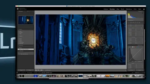
Okay, So inside of the develop module, there are panels And here are the panels you got Basic tone curve hs el, which means hue, saturation and luminous. You have split toning detail, lens corrections, transformations, the effects panel, and then at the very bottom calibration panel. Uh, and the first thing that we're gonna talk about inside of light room is what used to be inside of the calibration panel. There used to be an area up at the top that said profiles. Now, Now, the process, all that's in there is the process version, which is the type of math that it's using. Um, so you want to use the latest possible math that you have, So if you're in light room CC or or the current version of light room not light from six, or before those were standalone versions of light room. So if you're in light room classic, which is a creative cloud product now, you will be in light room five if you have updated your system and and I highly suggest that any time an update comes out that you update...
it, um, that means you're a the latest math and then below that is, if you have a camera with some kind of shadow issues or something like that, where the chip is always a little bit tempted towards the magenta or a little bit towards the green. Or maybe your shadow Zahra weird that that kind of stuff could be taken care of in the calibration. It's not often that you have to really monkey with this, but if you have a camera that you're finding is difficult in those areas. This is where you take care of that. Oftentimes you'll never even reach it. But the thing was, there used to be something in here called a profile, and they removed it from there, and they put it up at the top of the panel in the basic area because that's where it actually belonged. Profiles is the beginning of every photograph of as it comes in to light room, and what a profile is is. It's an underlying definition of color. So when I assign a profile to you might know him from printers. So if I have a particular printer and I sign a profile to it and I print than the printer knows, the definition of color that the computer is giving it, and so that the print that comes out of the printer will look like what's on the monitor. That's the nature of a profile. A profile is just defining color on the way in to the computer. Your camera has a particular way of displaying color and of recording color. And then when it comes into the computer, the computer has a completely different way of rendering and viewing. And looking at the color and light room renders it differently than other programs render it. And so every every system is rendering color in different ways. So the profile is the definition, or the basically. It's like having a French to English dictionary eso. If I want to understand someone who's speaking French, I need to have that dictionary so that I know that my version of the word is this version in French so I could talk to someone, or at least I can understand what they're saying when they write or whatever. So profiles are definitions of color, and if you start with a profile, you are going to be able to define your color so that it looks correct and it has the right style that you want. And so we're gonna talk about that right now. When you come into light room, you will find that there is a profile, and that profile is either adobe color, adobe landscape, adobe portrait, adobe standard, adobe visit, vivid, etcetera. Um, and so those are trying to emulate the actual, um, color from the camera itself, so you'll notice that they feel a lot like the names that air inside of your camera. So, like landscape, your camera probably has a landscape version in its picture styles. That's what Canon calls it, and I forget what Nikon calls it. But anyway, they every camera has certain, ah, color switches that you could turn and say I want you know, Teoh on Fuji. You get to represent it by various film types. Eso each one has its own. Those air, those air, the camera profiles inside the camera, and then they need to be translated out into light room. So if I take an image and I change that profile from color, I'm just going to zoom into this image so you can see I'm gonna go in, and in that profile, I'm going to take it from color to portrait, and there was a slight shift hard to see it. But maybe if I did vivid see that there's quite a difference between vivid and a portrait. And what's happening is that it is defining color. It's saying Red equals this blue equals blue. And when I do vivid, it's saying Red equals even more red and blue equals even more. Blue landscape does the same thing. It's very vibrant colors, whereas portrait ties tries to limit those colors so that they're not quite as over the top. Because then you don't like the way that skin looks now. In addition to Adobe provides, there are also a ton of other profiles that are available inside of light room when you started up. So right from the beginning, if you click on this little browser, these four squares right next to the profile click on that and it will open up the profile browser. So this is the profile browser, and you can see that it's got folders full of profiles. So I'm just closing them all down so you can see these air all the profiles, and most of them ship with light room so you can see that there's Theodore B versions here. Those are the ones that we were just going through. So these air and, by the way, all black and white, is a profile. So any profile that when you turn your image to black and white, you are choosing a profile for black and white. If you just hit the wiki for, uh, victory black and white, if you click on it, it's choosing the adobe black and white profile. If you want to choose a different profile, you need to open up this profile, that browser, and then you can come into the black and white area here and now you'll see what all these profiles might look like. And if you hover over them, the actual image changes to show you what it's going to look like before you apply that profile. And if you like a particular profile, you can always Starrett, and when you star that profile, it will then be added up into your favorites so that you don't have to keep going through all those. You can just click on your favorites and just go through the ones that you use most often, so the favorites panel is really quite useful now. Not only is a dhobi have their own, but also every time you use a camera, there's a camera matching one. So when you open up a camera, start using it. This is the camera maker's version, so these are the ones that most closely approximate your actual camera. So if you have a Fuji camera, these images will show. Are these this camera matching will? Instead of saying faithful landscape neutral, it will actually have film types that you can choose from because those are the the It's approximating what the camera is shooting in, um, when it's shooting. So these profiles these camera profiles. The camera matching profiles are really trying to emulate exactly what the camera showed you on the back of the screen. So we need to choose a profile, and I don't suggest that you choose a profile for every single image and, like come hunting through profiles every time you come across an image. That's not what profiles air really meant to do. Profiles are meant to kind of create a style for that shoot or for your brand or for your mark four cameras. So really, what you should be doing is saying I want all of these images in this photo shoot toe look like this and then choose a profile to go on all of the images at once. Then once in a while, you might come to an image, and you think, Ah, different profile might work for that image. But that's gonna be the exception to the rule rather than the rule. So when I click on a profile and I'm gonna go down and choose one that I actually created myself, so I'm gonna go down and click on one and I can create art artistic looks as well. So notice what the image looks like. So that's what the image looks like on its own. But watch what happens to the image when I change it to a more artistic profile. So instead of trying to match with cameras doing, I've actually changed the profile so that it's completely recalibrating all the colors, and you can see that it gives us this really nice, warm glow. It brightens everything up, and it gives it kind of a filmy look. It's a little thinner. There's not much not as much black in it. I really like that warm tone, especially for this image or for this set of images. So I'm gonna hover over that, and I'm just I like that. And the great thing about this profile is that when I click on it, I also have the ability to go through and either shifted Mawr or less. So right now it's a 100%. So this is actually it's really cool, because for the longest time, we were asking Adobe Tom make us relative presets in light room presets that we could change and slide and do different things on Well, now we actually can, because we have these profiles and when you make a profile, you can actually shift it so you can shift it up so you get more of that effect or down. So you get none of it. So I'm 0% and now I'm gonna warm it up and I don't want it to the 100. I want this one like 75% sounds good. So I'm not about 75% on this image, and now I hit close and I've got my profile and you can see that the profile is the JP color warm art shift one. So that is my profile I'm using. But remember, I could choose a camera matching profile, or I could just use adobes profiles, and they have quite a few that are already in there. So the minute you open it up, there's probably, you know, 100 profiles in there that you could use. Okay, so and then I have the amount slider right here, too. So if I ever want to shift that amount, I don't have to go into the profile browser. I could just shift the amount right here, but I like about that 70 something percent, so I'm gonna go with that.
Class Materials
Bonus Materials with Purchase
Ratings and Reviews
Ira Richterman
I am truly a recreational novice in the photography world and this video is fantastic. Photography has become a very technical world both on the camera side as well as post production. Jared has great teaching skills and sure makes it look very simple. I would recommend this video for those starting out in Lightroom as this program can be overwhelming and has a daunting amount of information. I would like to know if there is a resource of location of contact to ask a question or two for clarifications as a viewer goes through the course. For example, when making a new collection and if you choose the option of making this new collection a target collection, what happens if you then make another new collection and select that new collection to be a target collection? If you click on B to add a photo to a target collection and you made two target collections then where does this virtual selection go, ie into which target collection? Thanks Ira irichterma@aol.com
catherine Haggerty
Loved this class. As a beginner it really gives me working knowledge to use LR confidently. This class is older, so a few times I really had to stop and figure out how it worked in the newest version of LR... but all in all this class was amazing!
Dan Clarke
This class was great. I've never used Lightroom before and now I feel comfortable in it. Massive amount of good info.