Edit Type And Glyph Graphics: Birthday Invite
Lesson 9 from: Invitations in PhotoshopKhara Plicanic
Edit Type And Glyph Graphics: Birthday Invite
Lesson 9 from: Invitations in PhotoshopKhara Plicanic
Lesson Info
9. Edit Type And Glyph Graphics: Birthday Invite
Lessons
Class Introduction
06:54 2Document Set Up: Save The Date Card
03:05 3Create And Place Type: Save The Date Card
10:35 4Add Watercolor Clipping Group: Save The Date Card
08:23 5Add Texture: Save The Date Card
05:31 6Add Glyphs And Graphics: Save The Date Card
08:03 7Add An Image Save: The Date Card
06:35 8Layer Masks: Save The Date Card
08:24Lesson Info
Edit Type And Glyph Graphics: Birthday Invite
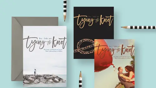
One other thing I was going to make for you is a birthday invitation. I have had the distinct honor of creating my nephew's birthday invitations for a number of years. It's always been a lot of fun, so I thought that would be something fun that I could show you guys how to do and talk to you about. I thought we would create a fun, hand lettered sort of birthday invitation. I have started here with this document. Again, we're gonna just stick with that five by seven kind of a format. This might be a card, so maybe there's a backside that you would wanna create. Or, maybe it's just a photo, you could just have five by seven photos printed up and send that out as your invitation, that would be another option, too. But that's what we're gonna do, is another five by seven kind of format. Let's go back to this card for a minute, 'cause I guess I forgot to tell you, of course, before that you send this in to the printer, you would want to save it. The best way to do that is file, save as. Let...
's save this with, save it as a Photoshop document. Don't choose JPEG right now, 'cause then you'd lose all your layers. You wanna save your layered file, as your master file, as a Photoshop document. Then, when it's final and you're ready to have it printed, and you've checked with your guide, that nothing is sticking out of the edges or going some place it shouldn't be or not going as far as far as it should. As long as everything's okay with your guide layer, make sure that's hidden, then you'd save this as a JPEG to send to your lab, or your printer, or whoever's gonna do this for you. So then you'd go back to file and choose save as, and this time, you would choose JPEG. Does that make sense? Your layered Photoshop document is like your work in progress file, that's your master file that you keep for being able to go back to and make changes. And it's the flat JPEG, that's the one you send to the lab. Just wanted to make sure I get that in there before we get lost in this one. Now we're gonna go on to this birthday card. And again, five by seven kind of a deal. We're gonna add some fun text to this and then we're going to, we're gonna also add some fun graphics. Something that, again, comes from a font, which is really exciting. We're gonna start by adding the text. We'll grab our type tool and we'll make sure that we get white as our active swatch. That will also put it up here and this is gonna be what we're gonna come with. I'm starting with a black background 'cause I just thought it would be fun to start with something dark. Oftentimes people start with a blank white canvas and I thought we'll start with a blank black canvas. We're gonna add a couple of different type layers up here. I'm just gonna click and I'm gonna type out it's my. We're gonna write it's my birthday, but we'll put it's my on its own little type layer. I'm gonna do that. Now, you'll notice that this is still the script font that we just used in the other document. Lovely as it is, it's not what we want for this piece. I'm gonna change the typeface by making sure that is the active layer in my layers panel and I'm gonna press T to get my type tool and I'm gonna change it to a font from one of my favorite hand lettering font collections called Font Box it's called Font Box Geronimo Bouncy. Here it is. It's my, there we go. And I'm gonna make this quite a bit smaller by transforming it, so commander control T, again. And then shift dragging to scale it down. Now while I'm here and I still have this active, let me zoom in so you can see, what's nice about this font is it has a bouncy baseline, so that's why it's actually called Font Box Geronimo Bouncy, I believe, because the baseline is not perfectly straight. That helps it look really, show off the fact that it's hand drawn and everything. I think that's good. On the next piece that we're gonna add, we're gonna do some work to it to make it have a bouncier baseline. We've got it's my, now we'll add a second type layer and we're gonna write birthday. So I'm gonna click and write birthday exclamation point. Now I'm gonna change this font from that Geronimo Bouncy. I'm gonna change it to something called Bonjour. It's by the same artist, by the way, who made the Font Box fonts, her name's Nicky Laatz. We'll get this one, it's called Bonjour Regular. We see that it's this brush typeface which is really cool. I want it to look a little more, less perfect, I guess. A little more hand drawn and sort of made by me. Let's warp it. I'm gonna press commander control T to transform it and while I'm in the transform space, we're gonna go into another transformation called warping and there's two ways to get there. With the transform box active, you can come up in the options bar and click the warpy button right here. Or, for whatever reason, I always end up doing it this way. If you right click, you get a menu and then you can choose warp. Now we have to choose type of warp that we want to do. There's all kinds of things that we can do to it here. Some of them are gonna seem just really straight up ridiculous. That's okay, 'cause we're gonna dial it down. I'm gonna choose this rise option which makes it like flag, which looks ridiculous, like this. But, it can be dialed down. So up in the options bar where it says bend and it said 50%, I'm gonna just click on the words bend and you get this double sided arrow cursor and you can actually click and then just drag and it will, I'm just dragging way to the left. It's reducing the bend, so now it looks less like it was warped like a cartoon, and more just like, hey, I wrote that by hand and it's not perfectly straight. I like that, it has a little bit of a swirl in it which is kinda fun. Maybe I even wanna rotate this a little bit so I could press again commander control T and then hover my cursor in the corner and just spin it a little bit to just rotate it ever so slightly and I'm gonna make it a little smaller, too, I think. I think it's a little too big. All right, and then let's go back to it's my. It's my, and I'm gonna put that up here, something like that and I think I'll rotate that, too, a little bit. Just a smidge, there we go. I'll get my move tool and tuck that in some place like this. All right, so that is looking pretty awesome. One last thing that I like to add here is a little doodle illustration. These are really fun, this is another thing you can create yourself or you can find from Creative Market or if you buy certain font collections like this Font Box collection, it comes with illustrations that you can use for things like this. I'll show you how that looks like. Here I have this document, this comes with the purchase of that Font Box collection, which by the way, includes like 16 fonts. You're getting 16 fonts with that and this document that has all these doodles which is really fun. One of the ones that we're gonna use here is this just sort of scribbly line right here. Now, in this document, you'll notice the layer panel is just a huge run on mess of layers and nothing is specifically labeled. It's very difficult to figure out which layer has the doodle that you want. But thankfully, with the move tool active, you can come down here and hold down commander control on your keyboard and then if you hover over the object, eventually you'll see a purple box around it and if you can manage to click when you see that box, then it'll jump to that layer in the layers panel. So you can see, it jumped up here, now I've got this selected and so I'm just gonna click and drag it over to this birthday design. Drag it in and oh my gosh, it even practically fits just the right size, that was a coincidence. We'll land it in here and I'm gonna rotate it slightly by pressing commander control T to spin that around like that and I'll press this check mark here and I can move it in place. It's starting to look good and very hand crafted. That's looking pretty awesome. Let's move this up a little bit into place. It's called, the squiggle came in just with a very generic name called compound shape, so I'm gonna rename that by double clicking and just calling it, we'll call it underline, how about that. 'Cause that's basically what it is. If we wanted to change the color of this, we could select a color. We're gonna do something else to it later, so I don't really care about the color. But just so you know, if I wanted to change the color, you just select a different color and then you do that same keyboard shortcut that we did before to fill that layer with the foreground color. So again on a Mac, it is option delete, and on a PC, it would actually be command delete. That can be a little confusing sometimes. That's how it works. So we can change that color and we're gonna do something different here anyway, so I'm gonna go ahead and just make it white for now, but we're gonna change that later. I'm gonna select these three things, the it's my type layer, the birthday layer, and the underline layer and I'm just gonna move them some place like this, I guess. And then I have another type layer that I already have in place that I just had prepared already. This would be our information and this is nothing fancy. It's just another type layer, I just was saving us the time of creating it, but it's the Font Box Geronimo Bouncy, so it's the same type as this. This is just the information as far as date, and time, and place that you obviously would want to include in your document. Let's get to the really fun part. We are going to create a giant gift box down here that is going to actually come from a font. It's a giant picture of a gift box and then we're going to place type in it and it's gonna be really exciting. Where are we gonna get this gift box? This is one example of a free font that is totally free, 100% free, and I found it at dafont.com, so D-A-F-O-N-T .com and I think it's called Happy Birthday. Let me see, I think it's called Happy Birthday. Yes it is. So you can find it at dafont.com or there's a link to it in the resource guide, but Happy Birthday Regular is the font. Oops. See what happens if you have a type layer active and you change the typeface? This is now in the dingbat, that's not what I wanted. I'm gonna make a new layer for the dingbat. So with my type layer, type tool active, I'll click to make a new layer. And then I'm gonna go to my glyph panel because I don't remember what dingbat is the one I need, so I'm gonna go to the glyphs panel and I'm gonna type in Happy Birthday and see if I can get close to it, and I can't, so I have to scroll. Here, where is it, Happy Birthday. Here are these little dingbats and the one that I want is this, I don't know why I have so many down here. I just want this one right here. I don't know if you can see, I can zoom in on it. It's this gift box and then it has polka dots and I don't want the polka dots, so I'm gonna show you how we're actually gonna edit this shortly, but this is the overall shape of the box that I wanted, so not bad for free. You can't really complain. This is a great source if you like designing with this type of stuff and you're like, where am I gonna find all these little illustrations, fonts and dingbat fonts are a great way to find it. And sometimes you'll find that regular fonts have dingbats with them, so you just have to check out the glyphs panel or look before you purchase a font, look to see all the glyphs that are included. Glyphs is just like another word for characters. All the little graphics that come with the font, like the letter F is really just a glyph. I mean, it's a drawing of a shape that we call the letter F. All of these characters are called glyphs and they can include other little pieces that aren't necessarily letters. In this case we have a gift box. I can get rid of my panel now. I'm gonna scale this up, command, or control T. Are you sick of me saying that, it's all the time, right? It's so handy so I use that all the time. I'm gonna scale this up to something about like this, I guess. We'll see. Actually maybe a little bigger, I don't remember what I had. Something like that. And we'll go ahead and set that. Now I don't want these polka dots that are in here. We're gonna cover them up. In our layers panel, this layer is represented with a T for type, and apparently this gift box character is the plus sign, so that's why Photoshop has that there. Let's rename it and just call it gift box, just to make life easier. And now we're gonna go ahead and fill in all these dots. We're just gonna cover all of that up. There's a number of ways that we could do this, but I wanna keep this editable, just in case we decide to scale it later. I don't wanna rasterize this and turn it into pixels. I want to keep it as type. What we're gonna do is grab our shape tool and instead of a funny shape that we might have, I had this tear drop still selected. I'm gonna come in here and down to this custom shape tool, and I'm gonna choose the rectangle tool. This is different than the rectangle marque. The rectangle marque makes selections. The rectangle shape tool draws a shape in the shape of a rectangle, but then you can fill it with things, in this case white. With the rectangular shape tool selected, I'm gonna come up and make sure I have it set to operate as a shape tool and I wanna choose white for the fill and I don't want a stroke. Then I'm just gonna come down and just draw a box basically, on top of all those squares, or those circles, the polka dots, and it will just fill with white and that's it, and it's scalable. I can adjust this whole thing as one unit. To make things easier, even, in my layers panel, I could go ahead and group the rectangle with the gift box. With the rectangle layer active, I'll shift click the gift box and then I'm gonna click the folder icon down there and that will group it, just so I have an orderly layers panel, and then I'm gonna rename this and just call it gift box. It's really nice to keep your layer panel orderly. Sometimes when I'm experimenting, I don't do that because I'm experimenting and I'm just quickly changing things around and I go from one thing to the other and I don't stop to name my layers or group them. And then when I try to go back and undo things or rebuild or something, I really have to scratch my head and think what is this? It's nice, when you think of it, to just do it as you go.
Class Materials
Bonus Materials with RSVP
Bonus Materials with Purchase
Ratings and Reviews
Nova
Khara is a brilliant instructor and I learned so much to improve my business. I'm running wild in photoshop with the tools and approaches that I gained from this amazing course! Thank you!
April S.
I have a Photoshop Bootcamp that encompasses a few weeks of learning but I just haven't had the time and focus to sit down and go through it even though I know there is a ton of useful stuff for me in it. One thing I have wanted to do for awhile is to design cards using some of my photography and graphics/lettering. Khara's Invitations in Photoshop class goes right to the heart of what I needed to know in PS for this specific kind of project. I am not a complete newbie to PS but seeing her use various functionality in this context hit home for me. I'm glad I picked up this course and look forward to working on some of my own cards. Khara's is well-prepared and direct, she speaks well, is clear, gets right to the things you really need to know. In my opinion, she's a very good instructor for the Creative Live teaching format.
user-f9ff5e
Khara packs a lot of info into this 2 hour class. She has the right balance of being friendly and conversational yet stays focused and on- topic. She shows several ways of doing actions or accomplishing a task. What I like the most is how she sometimes backs up and reviews what buttons she pressed or actions she just did. Even if you have been doing PS a while, you might learn some new shortcuts or new ways of doing a task. I could have written 4 or 5 pages of notes easily on tips. Sometimes she is a little fast and I couldn't see what exactly she did, but if you buy the class it would be great to pause and rewind a section several times. I would put her up there with Dave Cross as one of my favorite PS instructors who pack in info and won't put you to sleep.