Lesson Info
3. Create And Place Type: Save The Date Card
Lessons
Class Introduction
06:54 2Document Set Up: Save The Date Card
03:05 3Create And Place Type: Save The Date Card
10:35 4Add Watercolor Clipping Group: Save The Date Card
08:23 5Add Texture: Save The Date Card
05:31 6Add Glyphs And Graphics: Save The Date Card
08:03 7Add An Image Save: The Date Card
06:35 8Layer Masks: Save The Date Card
08:24Lesson Info
Create And Place Type: Save The Date Card
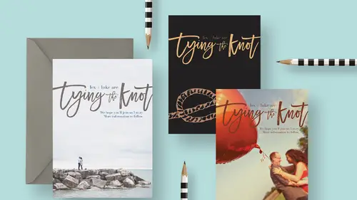
The next thing we're gonna do is add some big scripty type down here and so we're gonna make that, basically it's gonna be graphical by nature. So we're gonna say Lex and Luke are, and then in swirly letters we'll write, tying the knot. So, I'm gonna grab the type tool again, and I'm just gonna click, and we'll write, tying the knot. All right, let's commit that and move it over. Now obviously we're gonna change this, but let's talk about what we've got in our layers panel first. You see that we have one type layer here for Lex and Luke and Photoshop creates this automatically when we use the type tool and we click to enter text. Photoshop will automatically create a layer for it, and it's represented with this giant T here. So then we made another type layer and we called it Tying the Knot. By default Photoshop names it with whatever you type. So we've got two separate layers. This is the one that I want to change now and to style up a little bit. So with this layer selected and my ty...
pe tool active I can come up and change the font to anything I want and I don't have to worry about trying to highlight the text, because I've got the layer selected. I'm telling Photoshop I want all the type on that layer to change. So I'm gonna go ahead and change this to a font called, what is it called? Let me look for a minute. I forgot already what I called it. There we go, Medina. Whew, I forgot to star it has a favorite and I was looking at filter fonts only. So it's called Medina Script, and I'm gonna go ahead and click that to get it to change. There we go, so Medina Script. So we can see that it's this really fun, swooshy kind of type face which is great. And I wanna make this bigger, so I'm gonna come up here and just (clears throat) click, whoops. I'm gonna make sure I'm not in there. So nothing's highlighted, I've just got the layer active. So that means I can come up here and I can either choose a number in here, so instead of a 19 point font which is way too small, maybe I wanna choose 48. That's bigger, but I still need it quite a bit bigger. So I could try one of these presets like or I could type in a number like 100. Or I can click here and it's called scrubbing, if you click and drag along the T's themselves. Right here you get this double-headed arrow and I can click and drag and that'll actually change the size too. What I prefer to do, for whatever reason, I think it's more visually useful, is I like to just transform it. So because we're working with type and it's all vector information, I don't have to worry about resolution. So I'm gonna press command or control + t to enter what's called free transform. And if I hold the shift key down I can then drag for the corner and make this bigger. So what I'm going for here, is basically just want this big enough that these little swooshes just reach off the page, 'cause I think that's kinda fun to have it breaking off the page. So I'm gonna do, basically, we'll move this just a smidge over, like that. So I'm having it big enough that the crossbar on this t comes off the page and the crossbar on this t also goes off the page. So when I'm happy with that I'll go ahead and commit it. Nice. Maybe we'll do some repositioning here. So if I wanna move this layer, I have to target that layer in the layers panel, grab my move tool and I can move this around like that. Okay, maybe we'll select both those layers. If you click in the layers panel and shift click to select them both, you can move them together. So we'll put it maybe something like this. So that's looking pretty good. Let's get one, our one last type layer and then we'll talk about styling this up a little bit. So I'm gonna click to make another type layer and it's still in Medina Script which is not what we want, but we'll style it after the fact. So I'm gonna type we hope you'll join us. That's really huge. Let's go ahead and set that and change this to something really clean and simple like Montserrat. Right here, we'll do like light. There we go. We'll scale this down. Okay, now I'll finish. We hope you'll join us, let's say whenever that date is. So like I'm making this up, 5.10.17 perhaps, period and I'm gonna hit return to get another line here. And I'll type more information to follow. And then we'll go ahead and I'm going to align these, you can see right now it's center aligned. So what I want is to have this right aligned. So I'm gonna, with that highlighted, I'll come over here and click this alignment option to make everything line up on the right edge and we'll go ahead and commit that. And I'll grab the move tool and move it over here, something like this. So the cool thing about save the dates is you don't have to know all the information yet. You don't have to know the venue, you don't have to know the time of the wedding, the location and all that, you just have to know the date. So there's not a lot of information that goes on the save the date, so just a quick little thing. But it's nice, you gotta mention the date obviously and then it's nice to let people know there is more information coming. So we put in that sentence down there. Now this is actually I think pretty cool, even just the way it is. It's very nice high contrast. Maybe you're having a very black and white wedding, so this would work. But we're gonna play with it a little bit and add a little bit of color and make it a little more interesting and I'll show you how we do that. So let's go into this layer where it says Lex and Luke are and so in the layers panels I'm gonna select that layer to make it active. Now like I mentioned before, you don't have to highlight the text to change it. However if you want to change only bits and pieces of the type in that type layer, then you do have to highlight it. So for example, if I wanted this whole type layer to change orange let's say, so I'll grab the type tool and if I come up in the options bar and click the black swatch and I'll just choose like orange and I click okay, the whole layer turns orange. And that's great, except if I only want a few things to be orange, then I have to do it differently. So I'm gonna press command or control + z to undo that. And what I'm gonna do is actually select, whoops, just the part that says Lex. So carefully, the easiest way to do that, you gotta watch your cursors all right. You see when I have this box cursor, if I click with that I get a new type layer. If I wanna insert my cursor into an existing type layer, I have to get close enough so where you see the box goes away, that means I can click to put, whoops that was the wrong box, I can click (laughs), let's hide that for right now. I can click to get my cursor in the box. So what I want is we'll make Lex, I'm gonna highlight Lex and then I'll come to my swatches panel. If you don't see your swatches, you can find it under Window, Swatches. So it looks like this. So I've got bunch of swatches here, and I'm just gonna grab sort of this mustardy color. Lex and let's say Luke are gonna be red and maybe this is gonna be, these people Lex and Luke, they really love color. So we'll give them some fun color like that. Lex and Luke are and the we can leave tying the knot black. And then maybe down here, I'm gonna get outta the type tool for a minute. I'm gonna scroll my document over. And one of the things that you need to do to be able to do that, is get out of this tab view. You'll notice I have a number of open documents right now and they're in tabs. If I wanna be able to scoot the document over I need to get outta tab view and the way that you do that is you press f for fancy, for fancy view mode. And then when you're in fancy view mode, you can press space bar and drag your image over. And that allows me to see the image and my swatches at the same time. So it's just kind of a little workspace juggle that you can do. All right so I'll get my type tool. And let's say we hope you'll join us, we'll make that that same, I don't know what green it was, this? That same green color. And then maybe we'll select that and make it red so it's easy to see. And down here, more information to follow again yellow. Okay, so perhaps, perhaps this is it for this card. I mean, I think that could stand alone, you know, just as it is. We've got really nice movement with the swoosh of the brush script, which is really nice and we have some really fun contrast between the shapes of these letters down here and the letters up there and color too. So I think that's really fun. I think that could standalone by itself. You could experiment with background color. Maybe instead of white, maybe we wanna do kind of this beige color. So I could just select the background layer, come to my color panel and pick a color and then do a quick keyboard shortcut to fill it or you can come to the Edit menu and choose fill. And then just tell it to fill with the foreground color. Ooh, that's too dark. Let's try this one. That's a little bit better. You just wanna make sure you're still having contrast. So I wouldn't wanna make the background too dark, 'cause it would be hard to see this yellow color that I picked. So I think I would end up, whoops, I'd probably wanna keep that white background, 'cause I like how that looked.
Class Materials
Bonus Materials with RSVP
Bonus Materials with Purchase
Ratings and Reviews
Nova
Khara is a brilliant instructor and I learned so much to improve my business. I'm running wild in photoshop with the tools and approaches that I gained from this amazing course! Thank you!
April S.
I have a Photoshop Bootcamp that encompasses a few weeks of learning but I just haven't had the time and focus to sit down and go through it even though I know there is a ton of useful stuff for me in it. One thing I have wanted to do for awhile is to design cards using some of my photography and graphics/lettering. Khara's Invitations in Photoshop class goes right to the heart of what I needed to know in PS for this specific kind of project. I am not a complete newbie to PS but seeing her use various functionality in this context hit home for me. I'm glad I picked up this course and look forward to working on some of my own cards. Khara's is well-prepared and direct, she speaks well, is clear, gets right to the things you really need to know. In my opinion, she's a very good instructor for the Creative Live teaching format.
user-f9ff5e
Khara packs a lot of info into this 2 hour class. She has the right balance of being friendly and conversational yet stays focused and on- topic. She shows several ways of doing actions or accomplishing a task. What I like the most is how she sometimes backs up and reviews what buttons she pressed or actions she just did. Even if you have been doing PS a while, you might learn some new shortcuts or new ways of doing a task. I could have written 4 or 5 pages of notes easily on tips. Sometimes she is a little fast and I couldn't see what exactly she did, but if you buy the class it would be great to pause and rewind a section several times. I would put her up there with Dave Cross as one of my favorite PS instructors who pack in info and won't put you to sleep.