Lesson Info
6. Add Glyphs And Graphics: Save The Date Card
Lessons
Class Introduction
06:54 2Document Set Up: Save The Date Card
03:05 3Create And Place Type: Save The Date Card
10:35 4Add Watercolor Clipping Group: Save The Date Card
08:23 5Add Texture: Save The Date Card
05:31 6Add Glyphs And Graphics: Save The Date Card
08:03 7Add An Image Save: The Date Card
06:35 8Layer Masks: Save The Date Card
08:24Lesson Info
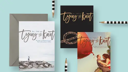
Add Glyphs And Graphics: Save The Date Card
So one of the things you might experimenting with is the format. So if I'm looking at this, and I'm like, well that's pretty cool, I made this watercolor version. Maybe you wanna offer an additional version as well and maybe you wanna try using a graphic in it and maybe we wanna try playing with the orientation of this document. So maybe instead of a horizontal, landscape image, maybe we wanna try something that's vertical. So one way to do that, now that we've already got this here is we're just gonna rotate the entire document. So I'm gonna come up to the image menu and I'm just gonna choose Image Rotation. And I'm gonna choose 90 degrees Clockwise. And the whole image and all the text and everything is gonna go sideways. So I'm gonna zoom out by pressing command or control minus just to scoot back a little bit. Now we have to straighten all this out and it's pretty easy to do. So I'm going to in the layers panel here, let's get rid of that, I'm gonna select this layer two, that's th...
ose splotches and I will then shift click on this bottom layer and I'm gonna press command or control + t. Everything's selected now. And now that I've pressed command or control + t I get this transformation box. Now I can't see the corners, 'cause it's so big, so I'm gonna press command or control + 0. That will scoot me out far enough to see all these handles and then I can put my cursor here and just spin the whole thing and if I hold the shift key down, I can spin it in 15 degree increments, so it'll snap to exactly 90 degrees. One other hint, you can also come up here and just type 90 degrees or minus 90 in this case and that is gonna be fine. Then I'm gonna have to bring this in a little bit, because we're obviously dealing with a narrower width, right? It was gonna be a five by seven horizontal, now it's a vertical so the width just got shorter. So, I'll scale that down just a little bit and then we'll go ahead and commit it. Okay, so now we have this vertical piece. Now we are done with all this watercolor stuff. So everything watercolor related I'm gonna get rid of, because we already did that version. All right, so we're gonna rethink this now, and we're going to add a graphic to this, which I think is really exciting. There's a lotta different places that you can get graphics. Graphics can from your own illustrations, you could sketch something out if you've got a gift for that. And sketch it out, shoot or scan it, and bring it into the computer. You can find things on creativemarket.com. There's so many amazing illustrations and they're really affordable that you could find there to bring in. Or, one of I think the underappreciated places that you can find great graphics is within fonts, actually. And I happen to have this one graphic in mind that we're gonna be using from a font called Wed Dings. Isn't that clever? Like, instead of wingdings or webdings, it's Wed Dings, and it's a wedding based graphics font. So like dingbats, but they're all wedding themed. And there's a link to it in the resource guide. So I'm gonna grab my type tool and with my cursor in clear area I'm just going to click to just create a place for my cursor. And I'm gonna go to my Glyphs panel. This is a really exciting, somewhat new addition to Photoshop. If you don't see it on your screen already, you can find it from the Window menu, by going to Window, Glyphs. So I just happened to tuck it over here, 'cause I use it all the time. So in this Glyphs panel, you will see that you have the ability to select a font right here. So the font that we're gonna use is the one called Wed Dings. Here we go, Wed Dings. And you can see, you can change the size of all the little graphics by clicking on these different buttons or dragging these sliders here. So you can see there's all kinds of fun stuff. Like little words and here's some wedding rings, and what I thought would fun was this picture of a knot, since the phrase is tying the knot, I thought, let's have a knot. So to insert this character from this font into the document without having to type out the whole alphabet and wait 'til we hit this character, we just double click with our active cursor and it will just go ahead and put it in. So now we can close this. And I happen to have it pink right now, and actually I think we'll keep that. So that works out nicely. So I'll go ahead and set it. And let's scale it up to be rather large. So I'm gonna transform it with command or control + t. I'll hold shift and I'm gonna drag it pretty big. Something about like this. Maybe a little smaller. Incidentally, when you're transforming things, you wanna hold shift to drag from the corner to keep it proportional. And if you want to be able to scale it on both sides at once, then you add the option or alt keys. So that's how I'm scaling that in from both sides at the same time. So we'll drag this down here, about like so and I'm gonna go ahead and commit that. Now we need to do some rearranging of our type here. So I'm gonna grab the lex and luke layer and I'll hold shift and click Tying the Knot layer. And actually this too, so I'll shift click that as well. And we'll get the move tool and let's move all of this up now to a higher position in our document. And now I'm gonna move this one up a little too. So we'll select that and move that up by itself. And this knot layer. So it's represented here in our layers panel by the letter F, because this knot graphic is designed to the letter F key. So that's why it just says F. So we can rename that by double-clicking and calling Knot if we want. So now we know that that's the knot. So let's recolor some things in this document. Let's make this background, I'll select the background layer, we'll grab our swatches and let's find a like a, oh what did I have, maybe like a dark blue. I don't remember what I originally intended here, or dark purple, and I'm gonna go ahead and do that keyboard shortcut again. You can see it up here under Edit, Fill is the keyboard shortcut that's gonna do the same thing as filling this background, with my foreground later. Ooh, I kinda like that. Sort of a purply-pink. And then let's change Tying the Knot, so I'll select that layer and maybe get like a peach color. Maybe like something like this. So I'll select that and do the same keyboard shortcut. That's looking pretty good. And maybe, maybe we leave it like that. Or we could experiment more. What does this look like with like a dark blue? Oh no, I don't care for that. We could spend all day doing this now. So you can play with that however much you like, but the important thing is to remember to have contrast between the colors so that's gonna be easy to read. But I think that this can be kinda fun to play with some colors that you might not otherwise expect. So that's another treatment for having all this type and adding in a graphic. And we've created now three different looks and we haven't even added a photo yet. So I think that's pretty incredible.
Class Materials
Bonus Materials with RSVP
Bonus Materials with Purchase
Ratings and Reviews
Nova
Khara is a brilliant instructor and I learned so much to improve my business. I'm running wild in photoshop with the tools and approaches that I gained from this amazing course! Thank you!
April S.
I have a Photoshop Bootcamp that encompasses a few weeks of learning but I just haven't had the time and focus to sit down and go through it even though I know there is a ton of useful stuff for me in it. One thing I have wanted to do for awhile is to design cards using some of my photography and graphics/lettering. Khara's Invitations in Photoshop class goes right to the heart of what I needed to know in PS for this specific kind of project. I am not a complete newbie to PS but seeing her use various functionality in this context hit home for me. I'm glad I picked up this course and look forward to working on some of my own cards. Khara's is well-prepared and direct, she speaks well, is clear, gets right to the things you really need to know. In my opinion, she's a very good instructor for the Creative Live teaching format.
user-f9ff5e
Khara packs a lot of info into this 2 hour class. She has the right balance of being friendly and conversational yet stays focused and on- topic. She shows several ways of doing actions or accomplishing a task. What I like the most is how she sometimes backs up and reviews what buttons she pressed or actions she just did. Even if you have been doing PS a while, you might learn some new shortcuts or new ways of doing a task. I could have written 4 or 5 pages of notes easily on tips. Sometimes she is a little fast and I couldn't see what exactly she did, but if you buy the class it would be great to pause and rewind a section several times. I would put her up there with Dave Cross as one of my favorite PS instructors who pack in info and won't put you to sleep.