Lessons
Lesson Info
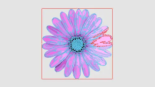
Add Texture to Image
So the next one I want to show you is going in getting some basic texture. I've got this piece of paper right here, and it's a low resolution file you can see, because when ice slicked this image up here in my control bar, I have the ability to read what the file is. It's RGB mode and it's 49 pixels print very low rez. I don't need a really high rez with this. It's just gonna be a texture of the paper in the background. So I'm just going to zoom in on this so we can see I've got my content selected. When you go under image trace now the preset. I don't want to do black and white logo because black and white logo is gonna take anything that is 50% gray light of them, 50% gray. It's gonna go white Anything. It's 50% black is going to go black. So if I do black and white logo here, this is what I end up with. Not what I wanted. So I would probably want to go be in and do something like shades of gray, which you're going to give me my entire tonal range. Now you see the progress bars here.
This is a low resolution image, but there's lots of content in here. And how much content do we have at the bottom of our image? Trace panel. paths and a whopping 15,600 little anchor points. A lot of stuff in here very simple. This comes across that gives him my texture. Now the mode is gray scale, and we can change this mode as we go through. But it's gonna pick out what's gonna be best for this. I don't want this in color mode because it's just a great scale to begin with. If I do black and white, then it's just going to give me black and white, Black and white means exactly that. No shades of gray. Any changes that you make, it's gotta run through the entire progress bar and redraw everything. So be prepared to wait, folks. So here's my entire color range. Based on what this image was to begin with, the Image trace panel basically said, OK, here's the number of colors. 50. I could go less, which is going to break it down into far less shades of gray. Wait for the progress bars. You'll get used to it. Give me less Shades of gray. Doesn't look very realistic. If I go all the way up to 100 it's going Teoh, give me a lot of shades of gray And you may think, Oh, you know what? This is really going to give me great detail. Well, the problem with this and when you see great detail, this doesn't correlate between what you think. Oh, my gosh, This is gonna be really great detail. It starts to pull in some other things and you can see really up close here how it starts to really model the paper. So even though it's like, Oh, yeah, I mean, 100 shades of gray are gonna give me really all that texture. Not really the way you'd want it to. We're gonna have that same problem when we do a color image to a really high fidelity, one doesn't give you the expected results. So I'm gonna set this back down to someplace around 60. We started at 50 here, and I'm gonna get enough that I can get good enough tonal range in here we're going to see where we are. Here it is. I think that looks pretty good. I still have a little bit of modeling in here. And that all came from the two thing. This of the paper. We'll talk about noise and that little kind of quality that we get and how we can get rid of that set this back down to 50 because I think 50 was like the right place where illustrator told me it was supposed to be. So I think this looks pretty good overall when I zoom out and they click off this, that really looks like wrinkled paper. And now we can have This is an illustrator file that allows me to go in and simply scale this and use it Any place where textures needed without having to have this photograph, you're not done yet. Need to click on your expand button and convert it all into shapes. Yeah, this is what it looks like. OK, go in a preview mode. That is your file right there. That's what the whole thing looks like. And that's your paper scale. It Any size that you want continues the tonal range to you can adjust the opacity overall if you want to do it and the color texture or something really quite awesome. Put on the color background set the opacity Fact. Let's just do that. I can put a colored background behind here. Send that to the back. But a color in here going to get that textured paper. Look, I had screened back that paper of it said the opacity said the opacity up a little. Here it is and kind of let that show right through. It's great. It's all vector, completely scalable. Ready to go. Absolutely awesome. Pretty sweet. Like that paper a lot. So the next one I'm going to dio was We're gonna go in and do a piece of sketched art. So I'm gonna go under file place, and I'm gonna grab my hand sketch here, which is literally a sketch of a hand and scale that up so we can see. So this is a hand drawing right here. Now we may want to go in and looking at some of the options here. We may think a couple of we're going to be relevant here, So the preset, it's like, let me do Leinart because this looks like Leinart, where you're actually going in and sketching, and it's like, Okay, it's all lines. Well, Leinart and technical drawing give you something that is not probably what you expect when you do Leinart here and you trace the whole thing. It just gives you lines, literally lines. And you can see here with the threshold because these lines were very lightweight and very light in, um, opacity. Not many of them showed up. So I want to go in and I consent mawr. But you see how all we do is we get lines and it looks kind of like a little scratch pad kind of thing. And it's not really what people expect. The same is true. When you go in and do a technical drawing, it is all going to be lines. It's a different style of line, but it's all strokes and no fills, so that could be interesting. But I don't think it really relates to what we would actually think of as having and actually lying drawn sketch. So what I'm gonna show you is going in and actually doing what's called Sketched Art. So with this sketch, Dart is going to go ahead and give us some of those characteristics of those line weights. We definitely want to set our threshold. So we get more of our attributes in here, and this is kind of like the woodcut effect as we go mawr on the threshold. It's going to pick up more of the fine details and begin to fill some of this content in. So it gives us very much the wood block effect with this, and that's going to be the sketch dart right there. If I do silhouettes, it's going to give me a slightly different style of this as well. This is a lot more extreme, so it's leaving out some of the details. But it's also giving me a different style Maurin line of going in and actually doing just a basic graphic rendering in black or white. So either way to do that black and white logo is not going to be quite the same, because it's going to treat these things as just simply black and white. We're gonna get a lot of large filled in areas. Each one's gonna be slightly different. Part of this is going to take time as you go in and you put in your artwork to see what the best results are going to be. So in this case, if I was going with this, I think sketched art can work with a higher threshold toward the more position. And it starts to come in and form something that looks kind of along the lines of my sketched part so I could easily render it this way. If I did, I could get my file and everything's going to you. Look, just like that. I had expand and there's my entire set up, right? They're going to preview mode doing command. Why? And there it is. So I'm not opposed to that at all. The other way of doing this exact same hand, I'm going to go in, and I'm gonna create a new file place, that same sketched hand in here. I'm gonna run this slightly differently, and in this case I'm going to take this. And yes, we see this as an actual sketch. But the reality of this is is this also has a lot of tonal range in there from either like smudging or erasing or just getting a little bit of the graphite from pencils in the background there. So in this case, I might take my preset. I'm going two shades of gray and shades of gray. It's automatically going to determine the shades of gray that are gonna work really good. And there is my sketch. Overall, it's like, Oh, that's pretty cool. I like that look, and I get a sign of that tonal range there as well. If I do, I'm or it's going to go in and give me going to break it out into more colors. So it's gonna give me a broader range of grayscale getting a little bit more detail. But when I get too far, the more detail now, what just looks kind of blurry and syrupy. It doesn't really give me that kind of sketch early quality to it. It looks more like now that somebody has kind of gone in with an eraser. So even though it's giving me Mawr tonal range there, it isn't exactly what you would expect. So if I cut this way down in terms of the number of colors or gray that air in here, this is going to be more along the lines of that schedule equality a little bit flatter in terms of the number of colors here, but a little bit more of that. Really nice, rough defined edges. So this is like 20 colors right here and again. Any time you make an adjustment, it's got to re render the entire thing wait for the progress bars, and there it is gonna expand that. And that's what I have in terms of my sketched document right there. So this is my hand Gonna jump back over to the other one and show you when we went in and did are other preset. And so there's our differences from both of our same hands that we used. So this was more of a sketch, and this is going in and using the gray scale, either of them look really good. It just depends on your style and got shades of gray here and here. We just simply have black and white. If you want to throw some color behind there, you can. But either way, we've been able to go in and render this. Now, what's nice about this at a low threshold is it looks very much like a sketch and you want to put this on a backdrop or something or, you know, do this on a T shirt. It literally looks like it's hand sketched but completely scalable. So we don't have to worry about file size ever again. So we're gonna create a new file and going to put in another image here so him and choose file place in this case, I want to go in, and I'm going to something kind of in between here, which is kind of interesting. So this is a Christmas card that my mom happened to make, and she does amazing stuff with paper. So what we're seeing here is we're seeing just highlights and shadows. Plus, we've got some dimension here with the things that air glued on here, and she also uses some foils with that have some really cool textures and this foil or this metal that she's using right here. You can actually capture that perfectly an illustrator. So we've got both of dimensions of the cut paper and some shadows in there as well as her nice little in Boston stamp that she did. I'm gonna render this in a couple different ways, so I'm gonna select my image. I'm gonna go to my image trace here. And if I go when I do something like sketched art here, this could be kind of cool again. It's gonna be black and white, so it's just going to give me the highlights here. And I can set the threshold where it's just going to pick up the shadows on everything so I can kind of create some interesting look. If I want to kind of fill those in, adjust the threshold. If I go when I turn this into gray scale, that's going to go through and render this is the grayscale and capture all of those tonal ranges and dimensions. They're giving me both the highlights and the shadows as well as all the textures. Now you can see how long this takes, which means every time I make an adjustment here, it's going to take this long because there's a lot of content in here, runs through everything, see how it looks and there is my grayscale image. That's pretty convincing because you can actually see kind of the highlights of that foil that's cut out there. That's pretty awesome. And presets here like a do shades of gray. I could do color if I wanted Teoh, but this looks pretty awesome right there. Go ahead and expand that. And it's amazing that even that foil covered paper looks just like foiled cover paper. Most people would be completely fooled that this is not a photograph. So if you want to capture a really cool texture like a metal surface or a glass surface or any type of texture, do it, scanned it in, take a picture of it and then render it. Because those highlights on that, it really can capture that. Look at those little dots right there. That Aaron there, everything, even little crystal inside there looks just like it. And the paper right there. It even captured where the paper kind of broke right along the edge. Now in use. Ilmenite does seem kind of melty, but the reality of it is when you look back at this, it's hard to tell that this is actually just vector shapes and not a photograph
Ratings and Reviews
Hayden Brooker
Great overview of image trace, I had a basic understanding of how it works so I was looking for advanced explanations of how the different settings worked and best practices; which I definitely got! Great teacher and easy to listen to. Love how quick this was.
Karen
Fantastic! Learned new ways to use image trace I never even considered.
Student Work
Related Classes
Adobe Illustrator