Lessons
Lesson Info
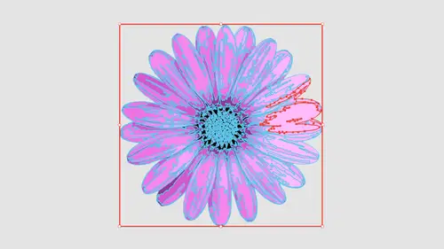
Render Textures with Color
So with those textures, I'm gonna go in and place another file here, and I've got some burlap here and I'm gonna place that burlap. Then we're gonna talk about texture here. But now we're introduced. We've introduced color as well. So here is my burlap and I can go in. And I look at this and I say, OK, I may want to go ahead and render this in colors. I'm gonna do three colors just to see how this looks. Render this in color. It automatically sets the color the mode to color instead of grayscale when it's going to render it in three colors again. This is a very small file. It's only 29 pixels per inch, but there it renders in three colors, and you know that isn't bad. I get my highlights in my shadows, and that is three colors. Yeah, literally three colors when you go in and you said a preset to say 36 or 16 colors here, Really, what it's doing is it's setting it low color mode, or what we call a limited palate. That limited palate goes from two colors all the way up to 30 so whatever ...
setting you use 36 or 16 is just going in and setting that to be a limited color palette. Surprisingly enough, if I take this color palette and I ramp it up to, say 15 colors and I re render it, it's going to be surprisingly realistic, even with 15 colors, because this is a fairly continuous color palette here light Brown's dark browns and tans, and it's going to be amazing what 15 colors will actually dio when you look at something from a distance. If you looked at that, I don't think anybody would look at this at that size and say, Wow, you know, that's a vector piece of art. No. What you going to preview mode? We haven't converted it yet, so you can't see it. We'll go into preview mode afterwards. You look at that and that's pretty awesome going. And so right now that did set it to 30 colors right there. So that's pretty much the maximum amount of colors. You can always stop this in the middle of the process if you don't want to do this, but you can go in and make illustrator crash. Um, if Illustrator does crash in here, which it has before. It may be because you have a big file, so be prepared for that. Save your stuff. It should go along. This is very memory intensive. It's not a bad idea to quick out quit out of your other running applications so that you can dedicate the most power to this when you're using this. So I'm gonna go back into the preset here. Instead of choosing just my basic color, I'm gonna choose a low fidelity photo because there's not a lot of detail in here. Even though we think there's a lot of detail in terms of converting this to a vector object, there really isn't that much detail. We're basically dealing with highlights and shadows. Now you can see that this produces a flatter image than going in and just choosing the 36 or 16 color presets. When the reason why is because when we do a low fidelity photo, the palate has automatically changed from limited to full tone. Full tone means is going to go and pick up all the hundreds of different colors that are in there, and now it's going to give us the full town right here. So when we set the colors, we don't actually set the colors. Here we set the amount of accuracy in terms of percentage. This is 20% accurate. Just because we're using the full town. If I go to limited, then that limits me to 30 colors maximum. So now I have more control over how it's gonna render. And surprisingly enough, by limiting the color palette, it actually looks better. Does not seem like it's a linear type of thing. But there's a lot of things with image trace that go exactly against what you believe in. A photo would be correct. They're not. So when you get into image trace so I'm gonna set this to a limited color palette and you can see the dramatic shift right there. So doing something in full color while you would expect that full color to you look really great. It doesn't necessarily do that in case in point here, the limited color range actually produces better results. It doesn't seem like it makes sense. But this is why you have this class. I'm going to expand this and he's gonna turn it into outlines here and checked head out. That's the entire Berlin looks. Nothing like burlap whatsoever. Because a lot of these shapes are overlapping each other, they aren't actually drawing just the color they're drawing, kind of like a topographic map on top of each other. So it's not just the individual shapes, but when you zoom in here and look, that's what it looks like. It's amazing because once you put it all together, looks completely believable. So there's our burlap. So the next one I'm going to bring in an actual color image, but a very simple color image. I'm going to use the pliers and with the pliers here it is a basic color image. So I look at this. It looks really high. Rez, it isn't. It's just a low rez file. It looks nice right there. And then I'm gonna go. We in and I'm gonna choose high Fidelity photo because, okay, this sharp, it's in focus. It was taken in a studio. That lighting is just right soft diffused. Okay, here we go. So it's gonna go we know is gonna render using a high fidelity photo. I look at this and it's like, you know, look at all those chunks along the handle here. It's like, Wow, that doesn't look very good. Exactly. And here's the problem. We actually have too many vector shapes in here. Surprisingly enough, doing a high Fidelity photo doesn't give you the quality that you expect. I'm going to switch this back to a low fidelity photo and have it re render the whole thing and look at what it does. It cleans up a lot of the edges Now we're gonna have a lot flatter color in here, but it's going to render the edges a whole lot better right now, I think, with a low fidelity photo a 20 it's not quite as like I wanted to. Not quite is smooth transitions between the colors that I would like to have. If I go back in here and I actually switch my color palette from full tone, too limited, it's going to re render the object and your concede how it kind of breaks up. The surface is a little differently now. I've got a little bit more surface texture in here, going back from limited to full tone. It goes in and it re renders it and changes how it looks now I have. Once I go to full tone, it now becomes a matter of percentages of colors for accuracy rather than two colors up to 30. When I have my limited, I'm gonna go When I'm gonna ramp this up to say 35% and you can see it gets better. And then I go too far. It begins to get worse inexplicably. So if I go, we don't make it too accurate here. I'm going to start getting thes areas where things to start to fall apart so I can drop this down to the point where it's going to look good. And you think 100% would be dead on absolutely awesome. Inaccurate? Not necessarily. So there I have it. Now you're probably seeing these used before where, people, they've have ads out there where you go when you take a color image and you break it down into a certain number of colors. If you want a limit, your color palette go down and see what it looks like when you just limited to a couple colors. There's two colors, very high contrast. We could go in and bump it up to say four colors, and you can see where you can get some of this really cool look and feel with this very high contrast look and we put it there and you can see how those colors begin to progress as we go. This is a really cool way to go. We and and create a very distinguished stair step effect. And this is even more dramatic. More contrast you have in your initial image so I could go in. And do you say 13 colors and kind of give some interest in here? And if we render that whole thing, it can kind of create a very high contrast look and feel makes it look like it's a very high contrast photograph. But it's got those actual individual kind of layered effect of the highlights and shadows going in there. So having something be a perfect image and having it render absolutely perfect there isn't a direct correlation, but we can go in. We can create a much more realistic look and feel when we have an actual image. Say we go in and we're going to use these grapes. I've actually done this. Years ago, we had a huge convention we needed to put these grapes very large on the back panel at the convention. And this needed to be a panel like, 150 feet long. So this photograph looks like this. And in this case, I would want this to render toe look exactly like these grapes. So we would naturally go into the default and say, Okay, I have a five high fidelity photo here choosing high fidelity. It's gonna automatically set the palate to have a full range of colors. I'm just gonna go through and this is gonna take some time because it's a lot going on. Even though my images only 49 pixels per inch, it looks good on screen. And as long as it looks good on screen, you can forego all the other understanding that you have off. What a high resolution and low resolution images we know a high resolution images 300 pixels per inch. But in terms of looking good on the screen, if it looks good on screen is high rez enough. You don't need to make it much higher. Rez in terms of okay, need to use this for print because we're not using this for print were simply using this for rendering. So there's my full tone image right there. Yeah, that's all. Vector, folks. Okay, you're seeing an entire vector file right here. And you know how I know that I can turn that off? There's the photograph. There's the vector file. If you can't see the difference, it did a pretty good job. So let's zoom him. Sure enough, that's all. Vector. Okay. Vector photograph factor Photograph Pretty sweet. Now that is using the full tone right there. And what they done was gone in and it automatically said it to be 85%. I'm gonna set this toe 100% color accuracy. We're going to see what this does. Generally, it doesn't make it better when you're using very simple images. This is a pretty full tone image. So when we set the accuracy with something like this, we've got 100 and 57,000 anchor points and 17, paths in here. This is a smoking big file already in terms of points and paths. So it's gonna take a while for it to render Wait for the Progress Bar is the kind of thing that having more memory on your Mac makes it really smart to do that. And don't think you have anything else going here cause any adjustment that you make is going to go through. It is gonna take time. There it is. Wait for it. That looks pretty good. I think that looks absolutely fantastic right there. So if I go ahead and click expand, there's my file. Look at that. If I go into preview mode here, that's some pretty intense. It's in a vector right there. But you look at that and you use that, is that And it's like, Wow, that is amazing. I mean, look at those grapes. How can how can that all be vector? It is. It's all vector now. This is what happens when I went in and I set that from 85% to 100 Do you see how we start to lose the actual shapes here? So I don't recommend going in and going much past what the presets are going to be in your file. I'm just gonna do a command Z and I'm gonna undo this, and I'm gonna knock those back down a bit. So that I can adjust those so I don't lose those actual shapes. Setting it to the maximum amount in most cases gives us the best. It doesn't do that for Image Trace and Illustrator. We want to keep it a little bit below the maximum amount of colors and accuracy in order to give us the best results. The reason why I want to run through a whole bunch of different images is because there's so many great things that you can dio that it's going to be different for every image. But it gives you a really good taste of what images you can use and what to look for when you're trying to go ahead and experiment through this, and hopefully this gives you a really good outline to be able to work with us. I'm gonna set this back down to say 80% where it was before, but hopefully this will rear ender. So I get rid of some of the little bumpy edges right there, and it turns into more of the shapes. Be prepared to wait, folks, because you will. There's nothing like watching paint dry, but that's what we're doing right here. Keep in mind Any adjustment that you make, it's gonna happen. It's gonna have to run through the entire process day. Do you see how much they cleaned up the grapes? A whole lot less total range, but a little bit more specific to the actual size right there. And it still looks great. And I can expand this. I'm gonna turn this from color over the gray scale here just to see what this looks like. And with the gray scale here, we could get this great tonal range in this file and get some really nice tones here with the full color image. If you wanted to do something like this as well, you'll notice that the grays, they're gonna drop down right about in the middle here to give us a pretty good balance between highlights and shadows there. So we don't over blow out the areas or over saturate the shadows right there. The midpoint is going to be perfect. And there's our gray scale. Looks really nice. Go back to color here. And if I go back to color, click stop, I'm gonna go. And I'm gonna do a limited color palette here, so it's gonna break it down into 30 colors or less, and this can create a really dramatic effect, especially with a full tone image. If you limit the color palette, you're gonna get very strong stair steps. There's ad campaigns that people use this on. We're going to go back and get very large areas of flat color, setting a number of steps to 68 10 steps, and it really creates a very dramatic effect with the outlines, and it could be kind of cool to see that. So when you create a limited number of steps, this is the effect that you get right here. So this is 30. I'm gonna drop this down to 15 and you'll see how you get this dramatic kind of tone on tone effect highlights mid tones shadows that really creates this very artistic effect. And people have seen this before, and they're like, How do they do that? How do they go through and trace it? Used image trace and then just set it down to a limited number of colors, and it breaks it out into a whole series of flat colors but a limited range. So there it is, So there's that look and feel kind of creates that cool kind of text arised effect in there as well. It's a lot of different things that you can go through and play with. With this really dramatic effects. Set the colors down really low and it will break it down into very sharp delineations of lights, mediums and darks in your file, going back in here and going to file place. And this is a full image here. We did the grapes, but I'm gonna go in and I'm gonna dio the full image here where this is just a photograph, a complete photograph here, just something I snapped with the camera and I want to render this whole photograph exactly this way. The grapes were one thing because they were shot up close and they were nice and stylistic, and there really wasn't much else. But here is just an actual photograph with everything in here. We've got textures, we've got everything. And here's the amazing thing. I'm gonna run the anonymous, okay? Make this a high quality photo and it's gonna run through what it's doing. You won't believe the results of this. In the end, it'll look exactly like the photograph. It does take time. I did scale this way down. It's only pixels per inch right here. We're gonna show you if you do get a big file, what's gonna happen? Because we can actually set this file size in illustrator if something comes across as being too big for it to render, cause that's quite handy. Tohave So what? You get to curve fitting. That's pretty much the end. And that's the overall image right there. Can you believe that, folks? Yes, that is all Vector. I'm gonna zoom in on this right here, and you could see all those vector right there. It's like, seriously, I mean, how can you tell the difference? Well, it's pretty awesome. So I mean, that's all millions of colors right here. And it's like, get out. It's like, Wow. Even though it's at a distance here, it still is totally believable. Yeah, it is expand that whole thing done. That's what it looks like. It's like, get help. Yeah, I love that. So what I want to do is I'm gonna do this last file right here. What a place. My last image choose place and I've got my pointing hand, which is just a what looks like kind of a woodcut right here as we go. Now, somebody may if you do have a very large file and you want to render this file Teoh be a smaller file or this is kind of a lower resolution file and this one is actually very low resolution. I want to beef up the quality here, but I really don't want to go into photo shop to do it. Select your image, go into the object menu and I want to go under Rast arise. Under Rast arise I will be able to go in and change the color mode of my image. And I can also change the resolution off my image as we go so I could go in and I could render this is a higher resolution or if it's too big illustrators gonna warn me saying, Hey, you know, this is pretty high resolution. It's gonna take a lot of time. Do you want to really spend all that time? You can say no object Rast arise and then re render this whole thing and I'm just going to render this as a high resolution bit map, click. OK, and this will go beyond and it actually renders it just like that. So I could then go through and do my image trace here If I'd like to go through and do a little bit of different look and feel right, an illustrator So I can resize these things resolution wise and color mode wise in here without having to go to photo shop, which is quite handy.
Ratings and Reviews
Hayden Brooker
Great overview of image trace, I had a basic understanding of how it works so I was looking for advanced explanations of how the different settings worked and best practices; which I definitely got! Great teacher and easy to listen to. Love how quick this was.
Karen
Fantastic! Learned new ways to use image trace I never even considered.
Student Work
Related Classes
Adobe Illustrator