Lessons
Lesson Info
Image Trace Panel
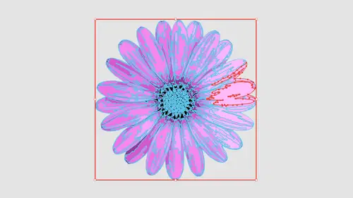
So we're gonna show you just the basic image trace panel before we get into the advanced features because we have the advanced features here at the bottom of our image trace panel, which a lot of people don't get into because they're like, Well, you know, I can do what I want here and you can. So one of the items that we have to adjust is what's called the threshold, and if you hover over the threshold here, it tells you pixels at a darker than threshold value. It converted to black. What that means is we're setting the midpoint. Do you want mawr of that content to be rendered darker, or do you want more of the content to be rendered lighter? So if I go when I take my slider and I slide it to MAWR, it's going to go in, and it's going to give me the little progress bars and you'll notice by rendering Mawr. What it's done is it has now picked up some of those items that seem to be kind of on the edge, and the threshold is literally the point in which, okay, everything here that's lighter...
than, say, 50% black is gonna go toe white. Everything from 50% black and higher is going to go to black. What? This will also do if you're still letting if you're still getting everything, rendering the way you want, Teoh. This will allow you when you slide ITM or this will allow you to kind of beef up the weight of the lines. So I want you to look at this, even the ones that are in focus. If I set the threshold higher, the line weights will start to gain a little bit more. So a lot of these have dual purposes. One. The threshold is to get everything to show up. The second is I can adjust the threshold to kind of beef up everything in there. If I go too far, you'll notice that now these shapes have filled in substantially. That may be fine because that's a way that I can add a little bit more weight or mass to my finer items or it just goes in and it just gives me slightly. Have your line ways. If I use this threshold, I can also bring the threshold down, which will allow me to go ahead and create a little bit more of a stylized look where I actually start to break this up. If I want to create Mawr kind of of a stylized woodcut field where I'm actually going in and adjusting the threshold, saying, OK, these pixels are not, like, not light enough to render, so just give me kind of that broken look. It's a fine line. Depending on what you want, you're gonna just a threshold. The threshold higher is going to go ahead and give you more dense lines, but pick up more information that's questionable. If your information's already there, it's going to start to fill things in. So you gotta pay very close attention to what you see on screen right now. I don't think my threshold is good enough because my blurry items I'm losing things. And then over here I set the threshold, and I'm gonna look overall. Definitely take the time to see what is going to look like cause the results that you see on screen, or exactly what's going to happen when we convert this to a vector shape. So anything that we go in and we adjust, you'll notice that the preset now is no longer black and white logo. The reason why is because all these precepts are just simply a starting point. Once it goes to custom, then that means that you've just gone interviews adjusted something that is no longer the exact match of the preset. With this, I've now could go through here, grab my hand tool, I can see my content. Overall, I'm liking what I see here. I can see that my blurry items here have lost some of the detail, but I'm happy with the overall looking field. Now, this is only the preview here. I actually need to turn this into actual vector art. If you do nothing here, all this is showing you is what you could get. But there is no OK button. So a lot of times, when you see this view tracing results here, you think OK, it's traced it. Where's my vector file? And you go under the cheese grater and there is not in your like, how do I get this to actually work? Well, okay. Makes no sense whatsoever. Unless you really understand, illustrator and up here in the control bar, funny enough that we don't actually have this in the image. Trace panel Seems a bit ridiculous. Have to go into the control bar and shoes expand. Expand? I mean, really, Why not? Okay, go ahead and trace the thing for me. No expand. When you hover over the expand button, it says, convert the tracing objects into paths. I didn't know that. It's like, really, how would I ever stumble upon that? So I click the expand and it goes through, and it renders absolutely everything. Now what's happened to your image? Your image is gone. It's basically taken it out of the file, and all you're left with is your vector shapes. So I zoom in and I could go in a preview mode by hitting command. Why? And I can see all my vector shapes or right there is converted everything. Defector. There, right there. It's great. I can use these filled these with color, however I want to, and there's my vector shapes. One of the very common things, though, is because we have brought in an image and you try to get to your vector shape. We always have this bounding box around the entire thing, and this bounding box is literally a clipping mask and because when you trace the whole thing, it literally traces to the bounds of your entire image. This is really frustrating because people try to go be in and then you go we in and you can ungroomed and you can have two on Groupon, Groupon, Groupon on group. And sometimes when you on group, it changes the overall look and feel. But every time you try to select something, you get this big background. Here in this background is this whole big background item of all these shapes. And this is one of the attributes of using image trace because it will trace not only all the content but the entire bounding box. We're gonna show you how we can get away with not having to do that. But if I get rid of that area now, I can go in and I have each and every one of my elements that's completely selectable and edit herbal in vector. The advantage of this completely scalable anyway, that you want to. Now, if I look at my items here, I'm just gonna compare these really quickly to each other. The one on the left was done very nicely in focus, nice and crisp. The one on the right here was a little bit blurry from the original, and you can see the amount of detail that I have lost. The line weights are pretty much the same, the blurry ones a little bit heavier because it cheated on the side of making sure it included all that information. But you can see how much detail I lost inside that content. So it's a very fine line of going through and exercising that right amount of threshold in order to get where you need it to be. Really good thing to Dio. Do one element at a time. Break it out so you can adjust based on just that one element. Instead of doing everything on a sheet like I've done, I put multiples up on one file so you could see the difference between what a very sharp image looks like and one that isn't very sharp. If you run into this issue, you can always go into photo shop and open up your file and go ahead and apply some contrast to your file to get rid of those softer edges and what I could do is I could take my items that are soft and I could select just those and the way I'm going to go ahead and clean those up or bring them into focus. A simple way of going in and getting more contrast. Image and I could go under my image adjustments here, get to the right layer. So you have all that content right there. There is my content. I'm gonna go into the image under adjustments and do a levels on my area. Very simple to do a basic contrast adjustment to get mawr out of your image. Trace Photoshop image. Adjust levels on levels. We have our shadow slider that makes all of our dark areas darker. So you can see how I can go in and darken those up the highlight slider that will make all my lights lighter. And I can go in here and I can bring those closer together, which is gonna provide a lot more contrast. Taking my highlights and shadows bring them together is going to provide a lot more contrast with my items. The more contrast, the brighter, the brights, the dark of the darks. This is going to give me a slightly better file going in. We're going to show you this again when we have some other files so you can see the difference that we get from just doing a basic levels adjustment for contrast. So this is my converted results here. It's now an illustrator file infinitely scalable, any size that I want to all vector, and I comply any type of colors that I want. Teoh from my color panel. Whoops. No colors. Here's what happens. People will go in and they'll do an image trace and they have no colors in their color panel. And the reason why is when you open a file directly into illustrator, which is exactly what I did when you profile open, I open this file up when you open a file and illustrator, your entire swatch panel is completely empty, and then you have to add swatches, or you have to then copy your artwork out of this illustrator file, creating new one pasted into the new file, and then your swatch panel is going to be filled with color. So the way you get around having your swatch panel be empty is don't go in and open your file going to the file menu and choose place and place your image file into you're illustrator file. So if you want to be able to use this, you can go in and use it with all of your swatches. It's a very common thing. People are like, Why there no swatches in there because you opened a photograph. If you don't open a photograph and you just place it like I will with this paper, I've been a click place. Now when I have my place piece of paper here now when I go to my Swatch menu, I still have all of my content.
Ratings and Reviews
Hayden Brooker
Great overview of image trace, I had a basic understanding of how it works so I was looking for advanced explanations of how the different settings worked and best practices; which I definitely got! Great teacher and easy to listen to. Love how quick this was.
Karen
Fantastic! Learned new ways to use image trace I never even considered.
Student Work
Related Classes
Adobe Illustrator