Dodge and Burn
Lesson 46 from: Fine Art Conceptual Photography from Shoot through Post-ProcessingBella Kotak, Pratik Naik
Dodge and Burn
Lesson 46 from: Fine Art Conceptual Photography from Shoot through Post-ProcessingBella Kotak, Pratik Naik
Lessons
Class Introduction
04:47 2Artistic Vision and Inspiration
17:06 3Personal Projects
18:59 4Creative Motivation and Defining Your Story
15:15 5Organizing Your Inspiration
16:26 6Building A Character
03:19 7Creating Wardrobe and Props
33:59 8Location Scouting
12:55Resourcing a Team
17:52 10Working with Talent
06:39 11Building Community
05:06 12Scouting Location Pros and Cons
11:29 13Camera Gear and Modifiers
10:03 14Shoot Set Up and Styling
11:34 15Test Shots With Model
06:04 16Location Shoot: Model in Red Azaleas
26:04 17Location Shoot: Composite Pieces
16:35 18Plates Extending the Scene
07:11 19Set Concept and Design Overview
08:31 20Demo: Equipment Overview
04:39 21Shoot Set Up
08:12 22Shoot: Test Shots
15:08 23Shoot: Standing Against Flower Wall
06:47 24Composite Pieces: Hair
05:31 25Shoot: Overhead on Flower Wall
22:22 26Adjusting Images With Composite Shots
07:25 27Color Theory
11:40 28Capture One: Image Selection and Color Toning
19:42 29Moving from Capture One to Photoshop
17:01 30Compositing Hair
15:52 31Healing Brush Tool
06:42 32Dodge and Burn Tool
08:14 33Liquify Tool
12:01 34Adjustment Layers of Color Toning
35:05 35Blending Modes
10:44 36Channels and Channel Mixer
05:16 37Selects for In Studio Image
08:57 38Compositing Background
13:58 39Compositing Additional Elements
09:49 40Gradient Maps
15:51 41Color Toning with Controlled Light
21:32 42Adjust Skin Tones
17:27 43Retouching Skin
17:12 44Spot Healing Brush
06:11 45Clone Brush
03:47 46Dodge and Burn
18:49 47Sharpening
10:42 48Critique
15:40Lesson Info
Dodge and Burn
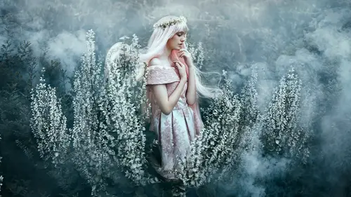
Now the next step of the process is dodging and burning because it allows me to even out transitions really easily. The best part about that is it's really fun to do and it's very artistic as well. Okay, save. That way we don't lose our file. (laughs) So let's zoom out here. We already covered the dodge and burn stage when it came to your work. And remind us again what we did with the dodge and burn. Well, we just applied it topically, really. I was looking at the lights from a broader perspective where I was just kind of using it almost like crafting how the light was sitting across her face. But you wanna use it in a more finesse way. That's right. Yeah. 'Cause you can't quite get away with it when you're doing a portrait like this, I don't think. And even with my photos, we'll dodge and burn twice. I'll dodge and burn and then I'll send it to Pratik 'cause he knows how to dodge and burn, you know, a very finesse way, yeah. Good point. I am going to focus mostly on the face f...
or this section. But if you ever wanted to also lessen the appearance of this line here, it would be the same thing as the under eyes. You just take your clone brush, you sample somewhere similarly, and then just gently brush. What happens is you lessen the effect of that line without having to remove it completely. But I think it's fine, doesn't really bother me that much. No it doesn't bother me. I actually did quite like it when you lessened it. (Pratik laughs) The good thing is with this workflow you can go back and forth depending what you want. So when you're done with everything and then you see it, then you can also decide like, actually let's go with this. Should give you a new layer for that. Oh boy. There you go. Neckline. Okay. Also the other part that we can fix is over here as well. Let's say we start with the healing brush. We can get rid of the finer lines here. And then if you go with the clone tool and just gently soften that up here. Okay? So it's not too in your face. Too distracting. Brilliant. 'Cause I would never remove it completely, I just wanna lessen the impact of it. Yeah, it would look weird if you removed it completely because the anatomy isn't like that. When you turn the head, you're gonna have a line there. And again, if you're not sure what to remove or what not to remove, then just look at artist books and artist drawings. I'm always collecting books, especially model studies, drawing humans and faces and anything like that and you really get an idea for shapes that you should and shouldn't keep and lines that you should and shouldn't keep. That's right. Okay, so our dodge and burn step is gonna be very similar in the setup, so in our actions that we created, we have the dodge and burn folder already there. So I ran the action. And you see our dodge and burn's already setup for us. Except this time I'm focusing on the transitions. I notice one thing is that over here there are these transitions that are really harsh. There's some gaps over here in the makeup, I can darken that up. I can also lighten or darken some of these eyebrows if I wanted to. I can increase the lighting in the eyes. I can also change this transition point here. Even the necklines. I could do anything with this. Not everything. Okay, I could do many things with this but some things I can't do. So let's start with the dodge. If you have a hard time seeing the transitions, another thing that we could do is add another curve on top and just quickly darken it a little bit so you can see the transitions a little bit easier. So this is where Pratik really comes into his own, as you can tell. He's very excited. But I do this. I always need to add this extra curve and I bring it down, underexpose it a little bit, and all this does is just increase the contrast so that I can see the gradients between lights and shadow more. The transition between lights and shadow more. So I come over to my dodge. I'll select the brush tool. I'm gonna use a flow that's quite low, like one, literally 1%. And then I'll simply go in and start brushing as I change my brush size. This is really important because if you don't change your brush size, it makes it a lot difficult to get the exact size of the transition. So with a couple of strokes, let's turn it on and off. And you see what happens is it kind of removes the indentation. Or as you said, I'm undenting models. (Bella laughs) There you go. The same thing goes for this area here. If I wanted to just lighten up some of those dark patches, I can do that. If there's any more gaps of light here, I can go to my burn and simply go in and darken that up. So would you say anybody can dodge and burn? Yeah, I think the biggest issue is seeing. It's just like color. When you can see the transitions, this is the only tool you really need to lighten them up as well. So it just works for practice. Exactly. And also, rotating helps because you can see transitions a little bit easier. And you can pick up on things that you wouldn't have noticed beforehand. Like once I rotated this, this becomes way more obvious to me. And so I'm gonna just dodge that up. That's very interesting. I never thought of that. And so if I turn that on and off, it looks better. The same thing goes for maybe some of the chin. I can lighten that up so it doesn't look as rough. And also, let's do the makeup here. You see there's light patches? I go in my burn. I can go in and darken that up here so that any gaps are filled and we have really beautiful transitions. So what examples of bad dodging and burning can you give us? You wanna see? Okay. Yeah. So what I'll do is basically overdo something, okay? I'm gonna overdo something. I think a lot of people get really close to being perfect but what happens is they do a few extra strokes and it goes over, as you can see. If you do a few extra strokes and you turn it on and off, you can get a sense of oh wow, I went too far. The easiest thing to fix that, if you go too far with your burning, is just switch your brush over to the black brush and then quickly lessen that effect so it's not as much. So that's a really common issue that people have. So I know that some people use the dodge and burn tools as opposed to the way we're doing it right now. So what are your thoughts on that? The reason that I don't use the dodge and burn tools is because I don't work on the background layer or a copy of it, and this is more editable. So in case I go you know what? I dodged and burned too much and I can't go back because I was actually working on the background layer, the duplicate of the background layer, with this I have a mask and you can see my work over here. That's my dodge, that's my burn. I can go back and forth all the time. It makes it really nondestructive as well. So basically the very nondestructive nature of it is really nice. So now that we lessened that, we can see my dodge and burn. There is a really nice, beautiful flow to it. You can see the transitions weave in and out really beautifully on her face as well. And the same thing works for lines on the lips. If I wanna lighten those up, I can easily just dodge those. I think it works really beautifully for doing that. And this is why having a beautiful model is great, but also makeup artists. Because a makeup artist can really see what needs to be done without messing it up. Usually when the makeup is really bad, it becomes impossible to fix. So even in Photoshop, there are things that are not possible to fix if you don't pay attention on set. You have to be sure that you're really focusing and taking care of those details before you do any of the retouching. Right? It's really critical. It'll save you time as well. Yeah, it pays off. Ultimately. And the best part about this workflow is that if you dodge and burn and you realize there's other things you wanna fix, you can go back to your healing layers and then just quickly fix something. Like, you know what, over here there are these blemishes... That I wanna take care of really quickly, and I can do that. Then I can go back to my dodge and then just even that out. So I can remove the darkness of that area without trying to heal it all out in one go. I can fix the texture and then the lightness and darkness. Yeah, I'm very pro-nondestructive editing. 'Cause we do all make mistakes now and then and I think yeah, especially when you're learning, it's a great way to learn. It is a great way. 'Cause you're allowed to make mistakes. Very true. So I'll go ahead and lighten some of these lines over here. Just a little bit. Also, we're gonna lighten the eyes just a touch. Just do a quick swoop around. As you can see, just a little bit of light into the eyes just to bring out the color. I don't whiten eyes. Because I feel like when you whiten eyes, it changes the impact of how the light hits it. Because you know visually when it's brightened and it doesn't look right all the time. But with color, it just changes the intensity of the color itself. Yeah, I don't think it's necessary. It would look weird. So I'll continue on. And then the rest of it comes down to the minutia of seeing what you wanna fix and what you don't wanna fix and keeping all that detail. Okay. As I'm working, does anybody have any other questions? I have one, Patik, from online, maybe just to clarify. This was from Anoup in Dubai who was asking about when you're dodging and burning and you're looking at it there in black and white, what do you do to correct any color shifts that might happen with that when you go back and how do you tell? Perfect, I love that question. Because when you color tone and fix it in Capture One to begin with as a base, you will have a lot less color shifts. I've noticed when switching over to Capture One, the beautiful tones of the skin stay really harmonious so when you're dodging and burning, there's less issues. So that's a two-step process. You fix those varying skin tones in the beginning as well as you stop having problems when you get issues with dodge and burn. So as you notice, after I've dodged and burned, you don't see many skin tone shifts because we've already corrected for it. And that's the beauty of it. Number two, that's why I also use curves. Because when I use curves, I don't get as many shifts in the skin as opposed to doing it another way. Another way to do it is actually using the soft light blend mode. A lot of people like to do that, they'll put a 50% gray layer to soft light and they start working. I'll show you where that problem lies. If I use that method, instead of filling with 50% gray, I'll just leave it blank, it doesn't matter. They both do the same thing. So I'll click on soft light. And then I'll use white and black as my colors, so I'll hit D on the keyboard for default. And then I'm gonna start brushing. I'm gonna do general strokes, okay? So if I do general strokes, let's just say white here, what it does to the image is it also changes the saturation level as I'm brushing. Especially in the shadows, what tends to happen is it dulls out the color of the shadows. It also grays out the highlights. And that's why I don't use it. Because there's no stopping it from doing that. So if there's any area where there is a big contrast or if you have skin tones that are very saturated, it's much harder to control. And you add the fixed colors on top of that and it's a whole other process. So I recommend sticking to the color blend mode. Now if you still have color issues, I'm gonna show you how to fix that as well. 'Cause this is gonna come in the next step. When you're done dodging and burning, and let's say we are, let's say that we collapse our layer here and we started dodging and burning. As you notice, we've evened out these transitions. And you do that going across the rest of the image, making sure the transitions are beautiful. But as you see here, you see the face has beautiful transitions, the anatomy's the same, the texture's all there, we've done our healing, we've done our dodge and burn. If we decide to fix some color shifts, we can use blend mode to do that as well. Let me see if I can give you an example. Let's say in theory we wanna change the color of this to more of a brown color, or vice versa. There's a quick way to do that. I'll set a new group and we'll call this color and color fixes. I'll set a blank layer, really simple. Next I'm going to go to color or heal. What's the difference? You tell me. You, you tell me. You, you tell me. There you go. Okay, so this is the difference. Let's say I have color, right? This is gonna be really fun. I like this example. Let's say that I decide to use, let's say just a random color, let's say like light green. If I use the color blend mode, the color blend mode has a few properties that it takes. It takes the vibrancy as well as the original tone. So for instance, if I start brushing, perfect. Beautiful. Green Lantern. We should leave that. Yeah. It's great. There. So it takes the saturation of that green and puts it on top of the image, as well as the green tone itself. So you're asking then what's hue, right? Well, hue is this. As you notice, the saturation matches the original saturation of the colors that were there on the image itself. It only shifted the tone, as you call it. That's why it's called hue, it shifts the hue. It doesn't affect the saturation. Okay? So I could literally go in over here and use anything. And it does the same thing. Because it doesn't care about the saturation of this color. It just cares about the actual-- The tone. Yeah. It keeps the original saturation. So because of that, what I could do, let me delete that really quick, a blank layer set to hue, I can take, say, what do we do here? Let's go to color picker again. Current and below. We'll go to the brush. We'll take this... What color is that? Lilac? Yeah, iridescent pink. Wow. (Bella laughs) Pixie... Pixie pink. And just like that I've replaced that brown tone with that lilac tone. It's purple, actually. Okay. (Bella laughs) Actually... And the same thing goes for this side. So now I'm a makeup artist. I can change tones. Have you ever had to use that to save some makeup? Yes. Oh, well there you go. I've used it to blend makeup as well. Which is really nice. In that sense. However, there are times when you want to use color over hue. Because as you notice here, this area is desaturated a little bit more, but it's also a different hue. So in that sense, I can't just change it because it's still desaturated. So what I will do is select blank layer, set to color, sample, and then brush. So what happens is it matches the same color. Right? That looks great. And so when you see really beautiful skin tones in terms of transitions, and when you see really nice hues of color across the makeup and the skin, that's kind of how you do it. You end up matching those elements together and just like that, I'm able to change our wonderful model and adjust that way. It looks so simple. It is. So you can see when you break it down like that, when I do a quick before and after, we're able to quickly transform the impact of something so simple and really powerful without overdoing it. This is why I recommend when you get caught up in shortcuts, it doesn't pay off. It also increases your size of your layers. We've used mostly blank layers for this whole thing and really simple adjustment layers to craft an image in a way that's really powerful and really striking.
Class Materials
Bonus Materials with Purchase
Ratings and Reviews
Kathleen
Great class and great instructors. Genuine and informative. Practical tips to create stunning images. Seeing them work through the process from shoot to finished image was great and I loved that they shared the thought processes behind the creative decisions. Definitely recommended!
RoxSpiegel
Truly a remarkable duo. Bella is so down-to-earth and humble for a photographer with such a strong beautiful and ethereal voice. Her explanations of her process really inspired me--I was sketching concepts throughout the class. Pratik's process really opened my eyes to "smart" retouching--understanding what can be done in fewer brush strokes and slimmer PS files. All in all a really unique and inspiring class that makes me excited to realize my next conceptual shoot. They're also adorable together!
Mai Her
I've gained sooooo much from this I can't even contain my appreciation and excitement! So much inspiration and so much generous advice and tips to help me! Thank you so much Bella and Pratik and Creative Live!