Adjustment Layers of Color Toning
Lesson 34 from: Fine Art Conceptual Photography from Shoot through Post-ProcessingBella Kotak, Pratik Naik
Adjustment Layers of Color Toning
Lesson 34 from: Fine Art Conceptual Photography from Shoot through Post-ProcessingBella Kotak, Pratik Naik
Lessons
Class Introduction
04:47 2Artistic Vision and Inspiration
17:06 3Personal Projects
18:59 4Creative Motivation and Defining Your Story
15:15 5Organizing Your Inspiration
16:26 6Building A Character
03:19 7Creating Wardrobe and Props
33:59 8Location Scouting
12:55Resourcing a Team
17:52 10Working with Talent
06:39 11Building Community
05:06 12Scouting Location Pros and Cons
11:29 13Camera Gear and Modifiers
10:03 14Shoot Set Up and Styling
11:34 15Test Shots With Model
06:04 16Location Shoot: Model in Red Azaleas
26:04 17Location Shoot: Composite Pieces
16:35 18Plates Extending the Scene
07:11 19Set Concept and Design Overview
08:31 20Demo: Equipment Overview
04:39 21Shoot Set Up
08:12 22Shoot: Test Shots
15:08 23Shoot: Standing Against Flower Wall
06:47 24Composite Pieces: Hair
05:31 25Shoot: Overhead on Flower Wall
22:22 26Adjusting Images With Composite Shots
07:25 27Color Theory
11:40 28Capture One: Image Selection and Color Toning
19:42 29Moving from Capture One to Photoshop
17:01 30Compositing Hair
15:52 31Healing Brush Tool
06:42 32Dodge and Burn Tool
08:14 33Liquify Tool
12:01 34Adjustment Layers of Color Toning
35:05 35Blending Modes
10:44 36Channels and Channel Mixer
05:16 37Selects for In Studio Image
08:57 38Compositing Background
13:58 39Compositing Additional Elements
09:49 40Gradient Maps
15:51 41Color Toning with Controlled Light
21:32 42Adjust Skin Tones
17:27 43Retouching Skin
17:12 44Spot Healing Brush
06:11 45Clone Brush
03:47 46Dodge and Burn
18:49 47Sharpening
10:42 48Critique
15:40Lesson Info
Adjustment Layers of Color Toning
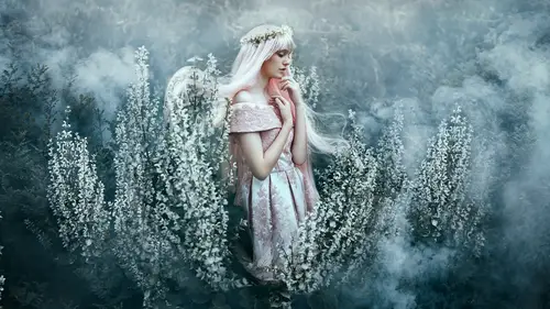
This is where we're going to make our adjustments. Perfect. So now is the fun part. Okay, let's jump into color adjustments. When it comes to color toning, I actually use-- We've already started color toning as you saw. We used Capture One. And that's just to get the image to a foundation that I really like to build up from. So now in Photoshop I'm going to introduce you guys to the color adjustments panel over here. And there are a few tools that I really enjoy using. The first of them-- Oh, yes. That's a good idea. Let's have a group. The first one that I really enjoy using is selective color. And actually, for some reason I work bottom up, instead of top down. (chuckles) So we're gonna go through this in this order. So selective color. Pratik, do you want to explain to us what selective color is? Yeah, absolutely. Selective color, I think, is a really easy to use tool because it allows you to select the color, as you call it, that you want to manipulate. So for instance, if yo...
u want to start with the red channel here. I call them channels. Not necessarily channels, but... The red over here. And add a different color to them, and push and pull them in a specific way. It allows you to do so. How do you usually like using it? Is it very similar where you have an idea in mind what color you want to manipulate, and then go from there? Yes. I like to think of selective color as, I guess a more intricate way of using hue/saturation. Isn't it? It is. They're very similar, but this one has a bit more finesse to it. I do use hue/saturation as well. But when I want to tidy up an image a little bit, or just have a bit more control over a particular color, I'm going to use selective color. I'll show you exactly what that means. For instance, over here we have the reds. If we wanted to move the cyan in and out, you notice that the influence changes. If I move the cyan slider to the right, it's including more cyan to the reds, which effectively is changing the tone of the image, of those reds. This is why setting up that color palette beforehand of what you want to shoot, and which colors you want to involve, really helps you figure out how to manipulate later as well. Now the difference is that over here in the selective color area, we have multiple sliders. We can add or take away magentas, which really make it shine quite a bit. And if we double click the pointer it goes back to-- I'm sorry, the title-- it goes back to zero. I used to go and adjust these sliders and manually try and get it to zero before. So, just a quick tip. That is really annoying. Same thing with yellows. It's really beautiful and really powerful. Yeah. And then if you move them all, like in... So here we go. I'm gonna look at the cyans and the reds. Say for example I want this image to really pop. I will look at the magenta now. And the yellow. Again, you are going by eye. And the blacks, which I love, because that adds a little bit of that pop, doesn't it? And the black slider itself, which is in every other color, is independent from each other because what it does is it adds density to that color. So if I adjust it as you saw when you adjusted that black slider to the right, it added richness to that specific color. And when you take it out, you see the brightness of that color come up, and the saturation go down. So it's a quick way of adding localized contrast, in a way, and brightness, to specific color regions. And I would always turn that little on and off to see what it's doing to the image. Now interestingly enough, do you have a direction which you're going with the color changes you're gonna do? Or is it gonna be based on feeling at the moment? No, I have a direction. But I'm not gonna say it in case I decide to change my mind. Ah, sneaky. Because sometimes things surprise you in Photoshop. So I actually have an idea of how I want this to be edited, and how I want it to look. But I'm not gonna say it just yet. I also like things to surprise me in Photoshop. So that's actually a good point that you raised, because I often speak about letting the image lead you. Especially when you're doing personal work, or I guess any work really. I let the image almost lead me down a path that it wants to go. Sometimes it will go exactly where I want it to go, and sometimes I'll realize, "Oh my god. Yellow looks better here than orange," and then suddenly we're off on a different journey completely. So it just depends. I leave myself open. It really shows, because whenever you play around with these, it sings to you. Because I notice when you stop on one side versus the other, it connects with you. Just like emotion of a model. Color speaks to you the same way. Yes. That's right. What we forgot to do was do a desaturation layer. So I'm actually gonna do that first. Because we are going through color adjustments, but I want to show you very authentically how I do edit. So the first thing I would do prior to jumping into selective color would be to go to my color adjustment panel. Go to black and white. And this is a personal preference, it really is, but what you can also do over here is change the different modes of black and white, essentially. Right. Different filters. The different filters. So there's some really beautiful filters here. And you can change the opacity of that as well, that layer. I, however-- Hang on. I like to stick to default. And I go to my panel over here and go to hue. You or me? Oh, hue. Hue. And I just bring the opacity down to about 20%. 20, 15, 25. It really doesn't matter. All it does is just desaturate that image a little bit further. I actually think 20 is a bit too strong, so I'm gonna turn that into like 10. Yeah. About 10. And again, I'm just turning the layer on and off. Seeing what I like. What's the quickest way to change opacity without actually using the sliders? If you wanted to change opacity of any layer, and you don't want to drag your mouse all the way up to this button over here, you just want to make sure you're selected on... The navigator. The navigator. So it's V on the keyboard. That's right. I always just go V on the keyboard. Make sure I'm on that layer. And then I will just press either three, four, five, any of the numbers above, and it will change that opacity. So three is 30%, four is 40%, five is 50%. And that changes the opacity of that layer. It's good to know, actually, and I'm glad you mentioned it. Because not all of our color adjustments are at 100% opacity. Some of them are at 20, some of them are at 10, some of them are at 25. I really do tweak as I go. So now for the next one. We are gonna go to color balance, because this is another favorite. Essentially if you want to play even more with color, we explore all of these, and see what adjustments work best for you and your workflow and what connect to you more. I'm gonna show you the ones that really connect to me. But yeah, they're all great, aren't they? I know. There are so many beautiful options that you can play with. Do you have any ones that you use more than others? Yes, and those are the ones I'm showing you. So what does color balance do? Is this a quiz? Yeah well, you said you were gonna explain the technicals, so I'm testing you. Okay, here we go. So color balance basically is really interesting, because you can control the regions in which your affect the colors. You have your highlights, your shadows, and your midtones. Now, with color balance, you can select which region you want to influence, and work that way. So it's the opposite. Selective color is very similar in the way that you first select the color that you wanna modify and then you modify that. With this tool, with color balance, you first select the region you want to modify and then adjust the color within the highlights, or shadows, or midtones. So if we started with shadows and we adjust, say, the yellow to blue, we can change the balance. Again, everything has been about balance, and symmetry, and complementary. And accordingly, we can adjust the balance. So if I go towards blue, the shadows get bluer. If I go towards yellow, they get yellow. And similarly they have these sliders here that go for these three regions. And within each region, they have the same sliders. So familiarity is easy, as well as adjustability. Yeah. You explained that beautifully. Thank you so much. Well done. So we're gonna start with midtones, and then we will just see where our eye takes us. I'm gonna go into the cyan a little bit here. I'm gonna move my cursor in the magenta region, magenta and green. I quite like going a bit more richer with the red, so we're gonna stick to that. And then I actually quite like the warmth of the yellow. I really do. So I will turn that off and on. Okay. There is one thing which is really interesting that you reminded me of. By default what happens is if I turn it on and off, you notice that the luminosity also changes. There is a preserve luminosity button. So in case you feel like you like the original luminosity of the image and you just want to affect the color tone, you can keep that checked. But if you like the way that the image shifted with luminosity as well, you can keep it unchecked. So it's personal preference. What's the difference between the color balance that you're doing here than what you did in Capture One? Is this just like redundant? And just changing the feel completely? Or is there something different in the tools? Color balance here really will affect the colors a little bit differently than Capture One because this is a different program as well. It is. And also in Capture One you're using the RAW data. So what happens is you affect it even more naturally through camera RAW-- I'm sorry, through Capture One, because the algorithms are using the RAW information to do that. Over here, you're using a much more compressed version. But the pros is that it's completely adjustable. So as she's building now in multiple layers, and you go back, you can easily decide to, if you want to change the palette as well. Yeah, and also, I'm not going to use color balance once here. I'm going to use it three or four times to build up the colors. So essentially, I literally just play with my favorite tools and I introduce them over and over until I keep tweaking. The tweaks are make are very, like, small, and I build up a color palette. And yeah, I will use them several times. You'll see several layers of color balance, several layers of curves, sometimes, in one image. But that is a very good question. I'm glad you asked it. Why would you use the black and white adjustment layer to desaturate the image, versus the hue/saturation color adjustment? Ah, very well. Personally, that's a personal preference. I'm quite happy with how that black and white layer looks. Again, like I said, you could put a filter on it, and you could do multiple things with it. My go to is just changing it to hue and dropping the saturation to like 20%, 15%. But again, it doesn't matter. It's just personal preference. If you go to hue and drop that, that's fine too. The goal for that layer was to just desaturate the image a little bit. That was its purpose. It just depends on what kind of look you're going for, really. Also, isn't it that when you drop the saturation in hue/saturation, isn't there still a bit of color left in the image? Yeah. It interprets it a little bit differently, as well. But in minute situations, it's not as impactful either. So you can get away with both. Great. Okay, so we're gonna go into our shadows. And here, yes, I'm essentially just looking at the shadows, and at the colors. And again, when I work with colors, I'm looking at the overall image as well as at the same time dissecting the image to see what the colors are doing where, essentially. So I'm like, "Oh, it looks great overall." But I'm also looking at, but what is it doing to the flowers, what is it doing to the dress, what is it doing to the skin. And all of those thoughts are happening simultaneously. It's interesting because I'm having all the thoughts but I'm trying to also say them to you so you're sticking with me in my thought process. It's a good exercise. So here I am literally looking at, as I make these small changes, I'm looking at the colors in the flowers, I'm looking at the colors in the shadows, I'm looking at what's happening on her face. And we're gonna go back and forth again. And essentially the image has retained a sense of contrast and warmth. I've introduced more warmth into it. I'm gonna go to highlights. Something else as well that must be said. You don't have to work in all three when you're working color balance. You really don't. If you're quite happy with how that looks now, you can move on to another color adjustment. These are just tools that you can manipulate at your whim. I'm going through them because, well, I want to show you what each individual one does. But sometimes I'll just work on the midtones and then I'll just open up another color adjustment, and tweak that, and so on. I just work until I'm very happy with what I'm looking at. And when it comes to building up a color palette, I'm looking at making each layer a little bit more in-depth and livelier than the last. I'm dropping the highlights here towards the cyan. Here we see some more greens and more reds. As you can see, the change is like minute. Minus one. And bringing that down a little as well. I'll be honest, I think I think of this as fairly easy. But it's not, because what happens is as you do this, you will be training your eye to notice those tiny little shifts in color. And actually, it's a really great way to train your eye. So what is the difference between minus one towards magenta and plus one towards a green. And you'll be moving that back and forth until your eye slowly sees that shift in tone. And you really do start training your eye. I remember at first, as you saw in my earlier work, the colors were very all over the shop and quite muddy. I was very experimental, but that's me still learning. My eye is still getting trained. And like with everything, with practice your eye will become sharper. And I suppose when it comes to color toning, that is your greatest asset. The sharper you can make your eye in terms of differentiating between colors, you'll notice an increase in your color toning capability. But yeah, this is a very good exercise for it. The next adjustment we're gonna look at is curves because, well, they're always fun to play with. I would say it's a staple, isn't it? Because curves can do so many things, from light adjustments, to even color adjustments. That's right. I've used some of your actions before, and I noticed some of them said about masking skin. And I was wondering about if you're thinking about that during this process, or that's just something you just worry about at the end in which one's you're gonna adjust. Yeah. Very good question, Jessica. Yeah. As I said, when I'm color toning, I'm always looking at different parts of the image as well as overall image. So for example if I loved how the color was looking in the flowers and the dress, but it was looking really weird on the skin, that's when I would mask that, the skin, on that layer. Yeah, and then I would just move on. So I'm tweaking as I go. Yeah. I wouldn't truly ever leave it to the end because by that point, sometimes she might end up looking blue. And then how do you save the skin? It's like, "Oh dear." So now I tweak it as I go. So right now I'm quite happy with her skin tone. But maybe this adjustment that we do here might work on the overall image. Let's try that. Let's try that and we can see exactly how we go from there. When you're working with curves... Do you want to explain anything about curves? Is there anything in particular you want to say? Yeah. Actually, curves is very similar to color balance in the sense that you can adjust colors based on regions. And I'll show you what I mean. Now that we have our curves setup here, we are gonna go down to our channels, which is red, green, and blue. Again, very similar to what you've seen before, except now you're not adjusting-- You're not starting with the regions of shadows, highlights, and midtones. You're starting with different channels in the image. So for instance, let's say we start with the red channel. And you're gonna understand visually what happens. This curve here represents the range of information we have. You can see the histogram in the background. We have the data here, show you that a lot of the reds start a little bit closer, not in the brightest areas, but coming closer to the midtones, going all the way to the shadows. So accordingly if I brought my curve down and I pulled the reds out of the image, you start extracting the reds away which leaves you with the opposite of green. Or I should say cyan. Opposite of red. Yeah. Same thing with green. If I go up with green, I add more, effectively, or add more green to the green channel. And if I go down, you get more magentas. So either way. Also, next is going to be the blue channel. I go down, and I go up. They have the inverse relation. Even cooler is the fact that you can add multiple points. So if I drag that point off of the curve, it goes away. I can also click on the curve and add multiple points. So one here, one in the midtones, and one in the shadows. So if I go up here, you can see I start influencing and adding more blues in the highlights, but it's a natural progression. Because the gap in between the area that we started with and the amount that we've increased has a gradual transition into the midtones. And similarly, if I go into the midtones and bring it a bit lower, I can add more yellows into the midtones. And then also bring back more blues into the shadows. And you get this beautiful cross process type look really gradually. And so that's how that differs between those three. So I'm gonna click on those points, hit delete, and let you take it from there. Great. I think you did it. Was I done? Oh great. You should have left it. It was looking fantastic. Great. And RGB? And RGB is effectively luminosity. So any time we want to change the "exposure" of the image and manipulate that, we can do that. Yes. Something I like to do is drag a corner from the top, corner from the bottom. Bring that up a little bit as well. I'm bringing back the highlights, bringing back the shadows just a tiny bit. And then I'll do a little gentle S in the middle. So taking a point and dragging it up a little, and bringing up a point over here and dragging it down a little as well. You can also use the arrow keys in case you want to fine tune something. Because sometimes that little dot is so precise and really hard to adjust. The arrow keys can really fine tune if necessary. That's right. And then I hit my eye tool to see what changes have been made. So I quite like how that looks. I'm gonna open up another curves adjustment. There we go. And now I'm gonna work on the red, green, and blue. Okay. I'm gonna do a couple of S curves, because that's something that I quite like to do. And as you can see-- It's quite important actually, isn't it, when you look at the histogram. I'm actually going by eye, but the histogram back there is really useful. So I'm gonna drag that point up, drag this point down. Oh, I love that contrast. Okay. Her face is looking a little bit too red for me. I'm gonna get into my green. That's not so much of a big shift. I'll drag this down a bit more. And I am gonna make these flowers intense. So it looks like you're gravitating towards the palette of the flowers and enriching them from this process. Yeah. I knew that I was gonna have richer flowers. It just wasn't-- I was just working my way towards them. There we go. So keeping an eye on the flowers as this point. There we go. I think that's beautiful. Now I'm looking at the face, what's happening with the face. And the colors on her hand. I'm gonna zoom in here. And I'm gonna turn this off and on. Okay. Now, if I don't like what I'm seeing-- And I don't mind it-- but if I don't like what I'm seeing then I will make sure that my layer mask is selected. Go to my brush tool. And just, depending on how I want it to be-- I might drop that opacity actually to about 54%, it doesn't matter. And lightly brush. So what this is doing is just bringing back some of the skin color from the layers below it, but still retaining some of the tones from this curves adjustment. There we go. And we're just gonna-- Oh. Turn that off and on. So you get a mix of both, and that way you're not stuck to either/or. You can do a little bit of each. Yes. So I'm keeping an eye. I think her skin went a bit too pink. I quite like the pink, but I don't want all of it to be pink. So I'm just gonna keep my opacity maybe like 50%, my flow is low, and I'm just gonna brush gently to see how I feel. Again, if I wanted to bring that back, I would just turn that into a white brush and bring it all back. Okay. Great. We're gonna see how this affects the flowers. It's all looking good I think. Fantastic. Okay. Turn the color folder on and off and let's see what we've done so far. That's a good idea. There we go. So that's the before. That's the after. Wow. Yeah. Before, and after. So we've gone quite intense with the red, haven't we? Before, and after. So the next adjustment that I want to make, I really want it to affect this green. Because this green to me is far too distracting. I'm just gonna bring that down a bit so I can see. And actually it might be a good time to use hue/saturation. Yes. Yes. Hue/saturation. Right, and we are gonna go to our greens. Actually, there's a bit of yellow in there. If you're not sure, you can also use the color picker here and then just sample the color. You have to unselect the mask. Oh yes. Of course. I guess not. Let's see here. So you have your greens. Color picker, and then select the area. So what happens is it automatically defines, over here on the hue/saturation, what range it's in. If you want to increase that range to be more encompassing you just increase that over here. And we get all the green shades and yellow shadows. See, I knew it was in the yellows. Yes. Ah, see? This is much better. What does that hue slider do to the image? Essentially, right now I'm just looking at the area that I want to target. So I'm looking here at the top corner. And I do not like-- This is beautiful. (Pratik laughs) Oh dear. So I'm just seeing what's happening. We can go pink with it. But we don't really want to do that. I quite like making it a bit warmer. I'm going to-- What are we gonna do here? So if it's going too much on the rest of the image, we can bring it down so it starts getting more precise range, in case it's affecting too much of the flowers. So if we bring that in over here, and on the reds. See, it went and affected the reds. We don't want that. We'll bring it in, and then fine tune that. Brilliant. All right. So I'm quite happy with that there. I'm going to bring the saturation of that actually a little bit this way, because I quite like how that looks. And then I'm gonna play with the lightness and darkness a little bit. Again, just going by how I feel. And we're gonna go before and after. Wow. And that's the difference. Now I'm gonna go into my layer mask. And I'm just gonna make sure that I bring back the yellow in the flowers because I quite like that yellow. So with brush opacity 100%. And I'm just gonna lightly brush across her. Again, because I did not want these color changes to happen on her. I quite like the greens in her dress, so we're gonna bring those back as well. I don't mind that, actually. Okay. I'm gonna zoom in on her face. Brilliant. And here we go. I'm gonna bring this back just a little bit. And helping the flow at 9% means that the graduation of color coming through the brush is nice and steady. And so it feels very seamless. And there you go. Because even if you're-- you know, you make mistakes, it's a bit forgiving, I find. There you go. Okay. Great. You can see that yellow now, can't you? Yeah. Great. Fantastic. Because I want her to pop. I want the red in her to pop, and I want the yellow in her to pop. Okay. Actually, this might be a good place to show you another adjustment that I really like. Okay. I think I'm happy with that. Let's turn that on and off and see. Okay. Beautiful. So essentially, what I was thinking here was that the green was too distracting. I felt that whenever I looked at the photo, my eye kept going to it. And that's not where I want my eye to go. Also I thought that in terms of color toning it was a little bit too jarring in the photograph. It was beautiful on location, of course, but right now I have complete control of the mood that I want this image to portray. And I know that I want to play within the palette of red, and yellows, and bring some gold in there. Just highlight those warm tones. Just make the image a bit fiery. So I used the hue/saturation tool to reduce the green. I do have several questions coming in. I'm trying to kind of adjust to when you're talking about some of these subjects. Photo maker had asked a question about that it was interesting that the hue/saturation slider adjustments aren't affecting the green print on the model's dress. Can you explain that again, sort of how that might have worked? Absolutely. Basically, in the hue/saturation adjustment layer itself, the reason why we didn't actually impact the dress, is even if we temporarily turn this mask off by hitting shift and clicking on the mask, you can see it didn't really affect the dress. And the reason, very simply, is because when we use this color picker here and we selected just those leaves. You'll notice that what it does for us is it creates this range over here at the bottom. And this range is really helpful because if I increased it up, and increased the whole image, or the whole range of yellows and greens, it would start fluctuating more of the greens in the dress. So we were able to easily isolate those neighboring colors using this range over here. So you can see exactly what area we're gonna affect. And so even without masking, it's like an auto mask. Yeah, because I think the green on the dress had a bit more blue in it. Ah, yes. Whereas the greens that we manipulated were more on the warmer side of green where it had a bit more yellows and light greens. So let's see, for example if we bring this up all the way, bring that over here, and then we turn off our mask. And do that. So we definitely like the fact that it, like you said, stuck to what we were doing. Undo that really quick. Okay. Somewhat related, the question is, is there any way in Photoshop to turn on a visual guide that shows which elements of the image will be affected when you're working in the different channels? Or is it strictly just dragging the slider back and forth to see? Or the on/off. Unfortunately there isn't. There isn't a way to see what's gonna be affected before it does it. But that's also a double duty of these sliders. Because with the sliders, it will show you right away what's being affected, because you can see the changes coming in. And so that's the reason why we also look like we're uncertain, because we're moving around to see the area that it's affecting first, and then changing it and fine tuning it. Yeah. Yeah. I don't mind it, personally, because I feel like it gives me a bit more freedom. Having too many guidelines I feel like might suppress... But then if you are working in a situation where you have particular color tones, I can understand why you'd ask that question. However in Capture One, there is a way to do that as well. One of the advanced features in Capture One is that they have this color editor. And again, as I mentioned, we're not gonna go through extensively. And you can check out my full course if you want to learn more about the program. But over here it allows you to go to advanced. And you can click on the color picker. And over here you select view selected color range. And you simply select the area that you're gonna modify. And automatically, the parts that are saturated are the ones that will be manipulated. And then you can tweak the color of those specific flowers in the way that you like. You can also then adjust the selected layer as well, or create a masked layer from selection. So it makes a mask by itself. And it creates a mask. And then you have a layer here that you can easily modify if necessary. Any ways that you want. With curves, et cetera. It's very powerful. But in Photoshop there isn't a way. But that's not a bad thing, because like you said, you like the ability to see what's gonna happen as well with the sliders. That's right.
Class Materials
Bonus Materials with Purchase
Ratings and Reviews
Kathleen
Great class and great instructors. Genuine and informative. Practical tips to create stunning images. Seeing them work through the process from shoot to finished image was great and I loved that they shared the thought processes behind the creative decisions. Definitely recommended!
RoxSpiegel
Truly a remarkable duo. Bella is so down-to-earth and humble for a photographer with such a strong beautiful and ethereal voice. Her explanations of her process really inspired me--I was sketching concepts throughout the class. Pratik's process really opened my eyes to "smart" retouching--understanding what can be done in fewer brush strokes and slimmer PS files. All in all a really unique and inspiring class that makes me excited to realize my next conceptual shoot. They're also adorable together!
Mai Her
I've gained sooooo much from this I can't even contain my appreciation and excitement! So much inspiration and so much generous advice and tips to help me! Thank you so much Bella and Pratik and Creative Live!