Color Toning with Controlled Light
Lesson 41 from: Fine Art Conceptual Photography from Shoot through Post-ProcessingBella Kotak, Pratik Naik
Color Toning with Controlled Light
Lesson 41 from: Fine Art Conceptual Photography from Shoot through Post-ProcessingBella Kotak, Pratik Naik
Lessons
Class Introduction
04:47 2Artistic Vision and Inspiration
17:06 3Personal Projects
18:59 4Creative Motivation and Defining Your Story
15:15 5Organizing Your Inspiration
16:26 6Building A Character
03:19 7Creating Wardrobe and Props
33:59 8Location Scouting
12:55Resourcing a Team
17:52 10Working with Talent
06:39 11Building Community
05:06 12Scouting Location Pros and Cons
11:29 13Camera Gear and Modifiers
10:03 14Shoot Set Up and Styling
11:34 15Test Shots With Model
06:04 16Location Shoot: Model in Red Azaleas
26:04 17Location Shoot: Composite Pieces
16:35 18Plates Extending the Scene
07:11 19Set Concept and Design Overview
08:31 20Demo: Equipment Overview
04:39 21Shoot Set Up
08:12 22Shoot: Test Shots
15:08 23Shoot: Standing Against Flower Wall
06:47 24Composite Pieces: Hair
05:31 25Shoot: Overhead on Flower Wall
22:22 26Adjusting Images With Composite Shots
07:25 27Color Theory
11:40 28Capture One: Image Selection and Color Toning
19:42 29Moving from Capture One to Photoshop
17:01 30Compositing Hair
15:52 31Healing Brush Tool
06:42 32Dodge and Burn Tool
08:14 33Liquify Tool
12:01 34Adjustment Layers of Color Toning
35:05 35Blending Modes
10:44 36Channels and Channel Mixer
05:16 37Selects for In Studio Image
08:57 38Compositing Background
13:58 39Compositing Additional Elements
09:49 40Gradient Maps
15:51 41Color Toning with Controlled Light
21:32 42Adjust Skin Tones
17:27 43Retouching Skin
17:12 44Spot Healing Brush
06:11 45Clone Brush
03:47 46Dodge and Burn
18:49 47Sharpening
10:42 48Critique
15:40Lesson Info
Color Toning with Controlled Light
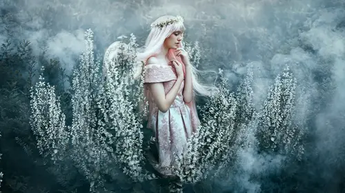
We're going to talk about color toning in a studio as opposed to color toning on location, very quickly. What would you say are the pros and cons of color toning in a studio 'cause you've actually worked with many studio images, whereas I work with a lot of location images. It's true. The biggest thing, for me, is the lighting condition. Here we have a lighting condition that has a lot more gradations from shadows to highlights and what that does is there's a more interesting way of seeing the colors because here we have sharper highlights, we have darker shadows, and it adds to the intensity of how colors play. Like I mentioned earlier, if there's a different balance of shadows to highlights, you end up shifting colors differently based on where your focus is gonna be. Also, when you have harder lighting, you get a lot more detail and contrast. So, the same thing happens with elements like this dress. If this dress was shot outside, it wouldn't have the same specularity and therefor...
e you won't have the same color spectrum in the garments you're shooting so the colors are then interpreted differently. So your lighting and internal conditions change it quite a bit. And then also, you have different things like we're not shooting at 2.8, we're shooting at f/ so things are sharper, colors are more radiant, you get a lot more range as well. So those are primarily the differences and how these same tools, when applied to both indoors and outdoors, have drastically different effects. Yeah. Well said. Oh, thank you. Yeah. Okay, so. Okay. What did you wanna do with the color lookup? Yes, we're gonna have a quick look at an adjustment or two. Kay. Let's see. Quite liked the moonlight one, actually, I remember. And that's because it adds a subdued tone to the skin again. I know, I keep brightening and subduing and this is why I struggle sometimes when I'm shooting with a DSLR and I can only do this with a medium for my camera. Okay. So I'm gonna change the capacity of that to about 15. Yep. I'm happy with that. And now I'm going to go to selective color and we're gonna grab some of this green and change the color of that. Okay. There's actually a bit of cyan in there, more than green, if anything. I think it's in the yellows. It's in the yellows? I think so. Let's try. I think it's in cyan's. Who's going to be right? Oh, I'm scared. Aw, it is in the cyan's. And I'm gonna make it really, like, really lush, almost. 'Cause I quite like that. Let's have a look at yellows. You might be right as well. Nope. Nope. Aw man, I was wrong. And you can also duplicate the adjustment layer in case you wanna double up the effect. Oh, whoops. Oh. Command-Z. Oh. Did I do that? Oh no I got, yeah, I got rid of it. Let's do that again. Okay. So I'm just looking at the background again at this point. And you are doing what? Try and darken it? No, I'm just trying to bring out the greens more than anything else. Okay. I'm gonna turn that off and on. Oh, I see. See? There's a slight... The green's a little bit more vibrant now. And the funny thing was the colors weren't actually in the greens, they were in the cyan. It's an interesting interpretation. Yeah. So we're gonna go to hue saturation. I'm gonna do what you did earlier. Oh, let's see. Actually, I just wanna... Ooh. Ooh, what is happening? So here we go. Earlier, when we were playing in hue saturation, we stuck to, like, one color, didn't we, and then we moved on. You can actually play and you can stick around and just see what's happening. So the cyan's, I've noticed... that looks cool but this might look quite nice as well. In the blues and just looking at - Do you care about the dress or just the background? I'm looking at all of it, actually. So the blues in the dress seem a bit too strong so what I might do is drop the saturation down just a little bit. Make it more pink 'cause I think that looks really pretty. And then let's have a look at what happens to the magenta now and drop the saturation down as well, just a tiny bit. I'm looking at the dress. I'm looking at the dress. Okay. Okay. Okay. Alright. And we might actually subdue this down a bit as well. This purple. So we'll go for another hue saturation and subdue that. Kay. And that's in the blues. Oh, gosh. Wow, okay, so you can also play and see what happens. I thought the colors were a bit too distracting so I think that's what I've naturally decided to do which is subdue them just a little bit. Okay. I'm quite liking how that looks as well. Okay. So now I'm gonna go into my layer mask and make sure that the color adjustment that I made isn't on the face. Okay. 100, 100. Hmm? Yeah. Turn that down just a little bit. There you go. On the skin, anyway. Next one, too. Pardon? Do it on this one as well? Yeah, yeah, I will. Yeah, I'm gonna do it on both the ones that I did. There we go. Clicking on that. I'm gonna turn that off and on just to double check. Actually, that's not too bad. 'Cause that actually unifies it quite nicely. Okay. Erase that on the neck so it's not de-saturated right here. Yes, you're right. Good call. That's why I have to double check, just in case there are some areas that... There we go. Okay, I think I'm... There we go, there we go. Kay. And the way to, basically, know if you've done it is just click on the mask itself. Okay. Like that? Yeah? Yep. Okay. Where is that hiding? Oh, I think it might be the smoke as well. What are you looking for? Hang on, I'm just having a look. No, we've got it. We've got it. Perfect. Alright. So, something I'm gonna show you is a little flare. Yeah. Okay. So, I'm gonna show you something that I like to do now and then which is just adding a little flair. You can actually download flair textures from online. Like, there's other stock websites and you can just download, if they're a texture from there or many, many flair textures. We're gonna create them. I'm just gonna create one. By opening up a new layer. I'm gonna title that "flair". And I'm gonna go to white. Grab my brush. Make it nice and fluffy. Fluffy. Fluffy. Making sure my flow is low I'm just gonna paint very casually here. There we go. There we go. Alright. Alright, alright. And we're done. Okay. Now I'm gonna make my brush a bit smaller. I think the computer's thinking a little bit. Yeah, it says - It says thinking. Oh, whoops. Give it a second. It's okay. Don't worry. Too rich flair. Okay, there you go. Yeah, 'cause it's such a - it's 3,000 pixel brush so it takes some time. Let's just go back a couple of steps. Brilliant. Okay, so we're gonna go to screen. Oh, nope, not color dodge. Screen. Doesn't really do much, it doesn't matter. 'Cause it's white. It's 'cause it's white. And we're just gonna drop the opacity of that to... How 'bout overlay. Yeah. I was gonna try that next. Again, you just want to test it. I'm gonna stick to screen for now, I think. I'm just gonna drop the opacity of that to about... 30? 30, yep, 30%. I'm gonna turn it off and on and then open up a layer mask, and using my brush tool, lightly brushing. It'll brush some of that away. So with a black brush? With a black brush. And just keeping the flow and opacity low. I'm just gonna craft that lower light hitting her just a little bit more. So, essentially, it is a bit like painting. You paint and then you just control where you're brush is going a little bit. Let's see. Brilliant. Okay. There we go. I'm quite happy with that. Alright. So something I also like to do is to darken the image just a little bit and I would use the curves tool to do that. So I'm gonna go to the curves adjustment. There we go. Drag this down and then use a lasso tool and just lasso around her. You can also use a marquee tool, the elliptical marquee tool, and do that as well, and that works too. It's the same principle, but I'm gonna use the lasso tool. The lasso. Okay. There you go. Hashtag lasso. Oh god. Okay. I'm just gonna do it very casually around her. And, making sure my black is at the bottom, press delete and that just deletes everything that's within the marquee tool. Marquee. Alright. Gonna go to filter, blur, gaussian blur. And that's just going to soften up the edges. There we go. Okay, let's press on and off. Alright. I think that could be a bit more blurry. I forgot how big this file is. There you go. Maybe 800. Okay. Brilliant. And something else I'm going to do as well, very quickly, is go to my levels and what I'm doing in the levels here, so, notice that this picture is looking a little bit flat? I like the colors but it's looking flat. So that's why I'm just gonna check out what I can do in levels to bring some of that contrast back. I'm just gonna drag in these sliders and just see what I can do over here. So this slider brings in your, like, blacks, I assume and this one brings in your whites. It compresses all your shadow and highlights so it matches where you're input and output levels are so you don't have any gaps in the image or the shadows aren't too flat. Yeah. And what does this one do? It brightens up, basically, where you're bringing your end points as well. Okay. Simply put. Great. See, I just go by how I think it looks and whether I like it or not. And this is why we get along. Yeah. We're both, uh - Yeah, you know the technicalities behind it. Okay. I think that's a bit too bright there, on her own, so I'm just gonna bring some of that back by brushing away there. Right? Mm-hm. Great. Also, before we go on any further, as well, can we see a before and after so we can see your progress? Let's go and put these all together. So, we haven't actually liquified yet, we haven't dodged and burned this image, we just jumped straight into color toning. Right, because we've already done a lot of that stuff before, but the color toning bit is the most interesting aspect and how you transform these images. Even having a 100% view is really interesting to see the detail and differences in color. So where are we at this moment in terms of where we've come from and where we are at this moment? So I think we've still got a way to go. Mm-hm. I would still tweak this image a lot more and I would be using all the color adjustments that I showed with you earlier as well. So I'd be going into my color balance, we'll have a look at them. Okay. So, I would be going into my curves a bit more, into the red, green, and blue channels. I'd be going into my color balance, and I'd just be going back and forth, adding and tweaking it. Just trying to pull the image towards the direction that I want it to go. So, I like the muted tones and sometimes, you know, sometimes you can get to a place where you're very happy and sometimes you can get to a place where you're feeling a bit lost and that's where having an action set comes in handy. So, for example. If I was completely confused and I didn't know which color direction to take this picture into, I'd probably run one of my action sets and the reason for that is my color toning is very consistent in terms of, like, you know, when you're looking at my portfolio there's a consistency in there, so what I would do is just grab one of the colors that I've already used in one picture and bring them into another, just to see how they look. At least, that way, I know that I'm within the same palette of colors that would sit very nicely alongside another photo. So. Before we go on any further, do you have a general direction into which colors you're gonna change or where you're gonna end up with at the moment, or do you not know? Yeah. No, we an go further. Happily. Okay. So, let us go into color balance because we haven't actually done that just yet, have we, in this picture. So we're gonna go into color balance and we're gonna go into our midtones and we're just going to have a look. This time, I'm going to be focusing more on the background. Okay. I've got pink in the foregrounds. I quite like the idea of a muted, of a deeper, either green or blue background so I'm just gonna focus on that now. And I'm using the color balance adjustment to figure it out. One moment, I'm gonna - I'm actually getting to a place where I'm actually feeling a bit happy about this. I love the greens there. That looks really, really pretty. That made a big difference. It did, didn't it? It felt like the greens have started tying more without being too magenta. That's right. Okay and what I'm going to do is grab - and, this is basically how I think. I'm constantly just looking at how I feel about the skin and how I feel about the background and how I feel about the dress and just to see whether all of this is working harmoniously and if it isn't, I tweak and tweak and tweak until I feel like we're getting to a place where it is. I thought this was going to be a really blue picture. Didn't turn out that way and that's okay, 'cause sometimes that happens as well. There's so much mystery to it when you deepen these colors like that. Yeah. I like that a lot. I'm just gonna bring the curves down a little bit more. Like that. And then I just gonna bring the highlights, the shadows, and do a really gentle s-curve and just see what's happening. No. And that's okay as well, we can delete that. Okay. We can just duplicate that in case the edges are losing their focus a bit, there we go. So I've darkened the edge just a little bit, I'll bring that up here. Again, I just grabbed, I touched that layer, Command J to duplicate it, brought it to the top, and now I'm just looking at the shadows. I'm loosing some shadows here, loosing some detail in the shadows here, so I'm just gonna make sure my layer mask is selected and, with a white brush, lightly bring some of that information back. Oh, hang on. There we go. Was that right? Yeah. Yeah, that's right. There we go. Okay. This will make it a bit more balanced. Okay. And actually I'm gonna say something as well, which is now and then what I will do is, you know how you can dodge and burn on just the skin? You can also dodge and burn on the whole picture. It's the same premise, you're just balancing out the light and shadow in the whole photo. Right. So what I'm gonna do is run projects action. Just the dodge. No, dodge and burn. Okay. Okay. And in the dodge, I'm just gonna look at what areas of the picture's light and work out my transitions that way. So I know some of this is smoke, but I just wanna see if I can - Oh, hang on, that's definitely not supposed to go there. Command Z. There we go. Burn that just a little bit. Want some opacity? Okay. So you're just burning down the bright smoke? Just a little bit, just so that it looks a bit more... What do you call it? Balanced. Balanced, that's right. 'Cause it felt a little bit too, um. It wasn't soft. Mm-hm. Yeah. The transition between light and shadow wasn't soft. And, oh, hang on. That did nothing 'cause I wasn't brushing with white. There we go. Perfect. Great. Okay. And I'm gonna dodge some of this back. Actually. Yeah? Instead of dodging that back, let's go to the... The one where you darkened the edges and we'll undo that. Yes. Right. That's a good idea. 'Cause otherwise we'll lose all that data. Okay. Alright. And I'm gonna burn some of this, just a little bit. Okay. Alright. Turn that off. Do you see the difference? It's very small. Do it slowly. So this was the after in terms of the smoke balancing. That's right. Right? Yeah. Just to make it a bit soft. And then we can also use this layer as well to bring back the edges if necessary and this one as well. Yes. Yeah. Okay, so let's do that. Go here. It'll bring back the edges. Higher flow. There you go. Kay. Put some detail back. Oh, much better. Beautiful. Yeah? You happy? Brilliant. Perfect. Kay. So let's take a look at what we've done so far here with the colors. So this is our before. What a massive transformation, actually. And this is our after.
Class Materials
Bonus Materials with Purchase
Ratings and Reviews
Kathleen
Great class and great instructors. Genuine and informative. Practical tips to create stunning images. Seeing them work through the process from shoot to finished image was great and I loved that they shared the thought processes behind the creative decisions. Definitely recommended!
RoxSpiegel
Truly a remarkable duo. Bella is so down-to-earth and humble for a photographer with such a strong beautiful and ethereal voice. Her explanations of her process really inspired me--I was sketching concepts throughout the class. Pratik's process really opened my eyes to "smart" retouching--understanding what can be done in fewer brush strokes and slimmer PS files. All in all a really unique and inspiring class that makes me excited to realize my next conceptual shoot. They're also adorable together!
Mai Her
I've gained sooooo much from this I can't even contain my appreciation and excitement! So much inspiration and so much generous advice and tips to help me! Thank you so much Bella and Pratik and Creative Live!