Lesson Info
4. Composition and Color
Lessons
Day 1
1Introduction
16:55 2Psychology of Parenthood
20:59 3The Power of a Story
14:45 4Composition and Color
27:50 5Psychology of New Parent and Connecting
28:26 6Pre-Session Questionnaire
33:31 7Posing Basics for Connection
20:40Shoot: Parent Pose with Newborn Part 1
41:02 9Shoot: Parent Pose with Newborn Part 2
32:06 10Shoot: Toddler and Newborn
12:17 11Shoot: Parents with Toddler and Newborn
22:27 12Shoot: Parents with Four-Week Old
31:15Day 2
13Connection with Yourself and Creativity
19:20 14Your Inner Critic
11:02 15The Five P's of Creativity and How to Steal
33:11 16Parenting Themes
15:00 17Prepping for Concept Shoot
12:13 18Frozen Themed Shoot: Mother and Newborn
27:17 19Frozen Themed Shoot: Mother and Daughter
16:01 20Concept Shoot: On the Ground with Newborn
28:36 21Concept Shoot: Mother in Water
15:46 22Shoot: Dad and Newborn
31:31 23Book Concept Shoot: Dad with Daughter Part 1
21:20 24Book Concept Shoot: Dad with Daughter Part 2
19:18 25Closing Thoughts with Q&A
13:10Day 3
26Post Production: Skintones
25:57 27Post Production: Liquify and Selective Color Part 1
27:18 28Post Production: Liquify and Selective Color Part 2
33:48 29Post Production: Concept Shoots - Winter Theme
14:28 30Post Production: Book Concept Shoot Part 1
26:30 31Post Production: Book Concept Shoot Part 2
27:03 32Printing and Self Mounting Fine Art Piece
29:20 33Photo Mounting Demo Part 1
14:59 34Photo Mounting Demo Part 2
38:56 35The Buying Mindset
25:39 36Marketing Fine Art and Hospital Contracts
21:05 37Pricing Fine Art
16:08 38Wrap Up and Review
17:36Lesson Info
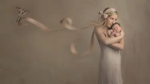
Composition and Color
How can composition be symbolic it's very powerful stuff and I am just going to talk about one simple composition tool the rule of thirds okay is this powerful stuff? The power points have meaning the tick tack toe box one, two, three four this is some people will agree with me some won't this is one of those things where it's all in the eye of the beholder and so people can look at me and go oh that's hogwash ok sure it's totally fine this is how I see them and how I use them for my own work okay and one of the major reasons these hold true so for those of you who are in eastern countries who read from right to left this may not hold true for you but in western civilization we read from left to right so that's why many of these resonate okay, so first the lower right power point it's the place of finnish it's the place of rest okay, peaceful completion grounded it's calming it's the end of the page. Okay, it's very supportive I will often put pensive characters. There are people who a...
re in very much harmony. You saw the little girl with the baby in her lap there in the lower right corner very peaceful, very soft, very pleasant okay the upper right power point it's still a finished position but it's more exalted if you actually look at a lot of religious artwork during certain periods of our history jesus is in the upper right power point okay it's this glory position it's where you kind of it's complete its heavenly it's very innocent so if you know that posed everybody likes to do with dad's hands like this and the baby in the hands and you can't see the dad it's just the arms with the hands you know they put the black sheet over boy what a great spot for the baby in that upper right power point exalted heavenly innocent pure but in a place of rest in a place of finisher completion can you see where I'm going? Okay now let's talk about the other side and this is not always the case I mean I'm sure you'll see plenty my images where I go put on the lower left power point today I mean you know it's it's one of those things rules of entry broken you're not rules there symbols okay, you can choose to interpret them how you like uncertain incomplete okay, very uncomfortable. The future is over there and it's a little bleak we don't know what's happening it's very empty there's a lot of negative space over here and like whoa it's gonna go on okay? It can be conflicted abnormal odd it feels kind of it just has this feeling of discomfort over there it could be very awkward somebody who's sad can be put in that lower left power point it's just a place of discomfort but it's still grounded. Okay, now let's, look at the upper left power point wu this one is the precipitous one if I was like, trying to see see a bride committing suicide on the cliff this is where I would put her okay, way up in that upper left point on gran and like I said, there will be times when I look at a family image of a mom and I have her on the right I don't know I feel like putting our left today I don't mean that she's going to kill herself for b thing but I just you know, sometimes it's for change up but it really has to do with how you interpret symbols. Okay it's kind of hang in the balance for boating unknown it's very suspenseful place can you feel it? Can you feel why that could be an interesting spot compositionally to tell a story or or place symbols especially if all the other symbols within your story highlight that feeling like, for example it's if I can think of it I mean the bride about to jump off the cliff hello that's pretty like precipitous hanging in the balance suspenseful scary what the heck's going to happen I don't know feeling whole subject matter the colors what if you use what if you supported that scene with color tone subject symbols weather everything then you'd be like oh that's really powerful if you put her over here it might just be a beautiful image but the minute you flip it you'll go oh that's better okay so don't be afraid to flip your images and go which one feels better for the subject in the message I'm tryingto send okay so idea to placement let's talk about a few ideas where we're gonna put up based on this you know loose theory of symbolism and composition let's talk about adoption give me a story about adoption girls you could do it was microphone I believe that nicole has it there's too awesome give me a story about adoption let's brainstorm a little bit and think about a theme and where we're going to take it emily ah young woman young woman looking all over the world for a child international adoption um different race um search yes so perhaps great there's a ton of different themes right there so let's latch on tio ah girl looking for her birth parents okay that's a pretty interesting story is we're gonna take it in a negative direction we're gonna take in a positive direction is she looking and she can't find them or is she has she found them those are two different places on the composition is it if she couldn't find them you probably want to put her on the left where it's like whoa the future's uncertain we don't know what's gonna happen to her is she get it there's that conflict we don't ask the story it's a convent we don't know what's gonna happen to her we're creating that conflict by simply placing her in a different part of the composition what if she had found her parents and it was a happy ending we'd probably want to put her on the right more towards the lower right power point which is that feeling of grounded and calm and peace right so let's talk about a widow same concept give me a story about a widow you got the mike girl think about teo how about somebody who has lost their significant other and still has a lot of life their young yes that's a very interesting I want to do because you could take it positive or you could take it negative yeah so maybe perhaps put her in the upper right power point where it's that feeling of being uplifted and like it's everything's going to be okay like hope do you know I'm saying and that's I think why jesus was put in the up because he was such a symbol of hope but that's a great idea okay, what about the concept of nurturing if we think about and the positive spin it would be something we would put mohr in the lower right correct but isn't this getting you thinking about okay I can be more purposeful on how I create my images and tell a story with just small things I mean here I am you know I'm doing all this major composite work and stuff that I've got no education that guarded over the years and you never do that that's okay you can start small start by simply the next time you photograph a baby where you going to put him in the door in frame I mean that's a simple is that oh, I think I'll put in the lower right because it's very peaceful right now oh mommy's holding baby right here it's it's so glorious I'm gonna put her in the upper right okay, that makes sense following along okay let's look at color what does color symbolize? Some of you have seen this exercise before okay on the next page I want you to stare at the red triangle for twenty seconds straight do not stop staring at the red triangle is my fact look at the black dot inside the red triangle just stare at it sarah sarah sarah almost done another ten, fifteen seconds yeah, keep staring, keep staring and so it was morning teach photography says wow placement is something I have never thought of really really useful awesome I'm so glad thanks for the feedback that's awesome thank you okay now look at the white the dot on the other side where the white is whoa yeah breeze like holy cannoli what do you see there there's a trying what color is it it's like green blue isn't it okay we're doing this digitally it's a little different in doing a piece of paper what is green to red it's complimentary color our brains want harmonious color whoa I like holy kenobi that was a little bit of a trip no, I swear I'm not on drugs that's a little weird isn't it like you stare but it's true your brain will competent and go opposite fill it isn't that strange the human mind is so complex and we know so little about it but I hope this imparts to the importance of color even though we haven't really talked about it yet okay color is so powerful its ability to influence the mind okay so colors themselves have general meetings like you confined this all over the internet just put color meaning and you'll see and I just kind of took a few that are pretty popular so the primaries red, yellow and blue red is signify symbolizes war, danger, strength, power determination as well as passion, desire and love I kind of make red come down to passion because passion could be either positive or negative connotation correct you'll excuse me yellow could mean joy happiness, intellect energy can also mean jealousy too much yellow is very disturbing they've actually done studies that if you put a baby in a room that's too yellow they will cry more than if they're in a different colored room is that freaky? Yeah color has enormous psychological impact on us so blue is trust loyalty, wisdom, confidence, intelligence, faith, truth and heaven okay ah lot of corporate companies use blue and their logos to invoke a sense of trust chevron you see it it's like you see the logo on you that blue is blue for a reason people blue for a reason color choice and color psychology is incredibly neat stuff so let's use it there are three aspects of color hugh, intensity and value okay, you see this all the time when you go into the huge saturation slider icons on your photo shop okay? The hue is what color is it? Is it red, blue, green, yellow, orange whatever okay intensity is the chroma or the saturation the brightness of a color bright or dull so too when you're the painter when you paint to dull the saturation you add its complement so if I wanted to make red dollar I would add green to it not much don't think much but that's how I would dull down red value is the amount of black or white in color darker light so a color can be very intense but light so bright yellow with a lot lot of white in it is a very intense high value color if you add purple to the yellow you're goingto jill it down that's a low intensity color but it may still be light it may still have a lot of white in it that makes sense so painting actually teaches you a lot about color mixing and how color values with intensity value who relate to one another and my painting teacher heather michelle I'm sure a lot of you guys know her she's just amazing lady if I could even come close to being like her in my life and how wonderful she is I would yeah anyway so she she taught me and its really when it came down to where we started mixing paint she came to my studio for two days we started mixing paint I just had a little of this a little bit see how it affects you how it draws down see how this is all of a sudden you start looking at color toehold in her way you're like oh my gosh this is so cool even in photo shop now playing with a saturation the lightness is what really kind of takes it to a different level like you'll see color and all of a sudden intensity how dole it isyou know you guys know I love muted dull colors I like color but not much of it I don't want things to be intense and bright because to be it's distracting especially one with my subject matter with maybes okay but it's not to say that it's wrong it's just a personal thing so let's look at colors warm colors red orange yellow brown is a neutral but it kind of beers on the side of yellow and orange brown is technically orange so I'm putting it on the warm side cool colors blue purple, green gray gray is the neutrals well but and greg can go warm or cool I mean you've seen really blue grays and you've seen really brown grace so keep that in mind but these are just standard regular hugh intensity value colors right? Well, look what happens when I change they can shift in mood by changing their intensity and value. Okay, so watch this is pretty cool look at that it's the same color but it has a different intensity and or value red kind of a dark muted dole read the orange got very light, very dull do you see that? Okay, so color can be influenced not only by the actual hugh itself and symbolized there but how much intensity it has and whether it's darker light can also impart meaning and symbolism so we have an onion that has a huge amount of layers and we get to peel them all apart. And what am I gonna use today? So all of a sudden photography, that little black box you have that's. Good to clip. Eso shutter speed an aperture that's. Just one tiny aspect of what you do, that's. Just the paintbrush you're holding. You have canvas. You have seen. You have color, you have texture. You have all these things placement, composition all these things to play with, to create meaning and image. So let's, look a little bit more color before we wrap up here for the first segment. Okay? Complementary colors have meaning as well. Like how colors are paired together can be symbolic. So opposite. Colors on the color. Welcome. Very contrasting. Very energizing. So if you put purple and yellow together it's like no energy I mean, you guys have seen this. I'm sure it's like intense. If you do all the intensity, it definitely brings on a different flavor. Correct. Split commentary. Colors are when you take the two colors opposite the its complement and use those instead of the actual compliment. Does that make sense? So it's a little more balanced? This is actually a beautiful color scheme, especially when you doll it down. For me and I'm injecting my personal pain in here but when you dole it down it's like all of us on these colors just got magnificent feel to them and very rich it's softer its equal it's still energizing but it's balanced where is with complementary colors? Yes, it's balance but it's like vibrate off each other, creating this energy okay, which if that's what you're trying to create fantastic and al agus colors are colors that are opposite a main color on the color wheel. Ok, they're a lot more harmonious they tend to be not very distracting because they work together they are unified, they can be very peaceful of course that all depends on the actual color you pick and its meaning. If I choose the red family analogous colors that's going to send a message? Yeah, the colors themselves next to each other are going to be unified but the red itself is going to send a message okay, try attic colors are three colors on the color wheel that are kind of equally spaced apart from each other. It's very even killed its vibrant but balance very fluid. Okay, so I think you can see from what I'm I'm talking about that these are decisions that we have to make when we're pre visualizing an image, what are we going to use so when you're faced with these color decisions, ask yourself what colors can I not change in what I'm about to photograph? What colors can you not change when someone when you're going to photograph someone? What can you not change color of the baby? Yeah, what else? The skin tone and hair color you're kind of stuck with that clothing can change, but skin tone you have to keep in mind and this is entirely dependent on the image and the message you were trying to send, okay, so with my work I like to the faces and the a portrait itself to stand out. If I'm telling a story like a conceptual image, then that whole muted skin color thing kind of goes out the window because I just want to tell the message I want to tell and the subjects are simply symbols in the in the story I'm trying to convey okay, so skin tones are muted, keeping everything within the muted color zone tends to keep it somewhat harmonious and less uh contrast ing and to me baby there's families air stuff love especially good positive love I wanted portrays being peaceful, so I'm going to use colors that relate to that so here's a little quick project you khun dio explore the world of art to help discover your own sense of color desire you will find you are drawn to certain colors that image on the upper left is mine the others are ones that I swiped from other artists. Okay, so go to google art project this is an exercise of homework tonight explore the museums of the world google art project is fantastic in that it has so many museums all over and they have high resolution files of some of the major works of art in the world dating backto bc okay it's incredible you want to go to art museums go google our project it's fantastic granted obviously you can't see things in their true three dimensional form that you can study stuff and make a swipe file on your desk top yes, I'm telling you to steal images but it's for your educational purpose you're not going to copy these you're just goingto be inspired by them and I want you to just put him on the folder and what you'll notice is that you're drawn to certain colors why ask yourself why do I love vibrant colors? What does vibrant color mean and feel and symbolize and what in my experience is making me go that direction self awareness as an artist for me it's muted colors this is andrew wyatt win from the see I wonder why that's one of my favorite contemporary artists and I pulled out that little red square thinking heather michelle chen gave me this exercise I have to credit her and she told me to pick and then pull as many colors out of it that you can like, oh, I'm gonna pick the spot that has no color at all, so I'm gonna show her look at all the colors of a rainbow that I pulled out of that tiny little square it's. Amazing how much color? And this should tell you that artists for decades for centuries have been using color to send a message to evoke a feeling to symbolize something and there's no reason why we can't do that, either. So first question is from and please, if you have questions here in the audience, let me now raise your hand. This one is from deandra roe and a reminder this one has votes everybody there's an ask button right here next to the screen that you're watching, and that is where you can ask questions directly for julia, you can also vote on them, which is really cool feature. That way, we can see what people want to know. How do you find enough time to plan out all of these symbols and color schemes when you're working with a client? Are you doing it before, during after the shu, and I'll just add to that? Is this something that you have, like a database mentally of all the things, or is it client specific? It depends like I said, I don't get commissioned a lot for fine art work I have to be really honest with you they're probably three or four times a year people love to see it in the studio they look at it in the first day of course they ask how much is the happy you know and I gladly tell them and it's for a specific type of clientele that carriage trade type of person who wants the best of the best I had a client who moved to the netherlands unfortunately had to move back because of health reasons but they had plans to fly me to the netherlands and shoot a composite in the castles of the netherlands and they wanted kind of a superhero theme with their two boys I'm like oh how cool that would be neat but I really stressed to clients that if you want me to do this type of work you have to let me express my inner voice you can give me like I could take that theme and run with it it's just simple parameters we want the concept of superheroes and be like okay because then I can take it and run with it with my own artistic voice which is what your clients are hiring you for that they want you they don't want to dictate everything and that's important as an artist to not let them do that if they want to dictate every single thing teo that you say you know, this is something that's very deeply creative and comes from my heart and soul and we could start with the basic theme, but you're going to have to let me take it from there there is an artiste her name is stan ca kordic and she's a painter she's an organic painter and heather introduced me to her a few years ago and she is one of my favorite painters to this day just the work is is the brushstrokes and the color shoes is in the way she makes the faces so soft and a cereal like just gets me every time I would if she a time she was still doing commissions like she would do private commissions and I could send go there with my son and have her do a report on my son and I said it was like ten thousand dollars to do that and I was like, oh my god, I just can't afford that at the time, but now I look back and I'm like, why was I so I would have paid what she won't do commissions now because she's doing personal work and I just she's the commissions were just too hard and I can understand what she means about that it can be very difficult to work within the parameters that a client is giving you but for me I wouldn't have cared what she created we should just do something is all of it no matter what you do mean it doesn't have I mean just all I wants my son and he's using a subject you feel free to do what you like with it because I love your work that much and that's what I think I have the level I want you guys look at where your clients just love your what you do they love your voice so deeply and dearly they don't care what you create as long as you just it's you and what a neat position to be in you know I don't know if I'm quite there yet as an artist it's a pretty neat place to be and now like I said, not everybody's going to love my work and that's that's all right? And you you're going to run into the same thing and I think you see that every day anyway and you're in your just standard client work not everybody likes to do that's okay you're not the client for everybody you got the photographer for everyone okay? So um to make a very long answer short, the symbols are just honestly you're right I don't have a lot of time people kind of call me a type a I am a little bit of a workaholic it's a flaw um I really expect my imperfections anyway a lot of this is just kind of in the shower stuff like I'm in the shower and I'll be thinking about really like the concept of knowledge and father daughter what can I do for that and I'll be in the car and I kind of talked out loud my people you think I was a total lunatic if you're in the car with me and I was truly being my authentic self anyway yeah so it's it's you kind of collect these things over time I'll see a movie tomorrow we're we're doing a shoot from within that's inspired by a very recent disney movie okay because the theme of the movie is all about letting go and it's about vulnerability it's truly about vulnerability and so I see these themes and other things like I just got to do that I gotta figure out a way to do that and so I'll think oh my god okay now I looked on intuition backgrounds becky gregory is a dear friend of mine she also does a lot of backgrounds for us and I looked at her side like becky has anything she's in great artist and I saw this back when I went that's it becky sent it to me and it's going to be perfect for the shoot and I'm like oh that's exactly the message I want to send so you'll start to build a collection of symbols vendors, people ideas props that you think could work for the message and the story you're trying to send? Okay? And then I haven't started this heavily, but a lot of composite artist keep stock photography libraries I'm not that organized. You're going to see my desktop on saturday and I'm a little scared about that. I'm a mess, I admit, and belinda the other day sent me a article on why messy people are creative or why creative people have to be messy. Yes, that's me, but it is you will discover your own methods for collecting things. I keep an idea book I mean, this little book is just my little passionate says do more of what makes you happy. All of us at the studio have these little notebooks everywhere, and we're constantly scribbling in them. I have a moleskine book that I I draw stick figures of ideas of different images that I want to create my head, the image we're doing tomorrow has been in my head for three years and I'm so scared to do it like I but I have to, okay, I have to create this image and you'll learn line a little bit, but you will find yourself in that same position where you'll have some deep meaning something that meant something to you in your life and you feel like I have to tell the story and that's actually quite liberating very neat, especially when you create it, successful or not, doesn't matter if it's a sex most successful image. Or, if it's a total bomb. The point is that you tried and you let that authentic party of yourself release.
Class Materials
bonus material with purchase
Ratings and Reviews
Natalia Malinko
This is the second course with Julia I have seen. And it's amazing and very inspiring in so many ways! I appreciate so much the honesty of Julia, her spirit for doing things she loves. Like a photographer and artist myself, I feel identified with her perception of world and the passion for artistic and family photography. This course is about never give up, it's about hard work, and also it's about cultivating creativity and honesty. I highly recommended this course to every photographer who want to grow and understand himself and the business of professional high-quality photography. Thanks, Julia and Creative Live, for this one!
a Creativelive Student
So glad I bought this class - well and truly worth the investment. This course has helped me realise why it is so important to make an emotional connection and how to use it to my advantage {while giving my clients the very best too}. I cannot wait to try some new printing/mounting techniques...so glad Julia was kind enough to share this! I got a lot out of this course and would highly recommend it to anyone wanting to take their newborn photography business to the next level.
Jenny White
This class was amazing!!! Julia does a great job of showing her process, how she captures beautiful images from start to finish. It was worth every dollar I spent!!