Lessons
Day 1
19:00 am - Intro & Michelle's History
38:59 29:45 am - Intro to PS Elements & Organization
44:46 310:50 am - Using Quick Pages
36:10 411:30 am - Second Quick Page Example
15:42 511:45 am - Useful Tools
12:08 6FreePreview: Red Eye, Feathering & Collages
34:33 71:30 pm - Creating a Simple Cluster Page
16:301:45 pm - Different Modes & Making a Bookmark
31:54 92:30 pm - Creating Cards With Digi-Kit Elements
41:29 103:15 pm - Constructing Cards Without Digi-Kits
33:30Day 2
119:15 am - Collaging: Alignment, Guides & Grids
23:50 129:45 am - Paint Bucket, Brushes, Gradients & Text Effects
45:13 1310:45 am - Cookie Cutters, and Personalized Background
22:38 1411:15 am - Frames, Filters, & Blurred Backgrounds
42:12 1512:45 pm - Photo Restoration: B&W and Color
37:22 161:30 pm - Photo Retouching
44:41 172:30 pm - How to Use a Pre-made Template
37:02 183:15 pm - Creating your Own Templates
38:31Day 3
199:00 am - Creating Your Own Paper
36:09 209:45 am - Photomerge: Panoramic & Style Match
21:18 2110:15 am - Text Clipping & Guided Modes
17:05 2210:45 am - Postcards from Digi-Kit
50:20 2311:30 am - Postcards from Scratch
17:40 2412:45 pm - Creating a 12x12 With a DigiKit
34:01 251:30 pm - Creating a 2 Page Spread
44:18 262:30 pm - Creating A Collage
48:47 273:30 pm - Second Collage Example
21:25Lesson Info
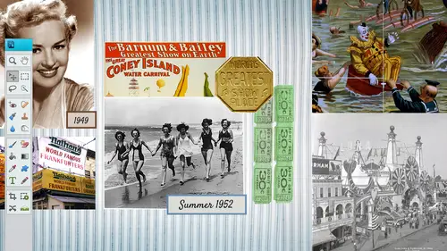
10:50 am - Using Quick Pages
Well quick pages will kind of get you quickly into scrapbooking if you are remember what I was talking about as faras what if I'm not creative? Well there's a plethora of quick pages out there this one happens to be from snickerdoodle designs by karen dot com and she sells some quick pages on her site and they're usually maybe a dollar or two and they come pre made which is really nice because it will only take you a few seconds to create them uh once you get to know photoshopped elements a little bit better so really they come with either a couple layers or they're all flattened it could be a png file which means that you just throw in your photo behind it's kind like a frame and then you pull that photo into it so we're to do a couple quick pages here in the next half an hour so and then we'll get into a couple other things but I wanted teo kind of jump from basic tio this so that you all of you at home can at least put together a quick page if you need teo and I believe this quick p...
aige out this quick pages going be available for all viewers so I don't know if it's available just yet but we will put it in there that you can download it and use it to your liking so this is I just wanted to open up the file first so you can kind of work week I kind of like like to think backwards like to see the end result and see how it got there first so we're gonna be talking a lot about layers as well, but this is basically over here to the right hand side you will see your layers now this one only happens to have six layers, which isn't a whole lot you can have up to hunt hundreds of layers if you need teo, but this one only has six layers and you'll see that the bulk of it is on the second layer and when you hide that layer, you're going to see what's underneath there so there's a couple pictures and there's uh, text and then there's that quick page in this part right here is the quick page, so let's start from scratch and go ahead and build this page real quick I'm gonna go file and open and you can either a bring up the quick page right away, which is normally what I do I'll go ahead and open up that quick page and then if you want teo right away, you would want to save that you will also notice that these quick pages almost ninety nine percent of them will come in a twelve by twelve size that doesn't mean that you have to stick with twelve by twelve you can shrink it down teo ten by ten or eight by eight or whatever size you want teo but it is kind of nice because you always want to start with the largest and then shrink it down you never want to go from from small to large and shrinking our and take it up so you can see right away you've got the twelve by twelve you go into view and rulers to bring up your rulers that you can see what the sizes we gotta cover grids a little bit too and we'll cover that here in a few but if you wanted to bring in your grits at this point you can I'm not going to view them because they kind of get in the way a little bit but as you see here we have this checkerboard behind this frame that means that is transparent okay png means that you can do things that are transparent so you can put things behind them and it will show through so it's just like a transparent window where you can put your own picture behind their notice how detailed these pieces are even if you zoom in there really fine quality of the bubbles here I'm just really impressed with a lot of these digit designers on how awesome they can put these embellishments together and they do kind of look three d because they do have drop shadows and here again if you do you have a lot of embellishments that you would want to mix in with this you could always you know, glue it on top of this and become you know if if you're kind of worried about transitioning from traditional teo did he digital then you can go ahead and kind of use the embellishments on this paper as well but as you see right here these air pretty tight quality and very detailed pieces so once you look over here to the right hand side you're gonna see there's just one layer but once we start bringing in maur this layer is going there's going to be stacked upon this layer so I'm going to quickly go ahead and save it as something else and I'm going to save it as a p s d which stands for photoshopped document, which most of you probably already know that but I do want to make sure that those of you our brand new that you understand this difference here because it could get a little bit tricky. So at this point I'm going to go ahead and name this gonna go ahead and highlight that the part of it that I need to rename and I'll just go halloween oh too so I don't override the other one and then click on save now we have that copy and now you can still use that quick page if you need teo for other um pieces so I'm gonna go ahead and open up that halloween too and then I need to find the photo that's gonna best suit this particular quick page and that would probably be a halloween photo so I'm gonna go into file and open and by the way, those of you want to know the name of this quick paige it's s d s kimber cat scraps little tots quick page for png so I think that we'll have that in where you could download that and kind of play around with that just so you kind of get familiar with that request for that okay, that will be available for the viewers and for purchasers as well. Okay, wonderful. Yeah, and then they can go ahead and use that one and I think I want to have another one too. Okay, so this is the photo I did this before many years back and I did a postcard but I couldn't find the original photo and I have already go ahead. He did not like this costume by the way, he was not very happy. I got one picture and that was it that's what you got that picture I have of being the picture, the costumes that was never an option e got one picture and that was after that the tears came out, so I was lucky to get that so I didn't make a postcard of it many years back and here I am preaching that you should keep your psd files and this one I did not so it is a flattened version which is fine because what I want to use is is this photo so I'm just going to grab this photo and I'm going to take my rectangle marquis tool I'm just going to clean slice this part out of it and I'm gonna take my move tool and just drag it see how it's cutting it out of there dragging it and dropping it over here and it is a little bit small because I didn't keep the original but I'm just I'm doing something that you really shouldn't do is in large things but in this case it shouldn't be that big of a deal I enlarged it a little bit when I go back over here and close out of that one because I don't needed anymore and as you notice with this layer this is on the top and we don't want this to be on the top we wanted to drag and drop it to the bottom so that it goes right in there kind of clips itself in there and now you have that photo I do want to move it down a little bit so I'm gonna take my move tool I'm just going to nudge on my keyboard and push it down a little bit maybe over to the right and place it right in there as you notice this bottom layer is the checkerboard layer so that is, um basically don't really it doesn't really matter anymore because, uh but but it is the png so that's why you could do that? Uh, the checkerboard, the transparency. Now, if this was a jpeg or a psd file j pegs actually those air compressor oh, it's going to compress that all down? You're not going to see that tape that, uh, the checkerboard anymore? So I got both my layers showing. Now the only thing that we would need to do now is maybe to add some text may be along the side and some journaling down here along the bottom, and I'm just gonna go ahead and bring it in a text box. I'm gonna go get my text tool. I'm going to go down to the color, which is down in the bottom there I'm gonna click on set the text color and here it gives you an option, a bunch of different defaults, but I don't really like to use the default colors. I like to use a color that's inside of my layout, so what I need to do then is any to bring up color picture, which I'm gonna click on this, and it brings up my color picture picker where we can choose any kind of color from this you bar here and then we could come into here and pick a color notice the new on the top and the current on the bottom um so you you got all those colors now if you had this selected the web on ly colors, you're only going to get a few colors don't know it was a two hundred fifty six or something around there, but you don't have as many options, so make sure that you click on this that you have more options for photo colors but I'm going to go out in here and I'm going to pick kind of a dark color not real light because it is going to be going to maybe go with this brown so I'm pulling it from the costume it's kind of a reddish color that it picked, which is not bad, not at work and then I'm gonna go ahead and click on okay, so now I have the color set. Now I gotta think about what kind of fought am I going to be using? Ariel is always a good default narrow bowl this is nice can you read it pretty well? Don't get anything that's real frilly like that has, you know the sheriff in the sand saref you don't want those little node on their tariffs on their guess you'd say because our script e was put on probably trying to say more so because script is really hard to read when it's smaller text so make sure that your texas really readable so what I'm gonna do is I'm gonna go to that top layer make sure on the top layer I'm gonna click and drag and I'm gonna release now I'm going to start typing just whatever it's not gonna make any sense here and it's going to go ahead and since it is a text box it's going to rap for me which is really nice and then I'm just going for sake of quickness I'm gonna highlight that I'm going to make it a little bit bigger so you can read it maybe go with a um twenty four point and then the leading down here is really important because you can push the leading to the right and that's going to increase the leading there see how it's moving itself the more you push it to the right, the more uh space you're gonna have between each line of text. So sometimes if you don't have a whole lot of text, you might wantto increase that or if you wanted teo decrease it, you could push it to the left or you could just do it manually either way is fine over here to the right of that you've got the left aline text center and right and then I'm just gonna go ahead and copy that. So control c and control v to copy that and then there's my journaling text, okay, you can also go ahead and shrink it up if you want to buy taking in the handles and pulling it. It was all different kinds of options to kind of re focus that text once you're finished and you want to commit it, it is commit current operation, and I'm just gonna go ahead and double click on the handle, and now you've got your journaling down there in the left hand corner, and then if you want to, you could put some text on the right hand side and we can rotate it down. Doesn't the quick pages seem like that would be something to really get started with? Because if you you are a beginner, you could put a page together like within seconds. Yeah, we're getting a lot of appreciation for that, and I'm also saying, you know, it is really photo dependent. What are the colors in the photo you have and just, um, easy ways to manipulate and create some complimentary color schemes and rights and then just get creative, like whatever you think works with, they just start playing, right? Right? Yeah, and the funny part is, like all of us, scrap workers and vicki, you're probably gonna laugh, but it's hard to pick a font sometime. You sit there and go just pick a font on, but something I do this all the time in my classes, I'm like, I don't like this one. I don't like this on this wasn't looking, so you can kind of scroll through all these that's, the font world for scrap. Booker's is awesome because there's so many different ones to choose from out there. So, yeah, picking the right now with the like I was saying with the journaling, you don't want to pick any crazy fonds because you need to read it, and you also have to remember to would advice shrink this down to ah, an eight by eight. Is the font going to be readable? So you have to kind of keep all that stuff in mind. I remember when I first started doing this and I went to costco and I had a twelve by twelve and then my two six by six is. Doesn't work so good when you take this and you take it down to six by six well, I found out the hard way spent a little money and well okay, but now I remember so just because you have a twelve by twelve that font might look really big when she printed out but then one even if you do it in six by six it's going to be really small so you have to kind of keep that in mind well, we have some, uh, awesome font kind of sewers let me internet, you know, just kind of shouting out some of their favorite yeah j js piro says they're a big fan of palatine o o pai latino comic sons is my favorite, but I do know something about wayne crop ear's and we've got other names and now we've got did what it was for connoisseurs yeah there's all kinds out there I have to remind myself teo maybe have a list of some of the cool places you could get some funds. Del font I don't know if you're going to go over this, but with the text are you able to go into that and make it more bold or pop out more like like I use photo shop a lot so I know that you're going to have like a drop should shadow and I didn't know that was oh yeah, something that was yeah, right there is a devil's and like, if you can't read it very good you can kind of put like a back shadow on it glow so shaken to your text a little bit better we'll we'll get into that for sure. Yep. Point yes? Do you think it stands out more if you put it on a tag or something behind, it makes it stay I di dio and it really just depends on what it is like a lot of times I'll put the date or the year on a tag somewhere small and kind of like off the side that it's not obnoxious, but at least when you're looking at it going, what year was that again? Oh yeah, two thousand for so and I put him on tag's a lot or the date is the biggie seven years old or how old the person was or their name, but yeah tags are awesome. All kinds of the embellishments, even ribbons you can kind of put your text within the ribbons itself if you want teo over the top of it. It's really unlimited as long as you can read it, it is not too crazy and two I always like, try to just do two different fonts per page unless you're really wanting to do like twenty five different fonts, so and it's obvious but if some people put five or six different fonts on the page it just gets graphically it's just not good so if you're a graphic designer and you see five or six different fonts on a page you're gonna go you went gone crazy so I usually use teo I usually use maybe one sarah finn one sand saref just to kind of keep it balanced I'm kind of more like the balance kind of layouts so what we're going to do now is on the right hand side we're gonna go ahead and just put the little boy's name and then the year and we're gonna rotate it and put it along the side and in fact I think this is the one that we're doing a publishing pulled that up to begin with so this is what it's gonna look like it and I didn't put that I'm gonna put the picture in there too just so you can see how pulling that picture in but this is what it'll look like and this was printed by persnickety prince it's not the metallic one but it is a high it's high quality twelve by twelve a dollar ninety nine and they do really excellent work you were saying earlier about different print shops that you use and also this is a company that you have a very good relationship and feel comfortable about what people have been asking about printers at home are you going to get into that later about any perhaps models that you recommend or you feel do better jobs? Another yeah, I don't really recommend anything because they're so money out there, and I haven't used them, and I know what people say they use, like the ibsen, um, but I don't I don't see the quality myself, so I just say, you know, if it works for you, then go for it, I don't like to print from home one reason is because the ink is so expensive, and so I I would rather just pain dollar ninety nine and make sure that it comes out good, but a lot of people do print from home and when you're making your cards and stuff it's really nice to print from home, because then you could do the size that you want teo as well, so but I, you know, the people that's, what I have is an hp printer ink jet printer, but persnickety prince, they do color correction, they're very mohr they're much more individualized, so if somebody sends in a picture from facebook or something that's really, really low res and they want to do a twelve by twelve, I'm pretty sure they'll stop him and say, hey, do you really want to spend that are ninety nine on something that doesn't look very good if they say sure I guess they would print it for them but they kind of I don't know if you ever like upload things too costco or wherever and it says there's a really big explanation point ah sometimes also say or whatever go ahead and print it anyway and sometimes it looks ok but it depends on what you're printing it for two you know photographers that would be a no no too probably print that but for scrap pickers if if it's not going to be hung somewhere and people are going to actually looking at it like with fine detail then then it should be okay but yeah and printers you know, use print from home sometimes you said yeah so I think it's half and half with who prints and who doesn't good question okay, so I'm gonna go ahead and get my text tool and in this point I don't think I'm gonna use the same color fought but I think I'm just gonna go ahead and go ahead and click one time and then type in all I'm going to type in all lower open upper case j c two thousand for you and you can't see it right now but I like to just go ahead and I don't know what size I need to be so I'm just going to go in there and click on the check mark and I'm gonna pull it from each side here, just pull us out there so it's a lot bigger, and then I'm gonna rotate it, so I'm gonna hold down my shift key while I'm rotating, and it will give me those, um, I did it, so I haven't do that. I think it didn't stop that stopped a little bit. You just go ahead and when you're holding the shift key down, it should go in increments of forty five I believe, or thirty. So I did hold the shifty down. I wanted it to go like a just flip this way, a ninety degree, but you can go in there and rotated however you want to know, but holding that shifty down will help you a little bit as faras getting it to the right. It's kind of stuck a little bit, so it's. So now, obviously, you really can't see that very well, but I want to help go ahead, and I'm gonna go ahead and get my text tool and I just want the word j c to be a different color, so I'm gonna highlight over the top of j c I'm gonna go down to my color picker down here, set color text, and I'm just gonna pull in a color, gonna have to go back into my color picker down here in the bottom left hand right hand corner and I'm just gonna pull in this color here and then that's going to be that color and then I'm a highlight two thousand four and do a different color for that. Go ahead and pick that's and maybe it's going to be a color there and then okay now may or may not look good, we can kind of play around with it more if we want to, but we're going to go ahead and pretend this is what exactly what we want, but it is pretty obnoxious it's too, too much in your face, so what you can do is go to the kind of stretched, helpful bit tio just to kind of pull it together, you can go over to the opacity and take that down to, like fifty percent or whatever you think you need to just be careful because sometimes it looks you know, like you can read it on this on the screen, but that whenever you print it out, they may not look so good. So remember that capacity is kind of fun to change. Change it around a little bit and you can nudge it into place by this, selecting it using your arrow keys up and down arrow keys, nudging it into place and just letting us sit there and every once in a while, you want to remember to save it because if you are working on it for an hour or so and something happens because they're not in your head save all right? So yes, michelle, do you find when you get prints from persnickety prints that what she get is pretty much exactly what you saw on your screen or have been disturbed? Quiet, it's pretty good usually pretty good there's been some places I get it printed out and I'm like, oh it's so dark usually it's that it goes dark doesn't go the light way that's why use that dodge and burn to a lot so I can just brighten it up just a couple clicks just because I know some printers are they print tend to print dark and on your screen it's beautiful, usual like it's already, so I don't know if anybody's ever going to be one hundred percent satisfy when it comes to the print, unless you're really paying really high top dollar for it. So a lot of experience with per second persnickety good. Yeah, so they're saying, you know the prince excellently, this is melissa gross and it's excellent quality, yes, so a guy like him in there in there, you know, they don't cost a whole lot either cool thing about it. You looked when I first went there started like a dollar or nine. Wow, I don't know if it's going to good quality, but when you get it it's really good qualities, you know, it's up there definitely passed, I think costco so the cost goes to ninety nine, but I still you know, sometimes I do print from costco if I need it right away and all that. So all right, let's say, for instance, I wanted to bring in one more photo so I'm gonna go to file and open and I'm just gonna bring in this photo. This isn't the same year but one of my favorites but go ahead and get my rectangle marquis tool font sony, fifty nine wants to know I think, the orientation of thie j c two thousand for is there a way to actually stack the the letters and the numbers to make them sort of be on top of each other? Yes, there is. Ok, yeah, I get that. Okay, perfect. Serious. Thank you. Stay tuned. Andi. I'm gonna go ahead and crop that so I can go are actually don't have to crop it, I just go ahead and get my move tool, drag it and drop it and I can place that wherever now there's really not spot for this but I thought well I'm gonna show them how to bring in another photo if they want to bring in a photo you would probably enough all pretty good right up in here maybe and then click okay now back to your question is if you wanted it to go down this way you can choose there's all different options underneath your type horizontal tool over here to the bottom left hand corner you see that the one that pops up first is probably going to be your horizontal type tool, which is what we were used to using and then the next one over is your vertical type till I think that's what they were asking the other saying yes, instead of turning the words I sideways can you stack the letter was pretend that we're going to do that just to see I have a hard time reading those kind of things but let's just see what it looks like, okay, thank you. I'm gonna go and hide that one so we still have that available if what we back up I always like backup going to go to that top layer go get my text tool, click one time and in time j a c why and of course I can't see it so let's enlarge that I didn't put the two thousand four but I just want to get that in there okay actually this looks pretty good I think this way to sometimes it's hard to read but thiss should be fine then I'll go back in there and get the two thousand for water can you believe we're gonna be in two thousand fourteen very alright yes I can put that in there not doesn't look too bad good ideas come from later love it and then we can mess around with the color of the text you know it just depends I mean you could get skinny here you could pull it drag it that's what's kind of cool about digital is because it's never set in stone if you look at it if your graphic design and you keep looking at it I don't know and you could go back and change it sometimes that's that could be bad tio could drive yourself nuts mama's gonna pull in this color here just to keep it consistent and then again because it is a little bit stark you could pull it down with the opacity so I'm just gonna zoom in a little bit closer over to the right hand side layers effects graphics favorites and mme or now if you're abusing version eleven it's probably going to be on the top and then they switch down to the bottom with version twelve which is totally fine I'm getting used to it every time there's a change takes a little bit of time to get used to in the coloring is a little bit different to between the applications the different versions that is so I'm going to bounce on over I am on that j c two thousand for layer I have it highlighted see how it's blue right here I'm gonna click on the effects button and you're gonna have all kinds of effects in here you have you can stroke your text you could do bev als you can do drop shadows which is pretty popular with the larger text and all these types of things so let's just look at let's just look at the drop shadow for knox that's a biggie so I got a three down and they have all these different defaults and I normally if I'm going to be using one of them it'll be the soft edge I don't really use any of these let me pull this over well, I'll keep it there for now so some of these they're really funky and you can try him out can't really see him here but I'm gonna use a slight drop shadow gonna move it kind of over so you can see it more in fact you know I'm gonna dio let's go back to my layers turn this one off so that we can see it better when I add a layer down at the bottom so I'm going to add a layer I wanna fill that with a solid colors that we could see this more we'll get back to this quick page no big deal, all right, so I've got my still that perfect much better then I'm gonna turn off these other players too. So now we can see a little bit more of what's going on with this with this text so now we have a flight drop shadow and the soft job shadows I think look pretty good when they're printed off. Now if you do really hard drop shadow sometimes it's too dark of course it prints a little bit darker usually when I go back to that layer, this is the cool part see this little fx to the right hand side of words that to chase a two thousand four you could double click on that that's going to pull up your style settings you can change the angle of your drop shadow, so if I want the sun to come this way, it'll drop shadow that way. Um, all you gotta do is click on this and move it to wherever you want it to be. I think the default is right around there close down this way um and you can change the size of that drop shot us if you want to be thicker, thinner the distance as well and then the opacity so that's by just clicking on the double clicking on the fx and then he should be good to go now if you wanted to put a glow on that you could put a back glow in this case we probably wouldn't need teo but there's all different options you can change the color of that back lo um and you could do an outer or inter back alone we'll talk more about that too but I just want to kind of think something you meant stay so you might have mentioned that before you could put a stroke on any of these texts and you could dio as because you want to I just taking the slider if it's if you wanted to really stand out and put a stroke on their change the opacity if you need teo it was this double click on the kind of go ahead and okay it right go back in here kind of being finicky with me right now. Oh oh I know what it is pride to press the enter key it's not going back so let me just close it's kind of um dragging a bit which happens everyone small especially when you're working with a higher rez this's like a thirty seven megabyte file and sometimes it will do that actually you know what? No it doesn't have ah that's weird there we go okay, yeah, I don't know if there was like I think the little check mark was not in view so that's probably what was happening so let's, go ahead and close out that one because that when we wanted to go ahead and just do the regular rotated and I'm a turn these on and off remember we are going to be getting into layers, so I will be talking about turning them on and off. But for the sake of showing you that tex wrote hitting down wanted to kind of do that, turn off this layer because that is stacked on top so we can delete that layer and I want to turn that other layer back on not that one, but this one. So now let's, just pretend, okay? Everything's fine, this is the way we want our quick page to be. We're going to save it one last time, and then we also are going to save it as a j peg, because what you want to do is you want to make sure that it is compressed before you send it to a printer. You usually don't send the psd file because it is such a large document, you're going to want to save it as a jpeg so that is compressed and that you could upload it, teo the printer I'm gonna go file save as and you want to make sure that you choose j peg from your list of drop downs here you got psd to choose from? I don't do that that map the bmp I don't use the gift very much. Um, pfc not used, but the jpeg and the p f d f I will use every once in a while, someone choose j peg and I'm gonna go ahead and save it and you can say how high of a, um a quality that you want, so if you want to go maximum, you can choose maximum, which is usually what I do when I'm printing or if you want to go low, you'll notice this number drops when you picked low it's nine hundred seventy five k instead or you can go maximum, which is going to be a higher number, okay, and then disco ahead and click on okay, and now you have a j peg version in a psd version and it does take up a lot of of your memory on the space that is, but at least you have those if you needed to go back in and change something, you know what? I don't have a whole lot, but I have a ton of pictures, but I had I do put a lot of stuff in my dropbox, so it's that's my backup system and that would be interesting to know maybe the internet audience khun let us know where they back their files up tio dropbox is one thing that I heard a couple of years ago that's where I've always been doing it could like work with other people and we can switch files back and forth through drop box a lot when it would be interesting to know if there's any other places and then I just have an external hard drive and I used to always save them onto my discs but I have kind of moved on from there I'll share with you I am a huge fan of dropbox good not just for photos though it is amazing to organize your files you can have documents and pdf ce and excel files on the go on your phone and the way I love it yes yeah I use it a lot teo transfer different files back and forth to different clients and all that you guys how many ways that you back up or any I use dropbox is costas well yeah it's really nice I have the app on my phone as well so every time I'm in a like what wife eyes zone like at my house it just takes all the photos I take from my phone and put it up there which is amazing yeah yeah perfect love that you know how to think about it you know it was there okay, so you know, now that we have a psd and a j peg, and of course they are gonna be different sizes, the psd is going to be a lot larger, and j pegs could be a lot smaller because it is compressed, um and that's, the one that she would upload tio, the printer or wherever. But if you're printing from home, you could just print directly from that psst, not a big deal. So I'm just a really quick question about saving it, though. Are you saving it as the sd and the jpeg, or is it either or I do both? Okay? Yeah, just a clarification. You lose any pics, elation between to a little bit and when you're doing the j peg, compresses it a little bit. But you know, if you do maximum compression, I mean, if you if you save it where it's going to be not as much compression, then that's going to be fine quality for these sizes and like persnickety prints or any printing service, they'll accept whatever file you have, right, right. They can print from any file. They can't well, usually I think we just upload j pegs, but I don't know if they if you upload a psd or not, because it will take a long time for that p s because it is, you know, like, for instance here here's the psd, and I'm just gonna click on it and notice down here, I don't know if you can see that, but it's a seventy five megabytes, that's the file size that the psd is. But if you click on the j paige it's so much smaller four point six so really, when you're uploading it it's so much easier and faster if you blow that j peg, I don't know a persnickety would do the psd that's a good question, maybe I'll try to you find that out, but a normally I'd just go ahead and do the j pegs. We also seem to peer into some other questions about definition and quality. Nazi g from albuquerque is asking she's, saying when she changes to a four by six element's, twelve automatically changes the number of the original two, three hundred. Why is that she's asking, um, I didn't know that automatically does well, I always punch in that number. I didn't. I figured maybe it would automatically do the three hundred. But three hundred is the industry standard for printing, so maybe that's. Why it does that, so that people that don't row that, that it will do it for them so they don't get this seventy two. So that's kind of smart on toby's, part of that's case. Good, but I always punch it in just because I'm just I'm not sure what the quality's gonna be if I don't punch it in so that's, good to know.
Class Materials
bonus material with purchase
bonus material with enrollment
Ratings and Reviews
PJ
I really enjoyed Michelle's teaching style. I'm new to digital scrapbooking and am on my way to becoming an die-hard convert. Thank you so much for explaining everything so clearly. I'm so glad I bought the course and all the extras you gave me were wonderful - a quick way to get started. Hope to see you again on CreativeLive soon!