Lessons
Lesson Info
Visualizing Data
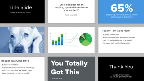
How do you include data in your presentations? How do you visualize that data? You can use charts. You can highlight selected numbers. You can create diagrams. And again, you might be able to come up with something else that I haven't included here. If you do use the chart feature in your presentation software, choose wisely. So here are some examples of the built in options for Keynote, right? These are 3D. Don't use 3D ever. And then you can see the pie chart is like a color bomb exploded. A better selection would be go with the flat designs, not the 3D, and you can see the palette here is analagous. The same palette that we talked about earlier. Many times when you're presenting people on the receiving end aren't going to have time to look at all the data. So you don't need to give this complex spreadsheet. And because you're presenting the data, you have the ability to pull out only the information you want to pull out. And this is very powerful. Sometimes you just want people to k...
now this one number that's amazing, right? And in cases like that, that's all you need, that number. You can also do it yourself with simple shapes, type and color when you need a diagram. I designed this for another presentation, but I just used the drawing tools within Keynote. So the shape tool. There's an arrow tool that has an arrow on each end, and then I used type. And you know that you need a diagram like this when you're maybe putting together the slide and you can visualize it in your head. So in those cases, make that visualization if you can. Here's another example and this is really easy to do. It's just circles that overlap with type. And by providing the audience with visuals like this. It helps them remember the content. Another option is to design it yourself by hand. So there are free drawing apps out there and you can use them just like you would use your notebook, right? And the thing I like about this is it feels very organic, in contrast to this digital environment that we're presenting in. And I like that it came from me and I made it. So again going back to generating your own images and feeling more connected to them. And it doesn't have to be perfect. If you have a lot of data that's textual and you want to maybe compare it side by side, use a table and this helps you organize things into columns and rows. And this is what I showed you earlier when I was comparing the presentation software. It's just a nice quick at a glance, right? But no matter what type of imagery, what type of diagram you might be using, just make sure again that you remember to keep things consistent. And this is in terms of line weight, shapes, color, and typography.
Class Materials
Bonus Materials with Purchase
Ratings and Reviews
Dave Pasciuto
This is a very basic class focused for a beginner, but explained well. I was hoping to see some great, successful and unique designs, but none were given. Much of the information here is beginner graphic design basics.
Josh Hersh
People often overlook the fundamentals of building a great presentation. We've all seen too many different typefaces, crazy typefaces, and distracting formatting and colors. Lara teaches you to build a presentation from the ground up, reminding us that the content is vitally important and that design is used to communicate, not decorate. I really appreciate the seemingly "small" tips that add up to make a big difference. I'll have much more awareness going into my next presentation. Thanks, lara!