Lesson Info
6. OpenType Demystified
Lessons
Bonus Video with Purchase: 'Custom Letterforms - Gerard Huerta'
1:05:31 2Beginning of Typography
14:15 3Selecting the Right Type for the Job
40:00 4Text vs. Display
23:10 5Type Hierarchy
21:13 6OpenType Demystified
29:56 7Taking the Plunge with Type
15:28 8Think Like a Type Designer
23:10Lesson Info
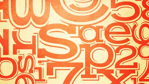
OpenType Demystified
Moving along two actually one of my favorite well, it's all my favorite but you know, some favorites arm or favorite than others. Okay, uh, this is probably the only kind of techie section but I'm telling you your job is going to be dropping at the end of this. Okay? Don't think because it's technology and it starts a little dry that, uh I don't need this you need it. Stay put. Okay, so we're going to talk about open type how many here have heard of open type? Okay, so most people have or are many designers and people have heard of open type, but they don't really know what it is and they don't know the potential features. What is open type open type is a font format jointly developed by can you believe it? Adobe and microsoft of all people who knew they'd ever work together. Okay, we like to describe them as a kind of a super set of the older technologies which your type one and true type with added enhancements, the added enhancements for open type are they our platform independent? ...
They have the capability of having an expanded character set and they have the capability of having live substitution all of which I'm going to explain platform independent means the same font the same exact font will run on both a mac and a pc yes the same exact fun and the reason I make such a big deal of it is because fonts are considered software do you know any software that you cologne on a mac and a pc now there's nothing else everything else you have to buy separately so there is one one file for an open type font and the oh that you see here is what is the symbol for open type and what you will see very often if you look into your font menu in a lot of software a lot of times it will show you an icon so it will tell you which are your open type fonts and if it has an a or two teas it's type one or two type so this is one way you can tell when using your software ah most open type fonts and the ones that you will most likely be purchasing will have the suffix of o t f meaning open type fun there are some open type fonts that our ttf which technically means true type fonder trip type flavors we like to say sometimes and those those air the system fonts that are that are designed a little bit differently so that they have better screen um re production and so without getting overly technical it's not important for you to understand why that's a t but the most of them are going to be o t f so an open type font can contain thousands of characters from the two hundred fifty six of type one and true type which was not very much two can you believe an open type font can contain up to sixty five thousand characters but don't freak out because I only know one fund that has four thousand characters it's not like everyone's doing it but just to give you a quick history the reason microsoft and adobe work together is because first microsoft was looking for a fun format that could accommodate language systems that have thousands of images such as let's say condi or devon andrea these other languages that don't just have you know, twenty six letter alphabet and then you make everything out of lower case in caps okay so they were developing a system to accommodate these characters and then adobe joined them because they said that will be awesome for our graphic design professional because there's lots of characters we can't now fit in a type one or two type fun so that's how that came to be that's the reason for that so an open type font can't contain thousands of characters and those extra characters can include most of the things these things we will be talking about today or at the next session lining old style figures proportional and tabular spaced figures standard and discretionary ligatures swash an alternate characters true drawn small caps fractions, dingbats ornaments, symbols and extensive language support all in one fund. Okay, so how do you access all these extra characters again? These things we're going to be talking about over the next today, in the next session, you can access them globally via the open type panel. Most of the software screen shots I'm going to be showing you are from in design illustrated does support many, if not most, of the open type features the others. It depends on what version and and not so much okay, it's mostly in design. Okay, so if we're looking at this, this is the character, um, tab and most people are familiar with this because you press this and you see, you see all this stuff with a lot of people don't realize that if you go to open type and you click on this, this is the open type panel that is what is critically important to where you can globally access any of these characters, okay, or you can you can insert them. So for instance, if you're doing a global insertion, you're going to either click on the text box or or or highlight a certain number of characters, and you can call it you can click on something here that is not bracketed. If something is bracketed, it means they're not available. In this particular fund so this is showing adobe gara mon pro dobie gammon pro does not have swash is does not have contextual alternates but it does have small caps it does have different figures does have discretionary ligatures the other way you can access these characters is individually using the gl if panel so I'm sure you're all familiar with the ge lift panel if you're not you really should me because it's critical and it's in it's in every design software that at least you know in some way you have to be able to access that. So this is the cliff panel it's showing the entire font this happens to be adobe castle in pro so if you didn't want to turn on all of the let's say discretionary ligatures or all of the swash is you go to your text you highlight a word or a character you find it here and you click on it and it will insert it individually so it's not globally it's individually um just before we go onto this by the way when you're doing that understand that you could use both at the same time in other words, you could turn on ah feature globally but then and go in and change one character individually using the cliff panel so they can overlap okay just a little bid on these fine identify irs and most of these aren't used so much but a lot of like I said the other one was adobe garin one pro you see pro is probably the most common identify or you'll see okay but there are there's pro their standard occasionally you'll see calm occasionally you'll see two point oh okay many open type funds don't have any identify her at all you just have to know from the manufacturer standard means it supports latin based languages standard, which is western you know english central european a few turkish, eastern european and baltic character so that's that's your sort of I don't want to say that your plain vanilla font because some might not have that but those are the character tres at um are normally and even the older type one and true type fonts ok pro many people misunderstand what they think pro what pro means pro of pro font just means it supports non latin typography usually greek and surreal iq and possibly some others could be a lot others what many people think it means is it has a lot of bells and whistles it has swash is it as ornaments? It has also all this stuff well it can, but technically when you're buying a profile tactically from a manufacturer point of view that's not what it means but it's very possible when you're deciding upon buying a standard or a pro version of a font the pro version might have mohr stuff in it so usually the foundry will show you a list or a chart of what's in it two point oh is another way of saying pro only certain manufacturers use that some independence com line I know lina type has some fonts I believe it refers to the word commercial and it supports forty eight language so if you're doing multi lang which, uh usage then you might look for a calm fonso you khun set everything in the same type style with different languages so far identify irs are inconsistent at best not every foundry most foundries air using the word pro that's become adobe started them and most people have adapted the word pro because it's becoming commonly understood. Okay ah lot of foundries will have standard and they'll have pro because what started the way it all started when open type became um uh uh an accepted font format about ten years ago or so is that library's such as adobe were converting quickly, converting all of their back life for me to open type and they weren't adding anything extra was like we've got to get this out. We got to just, you know, put it through them, you know, get it done and get them all out then when they called those standard, then they went back to certain funds and they added all the extra characters okay? Or added a bunch of extra characters, so you will very often find a standard and a pro version of the same fun available at a foundry. Okay, I did mention a lot of extra characters, standard ligatures versus what's the different standard versus discretionary. We didn't have those two terms prior to open type. They were standard ligatures, which are usually was the f ligatures, um, plus others that tend to correct or improve crecion character pairs so here's an example of some f ligatures in addition to a th ligature once again adobe gara, mon pro so it's starting off with the f f and the f I and these were the only two ligatures that were typically available in the type one and true type fun, and they're typically turned on by default, because they're important to improve the look of text. But now that we have room for lots, ah lot of manufacturers and type designers are adding maur. The reason you have these is because, for instance, the dot of the eye, my crash into the top of the f and the saref on the I might crash into the crossbar of the f so it creates an ugly connection in a lot of typefaces, so these are meant to improve the fit and the overall look the same thing here I mean that's tasteful but it looked worse if you didn't have that. Okay, so then of course you've got f f I f f l there might be some that you say well, what word does that it's not all for english I mean there's other let you know at languages that use the same letter forms that might have very calm um, pairings and th is just a real problematic combination so it's nice to have that so those are standard ligatures they're often turned on by default in the character palette so again, this is not the open type palate this is the character palette so you can see and it's it's most likely going to be selected or turned on with a check by default discretionary ligatures arm or decorative in nature um used at your discretion. Okay, so here is some discretionary ligatures from dhobi kazel on if you're not familiar with this aspect of the gl if panel you don't you there are subsets if you click here you're going to see a whole list of subsets that's very similar to the open type panel. So if you want to look at all the discretionary ligatures, all the standard ligatures all the swash is it's a lot easier if you look at a subset instead of looking at that hole big chart which is is overwhelming so these air historic forms don't ever make the mistake of thinking these air f ligatures because whenever you see what seems like an f with a missing right crossbar and ain't no f as to be very unprofessional for you to use that it's a historic form it refers to it s a long s so if you have ever seen some old you know printed old pieces where you see letters that don't you know you see this and you you know you can't read it or it reads funnier it looks funny it's because this is s l is two esses s t s h s I so they're usually under discretionary ligatures but on some funds they for some reason understand erred on then they might not necessarily automatically substitute but you'll sort of get one up on on your instructor on your employer on whomever if you know a little bit about some of these characters even if you never use them ok, so the discretionary ligatures are located here once okay, this is exposed share of sands again remember to go then this is in remember it's an in design it's a little bit different and illustrator illustrator actually has an open type tab which has a combination of icons to represent things likes, washes and small caps and also has a pull down menu on the side, so if you're using illustrator explore the interface it's slightly different from in design this is never going to be turned on by default because it's a discretionary is an optional thing okay figures what one of the most important and one of my favorite um options in many open type fonts on before you understand that an open type why it's important that open type contains four styles of numerals you have to understand what they are so and they happen to be located at the bottom here okay if they're bracketed theywill be bracketed in any type one and true type font okay and they white be bracketed in an open type font if that doesn't have them ok but what are they okay well there's two different styles there's lining figures and there's old style figures lining figures what you say on the top generally a line on the cap and the baseline granted and gary mon they're not completely aligning they have little bit they extend a little bit you know the three the five teeny teeny bit but in general these are the lining figures and most lina fears a line perfectly old style figures or what you see on the bottom all style figures approximate lower case letter forms and that they have an x height a sender's andy centers okay, so those are the two styles of numerals numerals, numbers, figures it's all the same thing okay, but as I mentioned before I say there were four styles. Ok? The other two styles relate to the spacing. So for lining figures, you have tabular figures and proportional figures for old style you have tabular and proportional tabular means every individual character has the same total, with total, with referring to the width of the gl if the drawn character plus the space that's assigned to the right and left so that it doesn't crash into other characters, the purpose and the use for tabular lining figures is so they will align vertically in tables tables. Thus the word tabular that's how you could remember it. Okay, so, um, and the proportional style means everyone has just the right amount of space, so that if you combine the numerals, they're going to look good. Okay, if the fun also has tabular old style which you don't use that much, but you might see some at, you know things like annually reports, price lists, invoices, things like that, and you can clearly see that the tabular figures are more open, and you khun better see it in this example, where you see every character has the same total with remember I said, the with is the the width of the cliff plus the space, ok, so if these air aligned vertically, they're going to align, and these won't so if you use tabular lining figures in your setting prices everything's goingto a line even though the ones might have open spacing if you don't use it, you're going to get that and that's not the way uh columns of figures should be set so which style is a default? Unfortunately, in most fonts it is the proportional lining figures, which is probably what you're only going to use five percent of the time. Okay, so unless you're setting columns of figures you might want to change the default this is one of the features that people overlooked they don't know what's there they don't remember to change it and it could make a huge difference old style figures look really great in running text for instance much better than lining figures unless you're specifically trying to call attention to numbers okay, so once again it's loaded located right here at the bottom of the open type panel okay, change the default toe whatever you want you can use to stiles and one document if you have to. If you have a letter headed an invoice maybe in the address you want to use the old style figures and you may be in an ad the address you want to use the proportional old style figures and maybe in the columns of figures telling them how much they owe you you want to use the tabular lining it's okay to combine also if you're familiar with styles if you're not don't even worry about it if you used paragraph in character styles and in design note that you can make selections of all these open type features anything you want so it's easy to apply that when you're using styles fractions okay prior to open tight the most fractions of font could have were a quarter a half and three quarters it's all that could fit in some of the type one and true type funds many but not all open type fonts contain a broad range of pre built diagonal fractions so they'll usually it's not random they usually consist of these okay and how you know go toe to toe with palette see if they're there okay but what if you want to set some arbitrary factor like this? Okay here's where we we go in a little bit to teo it's a cliff substitution feature I'm going to talk about that more in a moment but some open type fonts can build what we call arbitrary fractions any fraction that's something that not out of the ordinary number on the fly okay it's really great because you want him using fractions more than you think if you're doing a recipe measurements manuals and they look like crap like this I mean this ain't noticed this isn't even this is a a slash this's a fraction poor mean everything's different okay, some fonts have the ability if you set this in your document and you highlight it and you go to fractions in the open type panel it will convert automatically I don't care of its fifty seven, eight hundred twenty seventh okay, so this is a really good feature tohave especially if you know you're setting a lot of fractions but unfortunately um oh what did I say keep your fingers crossed because not every font has them and I don't know of a way to automatically know it's pretty much trial and error okay, so I know from from you know like adobe casslyn khun do it when I tried gara monnet couldn't do it so a lot of these things are trial and error okay, but if this is important to you when you're selecting and purchasing a font tryto find out ahead of time whether it means contacting the manufacturer whatever because this could be critical what if you're just doing magazines with recipes or doing recipe books or lots of measurements? Okay, trial and error is the only way I've not found out that you could know if this feature exists okay stylistic sets you know what it's not critical I know there's a lot of this information I just want you to be aware that this stuff exists and one day you're gonna have the time to explore okay so stylistic sets are pre selected groupings that allow for the global insertion of anywhere from one two twenty alternate so eliminating the task of selecting and alternate individually again something most people never notice. Okay, this is james model bonner's trilon of terminal design he's an incredibly talented designer and a wonderful foundry. Okay, so go to stylistic sets and you see there's set one to twenty anything that's bracketed means that designer is not making use of that feature. Okay, he has forced set so what does that mean? Well, these are the standard characters. Okay, he's got two story g two story a talk about that later, okay? He happens to have three alternates I'm showing you here for a reason we're starting here. He's goes from the two story aye here he has the ones I'm g two story g to one story g two story a he's got a one story a alternate and a diagonal g he's got a kind of a more vertical why okay, so what if you on ly wanted to substitute the g but you didn't want to do all the others if you just clicked on alternate you'd get them all and you'd have toe search and replace every little thing it would be crazy, right? So in stylistic set one he just put this g in stylistic set to he just put that eh three he just put the why and four he put the mall but guess what you could use more than one of these so if you wanted the g and the y and it didn't want the ai you click on this and you click on that and you'll just get those two so I think you get the idea that this could be an incredibly useful tool which not enough in my observation not enough type designers or taking advantage no but it's very powerful if you have a lot of alternates and you want to make things faster for designer okay, so this is what this stuff and also if you want to know what's in the stylistics sets once a can gl if pound of the panel if there are any it's going to appear in this drop down menu and you can see what's in there okay so now for the for the sexy stuff okay, I'm going to show you some kind of like some before and afters so this is a setting set in lati n pro another mark camera ah lovely typeface from type culture that's he's sort of an independent foundry on and this is using the media metallic and the bold now using some of the features that people don't even know they have, what could it could turn into using swash is swash is fabulous that's grammy look and these air true drawn small caps big difference, right? Okay and that's is not a time consuming thing you just have to look for what's there these are all the swash is if you want to go or what what's in there okay, looks like a lot there mostly because it's a profile there mostly the foreign language versions with the accents but here you can see the a through z and all the options you have. Okay, oppegard gothic is ah wholenother story this is a typeface that was original drawn by her blue mao and originally based on a nineteen sixties very often guard magazine very right wing magazine called naturally often guard and so but it had all these kind of crazy ligatures you see all this angle type and it's actually sort of making a comeback so originally this typeface was digitized and released but there was no room for all those extra characters which actually were available in the prior font format which was photo type but once it was converted to digital, all those things were missing. So once open type came about, I t c remanufactured it as a pro and included all these alternate. So now if you could set that this was set with the digital font which it you were unable to do prior to that lots of alter their actually called discretionary literature's keep in mind a lot of what you're seeing are these accented because this is a profound okay but still I mean it's impressive you have choices and I'm telling you guys and I'm telling everyone watching you have fonts on your system that has features that you don't know about so when you're done today it makes sense for you to explore the fonts you have to take full advantage of the features and the extra characters you might have. Okay, so here's eric adobe gara juan premiere pro it's different from pro so using the regular roman in the italic what can cool this could be okay uh kind of boring pretty name look what we're using swash is ligatures terminal this is a terminal swash because you wouldn't want to use that d anywhere else it would take up too much space s t is ah discretionary ligature the I s is a contextual alternate don't where mike and overload you with definitions of all these things just play with them uh dingbat true drawn small caps old style figures look att tthe e look att the figures okay, just go back to look at that can plain vanilla I don't know but not a split something ornaments in that font some cool things in the font. Okay, I love this one. How many of you have heard of him script? Okay, a lot of people have heard of it sometimes I think it's on a lot of people's computers um but a lot of people because they made a number of versions and people, those only have the opportunity to use it. You don't know what it's in what's in there. So I did this little example, which was not quick to do. Ok. And I'll show you why but from this using a font. Look what I did. I mean when anyone khun d'oh! Okay, okay. That's just using swash is alternates and flourishes. This font has about three different cap versions for everything it has nineteen ages. This is not an easy thing. You have to think like a lettering artist. You have to really use your design shops to go from this to this. But guess what? It is fun, it's a lot of fun. You have tools. I'm not saying you never need to use a lettering artist. But look what you could do with some of these fonts and they're getting bigger and better all the time. Even some of them this is james montalban was giacomo, he said, uses two point oh instead of pro. So this particular font has surreal iq. So I would love to be able to tell you I highlighted this and clicked translate. But doesn't work that way. You know, maybe one day it will. It is, and I really I had to find this quote that I found on the web that had the translation. But once it did, I was able to use the same exact font, just had the full cyrillic character said.
Class Materials
bonus material with purchase
bonus material with enrollment
Ratings and Reviews
a Creativelive Student
This course is packed full of the answers to questions I've had at the back of my mind for a long time. Ilene teaches with great clarity, her material is well organised, and she teaches at a good pace - with a bit of humor to lighten it up. I found it really useful.
a Creativelive Student
Ilene's courses on Typography are jam-packed with excellent information that will elevate the quality of your work in print. She knows what's current, but also what's important in long-time standards, and why. Just an incredible amount of information! you will enjoy watching, but you will want to purchase because of the sheer amount of useful content.
shiran
This course taught me very well about Typography. I knew almost nothing before taking it (I barely understood then the difference between Serif and Sans-Serif...). And now, I feel that I really understand a lot. It is a very good starter to learn when, how and why to use type. Plus, Ilene is a great teacher with a big sense of humor and a lot of experience in Typography. A must have for everyone who want to understand something about types and fonts.