Lesson Info
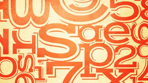
12. Typography Misdemeanors - Part 1
Lessons
Bonus Video with Purchase: 'Custom Letterforms - Gerard Huerta'
1:05:31 2Beginning of Typography
14:15 3Selecting the Right Type for the Job
40:00 4Text vs. Display
23:10 5Type Hierarchy
21:13 6OpenType Demystified
29:56 7Taking the Plunge with Type
15:28 8Think Like a Type Designer
23:10Lesson Info
Typography Misdemeanors - Part 1
Incorrect use of hyphens and nm dashes oh, this gets even more complicated once again the same image. A lot of a lot of this thes issues in this confusion relates to the fact that on a typewriter there was on ly hyphens. They were no anne and m dashes, and you might not even know what the difference is. But you will surely okay. Hyphens and anam dashes I'm showing you different hyphens in an m dash is next to an n am's of different typefaces. Okay, so the hyphen is the shortest one. I'm going to go through the explanation in a minute, but just so you all know the hyphen is the shortest one the they're two dashes the n dash is the middle size and the am dashes the widest so the way you know, the difference between an n and m dash is I like to think of an m being the width of the lower case or cap him, which it isn't always, obviously, and the m dash is the wider one, because that relates to the letter m okay, so that's how you could remember, okay, but first I'm going to describe the th...
e usage of all of these characters, then I'm going to go into how to deal with the design differences, as you can see, they all have different with even the end ashes on similar typefaces summer wider somewhere now or so that's another more complicated issue but let's just start with the definitions okay ah hyphen is used to hyphenate or divide a word or compound words as well as for phone numbers so for instance these air compound words there are some that actually used in and dashes but for the most part most of them like go between dyed in the wool I don't need to demonstrate that you have that what a hyphen to hyphenate a word at the end of the line you know what that is so these air just other kinds of things ah so this is the hyphen also phone numbers not to say that you can't use a period or a space of your in europe I'm just saying you would use a hyphen for a phone number okay and dash important stuff okay? Most people don't know what you'll get extra points for this stuff with the boss and knows about type and n dash is used to indicate a break in time or a range. So what does that mean exactly monday? I'm sorry nine to five monday through friday nineteen eighty four through nineteen ninety seven so those air ranges okay or a brake in time if you remember your grammar one way to think of it is anything that can be replaced by a proposition I remember me being tarred propositions is anything that could be the box on the box over the box through the box five if they still teach that so if you can do that anywhere any of those propositions can be replaced by an end dish it is type a graphically incorrect but probably one of the most common crimes type runs all right, so it's a misdemeanor okay I mean I think it's more than that really? I would say ten to fifteen years but um but I see it all the time you know and so really the only type of graphically correct point on cia punctuation for this instance is and dash it is not a hyphen if it looks on to you I'm not surprised you probably and hardly ever see it correct okay and and ash which is the widest of the three is used to indicate a break in thought or a thought without a thought not a break in time the end ashes a brake in time this is a break in thought okay so this is not correct but this is an instance this is what we used to do with typewriters chris typewriters did not have dashes so wherever this is a thought within a thought okay so it's one sentence this old town of salem should be an m dash my native place etcetera etcetera and dash possesses whatever hold on my affection okay so this is what we should never see anymore okay unfortunately where we see it the most is on the web because not because it can't be changed I can tell you that and because I do this all the time I write many articles on the web and I code the punctuation I don't do with the development of it but I submitted with all of these dum punctuation I know it sounds like dumb punctuation but all of this done precedents I changed because it actually has to be coded okay so you know that there's a little code that I do a search and replace it doesn't take very long at all but I do a search and replace for amun and ashes not hyphens in web type it's just a cz wrong on the web it's just is wrong in type in motion okay it's just a cz wrong on titles for movies it's just a cz wrong everywhere okay and in most cases with a little extra work and it depends on the technology and on the platform it can be fixed so this is technically correct k it is grammatically correct not what we see up here so what the end ashes are there no spaces there tio e I love it I love it I get you know me already I'm very thorough so when I'm done if I miss the point you let me know okay we're getting to that okay. Oh and so what you're just asking no number one if a dash is too tight okay? Meaning there's not a lot of space on the right and left as it might be space may be added to both sides um whether you added with curren ing or in some cases of full word space can be added and I recommend that especially on the web uh this this isn't another okay part of that no two it is an accepted typographic practice by many professionals to replace a very wide am dash with an end dish. Okay, so before I elaborate I want to go back to that first image we see all the different dashes I've probably tracked these open so you can see these but they very tremendously in typeface to typeface or in font to fund ok in this case um my having developed typefaces for I t c for nine years and also been a type user because before that I did production and I did creative direction okay? So I know it's kind of know it from both ends so once I was developing type faces it was important to me to adjust the within the spacing of the n m dashes so I wouldn't have a problem when I use the funds to set okay, I believe in a lot of people a type specialists believe that the with of the end dish should approximate, like I said earlier either the lower case and or cap in okay and additionally, the width of the m dash, which this one doesn't so much maybe this one does a better job thie m dash it approximate the width of the lower case or cap em. The reason for that is because it looks better when the width of the dashes are in proportion to the rest of the typeface. So if you happen to have a nyro typeface and you have a really wide dash, it again creates a visual hole. It makes a really big spot that makes it hard to read. Okay, so why did why does that happen? Well, historically, with metal type, um and am dash again, this is one of these technical things that you don't need to remember, but it'll just help you understand ah lot of metal fonts had a standard for m dashes and all the and ashes were a thousand units to the m square and the m square was a a relative measurement related to the point size of the type, so if it was twelve point type and m dash was twelve points wide didn't matter how narrow the type was, it was standard, okay, and they're also they also didn't put space to the right, the left and subsequently and end ashen man aim and the days of metal very often was half of that was five hundred units to the m square okay so in contemporary typography that is no longer considered tasteful because they they can be too wide and they just don't look good as I'm going to show you okay so when I was doing typeface development I would adjust them so that it looked good because I was also a type user but there's a lot of foundries and a lot of people that when they designed typefaces that stick by the standard the old standards so you will see some typefaces where they're really do seem very wide on dh they will stand out so if we move I had again okay let's go back to this so when I said it is an accepted typographic practice by many professionals to replace a very wide and dash with an end dish um but this should be done on a case by case manner and very consistently so I can tell you in the days when I worked on upper and lower case which you guys might not be familiar with but was very well known publication designed and edited by her boob alan um this and I and I worked for I t c and I learned from I was is really lucky enoughto learn from master typographer tze and designers this is all we ever did ok this was accepted practice and people that are typographic designers or tight or designers that really appreciating love good type understand this concept and so they will alter and replace a lot of very white and dashes within dishes but when I say it should be done in a case by case basis I mean, every typeface is different so a typeface might have the right size m dish in which case it might be fine it also might have enough space to the right and left so that it looks ok what it might not. So, um for instance and by the way, if you have lengthy text ofyou have textbooks, brochures, it's one thing to replace all them dashes within dishes. But are you going to sit in and space to every before and after every character, every dash, maybe not. Okay, mike might just be something you apply when really important, but okay, so this is this is an end. Ash arrange monday to friday, um, read this at least twice that's a breaking thought. So that's a correct that's an m dish. Okay, uh, the length of this isn't wrong, it's just that to me it looks too tight a little bit too tight. You're looking at large if you see it in small print's gonna look even tighter, okay, in the same case with this there's two things wrong or things you might want to change because this m dash is so wide you might want to replace it with an n dash but whether you keep the m dasha replaced with the end as you might want to add more space to the right and left okay, so this to me is more tasteful into many designers, designers and type people. I added some space I used current ing didn't add a word space although it's not wrong. Okay that's a question of taste so this is better. This is if you don't want to change the m dash to the end dish and just one toe the space that gives it a little more air than this um and this is actually this one is actually adding a word space. Okay, adding a word space is a question of taste in print, but if you're doing web typography, I always tell people whenever you have an enter an m dash, you should always put a word space before or after. And this is the reason why right now there is no hyphenation on the web, somebody might say, oh, this browsers coming up with it so well it's not here yet it's not here for every browser and most people don't have updated browser browsers, so if you know a little bit about type on the web you can't control the line breaks okay? Because everyone's computer and system and environment has different size whatever so lines are always breaking in different places you cannot get snot a static environment because of that if there is if there are two words connecting by an anorexic within an hour and m dash the computer doesn't seize that is one word. So if you have this on the end of a line and it only fits two here it's going to bring this whole phrase down to the next line and make a really deep in debt that's going to look like garbage? Okay, if you add a word space for web typography around every end and every m desh it gives your browser more options to create better looking line breaks so you don't have a terrible rag on one particular place or more okay, so I advise always adding spaces for the web. I just like to add a little space with current ing for print but there are some people that like to add a word space for print and that is okay. Okay. Are there any questions on this because this one's hard you it's I mean, I think I covered e think I covered it'll ok yeah so this is another example this is grammatically correct this to me looks better but that's you might not agree and that's fine, okay this is what we see on the web this is a combination of dumb quotes and hyphens instead of dashes okay there's no reason why web typography and again, you know this is optional to me because I like the end ash instead of the am dish um in most cases there's no reason you can't do this okay there's a number of different um ways you could achieve it if if you're sort of a traditional kind of a website where you're just uploading copy you might have to just replace these with code like I told you that's what I do it's not that big a deal you just inward you do find replace and you just I have a little sticky with all of the codes for all of these things and maybe takes ten minutes not that big a deal, ok? You can't do that on everything if you have depending upon the kind of content you know cms the kind of content management system that is running the website that you're involved in you might or might not be able to give it code like this. On the other hand, sometimes even like wordpress on the back end of word press you can select certain preferences, so for instance, my website is done in wordpress I'm not a program or so I didn't build it, but I had white my developers set the preferences so that it uses all smart quotes and not some quotes the problem is I can't change them back to those instances I told you like contractions and primes so you don't always have complete control on the web but you're better off trying to at least get it to do this here's another thing if you get my eight newsletters called all things typographic it's free it goes out once a month you can sign up on my website if you like but anyway that's not meant to be a plug but the thing is I use constant contact which is very very popular I love them to use but they do not support any smart typography right now okay so even if I manually go in and enter the code it doesn't show up and so I because it's like embarrassing to me I have a disclaimer on the bottom of my newsletter saying contrary to my constant typographic nagging this you know so I mean that that's that's that's the story so all I'm telling you is do everything you can you know like I said on the print you already know is no reason not to um I see it a lot in motion graphics and I think the reason I see it in motion graphics is because also the web and as you get to more advanced digital technology the people who were doing a lot of web development I know you can tell me I'm right or wrong and and motion graphics they're not really a lot of times they're not really taught design and they're certainly not taught typography so they don't have a next they can't help it because they were never even taught this stuff there are print people that don't know this stuff so that's why I love that you're here and I think it's so important that everybody using typography in any respect at least be aware of what created what constitutes good typography so you could make every effort to investigate the software used and how you could try to comply with that. Okay, okay um I think I started with kind of the worst type crimes and now, um you know, some of these are things you just have to watch out for that might be misdemeanors and such. Okay, lengthy all caps setting ah when you said something in all caps there is reduced, uh, ledge ability actually it's it's ledge ability when though it is ledge ability it's not readability due to the lack of ass enders andy centers because the up and down characters which are the character lower case characters help distinguish one letter from the next contributing to the creation of word shapes, which is how we read so for instance um this is easier to read than this because we learn the shapes are brain, you know, we don't. Once we learned to read, we don't read letter by letter children read letter by letter they would go shop s you know, I mean that's sort of how they read, but we've stopped reading that way. Why? Because our brain memorizes shapes and we read words by groups of of letters and by word shapes. Okay, so when you have all caps, especially lengthy, all cap text because it's certainly much more visible, much more acceptable in headlines, okay? And that's that's okay, but we're talking really mostly text, so when you have a lengthy old cap setting it's harder to read, so for instance, all you have to do is look at these two settings and I think you could start to read the top and it's very inviting, very easy to read. If you look below it, can you even sense that it's a little harder, a little more challenging. Okay, so that's something you have to watch out for there's certainly a lot of copy that I see that it's said in all caps. Andi, I'm not talking about shouting in a text, I'm talking about real pieces, you know, some people that might say, well, I think it looks better, I like it better it's, more symmetrical um if you don't care about the ledge ability and the readability go for it but I'm telling you then in good typography if you want people to read what you're doing and to stick with it then particularly in in ten xed ok again I'm not saying this is a big deal in headlines okay? Because headlines have a lot of reasons why they are often said or even subheds if they're short enough so try to avoid a lengthy all cap settings okay, I have this might seem you know, for some people this might seem elementary for some people they're like what do you mean I do that all the time okay? All cap swash settings and I'm talking even display um are never acceptable because they're hard to read and we know we see this all over we know why we see it all over because people lot of people don't know a lot of people are doing their doing yourself and they're using the fonts on their computer okay do you know what this is actually you might not cause I notice it's not on my computer anymore there's a replacement okay, this is it sees off chancery and now there's I think apple chancery you know it's okay uh zapf chancery was one of the original core fonts when max came out fact I'll tell you a little story about that in a moment um this is but doni eitc badani seventy two swash, which is another version of the big tony we did before, but a tallix wash. Okay, absolutely gorgeous washes. But the problem is, neither of these are meant to be used one next to the other. Because the readability is terrible. Ok? They're very, very hard to read ledge ability. I should say, because it's the design of the characters. There's. No way. You could have improved this. And you see this a lot. And yes, sometimes it might just be spa brochures. Or or are you no restaurant menus? Because a lot of people do with themselves. And you know what? That's okay, but if this is why I'm trying it's not okay. If you do this that's, why you see these things a lot? You see it in sign itch? I think there are people that are signed makers that might not know that this is incorrect. Um, but never do it is considered. In fact, if you look at this, you'll see the spacing is terror is not even good. Okay, the spacing isn't good. I should know. I did the spacing in the current ing on this font way back when, when it first came out. Normally on a typeface that where it's appropriate to use all caps when we do the spacing in the current ing of the font I look at every single letter combination I look at all the caps to the caps caps to the lower case everything but in a in a typeface like this where it's never meant to be used all caps I wasn't going to sit there and space out the all caps when that's the wrong kind of usage for it and you're gonna find that all the time this's this's a beautiful typeface this is how those swash is should be used. Okay, this is not okay. So here here's that here's a little story ons off chancery um, you know, I worked at I t c so steve jobs walks into it. Sounds like a joke. I know this is the truth. Okay? I was there that long and that long ago so that when steve was first trying to decide on what fonts to load into his first apple computer, you know, he love type. He sat in on a calligraphy class, had reed college and I think he audited the class and he got hooked on type and I was working for I t c which was the only foundry at the time that solely designed and marketed typefaces we did not make me this was before adobe we did not make equipment, we didn't do anything else. And aaron burns was one of the owners of the company and steve totally, you know, he like we love typography. So he worshiped all these people so he would come in and he was negotiating with erin to license one of the I t actually, several of the eitc typefaces they was off a guard bookman's off chance to resolve acting bets. All of those things were licensed from the company I work from for the original, um, original mac and then the laser writer as well. So this was a wonderful typeface designed by herman's off it was a very, you know, one of the best type. What designers around there's still some and, you know, he designed a lot of typefaces. So these were all the weights of the typeface he licensed the meeting metallic that's all he licensed. So people on lee had this way. So I don't know who you want to blame steve jobs or my boss at the time, you know, jokingly, because this was the only version this is I mean, if you ever wanted all of these weights because it's a beautiful chancery script is designed by, you know, extremely well known talented designer, but unfortunately, this was all that was available this one way so that's why people started using it it was the swash they didn't have the option of using the roman and this is the italic this is the meeting with talent so that's, you know, one of my one of my little stories way back when he even announced the release of the laser writer printer, the apple lease or at a printer at the eitc office. And so, I mean, I have these memories of a lot of people kind of walking in and out then of course we all know how successful he became and how he changed our lives with everything anyway. Okay, so that's just a little back story on that. So anyway, going back to what I'm saying don't do it, don't settle swash caps, okay? Fake small caps, computer generated small caps, a real no no, okay, but a lot of people don't know it's a no, no, and I'll tell you why, but the first thing is, I want you to look at thes let me just tell you what small caps are. Small caps are reduced versions in size of full caps that, um, are either designed to blend with the lower case, in some cases for text typefaces, when in any case, should also blend with the caps and other words they should match and look, you know, match the way major don't match the with match the spacing okay, so I'm going to show you a few examples I want you to look at the writing, the left I want you to tell me, which are the fakers which of the fakes but, um left well, it's either all of one college yeah laughs and a little well think the left, you know, you're all right, absolutely. But I know people were looking carefully because you're probably not used to looking that closely because these these have been and accept an accepted practice and I'll tell you why but to find typography to professional typography thes air considered a type crime, especially in today's day of open type fonts were open type fonts can accommodate true drawn small caps, which I mentioned earlier. At that point I said I would tell you more later so now that's what I'm telling you now, okay what's wrong with thes what's wrong with these is everything I said should be right with thes they're too light now you notice I put it next to a caf, but I also put it next to a lower case because in many instances they're meant to blend with the lower case not always, but a lot of times they are a lot of times you'll see magazines that will have a lead in sentence of the first line will be all small caps or a few words of small caps sometimes following a full cap or in it or fancy initial okay these these air considered a type crime because they're too light I mean these air made with your software there usually a six years it's just straight reduction of the cap so it's just an algorithm that reduces when you press the one of the small cap features in in design if the font does not have true drawn small caps it will just reduce the caps if the font does have trude if it's an open type font with true drawn small caps it will automatically use those but if it doesn't it's going to reduce them straight seventy percent even though you can go in and say oh I wanted seventy two or seventy six I tell people the way to avoid committing this crime is to change that algorithm to one hundred percent so it'll never reduce this make fake small caps but that's another story so what's wrong with these they're too light in many cases they're too narrow okay how narrow they are compared to what they should be depends upon the the with relationship of the caps to the lower case again this is you don't need to remember this is just a point of interest uh some typefaces have narrower caps than their lower case some have wider caps than their lower case it's a subtle thing so sometimes the reduction is not as that they don't look as narrow this certainly looks lighter. Okay, but some of these really do look it's hard for me to see right now look over here you can see they're mostly it's that they're too light there often too narrow and there often too tightly spaced okay because a lot of small caps are spaced more open sometimes even then the caps so in today's world thes air considered a type crime because true drawn small caps are so much more available in open type fonts. Okay, um prior toe open type there was some availability of in the days of type one and true type fonts. There were some fonts that had designed true small caps okay and the way those had to be available if anybody remembers experts sets that adobe used to make you might not but adobe and other type foundries would release a separate fought that contained the small caps and sometimes it was something you purchased sometimes it was something they gave you for free, but in any case, if you wanted those true drawn small caps you had a highlight where you want it and use a whole different I fought it was a pain in the neck okay, so you actually had to set it in a different fun so because of that they weren't that available in the digital age it was more available probably a photo type and certainly available in metal type when they were drawn, this became quite common even though it's not considered good typography but now as I said now that we have open type fonts many of which that have true small caps or true john small caps these are considered a type crime. Okay, so please don't do that okay, yeah, many open type fonts contains you drawn small caps so stick to those it's just telling you what I said. Okay? Poorly justified type of this bugs me like crazy okay justify tight means that's type that it's aligned on the left and the right it's flush on the left and the right and if you're, um, setting columns of type that are not wide enough to accommodate enough characters to allow for natural spacing, you get what we call rivers of white space. So if you squinted this you will if you squint your eyes down okay, all of a sudden those white spaces they're going to pop out right? Just like that. Hey that's considered porter typography um and you see it all over the place because a lot of people either like just to fight type and the columns aren't wide enough to accommodate it or sometimes you work for a publication where that's what they do or a magazine and you can't really help it. Okay, so let me show you some examples so this is poorly justified type this was an effort just to take the same type the same with and make it flush left and you can see the rag is even really bad because I have hyphenation turned off here I made the column slightly wider so it's a little bit better but you don't always have the option off changing justify type two to flush left rag, right or something like that, but if you d'oh use justify type very judiciously very, very carefully, andi, only when you have let's say sixty to seventy characters for line that's just a guideline, okay, basically, if you're going to say it also depends on your hyphenation settings. Um, it depends on if you if you if it's copy with a lot of big words, if it's pharmaceutical medical copy if you're setting a different language like german, that has really big words you've got even with that amount of characters you mind up with two too many hyphenation sze what I don't what I can't advise in case somebody is going to ask me on the chat room is there are actual said it's settings that you can adjust that tells you how much to sort of shrink or stretch spaces for good justification do not ask me what that number is because I don't mess with that because I rarely use justified type unless it naturally looks good without having to adjust that okay there are like I said environments and newspapers and magazines where you might have to I would say if somebody is interested in that if somebody wants to discuss that in chat and make a recommendation for settings that they use and like I think that's great maybe that's something people chat or tweet and share with other people but that's not something I can advise you one okay this is that same copy said in a wider lengthen you khun swint arise down looks fine you don't have one natural spaces okay? This is real copy um squint your eyes down again okay so you see when I take that away all of a sudden they really pop out when I go back to the you see all those rivers so it basically why is it bad and people say I like I like the look clean alignment it reduces readability in the same way and even in the worst way than two spaces between sentences does okay because it creates all those visual holes you do the same thing and put it reverse squint your eyes down it almost looks worse maybe really careful and you know here's again here's this something that I don't agree with I mean this is this is actually correct. It's. Just optically. I don't like it that's, that really, really wide m dash with no space that I would replace within and dish okay, so you'll start to notice these things. This is the same copy said in a wide with, and it looks fine, except for that to me.
Class Materials
bonus material with purchase
bonus material with enrollment
Ratings and Reviews
a Creativelive Student
This course is packed full of the answers to questions I've had at the back of my mind for a long time. Ilene teaches with great clarity, her material is well organised, and she teaches at a good pace - with a bit of humor to lighten it up. I found it really useful.
a Creativelive Student
Ilene's courses on Typography are jam-packed with excellent information that will elevate the quality of your work in print. She knows what's current, but also what's important in long-time standards, and why. Just an incredible amount of information! you will enjoy watching, but you will want to purchase because of the sheer amount of useful content.
shiran
This course taught me very well about Typography. I knew almost nothing before taking it (I barely understood then the difference between Serif and Sans-Serif...). And now, I feel that I really understand a lot. It is a very good starter to learn when, how and why to use type. Plus, Ilene is a great teacher with a big sense of humor and a lot of experience in Typography. A must have for everyone who want to understand something about types and fonts.