Lesson Info
10. Breaking Down Typeface: Bodega Serif
Lessons
Bonus Video with Purchase: 'Custom Letterforms - Gerard Huerta'
1:05:31 2Beginning of Typography
14:15 3Selecting the Right Type for the Job
40:00 4Text vs. Display
23:10 5Type Hierarchy
21:13 6OpenType Demystified
29:56 7Taking the Plunge with Type
15:28 8Think Like a Type Designer
23:10Lesson Info
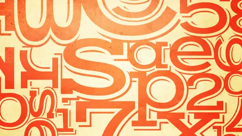
Breaking Down Typeface: Bodega Serif
Is there a basic form when people start designing and von is there a basic form that they start off with? H is and o's actually to get the basic proportion and shapes and wait thicknesses and whatnot. But then there is a test word that's not a real word that designers usual type designers usually do and it's it's hamburger ponds okay, you might see this, you might see it in my book, you might see it online somewhere in lower case sometimes they're using cap h h a m, b u r, g e f o n and sometimes there's an s v. Ok, the reason they used that word is because once they solved the design problems of all of those lower case characters, every other missing character contains parts of those characters. So they're solving all the design problems of a type face just with those characters. And so once they kind of nailed that, then they can draw everything else and everything is in there. Okay, so that's really the proper way again, these are things a lot of people wouldn't know, but if there i...
s a logic to it, you know, I will also tell you that people who start, um, designing typefaces often think the easiest typeface to design is a geometric sands I'm just going to use circles and straight edges and it'll be great I can't go wrong I'm telling you that is one of the most difficult kinds of type faces to draw properly because of all the optical issues that I'm telling you about nothing ever looks right until you make subtle adjustments to many of those characters okay even connecting around to a straight is really really difficult because connecting if you draw a circle and then you add a straight to it it usually looks like there's a bump there okay that was a little easier to fix in the days when typefaces were drawn using pan in a okay because you could do what you want it's a little more difficult in the digital world because as much as you think you have total control over digital points and all that stuff you don't have a cz much control it can only look so good compared to that's the old fashioned way how we looking here looking looking great and good yes yeah yeah this is great all right thank you. Okay. All right so this typeface is bodega serif so yes this is another sarah if but this is a more contemporary typeface I believe it was drawn in nineteen eighty nine it's a little funkier a little quirkier okay, so even though it's a sarah if it really is quite different from the gara mont okay and um so let's see? Okay the e I haven't taken out the yet let's see what people did most people did what I expect and I've seen mostly before, which is draw signed kind of a traditionally but with with you know, the horizontal stroke enclosing the counter can remember the counter is the enclosed negative space within a character so we have this one this one this one we don't need this here anymore this one this one okay most of them except for that or the majority have that kind of a shape. Why don't you think that shape is the correct solution whether you've done it or not? Because the shape of the sea okay it's sort of a part part of an answer, but anyone have a little more about that that really many horizontal zeman other than the syrups and I guess that that's exactly it you don't see that kind of a horizontal stroke or more importantly, you don't see that kind of a counter okay the counter whether you call it a teardrop counter whatever the counter this negative space the enclosed negative space inside this character resembles not perfectly but resembles a ll the others look here, here, here, here, here, here. Okay, so the one that a lot of people tend to draw really doesn't resemble anything in this typeface, okay, also, considering there were no alternates in this particular version, so in fact, if somebody was wanting to draw alternates to this and do an open type font and they made the kind of any that other people are doing even the angled one, which is kind of, you know, it's a little closer it's sort of I think this person sort of felt like is something different it's not shouldn't be just normal, but I don't not sure what it is if somebody were to draw this kind of ah character for this typeface they would need to create other characters that had that similar look to it so you can't have one carrying shouldn't in a well john typeface have one character that looks totally different from everything else. Okay, sometimes you do have kind of a symmetrical typeface designs, but you'll find those quirks appear in more than one character. Okay, well, you should so that it becomes a re occurring kind of a thing. Okay, so, um this one is the closest in concept I'm not saying it's perfect I don't expect perfection, but this person definitely got the right idea of imitating the other characters. This one also was close. I think so those those are the only two that kind of got the right idea for this typeface oh, I love that that's that's like a halfway between the one story and the two story g that's like it could have started like that and then they said oh maybe it's the other in this way I'm covered both ways okay? I don't know it's just I love watching it's entertaining and it's it's not to make fun of anyone it's really it's all about I can see somebody's thought process because I've done this so much looking at what people are doing anyway okay so let's look at the g um okay, so it's not a two story it's just you know, fifty fifty chance you get that right or wrong here's a case where somebody took a chance and said, well, I think it has a full you know, around the loop which actually impact wound up having okay but this typeface actually doesn't this one is is squared off and let's see what does this look like? It doesn't really look like I don't see where that would have come off with that, you know? So that looks like not even the pier the que um it's not you know, not a bit, not a bad concept. Obviously these two are not not making it this one and these two were kind kind of the closest this one imminent it is kind of ok, I know what this person did you might be here I don't know this person copied the bottom of the g okay, did somebody here do this okay it doesn't matter I mean it's just I mean you did a good like I said other people the creative live studio did these okay, so um that's actually a smart solution it's actually the closest solution so if we look at the you know what the at the actual alphabet you will see or actual typeface design you will see that the lower case g in the lower case g r are they the same or they little different they're a little different you think that's good or bad you think there's so close that should have been the same or do you think there's a reason why they're a little different there's gotta be a reason well, I think maybe it looks like a little bit longer on the g tillich balance the bowl okay, the keyword is balance it actually is not longer it looks longer looks because this aspect of the curve is fuller okay, where is this a little bit is a little bit more shallow. Okay if you mean low you mean longer this way mean wider. Okay, yeah it's slightly wider. You're absolutely right then the j so why, you know a lot of people when they're starting to design a typeface or even experience think I want to draw some characters and I'm just going to copy and paste those sections on everything and I got it made that's way it's really consistent not always important, ok, not always correct reason being this one is fuller and wider to balance, as you said, what's going on above it over here. Okay, um, this one is shallower because there's nothing else happening over here so it's more appropriate that it has a more conservative treatment of the de sender where this sort of chunkier wider treatment, if this had that it would look puny and probably look unbalanced. Okay, so once again, the logic of thinking copy and paste every syrup looks the same, every decent early should look the same. Not always true. You're going to find it in some typefaces, and it might be okay, but in a well designed, well thought out typeface, as in your own design using typography, every detail matters don't take any decision for granted, okay? Because, you know, even though we're spending a lot of time on the details of a typeface, you might be saying, or people won't be saying, well, how is that really going to help me in my design? The way it's going to help you is you're learning toe look at things extremely critically, and if you could see the details that we're talking about in a typeface, you're all of a sudden going to be able to see more details in all of your design everything is going to look different to you because you're training your eye as you would be training ah, muscle if you went to a tennis camp or if you went to a music camp or if you learning to play golf and you went, you know, whatever skill you can think of or fly fishing or something, the more you learn about it, the more you're able teo appreciate the vet, you know what makes something good? So learning to see the details is only going to help you in the big picture. Okay. Moving along. Where, uh, the k o k. Okay, no pun intended so here's. Okay, one, two capt. Case I told you, there's still not as many as I usually see. Um, this type fees is is a little bit different if we look at the actual k the key is to make it narrow onda also to capture the way contrast direction upper right lower left is the thin upper left lower right is the thick um, so some people didn't get that at all. Some people made kind of ah flared strokes, which you don't really see here. Um, I mean, see, this one got the concept is just the construction was wrong and and whatnot, so ah lot of people missed that. This one did get that aspect correctly in terms of the upper right being thin and that's thick and once again, aside from it being a cap k, we always get people who like to add curves the things and make him look pretty. And I always say, great looking kay, but not for this typeface, okay? So there's, nothing else in this typeface that has a curve diagonal, so that would not be appropriate, ok, the other aspect of the k is, wow, you guys said some strange things here is ok, I've seen it all that's, why you're here? No, listen, you know what? You have to have a sense of humor about all of this. I try to keep things light and entertaining, and I think you all know that because, you know, typography can be a very dry topic and I'll tell you working in this business, you can't take yourself so seriously, we have to be able to laugh at ourselves and have fun. So this is all men in the spirit of learning, I mean and that's how I teach and that's how, you know, I'm presenting everything to you because I'm the first one to laugh at myself trust me, all right, so let's, look at the sarah ifs let's look at the bottom of the k well let's look at all of the sarah's most of the sarah ifs either go in one direction or the other ok they don't go in both directions that's just one of the quirks of this typeface so it doesn't go on both sides it goes one or the other okay as you can see the same thing is happening here so some people let me see they a lot of them just went in the summer missing sarah's but a lot of them went in the wrong direction the main vertical stroke a lot of people did the sarah off to the right this one's off to the right this one's on both sides so as we just looked and noticed that none of them worked that way this one has no sarah ifs this one goes in the both directions both directions okay we're going to talk about thies too. Okay? Because the things that these two did right is that they both have one sided saref but they did walk like an egyptian you remember the old days okay? The actual sarah ifs on the k or or splayed like that how would you know? Okay, I'll tell you how would you know I wouldn't expect anybody to get it in twenty minutes or even people at home necessarily but there is a logic to it the single stroke characters in this typeface have bottom serves that go to the right so for instance the d a the f the I remember single stroke I the l okay any of the other characters that have more than two strokes are splayed to the outside right so for instance the bottom of the h the que hay the m and and the top of all these characters so if you were actually designing a typeface or you had a lot of time to really try to get this right that's how you would determine that bit of information okay and then now let's see we have two more are well you know the story with the are you khun see pretty much what people have done um br is very narrow it does have the single stroke off with the syrup off to the right it does have the little spur here so I mean you know most people didn't get it completely or they went in the wrong direction this one is nice sorta went in the wrong direction on the bottom so I don't think anybody did it off you know did the bottom serif off to the right but once again the thing to note is once again very very narrow our uh for the reason you will know I don't have to explain it it's all about the spacing and then finally another man those darn tease I did she giving us those teas okay so you could basically see the same train of thought which is I'll do a nail with a crossbar ok most people do that most people do that this one this one the bottom is is good okay this one you got the right idea this one went a little too far but at least you got the right idea but again it's once again the top is what's challenging with the t the top of the tea is not all that different in concept from the gara mont okay so once again the top of the tea is shorter than all the other s sending characters look att the tea in the l okay see how much shorter it is so even though it doesn't look like gary want it's not that different from gary mon gara mind has the curve here well this there's no curves here in these kinds of strokes so this has a diagonal gara mon has the curve here this has the curve a swell gara mon has the I'm sorry I keep saying gara mind then I mean by adoni okay so forgive me for that looking for the tony um the right side of the cross bar is wider than the left side in the back tony same thing here so even though this is a very different typeface so you go back and I can show you it's following the same rules so to speak okay, so here's the tea different looking same design principles okay question about the curve of the tea is it like the angle and the curve of it? It doesn't is it designed so that it leads up to like the top of an l or an h not really it's just next year maybe it's just designed to be visually pleasing and it's designed to be historically correct now I could say that and I'm not sure this is true, but I haven't fingered probably is ah lot of a lot of typefaces were initially designed with, um brushes things like that so I can imagine that this might have started off if you looked up the history of the tea and again I'm just guessing at this point I don't all right in that oh she's wrong about the history this is possibly how it could have evolved it could have evolved as a lower case character somebody could have had a chiseled brush and started that stroke and it made a point like that very possibly because all of these characters didn't start off looking like this they all evolved from different things so it's possible that's how that stroke evolved? It might have been a lot of reasons like that it could have been a technical, but I can't tell you for sure you know it was designed specifically to lead into another character it's just really supposed to be pleasing as a whole okay, okay any do we have any, uh, thoughts? Questions? You know, I think that we're good on the questions right now and we have people who are who were charming in with their explanation of possibilities with the tea but you know, it's all just kind of guessing right now, huh? Yeah. It's fine this fun stuff because it's this way had a question coming from tee it up for cc and they said single stroke b and f what determines the direction of the sarah? Any idea how that works when you're determining the direction of the sarah? Well, it depends on which type face you're if you're talking about the last one the bodega that's just a decide that's a design decision that was made by by by the designer so what you mean I don't know if what they mean the top, the bottom there's only room for it to go to the left so it would look kind of odd for the top to go in the other direction because although I guess it could possibly because here this goes to the right and this goes to the left, but I think that would look odd, okay, so some of it is just aesthetic decisions by the designer it's not all rules and regulations that makes sense yes, stylistic differences great got any other questions from from our students here? It has been helpful for you to do this exercise. Yeah, gonna look at everything gonna go out and you're gonna go oh, my god. Nothing looks the same and then you're gonna blame me, huh? Ok, good. That's what I like oh, it was saying that, um I even noticed that has similar characteristics to the tias faras that that cost line the f right? Yeah, you're right. You say you're already starting to notice that the right side is wider than the left and that's for the same reason that you have it's balancing off what's going here, if it were wider, it would hit all the characters and it would probably look like it was falling over backwards. So these are subtleties that air critically important to a well designed type face that you will take for granted. But that's, why it's important that you start to look the things a little bit more critically so you can determine what's the right type face what's the bedtime best typeface. What looks good in a headline you know, it's just opening your eyes to see everything. So I hope this was helpful to you and and I hope the people at home have participated in this is well so they could have the same experience
Class Materials
bonus material with purchase
bonus material with enrollment
Ratings and Reviews
a Creativelive Student
This course is packed full of the answers to questions I've had at the back of my mind for a long time. Ilene teaches with great clarity, her material is well organised, and she teaches at a good pace - with a bit of humor to lighten it up. I found it really useful.
a Creativelive Student
Ilene's courses on Typography are jam-packed with excellent information that will elevate the quality of your work in print. She knows what's current, but also what's important in long-time standards, and why. Just an incredible amount of information! you will enjoy watching, but you will want to purchase because of the sheer amount of useful content.
shiran
This course taught me very well about Typography. I knew almost nothing before taking it (I barely understood then the difference between Serif and Sans-Serif...). And now, I feel that I really understand a lot. It is a very good starter to learn when, how and why to use type. Plus, Ilene is a great teacher with a big sense of humor and a lot of experience in Typography. A must have for everyone who want to understand something about types and fonts.