Choose Color Palettes That Fit
Lesson 13 from: Illustrative Stylings: Lettering and More with PhotoshopChris Piascik
Choose Color Palettes That Fit
Lesson 13 from: Illustrative Stylings: Lettering and More with PhotoshopChris Piascik
Lessons
Class Introduction
01:42 2How to Set Up
04:20 3Letter Styles
07:21 4How to Start with Lettering Basic
04:37 5Create Style Through Shape & Word Connection
10:31 6How to Get Creative w/ Script Lettering
12:08 7Tighten Your Composition
17:00 8How to Work Hand Lettering Into an Existing Design
05:29Lesson Info
Choose Color Palettes That Fit
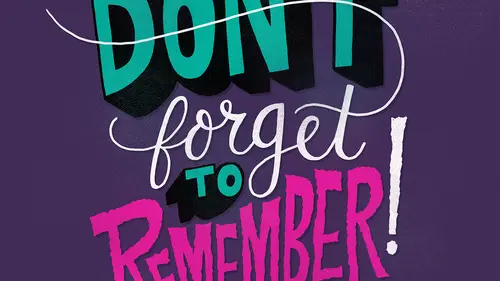
And then we're going to talk about choosing color palettes that fit when you go back to this keep up the good work drawing that I had done and to be honest color palettes or something that I struggle with um every single time I try to pick colors I'm like, oh this is so hard I don't know what to dio um and end up changing them a lot and I think that's fine you know you want to play around with colors the good thing with working digitally is you could do it as long as you want sometimes I just have to say you know what? This color palette is good I know I could change it a million more times but um I'm going to go with it so I personally like to use some punchy colors in my illustrations like loud, punchy type and I think the bright colors work well with it so I'm gonna go as long as possible and use this bright yellow color in the background. I always like to have a separate layer from my background so that way I can easily change the background color and not have to dio um with what's...
going on with the type itself, it gives us some flexibility if we end up needing to move the lettering around we can select that directly without dealing with the background so when I'm thinking about picking colors and I'm thinking about, um what I want to emphasize, I think, ok, well, I want, um, good work to be the kind of focal point in punch here, so, um, I think I'm gonna pick like, a bright blue because it's ah, you know, almost the compliment of the yellow, so that will really make it pop, so I'm gonna go ahead and you pick this science color go in, fill this in, and I think that blue looks really nice against the yellow really pops, because they're nearly opposites on the color spectrum. Um, I think I think I wantto change keep up the but leave the black don't really like the way this black is contrast ing against the blue and the yellow really makes it pop, so maybe we'll try a red for keep up, so yeah, I think these colors are looking pretty good together. I guess the decision is if I'm gonna keep, um, the in the same color, sometimes I might want to relate to, um, the good work because it's all kind of the same things I keep up the good work but don't necessarily like there's much. I think we can figure out another way that emphasize that a little better, so I'm gonna go back to the red for that, so I think, um for me, it's kind of a simple as getting a color palette that feels good. This feels pretty nice to me and I like the way it looks um at this point, I'm gonna add a little bit of, um a little bit of dark shadow underneath here toe pop these letters a little more like I showed you in the last round, but I'll do it again here and again, we can go ahead and pick ah light purple because that always works with shadows we go in, start a new layer and then run for that later on multiply and then I'm just gonna get my brush make sure I'm not on that noise brush anymore. I'm going to go back to my holds favorite to smooth to be forgotten I'm going up the size a little bit here, I'm just going to go in and draw over these ships. I'm going right over the edge here because I could just go in and believe that after it's easier to just get a smooth line, tom was gonna go in really like doing this because I I feel like it adds a little more dimension and field tow the illustration, it gives it a little more of a finish steel, and since we've got this crazy big dimensional element, I think this just adds a little more to it. I might go ahead and just make that whole area dark, so we're not having a little sliver of non shadow between them, okay? So, um, since we went over here instead of going in there, zooming in and trying to erase that I was going to click back on my lettering layer is the magic wand, so like the area outside of it, and then click back on my layer with a shadow isn't just delete that, and now we don't have any overlap, so if we zoom out, you can see that that really adds quite a bit of dimension to those letters, so I think I wantto we've got this little bit of space here on the sides. This is the time we're all like to do a new layer, maybe try little highlight saw switched to wait, I want it to be subtle, but maybe just give it a little bit of emphasis. Um, I'll go in and maybe just draw some little accent things it's fun to just decorate and stuff when you're doing him littering with us, the little details like this really kind of, um, make it feel like a more finished, polished he's so that's the super scientific way that I pick colors and I'm feeling pretty good about this piece I think this was turned out pretty solid.
Class Materials
bonus material with purchase
Ratings and Reviews
user-3a9318
This was very interesting. It would probably be best for beginners. It's always nice to see process. I feel very confident about jumping into lettering now.
a Creativelive Student
Love this class. I would like to see more like this class.