How to Get Creative w/ Script Lettering
Lesson 6 from: Illustrative Stylings: Lettering and More with PhotoshopChris Piascik
How to Get Creative w/ Script Lettering
Lesson 6 from: Illustrative Stylings: Lettering and More with PhotoshopChris Piascik
Lessons
Class Introduction
01:42 2How to Set Up
04:20 3Letter Styles
07:21 4How to Start with Lettering Basic
04:37 5Create Style Through Shape & Word Connection
10:31 6How to Get Creative w/ Script Lettering
12:08 7Tighten Your Composition
17:00 8How to Work Hand Lettering Into an Existing Design
05:29Lesson Info
How to Get Creative w/ Script Lettering
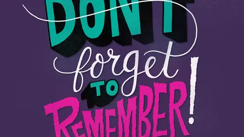
So now we're going toe talk about script lettering again in the bonus material there is a working file I've gone through this once before and I have that all set up where you can see the different layers for each one, so when I'm doing a script lettering treatment, I start the same way that I would the others where I just write down the word they don't worry about the script yet actually the word combination because we're doing two words here, so we're going toe illustrated the phrase stay weird, we're going to see a script to kind of tie these together and get a little bit more fun playful composition so the first thing I do is I just write it down normally in my handwriting this gives me an idea for a length of each word and then I'll just quickly write it down and script I do my ass is a little bit different I think the traditional cursive s is like some weird things like this, which is I don't like so I draw them kind of normal and then I just is the bottom counter thing. The thing...
about him littering is you khun break rules like that and have fun because that's what hand lettering is about it's your own personal touch on things one of the other things about hand lettering is when you're focusing so much on each letter and drawing you often think that words look like they're spelled wrong and you have to double check so I've been looking at this royal so but that's good we're ok so I work on this the same way that I would another category is I just keep trying it differently so what I'm doing script sometimes it's fun to have a little bit of ah curve so I might do a baseline like that to work from and then just follow that ism lettering and slowly go up and sometimes you can find ways to connect the letter so I might make a little loop at the top of this t uh yes to connect to the tea and then ah we'll make another baseline down here to make allow weird to follow that line so one of the things we're having to deal with is this the thunder on the why and then where the d comes up luckily these words air space kind of nicely so that we can kind of tuck that in we'll just have to figure this out and this sketch the r is really wide so we're gonna have to make sure we allow enough room here so I think that will just involved maybe making the w a little wider so I'm gonna turn the opacity of this layer down do new layer and then work on top of this because I think this is getting somewhere so to address that problem, I'm going to make this w a little bit here I'm going to the I now the heart doesn't have to be a cz wide so right off the bat, I'm saying that we can maybe connect these two here. Um I called them ligatures, but I think when you're using script it's probably not really look at your morning just a connection, and I'm thinking that maybe we can connect these here kind of similar to what we did with e stop doing that drawing, so maybe we can work out something like that, so I'm gonna turn off that other layer start with this one, running the capacity way down again and see if I can maybe bring this ass over on full of that down to the w since we're losing since we're taking this out, um, we don't have that line to connect to the tea, so I'm just gonna go ahead and use this as the connector and then just bring that to you a little closer. I think that he needs to come up a little bit, so when you're doing these multiple layers and kind of you can just keep fine tuning it, so I'm just going to get a straight line for the top of the day because I'm going to try to connect that with a y close, I think we're getting somewhere with this again, the benefit of photo shop is working in these layers we can keep doing this as long as we want to try to get it right and the fact that we're just working in this pencil pencil brush just we'll stay in loose and just china toe get the flow rate, sometimes I might go into the that layer and add some lines onto it just tow make sure my bass lines we're going the way I want them to be somebody do a new layer and just address where things were getting a little weird, no pun intended, so I see this w come down a little further on this. This is getting a little wonky, so I'm gonna try toe taking that up for this phrase, I'm probably going to keep starting with the bottom. We're just because the top word can kind of wrap around that and stay is a little shorter and easier. We only have this one a center to deal with someone trying to follow that line a little better, so I'm just kind of tracing this over and trying to adjust areas where it could be a little bitter, pushing this a little bit further so that I can start the why a little closer to the d a all right? So I think we're pretty good at this point for this um for the way the composition is set up so I think at this point I'm going to again turn the layer down, bring a new layer on top of that and then add some body to this so again well actually I'm gonna undo that so you could do command zito under your line way when I bring the brush size down a little bit when I tell you that my schedule's like to use a little bit of a smaller brush so that the lines can be a little tighter so again keep in mind when you're doing script that you want the down stroke to be wide in the upstroke to be thinner so this part being a stroke is going to be thinner and then we're gonna that enough the down stroke but we're also tapering a little bit for style so what we're doing is we're acknowledging the rules for how the lettering is but then we're also kind of bending them a little bit to work with the style of our hand lettering composition so don't be afraid to break the rules and experiment and have fun I'm gonna push this w out a little bit more to try to give it a little more weight so again fat on the down stroke center on the upstroke again don't worry too much about being perfect because we can always correct this only to go into the thinking part which will be in the next section when we talk enough our composition so sometimes I break the rules a little bit for readability like this why technically um when I'm coming down here this upstroke could be a little thinner but I usually like to carry that over a little bit into the curve just so we can get looking to find that a little more because you can see adding body really kind of makes us look better and feel more custom I also kind of cheat with the ease a little bit because I like toe fill out this bowl a little bit so we might need to adjust this a little bit I think weird is getting a little weird the way it's flowing I mean I could argue that it was intentional because the word is weird but yeah I think the need to tighten up this area a little bit but I think stay it's pretty good so well let's stay stay and fix weird weird so actually instead of drawing that over I'm going tio duplicate that later you can drag it to the there's a duplicate I kind of the bottom so now I have it twice I'm goingto take the bottom one bring the capacity down and then I'm just gonna use the race her toe toe get rid of the so weird weird's that I can do a tighter version of it and again you can control the eraser size what the brackets just as you can with the brushes so I think what we need to do here is pulled the w back a little more. There we go, yeah, that's falling a little better again, not trying to be perfect yet. Just going over these lines. So our sketches in a good place right now. So I think we can use this tax rate, are tightened up competition that will do in the next round.
Class Materials
bonus material with purchase
Ratings and Reviews
user-3a9318
This was very interesting. It would probably be best for beginners. It's always nice to see process. I feel very confident about jumping into lettering now.
a Creativelive Student
Love this class. I would like to see more like this class.