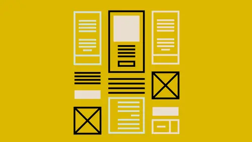
Lessons
Introduction to this Class
02:46 2What Are You Creating and What is its Purpose?
22:54 3Type and Typography
13:18 4Text Style and Placement in Your Layout
39:42 5Color Considerations
40:33 6Images and Graphics
19:09 7Basic Effects and Placeholders
19:39 8Masters and Automating Elements for Repeat Use
08:56Lesson Info
Type and Typography
Type and typography that just means fonts right? So everybody's familiar, I'm sure, with working with fonts. You'll hear fonts, you'll hear typeface. The terminology, I'm not going to get so into you know, what is proper, what is not. But basically, a font is actually that thing that you are actually printing with. So it's actually that file that you're putting on your computer or that you're downloading from somewhere, and that is the actual font. But what we're talking about when we choose a font for our document is actually a typeface, but I'm probably just gonna use font across the board any designers just plug your ears when I use the term incorrectly. It's just become more ubiquitous to just say font, so I'm gonna do that. So the type, the overall look and feel of type, it defines a tone and also a secondary message for your piece. You could have this beautiful thing and you could use a really awful, ugly font or a font that just didn't have a warmth to it I'm trying to tell ever...
ybody hey, come up to the mountains. I know it's cold and snowy and that's fun, but also at the end of the day, you wanna come to this lodge, and it's warm. Look how warm this photo is right? I don't know where this actual place is, but I have fallen in love with this place, and I wanna go to this place. It just looks inviting. There's snow, there's a bunch of places to sit and eat down here. I love it. Everything inside is all this wood. It's just this warm wood, so that's what you wanna also do with your font. You wanna say it's warm, and it's inviting, but maybe it's also adventurous. I'm going to jump over to InDesign really quick and zoom in pretty easily on this. With my text, I wanna say this is fun and also again I just have some text called out that says it's also interesting. I just wanna have some visual interest to it, and there are plenty of courses on typography and things you can read. You can go nuts. I'm gonna let you in on a secret though. I don't know many fonts from other fonts. I just don't always know, and I'm okay with that because I have friends that are really into it. They are typophiles. That is their job. My job is to make sure everything works together in a cohesive manner, and for me, it might take a while to find the font whereas my friends will be like I know what font I wanna use, but sometimes, I don't. I have to go looking for those fonts. That's what we need to come up with. Fonts that look good in here and also font pairing. Notice I have two different fonts in this particular text frame that's here and I also have some mixed fonts down here that are just different weights. These are actually two different fonts. Where do fonts come from, first of all? That's what we're gonna start with. Where do I get these fonts that I need to put inside my document? So I'm going to jump out to the Internet, and I'm gonna start with a couple of them. Google Fonts is a good place to start because Google Fonts are free. It's my favorite price, and they have a lot of options available, so you can jump out to there and you can add that and download them and I actually haven't used them a lot because I use Typekit which is another one I'm gonna show you in a minute. So that's a great place to get free fonts. Also, Font Squirrel is a great place to get free fonts that are available for commercial use and that's something you're gonna need to look into. I'm not gonna get into licensing and all that, but just be aware that using a font just because it's free, you might not be able to use it in a commercial product. If you're using it in a business setting or to make money or any type of commercial industry, you might not be able to use it, and every font site has font licensing issues on there, so you can read that. What's great about this Font Squirrel their free fonts that are here are all free for commercial use, so I always know I'm safe when I go to those. So Font Squirrel is one of them, Google Fonts, Font Brothers also has some commercial fonts available, so you can go into there and you have to scroll down to the free fonts. There's some really good ones in here. I like these. These are kind of It's gonna load really slow for me. There we go. They call this the, what is this, I forgot what they call it. It's like a selector. They have like an old jukebox where you can select the different fonts that you want. But all the ones that are here are free and also available for commercial use. If you are using any of the Adobe products so you have a Creative Cloud subscription, one of the things you get is a subscription to Adobe Typekit and what's great about that is that you can use them in your Adobe products and your non-Adobe products. You are able to download or to sync a hundred fonts at a time. Now, when you get close, as I'm getting dangerously close, I'm always right at 99 usually. You just unsync one and sync another one. It's easy as going to there, logging into your Adobe account if you have one, and finding a font that you like. In fact, I'm going to come over here to their main site, their main page, and they have it broken down into the types of fonts that are available and the type of typefaces. So we've got decorative, Serif, Sans Serif, Slabs And then I can look at each one and say okay, I'm looking for Serif font, great, I know I want Serif font, and now I have to scroll through and look at them all, and that's great if you have time to sit and look at all the fonts and then think about maybe how this works with another font that's there, but maybe you don't. Like for me, sometimes, I get overwhelmed looking at all these, and now, they've put them on separate pages. They used to have it one long scrolling page, and I liked that. I could actually look at them side by side, but the nice thing is I can type in notice I have Evergreen Lodge here. I can come in here, and I can change this to CreativeLive if I was redoing CreativeLive's logo or I'm doing something, and I decide they need a new font, I can come in here and type in what I actually need and see how that actually looks, and I can also play with the size just to kind of get an idea. But what I can't see is how that font looks with another font because I'm only viewing Serif fonts right now or only Sans Serif fonts. They're just set up alphabetically. I wanna actually be able to see how do those go together, and also, I want some suggestions because again, I'm font stupid sometimes. I just wanna look at it and go I like the way those fonts look together, and I like to do that when I'm just looking at stuff online. I will just take a screenshot and say I just really like the way those two look together. I always tell people my font knowledge is sort of like my classical music knowledge. I love classical music. I can tell the difference between, you know, Copland and Mozart because there's a couple hundred years separating them, but I can't tell you a lot of the Baroque composers between them, but I know what I like when I hear it. Same thing with fonts. I know what I like when I see it, but I couldn't just off the top of my head, you know what looks really good together? These two fonts, right? Because I can't do that. So for me, I use font pairing sites and I also just keep samples. So, some of the places that we can look at. There's this one called I don't know, Typio, I'm not sure how we pronounce that, but it's just gonna show you some of the different samples, so when you first go to it, because there are actually ads being served in here, and then these are samples of websites it looks like you just hit a page full of ads so it's a little disconcerting at first until you realize that's an ad. This is not an ad. I can come in here and say I like the way these two look together. If you notice, we've got a Sans Serif font and a Serif font. Actually, is that a Serif font? It is a Serif font. It's hard to tell. It tells me over here what the two fonts are that are being used, and these, I believe, are all coming from I think these are Typekit fonts? Maybe not. I can't remember. Different pairing sites might only show fonts from a certain site or not, but this is nice because we just have a lot of online samples, so I can go through and say I like the way these two look together. This is the same, actually they are different fonts. It tells you they're both italic, but they're different fonts. You come over here, and it tells you where they are. You can click on that and actually go out to wherever that is being served from. It shows you where it is, and how to get those fonts as well so that's a great way to look at that. There's one called Font Pair, fontpair.co. This is the Google Fonts. This will show you how Google Fonts are paired together, and the great thing, I like this across the top. Are you looking for a Sans Serif Serif match? Maybe you want something with cursive and Sans Serif? Cursive and Serif? You can click on that and just see those particular samples, and then it tells you where to download it from and what the fonts are. So again, it's just a great way to look at those. Just My Type does the same thing, smaller selection of type. But here's probably my favorite. This is called Type Connection. It's like the dating game for fonts, and it just basically gets you to think about how to pair fonts together. It says play. You basically choose one of these characters to start with. Maybe we start with Archer, and then it basically talks about how are you pairing these? Is it gonna be within the same family? So when you choose a font, you might want a font that has a lot of different type faces. It's got a bold, an italic, a bold italic, condensed, extended, maybe five different weights of bold. Sometimes you'll see numbers. 500, 700, 900, and those are weights, or there's extra light and light and book and bold. If you have many options when you get a font, then you have all those pairings sort of built in because you can just use that same typeface and use the different fonts available for that or things that are similar, things that are completely different, or maybe they have a shared history. So I'm going to do Explore the Past. You just sort of choose what goes well with that, so I don't know, I like this Archer, I like the way Bryant looks, so come over to Bryant. Then, you basically say, okay, I wanna see the differences and the similarities between the two. Just click in this little box here, and you can see the two of them on top of each other. It just kind of gives you, you know, you don't need to know why they look good. Do those things look good together? Also, then you can click send them on a date. This is my favorite part about this. Send them on a date. It's going to tell you whether or not you've made a good match. Whether those would look good together or not. Then it kind of gives you a sample of that as well. I like that because I can just play things together and go, oh and if it says it didn't go well together, I can realize okay see I'm glad I did that and didn't put it in my design and then realize it doesn't look good together afterwards. Maybe it looks good together to you though, and if it looks good to you and your client, you know, design is very subjective. Anyway, those are some of the places that I like to go to get my fonts and also pair up my fonts. The other thing we wanna keep in mind like I said is to choose a font that has several options available to it. So if I'm working in type and I choose something like Museo in this case. I'm going to scroll down to Museo here and again, we're gonna get into just how we put the fonts in here in a minute, but if I look at Museo, I can see that Museo Sans, I have three different weights available so I can see what those look like there. If I do Museo Slab, I have several weights available to me as well. That's something that when I'm purchasing a font or downloading it or syncing it from Typekit, I keep in mind when I do that. If we're in Typekit, it'll actually tell you how many fonts are in that particular family that are here. This one, for instance, I have 14 of them synced. There's nine more that are available, so there's 25 available in that particular family, so I know that I would have stuff for headlines, subheads, body texts, captions. Again, think about what your pieces that you're creating and do you need all that? If you're making a flyer, it mostly has four big bold headers on it, you might only need a font that has one typeface or maybe it has two: regular and bold. Again, keep that in mind. Then, you're either gonna sync them or download them, and it's gonna work differently across the board depending on where you're getting them from. The only other thing I would suggest is that if you have a choice of font types, look for open type fonts. Open type fonts just have so much more available inside that font. There's all the special characters and everything like that, so keep that in mind as well when you're shopping for fonts. Alright, so we've got some fonts. We've either synced them, we've downloaded them, and we're ready to go, or we're working with the ones that are already on our computer, and that's okay too. Now what do we do with this particular We've got the fonts, I know which ones I wanna use. In this case, I'm using Grafolita Script, and I'm also using Museo Slab. This is the Grafolita.
Ratings and Reviews
Trang Le
I'm a graphic designer and this is a really a nice back to basics course. Nothing can replace the quality of explanation as demonstrated by Erica Gamet. However, I can see that certain steps are probably too fast for beginners.
trevor hutchinson
Really good explanations.I know powerpoint and indesign well but Erica working with all applications the same time gave me a different insight into how to utilise each of their resources. Great course.
Student Work
Related Classes
Design Projects