Lessons
Day 1
1Course Introduction
14:58 2Shift your Thinking
21:17 3Pre-Consultations
30:15 4Policies and Liabilties
17:30 5Style & Creativity
45:51 6The Creative Process
26:53 7Designing an Image Session
45:59Composition and Style
15:40 9Safety and Newborn Psychology
18:01 10Shoot: Lila - Taco and Sideline Poses
29:49 11Shoot: Lila - Bowl and Tushy Up
28:17 12Shoot: Maceo - Nighty Night
18:05 13The Layered Ingredient Theory
15:45 145 Steps to Design
19:41 15Shoot: Marion - Sensitive Babies Part 1
30:24 16Shoot: Marion - Sensitive Babies Part 2
17:04 17Shoot: Mason Fussy Babies
21:54 18Shoot: Israella and Parents
30:54 19Shoot: Mason and Parents
10:37 20Set-Up for Composite Shoot
24:51 21Shoot: Mother Child Composite
25:50 22Shoot: Composite Continued
17:26 23Basic Photoshop Concepts
22:32 24Post Process: Day One Images
27:17 25Post Process: Day Two Images
27:42 26Starting to Composite
26:04 27Composite Shoot Images
13:12 28Step by Step Composite Images
39:43 29Starting to Paint Images
19:33 30Corel Painterx3 Demo
18:35 31Live Painting Demo
27:56 32Branding is your Business's Personality
23:56 33Marketing is Strategic
25:06 34Vendor Kits and Social Media
46:04 35Define your Style
30:12 36Style and Purpose
19:17 37Top 10 Things to Let Go Of
14:27 38Posing Techniques
08:52Day 2
Day 3
Lesson Info
Designing an Image Session
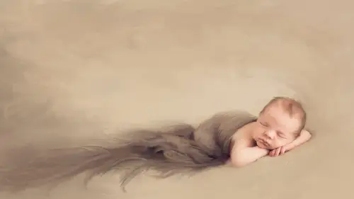
now we're going to talk about safety and design I know the two are kind of different but I wouldn't be a good newborn instructor if I didn't touch on safety so I know it's kind of the boring ho hum part of of newborn photography but it's really important there's a few things in there that may be new to you that I'd like to share with you about safety and then we're going to talk heavily about design okay so designing an image how you uh create a new image you know using color and texture and light composition and all those things that were used to as photographer seeing light but there's so much more to an image than just light so we're gonna talk about all of that as we go through here so how to capture emotion in your newborn images is going to be really important and we could do that or at least we can help ourselves do that by using color composition and design okay we're going to learn lighting techniques and planning for artistic set design color and its impact texture I'm huge o...
n texture I love texture it just adds so much interest to an image especially with a baby smooth skin we're going to talk about composition and why it helps to find the art and sell the emotion I'm going to tell you some things about composition that I may be new to you that offer meaning into your images and you know it's kind of my personal opinion and not always it's not scientific prove in fact but it'll be fun to talk about and learn we're going to talk about handling baby sleeping sleepy or awake soothing techniques that are sure fire that will pretty much help any baby you want them to help on then talking parents through the process through for genuine expression okay so we sell emotion it's a simple as that the emotion of a mother and child is extra incredibly intense and of course honing in on that with dad's as well is powerful stuff she's hormonal she's just had a baby those hormones air trying to stabilize and for most women it's it's a very positive time a cz you guys heard earlier it was positive for me but it was also very conflicting so tapping into that emotion is important and now that I am madly in love with my child and over my issues that I had after giving birth these images are the most important to me because it was such a life changing experience and having record of that beginning is highly important and it's a huge responsibility as newborn photographers just like a wedding uh newborn photography is very it has some pressure associated with it we've got to get it right and you don't want to screw anybody's new morn images up you know I mean it's kind of like I'm speaking to you as wedding photographers but I'm I am kind of but I'm newborn should be treated with that kind of reverence so mom is in a heightened state of emotion and we need to tap into that it is proven that eighty percent parent images with parents are eighty percent more likely to sell than an image of baby alone it's the parents who feel and it's your job to personify those feelings into an image so why don't we do it why don't we put parents into images it's hard you got extra hands an extra feet and expression and noses and lips and faces and all these things that have to go into a newborn image with a parent it's an extra layer and it requires seeing the pose but it also offers more opportunity for emotion it provides a scale of reference a baby in a bucket is just a baby in a bucket unless you know how big that bucket is you really don't know how big that baby is but you put baby in mama's arms just like this and that little munchkin fits right here twenty years later she's not going to have changed much but that baby will have and that will give her that emotion of what it felt like to have something so small it's actually quite unfair that the infant stages so short because it's so lovely and there's so many beautiful things about having an infant and there just so you just want to smell him and squeeze him in a door um and they change so fast maybe that's why I'm becoming something it's just like yeah that's why I have so many babies I just want to keep her living that ah you're a better person than me and I'm a one and done kind of girl I can't do it more than that so I just have so much respect for people who do it more than once so you know but it's scary to put all of that into an image and especially when you bring things like siblings into the picture that could be incredibly daunting my camera gear is very simple for shooting newborns I have a ninety eight hundred I used tiffany's dd d seven hundred as back up I have the fifty millimeter one point for ji lens eighty five millimeter one point for ji lens and my one oh five two point eight macro that's all use for babies that's it you don't need much more I'm a fixed prime limbs girl they offer the sharpness in the book or that I love they allow me to get down to those really why wide open f stops which I chair so much in my own work um so those fixed lenses you know the twenty four toe to seventy lenses with the two point eight are nice and they do they allow youto know zoom in and out but for me that fixed lens creates more of an artistic field to the work at least to my work and it's my style so equipment really you don't need a ton of equipment you know I have really good solid equipment I strongly encourage you to buy once you know I bought a bunch of lenses before I figured out which one was right and then sold the rest so if you can by once and if you're worried about what to buy rent first there's a lot of great length lens rentals places that will rent you a lens for a week we can ship it to you and you should get back it's super easy and you contest out equipment to see what you like and what you don't I I was thinking about upgrading with eight hundred tried it out first you know when they finally did I'm having a few regrets on that the file sizes air huge with the eight hundred on dit slows down our system a lot our computers just excuse to upgrade computers but you no more money out the door uh but the files are large and it drives tiffany a little crazy sometimes with e but what it has done is it's really reduced the number of images we shoot I am shooting a max I think tiffany told me the day about one hundred fifty images of session total and we show thirty to forty for a platinum session okay that's not a town of images it's about right I wish I could scale it down even more I want to get down to like a hundred just shooting one hundred and annihilating half of those for more than half of those for to show so the large file size forced us to shoot less we can't put that many images on her computer because it will fit there big files and that's the issue of the eight hundred however for compositing the eight hundred it's magnificent because I can photograph an element far away and it's such a huge file that I can extract that element off of the image and put it into a d seven hundred file and I still have plenty of room to work with as faras pixels go so the fact that the eight hundred files are so large is wonderful for composite because you can crop in so much okay so there's advantages and disadvantages to having each camera I really suggest that you do your research rent find out what works for you I'm sure some of you have gear already that you love and if that's the case you need to keep it don't change just because someone else uses something different it's really important to keep the tools that you love painters have different russia and some feel better in their hands and others and it's very important to you discover your own process and beetroot okay so if your gear fits you and it works right keep using it okay before we get into safety we're going to talk about designing an image alighting okay what makes good lighting for newborn babies what do you think what kind of light soft light look atyou kaiser family lovett softness babies air soft sui impure harsh high contrast ratio lighting is not going to be is not going to evoke feelings of softness is it if that's the message that you want to send with your art do it but it's kind of one of the reasons I stopped shooting on black remember how like in the early two thousand shooting a newborn on black was like the it thing everybody loved it I did it too and there's people out there who still do it's and it's beautiful when it's done right but to me it was a very harsh contrast thing babies are soft sweet and pure and so photographing them on black made it seemed dark heavy and high contrast and very dramatic if you're going for that drama it's great but it almost became overused look it was overdone and so now I like don't even have own black anymore in my studio because I think it's too intense and too harsh and I hate it when my parents were black like I I try to steer I'd rather do charcoal or grey then black because it's just especially on a caucasian family it's so high contrast that it's almost unnatural but that that I say that because light plays a big role in that creating softness is what will really help your images have that ethereal heavenly like this baby just came down from the divine thing and then is beautiful and innocent and sweet and pure okay and that's the feeling I want to bring forth in my images these are all tools creative tools light is a creative tool it's how you paint okay so you need to decide of tara for what emotion you want to convey with your lighting and I think that's the big take home message I want you to get from this nothing is wrong how you light is not wrong it's just what message do you want to send and understand that if you're going to use a high contrast light on a baby why are you doing it do you know what I'm saying don't just because it's all you know how to dio do it because you want you're going for that high impact high drama look with high contrast that requires that type of lighting okay but most part my setup for everyday stuff is pretty much the same all the time it's priority boring it's not very exciting I used mainly continuous light ninety two ninety nine percent of our time in eighty five is actually low of our newborns are photographed this way I used the westcott td six lights and all of this by the way is in the resource is guide if you enroll in the class we have a full resource is list of everything pretty much that I use in my studio so you can find all that there um the westcott td six is a continuous daylight balanced light is not a strobe it is always on what you see is what you get which is really nice because then you're not guessing your light you see it and also you don't have to deal with like radio poppers or pocket wizards or triggers or anything like that it's like less equipment to carry um it's also very easy on the babies it's not flash going off their face and you know there's been research done it the strobe does not hurt a baby I mean it would have to go off like multiple times it's the section to lex trigger any mind or you know they was was the sphere for like seizures for awhile that like there would the strobes would cause mental issues in a child that's not true it doesn't happen you're not firing fast enough for that to occur but the soft lights just make for a more calm environment in my opinion without the stroke is going off I use a seventy two inch starfish soft box right there on the picture you see that's a four by six I use a four by six occasionally I also use it as a strip light which seems it's crazy but you're going to see my lighting set up here in the next segment and it's pretty much what I use all the time it's totally jimmy rigged I am not a technically perfect lighter but it works that's all that matters right so um the seventy two inch starfish here I'm going to be using a westcott parabolic umbrella which is a seven huge seven foot umbrella so I probably won't need any reflectors to soften my life because the light source is so huge but at home I have a seventy two inch starfish so I have to use a tall reflector to help soften the contrast ratio that that starfish is from larson unfortunately larson went out of business this year so I can't get that anymore so I'm going to have to come up with another solution when that light dies or that modifier dice but in the meantime we use it so you can do strobes when I want to stress to you is if you are going to do strobes and you want that boca or that beautiful soft out of focus background is it bokor boca doesn't mean no I don't know bo cub okay okay like a bouquet flowers sounds much prettier but boka whatever I never know how to pronounce that word somebody can tell me that great andi I get it right I don't think it matters how you pronounce that someone's gonna be oh you know anyway his point the thing if you want that boca you have to have a low powered strobe why so you can open up so you can open up what does she mean by that open up stop okay you guys are all advance you what you're doing okay I'm kind of for the benefit of everybody because there's beginners all the way up to extreme advance people washing this so for those of you our advanced just bear with me for a second opening up your f stop your flash you can only sink it a certain sort of shutter speed right yeah state want to fiftieth no matter what you can't move that so the only parameters you have our aperture the distance of your light and this and the power of your life correct there's only so low you can go the weaker the light better so I used for a long time alien before hundreds there cheap there two hundred bucks a pop you can throw him on the floor that is practically indestructible you can't take him anywhere you want to go and you can power them down low enough that you can shoot it f too in the studio at one to fiftieth of a second so that's pretty powerful stuff right there all of a sudden I can shoot a studio with strobe and open up to get that pretty out of focus background so that's why would shoot with low powered strokes if you have a high powered stroke that's going to force you to shoot faa because you can't change the shutter speed you can increase your speed otherwise the sink you'll get that black line across your frame you know and so if you need I'll get you in a second if if you need to you know less light it's moving the light away but what does that do to your light source it hardens it the further away light sources the harder it isthe right the closer it is to your subject the softer tous so you're compensating for something you don't necessarily want to compensate for so if you could bring your light power down then all of a sudden you khun stay at that open aperture stay at that shutter speed and you're good and still get that nice out of focus background yeah allie say you have an eight hundred is there anything you can put over it like a neutral density you could you could defuse it even more the light source with the fusion panels and stuff like that which is a great idea in fact if you don't have anything else that's what I would recommend doing and that we kind of stopped down your light a little bit too give it less power and try moving it a little bit of a distance away it's not the end of the world to move it away a little bit you don't want to move it's so far away that the shadows start becoming you know not so not so nice yeah power on the t v six is theirs multiple bulls forty five watch about eighty five what I use the eighty five eighty five yes I used the eighty five watts I was using the fifty I have actually been having some issues with focus lately and I'm not sure if it's my camera it's me you know how you just doors on my shoulder going hold still doing on it is the holden super still you look kind of still camera shake what the heck's going on so I've had some issues so I upped my power to the eighty five what bulls that seems to I hoped so the tt sixes I'm shooting at eight hundred two thousand I s so sometimes when I'm cousin of my family's I want to shoot it like f or a five so I get everybody focus my plane of focus is deeper okay and that allows me to get everybody and focus with the family image so I have to compensate for that by upping my eyes so right so um all but my eyes so up to that range and I think sometimes that's what's giving me a little bit it's sos like like most people don't even notice that it's slightly out of focus but me and being my particular self I know it's there yeah ebony uh light source would you recommend for on location because I know it gets really hot and yeah packing and traveling yeah um honestly it's a pain in the booty to travel with lights no matter what it really is the alien bees are super easy to travel with is in fact if I was going to travel it's ah it's a six on one side half a dozen on the other the alien b is easy to travel with its lightweight you still got to bring your awkward clumsy modifier no matter where you go on dh then you have to carry pocket wizards or radio popper just feeling about to trigger your flashes so that's extra equipment that you have to bring so but the same time the alien bees are lighter so I'd probably bring alien bees with me on location you strobes the tt sixes are great for studio work they are a little heavy on the bulbs are big the other thing with the fluorescent bulbs is they have mercury in them so you don't want them to break period you do not want a cracked fluorescent bulb anywhere in your child so that's the one kind of danger with the with the tv sixes is that it's okay I mean if even if the bulb just cracked you're okay but you don't want that well breaking and shattering on the floor okay so it's probably one reason to take a strobe versus if you're traveling with it because the risk of breakage is much higher with when you're moving it around so it's probably why would stick to strips that answer your question okay okay so let's get into designing an image color texture composition and style and we're going to talk a lot about style on saturday on the very last segment and finding your own personal style ok which is really fun exercise in the workbook that is available on my facebook page there is a whole questionnaire about how to discover your own sense of style sometime between now and saturday I want you guys to do that exercise dig deep think hard okay really open yourself up and answer the questions honestly and it will help you discover who you are came well howyou want to photograph for images and then once you find that direction you need to stick with it fully so here we're going to talk about the technical aspects the layers of what that style can be okay so then you'll be able to take those layers and incorporated into what your inner voices saying and apply that to your image is okay okay color what makes good color for newborns it's a trick question I was like what hour would you kind of she's kind of right what do you think makes good color I think the key is not a story what color you use as much as what combination of colors like you don't want to use a bright orange and a bright pink in a bright blue because then you're gonna lose the baby but if you use one pop of a bright color you're ok because the baby is still the star of the chefs and even that one pop could be too much have to be really careful with color if that's your style and what you love and you're all about color that's fantastic and you have to go for that there's lots of photographers out there who are very bright and fun and colorful on dh that's their their their aesthetic okay I want you doing exercise everybody at home can do this too I want you to stare at the red triangle at the black dot in the middle do not veer away for twenty seconds I'll get out of the way look at that triangle for twenty seconds I'll let you know when you can stop when you stop you're gonna look over immediately at the other white dot on the right side of the frame and you're gonna tell me what you say but not yet keep staring keep staring don't stop looking keep staring just a little bit longer longer okay now look at the black dot on the other side do you see it if the triangle isn't it what color is it green blue green blue isn't that weird red and green are complementary colors on the color wheel your brain wants harmonious color it will find it so that weird it's holy weird it's kind of cool though isn't it so everyone will see the same color some variation of green or blue it's color is extremely powerful to our minds so if you change the color of the triangle but it do has changed to the other complimentary color yeah isn't that weird the color real so if I change it to purple you would see a yellow so you would say yellow triangle on the other side or yellow orange something in that family your brain wants harmonious color so it'll try to compensate color is a beautiful thing it has so much power and how we do things that has so much meaning and our brains interpret color so magnificently so we're going to learn a little bit about color okay I'm not an expert at color there's on the resources guy there's a couple of books that I recommend reading betty edwards is a wonderful artist she wrote the book color and it's a color about mixing paint and you know I love to paint so you guys I would pick a book on color that for painters but talks about mixing color but it's going to teach you a lot about the color intensity and value of a hue intensity in value in color and all those things conf actor into your newborn work as well you know regardless of when you're looking at a rainbow of scarves of colors each one of those colors has a hugh and an intensity in a value okay and you need to match up those values and intensities along with keeping the color harmony intact in your image and even just by focusing on color alone your work will exponentially improve because no one knows why they like it but their brains know think about the exercise I just did for you so if your clients are looking at your images and there's harmony in the color they're gonna love it there's something in their mind subconsciously is going to draw them in and invoke a feeling so I want to teach you about color so you can have the power to harness that with knowledge this color goes with this one this one does not this value in intensity will work with this one and not with this one okay so there are a lot of different harmonies kind of known harmonies in the color world and you could get it that's like the science of colors a super intense you could go nuts with this but I'm kind of kind of keep it basics there's complimentary analogous try attic monochromatic there's neutral warm cool colors all that stuff ok some of these air simple some of these air more complex so let's start studying them first of all what are neutral colors yeah they're grounding colors they keep things grounded they keep color from going out of control okay they help rein rein in the horse okay what are warm colors reds yellows oranges things that have a very warm huge than cannot brown be a warm color yes brown has a lot of orange and red in it when you look at this floor what color isn't it yellows why it's very light okay has a very high value okay so when you look at the light that everything your props your scars or whatever you used with a baby what's the real color there it's wood oh must be brown that's not brown is it that's yellow has a yellow soft peachy tone to it beige it's all kinds of stuff going on there right and what you'll notice is when you put other colors next to it it changes ever notice that like it's crazy how you can put a blue next to this all suddenly looked really yellow but you put a white next to it and it looks much softer okay so how color sitting next to one another is also very influential on the meaning in the image okay so let's study a little bit of these uh color harmonies air so to speak there is complimentary opposite on the color wheel inside your little bag you will notice that you have a color wheel okay I gave you all color wheel so it's good for you to study this and get to know the color wheel very well okay it will help you and I know you think oh my gosh what I need this for trust me you will be in a session and you'll be going I really like that read I have no idea what to pair it with I could be safe and just go with the brown or I could totally get fun and start combining with green and see what happens what's its complement again is it green rush you're going with okay that color wheel will come in handy and I strongly suggest those of you out there in the online world if you can get ahold of a color wheel there's plenty on the internet so go go grab him on the internet be able teo to see what I'm talking about and you also notice that I have different hues of of the colors in here so you know you have more of a aplomb than an orchid than a fuchsia on the purple line up here you have a lemon and a mustard so we have different ranges of yellow and purple okay so those values and an intensities all playing a part in each you that urine so the hue is the actual color okay so like yellow hugh okay it's intensity is its kromah are how bright it this okay so like um let's see can I put you guys in the hot seat I need um I hope this is okay I hope lacey's not freaking out right now um I need emily and I need kelly come on up here and kill me go ahead and take your blue shirt off but I want it I want the pink you can't do it no no no it's okay you got my gun just leave it there well so we can see the pink from here okay so these air two colors of peak right okay which one has a higher intensity yes it's brighter it's got more chroma to it okay there's more color in their value is how much grey or black or white is in the color her pink is a deeper value than hers think about think about how color would translate in black and white take a picture of them and put it in black and white this would be a higher value jimmy yes value sometimes I get teo um then hers because it would be this would be darker darker pink than this in a black and white image right so why would you combine these two picks an image you could maybe kind of pretty and add a third pick in there you can't get this monochromatic scheme going on right now but if I paired say this pink with a really dull green olive green the value in this would be too high for the green right so like my gray actually works pretty well let's bring up somebody who else has good color on you you're all around dark colors oh let's bring up tracy come here my darling tracy you're so pretty she has a bright pinks fuchsia scarf on right over here look at her pretty scarf okay so we have three different pinks here going on right she's got like almost fuchsia pink going on okay so this has a deep rich chroma pink right is this a high value or low value low value there's more black in it than white so if you photographed it in black and white it would be a deeper richer darker tone think of the zone system in the scale one through ten member ansel adams own system for those of you who are more of a more advanced photographer the different shades of gray all the way up to white okay so if you took a black and white picture obviously nj here would be the brightest thing here right and then it would go to kelly and that it would go to tracy's pinks car so I'm just trying to get you to see the different the difference between value and intensity the humans the hue it's pink or whatever you know and the intensity is how bright the color is okay he's like how much color how much pink is in there this has a high intensity pink this is a low intensity pig but a high value does that make sense you guys is it is it coming together he was hossam models thank you thanks guys but I think that helps you see how color has more characteristics than just its color okay so by learning those things and really understanding and how to combine them it's going to make your image is more powerful yeah anchor used like skin color really light maybe dark pink yellowish I mean it seems like that would be a big factor and influencing what where you might go with that it's a huge factor it's a huge factor and you hit the nail right on hand you're actually jumping way ahead of me stephen sorry that's okay no I'm I'm glad you did because you're thinking it means you're thinking and you're totally thinking along the right track yes I am going to photograph a session way differently with a baby that has ebony's skin tone gorgeous and brown and delicious vs patty who has a little bit she's got akash occasion skin tone but it's more of a kind of an olive ease soft brown it's not like as fair is m j I'm saying so and m j has a lot of pink in her skin tone so all these factors come into play so when somebody comes up to you and joan has this lovely pink tone to her skin as well so when somebody comes up to a session you look at the mego whose skin tones what we got here hair color what we got here those are the colors you can't change so you've gotta work with him but it's nice because it puts you in that creative parameter that you can then move from you don't have to be like overwhelmed with choose anything it gives you a direction okay which is really nice alright so complimentary our colors opposite each other on the color wheel okay split complimentary is one of my favorite it's a it's a little bit more of a complex color harmony but split complimentary means you take a base color and then go opposite the color wheel and split across so but between the primary and secondary colors okay so this kind of yellow green and the yellow orange split across the reason it harmonizes because yellow is the color that kind of marries everything on this side set makes sense if you went too far over here it would be funky it would not be a good color schematic does that make sense so by looking at your color even go okay the nurseries purple are the nurseries blue let's see here the nursery's blue so I can either go orange which with orange wood floors it's not gorgeous I mean think about the color harmony right there if you have a blue nursery and you're gonna use a blue scarf with your baby and you have a floor that has or in rich orangewood tones to it awesome color comment comment harmony but I also want you to take note that complementary colors vibrate against each other they they they're very vibrant okay so a soft sweetness and pure baby ah complimentary color scheme it isn't going to work all the time because it's so vibrant that you don't see the baby so what I do is I bring down the intensity and value of the colors I love those muted tones there's just soft gray pinks and brown greens you know the ones that are just the neutrals have brought them down those still give me my color harmony with the split complimentary but imagine all these colors just rude tone down then almost certainly had this neat color harmony but in a in an intensity and value scale that fits the baby and fits the mood you're trying to convey does that make sense you see how color can be so powerful like all of a sudden your world's going to open up and you're gonna be thinking about colors when you pick things we're going to be just fine except you guys or get to do this tomorrow morning when we do the bucket images with the baby you're gonna tell me what to shoot we're going design a set together okay so split complimentary is opposite the color wheel with a split analogous colors or anything close together on the color wheel this is the safest thing to do you're stuck go analogous it'll be easy or monochromatic for that matter because then the color won't be taken away from the baby it will just add two and the baby will still be the focus of the image okay so analogous are those colors that are right next to each other and look hella real so and it could be anywhere along the wheel as long as they share the same main color they share the same main primary or secondary does that make sense so you could go either side of yellow either side of orange either side of red does that make sense that's a analogous color scheme try attic try attic is truly three it's the triangle okay so try attic means basically any color that's on the third so green orange and purple actually really need color harmony it's beautiful red yellow and blue the primaries that's a tragic c'mon that's been that's been a color harmony that you guys all know right that's like the one that we all learn and in high school is about color photography and all that we learn that stuff there this is my favorite color wheel and I'm just I think you can see why it's technically not a true it's kind of a true color when I really it's got white in there which is not technically yeah but I just what are the reason I show it is because it's it's so it melds so beautifully with skin whether it be an adult or a baby and it allows me to bring in my neutrals that I love so much and create color images without being just dead brown brown or white you know I mean or grey so by taking these muted tones and starting off with skin which is naturally muted what color skin what cars my skin it's hard to define his it what color is my skin bay gpt red yellow if you go into photoshopping we'll do that tomorrow afternoon with some of the images we shoot and you work with a selective color mode you'll see there's tons of red magenta in the red channel in and almost all skin okay so there is a lot of red and skin believe it or not so there's defining these color it's not a bright color though it's hard to define it can't say oh her skin yellow or her skin's white were oh her skin's dark or black or brown or whatever you get okay my skin's brown I have brown skin so to steven's sort is ebony I mean we all dio really it's some shade of brown right so but it's muted it's toned down ok so how we combine that with colors and our newborn images to me I want that softness that lightness that ethereal nous in a newborn image so I use colors that tend to be a little muted so here's a little exercise discover the art world to help you find your color your sense of what you love for color this is an exercise that my painting mentor mentor heather chin taught me so I will give her full credit for this and it's a wonderful exercise by the way this is stanko cortex painting down here in the lower right I just love it it's just beautiful as you know I stole from her the image on the upper right isn't me stealing from her do you see that okay so it's still an original work of fine but I totally stole it okay I stole the idea I have this fascination with the wind I think the wind is like the most ethereal innocent and most dramatic thing I just love the wind and the fog as you can probably tell so I am drawn to images with muted tones and the sense of wispy nous and so when I am asked you to do is go to google our project or any you know any pinterest or anything like that and search fine art and just pick images that give you that little feeling that's a real word no I'm serious give you that little jolt of like I love that I love that I'd put that on my wall and just put in your little swipe file okay and what you'll notice is a theme do you see my theme you can easily tell what I'm drawn to write wispy nous wind muted tones pastels neutrals the sense of ethereal nous right you could see that okay then so google our project is a glade is a great place to do that it's all the museums of the world as I told you earlier you confined and make boards on google our project so you could like go in and make little folders of art you love which is another great place to do it so go do that and then take one of the paintings this is wind from the sea by andr wife he's one of my favorite painters he's an american painter from the twenty century and so take a section of the painting I took this little square right here the goal is to pull us many colors out of it as you possibly can so I picked this place on purpose knowing it had absolutely no color boy was I wrong look at all that color that's in there I literally opened up the little square inside painter you could do this and photoshopped to just take your color picker and a brush and mark the colors everything from white all the way down to the deepest riches blues would you think that all those colors are in that tiny little swatch isn't that weird there's I mean but what's weirder to me is that those colors are all the same is that color realize showed you that I love so much mind mind picked that little square for a reason that's what I love for color so this is a great style exercise for all of you to do is to go home and find a painting that you love and pick a place that you think we'll have no color or the place that the colors you love and just start picking them and selecting them and making a little rainbow you might be very surprised at what you get just kind of fun exercise so but it will definitely help you really nailed down your sense of color style okay and you know it could be that you I mean I love this impressionistic style art and maybe you guys love it too the brush strokes and the weight the way it looks on the way it feels but you may pick a section of a painting that's really bright and fun and you'll pull colors out they'll be way brighter than you anticipated whereas I might pick an entirely different section of the painting that's very muted and very toned down okay just go for it just pick don't think about it too much thinking about things sometimes is the kiss of death so just go for it and do it in see what you get okay so you guys have all have homework tonight love newborns was asking so how does julia decide colors on the spot you know she's saying that she's a location photographer and sometimes doesn't have time to pre discuss those things with clients so kind of what you're talking about now you look at what's around you look at the floor and say what color is it now that she has all these tools yes yes and honestly make the time call your plan the phone miss so easy these days of smartphones to have them send you pictures of their house it will help you so much it'll help you tremendously to see their home in advance to know what colors air there even tow and tell her I mean make a list for what people are supposed to photograph I want you to photograph the wall the floor the bed sheets the sofa the carpet the coffee table mean make her take specific photographs of specific things she'll think you're crazy but who cares take pictures of stuff it's kind of like her a little assignment and that's going to give you so much information about her color style the sense of what's going on in the environment and picking stuff on the fly when you have a set environment like that is a lot more challenging but if you know in advance what to expect then you could bring with you the props and stuff that you need that you think will work in the space and I might change out as you get there it might not be a solid plan but at least that will help you so honestly I wouldn't go into a non location shoot without knowing fully what's there before I get there unless I'm taking everything with me unless I'm not even using the clients home as a background then I would take you know just what I wanted or what was in the style of the client but yeah make the time if you can because it really will help you I got a question about color to one bright not the muted but the bright colors never just they just know your style and they pick you because of that yeah it's come to the point and it's just it's just a longevity and experience thing is all it is just been doing it a while so I have a set feeling for what I love and that's all I show on my website so that's why people come to me if they want the bright fun happy they're going to go to different photographers in the market that are going to give them that um oh my gosh eighty to ninety percent of my own I'd say seventy to eighty percent of my clients all say to me that they love restoration hardware or pottery barn which is totally baby I mean they usually come to me and I'm know what they're going to say I mean some of them will say west down or something more modern a crate barrel but always has that same underlying current of neutrality to it and comfort and texture and that's totally what I shoot so you will find after you grow a body of work that's consistent to your style that people will start coming to you for it yeah talking specifically about working with new words skin when you have a baby that's like john dist do you ask the parents like do you want your baby to look jaundiced because maybe they dio you know or do you just automatically say okay I'm gonna work with colors that tone this yellow down and I'm gonna take a little bit out photo shop like how do you work with unusual skin tones like john does her really read or something like that I fix it in photo shop I really do and I hate to say that but you're right I will look at colors we've had some baby have you had a baby that's like john just and pink at the same time guess splotches that's the word oh this sloppy babies are just the hardest in the world fix and tiffany I mean sometimes she'll spend you know normally she spent about an hour doing a session you know shaken paying through stuff pretty quickly editing but I tell you lately we've gone some wacko babies coming through and there also and I mean that kind of well I hope you guys know I'm being silly but yeah it's just like you'll have they're just getting over there john this john what is john asses it's billy reuben levels in the bloodstream which is something that the kidneys and liver are supposed to be processing but they can't quite do yet and so as the baby eats and poops more it goes away but it takes some time and there's a day or two in that process when the eyes will still be yellow and the tears there's be certain spots that are still yellow but then the rest of the skin is this pink and some babies are pinker than others there's some babies out there like a lobster red and others that are totally white pale skin and so you have to correct that and you can very much so correct that at least start correcting it with shooting and choose colors that that mitigate that so what color would you not want to use with jonah's baby blue blue stay away from blue yes any color opposite the color wheel like that is going to accentuate that yellow right so actually yellow is one of the better colors to use because then you could just tone down all the yellows and keep it looking nice okay so yes you look at skin tone you tried to start maybe get mitigating especially if it's really bad on the pink babies pink is so easy to remove later that all kind of just let my creative freedom override a pink baby but jonah's babies for sure can be very tony especially the block to ones and sometimes it's just gosh darn it it's just a lot of work and you just gotta do it fix it later but I don't ask my parents if they want to see baby john just I just fix it the what I do ask is things like birthmarks or angels kisses you know angels kisses are angels kisses are like on the islands their little pink it looks like it it's a birth thing and it goes away after about a year but they have like a little pink blood vessels and stuff on their eyes or between there their noses are like in little areas they'll be something that stork bite in the back of that my son has a stork but he still hasn't actually it's kind of cute but yeah it's a little red mark and some parents don't want that to go away so I will ask about those but not this isn't about a skin condition
Class Materials
bonus material with purchase
Free Downloads
Ratings and Reviews
Norma Martiri
Julia is amazing and has delivered a brilliant class here. Her wealth of knowledge and positive energy is inspiring to say the least. Julia is a brilliant teacher and I've learned so much. I am so grateful to Julia and to Creative Live for recording this and for the fact the I can rewatch over and over from the other side of the world. Thank you!!!!!!
user-a234ea
Amazing course! I love it! I will for sure be re-watching it very soon. Julia is brilliant, honest, unselfish and just a great inspiration. This course definitely has given me the boost I needed to be true to my style. Thank you!
Abbigirl
I've had the privilege of attending a few of Julia Kelleher's workshops and I love them. She's a great instructor with a cheerful disposition and a great sense of humor. Julia's photographic genius is like no other. This truly talented woman creates masterpieces out of her photos. It is really amazing to watch. I'm beginning to collect her workshops b/c for me attending her workshops is not enough. I have to own them so I may go over them again and again.
Student Work
Related Classes
Newborn Photography