The Guidelines of Approach
Lesson 2 from: Pairing Typefaces: Tips for Combining FontsMichael Stinson
The Guidelines of Approach
Lesson 2 from: Pairing Typefaces: Tips for Combining FontsMichael Stinson
Lessons
Lesson Info
The Guidelines of Approach
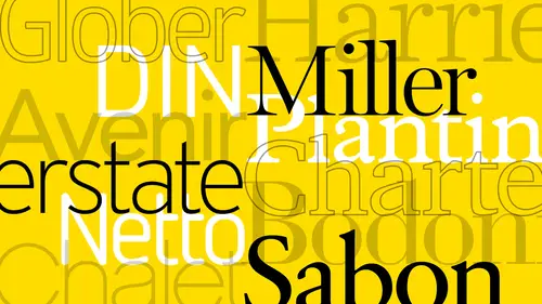
So here's some ideas on approach so this harmony or trying achieve this kind of challenging so the way we learned in the old days was that just just start with servants and serve to typhus is to build a system from there as you start to build more personality in confidence once the structure has been laid then you can add more typefaces if it works for that system. So this is the thing about you know the difference between matching aura pairing typefaces and parent fonts. Okay, I always wanted to have parrot typefaces first to make sure you have enough hierarchy range in your sand saref toe work with your sarah if depending on what the job is for magazines especially any type cases with a lot of range because you need a lot of different looks and we'll look at that in a minute. So before I pair of the thoughts up and look at weights of what's best to emphasize I wantto match up to families first okay style should be common each other's personality servant sense of both have too much pe...
rsonality they clash and also show you some examples of that as well. So some pairing guidelines so sands here for this sarah if one of the kind of work horse combinations that I went through in the late eighties and early nineties wass cara mani gil sounds this is kind of, uh a staple at that time of putting these two together, you have a humanist saref and you have a humanist sensor bam! Ok, another way to go is to parrot that the designers together in this case, herman's out fry often moon palatine. Oh, it hasn't always worked that way. It depends on the type face, but if you have the mentality of the designer has, you know, kind of a set of rules that they go by to design, this is kind of a goodman talk to your idea to go buy another one option is a super family and these air awesome because they save you a lot of time and they're designed in a way in in the aspect of what we're actually talking about, which is matching a surfeit of sand surf, and they're designed with same characteristics they already have. The same excitement already had the same character with just one has feet, one doesn't. So there if you get a family tisa that has anything from really light to black, you're done and a lot of times all recommended is the clients, if they can afford it, depending on the price range of these, I always wanted to test drive these first before they by him, just to make sure that everything's covered as far as the hierarchy.
Ratings and Reviews
Sarah
A good warm-up course for typography. I learned a lot and gained greater insight on fonts and type.
Ali Shadle
Michael, did an awesome job. He gives you a system for pairing font faces, and if you follow his instructions with your fonts, you'll really nail down why 2 different types of typefaces work or not. Thank you Michael!