Pairing Approach Demonstrations
Lesson 4 from: Pairing Typefaces: Tips for Combining FontsMichael Stinson
Pairing Approach Demonstrations
Lesson 4 from: Pairing Typefaces: Tips for Combining FontsMichael Stinson
Lessons
Lesson Info
Pairing Approach Demonstrations
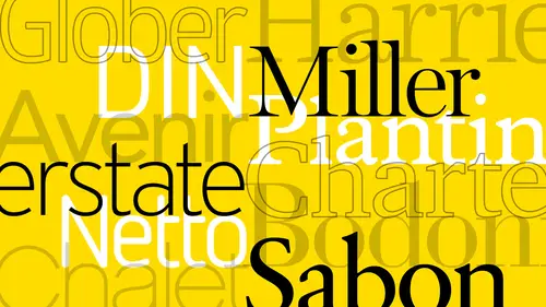
You guys I'd like to talk to you about, you know, some little tricks that I've demonstrate with over the years and kind of used to parrot typefaces together in like, a digital environment here, so, um a lot of times I'll look at the characters and compare them so I I want to set up a little system here that I've used, um to show you over the years just with sums characters real quick to start off with and I'll start off with some untraditional typefaces that we've paired together in the past if I could find those like ehrmann here and we'll get it really big so we could see it and so just some characters toe look at you know, I'm using the capital a in the lower case a and the lower casey I have the to allah graphs in here, the two story a g and I used to go in the e to look at the open counter in the tea in gary, mont here the eyes really small, and then though I use for to see how wide the character is in the r I try to see how how small this close counter is and then some numerals o...
f, of course, to see what I get lining or old style out of the gate and then just some punctuation to see uh again another little um idea of comparing two servants sand saref so here's always put them next to each other first just to get them on the same baseline and so here I'll put in gil sounds like I had before just the regular for now and I also wanted put it below and I have my grid on there so I can see what I want to start to do is just draw some lines to take a look at and give my I uh the way of comparing everything this is just something really quick comparing excites cat fights and I also want to notice where my dissenter lines are, okay? And I'll just pull these across two so I can see what's happening with all these these air said it the same size, so I'm just looking at I can adjust this one here and then I'll take these give myself a vertical comparison here with the character with that I was just speaking of and doesn't have to be too accurate I mean it's for us where they meet but close because I'm really just making a visual kind of character with thing here, but I do want to make sure that they line up at the same point currently it's a little bit till they meet same with this one, so I'm just noticing that the character with the z's you know, the gill sounds a lot wider right I noticed the ear on the jesus or kind of pointed in the same direction was not up well notice that I'm just like looking at some details I'm not necessarily saying you have to do is on every project because we don't, um but just depends on you know, if you got a and a report like I usually work on it's got a lot of content, I'll go through this exercise, especially if it's for a new company and if they don't have brand standards and all that kind of stuff, I'll just try to put something together that works for them I want to notice the numerals because like the example I was giving you before with a financial company, I'll definitely want to look at the numerals and I'm looking for, you know, the height of everything um I want to see if the force or the same so if things were similar with karen bond and gil sounds guys that we're talking about humanists, sarafin sans serif, so they're going to be pretty close I mean that's, why we kind of used these over the years I mean it's a little off, but it's close um but it's got the same curley quote kind of characteristics that you're on the g so you're really kind of building a case here to put them together is what you're doing right and ah that's what we're after, I mean the easier, quite different, but, um, it's still gonna work together? I mean, the the width of the a's or similar ours are kind of somewhere this was a little bit more open as far as a counter, but they're relatively close, and these are the kind of an example of a couple of older were courses, if you will. So we were just talking about doing a contemporary set and some of typefaces that I've been using lately, our by okay type and one of the one of them is the surf of carry it sand saref of alright, sands and the reason I've been using these lately is because they're very, um the designer is very intelligent, but what he's given us his designers to use because you'll notice here rather than up top with caramel, and here we get old sound numerals as the default, and I think that's smart and I've been looking there for that for years anti faces because, um, a lot of times you get lining numerals as default, but we all know that we're going to set body copy first, and if there's new rules in the body copy need him to be old style, so it bounces along the excite, you know, the centers and dennis centers of of old old style numerals like these need is in this sand surf does that which is create less steps for me, right? So I really like these two typefaces because they there are think this seems like they're thinking of me as a designer on the way I, uh build typography systems play worked for me also these these characters have been designed really well and they're quite contemporary everything's really big like the excite this really tall here as you could see me pulling it up from where the gara montez and it's really wide so you can see I'm pulling this out over here and the sand surface a little narrower but it's really just the optics of the feet you know these are pretty similar as well. Um the uh sansa after all right sounds down here quite a bit wider if you will but again the two story ji's one of the loops doesn't meet which I think is the morrell argument one does and that's kind of a heads up also they have the the shoulder arm of the a here it's really close to the belly of the a and here it's not so that's kind of a different too but the o's are pretty similar ours are pretty similar the numerous are very similar and these accents of recent so there's it's got cases foreign against this kind of um you know, pairing if you will, but they still kind of work together. The excites the heck sites are very close to one another again, like phil sands in clermont. I mean, they're not exact, but it's very close. So to show you a difference of maybe what wouldn't work has supposed toe, these would be acceptable to prepare to me based on exciting character with let me just show you what it might not work, you know, as far as some other examples as an alternative to these made let me put these two typefaces in together because I've seen this before and again, this is entirely subjective. I'm not saying you can't para type places like this, but it really builds your show. I'll show you build a case against maybe using them um, let's, try mrs ease. This is like the original mrs ease and then avenir, which is a geometric sands here so you can see here if you've ever used mrs eve before it's quite difficult, it's very small it's, beautiful immigrated, wonderful job on it. It's ah it's kind of a retro kind of feel to it, but it's it's, very small backside is very small I believe they have a larger version now, but I'll show you what I'm looking at here cnn he'd I want to move a few of these around just just looking at the character with between these two ways you see the deer for this how much it is now so that's kind of a heads up for me it's like wow it's way way different than as faras it's with so there to there and then e is that's conforming to a great of some kind of bc fact thickset more guys maybe yeah there we go so just to compare the e have to slide this over you can see how wide it isthe this is the other thing two story g single story g that's another thing um we just spaces outside compare the o's but there's no like no comparison you're really you're going to see how how different they are I mean it's almost like a stroke with and then you have old sound numerals and you have lightning new rules so it's another thing and then you have, uh curly quotes no quarterly quotes so keeps going you see what I'm saying so again I'm not saying that you can pair them but it's build a case against theirs too many differences the other one might be um let's see what did I use here? I want to set up over here yeah, ok like another classic a couple of classics actually I used to use cows on a lot early nineties and then we're talking about personalities clashing so if I put in baton here which is a slap this this is another good example to show you so I knew these lines around a bit excite wise there's castellan somewhere in there all right so if I move across I'm noticing that the dissenter height as well so baton is way up here right and I noticed these as well these air something funky going on here where as I have you know kind of nice ball quotes here and then when I go down here to the width see my aon kozulin is here the core baton is way over here so the character with this very different so not only is the x height taller their character with is quite different and that's in the capitals but then in the lower case it's also you know when I keep pulling us that should be pulling these here and just looking at the right and then again I have two story jian a lord in a single story g right another thing is dots on the I's that box in a circle you know that kind of stuff and numerals us well so to me this council on his humanists and it's very um romantic looking right it's got a lot of curves and this is very rigid right uh the stroke variation is very, very, very little it's it's kind of almost um, see, well, stroke with so there's. Just some of the characteristics of just looking at a pre emptive kind of look at pairing to two sets.
Ratings and Reviews
Sarah
A good warm-up course for typography. I learned a lot and gained greater insight on fonts and type.
Ali Shadle
Michael, did an awesome job. He gives you a system for pairing font faces, and if you follow his instructions with your fonts, you'll really nail down why 2 different types of typefaces work or not. Thank you Michael!