Blending Typefaces: Four Steps to Consider
Lesson 1 from: Pairing Typefaces: Tips for Combining FontsMichael Stinson
Blending Typefaces: Four Steps to Consider
Lesson 1 from: Pairing Typefaces: Tips for Combining FontsMichael Stinson
Lessons
Lesson Info
Blending Typefaces: Four Steps to Consider
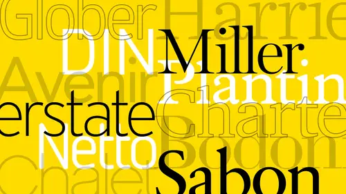
I ruined I'm michael stinson and uh welcome to combining typefaces today I want to talk to you about uh the importance and strategy of combining typefaces is a common question I often get of how do you combine typefaces and I learned a long time ago um how to just take a simple serif and sans stare of combination and, uh put two personalities together that work well in a typographic environment so just a couple things of un review here they'd like to talk about typing is an art used to dramatically improve a system through unity and variety characterises compliment and harmonize the key word here is harmonize with each other and create eye catching combinations so that this process I have four steps that I usually stick to uh big always begin with the content in any graph design situation you always want to begin with the content um I tried it in the beginning start to think of classifications because a lot of the personality and typefaces air grounded in the classifications, okay? And...
then we start to blend that some of those characteristics based on what works with each other as far as the two thai faces and then find balance in the details it's always begin with the content when you're looking through the content you won't want to remind yourself of legibility and readability so ledge ability is how how well you see the letters and the readability iss how easily someone can read the words so when you're reading the copy always read the content first forced typesetting that's one of the mantras I got from a mentor long ago we wanted to determine the type a project that your your interview type setting for so you want to have, um relevant decision making ideas there when you're ah picking typefaces to start with so a scenario project would be, you know, for a real estate investment and report let's say for company and its audience is forty five to seventy five years of age just as an idea and so in that content we might find, um, a lot of numerals and in financial figures that are going to be related to that content. So some questions that you might ask yourself is should the should the content be large enough to read since we have an older audience and the numerals that we're going to use especially if they're in that content are there going to be efficient enough for body copy? For instance, old style numerals are typically used in body copy and then lining numerals air typically used for lining up financial figures and that's the difference when you were talking about tabular versus proportional lining as well, so you want to be aware of those when you're when you're just reading through the content as among other things uh if these financial figures they're going to be in charge we may want to move to the sands sheriff for the charts and if they have these types of numerals as well so for kamani to tie faces again I always try to think of um picking tie faces and we're from los angeles so we were in the kind of the film community I've always thought of picking tie faces for specific role the personality for role so I put myself in the position at like casting director for a movie so I want to act and after an actress let's say for a comedy um I wanted big picks specific personalities for those rules so if it's a comedy I may not want you know meryl streep and um you know let's say jack nicholson for now I might want drew barrymore and adam sandler right? So it's the kind of the same kind of a situation for um getting the personalities together through the classifications in, you know, picking tie faces so here just the basics of sarah first of sand saref this is where I was taught where we usually start to combine two typefaces for a system of communication sir, if the old rule of thumb is to use a sarah for most of the body content for heavy duty reading and then use the sand sir for your hierarchy, your subheds and your headers and you know your some of your smaller content so here's a visual representation of to tie faces that might work well together surf and sand surf and these air some basic classifications I mean there's more elaborate systems in this but I just want to give you four of each for sarafin stan serve classifications you have for the humanists to transitional modern and slab and some of these have sub categories like I said so these could get a lot larger and more complex, but when we're talking about humanist we're talking old style and it looks a little bit more brush like the strokes of the thin, thin contrast if it looks like the apex of the looks more like a brush style it's kind of not always but it's so sometimes the indicator that it's a humanist transitional zx are a bit more refined a little larger in size, easier for reading right? Some of them have a less uh uh fictive thin wait contrast and uh these air really ah good category for if you want to talk to be really large and easy to read modern high faces there's a lot in there and I'll give you some on the next side ostracism examples of typefaces but this example of ditto here is you have even more contrast and might necessarily not have brackets on the sarah okay depending on the type face and then slaps or have become last you know decade here become increasingly more um popular because they operate in designed or more like a sand surf or a very little weight contrast but then they had these like uh thick service on them and this is one example here so here's some you know kind of some general um examples of typefaces in their classifications so I start to look this way you know, into these if if I have an older crowd like my finance on report that I'm working on and I see the age ranges older I'm probably might gravitate towards in here somewhere or even the slab if it's if it's not too classical let's say um if the crowd is a little bit more rooted in tradition let's say I might want to stick up here and in transitional rather than maybe on fledgling v c company or something that's a little bit more contemporary I might slide down here to the to the slab area where it's a little bit more contemporary with sand saref ce we also have a humanist but it's in the sand serves the stroke with this a little bit more subtle as you can see this is kill sounds I believe and so that the thick and thin the contrast is very uh close to each other is very subtle then you have your gothic pse and your grotesques and the protests actually have two it's spelled with a cute you ian and also spelled with a t s k as well I don't know if you guys know that butt and then you have course the geometrics and a lot of times in service this well you know you want to note well this is easier to see the sand saref but telegraphs that air here you have two types of aids here for the lower case a of a two story or double story and a single story geometrics air are it's kind of characteristic of those and also the pointed a packs on the aha's well but these are just some characteristics of those classifications and here's some of the typefaces within those categories gil sands and myriad up there at the top and then a lot of fear god looks like frequent gothic and news gothic and your grotesques universe in neue helvetica drop in there and you measures have become more popular last decade I would say here because they're really large gotham especially interstate as well and um they're easy to read on the web. So the next step of blending those characteristics we wantto just look at a body height chart here and the character is just for for parent typefaces I have a little bit more of a technical method and maybe most and so I want to just do a recap of what we're looking at as faras one word here of the baseline the exide here is the key component of matching tie faces the way I learned it, and the thing about typography on a page we're all looking for always looking for harmony on the page and that's the word I've always used over the years between the imagery in the text, and so when it comes down the text alone, you also want harmony between different kinds of typefaces and so for matching up to families let's say, um sarafin sans serif, we want to make sure that they're similar uh, in working order, since they're going to be working a lot with each other in that document. So the excited is very important because he wanted to be close in excite as faras its similarity. So when you get into these where they're all set here at seventy two point, you've got a huge swing and variety, right sarah, fs and sand service, so these might be too much of a difference where, as you know, these two san serves would be a lot closer to use. So here's an example between, um, avenir, next and planted and ah avenue next to mrs eve's, if you will. And, um, you know, the difference between albany and misses its is really quite large here and there said of the same type size so point it might be a better fit for combining with avenue justice faras excite because it's closer they have ah closer ex highs another ah secondary uh kind of idea that you want to use for matching typefaces is the character with two and this is just a slide to show you how different type faces have different designs and different character words in them based on classification to so in this case you have jaermann which is a humanist serif and then um you have a modern adoni serif and then uh the test is um a geometric san sir right now you can see how big the test is excite but it's got a like fairly narrow character with so the am space for the m dash as we learned in fundamentals of typography determines that with right so them is relative to the width of a character as in an am dash here like we're looking at so with all that character with x height we want try to balance out some of those details so some of the details just as a reminder of anatomy here this is some of the anatomy that we usually teaching fundamentals of typography as you can see here the one thing you want to notice to uh in here as a you know maybe a tertiary item is the stress of the stroke so the stress I mean the stress of the character so have its leaning. You know, if this always going left to the right, or if it's straight up like this one, you also want to notice that same thing with sand saref. You want to try to see if you know the cat parts or similar. How? Try to notice some of the details of how far up and up theus enders go health far down. The dissenters go those kinds of things. How around the e is, and how around the you know, the larger round characters are.
Ratings and Reviews
Sarah
A good warm-up course for typography. I learned a lot and gained greater insight on fonts and type.
Ali Shadle
Michael, did an awesome job. He gives you a system for pairing font faces, and if you follow his instructions with your fonts, you'll really nail down why 2 different types of typefaces work or not. Thank you Michael!