Lessons
Lesson Info
Analysis of Pairings
And we have some some spreads here, and they're different magazines for example, this is more of a financial magazine, this is more of a like a tech magazine, and then this is more like a business, and then this is kind of like a scientific magazine, so when we're looking at these now that I've said, you know what kind of magazines they are, what do you got to see this kind of, ah, a system when you start to, like, really analyze this system of that's working well for you and they jump out for you guys, the winner and one of the things to look at, too is, do you know where to start and reading, especially with the visuals involved like, out of all four of these? Which one says, start here the most to me, this one with the number? Because I think that they're using about like, a bright color and there's a lot of contrast between the smaller, smallest type and largest type trend. This layout is nice too, just because you have this drop cup that draws a really big drop car and then find o...
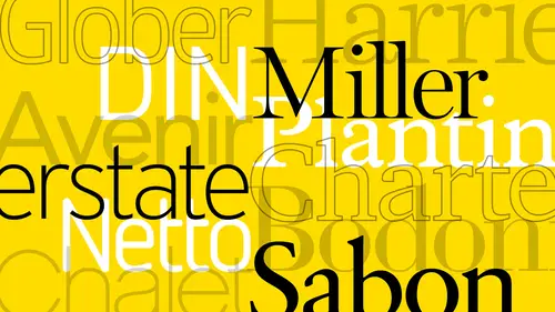
ut details, turn this this one it's kind of like really big header, right, but it's farther down in the page, me, if it was up here, you go to it right away, right but when we start looking at hierarchy a typeface pairing you know since I said this is a tech magazine if we just look at this answer if they have here it's really contemporary right it's kind of fits the feel of it of attack because even the body copies really thin and um whereas the financial solution here it has um I'm not even talking about what style the thai faces are they're using a slab it looks like in here but stands here for the body copy but the body copy looks a little bit more reserved if you will and this business one ous well it's using for its body copyists sarah but it's using some kind of gothic and then a slaps sheriff for like a tertiary level of memphis is here with a color so it's a little bit it's got that collective feel of having traditional and contemporary together and then for the tech magazine it's really trying to emphasize varying chungking style pieces of information as you go through here so even the colors changed by category as you go through here so this one kind of moves the eye around probably the easiest worthy's these three are kind of moving us around based on the content the columns of content right good thanks guys. Excellent. So now let's talk about um some examples to talk about impairing and I want to talk about this newspaper project that we had uh at the office one time and starting over here this is where we this is existing newspaper that was being used at the time when we're asked to come in and redesign and analyze and offer options for uh, typeface pairings and uh actually new layout and eventually new masthead right? But what happens often is a client doesn't know how far to go with the design like how far how much do we want to change right? So it was our job to offer bearing solutions that's why we put him up here in this order so you can see the main thing that we saw in the very first was that the masthead was really weak its emphasis I mean the main the main headline here was even overpowering it which I thought was kind of difficult so we just did a jump where we had a larger masthead is still traditional still sarah I'm still kind of same layout as this but it gave more emphasis to the headers where these got these were even kind of because they're still in sarah if we just offered you know ah nice gothic that could be used in various situations you've got really wide and then you got really narrow right? And so we kept the ad at the bottom but cleaned it up so it's not overpowering either because in this situation there was very left heavy and bottom heavy it wasn't emphasizing it was taking away from this mean article if you will so we kind of clean everything lightened everything up where these popped out a little bit more and give it the opportunity to do so but these also connected through their emphasis from there we jumped to switching the uh the masthead from sarah to sand saref made it a little bit more tech feeling, if you will. And in an aspect of the kind of thorn in the side of this of this structure of this layout with these three columns and this kind of bonus thing is we went back to a traditional three column and then move this this information up in here and down here where it it was kind of more of a horizontal lay out again and you've got three million visuals and then this main visual got even larger and moved it over here so it's more of a layout. But it was also typographic situation as well because we can emphasize these in a row same with the week with ease but these these two came forward. As you can see, you know where this one still comes forward quite a bit. So now you get more of a one, two, three, four kind of feeling over here over here is where we just completely redesigned everything. The masthead became the main character of the layout and we combined the ah the surf and the sand serve together in another option and these two solutions there's three typefaces that air used there's a gothic a sarah and then a slab and the slab is used for like a bonus feeling all the way through as you can see the surf that we use has really beautiful italics so those were used a little bit more prominently if you will and this section got a little bit more um um kind of digital feeling looks like more web kind of um you know, placement of thes emphasized boxes if you will so really can see just with a couple of thai faces you can really give a lot of punch as far as the design and the personality or offer options that air in between right depending on how you know which way the client wanted to go because we were just we kind of assumed that they would go here but obviously they went like between these two somewhere they wanted to keep this but they wanted this element down here and so on. So that's what you know, just a couple of typefaces khun do for that and the main thing that we we notice in doing this we knew that they would need a gothic that was the main thing because god thinks you get the full range of super narrow and thin to really wide and heavy right. The two thai faces that they use here were very dated it's times, new roman in helvetica, that's it. Then we got to the masthead. Here is rocky, and then you have, um, titling gothic, and then I believe miller is what we're using there, and then over here we using, I think, harriet for the sarah, if and then, uh, equips lab and then titling gothic and that's the same for this one, too. So these were coming to the same systems, but with different looks and that's. What I learned in the beginning to a typography is you can have. If you have a large enough typeface family, you can have a lot of different looks, too it's. Just on how you use the typeface of defense themselves.
Ratings and Reviews
Sarah
A good warm-up course for typography. I learned a lot and gained greater insight on fonts and type.
Ali Shadle
Michael, did an awesome job. He gives you a system for pairing font faces, and if you follow his instructions with your fonts, you'll really nail down why 2 different types of typefaces work or not. Thank you Michael!