Digital Workflow: Overview
Lesson 20 from: Advanced Lighting for Adventure PhotographyMichael Clark
Digital Workflow: Overview
Lesson 20 from: Advanced Lighting for Adventure PhotographyMichael Clark
Lesson Info
20. Digital Workflow: Overview
Lessons
Class Introduction
03:25 2Evolution with Lighting
04:44 3Why Use Artificial Lighting?
06:43 4Pre-Production and Pre-Visualizing
07:16 5Equipment: Overview of the Gear
25:28 6Equipment: Selecting the Right Gear
24:05 7Strobes vs. Speedlights
08:01 8Lighting 101: Flash Sync Speeds
14:35Lighting 101: Flash Basics
24:46 10High-Speed Sync (HSS) vs. Hi-Sync (HS) vs. HyperSync vs. Leaf Shutter
14:50 11Gear Requirements for Hi-Sync (HS)
12:29 12Flash Exposure
21:39 13Pre-production and Location Scouting for Rock Climbing
06:02 14Gear on Location: Rock Climbing
07:04 15Rock Climbing Photography 101
11:37 16Rock Climber: Environmental Portrait
24:22 17Finding the Shot
13:48 18Capturing the Action: Rock Climbing
07:09 19Shooting at High Angle: Rock Climber
21:15 20Digital Workflow: Overview
16:09 21Editing and Post-Processing of Rock Climbing images
30:17 22Cyclocross Photography 101
11:32 23Location Scouting for Cyclocross
05:36 24Gear on Location: Cyclocross
11:42 25Intro to the Cyclocross Rider
16:29 26Capturing Action: Motion Blur
43:13 27Communication with Athletes
18:55 28Variations of the Shot
23:21 29Cyclocross & Trail Runner Portraits
40:40 30Location Scouting & Planning the Shot
09:20 31Capturing the Action: Lighting Set Up for Trail Running
37:01 32Editing and Post-Processing of Cyclocross Images
21:34 33Editing and Post-Processing of Trail Running Images
07:52 34The Business of Adventure Photography
17:42 35Image Critique with Chase Jarvis
48:41Lesson Info
Digital Workflow: Overview
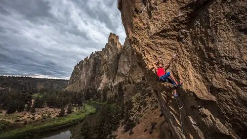
Let's actually talk about digital workflow, like an overview real quick. I just wanna say a few things. This isn't a digital workflow class, I'm sure CreativeLive has a lot of digital workflow classes, I've got stuff on my website about this as well. But really quickly, I just wanna reinforce how important color management is and specifically with monitors. So this is my office. You can see that giant printer making, I think that's a five foot long print. I wanna say that I'm kind of crazy with color management. The monitor, this is a pretty huge statement I'm making here, is perhaps the most important thing you buy as a photographer. I would say the monitor is more important than what camera you have, more important than what lens you have, more important than how many megapixels you have, if color is an issue for you. Because as I'll explain here in just a few minutes, we'll talk about the color spaces really quickly but calibrating your monitor. If there's one thing you do after thi...
s class, or right now, if you don't calibrate your monitor with an i1 or an X-Rite i1 display or a Spyder or any of the various color management hockey pucks that you can put on there. Technically called spectrophotometers, measuring the color of your monitor, you need this. And they're about, for, I think the X-Rite i1 Display Pro is about $200 or so through BNH or whoever you get your camera stuff from. Even if you're just working on a laptop, it doesn't really matter what monitor you have, do yourself a favor, buy one of these calibration devices so you at least know you're looking at accurate colors on your monitor. Because when you see, when we work this up, we're not like painting by the numbers here, we're just eyeballing it off of our monitor and how we calibrate our monitor is super important because if you don't have a calibrated monitor, when you print this image or when you send it out to the world, your monitor might be super dark or super bright and then it will look completely different on somebody else's monitor or the print won't look like it did on your screen. I'm not gonna spend too much time on this. One thing I will say, just a quick note about color spaces, going back into super techy mode here, ProPhoto RGB is typically the largest color space we look at and just so you are aware, this huge color circle here is basically all the colors that we can see with our eye. So you can see that ProPhoto RGB has some colors in it that are beyond what we can see with our eye. ProPhoto RGB is the color space of Lightroom. Adobe RGB is the standardized color space for prints world, so like magazines and offset presses. They technically print in CMYK but Adobe RGB is the closest to the CMYK color spaces. Typically when I deliver an image to a client, it's in Adobe RGB. And then, finally, sRGB is smaller than Adobe RGB. So, every laptop on the market, that I know of, there may be a new one that isn't sRGB, but this is an sRGB monitor, or some portion of sRGB. It might not be even full sRGB. And so, if I've shot my images in the camera in the Adobe RGB color space, I'm not seeing all the colors I captured on this monitor. So that's why I harp on monitors. Those monitors that I showed actually are full Adobe RGB monitors, so that helps a lot if you can see all the colors you're working with. You'll notice, especially up here in the greens, is where you're missing the color. So you can easily have a green color cast on your image and your monitor's not even showing it to you and that's happened to me a few times back in the day before I had a decent monitor. So, I won't go too crazy on that and I'll go ahead and start working this up. Let's see, let me turn on the Wacom Tablet here. Alright, we're connected. So, everything's working well. So, as you can see, I have the latest Wacom tablet. I started using these three or four years ago and they've kind of revolutionized my post processing. Working on a Macbook Pro here, it's a 15 inch model. And you know, I think these are pretty close to sRGB or Rec. 709 which is the video version of sRGB. So, just so you can see what we're working with, that is the worked up version of the image and this is how it came out of camera. So you can see that I definitely opened up the shadows on those cliffs in the background. I evened up the tones on the rock climb and brightened it just a little bit. Let me go into the develop module and I'm working in Lightroom right now. So, I have basically gone in and gone to full screen mode in Lightroom, and I'm clipping off these panels so I can get my image as big as possible. One of the other things to note, when you're in Lightroom, typically this panel's gonna be really narrow and so one of the first things I tell people to do is go in and grab the edge of that develop panel and pull it all the way out. It does make your image smaller but it also makes the sliders much less sensitive so you can make more accurate adjustments with your sliders. So a little tip there. So I'm gonna skip white balance real quick, I'm gonna deal with the exposure. And when I'm pulling up the exposure I'm looking at Kai and seeing how bright or dark he is. So I'm gonna pull it up a bit there and I'm gonna pull my highlights down. I'm gonna just start playing with these guys and see what looks good, somewhere in there. The beauty of Lightroom is that you have control over very specific parts of the image so the shadows, I can really pull out the shadows in that background. But I'm also making Kai, my subject, perhaps a little too bright there. Hopefully this is coming through on your TV or your monitor 'cause how I'm working this up and how you're seeing it is conditional on if your monitor is calibrated. So if you folks online are watching on an uncalibrated monitor and you have your brightness jacked all the way up, you might be like, "Wow, that looks really bright "on my screen," so that's why I talked about monitors just before this section. So, whites, on the whites and blacks sliders, I can hold down the option key and adjust and I can show where I'm blowing things out, which, nothing's really blowing out. That's interesting. So, I'm looking at the histogram right now and I am looking at this edge for the whites so I can set my white and black points here very accurately. So, let me go, whoops, put that back. I'm gonna go down to the blacks now. Hold down the option key and I'm not gonna clip any blacks here in terms of the left edge of the histogram because I'm gonna go into Photoshop and really accurately set those levels in Photoshop instead of Lightroom. I find Lightroom a little bit difficult to set perfect white and black points. So, clarity, clarity is like crack cocaine. It's hard to not use little clarity, and you can go way too far, sorry. (laughing) Just waking you up in the afternoon, here. Seeing if you were paying attention. So I mean, you know, you can go really nuts with clarity but it may or may not help your image out. And if you do go really nuts with clarity, you need to really go in, and you see how much noise it's pulling out, and watch the edges 'cause you can have funny edge effects with clarity. I'll put a little bit of clarity in but I'm not gonna go too nuts with that. Vibrance, so there's only one rule I really have with when I teach digital workflow is, don't go more than plus 15 with saturation. 'Cause once you go past 15, you start creating neon orange crazy colors that can never be reproduced and look hideous. So, I typically almost never even touch the saturation slider, instead I use the vibrance slider, which is a nonlinear saturation tool, meaning it's saturating the least saturated colors more than the already saturated colors. And I might, it's to taste here, salt to taste, somewhere in there. On my monitor that looks pretty good. Again, if you don't have a calibrated monitor, that could be an issue. The other thing here is the white balance. So the reason I skip the white balance here is because all of these sliders affect that white balance. So if I adjust the white balance first, and then go down and do all of this, I'm gonna have to come back and redo the white balance. The other thing with white balance here is know the white balance temperature of your lights. So, I know Elinchrom strobes are daylight balanced at 5,500 degrees Kelvin. So, I can typically go up here to the flash and that will neutralize the lighting. That's looking pretty deep blue back there in the background so I'm not sure I love that. Let's try daylight. Oof, even worse. So, we're gonna leave it as shot and I'm probably just gonna pull this down a little bit, somewhere in there. And technically I'm warming up the light from what it was, you know, the actual light temperature. If it's 5,500, and just of note, with all strobes, this is not Elinchrom only, the light temperature changes anywhere from a few degrees Kelvin to 50 degrees Kelvin at every full stop. So the light temperature of a strobe is not consistent, necessarily, throughout the entire power range of the pack. So that's something to play with. I don't own a color meter but photographers who are really dialed in in the studio might own a color meter and have actually tested the color temperature of their pack through all the different power settings. I know for still photographers that's a huge deal. Especially back in the film days it was. But just something to be aware of. And that can really help guide you as well. Interesting thing with these temp and tint sliders is I actually shot one of the first assignments for Lightroom 10 years ago with a mountain biking shoot and the engineers taught me how to use Lightroom for the first generation. And they showed me this cool trick where these are designed like a pendulum, like to do big moves. And the idea here is that you move the pendulum and I guess, we're not recording me, we're recoding the screen, let me go back again, sorry. You move the pendulum to the extremes and see what's going on and then you slowly start honing in on where it looks good to your eye. Because you can only see the difference in white balance when you're moving it. So if you just like go here, then here, then here, it's very difficult for your eye to actually figure out what an accurate white balance is. If we had something gray in the image we could grab the eyedropper, we could go to the sky and just do that and that's actually not too bad but it's a little warm. So I'm gonna keep moving this and find, I'm very aware of that blue in the sky, I don't want it to be too blue. Somewhere in there, that's pretty close to 5,500. And then I do the same thing for the tint and you'll notice it looks horrendous when I go to extremes here but my eye kind of catches like somewhere in there, it's pretty good. And you know, every time you work up an image, your eyes get better and better and better at recognizing super subtle color cast in the image. Earlier you said as you change the power of the battery pack or your flash backs, the color temperature changes. How does that relate as you increase power, does the color temperature go up or down? It depends on the power pack you're using and the flash. So you'd have to do your own testing to figure that out. And it depends on how they optimized the flash. They might have optimized the flash for 5, at the middle power setting, and then it goes up or down from there, it just depends on the flash manufacturer. Reality is, if you know your packs, daylight balance at 5,500, that at least gives you an idea of what's gonna be close to accurate within a range of settings. Like 7,200 degrees Kelvin for temperature is way warmer than the pack is putting out light. Or on the opposite end, like 3,500 degrees Kelvin, which would be super blue. If I pull this down to 35, you can see, obviously that's a totally different white balance than the pack. So I just gives you kind of a guide when you're working up the white balance there. So I'm gonna keep working down in Lightroom here. I'm gonna add a little bit of mid tone contrast and there's still a lot of things I need to fix on this image. I'm just giving it a little pop by adding a little bit to the highlights, or not the highlights, to the mid tone bright part of the image and the mid tone dark part of the image. Just to give it a little extra contrast in the mid tones. So, I'm not gonna touch these HSL sliders, I'll leave that as it is. Sharpening here, since I shot at ISO 800, there is a bit of noise in there. But remember, this is a 36 megapixel image so you're seeing right now on the screen bigger than this image will probably ever be printed. Unless we print it five or six feet long. And even then, I like a little bit of grain in my images. When I first started shooting digital I thought, "Eh, they're so smooth." It looks like somebody took a smudge stick and just like smoothed out all the grain out of the image since I started with film. So a little bit of grain is not that bad and if we zoomed out to 50% on this guy, pretty much all that noise disappears, or looks like film grain. So let me just go back to one to one and get rid of this guy. So, I'm gonna take out a little bit of the noise but I'm not gonna go too aggressively on that. I don't see any color noise so that looks fine. Any time I do a little bit of noise reduction, I might pull up the sharpening just a hair but technically since I'm working on a raw image, I don't add any sharpening more than the default in Lightroom at this point because this is raw processing and if I need to sharpen the image for print I'll do that at the very end of the process once the image is fully worked up and I've resized the image. So I'm kind of blitzing through a whole truckload of digital workflow here. Lens corrections, I'll click both of these boxes and see how that looks. It took out some of the vignetting on the sides here but I'll deal with that later. I still need to go in and open the shadows up in this for my taste and maybe control the spill of the light over here a little bit more. I'm gonna go down first and create a vignette and this will look hideous for a second so hang with me. First off, I wanna see what's happening so I went to huge extremes with the vignette and one of the things to note when I work up images is I'm trying to control where the viewer's eye is going in the image. That's the entire thinking process behind my digital workflow. So, now I'm gonna back that way off, I mean, so you could barely even tell I added a vignette to this thing. So if you didn't just see me do that, you would probably not be able to know I even added a vignette to that and that's kind of, I guess at this point it's not really a vignette, it's just a very subtle adjustment of the tones on the edge of the image.
Class Materials
Bonus Materials with Purchase
Ratings and Reviews
a Creativelive Student
Great course that combines the technical aspects of shooting with light in different situations, with the art of making a great image of athletes. Michael is a great teacher and I'm sure his lessons will continue to help guide over and over again!
norah levine
This is a course that I could watch repeatedly and be able to learn something new each time. Michael is a truly an expert in his field and is so generous with his knowledge. This course really breaks down the process of adventure photography, but it's more than that. I don't think you need to even be an adventure sports photographer to get tons out of this course. Michael is really good at breaking down some very complicated technology. Thank you!
Jeph DeLorme
Great class with dozens of tips, ideas and lighting strategies for tough outdoor lighting challenges. Advanced class taught in a way that allows even a beginner to get a handle on lighting tough situations. The location videos provide real life examples that make this class a definite must have for my Creative Live collection. Thank you Michael Clark and Creative Live! Jeph DeLorme