Use Curves to Restore Details on Vintage Images
Lesson 5 from: Adobe Photoshop Mastery: Retouch and RestoreBen Willmore
Use Curves to Restore Details on Vintage Images
Lesson 5 from: Adobe Photoshop Mastery: Retouch and RestoreBen Willmore
Lesson Info
5. Use Curves to Restore Details on Vintage Images
Lessons
Class Introduction
03:50 2Tonal Rescue & Noise Reduction in Adobe Camera Raw
14:04 3Retouch a Hazy Image in Adobe Camera Raw
07:33 4Recover the Brightness Range with Levels in Adobe Photoshop
11:34 5Use Curves to Restore Details on Vintage Images
48:12 6Color Rescue & White Balance in Adobe Camera Raw
10:12 7Selective Color with the Adjustment Brush in Adobe Camera Raw
06:29 8Correcting Color in Faded Images with White Balance
13:02Correcting Color in Faded Images with Levels & Curves
26:02 10Additional Examples of Color Correction
14:26 11Retouching Images with the Spot Healing Brush
14:27 12Fundamentals of Retouching Vintage Images
30:29 13Overview of Retouching Tools
46:51 14Refined Adjustment Techniques
21:29 15Refined Channel Adjustments
05:31 16Refined Texture Adjustments
07:16 17Refined Compression Adjustments
06:57 18Adding Color to Vintage Images
12:32 19Adjusting the Background of an Image
13:48 20Audience Questions & Final Tips
15:44Lesson Info
Use Curves to Restore Details on Vintage Images
Now we're going to have to start using other tools to kind of restore the brightness of the surrounding area to make it look more like the middle impossibly plots in detail in the middle, because right now, it's, looking rather black in there rather detailed lists to do that, I'm going to move on from the first kind of adjustment me we're talking about, which is levels and move on to something more sophisticated in that is known as curves. So at the bottom of my layers panel, I click on the adjustment layer pop up in this time I'm going to come in and use curves, terms of the jasmine that has many of the same controls his levels do remember and levels there were two sliders where we could force areas too black or four serious toe white. Well, those same two sliders air found right here, this one forces areas toe white, this one forces areas to black, and they do the exact same thing is the two sliders that were found just below the history ram and levels. So if you ever happen to need ...
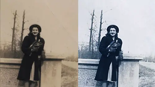
them, they're there. But then we have a diagonal line in curves in that dina line takes a while to get used to, but let's talk about what it means. Just like in levels down here at the bottom we have a bar that shows us all the brightness levels we could have in our picture from black to white and just like in levels we have a bar chart that tells us how much space each one of those brightness levels takes up within our picture just like in levels one of those lines goes all the way to the top that's whatever it takes whatever it takes up the most space but for now we could ignore that bar chart and let's just look at this line this line tells you how much light where it can also tell you how much ink depending on how you have this set up your images using so if you look at where black is notice the diagonal line is all the way at the bottom because for black how much light would you use? None so it's not the bottom saying you reduce none look at where white iss go straight up from it and look at where the diagonal linus it's saying to create white we would have to use as much light as we possibly could that's why this is all the way at the top there then for these other brightness levels we'd have to use less and less and less light as we got into the darker and darker shades and that's why this line just gets lower and lower and lower above each one of those shades, so all this line is doing is telling you how much light is being used to make all these shades so in the middle fifty percent gray, this is halfway up because we use half play as much light as we could use for here where we're quite dark. This is exactly how much light would would use what we can do a wearing curves is actually click on the line and I can move it up or move it down and that's going to either use less light by moving it down or more life by moving it up. If you add a dot by accident, you don't need it, you drag it off the grid to get rid of it. Curves isn't the easiest thing to understand, but you don't need to know that much about it. You only need to know a few core concepts to make it rather useful on your images so let's, look at some of those concepts, the reason why we're going to use curves instead of other adjustments like brightness and contrast levels in anything else that would adjust the atonality of your image is because with most other adjustments, I can't tell it toe on ly brighten his face or to target our brightness adjustment on the exact brightness of his face. Or the exact brightness of other areas in the picture. Instead, all the other adjustments we have in photo shop generically adjust the entire brightness of the image they don't let you focus in on just one particular shade but in curves we can focus in on just one particular shade to be rather precise in our adjustment of it here's how we do that and curves there's a little hand icon which I'm going to click on when you click on the hand icon that's going to make it so when you move your mouse on top your image you'll see a circle and curves you see a little circle all that circle is is it's measuring how much light is in the various areas and move on top of so if you think about where his body is it's almost solid black there there's almost no light there whatsoever so wouldn't it make sense when I move my mouse over that area the circle would go really low to say there's almost no light here well let's find out if that's the case look at how low that circles going in curves it saying there's next to no light here if you look at the brightest part of the picture which is either his face or the table that's there if I move they're it should move the circle rather high because there'll be quite a bit of light there and you see how high the circle is it's just telling me how much light is in there but what's nice about this is I can move my mouse on top of them an area and then in curves. That circle tells him how much light is currently there, but then check this out if I click my mouse watching curves, you see that circle the moment I click, it turns into a dot that dot is like a dimmer switch, just like a dimmer you'd have on your wallet home. If I now drag up, we're going to add light or if I dragged down, we're going to reduce the amount of light. But it's thinking about the area I clicked on when it's figuring out what part of the image to change and so I can bring this down and say, I'd like that to be quite dark. I could then move my mouse on a different area like the face if I want to and if I look encouraged, you see a circle that tells me how much light is currently in the face. It's relatively high, the face is relatively bright, but I could click there and I could drag down if I wanted to use less light we're up if I wanted to use more. You're if I decided I didn't want to did not want to adjust the face I could grab the dot and just pull it right off the edge of the grid they get rid of it now the problem with the kurds is most of the time you don't need the change that you're applying to affect your entire picture if I turn off the eyeball for this particular adjustment at the bottom of curves it will hide this in that change that I'm making would mainly be useful on the outer part of the picture when then I don't want it to affect the inner part well that's why we're using adjustment layers with an adjustment layer you get the adjustments sitting here in your layers pale this represents the adjustment itself and then on the right side is a mask that mask determines where the adjustment can happen when that mask is full of white and affects everything but we incorporate some black into it wherever we put black in it won't affect the image if I grab my paintbrush tool and down here this determines what color were painting with you click this little arrow to get black in the front I can now come into my image and if I paint with black it's going to remove my adjustment from wherever I pain so I'm just going to paint over the middle of the picture of what was already dark enough it should bring that back if I pay too far like I paint out here to the edge, I can just switch my foreground color so instead of painting with black which removes the adjustment, I switch it toe white, which would paint the adjustment back in and so right now I'm just trying to get the brightness to be relatively similar around the whole image if you look at my layers panel, you'll see what's going on there's the black paint that I put in they've got to be careful when you do this. If you've been switching between layers, you might not find that the black paint would actually go into this little mask, which is where it needs to go if you look at the mast you noticed the corners are highlighted, they got little brackets on him that tells you what's act if I click over here you see the brackets are no longer on the mask. That means if I grab my paintbrush tool, the paint would no longer get into the mask because it's not active it's not what I'm working on. So if you ever clicked between layers and things just don't seem to be working right when you grab your paintbrush tooling paint, then you just need a glance and see if the little mask as the brackets on it and if it doesn't for some reason just click on it in the brackets will move over there and that's what you'll be working on so in this particular image let's see what's going on? I'm gonna turn off the eyeball next to this adjustment layer and that's going to disable it. So here was before I'll turn it back on by clicking where the eyeball used to be and there's what we've done. So I've even doubt the brightness in this particular picture so that's what we're going to be doing with curves quite a bit we'll end up adjusting an area and then painting on the mask just in an area and then painting on the mask. Sometimes you want your adjustment to affect the entire picture. Other times you wanted to be isolated let's just try and other curves adjustment in here see weaken dio let's do a curves adjustment and here's one of the common things that I'll end up doing with curves instead of just clicking on area and dragging up or down to change its brightness. I can also try to pull out detail using curves to pull out detail you go encourage you click on the hand tool you look in your photograph at an area that had some detail in here I see just the little list into detail on his like lapels or other things just the littlest bit of detail in this suit but it almost looks like a solid black mass I want to see if I can get a little bit of that detail to come out to make it easier to see when that's the case here is what you end up doing in curse. You're going to end up adding two dots on your curve, one for the dark part in one for the bright part of the area where you want the detail to come out. So in here, I'm just going to glance at his outfit in guest inmate where the darkest area is I'm just going to visually look and decide where that might be. I'm going to guess it to be right here. I don't have to be absolutely precise, I just need to be somewhat in the ballpark now when I do that in curves, when I just mouse over it. Do you see a circle that tells me how much light is currently in this area? And I can tell you that that area is not black because if you look and curves, there is some light in there. If it was black, the circle would be all the way to the bottom. Does that make sense? I'll click, then I'm going to go for the brightest of the area that I'm looking to change, not of the entire picture of just the dark part of this suit. So if I look at that I can see little hints and I don't know if you can see it on screen or not but I can see looking for where's the brightest part now I'm not looking for his little flower hanker chair from whatever that is thinking about the black part of his suit in the brightest area to my I might be right about there I'm not sure if that's right or not but we will possibly find out or it could be down here in his arm may be right in here I'm gonna move my mouse there and I'm going to click then this is like having a dimmer switch in your hand if I want you to see the detail that's there I'm going to brighten up that brighter so I'm gonna drag my mouth straight up and as I do ignore the rest of the picture just look in a suit so if I zoom up a little bit I'll choose undo we're actually just turn office little eyeball over here before after what we're doing is we're leaving the dark part of this suit at the brightness that used to be at that's why we moved our mouths on the darkest part of the suit and we clicked once and let go we didn't adjust it wouldn't drag up to brighton we didn't drag down to dark and we just clicked and when we clicked it locked in that brightness that said just don't mix don't mess with this part then we went to the brightest part of the suit we clicked when we dragged it up to sae brighten it up and by doing so we pull out a little bit of that detail now if I didn't want it to happen to the rest of the picture I grabbed my paintbrush and I paint with black because the way a mask works which is sitting here attach this adjustment is any part of it that is white allows this adjustment to apply if we put any black and there it will prevent it from applying so I don't want to the floor down here to be affected I don't want this area in the outer part to be affected I don't want this area surrounding his face I might not even want his face to be affected although I don't mind it with air spaces maybe it's the table that I don't want but you paint wherever it is you don't want it to affect so then you can do before and after in this particular image there's not a huge amount of detail in there but I want to show you that even if there's barely a hint of detail you can exaggerate it so what did we end up doing and curves well let's throw that curves adjustment away just do it once more I went to my layers panel adjustment layer icon curves in curves in order to make it so you can click on your image to have it add dots and things this little hand icon needs to be on now that hand icon I used all the time so on the side menu of this panel in the upper right you see this little icon if I click there I get a side menu there's a choice right here called auto select targeted adjustment tool what that means is when I do a curves adjustment layer automatically click on the hand so I don't have to do it every time, so I'm going to go to that side menu choose auto select targeted adjustment tool all that did was click on the hand for me and now every single time I use curves from now on the hands will be on and that way you don't have to manually click on it every single time then what did I do? I came in here to my image he and first I found what I thought was the darkest area of the part. I wanted to exaggerate detail on darkest area of his clothing which might be here I clicked and all that did when I clicked is it measured how much light was in there and it added a dot as long as I do not move that dot then in effect with that dots doing is locking in the brightness of that stuff, so it doesn't move when I try to adjust something else, then I come in here and I look for the brightest area of where I want the detail to be pulled out. I'm only thinking about his black clothing that's here and I look at it and it could be up in here or actually in thinking it's here in his arm, I moved my mouse on top of that area I click, and what that did is it added a different dot in curves. Do you see the second dot up here? It's higher because it's a brighter area remember curves just talks about how much light is there so higher means more light? And when I clicked on that, what I would usually have done, I can find the area was in again, he is, I click and I just start dragging up up means brighton adm or light to that I could bring it up ridiculously and I'd see a lot more of what's in his suit, but I'm going to bring it up just to a reasonable level. Then when I'm done, I'm gonna grab my paintbrush and if there's any areas that I did not like, the change in I'm going to paint on them and where that paint is going is in my layers panel my layers panel right over here any part of this little mask that turns black prevents this adjustment from affecting your image any part that's white allows it to apply and therefore I can paint with black to have it not effect certain areas and if I paint in too large of an area I just switch the color and painting with the color and painting with is right here dwight do you usually paint with your brush at one hundred percent no I don't well how should sit vary it so my brush with default settings will give me one hundred percent and if you look at the very top of my screen here you find the number one hundred pro pass it e if you press the number keys and your keyboard it's a quick way of changing that if I press for instance seven I'll get seventy percent if you press too you get twenty percent of five to get fifty or if he pressed to numbers rapidly like five five you get fifty five or five three fifty three to bring it up to one hundred type zero and therefore you can vary it and so oftentimes I will need to do that like one area I'll really need to pull out the details all painted in at at full strength and then in another area it only needs a slight bit of that change and so a lower the opacity in brush it in yes, I um I'm kind of a little lost here our deal in tonal adjustments have we gone to color adjustments? Well, if you think about this image contains no color so I'm not really doing that but I made it black and white I did because when I looked at the original picture let me choose revert is the color that's in this picture truly part of the original if you were there in nineteen twenty six or whatever this picture was taken would that color have been there? So we did a little bit of color, which was just a hint of how could I brighten her dark in that area that is currently bluish so I did have a teeny bit into it, but when I talk about color rescue, I'm mainly talking about a color photograph okay has color problematic that tin was added after for alan, this was caused most likely because the however this photo was taken, the materials that it was taken with faded over time in either sunlight or something else degraded those areas and it caused them to shift to blue and look this way. And so one step we did involved color, but most of the stuff we did ended up being what I would call tunnel meaning brightness now this isn't my favorite end result looks almost black, but it's just where we happen to have headed with this photograph to describe these features well either come back to this image work on other images well you'll see us getting to a much brighter and different and result when you're looking for the brightest and darkest area can it be helpful to look at those numbers on the input underneath the tone of the curves the numbers that are underneath and curves and just so people know what he's talking about if I come over here to curves you'll find that whenever you click on your image to add a dot that there are some numbers down here they're called input and output and when it comes to having an image that doesn't have the full brightness range I don't necessarily find those numbers to be useful but just say you know what they do and I'll describe win there I find him to be useful whenever you click on your image and at a dot you're find these two numbers input means how much light was in that area you clicked on at the moment you clicked on it so this number converted from zero which means no light whatsoever to two fifty five that just had to go up to some number and they picked to fifty five so it says there's seventy two if I measure how much light is in there then when I drag on my picture up or down like a dimmer switch the number on the right says how much do we end up in there so this number will end up being higher if he brightened the saying there's more light, it will be lower if you darkened, but most the time, those numbers I'm ignoring cause I want to just look at my picture, but here's what? I find him to be useful, and in this photo, this could be one of the cases. This photo looks to me as if it was probably framed, and it had an oval matting covering up the photo in something in that oval matting, which might have been acidic or might have, then some other issue with it cause that its contact with the photo caused that outer area to become more faded in the middle. Well, what if I need to adjust this outer area and make it so it's exactly the same brightness as the interview area? Those numbers could be helpful. Ban if you want to see what I'm talking about, push, just try it once when you move your mouse on top of your image, you'll see those numbers changing. I just see him, it's just telling you how much light is in there zero means none to fifty five means as much as he could have, and I'm just going to move my mouse under this area right here, and I see the number sixty six. I can remember that cause route sixty six I don't make you remember sixty six and that just tells me how much light is in that area the number itself doesn't mean anything to me like sixty six doesn't do anything for me it just tells me it's higher than zero right just remember sixty six now we're mina curves adjustment later I'm going to click right here on the area that I want to change quick and I look in here and you see the number one thirty two that's how much light is in that surrounding area that was more faded than the rest of the picture but I wanted to match the inner part and when I had my mouse in the inner part I could see a number and that number was sixty six wasn't that so when I clicked on my picture it entered numbers down here in those numbers was how much light was in the area I clicked on the numbers themselves don't mean anything to me is just a measurement but I'll put I typed in something that told me how much light was in a different part of the picture and therefore it should hopefully be able to now make the two of a similar brightness the problem is this adjustment affected the whole picture so let's grab a brush and I'm going to get a harder edge brush so I've been using a relatively soft one gonna make it just a little bit less than fully hard. I'm just clicking up here on the brush preview to get its settings in hardness determines how soft the the edges I may just a little bit less than fully hard and now if I paint with black, I'll remove the adjustment here from the middle and when I get out here and he noticed the brightness is pretty darn similar that's because those numbers so the numbers are just how much light was there to begin with that's input? How much like do you want when you're done that's output and I find it useful when I need one area to match another, I say, I want the brightness of this outer area to match the inter area fine let's, grab the numbers from the inner area and just see how much light there is there in then less adjust the outer area to try to make it similar to that. So make sense. Yeah. Also in searching for the light and dark areas does the info tool work with the eyedropper and the adjustment curves later to help you really get specific? The info could the the import panel, which I actually have open up here at the top? It's not usually on your screen unless you go to find it to find the info panel, you go to the window menu pretty much any time you see one of these panels that I use if you don't find it on your screen, the window menu list all the panels you could possibly have. So if you don't find the info window on your screen, you go to the window menu and there's info. What the info one does is the same thing is the numbers that you found at the bottom of kurds is they tell you how much light is in these various areas? The only thing is, they have rgb and seem like a readouts. If you click on the tiny little eyedropper in set it to gray scale, that means just tell me brightness don't tell me, rgb, you're seeing like a just tell me one number and now that will be telling me how bright was this area and it's nice there percentages because that actually means something in my head compared to zero two to fifty five. But, um, you could try to use that to find the absolute brightest area, but for most purposes it's not that important that you got to the brightest area it's important, that you got close ah, and it's not usually worth the extra time it would take what you could do is move your mouse on top of the image and stare at those numbers. Until you found the absolute highest number but you're the difference between doing that and just eyeballing it is so minuscule that I find it's not usually worth the mental effort if you joined though if you love numbers you know go for it uh so do you see how the outer and inner now are somewhat similar? They're not exactly matching because it might have been when I moved my mouse under this inner area I happened to get to one of these areas with a little dark blob on it or a light blob or whatever in up here I got to an area that didn't have that so they're not absolutely precise but if I look at it to me the outer still looks a bit too dark all we have to do is go to curves there's one dot that's always added that dot it's just like a dimmer switch and if the dod is solid it means it's active right now it means that's what you're working on where is it it's hollow like this one up here it's not active if you clicked on it would become active and what that means is zero arrow keys and your keyboard could be used up is add more light down is less light so I might use that barrow apparel apparel and tell that outer part looks to be similar and then the main thing I need to do is be better at painting on that mask I was a little bit sloppy it's my painting is not perfect here later on I'll show you howto completely eliminate that transition zone that's there we'll talk about that when we do retouched you try to be as precise as you can in your painting on the mask but they'll always be that slight transition in there and there's a way to retouch it out that's relatively straightforward that we'll get into later on today so let's see what our adjustment did here I'm in a trough the eyeball on the adjustment layer in my layers panel before turning back on after do you ever make a coffee like of the back like comedian jay and work on the copy I understand which means she's actually do I end up copying my background layer because you don't want to mess it up the end that you can do that? The only problem with doing that is that you just doubled your file size because you know you get two copies of the image now and so I would rather mainly do it when I have a good reason for it. And if you think about the way I applied this just now I used something that wasn't permanent an adjustment layer is a layer that is separate from the original photo if you look in my layers panel the original untouched picture is sitting right here and this is separate from it is long as this is separate from it. Ah, we don't need a copy of the original because we still have the original sitting here. We haven't made any permanent change and so if on the other hand what I was doing is maybe some retouching that moves up a piece of the image to a different area you know, that's, I would want to make sure they don't do that to the original, that I do it on a separate layer, but you'll find that I don't usually duplicate the layer because that doubles the file size instead we will use other means that will get the same end result, but it will keep our file sizes smaller but there's not a problem that duplicated so anyway here, if you look at what we did for a tall adjustment that outer ring to see how similar it is now and that's where those numbers were useful, if I want one area to match another grabbed the numbers from one the area want a match? All right then for this image though it's looking pretty faded so it's nice that you brought that up so I could semi fixed that outer part why don't we do some more work to it? First off at the very bottom do you see an area that's lighter right down in here I want to get that area to blend into the surroundings more and then let's end up bringing out the detail of the whole picture but first let's get that bottom area to blend in so I'm going to do the exact same thing we just did what was that it was I'm going to come over here to curves I mean to create a brand new curves adjustment layer you can stack the use one on top of each other, all you do is make sure that top most layer and your layers panel is active you come down to this icon, which is the adjustment layer one and you say you want another curves and that curves it goes right above the one we had previously and in the layers whenever you're working with layers it's a ziff you're standing at the top of the layers panel looking down and down the very bottom of the original picture, but in order to see it, you're looking through these adjustments and their adjustments are changing your view of what's down there it's just like if somebody has a pair of sunglasses and you put it between your eyes and what you're looking at, it changes your view of it well, in this case this thing here was darkening so it's like a pair of sunglasses that's in the shape where the white areas are darkening our view of this so we always want to put new adjustments at the top that way they're considered to be applied after the ones that are below them so I want to adjust this syria and make it look more like this so I could have my curves adjustment layer and all I'm going to do it is first think about what am I wanting for brightness? Well, I want this area here to look similar to what's just below it so I'm going to move my mouth onto what's just below it and I'm not gonna klicks I don't want to adjust that area all I'm going to do is look in curves and curves I see a number the number is seventy eight that represents how much light is in the area where my mouse's so I'm going to remember it usually just grab a pen and write it down if I can't remember it for a few seconds but seventy eight then I'm going to click on the area that I want to change which is right here just going click and let go and it just measured how much light was in there this much and I'm going to tell it to put in seventy eight all we did was measure how much light was in the area we wanted to match clipped on the area we wanted to change types it in for output the problem is this mask is letting it apply everywhere I wanted to only apply to a small area, so we need to paint with black somewhere, but if you think about how much of the image I need to paint on, I'd have to paint on like ninety eight percent of the image to get where I want. So when it's a small area, I want to change after I'm done creating the adjustment, I'll do this image adjustments invert now, it's not going to adjust the picture because if you look in the layers panel the pictures down here, it's not active right now, if I grab a paintbrush tool, I wouldn't be painting on the picture if I were to grab a paintbrush tool in paint would not be opinion what's active, which is a thing that has these little brackets on, so if I choose infer what I'm really inverting is this mask invert means give me the opposite of what I have, so watching my layers panel and just look at the mask so it just filled it in with black and since black prevents an adjustment from applying this adjustments, not doing anything to my image because that mask is preventing it in sanaa grab my paintbrush tool, and I need to paint with white, and so I'm going to get a smaller brush, and I'm just gonna paint you're just men in and it's not always absolutely precise as far as the brightness goes, but we have a dotting curve so I could move it up if I need more light, I could move it down if I need less. The main thing is right now I'm painting this in where I think I need it, I'm done painting it in, I just grab that little dot that we were working with in curves as long as the dot is white, white means active, then the arrow keys will control it. So down arrow key down a rookie down archy, that kind of thing and I'll show you how to fix the transitions later on let's do the images a hole, the curbs. This is the kind of time when we had two dots remember we're pulling out detailed the guy's suit what do we do? Didn't we click on the darkest part in the brightest part? So I'm gonna try to find the darkest part just visually, and I'm not talking about things that should be retouched out like this little dark line that's something I'd remove in the end talking about the image itself. I'm going guesstimating where I think the darkest area is of what's important, and I see some dark, shadowy areas up in here that I'm going to use may be right in here I mean, a clique that's going to lock in the brightness of that area, then I'm going to look for the brightest area, which I'm thinking is probably up in here I'm going to click and then it's like me having a dimmer switch in my hand, so in order to see that more I would drag up to brighton, I can go over to the dark area again click and drag down to darken. We're going to run into an issue, though, and that is any time you darken a color photograph, it will always become more colorful and that's what just happened? So if you ever make a brightness adjustment and you notice the colors in your image change in any way that you don't like, then there's a simple way to prevent the colors from changing as long as you're using adjustment layer here to sit right here just above your adjustment layer is going to be a menu that says normal if you click on it, you're going to find a bunch of choices if you go to the very, very bottom luminosity will force this adjustment as long as the adjustment layers active right here on ly be able to affect the brightness so let's see what happens when I choose luminosity it means don't let this affect anything but the brightness luminosity is just a fancy word for brightness there's brightness, lightness, luminosity and a few other words that are just technical words that mean brightness and so this is you're saying make this layer only effect brightness the opposite of that would be a choice called color which would mean don't affect the brightness that all on ly affect the color so let's turn off that adjustment layer and see before fadi and just dull it looked and after you say much more popped out and that could be any part of your photograph anytime you wanted the detail to be more pronounced you had two dots to your curve one for the dark area one for the bright area and then move the bright went up and if you want tio sometimes movie the dark one down so we'll be doing a lot more with curves throughout the day but I'm sure people probably are asking questions about it question came up from bob it's given and he wants to know a little bit about the white corners on this image he says aren't the white corners affecting the history? Graham does that change anything when you work with the photo that has the white corners? Yeah, it does so the question is do the white corners affect the history ram and yes they do, but for what I was doing in this particular image I wasn't relying on the history graham if I was in levels pulling in those end sliders then that could be the case and let's actually do that I'll throw away this top layer that was the curves adjustment and let's see what we could end up doing if I did a levels adjustment, which wouldn't be a bad thing to do here and you see this system, graham, do you notice this kind of taller area near white that's telling me that things that are in this general brightness range that takes some some space compared to these things, which means compared to these brightness levels? Well, it's probably being influenced by these corners that air here, so if I ever have an image that has ripped or two orange areas and I'm going to use levels and look at that history round, pulling the little sliders until they touch it, then here's, what I'll end up doing first only grab a different picture I think I have on here. This one is an example because it also has the white around it and it has some missing parts. Here's what I didn't end up doing if you plan on using levels you plan and looking at the history graham to see if it goes all the way across and pulling in the end sliders to make sure you have black and white, but you have a black border or missing areas here's what I do first make a selection you can use either the marquis tool, which is this one or the lasso whichever you prefer and just select the general brightness range that's contained within the picture while ignoring the missing parts or the damage that you were about to retouch. So if I make a selection like that, you noticed how ignored the scratches that were in there because they were much brighter than the rest of the picture. I ignored the white border in the missing corner and if you look at what's inside the selected area it's just purely in general the picture with a few ex jeff exceptions there's a tiny area here that's a scratch and I could if I wanted to be really careful about it come in here and groups didn't interview that I wanted to you hold down the option key alton windows you can draw to take away from a selection and I could get rid of every little instance but most the time those tiny little areas aren't going matter. Uh but if you look at what I have selected it's purely the picture it's not the stuff I want to retouch out or ignore then what I can do is go toe levels and now the history graham was only thinking about the area that was selected and therefore it's ignoring the white is surrounding the image it's ignoring that missing corner in the lower left in all that in so if you look at the history graham there is no tall spike on the right that indicates have something white because it's ignoring the background it's on ly thinking about the area that was selected so now I could come in here pull this over here to make sure bright areas white pull us over here to make sure dark areas black so I have the full brightness range if you love little tips and tricks and things hold down the option key alta windows and it'll show you where in the picture it's be becoming white or black watch hold an option I'm going to click on the slider that's white and I'll continue to pull it in do you see little area showing up his read on the image that's where it's starting to lose detail because you're blowing out the detail there and I can see where exactly is it becoming either white or really close toe white by grab the black slider it will show me where is it starting to lose the detailed by becoming black or white? So if that was a nun unimportant area like something that was about to be touch out I could just ignore it and keep moving so anyway I did that now though the problem is it only affected the area that was selected so let's just fix that then we'll take a question what happens when you have a selection and you make an adjustment? Is it gets converted into the mask to say, hey, we're only going to adjust that area you had selected and it automatically fills in the rest of the mask with black to say, hey, I assume that you only want to adjust that part you had selected. Now if you want this adjustment to affect the entire picture, we have a few options. We could try to fill the mask with white let's, go to the edit menu, choose phil and say, I want to fill with my foreground color yeah, that's white now infects the whole image, or you could even click on the mask and drag it to the trash and it would say, don't live it where this adjustment applies, but now it affects the whole picture even though the history ram was only showing me that central portion that I had selected somehow you just need to get either the mask to go away or be completely full of white and so that's what I could do here too if I just said, hey, let's, look at just this important part now it's going to ignore the edges and things, and if I went over here and did a new levels adjustment has to be a new one, not an existing one now the history graham is ignoring anything that was outside that area was that was selected, and so I could bring this up to here. I could bring this over to here, and you see it's only happening to that middle portion, and I could adjust the middle slider for overall brightness, and then when I'm done, we have that mask sees got the black in it either filled with white or the alternative is drag it to the trash can. Now there is no mass tto limit where the adjustment applies, so therefore it can apply everywhere, uh, if this adjustment, just like the curves adjustment I used earlier, is affecting the color in a way I don't like that's when you go to the top of your layers panel course is normal and choose the bottom choice it's called luminosity, and it means only affect the brightness. Now we're back to a little bit more of the general color that we had earlier, but I prefer after I do that to start using curves to pull out detail because what curves aiken target specific brightness levels within my picture to pull out more there's so far before here's so far after we can take it further, we just need to know more about the features and tools that we're using. The main thing I'm trying to get across here, though, is how to think about adjustment layers you whenever you add a new one always add it on top and when you're done with the adjustment if there's any area you did not want it to effect grab your paintbrush painted black and just paint over the area where you didn't want it to effect then finally if you're concentrating on the history ram in parts of your picture you want to ignore you make a selection first is long as you make that selection first and then you do your adjustment when you're done you'll just have to fill the mask with white to say now affect the whole image or just drag it to the trash to say don't limit the adjustment all affected everywhere uh any general questions commentary there a number of questions I know that you don't have a scanner set up here you're not really getting into too much about that but we had a number of questions just asking about how you've gotten these photos in any suggestions for scanners that you like or also we had some questions about any commercial services of any place you could you could send your photos have them scan them in any anything you want to briefly touch on that well all of these images were submitted to me uh or if they're my own images captured him with my camera so uh that's just not my area of expertise I don't keep up with the near with the newest scanners and sex that's the problem is the moment you buy one you got your choice made and then you're not going to need another scanner for how many years after that scanner could last until the thing break and so I don't usually keep up with the newest scanner some sort of just not the best person to ask about that um but you a couple things I'd say about the scanning process if you have a black and white photograph that has any hint of color at all for instance this is a black and white photograph but over time it's faded and it's had color somehow in there I would always scan it this color even if the end result that you want it should be black and white because it just has more information in the scan if there's any color variation in the image at all or any hint of color I'll scan it his color and if we have time later on I'll show you some of the tricks we could use to get a little bit more info out of it because we scanned it in color uh and then if you end up having a image that has any kind of texture to it especially anything shiny texture you gotta be really careful one scanning it and sometimes you might not want to use a flatbed scanner to do that because a flatbed scanner is goingto take people into almost like a fluorescent light bulb and scan it across your image and you have little control over how reflections happen and if there's any texture on that image, you might get some really bright highlights on the three dimensional quality of the texture you might want instead slap it on the wall in light it and use your camera to capture it because what I would do is angle I put two lights on it both meant forty five degree angles so one to the right of the picture one to the left of the picture pointed straight in towards the middle of the image of a forty five degree angle. Then on your camera I would put a filter in front of the lens and the filter I would you would be a polarizing filter and with a polarizing filter you can rotate the filter and control the reflection that you would get off of it. And so if you do that, you might be able to minimize it's the little white highlights you might end up with on uh the texture of the paper, that kind of stuff but experiments some with that, you know that the things we're talking about here apply equally to non of antique photos here's ah modern picture in what we have in it but a little hint of a lens flare here so what could we do? Curves and remember, if you move your mouse over what you want to match, you can see a number. I see the number forty one in my curves. Then I click on the area want to change and I type in for output forty one that just darkened it to the appropriate level. I wanna paint on the mask, though, and this is a tiny, tiny area. So what do you end up doing? Invert the masks so that it is not applying anywhere. Then finally, you come in with your brush and paint with white and you can paint that change in. You might need to do a slightly different amount on wood. But for now I was only looking at the screen door. And if it's not exactly what you need, then just go to that little dot and curves and move it up or down. And I will show you how to get rid of the transition later on. What I could do in this case is we might need a second dot for the wood and it needs to go up a little bit to brighten to get it to match. But if I show you how to fix the transition there, then you, khun do things where you do the modern photos as well.
Class Materials
Bonus with Purchase
Ratings and Reviews
a Creativelive Student
Wow! That is pretty much what I thought about the course. It was my first live studio experience and it was fantastic! Ben is a great instructor because he presents the information in a straight forward manner that is understandable, detailed, and concise all at the same time. I have a couple of his other classes and the handbooks his wife creates are exemplary and make going back and reviewing the rebroadcast so much easier. Also, I want to give a shout off to the Creative Live team...Kudos! They are an excellent host...they are professional and fun at the same time! The content they produce has helped me tremendously to expand my knowledge and skills and mostly importantly they are affordable!
Wilson Blackwell
Super class! Ben is the best at explaining Photoshop and how to make full use of it. This class included techniques I've never seen or heard explained in other photo restoration classes I've taken. And the accompanying book, while I've only glimpsed through it so far, is expansive, well laid out, attractive, and looks to cover everything Ben went over in the class - it's a valuable resource as well (thank you, Karen Willmore, for all the effort you put in to produce a worthy complement to what Ben teaches.)
Old_Redeye
Ben is one of my favorite instructors on CreativeLive. (That's saying a LOT because they are all so good!). Besides being very thorough and understandable, Ben sets himself apart with two things. 1. He thoroughly demonstrates a process, then does a recap of all the steps he just took. That makes it much easier to remember. 2. His wife takes notes during the broadcast and creates a handbook which is available to download when you purchase the course. Some people find it easier to learn by reading than by re-watching the video. I like it because I can find information by using a word search. I feel so fortunate that I was able to sit in the audience for this class. It was great to be able to talk directly to the instructor and interact with the other students.